Brief: Launch Taylor & Smith Distilling Co. first Single Malt Whisky, keeping true to their existing brand and target audiences. Positioning the product to encourage their existing female leaning gin audience to try whisky and challenge existing whisky drinkers to be more adventurous.
Solution: Whisky packaging design and launch campaign for Taylor & Smith, a boutique distillery synthesising the Tasmanian Landscape into contemporary, small batch, experimental spirits.
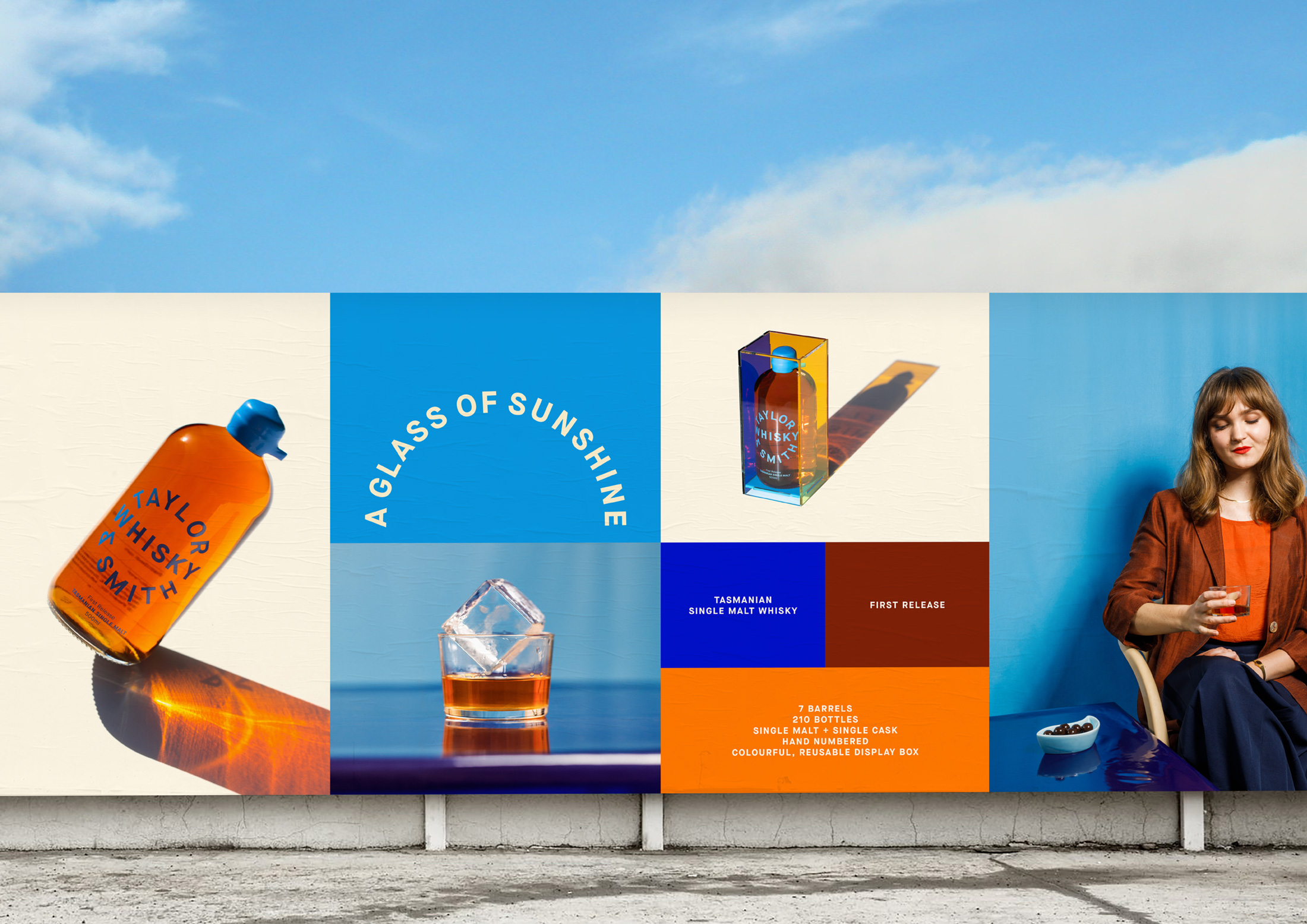
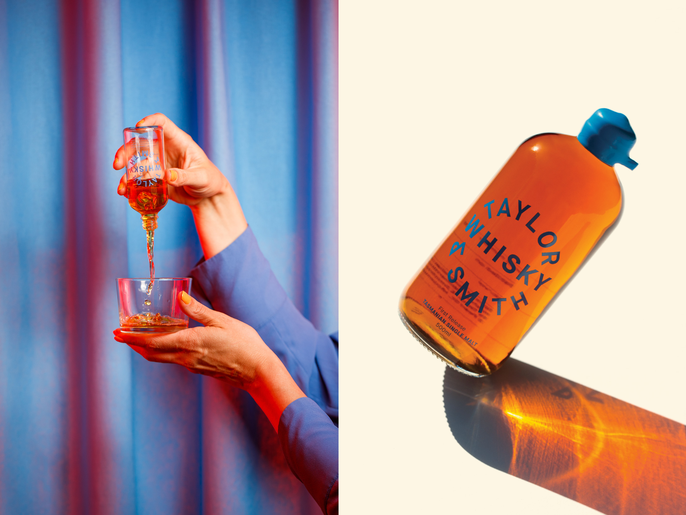
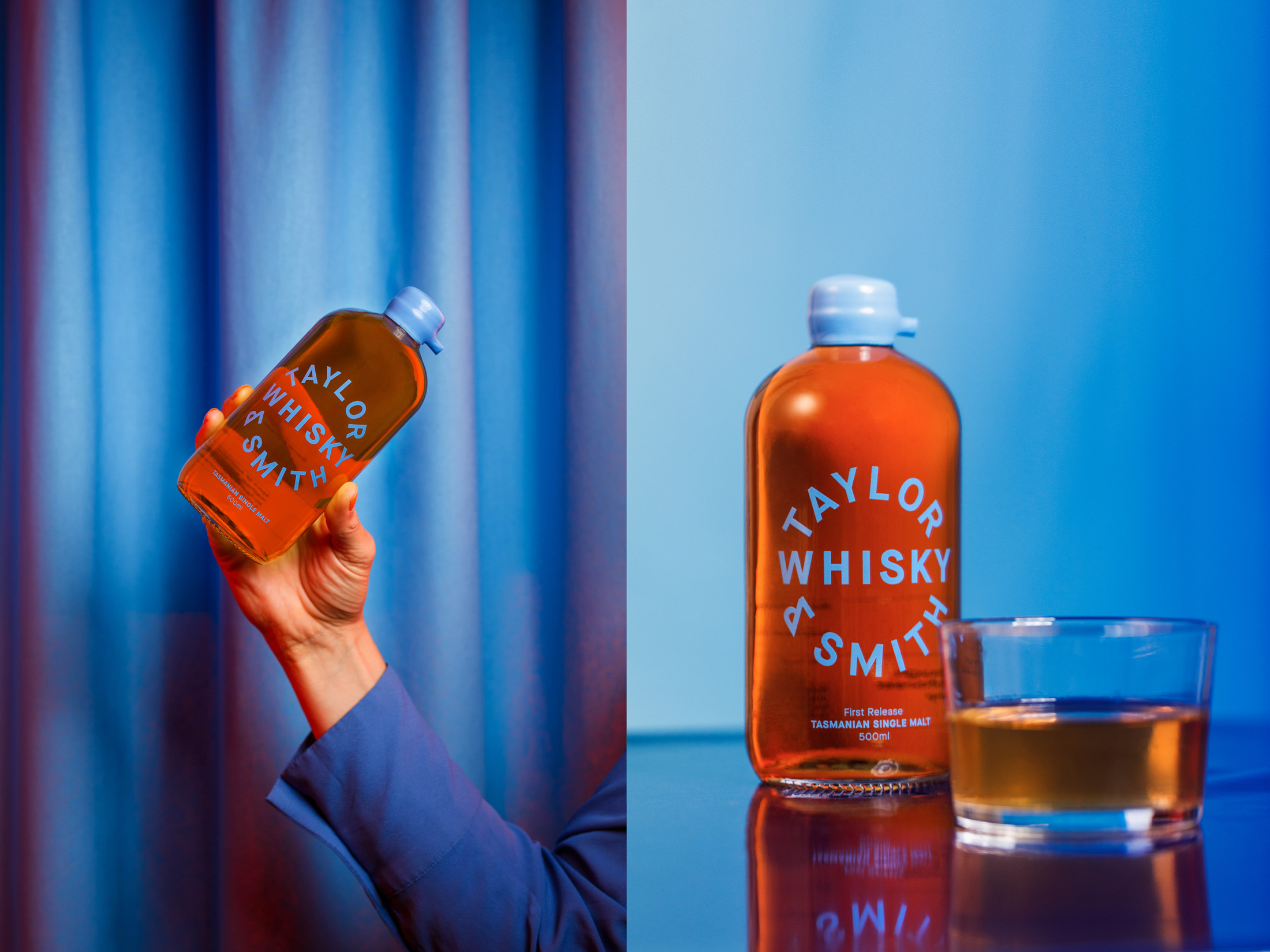
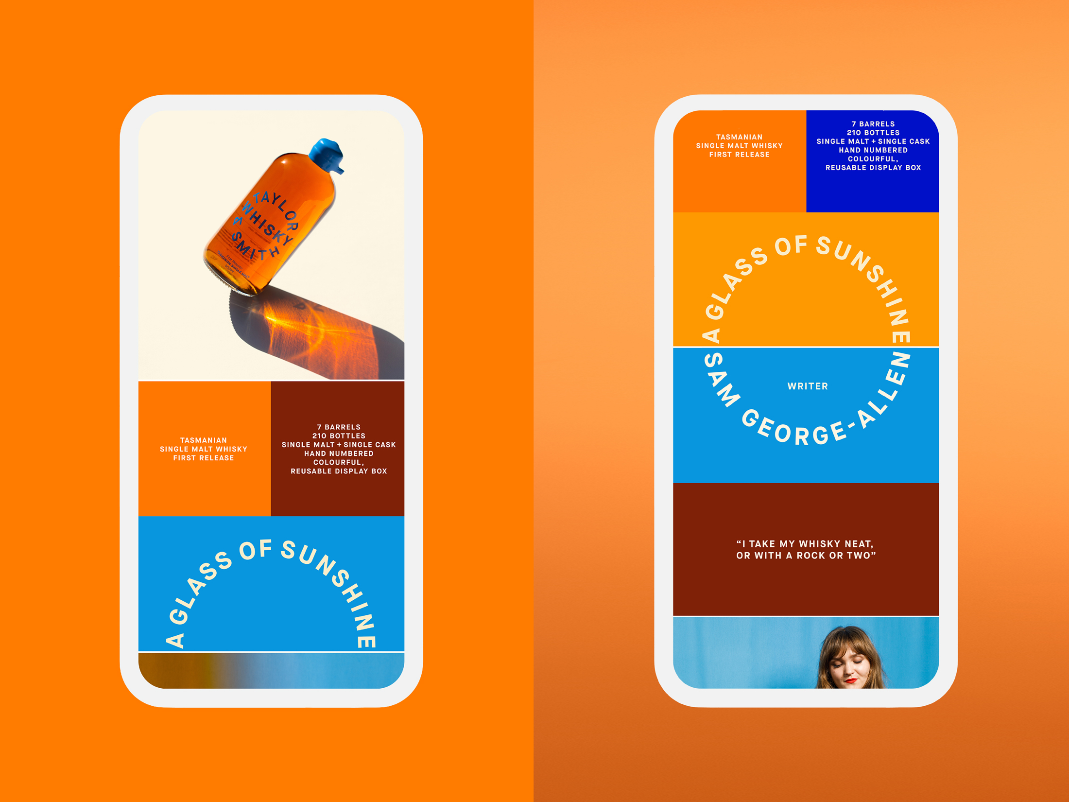
Sunshine is used as a metaphor for the smooth, warming spirit. The colours of the packaging design reflect the key ingredients and their environmental influences – single malt barley, pristine glacier lake water, the sun and the clear blue sky.
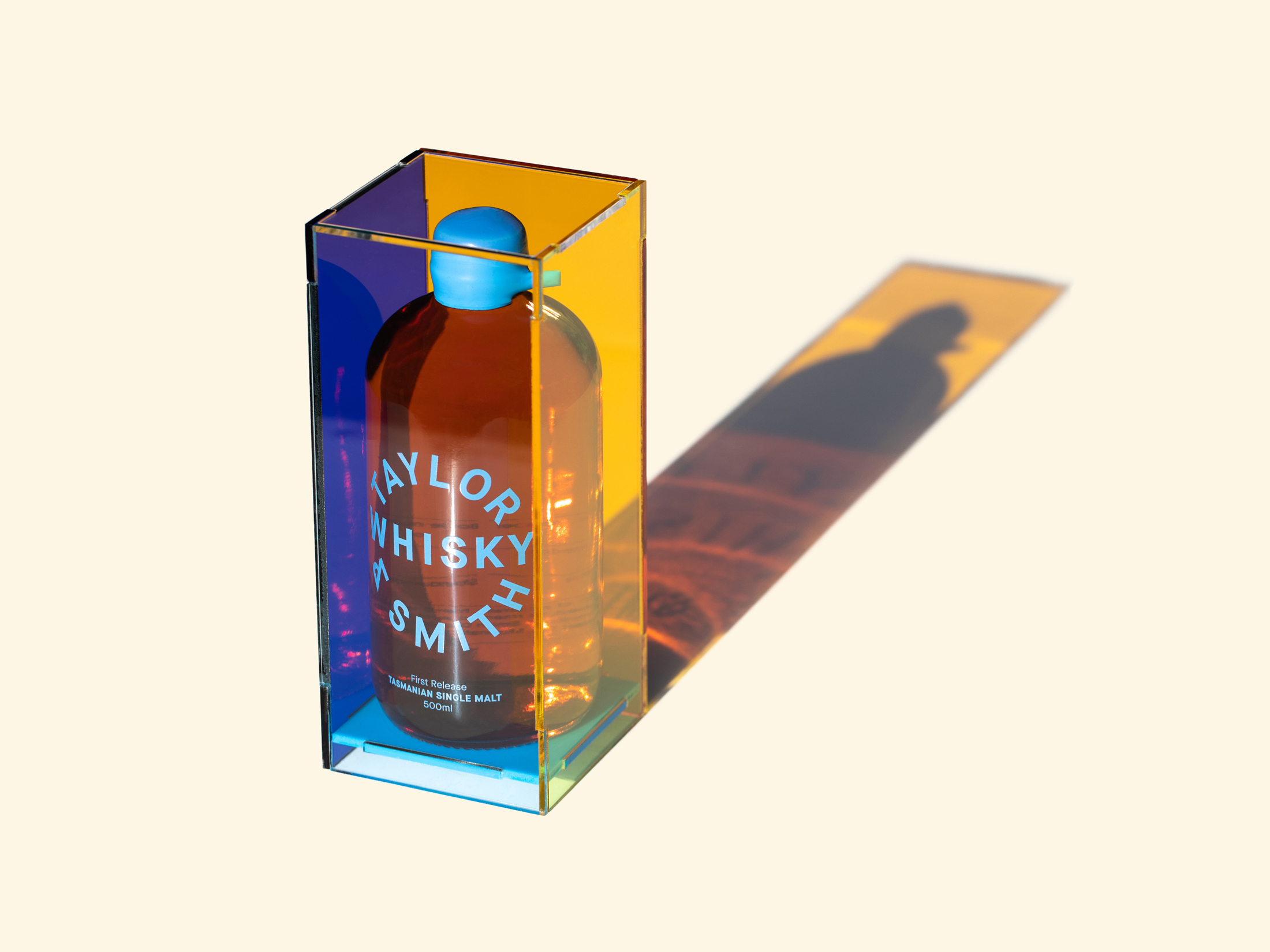
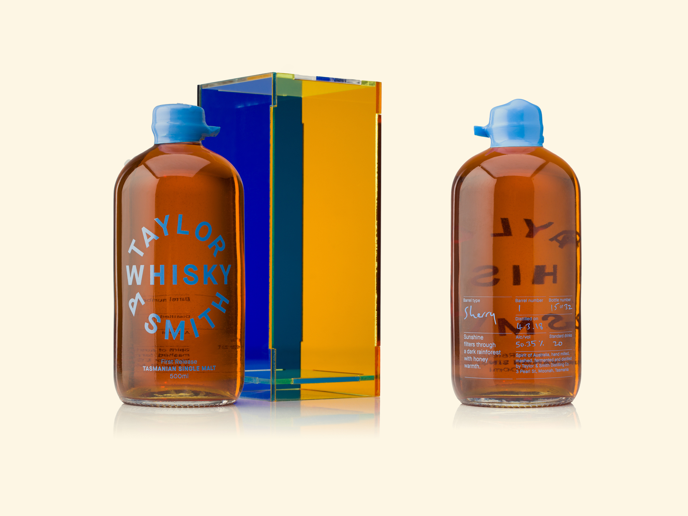
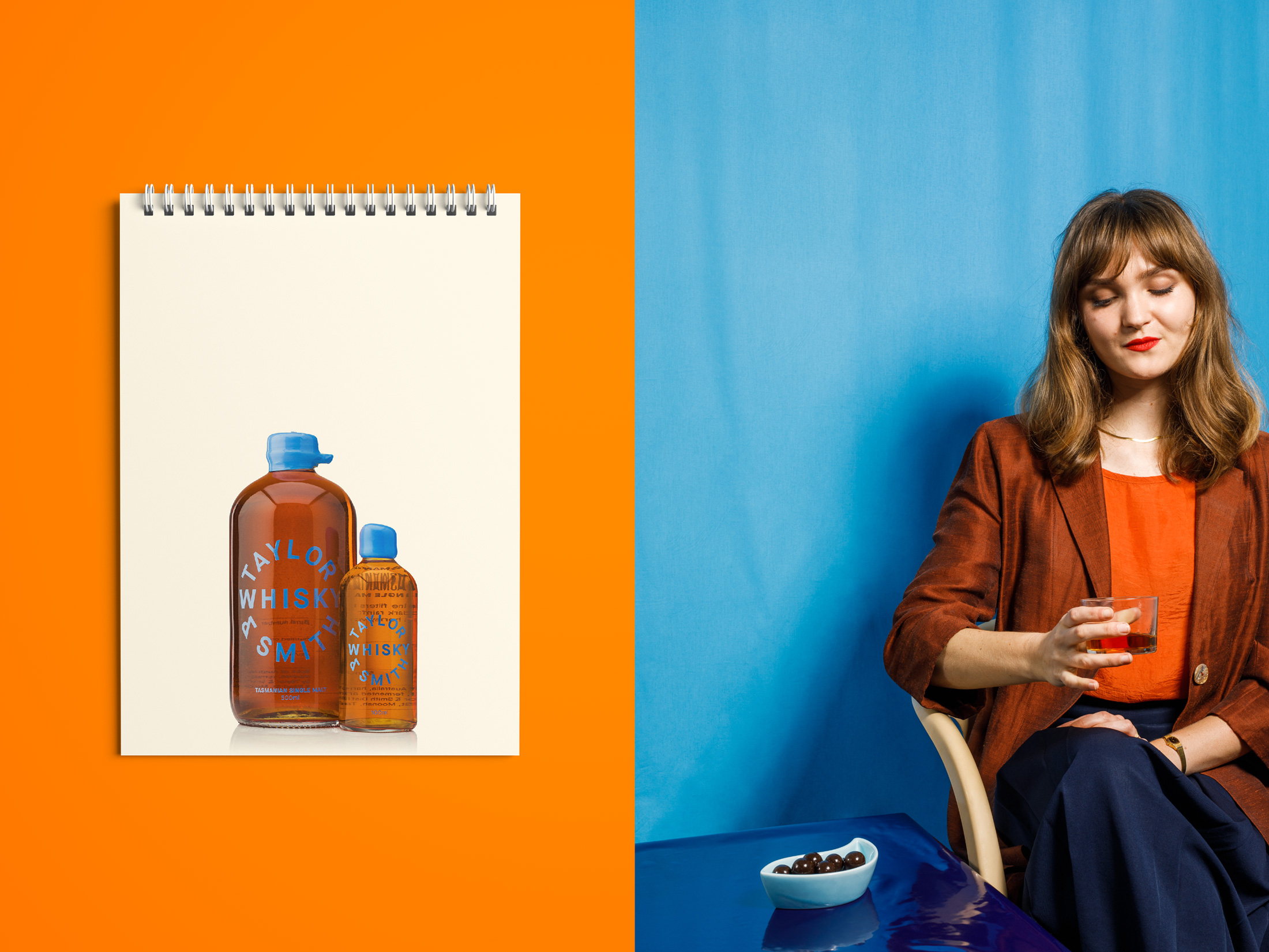
The packaging retains the minimal, distillery first approach Taylor & Smith is known for; hero brand mark lockup, rotary screen printed labels and hand waxed lids. The design allows for the inclusion of handwritten numbering and barrel details on the reverse. A striking, reusable display box allows the light to reflect, permeate and showcase the golden liquid. The intention is for the box to be kept pride of place, similar to a table top book. Customers have the opportunity to order new bottles to refill their box, making savings for their pocket and the environment.
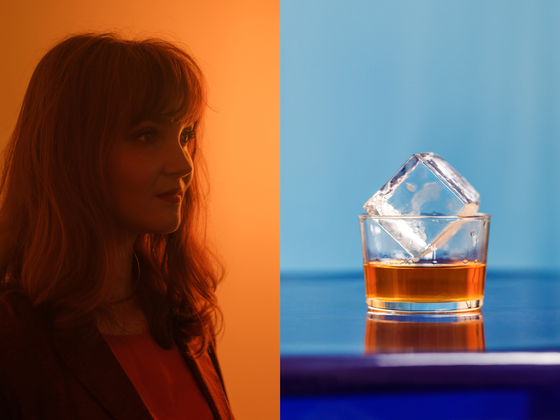
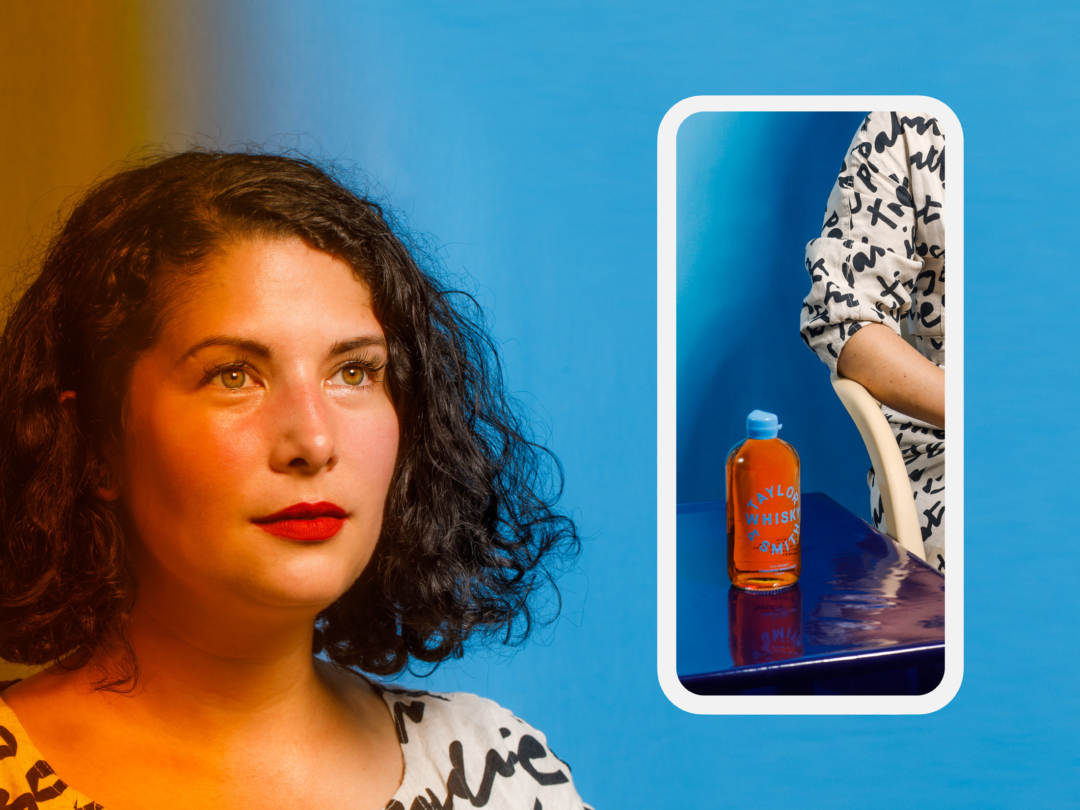
Taylor & Smith’s female leaning gin audience is encouraged to try whisky with a launch campaign featuring talented Tasmanian women as ambassadors. The approach challenges industry clichés, and provides a striking example of what contemporary Tasmanian Whisky can be. Direct sunlight is used to illuminate and reflect the product and mimic the sense of wonder and awe generated by the natural environment. Movement and reflection reminiscent of a sundial cast beautiful, contemplative colours and forms which are captured through still and video content.

CREDIT
- Agency/Creative: Megan Perkins
- Article Title: Megan Perkins Creates Packaging Design and Launch Campaign for Taylor & Smith Distilling Co. First Single Malt Whisky
- Organisation/Entity: Freelance
- Project Type: Packaging
- Project Status: Published
- Agency/Creative Country: Australia
- Agency/Creative City: Hobart
- Market Region: Oceania
- Project Deliverables: Advertising, Art Direction, Packaging Design, Product Photography
- Format: Bottle, Case
- Substrate: Glass Bottle, Plastic
- Industry: Food/Beverage
- Keywords: Whisky, Whiskey, Sunshine, Packaging, Campaign, Branding, Tasmania, Spirits
-
Credits:
Direction, Design & Strategy: Megan Perkins
Photography & Videography: Jesse Hunniford


