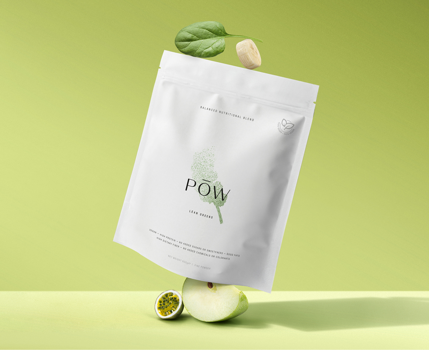
Making healthy choices shouldn’t be difficult. That’s why POW created its blends with a carefully balanced nutritional profile. An ideal way to add some extra protein, fiber, fruits and vegetables to your daily diet. All natural and 100% vegan with a smooth, crisp and refreshing flavour. To achieve a well-balanced lifestyle, the recipes are created by a certified dietitian specialized in sports nutrition and diabetes.
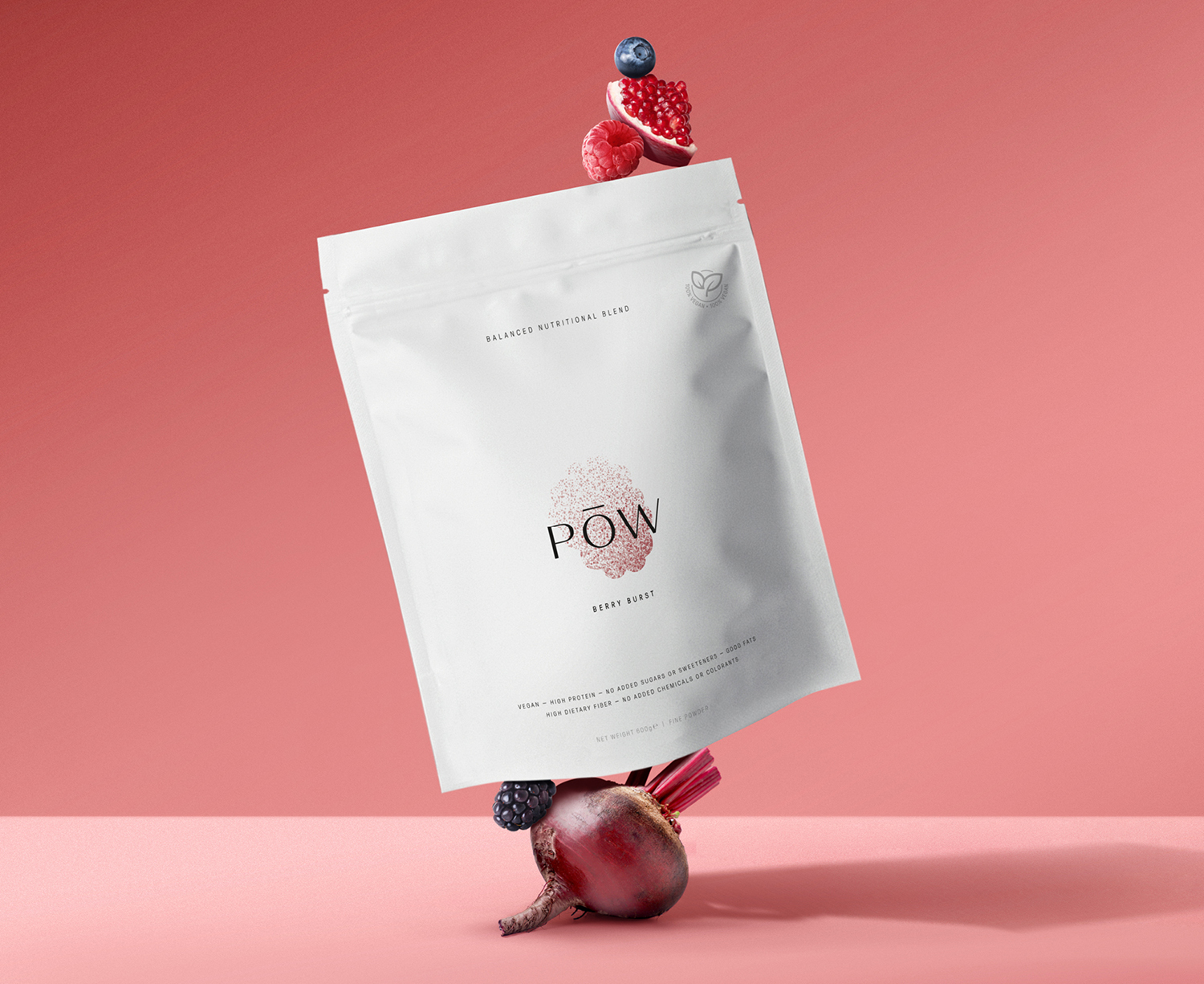
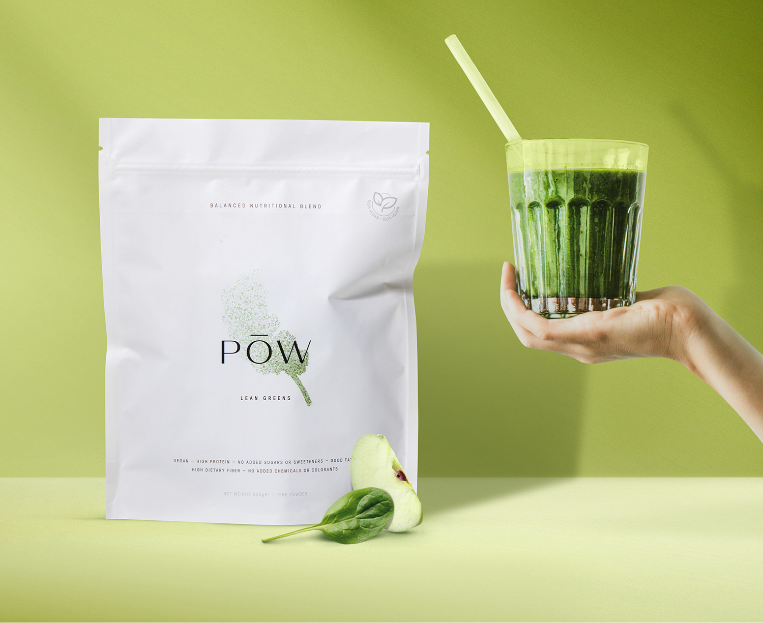
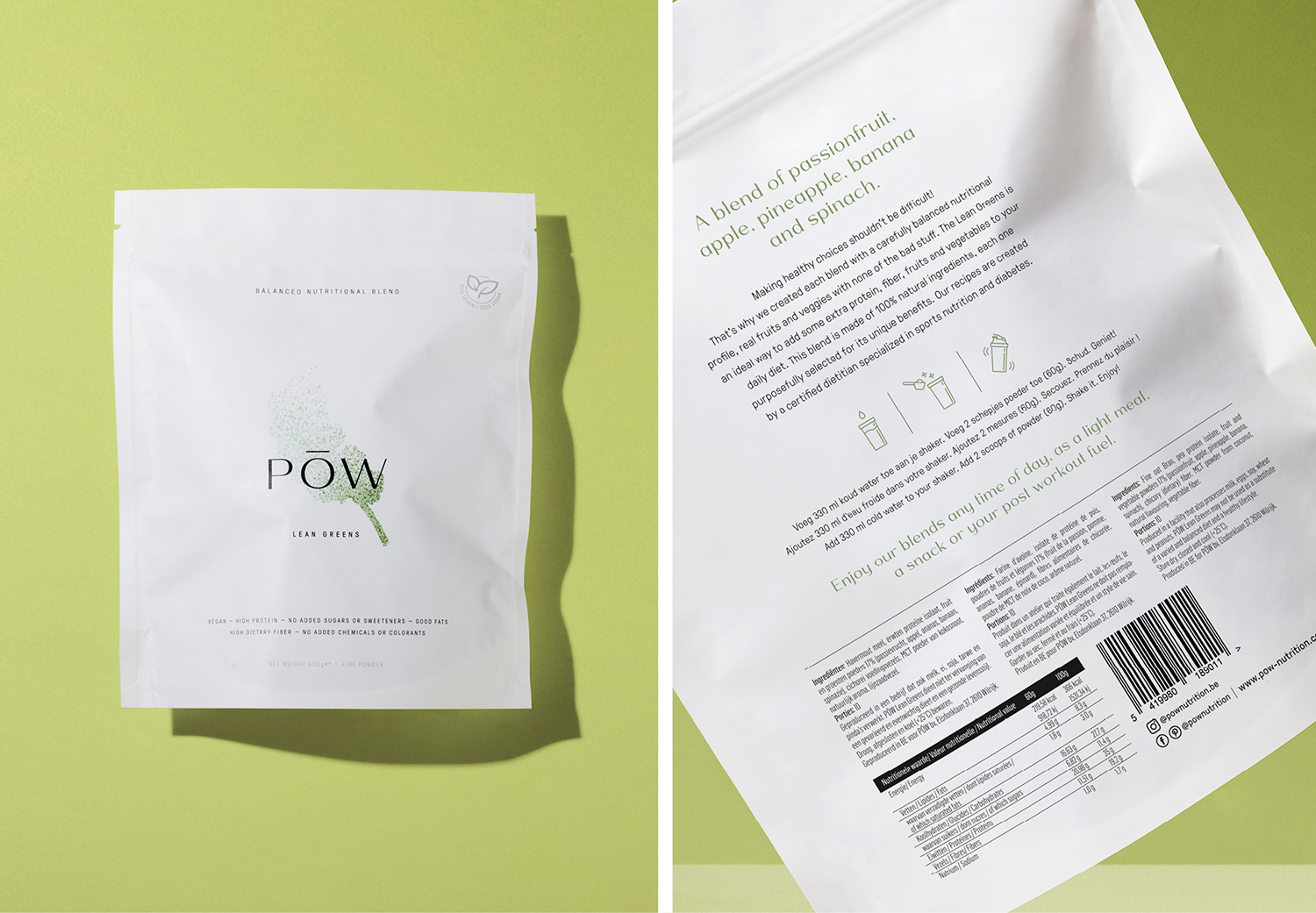
POW wants to keep your healthy drink/snack simple and effortless. Just fruit and vegetables as powder. Nothing less, nothing more. This insight is translated into a bright and minimalistic packaging that also keeps it simple. A new approach of powder shakes that breaks with the standards of an overwhelming health industry which screams colour and testosteron.
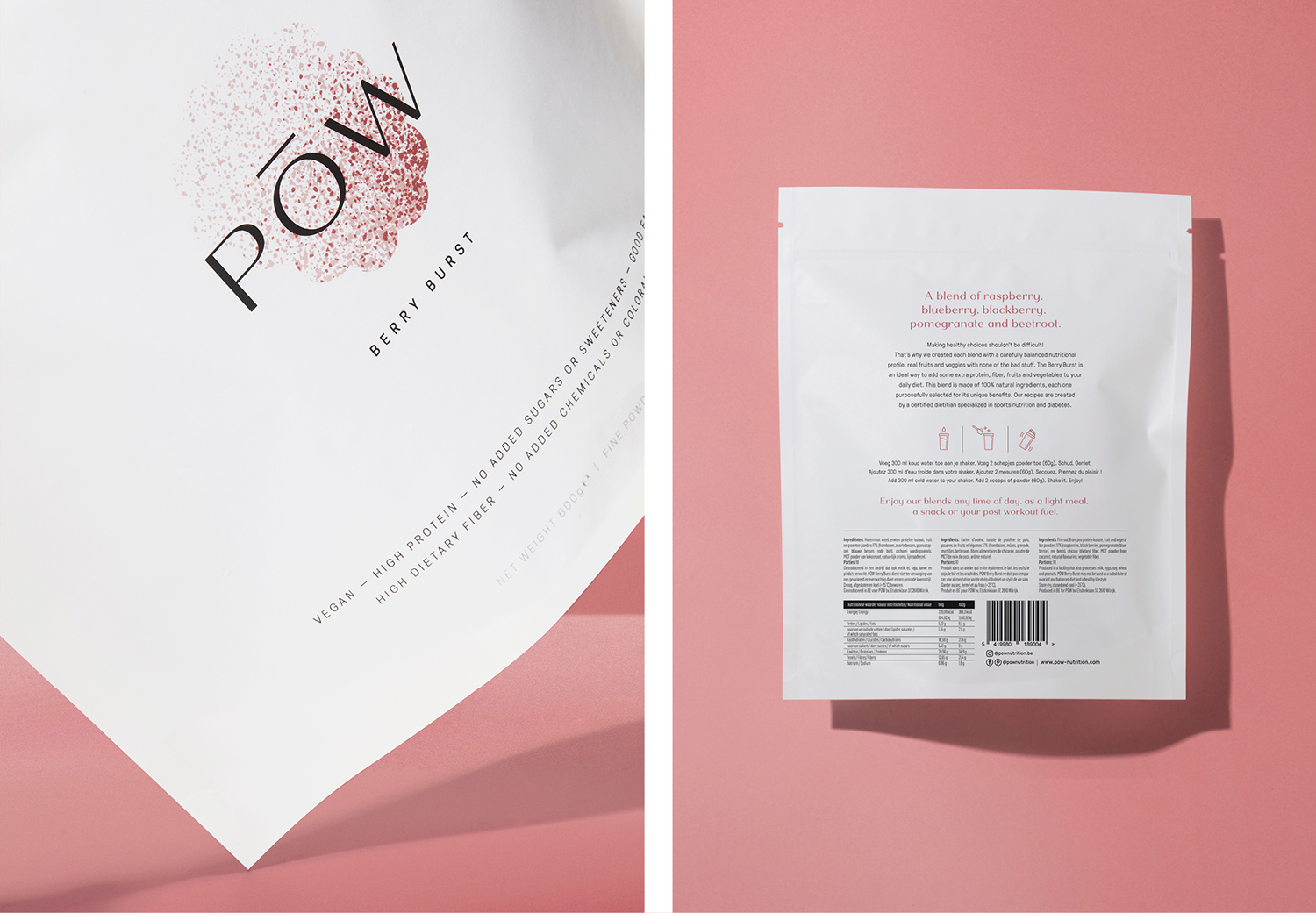
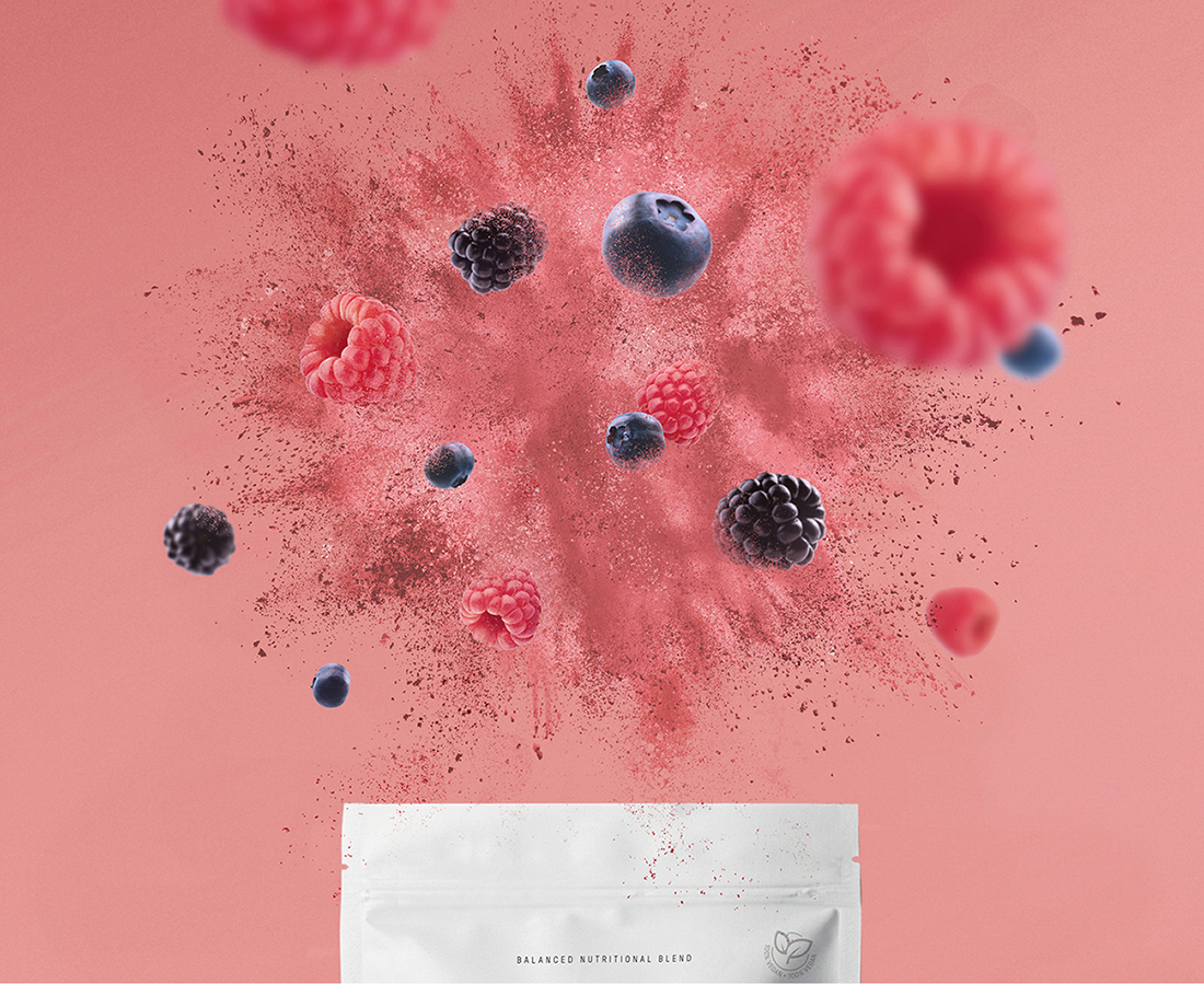
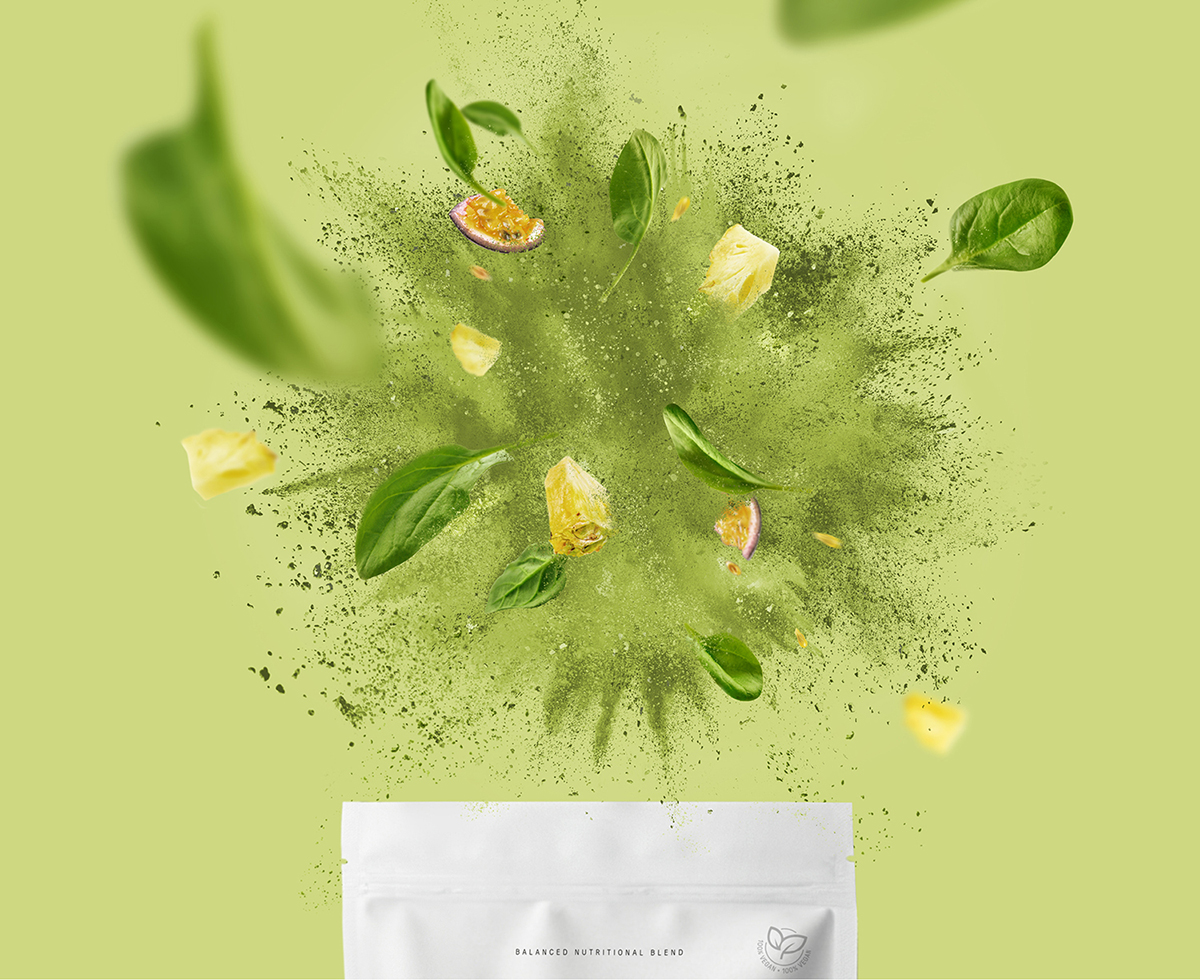
Every detail of the packaging has a deeper meaning and reflects POW’s brand essence ‘Pure Balanced Nutrition’. The design focuses on just the essential. It shows refined colour illustrations of powder bursts, shaping the main ingredient of each blend. An effective way to communicate taste and texture in one intriguing illustration. Using this airy visual treatment makes the ingredient stand out in the center of the white paper pouch. For the brand mark, an elegant lettering is combined with a floating horizontal line that evokes balance and purity. While the brand name is a confident abbreviation of powder, the product itself.
CREDIT
- Agency/Creative: Davy Dooms
- Article Title: Pōw Nutritional Blends Brand and Packaging Design Created by Davy Dooms
- Organisation/Entity: Freelance
- Project Type: Packaging
- Project Status: Published
- Agency/Creative Country: Belgium
- Agency/Creative City: Antwerp
- Market Region: Europe
- Project Deliverables: Brand Design, Brand Naming, Packaging Design
- Format: Pouch
- Substrate: Pulp Paper
- Industry: Food/Beverage
- Keywords: Packaging, Brand Design, Belgium
-
Credits:
Graphic Designer: Davy Dooms


