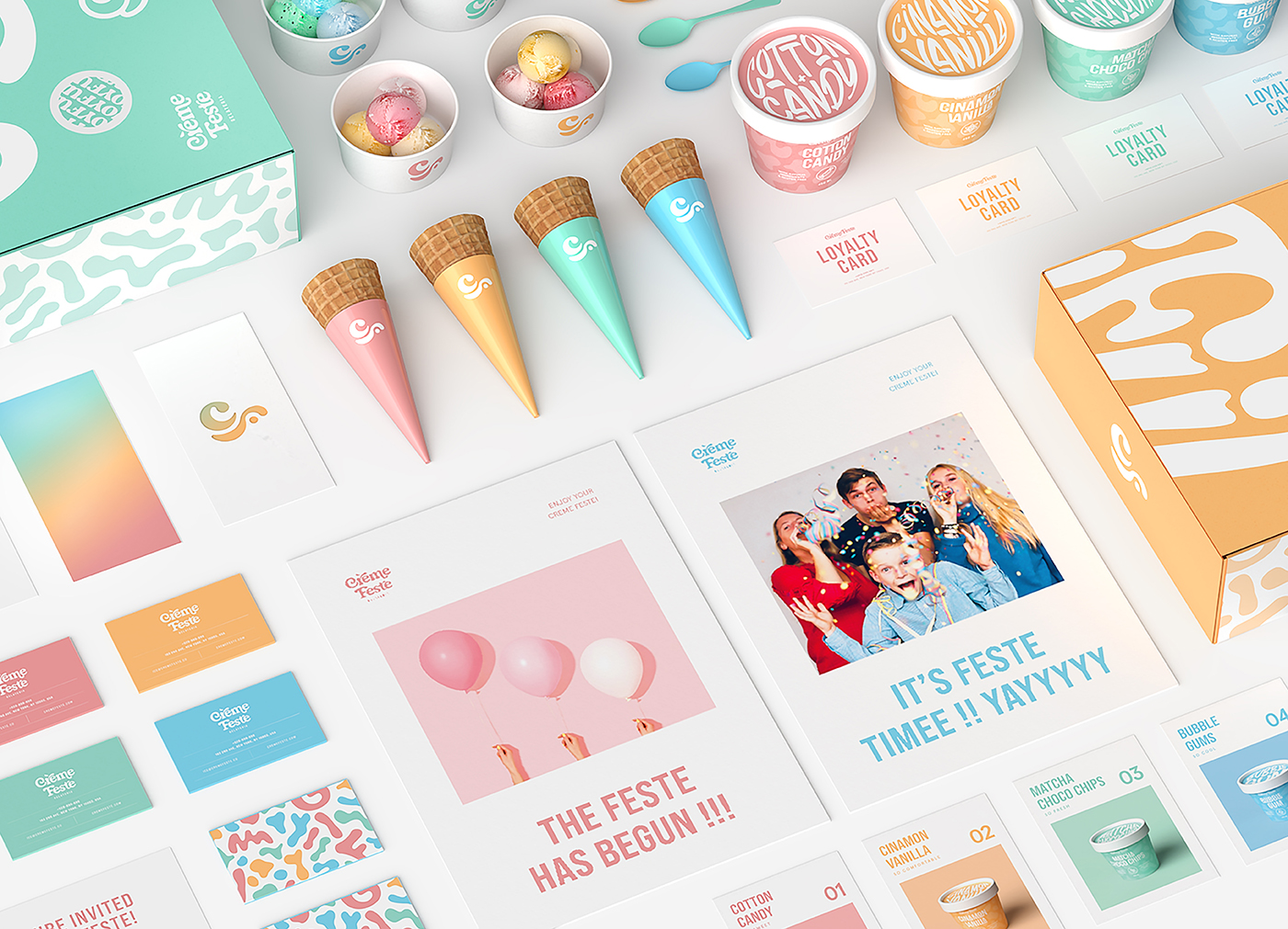
Crème Feste is a gelato brand in the US for young people who love the experience of gelato The brand’s guests will be immersed in the fun, excitement, and novelty like the atmosphere of an ice-cream party full of bright colours.
Crème Feste’s name is a combination of the French words “Crème” which means cream and “Feste” from Italian which means festival. This combination creates the image of an ice-cream party and wants to share this party with people everywhere. Moreover, our real goal is to turn an ordinary ice cream shop into a fun, happy & delicious party for everyone.
The main concept for identity is inspired by the confetti parties of childhood. Childhood memories of birthday parties are perhaps the most memorable, these are the joyful moments when we gather with family and friends and enjoy the lively wonderful confetti.
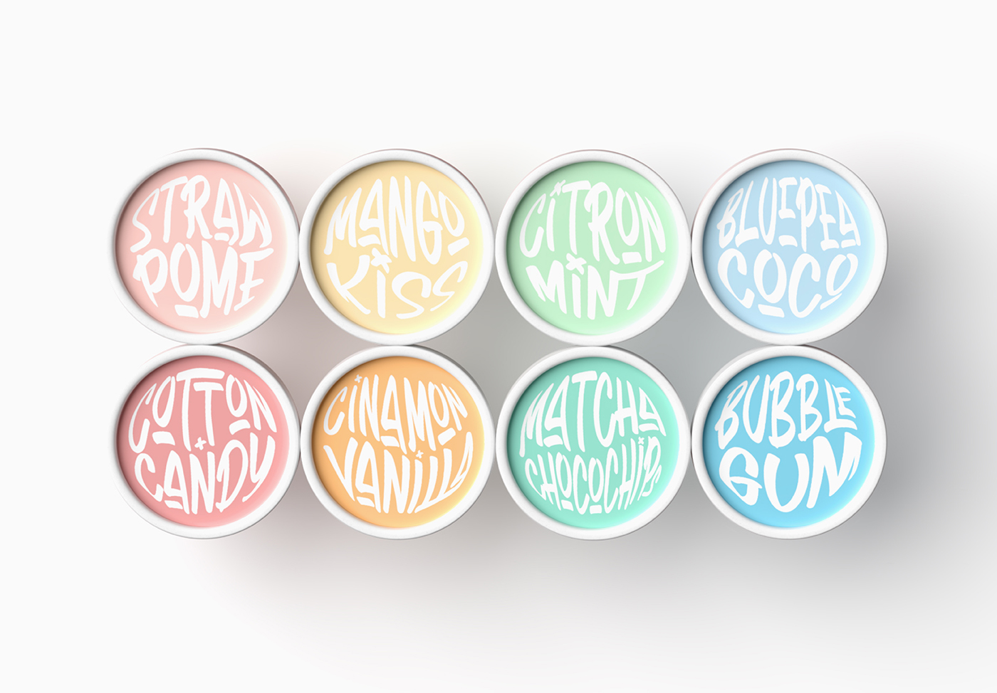
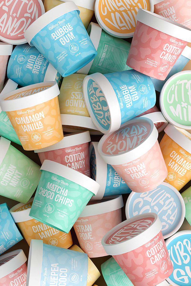
Therefore, we have brought the joy of childhood into Crème Feste in a more modern, fresh, and more experiential way by using bright and colorful pastel tones. These colors are like rainbows bounding up from bright and innocent childhood to the modern present. The logotype is also experienced in a round and playful and delicious way like at a party.
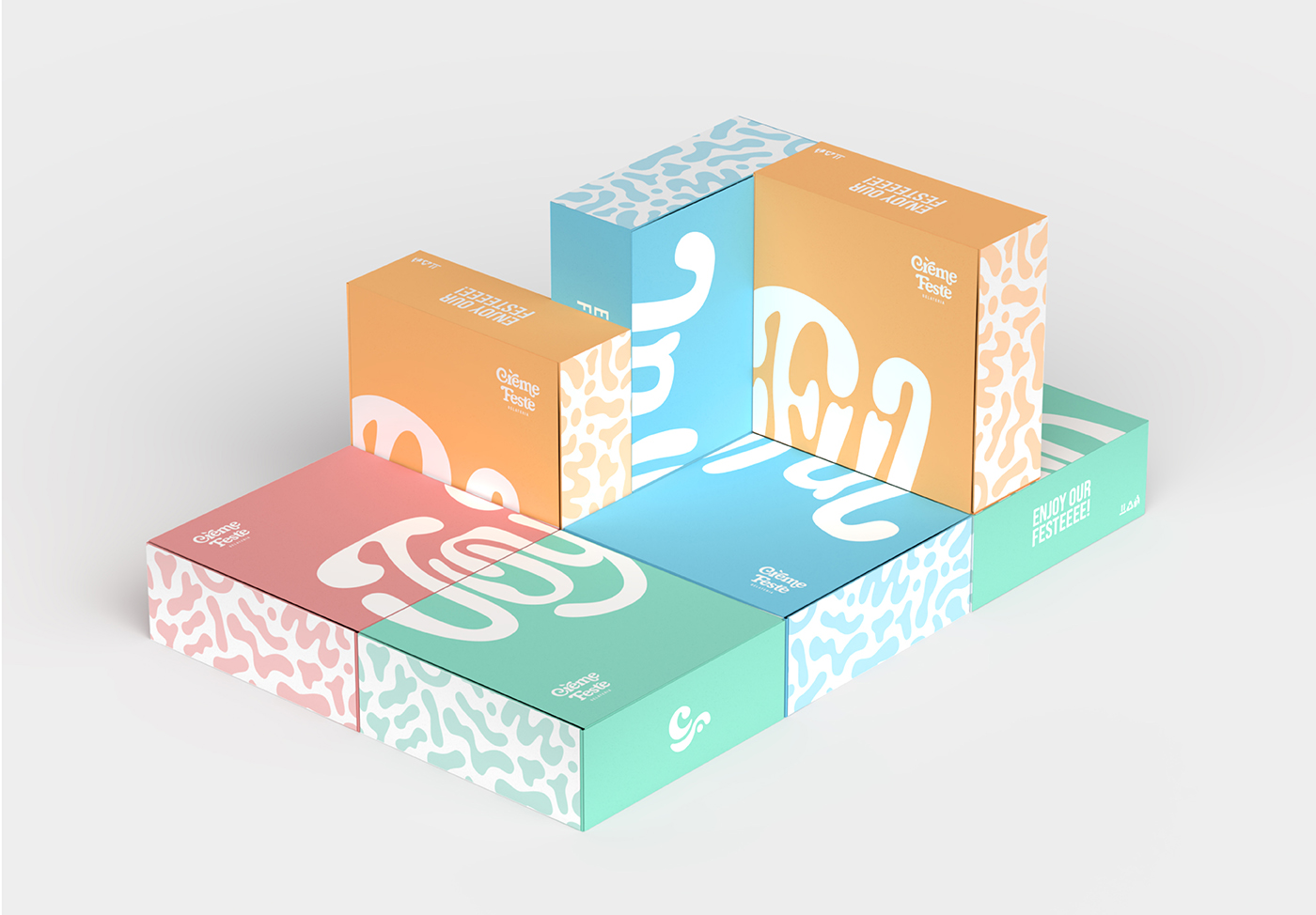
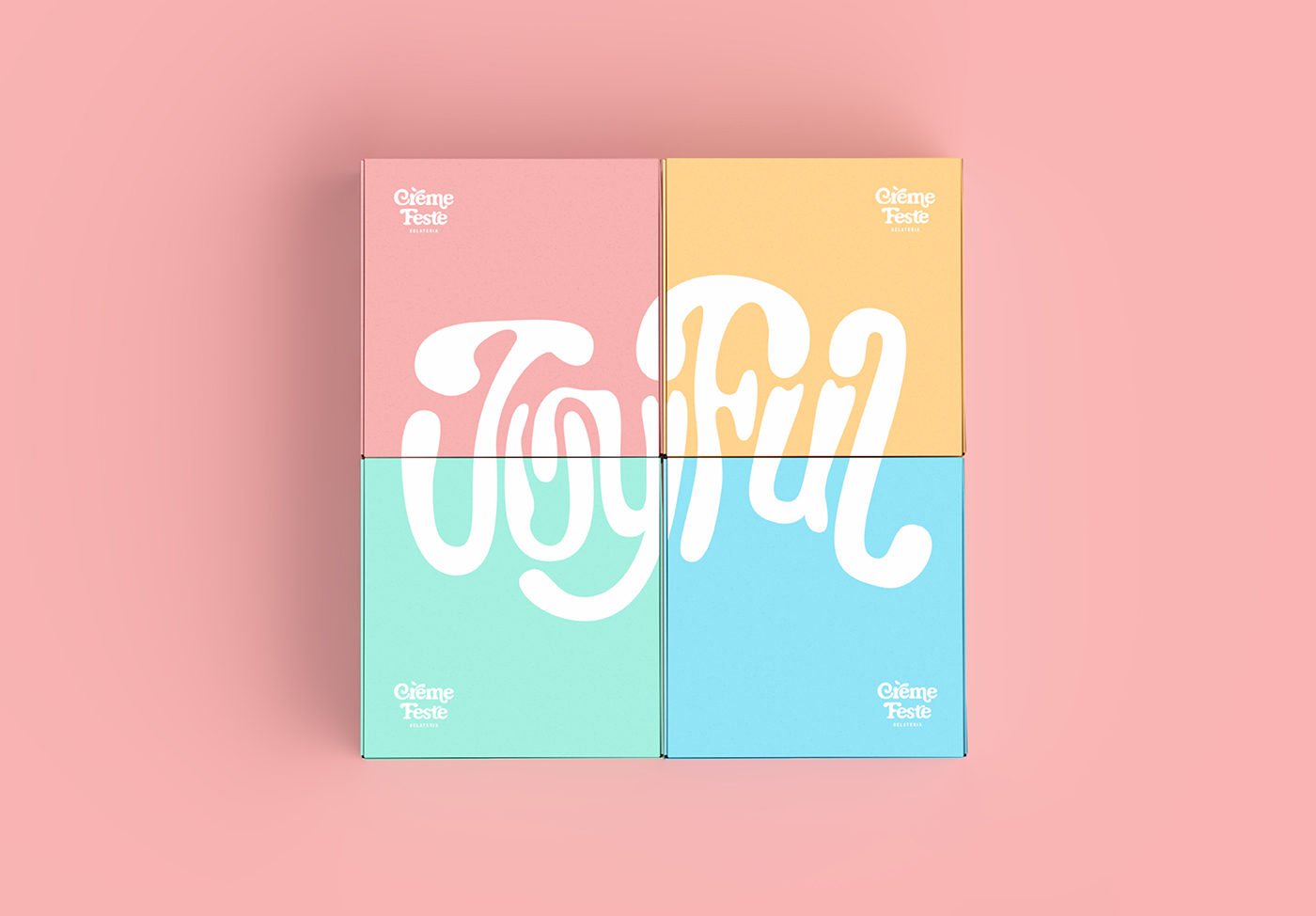
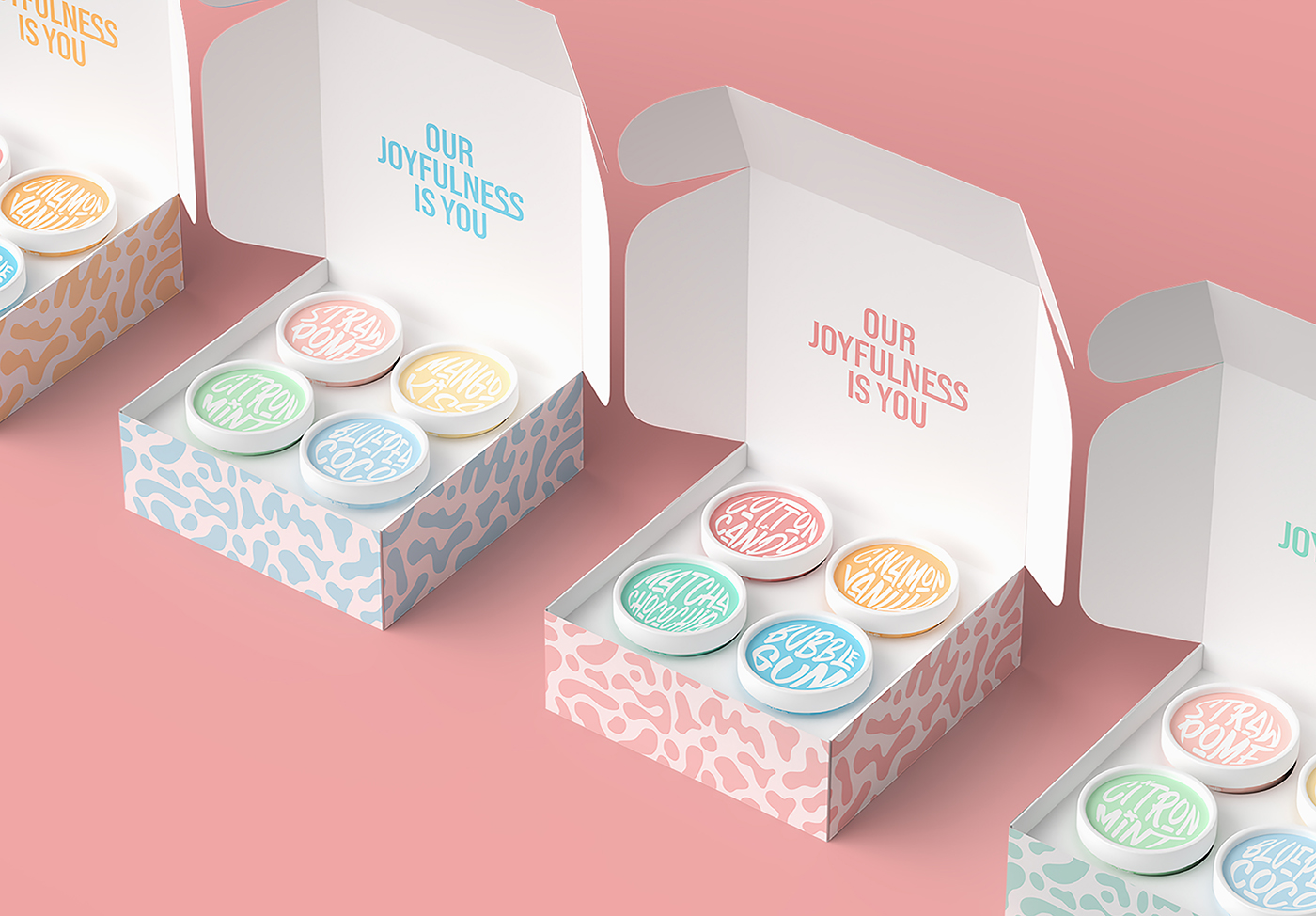
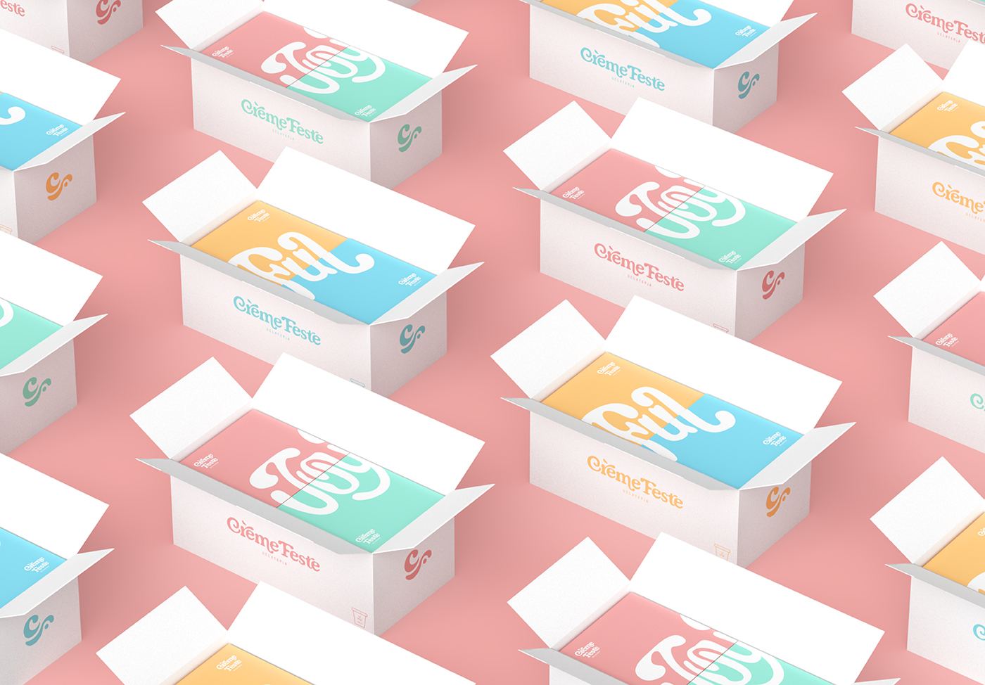
When we look at the blocks of ice cream containers, we suddenly think of the Tetris game consoles that we were given by our parents for our birthdays when we were young. Therefore, we have likened the boxes to Tetris bricks as well as childhood and fun ice cream gift boxes for customers. Inside each box contains 4 full sets of ice cream jars and is put into a tray to fix the jars. Moreover, the box, the brand’s key visual confetti is applied, creating a fun, wonderful and reminiscent feel of childhood when customers hold these boxes.
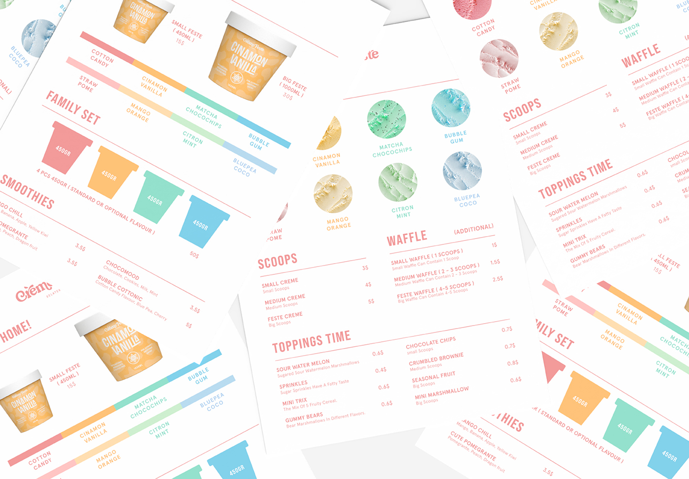
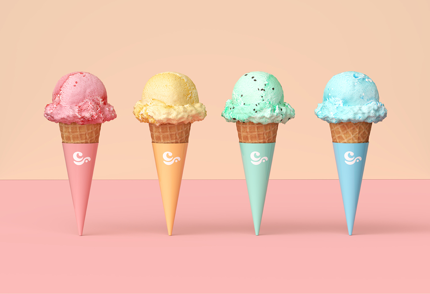
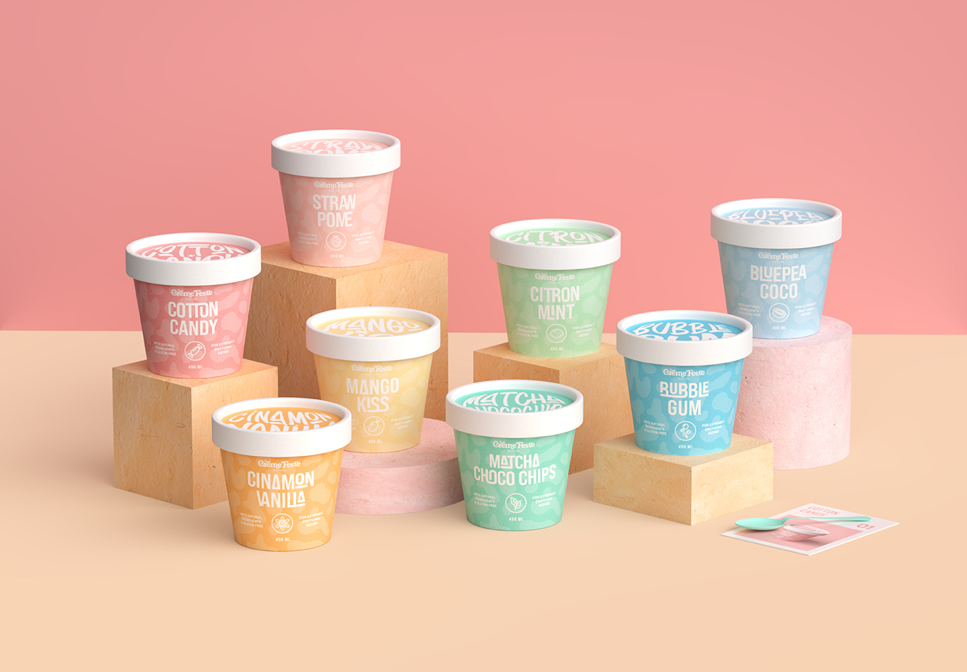
CREDIT
- Agency/Creative: Louis Ngo
- Article Title: Nostalgic Student Concept Design for Crème Feste Gelato
- Organisation/Entity: Student
- Project Type: Packaging
- Project Status: Published
- Agency/Creative Country: Vietnam
- Agency/Creative City: Hồ Chí Minh
- Market Region: Global
- Project Deliverables: Brand Design, Brand Identity, Packaging Design
- Format: Box, Jar
- Substrate: Pulp Carton, Pulp Paper
- Industry: Food/Beverage
- Keywords: Ice Cream, Gelato, Branding,Ppackaging, Jar, Childhood, Funny, Happy
-
Credits:
Art Direction, 3d Visualisation, Graphic designer: Louis Ngo
Art direction, Graphic designer: Larissa Charlotta
3d Visualisation, Graphic designer: Tan Dinh
Graphic Designer: Dan Huynh
Graphic Designer: Linh To


