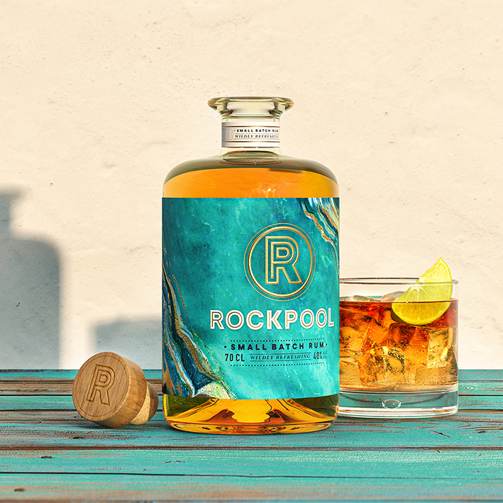
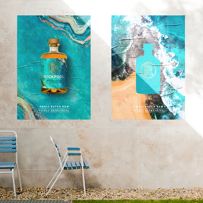
Rum is a drink of the ocean and like the ocean it can be raging and rough. Rock pools offer a calming experience of the sea, without the struggle for survival. And yet every so often a cold wave will wash over, and with it a refreshing reminder. This became a metaphor for the brand, when you sip on a refreshing Rockpool rum the chaos and stress of daily life disappears, replaced by calm and serenity.
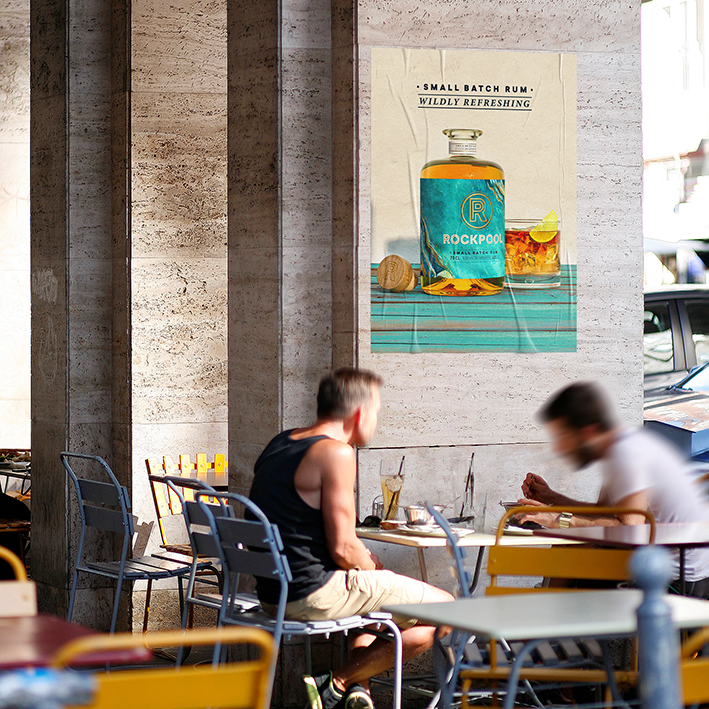
Rockpool Rum is a small batch spirit that gives tastemakers who want to try something new the opportunity to elevate their cocktails, and any social occasion. Rockpool rum wanted to stand out from the start, breaking category norms that are filled with classic Caribbean cues of ships and pirates.
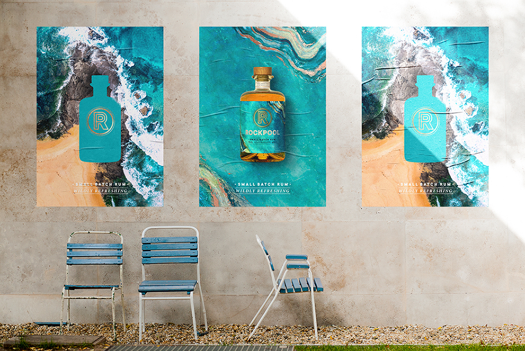
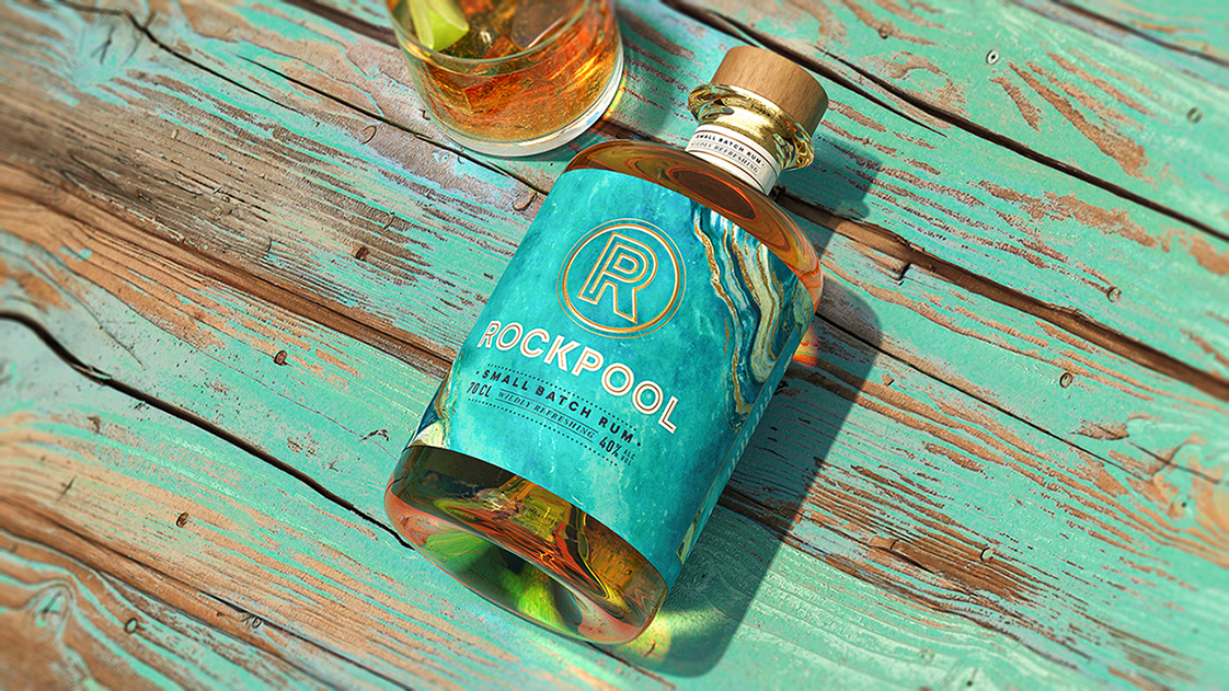
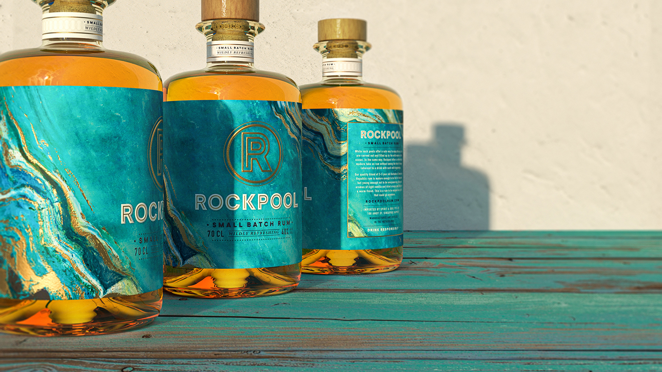
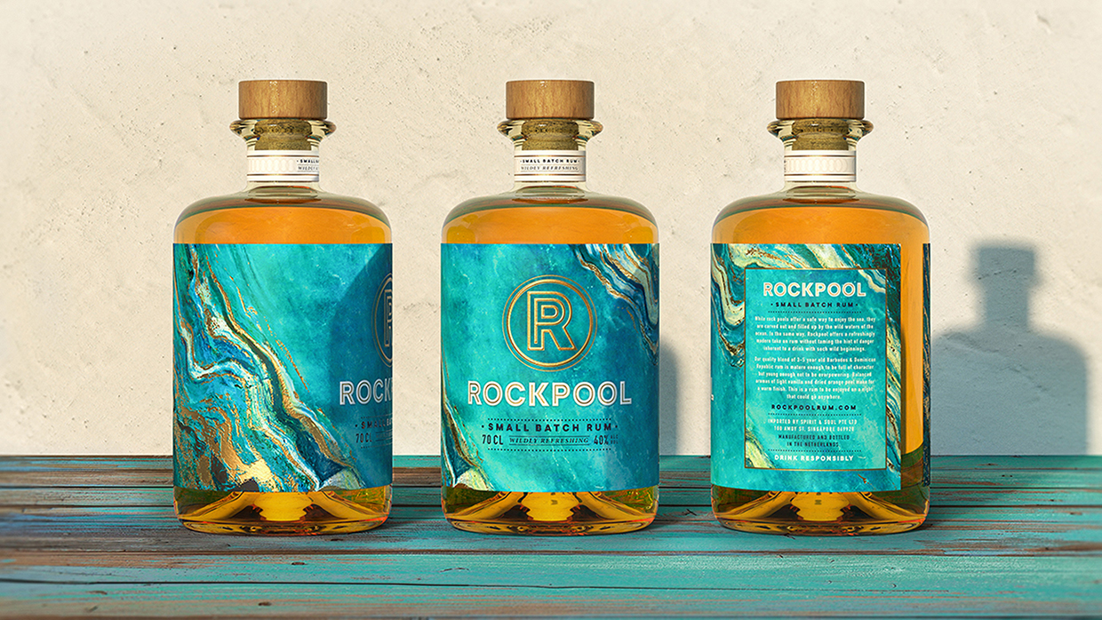
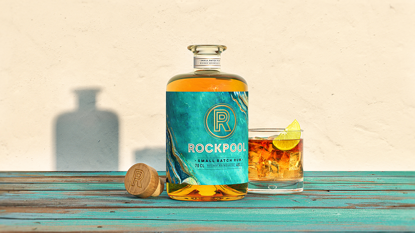
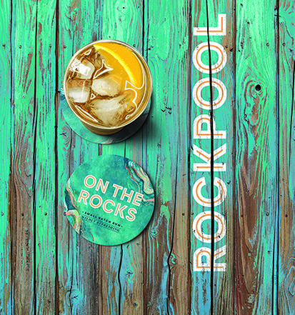
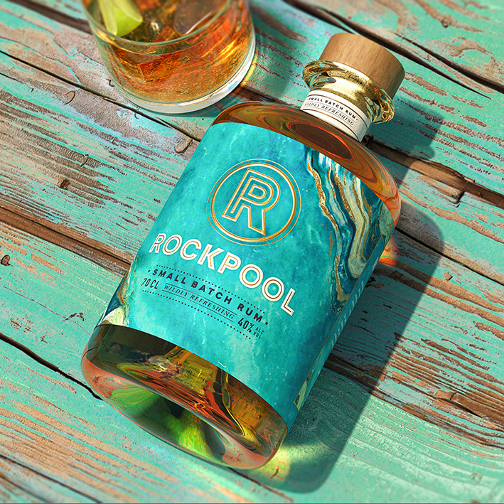
The BlackMoon Studio interprets the rum’s nautical beginnings in a brand new way, taking inspiration from the colours, textures and patterns found in nature. Touches of copper run through the rock texture symbolising the copper stills used in the rum production process.The RP monogram is crafted and simple. The P sits inside the R as a visual representation of the rock pool, protected from the raging seas. The outcome is a refreshingly modern design, carefully crafted to represent the progressive personality of this new to market small batch rum.
CREDIT
- Agency/Creative: The BlackMoon Studio
- Article Title: The BlackMoon Studio Creates Brand and Packaging Design for RockPool Rum
- Organisation/Entity: Agency
- Project Type: Packaging
- Project Status: Published
- Agency/Creative Country: Singapore
- Agency/Creative City: Singapore
- Market Region: Global
- Project Deliverables: Brand Creation, Graphic Design, Logo Design, Packaging Design, Visualisation
- Format: Bottle
- Substrate: Glass Bottle, Pulp Paper, Wood
- Industry: Food/Beverage
- Keywords: WBDS Agency Design Awards 2021/22
- Keywords: Visual Identity, Graphic Design, Brand Design, Package Design, Alcohol Packaging, Branding, Logo, Design Studio
-
Credits:
Creative Partner: James Diaz Alberdi
Creative Partner: John Hughes
Managing Partner: Grace Ng


