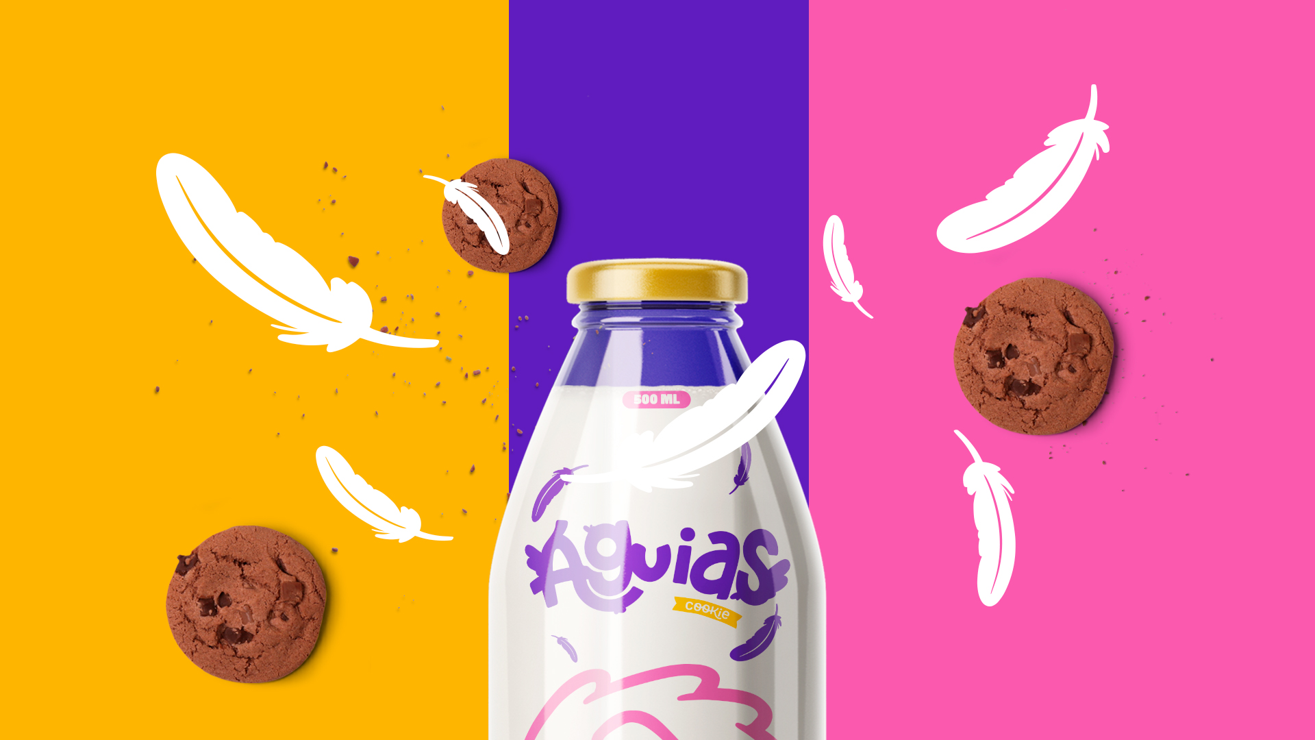
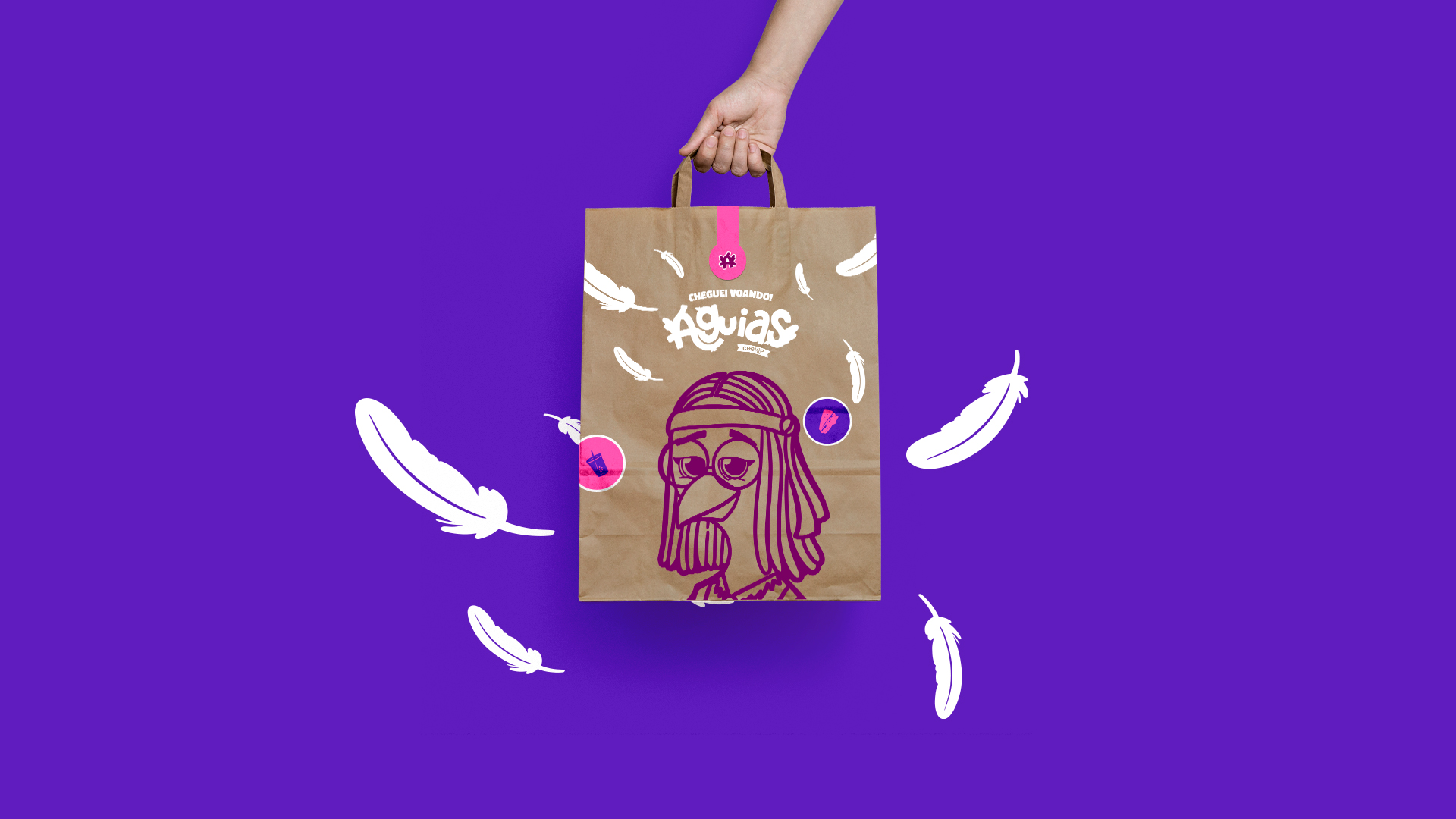
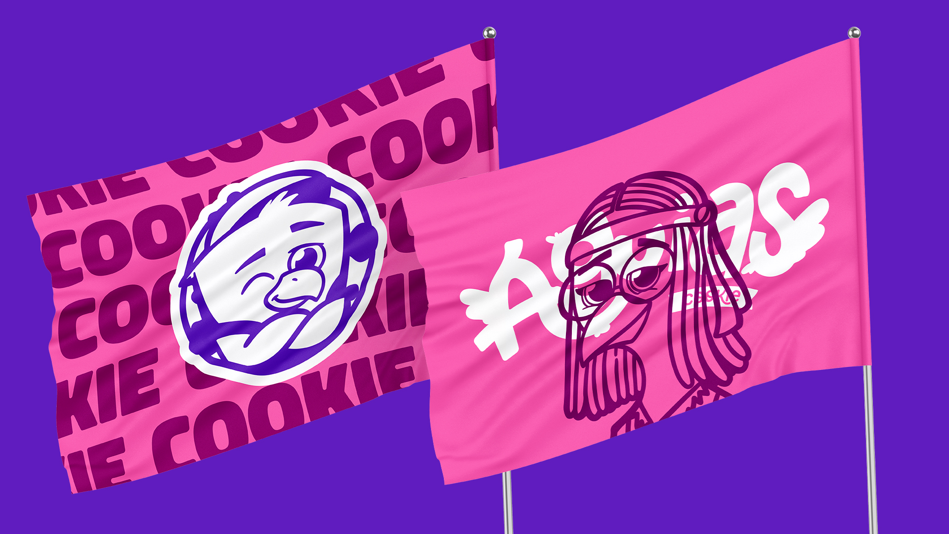
Eagles Cookie is a Brazilian cookie brand from São Paulo. The company intends to invest in extroversion and creativity to attract customers of all ages. His characters take the opportunity to give a unique face to the brand, making everything more playful, fun and delicious.
The brand takes with it, mainly in typography, references from Disney movies from the 90s, such as The Grinch, Fiding Nemo and A Bug’s Life. The idea is to reach both the public and the children, as the taste and fun is for everyone. Still on typography, it carries elements of the characters themselves, the feathers.
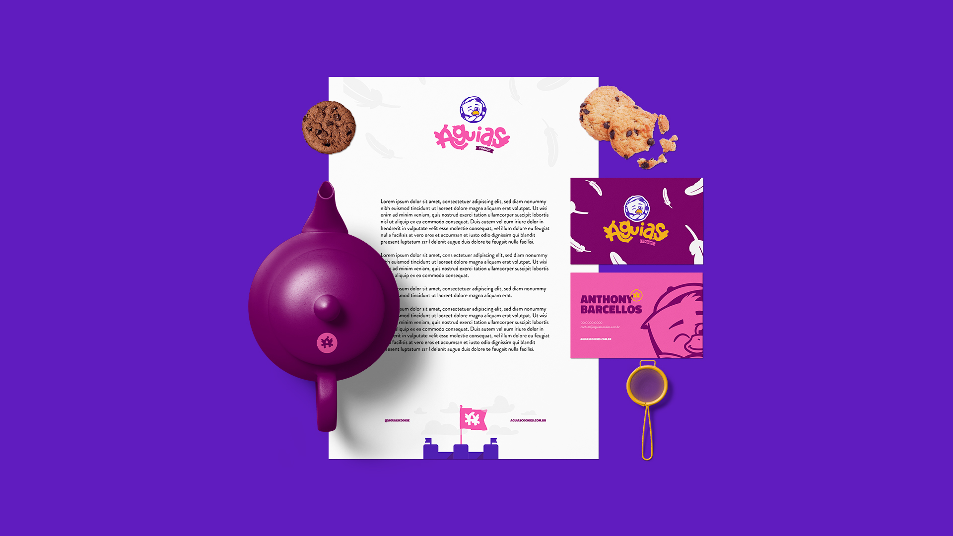
However, it can also be used without the symbols, so we have a strong typography that doesn’t lose meaning when used without the characters’ support. It also looks fun and moving, as in the future the characters can be animated. Also thinking of a brand that could show all the characters logo on the brand, it is changing, as it can vary its characters in use along with the typography. To give the brand even more life, we have the names of each character: Cookie, Estrela, Cocoa, Butter and Vanilla.
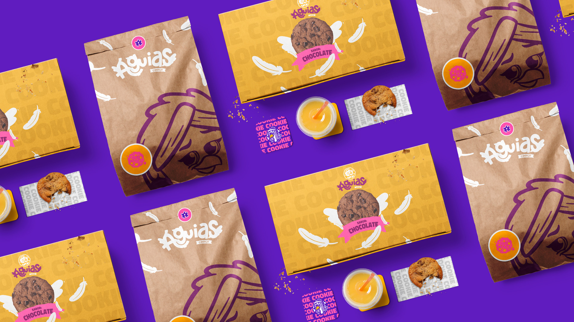
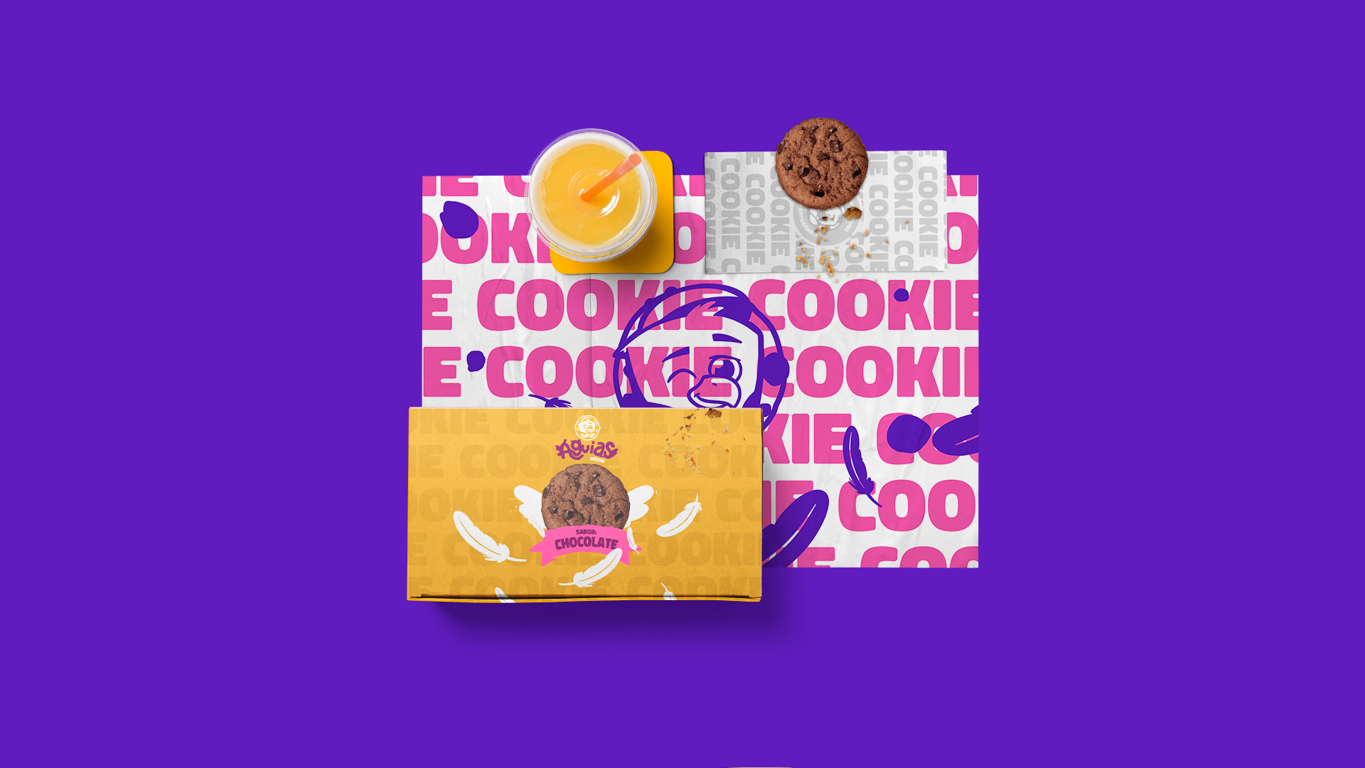
The identity in general contains a playful aura, aiming to impact and differentiate itself from competitors, but still carrying with it the American fast food aesthetic, the main inspiration of the owner.
The brand’s motto is “Flying high on flavor!” which gives every identity the idea of something radical, young and lively. Finally, we have a brand with soul, original, totally nice to look at and quite desirable.
CREDIT
- Agency/Creative: Fixgu
- Article Title: Branding for Brazilian Cookie Brand Águias
- Organisation/Entity: Freelance
- Project Type: Identity
- Project Status: Published
- Agency/Creative Country: Brazil
- Agency/Creative City: Fixgu
- Market Region: South America
- Project Deliverables: Brand Identity, Icon Design, Illustration, Logo Design, Packaging Design, Packaging Guidelines
- Industry: Food/Beverage
- Keywords: Brand Identity, Logotype, Fun, Cookie, Food, Illustration, Brand Design
-
Credits:
Fixgu: Fixgu


