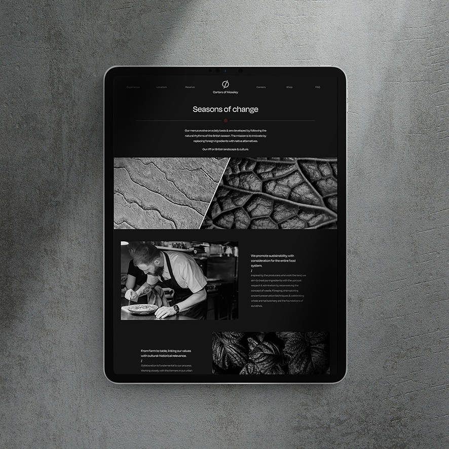
Carters of Moseley is a modern British restaurant and one of Birmingham’s finest Michelin starred eateries. Their menus evolve on a daily basis and are developed and inspired by the British seasons.
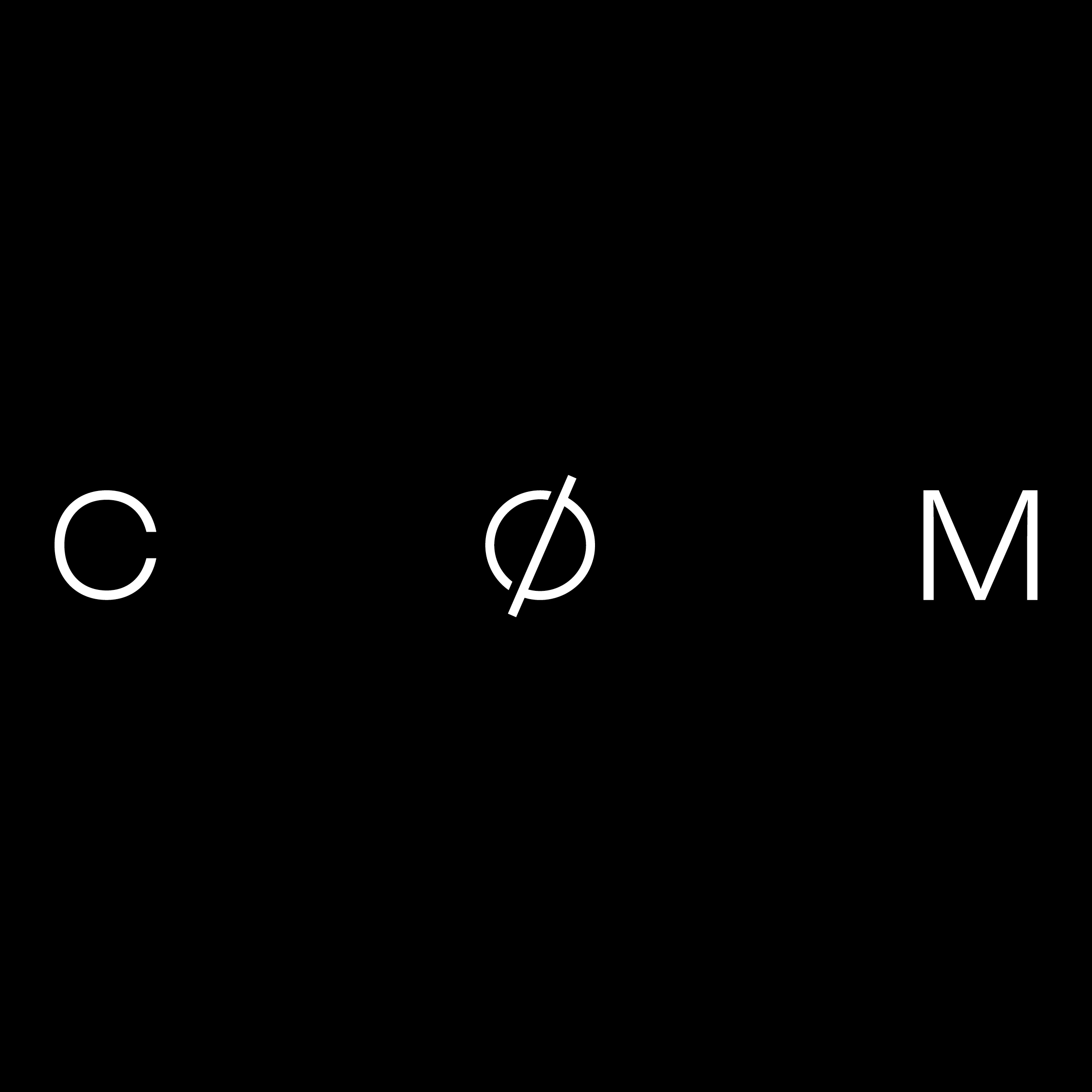
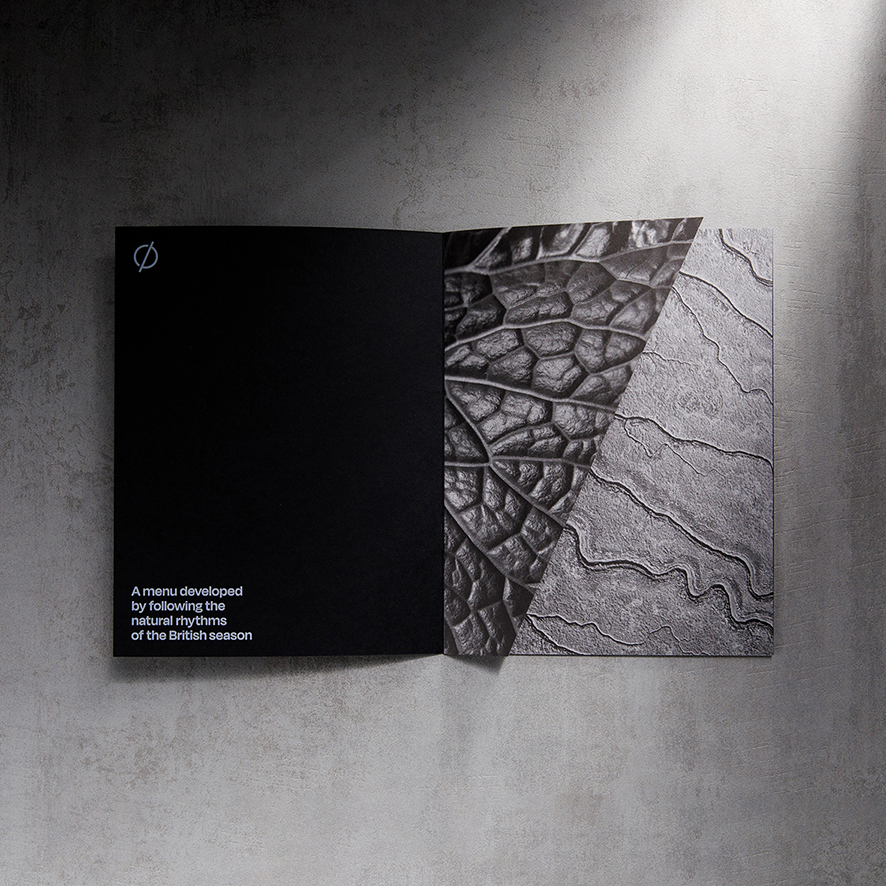
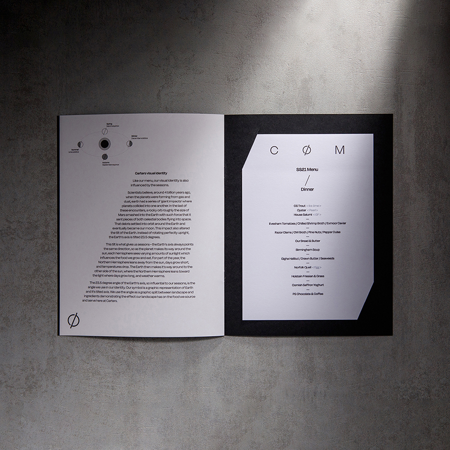
Seasonality is at the heart of both the dishes and the new identity. The 23.5° angle of Earth’s axis – which is responsible for our seasons – influences every element of the brand identity from the symbol and graphic system to photography, typography, formats and bindings.
When our planet was first forming, Earth had a series of giant impacts where planets collided into one another. In the last of these encounters, a rocky orb smashed into the Earth with such force that it altered the tilt of the planet. Instead of rotating perfectly upright, the Earth’s axis is tilted 23.5 degrees. This tilt is what gives us seasons – the Earth’s axis always points the same direction, so as the planet makes its way around the sun, each hemisphere sees varying amounts of sunlight which influences the food we grow and eat and also Carters whole ethos and ever changing menus
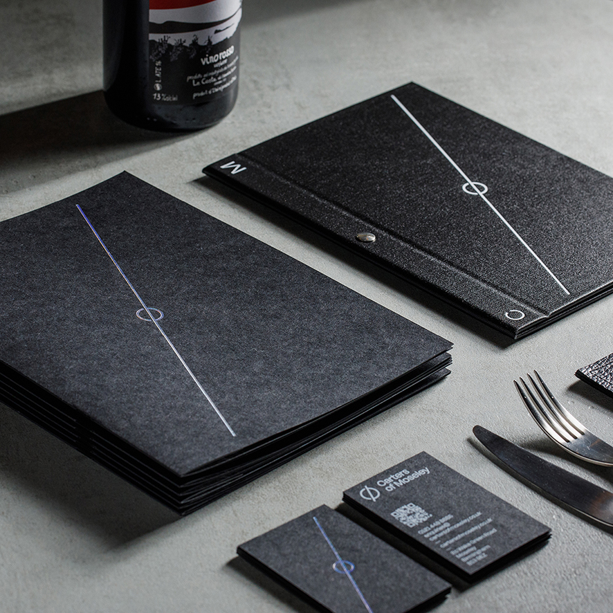
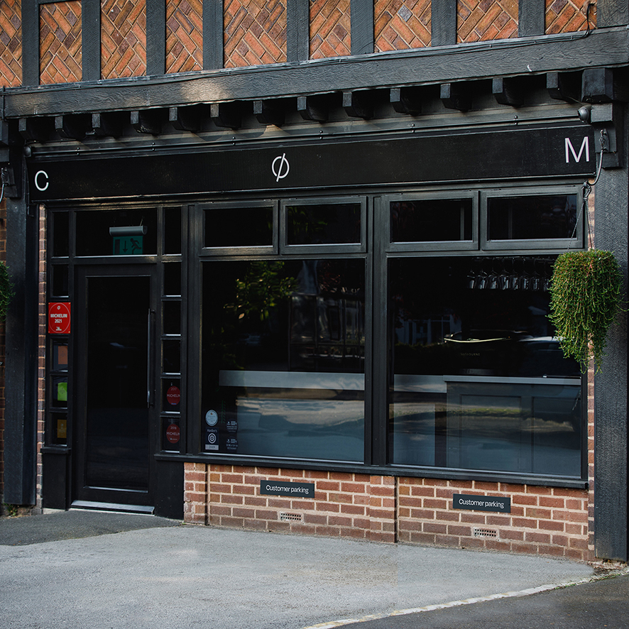
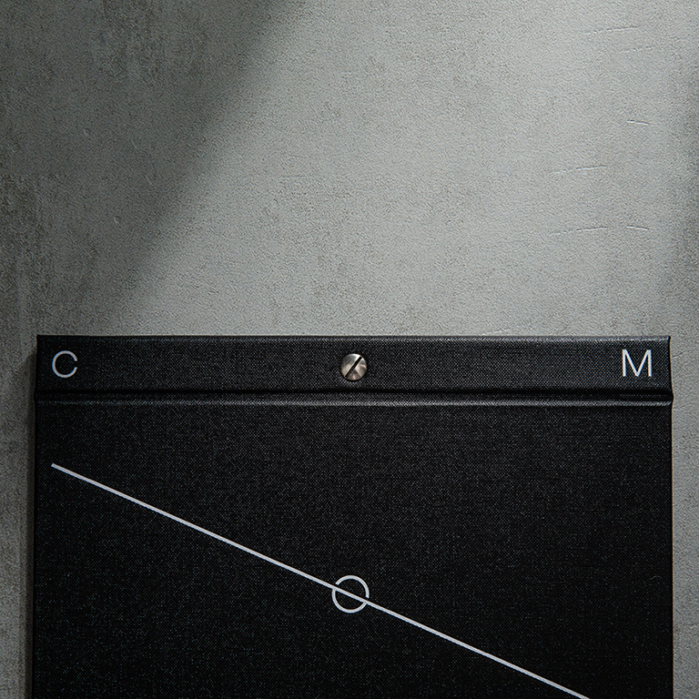
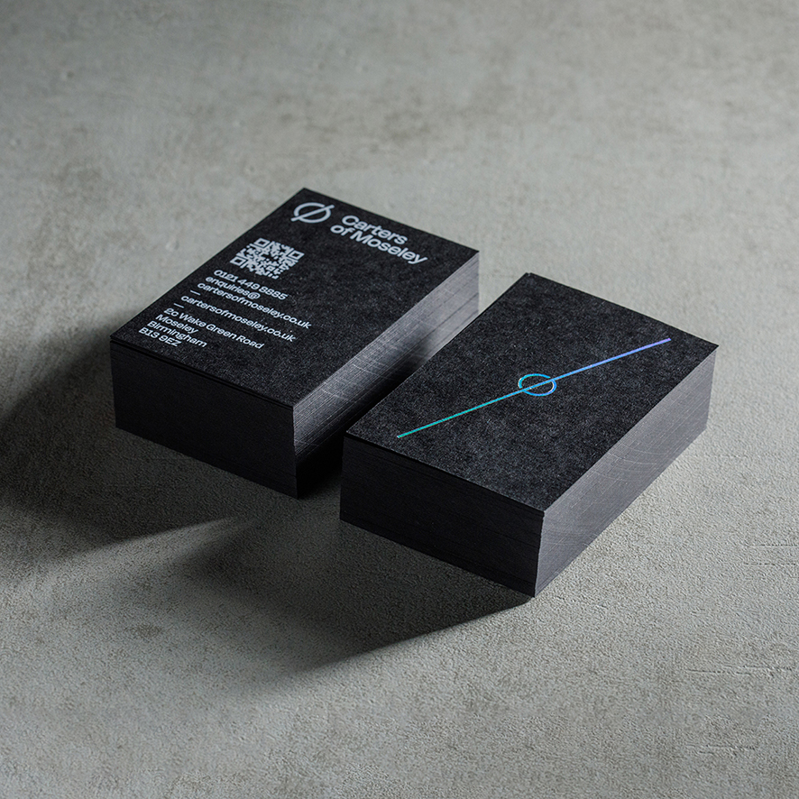
All touchpoints have been reimagined, including new handpainted signage, and food menus designed to accommodate ever changing menus, providing a momento for guests to take away. Typography and layout are influenced by the axis and each season is marked with a typographic, spherised abstraction representing Earth. Carters sublime dishes are spotlit and framed using lighting angled at 23.5°. The angle permeates throughout all aspects of the identity combining a striking monotone palette with touches of ever changing colour through holographic foils.

CREDIT
- Agency/Creative: Common Curiosity
- Article Title: British Restaurant Carters of Moseley Rebranded by Common Curiosity
- Organisation/Entity: Agency
- Project Type: Identity
- Project Status: Published
- Agency/Creative Country: United Kingdom
- Agency/Creative City: Birmingham and London
- Market Region: Europe
- Project Deliverables: Art Direction, Brand Mark, Brand Redesign, Brand Rejuvenation, Tone of Voice
- Industry: Food/Beverage
- Keywords: Restaurant Brand Identity
-
Credits:
Creative Director: Paul Felton
Creative Director: Alex Woolley
Designer: Carolina Magro


