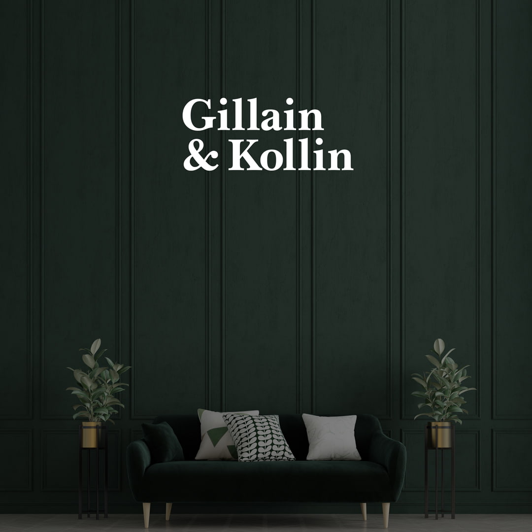
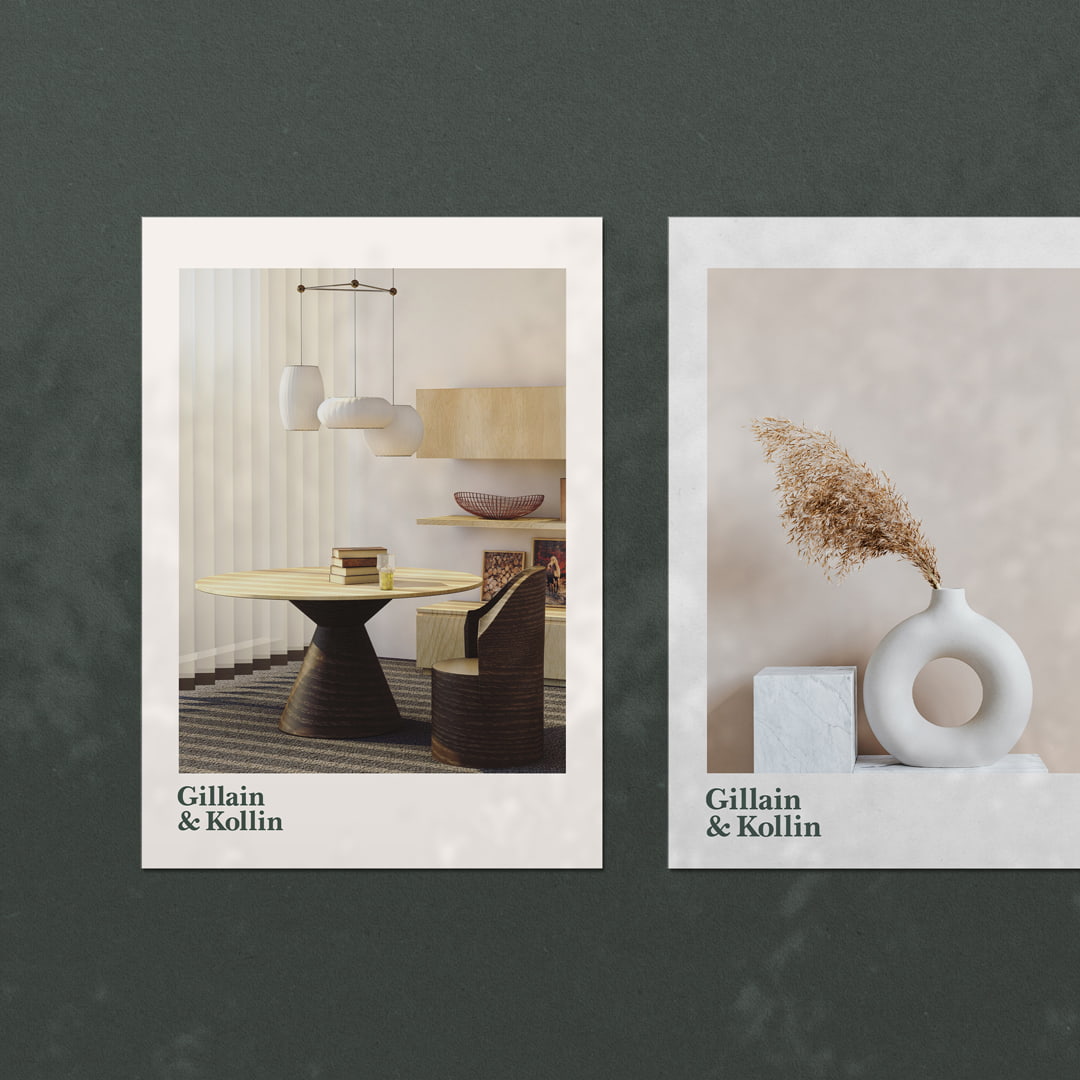
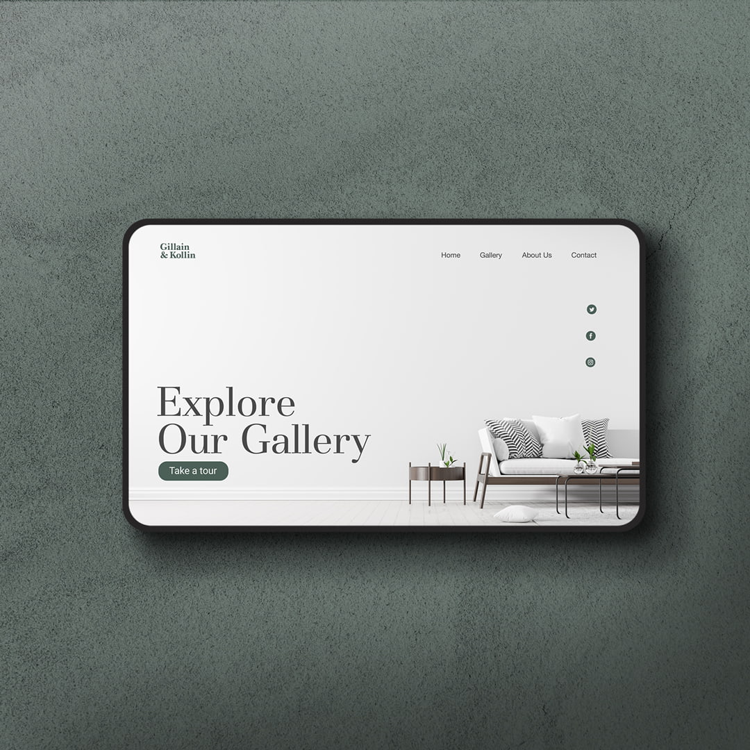
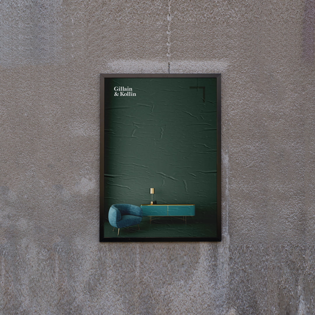
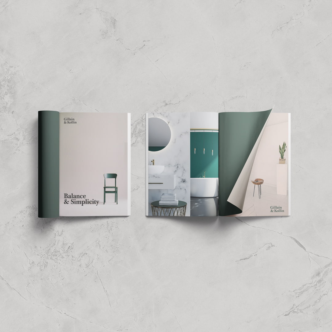
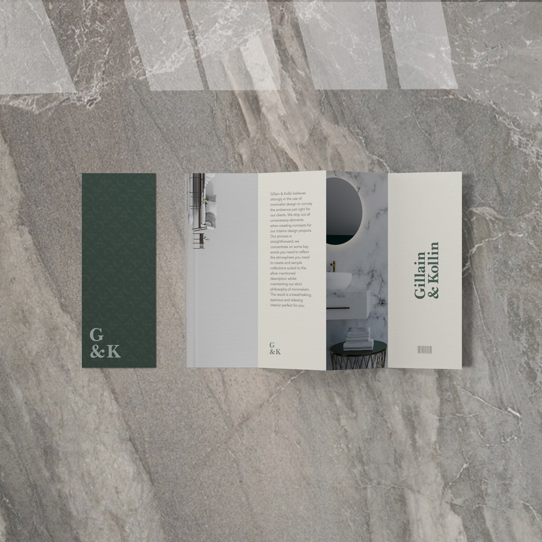
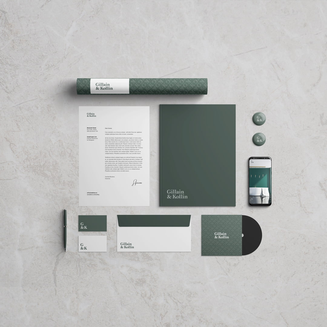
GIllain and Kollin is an interior design firm with a strong philosophy in minimalist design. The goal of the project was to reflect this philosophy in the crafting of the brand identity system which used minimal design from the logo to colours to style of photography and poster designs.GIllain and Kollin is an interior design firm with a strong philosophy in minimalist design. The goal of the project was to reflect this philosophy in the crafting of the brand identity system which used minimal design from the logo to colours to style of photography and poster designs.
In coming up with a suitable logo, our first task was to ask a number of questions with respect to the brand; who it’s for, the demographics and psychographics of the brand’s intended audience. After this we created a stylescape; that is a curation of images, typography, textures etc to get a sense of the look and feel of the brand. Three stylescapes were created with one selected which would serve as a general direction for the brand identity system. The draft phase included a lot of sketching to churn out as many ideas as possible; both good and bad. Initial drafts included the use of a symbol/mark which still resonated with a minimalist theme as specified in the design brief. After careful consideration of a number of designs we settled on a word mark that was classic, had a premium feel and was minimal in look. We selected Baskerville Bold as our typeface and made a number of adjustments to it; this included some minor kerning, alignments of the top text (Gillain) to the bottom (Kollin) to have the “I” and “n” of Gillain align to the “l’s” and “i” of Kollin. This was to create a compact and visually cleaner look to the logo.
We also realised the need for a secondary logo for the brand to be conveniently placed in areas of limited space. The secondary logo was simply a use of the initials of Gillain and Kollin whilst maintaining the structure of the primary logo. The colour palettes were carefully selected to have a subtle regal look yet not one that was overbearing. In all we were excited about the outcome of the project
CREDIT
- Agency/Creative: Mercury
- Article Title: Brand Identity System for Gillain and Kollin
- Organisation/Entity: Freelance
- Project Type: Identity
- Project Status: Published
- Agency/Creative Country: Ghana
- Agency/Creative City: accra
- Market Region: Europe, Global
- Project Deliverables: Brand Design
- Industry: Construction
- Keywords: Interior Design, Brand Identity, Interior Decor
-
Credits:
Brand Identity Designer: Felix Amoah Quansah


