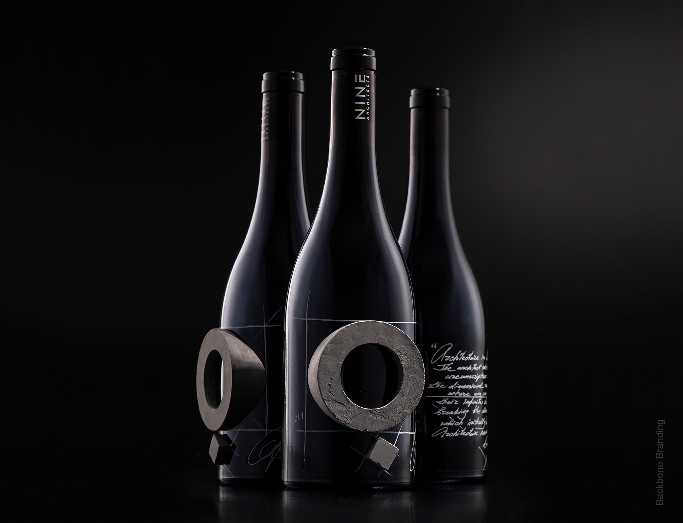
Challenge: Is it possible to transmit the limitless architecture to a limited bottle? This is the most exemplary project, where we were approached by an architecture company to create a private label for a self-promotional event, meanwhile we were the ones to suggest a product. So we suggested wine. Why wine? Because architecture and wine are conceptually and physically incompatible. So we came up with a stereotype-breaking solution, the same way as the architect breaks the stereotypes each time by creating unprecedented sculptures and architectural structures in an absolutely limitless and unconfined dimension of architecture.
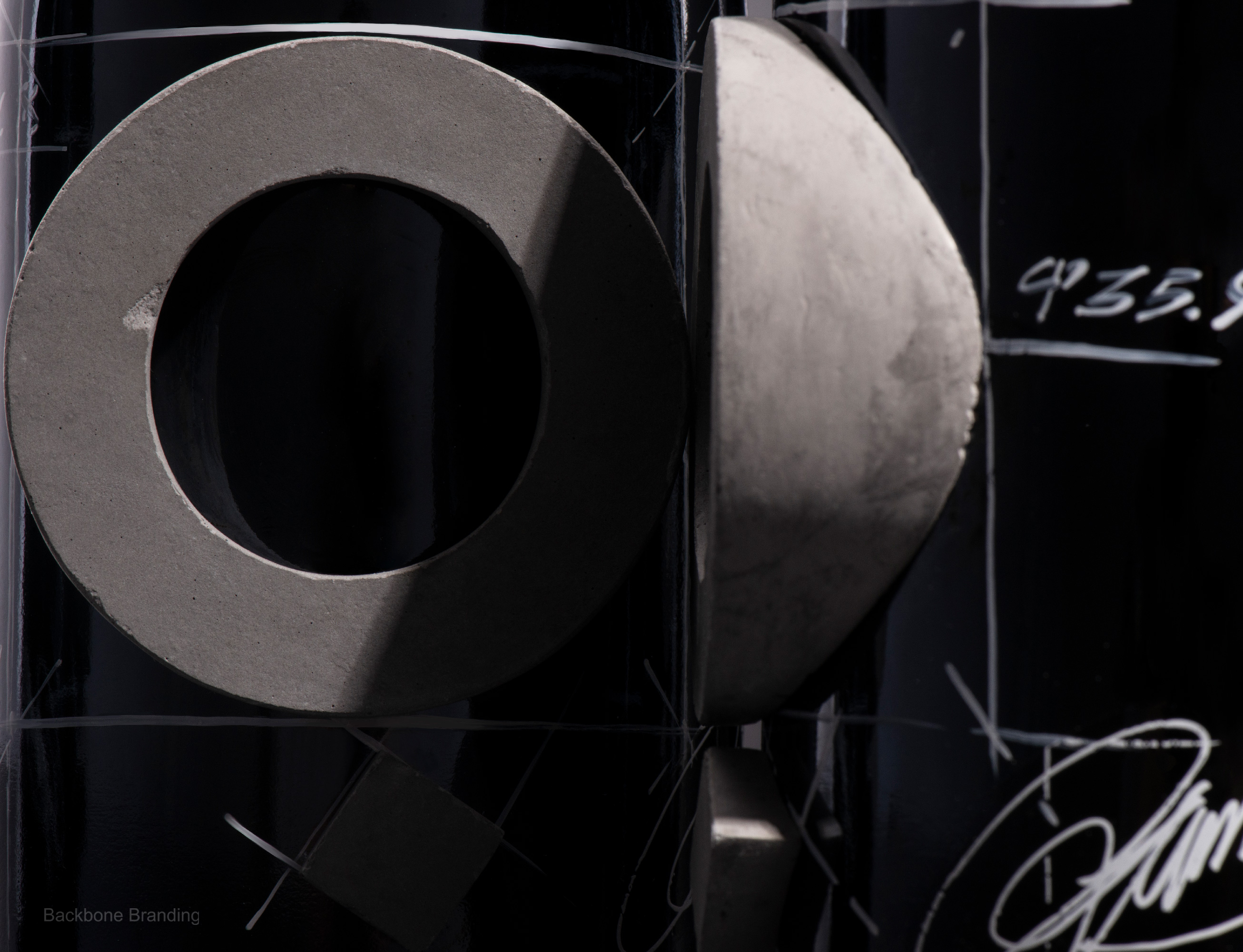
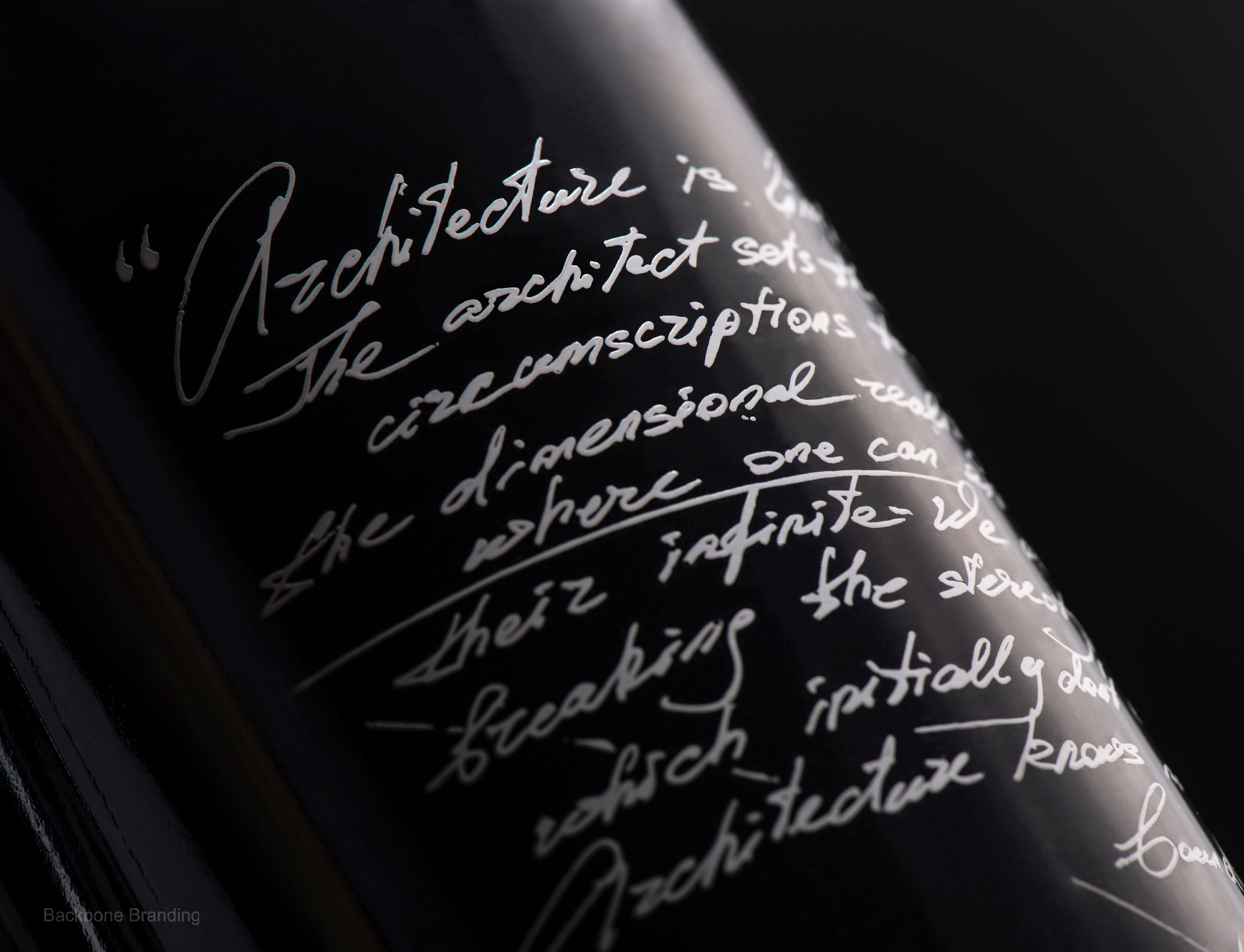
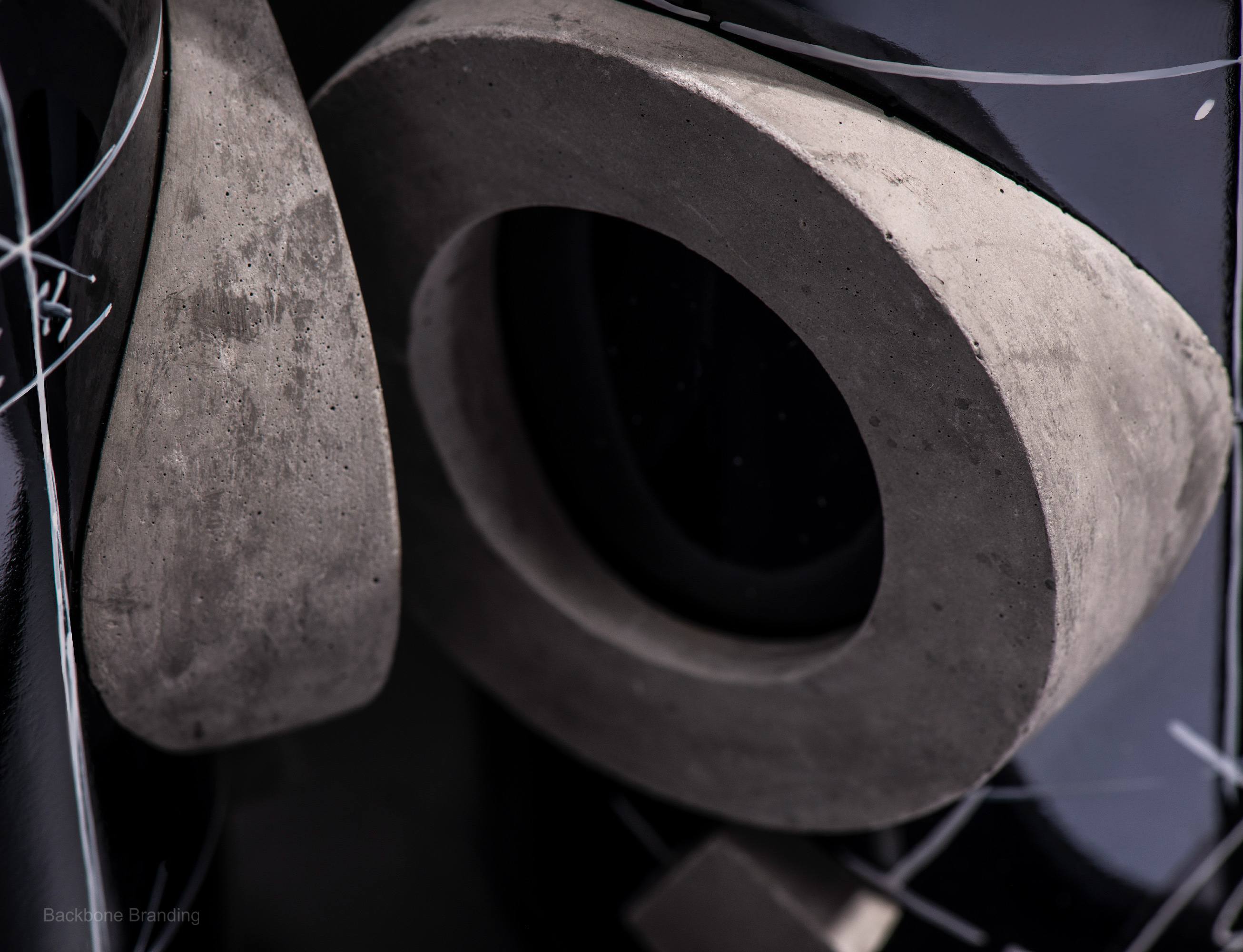
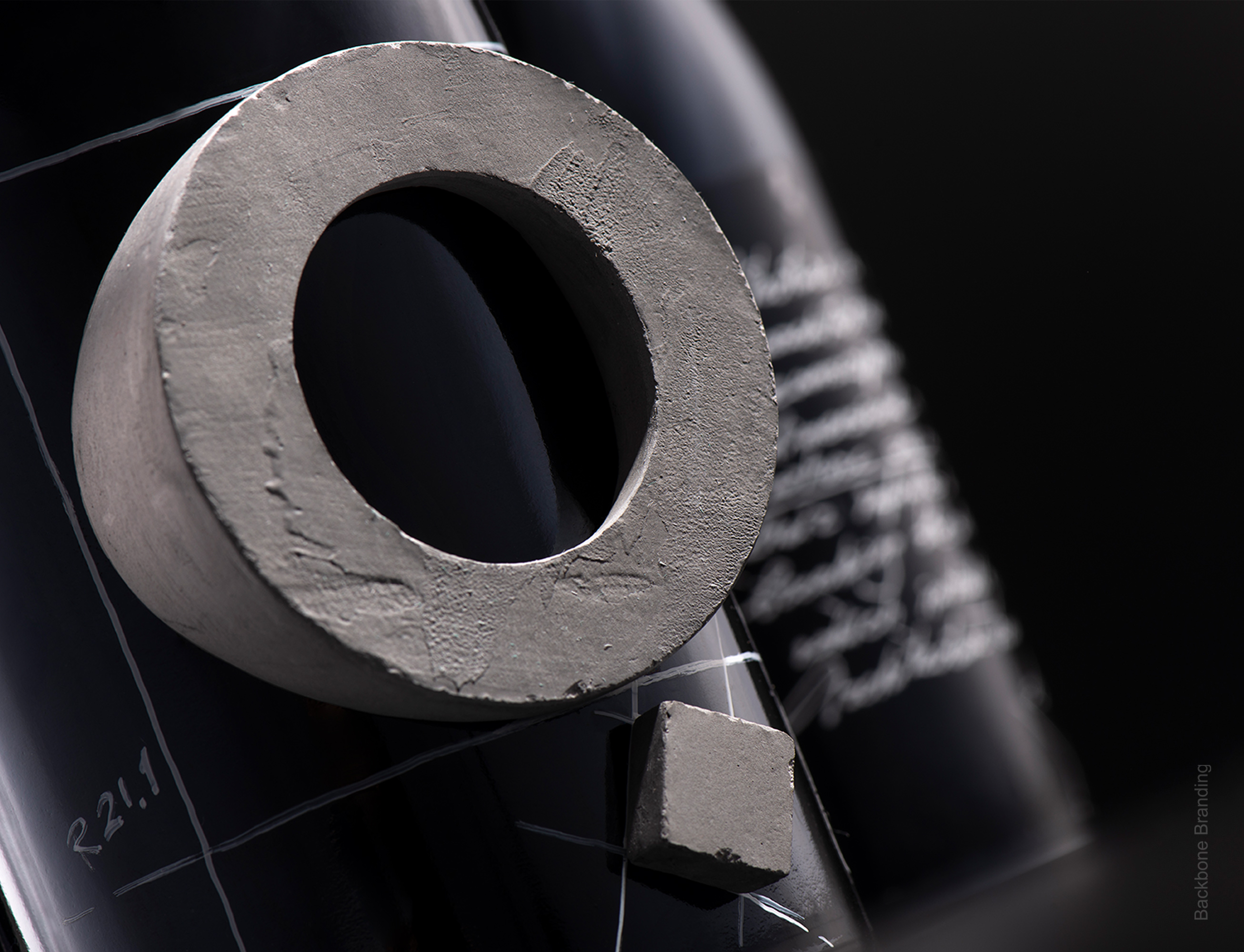
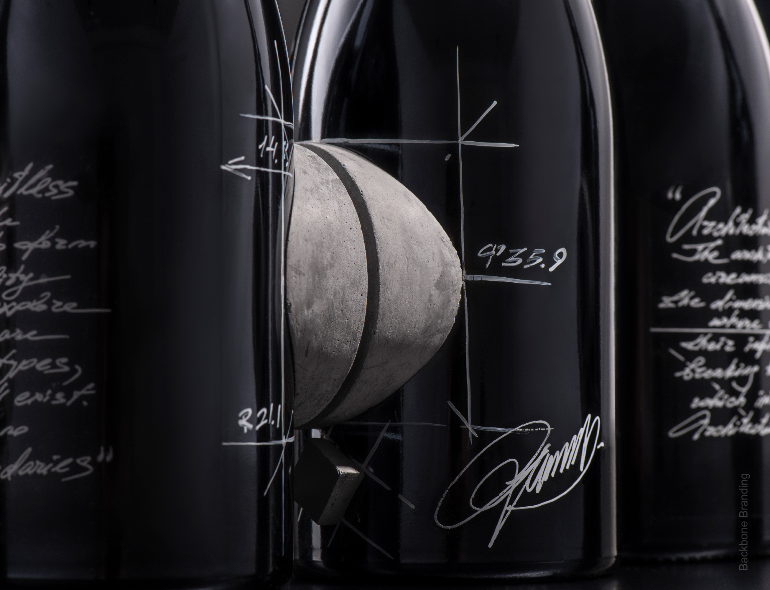
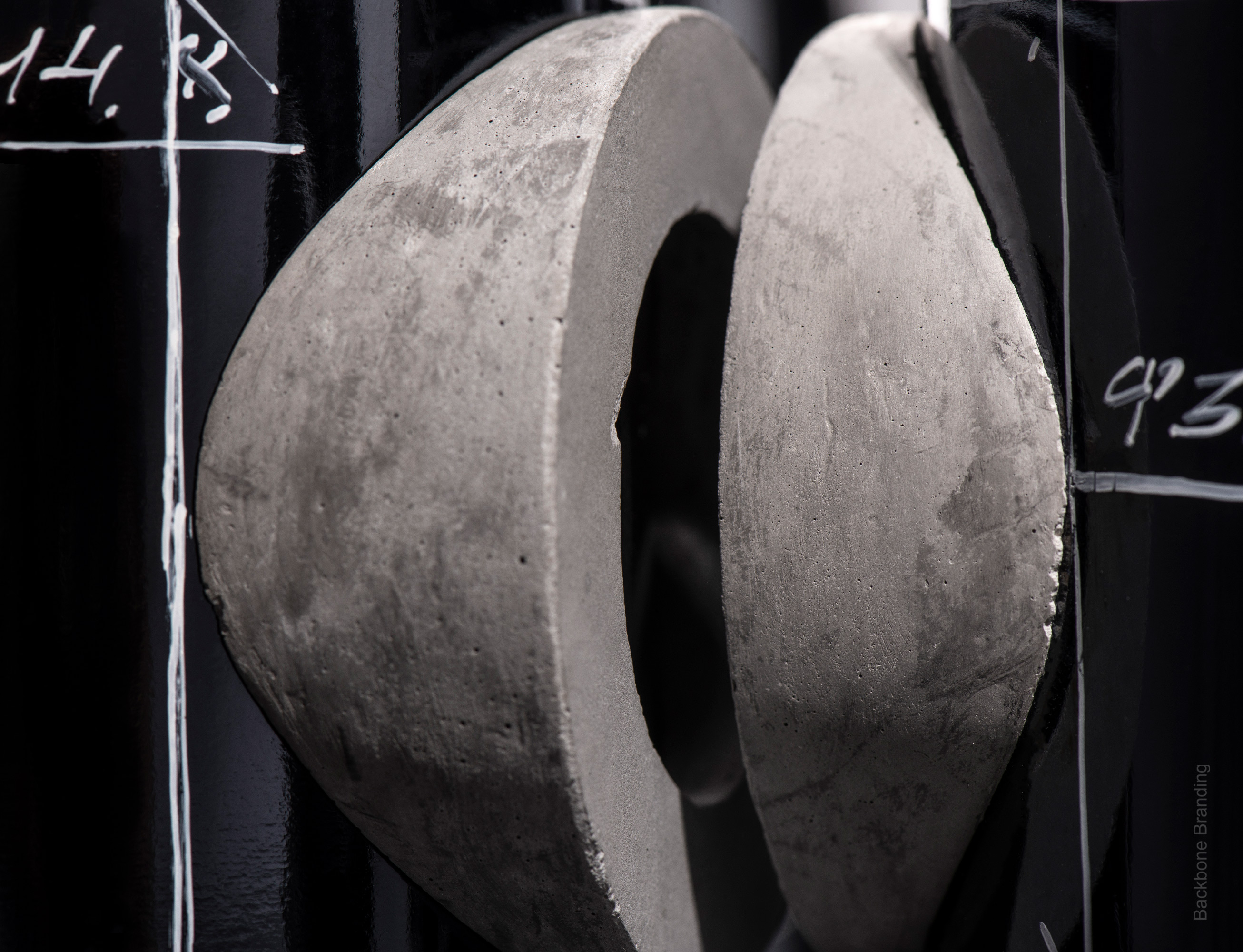
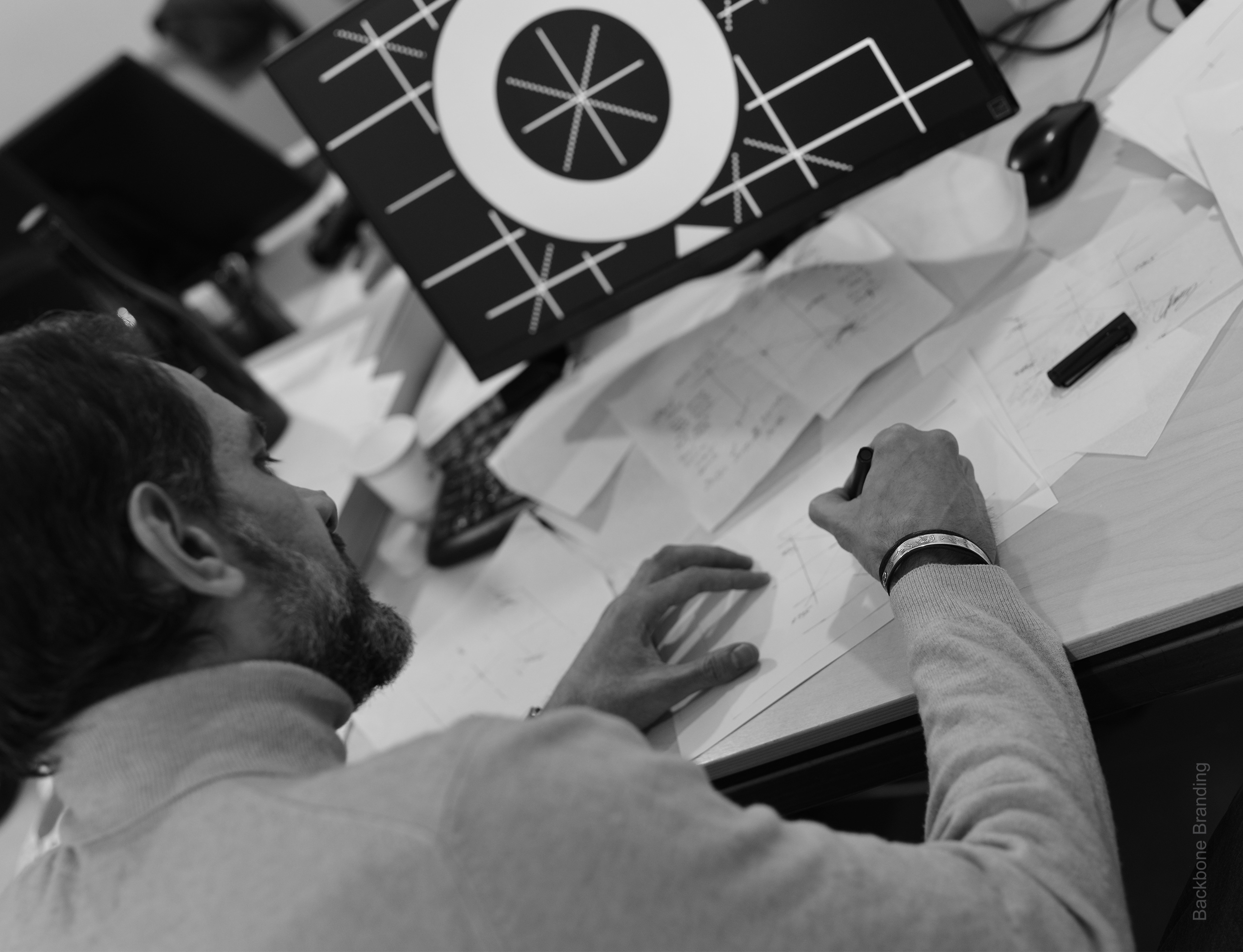
Solution: So as an architect needs to break the stereotypes each time in order to set a new bar in solving architectural problems, we dared to place an architectural construction on a cylinder-type bottle, which is the prototype of skyscrapers and architectural structures that rise up from the globe, the surface of which is not at all flat and even. In the meantime that is not just an architectural structure: these are 2 geometric shapes that form the logo “9” of the company from the above perspective. The label is presented as a layout.
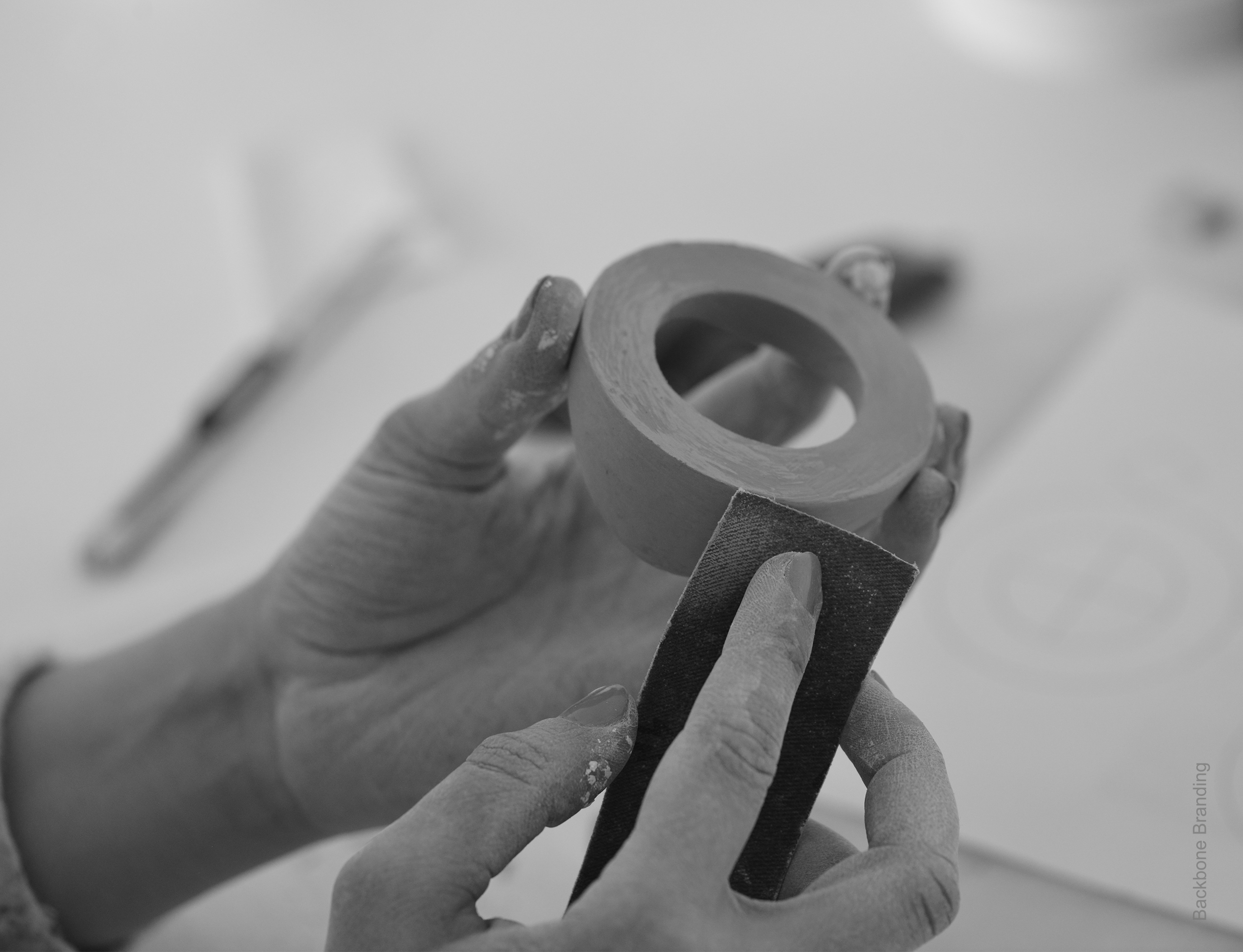
We used the concrete- favorite material of every architect.We took a form, filled it with real concrete and got an architectural structure and put it on a cylinder-form bottle. As the clay is in the hand of a potter, the same is the concrete in modern architecture, which is a tool that helps to call into existence any crazy idea of an architect and eliminates all boundaries in its realization.
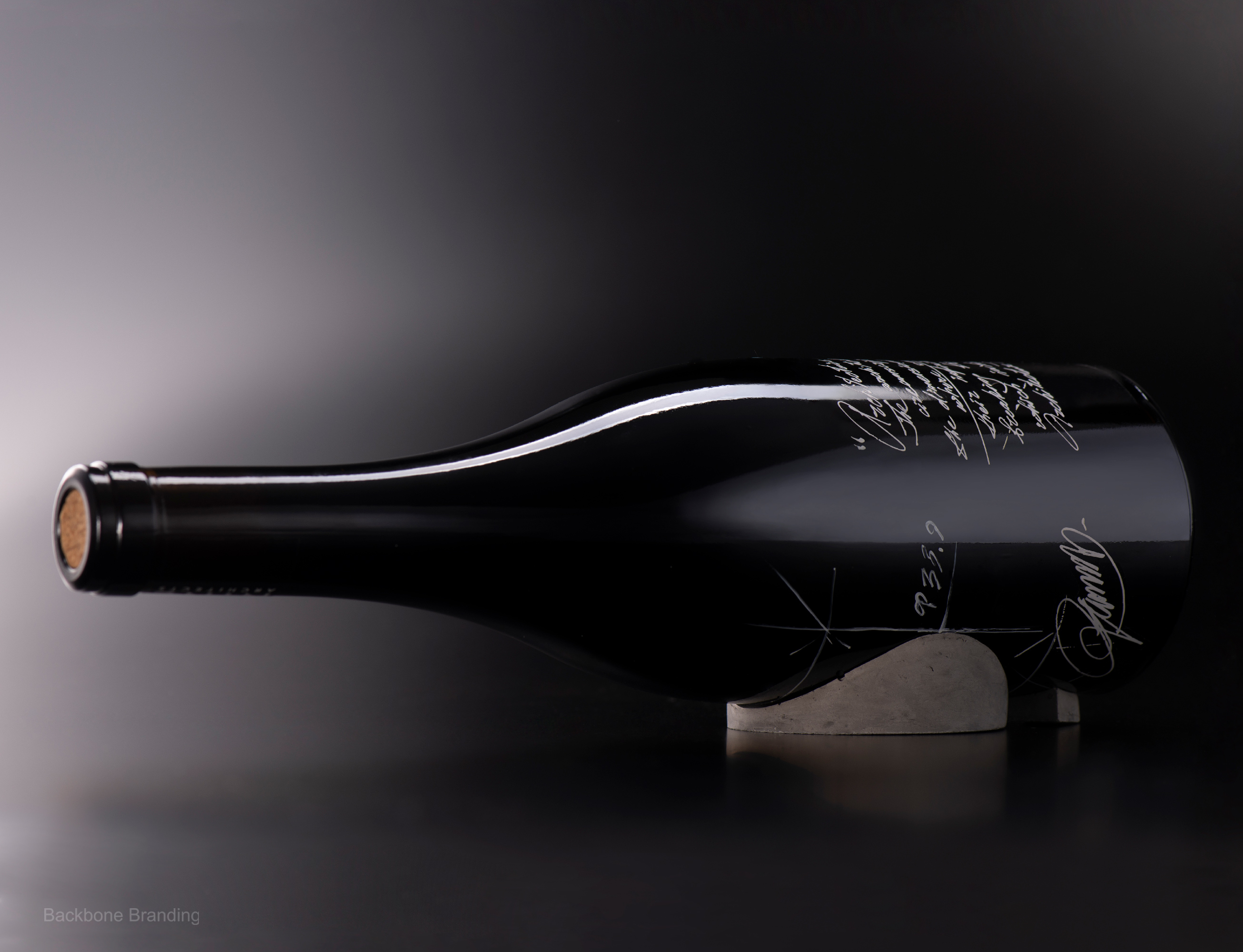
We have intentionally missed the hot cup on the bottle to make the cork visible which simulates/hints the profile/outline of the logo construction on the bottle.
Moreover, the concrete construction that ascends from the bottle not only has design purpose, but also functional: it serves as a device to hold the bottle in horizontal position, which is essential for the wine reserve.
Result: This creates a tremendous visual and psychological expression, which we have tried to pass by this design. As an outcome we managed to minimize a whole building into a bottle of wine, bestow it with a functional feature and create an exceptional design that once seen, can never be forgotten, as a remarkable architectural monument or a nearly perfect wine.
CREDIT
- Agency/Creative: Backbone Branding
- Article Title: Self Promotional Wine Packaging Design by Backbone Branding
- Organisation/Entity: Agency
- Project Type: Identity
- Project Status: Published
- Agency/Creative Country: Armenia
- Agency/Creative City: Yerevan
- Market Region: Europe
- Project Deliverables: Brand Design, Brand Identity, Design
- Industry: Food/Beverage
- Keywords: WBDS Agency Design Awards 2021/22
-
Credits:
Designer: Stepan Azaryan
Video and Animation creator: Sahak Zarbabyan
Photography: Backbone Branding & Suren Manvelyan


