1HQ Brand Agency – The English Provender Co.
“ In a declining category, no.1 chutney brand English Provender had lost its leading position and landed into a bit of a pickle. The brand was struggling to convey premium and was losing its core consumers.
Our task was to rejuvenate the English Provender brand with a new identity and packaging design that would help it regain its premium position and win back the hearts of its consumers.
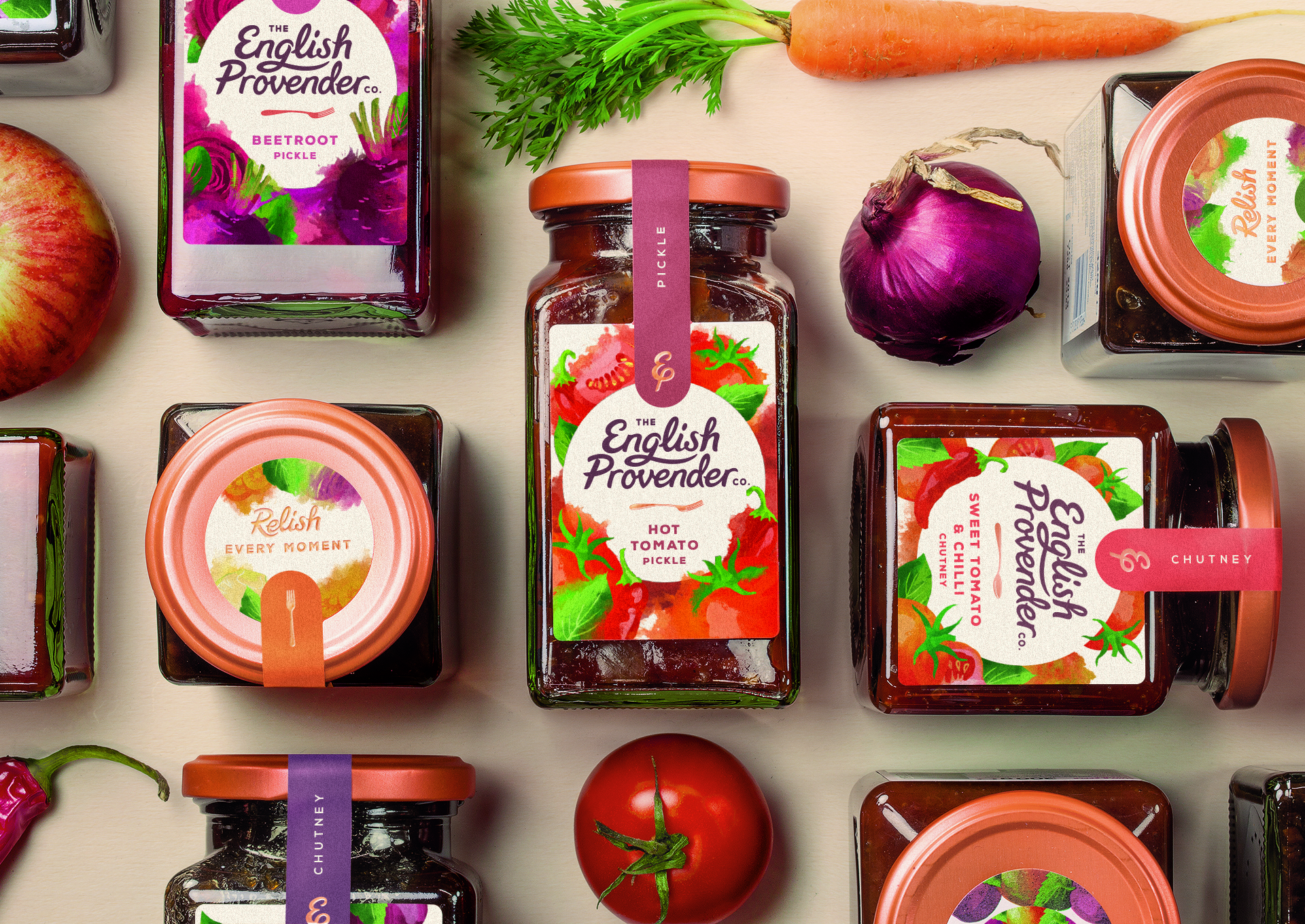
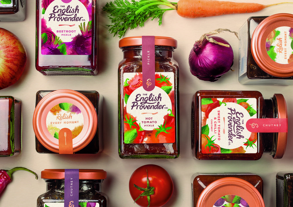
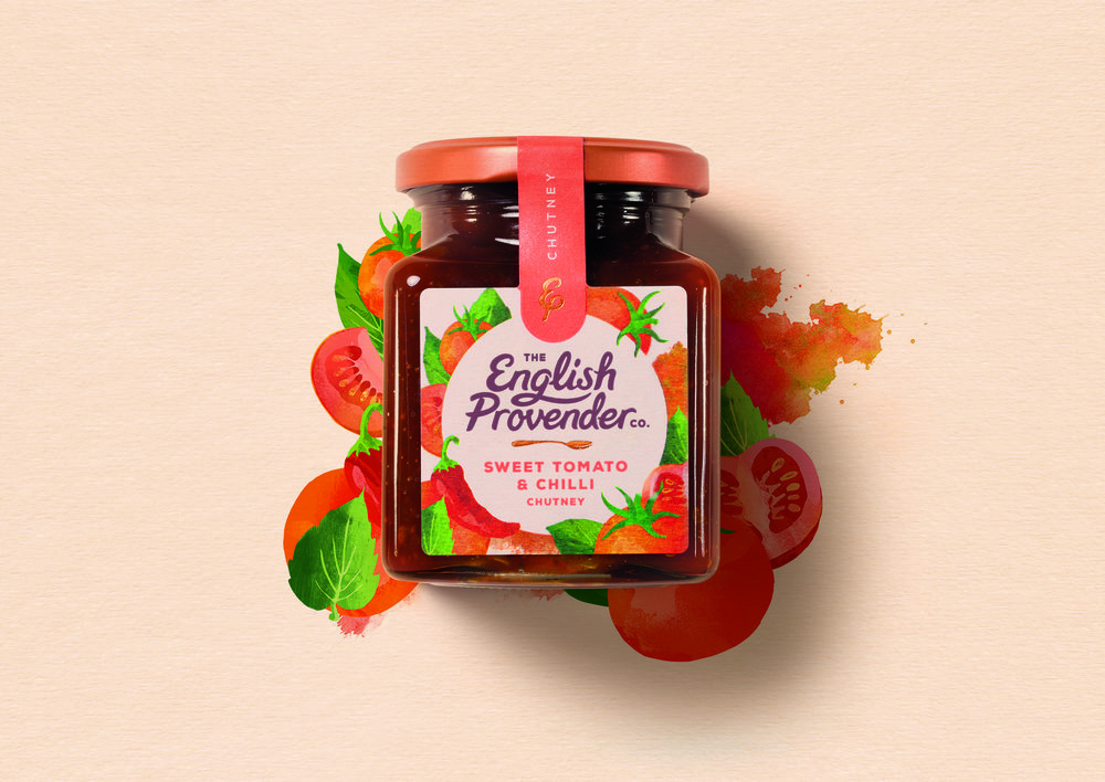
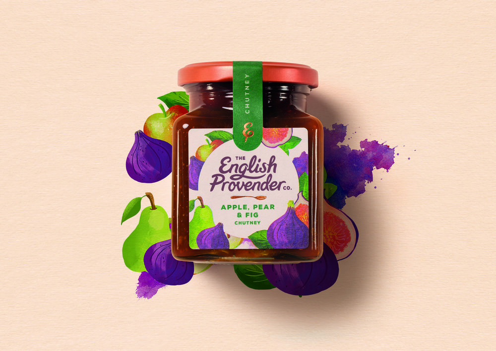
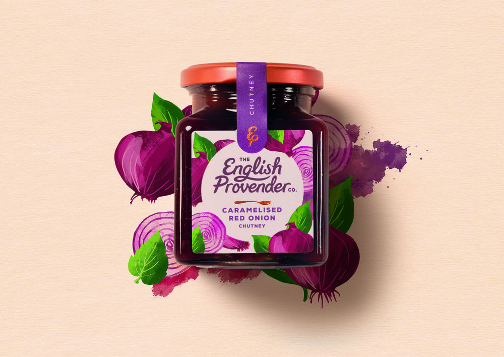
We drew inspiration from the real chunks of ingredients in the Chutney English Provender is proud to produce and chose to celebrate the love of real food through identifying and highlighting ingredients we know, love and trust.
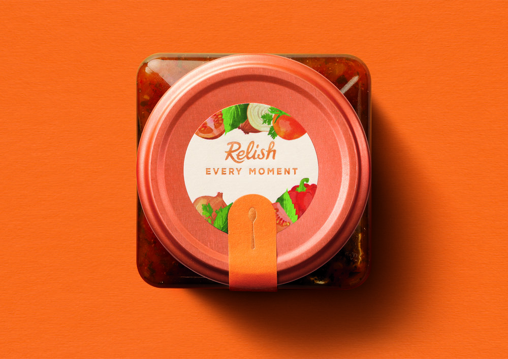
Each jar is sealed with a unique colour tab, capturing the flavours and ingredients inside. The illustrated spoon on the lid enhances the moment of diving in to the chutney for the consumer. The seal, signed off with The English Provender Co’s shorthand brand mark in copper foil print, adds a note of premium and encourages the consumer to break into the chutney and indulge.”
CREDIT
- Agency/Creative: 1HQ Brand Agency
- Article Title: How Do We Avoid a Pickle and Create a Brand to Relish?
- Organisation/Entity: Agency Commercial / Published
- Project Type: Packaging
- Agency/Creative Country: Global
- Market Region: Europe
- Format: Jar
- Substrate: Glass


