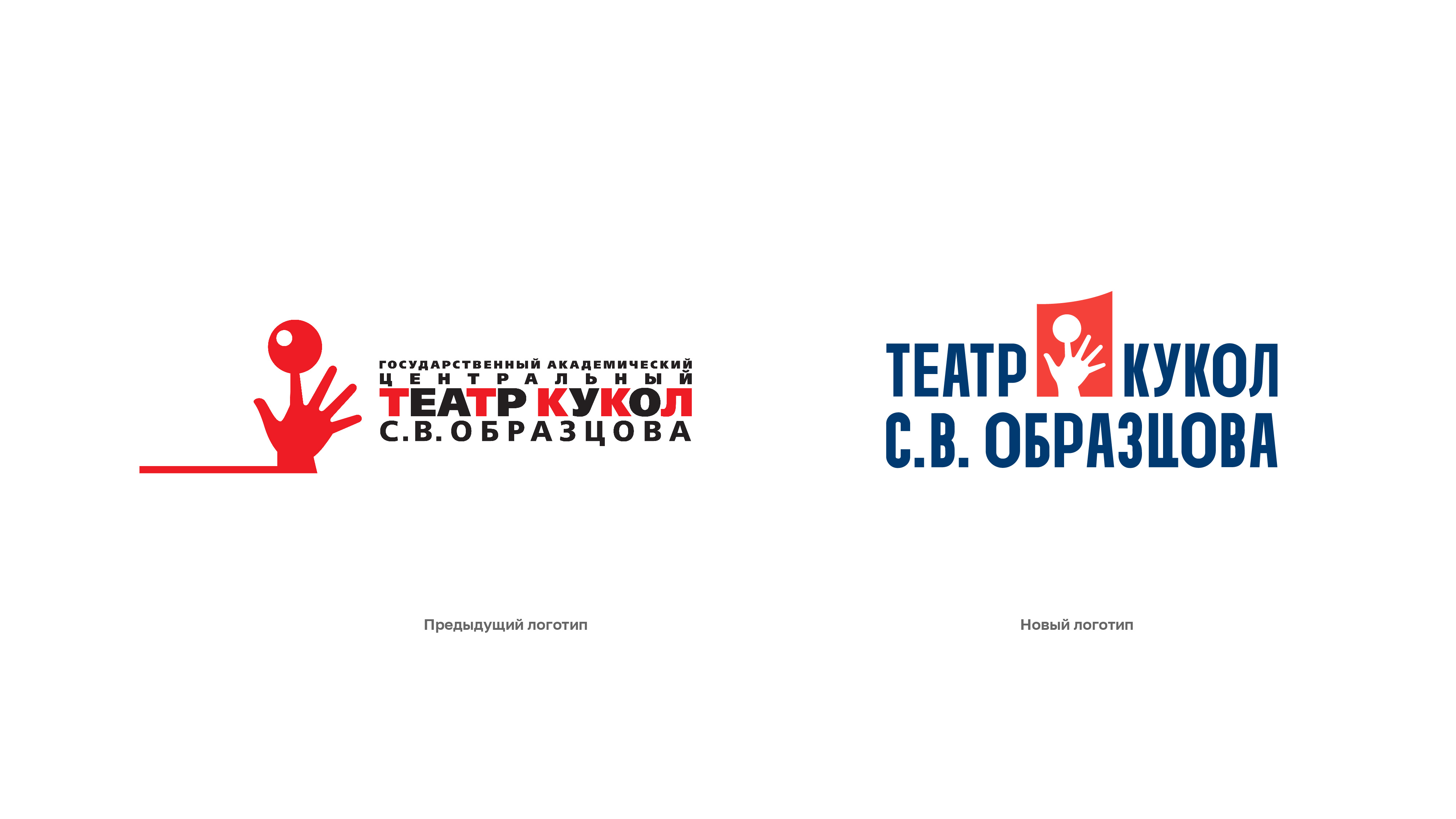
The Yasno.branding agency team has redesigned the corporate identity and updated the design of the website of the famous Sergei Obraztsov Puppet Theatre.
The theatre tasked the agency with redesign of their website. But it was impossible to make the website be in step with the times without working out the brand’s strategy and positioning and renewing its corporate identity. Therefore, at the first stage, the brand team was engaged in thinking through and changing the identity in such a way that it could remain recognizable for different generations of theatre audience and, at the same time, would rely on popular trends in current design.
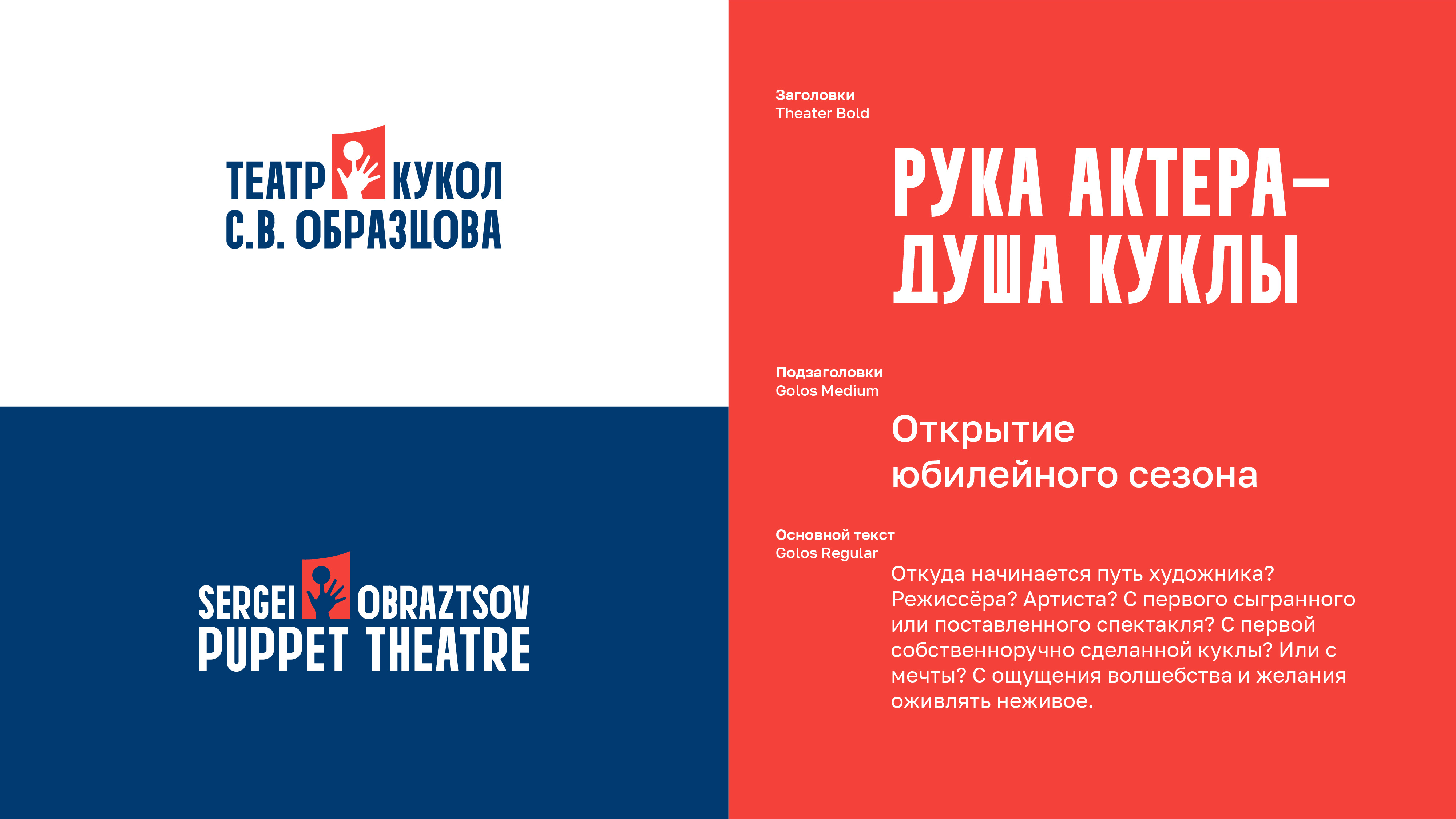
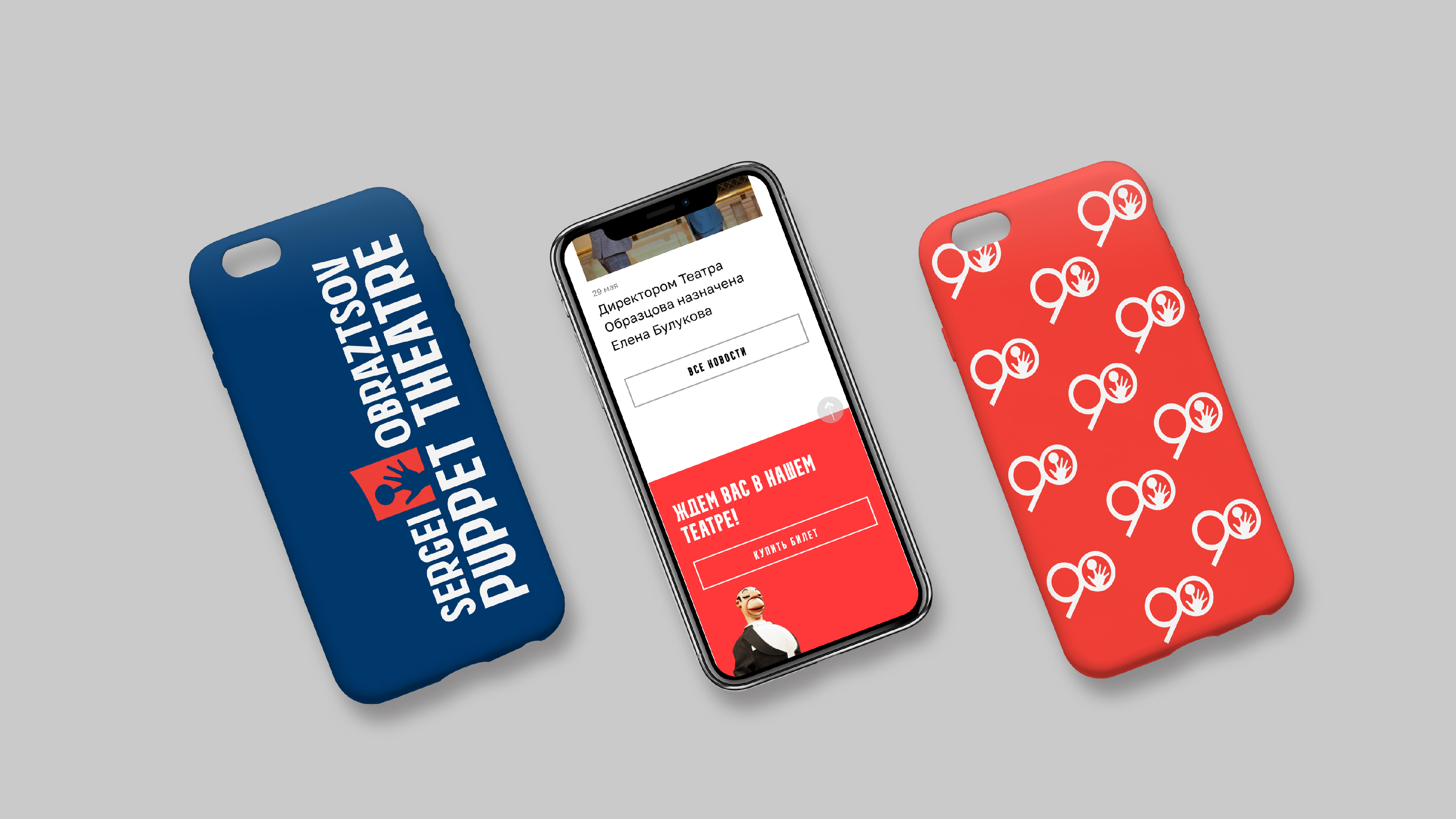
The agency’s task included: competitive analysis of the market and the target audience, drawing up a portrait of spectators, positioning the theater and its development strategy. The redesign of the corporate identity consisted of changing the logo, choosing fonts and the color palette. The theatre’s full name was retained in the logo and the hand’s gesture was altered. The identity was thought out in such a way that it was possible to adapt it to any medium, such as business documentation (letterheads, folders, business cards and badges), printed media (theatre program, booklet and ticket), image media (poster, repertoire sheet, banner and street sign), as well as for souvenir products like T-shirts, jackets, ecobags and pens.
The corporate identity on the whole has become more readable, minimalistic and reflecting the traditions of the theatre. Based on the proposed identity style, the theatre’s brand book was developed to allow making all the theatre’s communications integral.
After having updating the corporate identity, the agency was able to embark on the key task, development of the website design. It is worth mentioning to say that the theatre’s website is rather massive, as it is not just a landing page, but a multifunctional portal with 6 sections, each of which consists of 5 to 9 subsections.
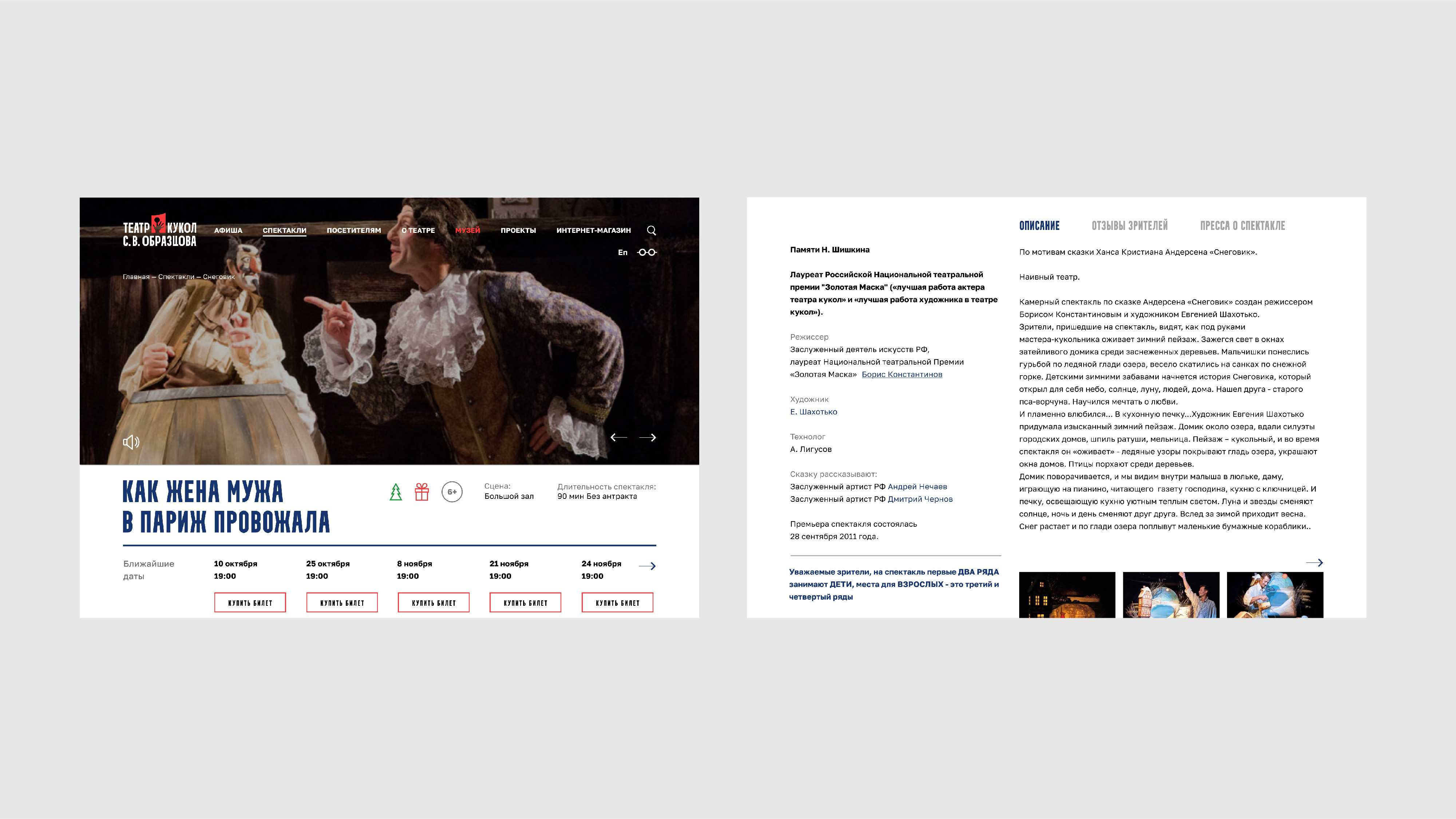
The previous version of the website did not correspond to current ideas about web design and usability. Therefore, the agency’s web designers proposed several concepts of the website’s pages so that all the content would look complicated and exciting.
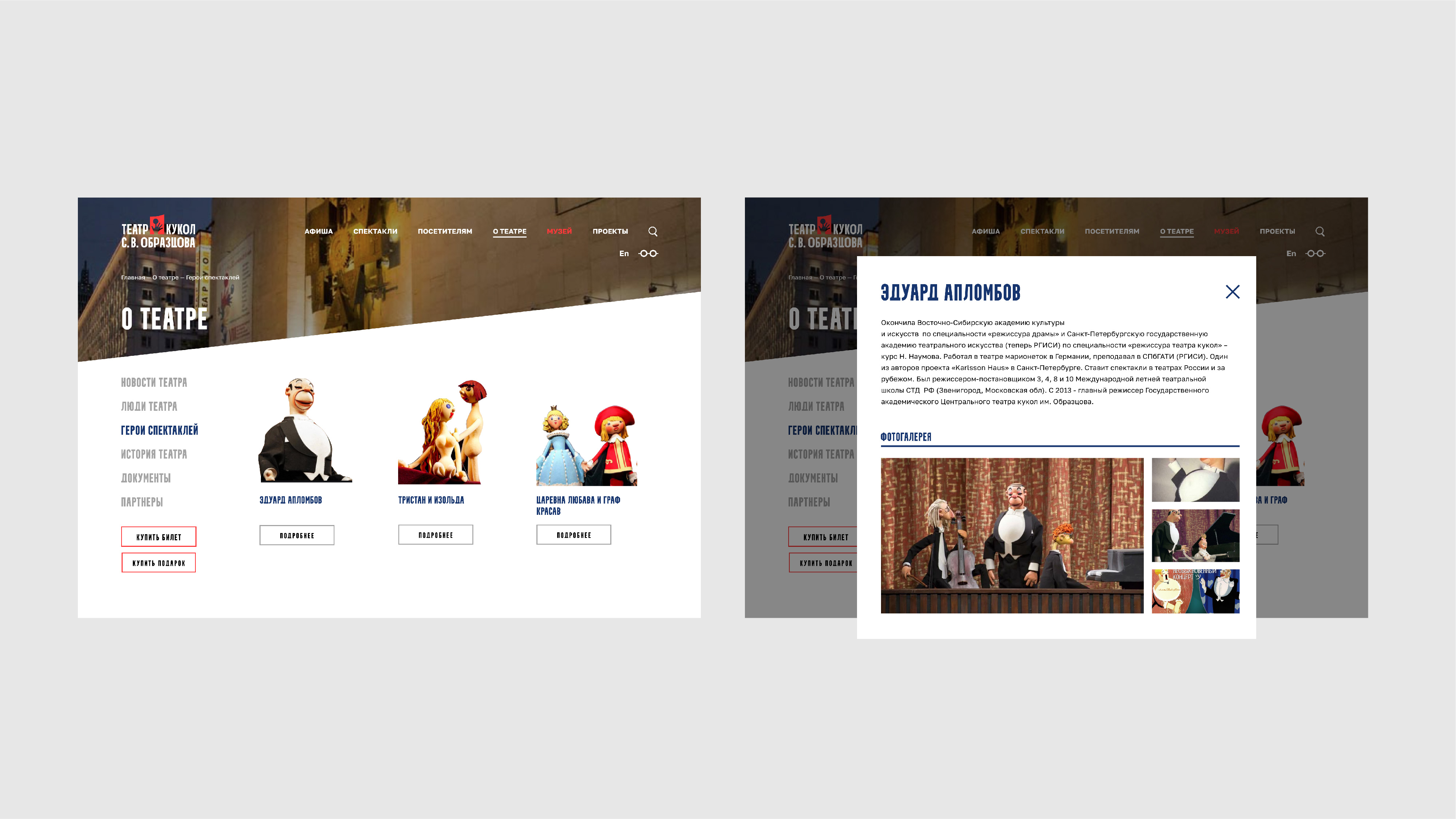
In the version chosen by the client, the team has kept the main visual attributes of the theatre in the section headers: photos of the famous clock, the facade of the building, the main auditorium, the puppets from the museum’s collection, and others.
Thanks to joint efforts of the theatre employees and the agency team, it was possible to give the website’s disparate content a comprehensible structure with the single style as far as visualization is concerned.
As the website primarily performs as selling booth, its design includes a service for online buying tickets in a couple of clicks. The service was thought out to the smallest detail: from the location of the buttons allowing the purchase of tickets and viewing of the upcoming performances to the new hall plans and recommendations for taking pictures of the images on the website. In the new concept, the website provides an opportunity to buy tickets not only for performances, but also to the Sergei Obraztsov memorial apartment and for excursions to the theatre’s museum, as well as to book group excursions for adults and children.
Besides, it is worthy to pay attention to the most interesting features of the web design and its reasonable functionality.
– On the main page, in the performances’ filtering and in a special section, when you hover over the filter, different easter eggs with the images of the performances’ heroes pop up.
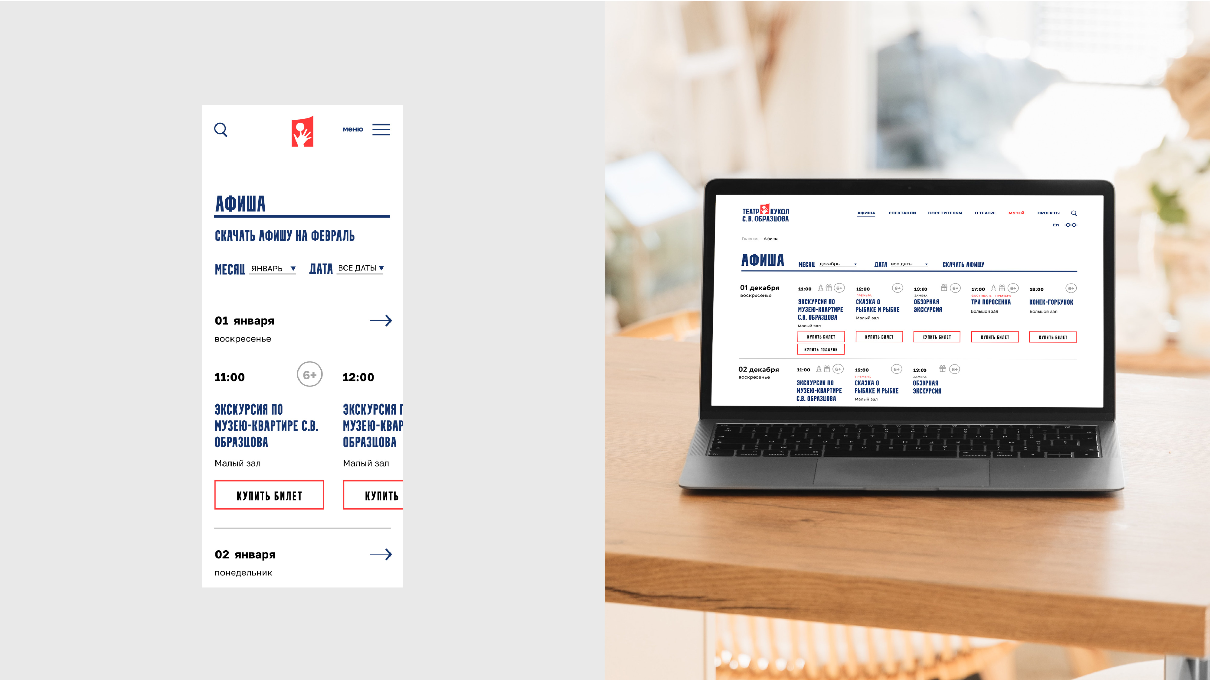
– The website offers a convenient and simple poster device whereby one can immediately buy a ticket for a certain date and time.
– The performance cards are made as informative as possible, and feature the entire staff participating in the performance, with hyperlinks to their personal pages; as well as it allows to buy a ticket right on the performance page, a description of the performance, reviews, articles in the media and recommended performances.
– The “History of the theatre” subsection features separate tab pages with the biography of Sergei Obraztsov and the scene elders, the history of the theatre, as well as the handy archive of performances with the chronology of productions.
– Extensive work had been performed on the important subsection “People of the Theatre”, which includes a convenient tool with pop-ups on the page. Now, it is easy to view information about each member of the theatre team, as it includes his photo, biography, picture gallery and a list of performances in which he or she participated; plus, an automatic transition is also configured here for buying tickets online.
– The “Virtual Exhibitions” subsection deserves special attention. The idea was to allow the user to travel around the page of each exhibition in such a way as if walking through a museum or gallery and going from the description of one picture to another. Therefore, the functionality of horizontal scrolling was thought out so that the information moved smoothly on the page from the right to the left.
– The “Obraztsovfest” subsection has become a visually simple overview featuring informative cards for each day of the festival.
Along with the desktop versions of the web design for different resolutions, an adaptation for the mobile version was developed, preserving all the subsections, and most importantly, the buttons for online ticket purchasing.
The agency’s designers worked in close contact with the developers and exercised author’s control over the project until the launch of the website.
As a result, now both the corporate identity and the design of the website are quite minimalistic, devoid of pointless “childishness” and overloading, unnecessary buttons and disparate fonts. Each page has become unique, original and heartwarming, befitting to the emotional atmosphere in the theatre.
CREDIT
- Agency/Creative: Yasno.branding agency
- Article Title: Corporate Identity and Website Design Updated for the Obraztsov Puppet Theatre
- Organisation/Entity: Agency
- Project Type: Identity
- Project Status: Published
- Agency/Creative Country: Russia
- Agency/Creative City: Yasno.branding agency
- Market Region: Europe
- Project Deliverables: Brand Identity, Web Design
- Industry: Entertainment
- Keywords: theatre, web-design, identuty
-
Credits:
Creative Director: Dmitry Izotov
Art Director: Edouard Hairutdinov
Designer: Yekaterina Voronina
Designer: Yevgeniya Solomentseva
Designer: Alexandra Moiseeva
Technical Design: Rodion Demochkin
Management: Lyubov Pavlova
Management: Nadezhda Nichvolodova
Management: Dariya Makurina


