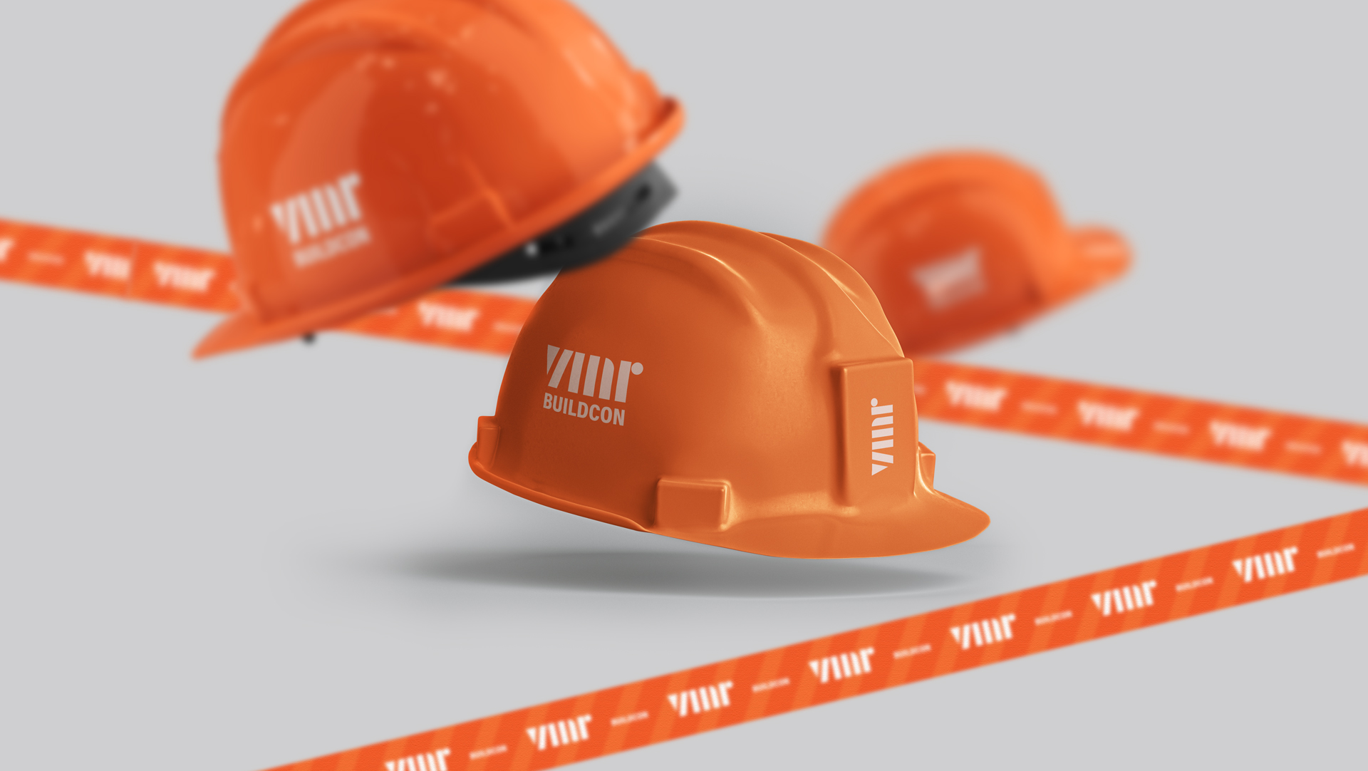
Client: VRM Buildcon is an engineering and construction company located in India, building residential and commercial buildings. VRM is Organized, technical, experienced, formal, accesible and mature.
Challenge: I was the 3rd designer asked to do this project, so the challenge was a little bit bigger, since the expectations are higher than normal. Client is very happy with the result now! Focused on upper class people, who seeks a professional buildcon to create their dreams. This level of client is very smart, so the brand needs to represent confidence and caring about each project.
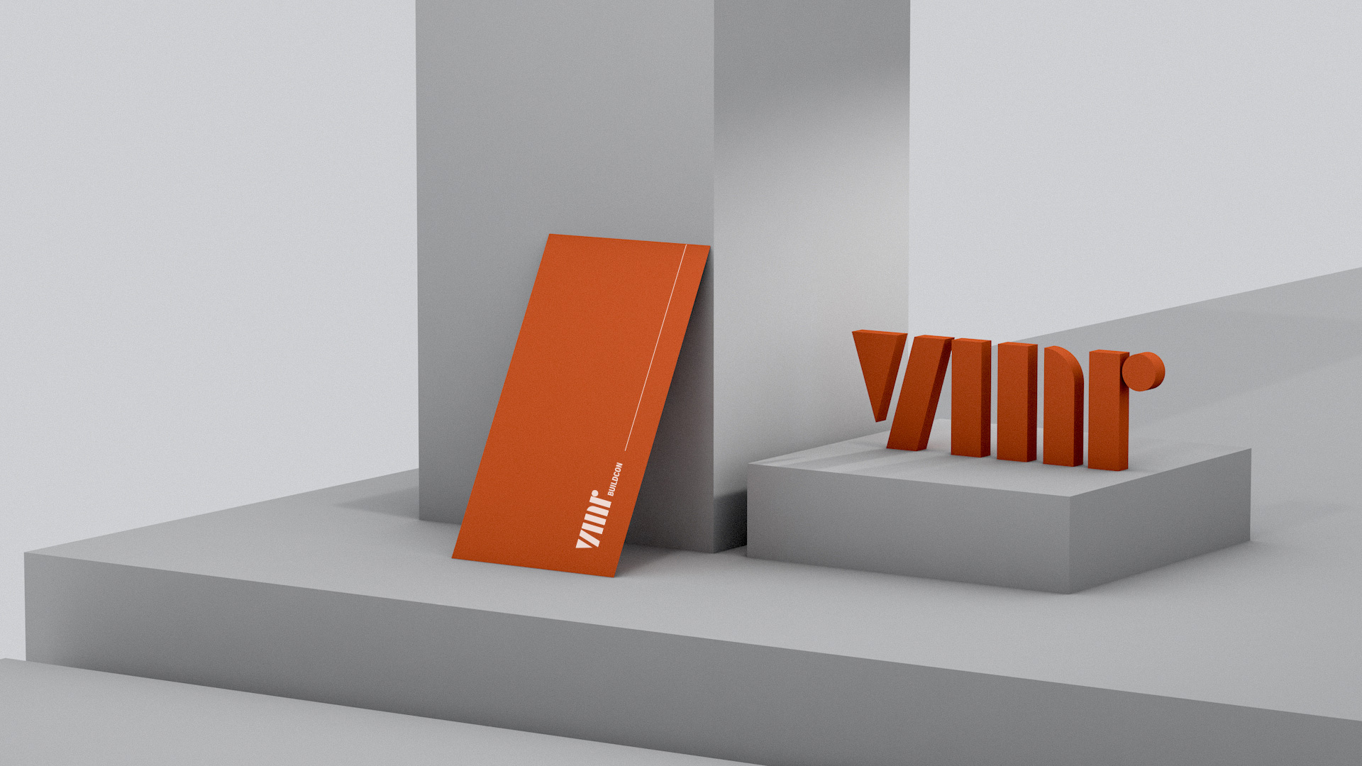
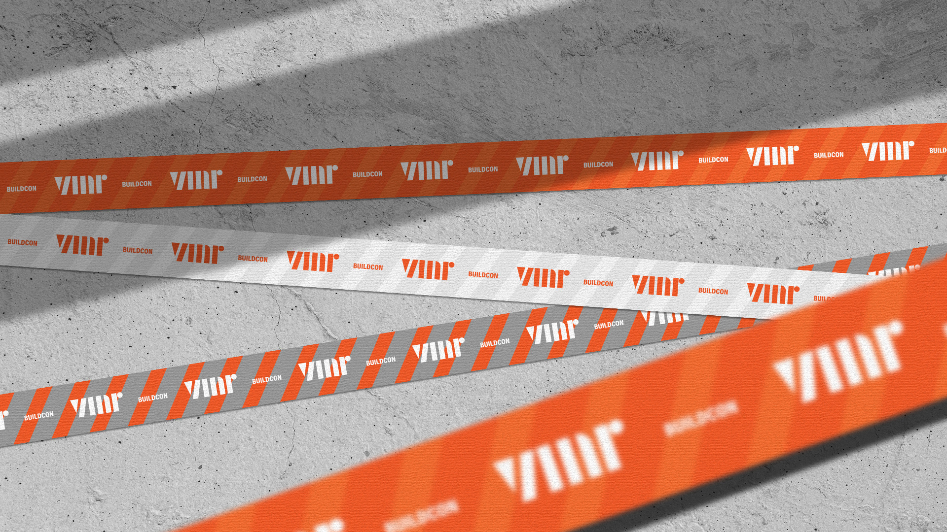
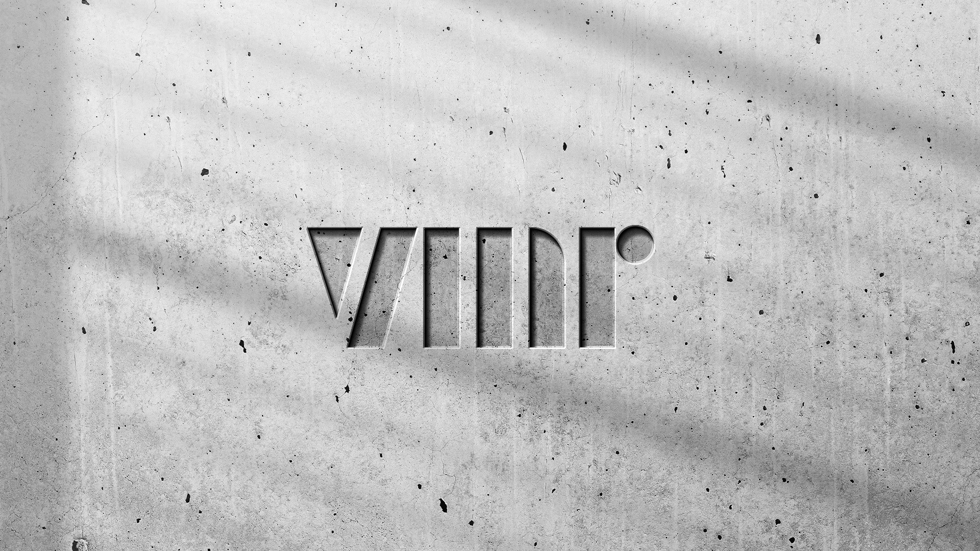
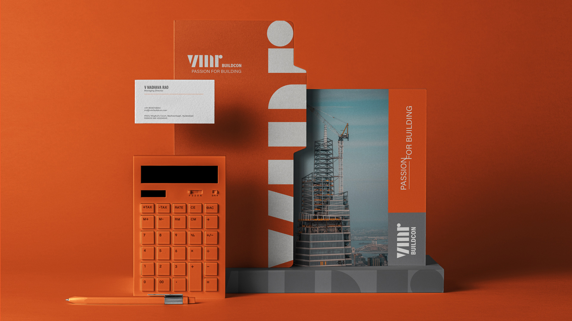
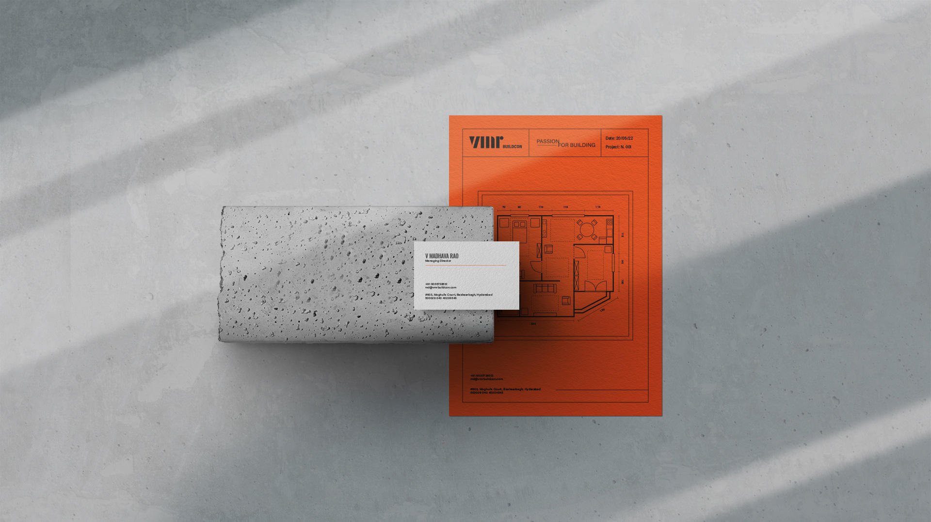
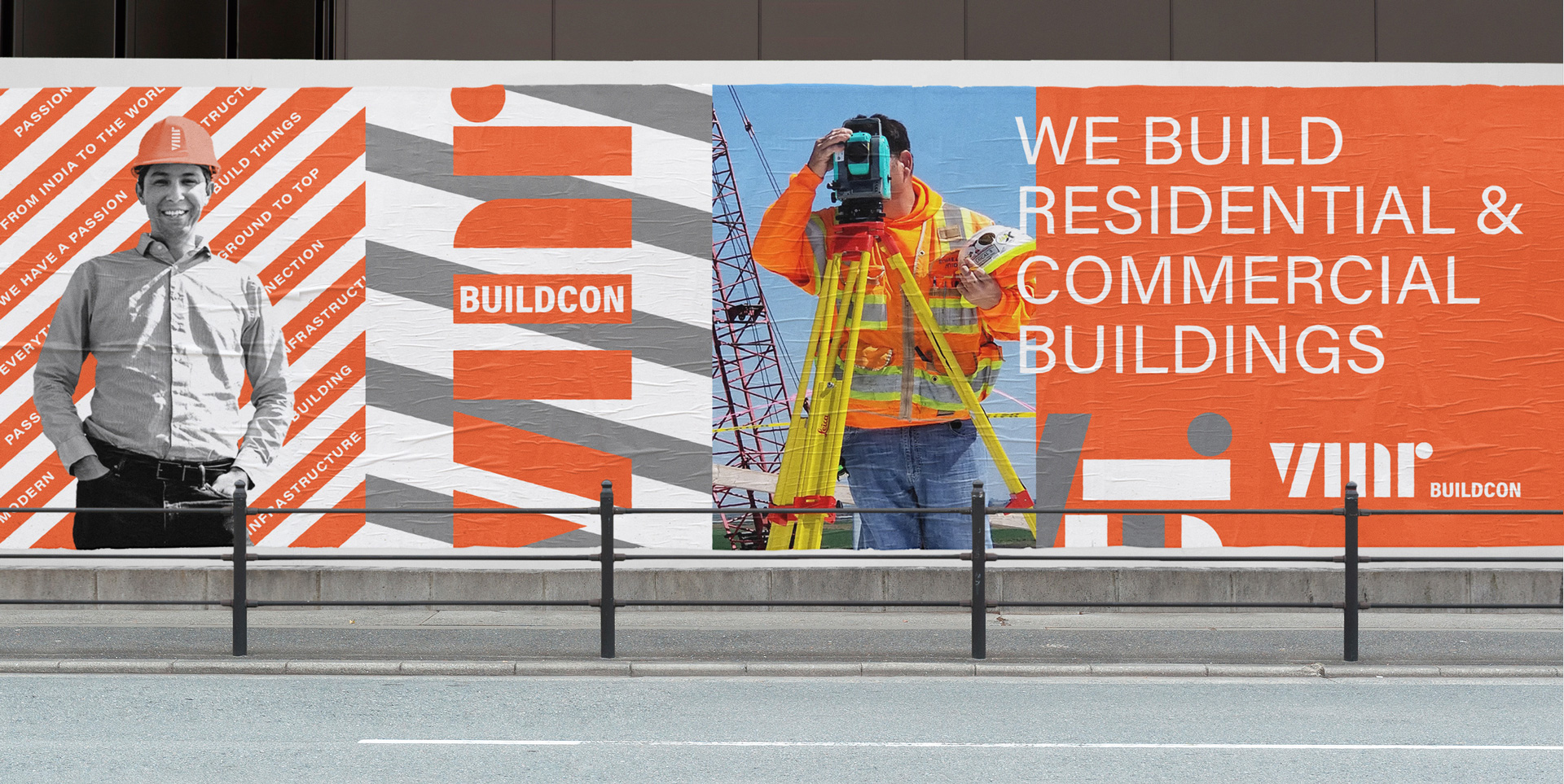
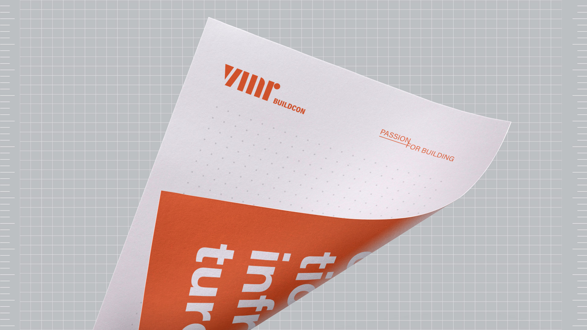
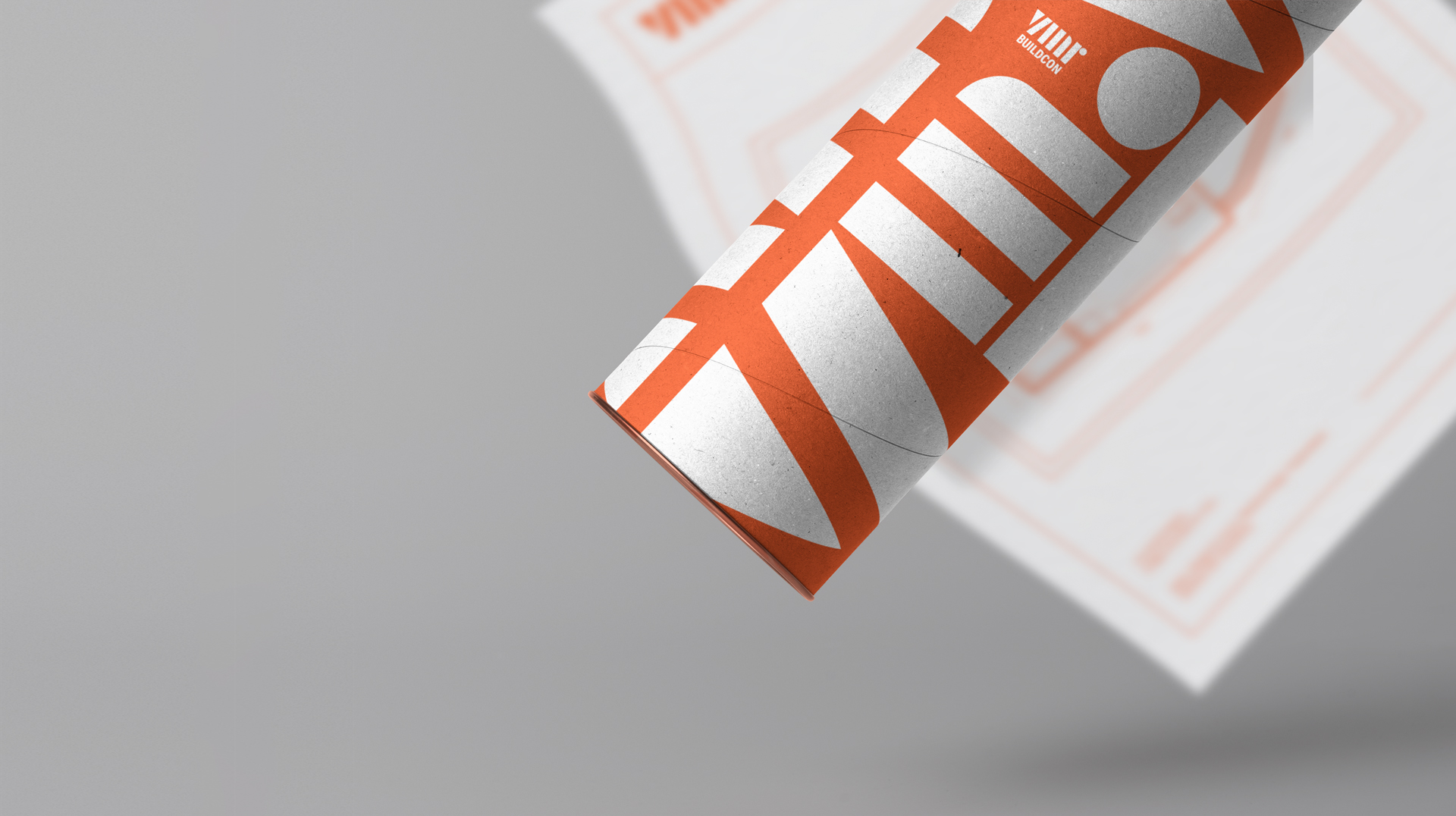
Solution: The solution was: Use basic and simple geometric shapes to construct the letters VMR, inspired by the drawing on blueprints and the shape of buildings. This palette of colours was defined by search among the construction business, representing energy, modernity and commitment. The typography was chosen in order to convey the feelings of humanity, technical, math and elegance, directed to the target audience. The symbol is text based, with a unique twist, creating an unique set of letters, represented by constructions, structure and buildings. The vertical shapes represents the buildings. A strong shape and colours was set in order to represent this structure, power and energy. With this in mind, the project aims to create a truly professional look for a company that has over 30 yeas of experience in the field, emerging from competition and beign reference in the construction business.
CREDIT
- Agency/Creative: Dhyogouveia Design
- Article Title: VMR Buildcon Engineering and Construction Company Branding
- Organisation/Entity: Agency
- Project Type: Identity
- Project Status: Published
- Agency/Creative Country: Brazil
- Agency/Creative City: Recife
- Market Region: Asia
- Project Deliverables: Brand Design
- Industry: Construction
- Keywords: construction, engineering, buiding
-
Credits:
Designer: Dhyogo Gouveia


