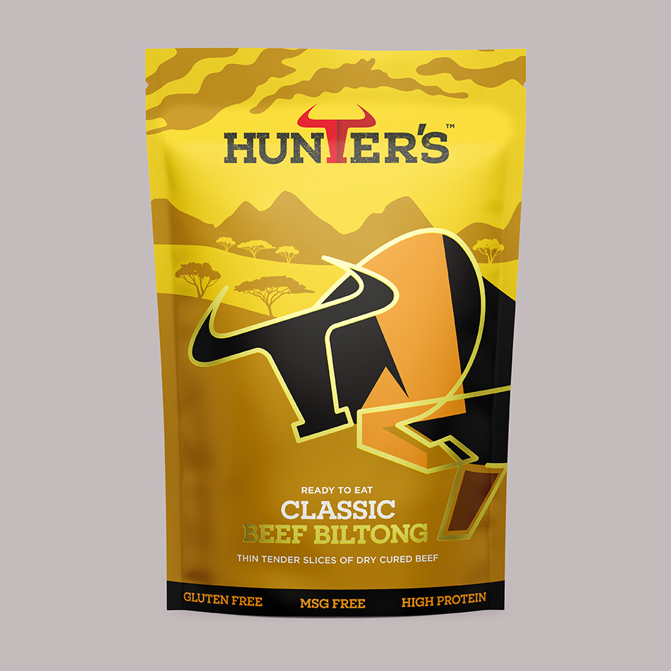
We were approached to create a redesign of Hunters smoked meat products. To give the packs a stronger shelf presence and a more modern look and feel to the range available and to help open their appeal to a younger emerging market as these products are making a real growth amongst fitness and health consumers and generally a younger crowd. They also wanted to ensure that the heritage and origins of Jerky and Biltong is clear through the packaging as it is not so well know what the difference is between the two.
Inspired by our family who have been crafting delicious Biltong for generations. Hunter’s is a family run business that was established in the UK in 2002. By mixing old recipes with new they have created a range of Beef Jerky. Crafted on site in small batches from prime cuts of lean beef marinated in a blend of specially selected spices and gently smoked in their ovens.
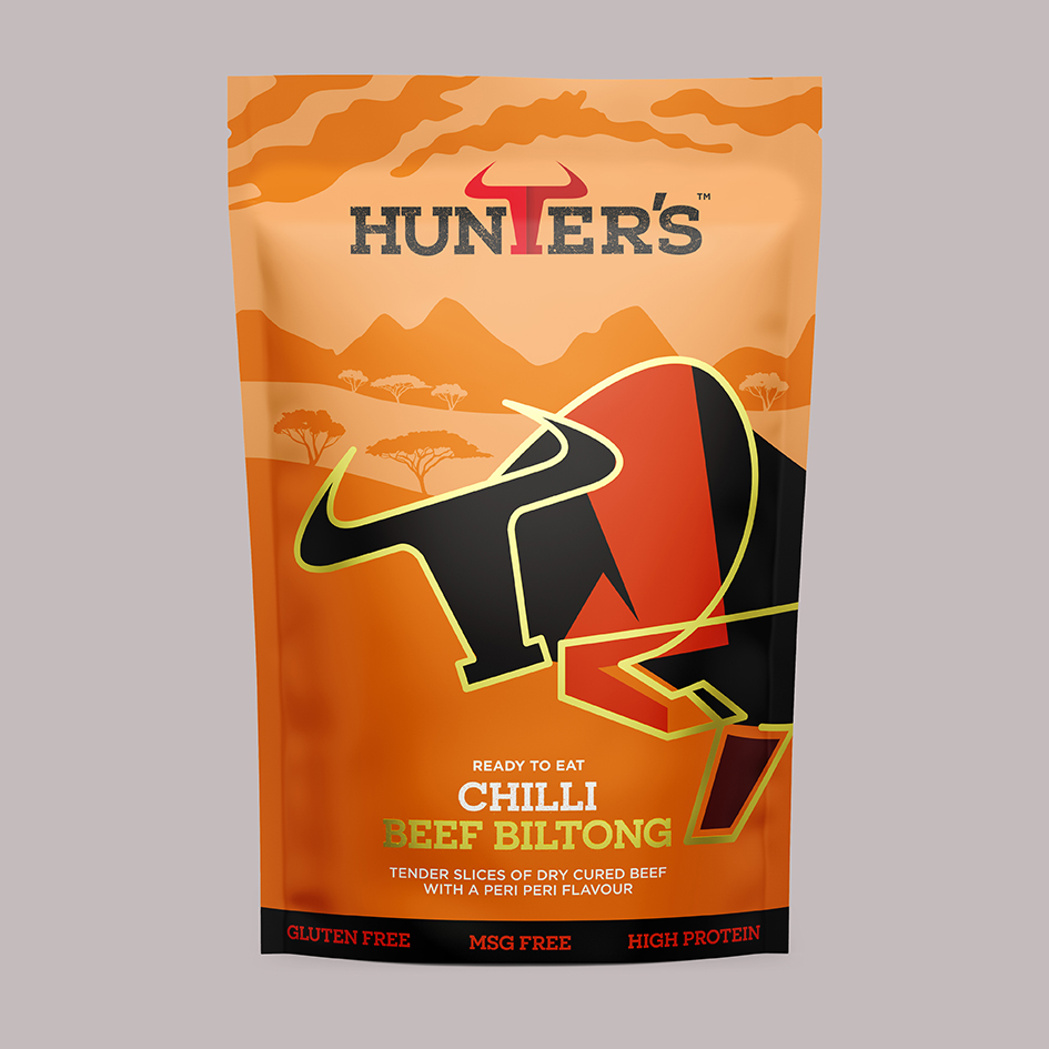
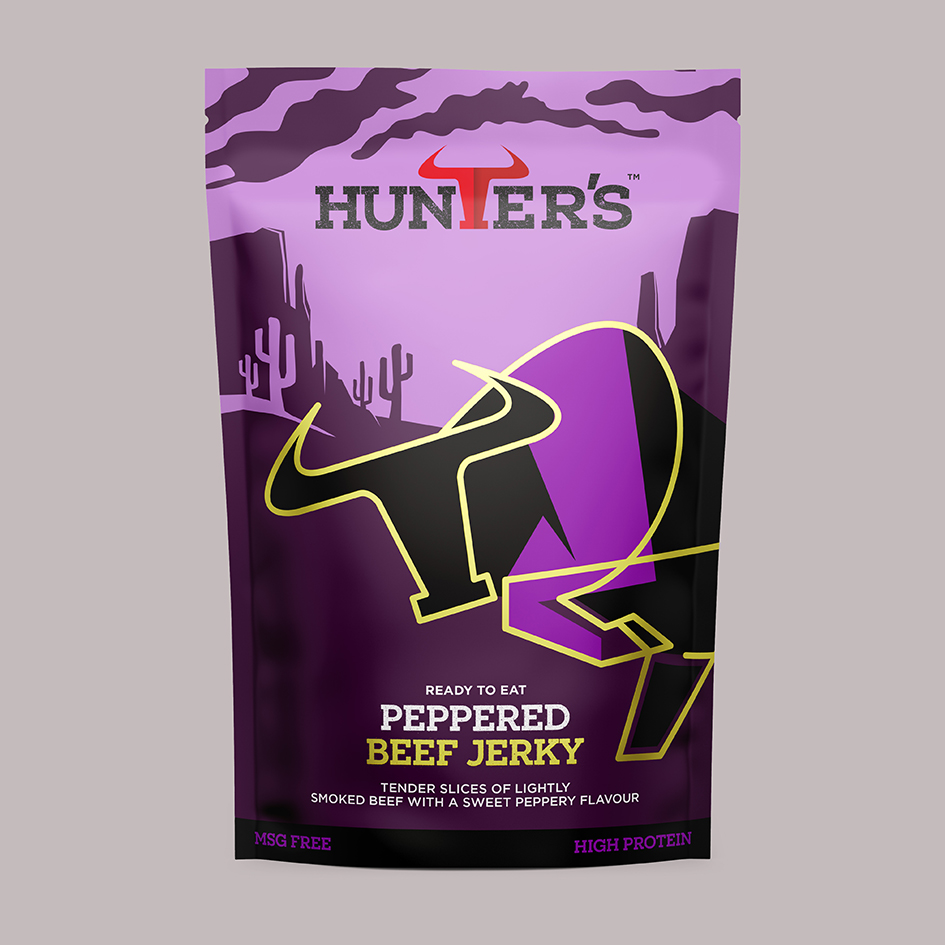
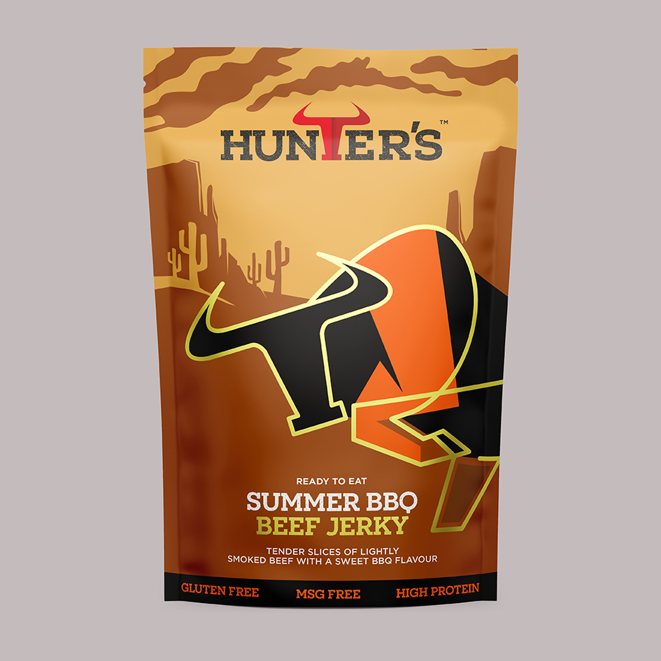
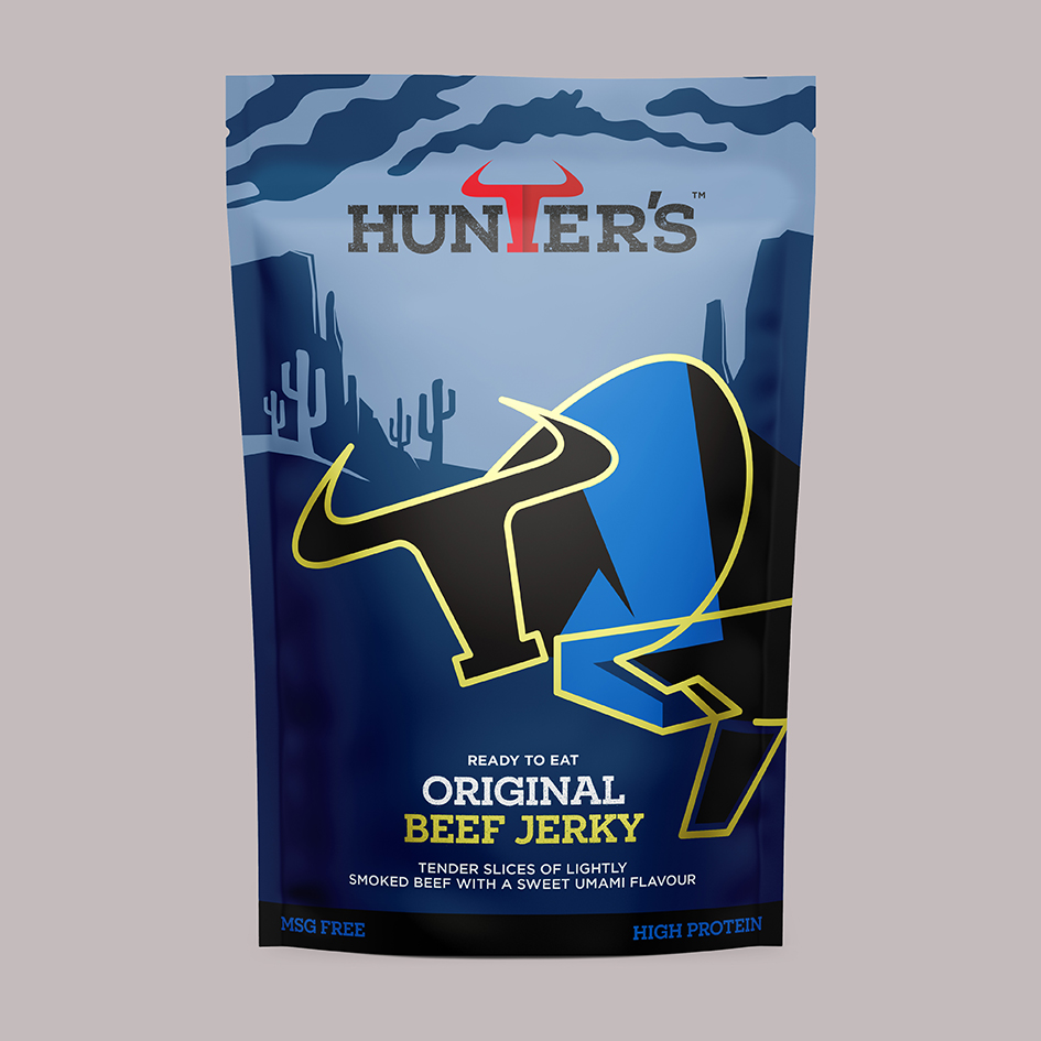
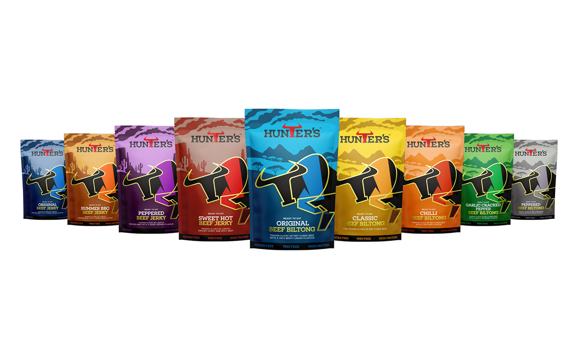
With the design we to reflect the ‘art’ of smoking jerky and biltong. The stylised Bull gives a craft feel to the brand and a real own able look/style. By using the foil substrate of the pouch to reveal the gold lifework to the bull to enhance the quality of the product. Simple background scenes were crafted in a hard style using simple colours to shade. These change to help identify the packs between Jerky and Biltong using a more American western background for Jerky as it was most synonymous with cowboys etc and an African plain for the biltong range. Bright bold colours help define the flavour of each pack.
CREDIT
- Agency/Creative: Pencil Studio
- Article Title: Hunters Biltong and Jerky Packaging Design Created by Pencil Studio
- Organisation/Entity: Agency
- Project Type: Packaging
- Project Status: Published
- Agency/Creative Country: United Kingdom
- Agency/Creative City: Frome
- Market Region: Europe
- Project Deliverables: Packaging Design
- Format: Pouch
- Substrate: Plastic
- Industry: Food/Beverage
- Keywords: Jerky, Biltong, Packaging Design
-
Credits:
Creative Director: Luke Manning
Chris Osment: Illustrator


