Challenge
We were approached by a dairy producer that aimed to launch a new line of butter-based ice creams. This type of ice cream is widely spread and talked about, so we were challenged to find a new way of presenting this ice cream (it) on the packaging. So we chose an educational approach and purpose. We aimed to educate a wide range of society, especially the young generation of ice-cream lovers – children, about the people, who have lived before them and have brought major changes in culture, science, cinematography, business, and other spheres. We wanted to make the packaging of these products a study board, which would introduce them to the works of these remarkable individuals with which they interact permanently in one or another way and make them choose these characters as their heroes.
Solution
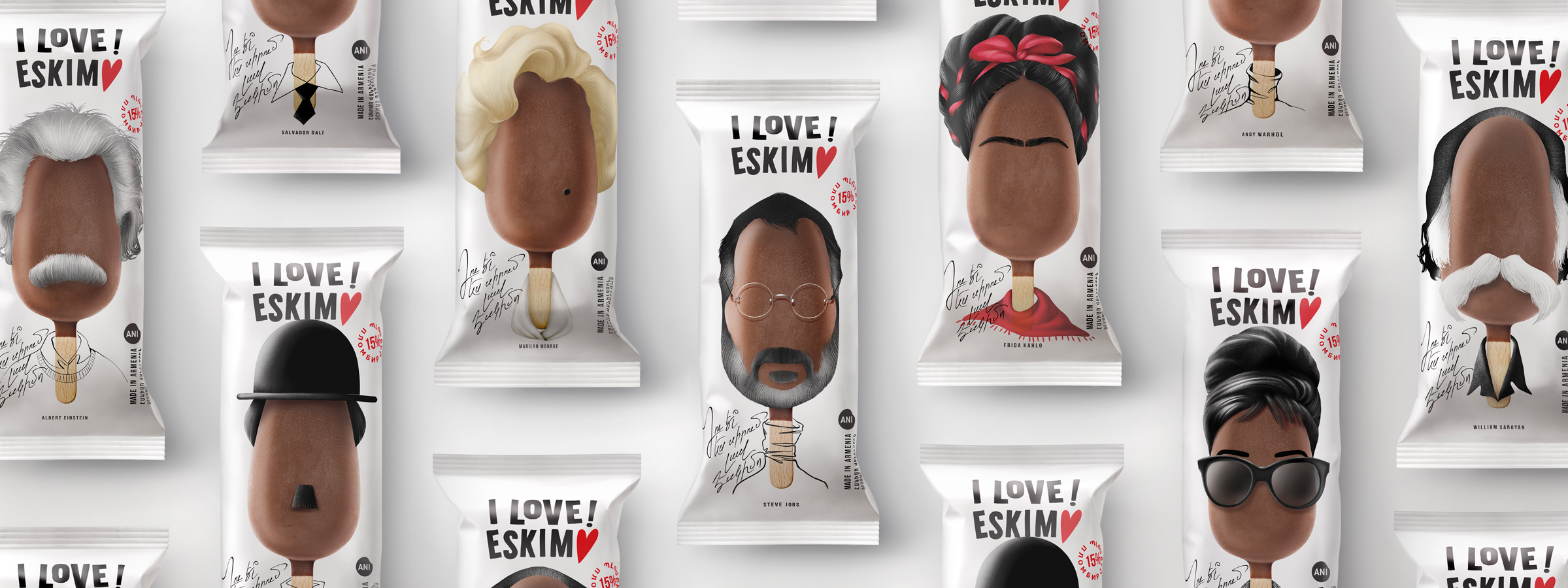
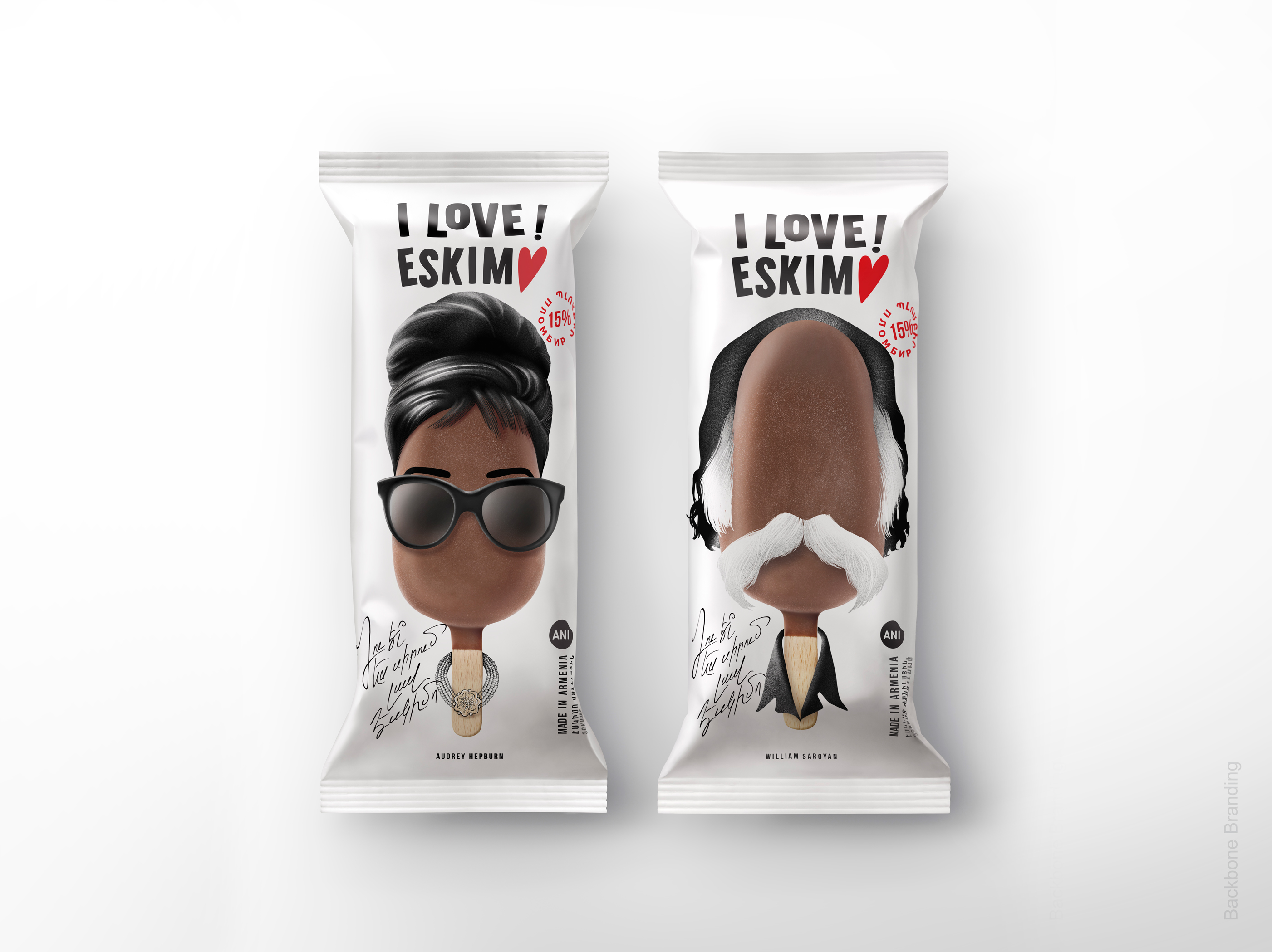
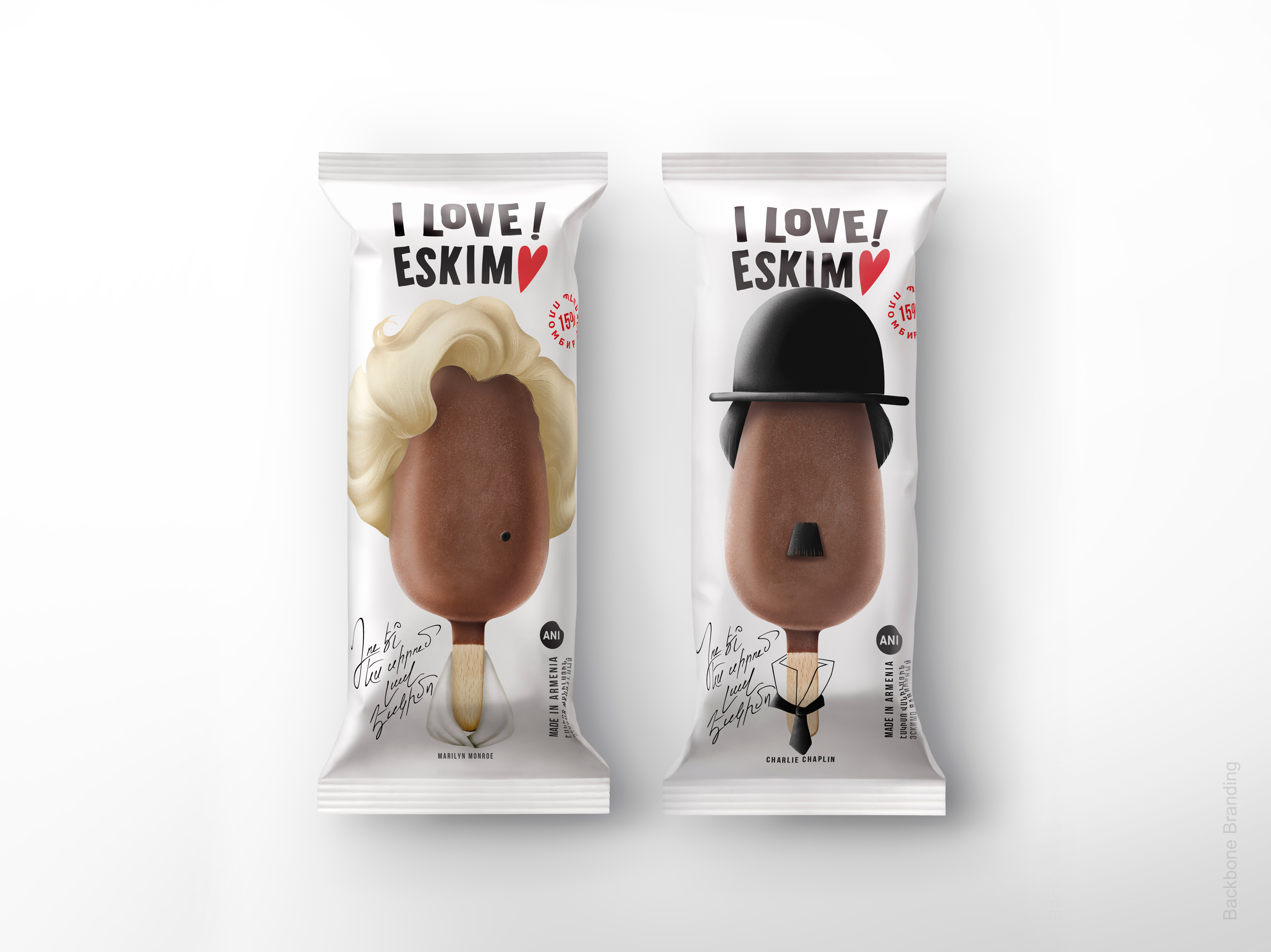
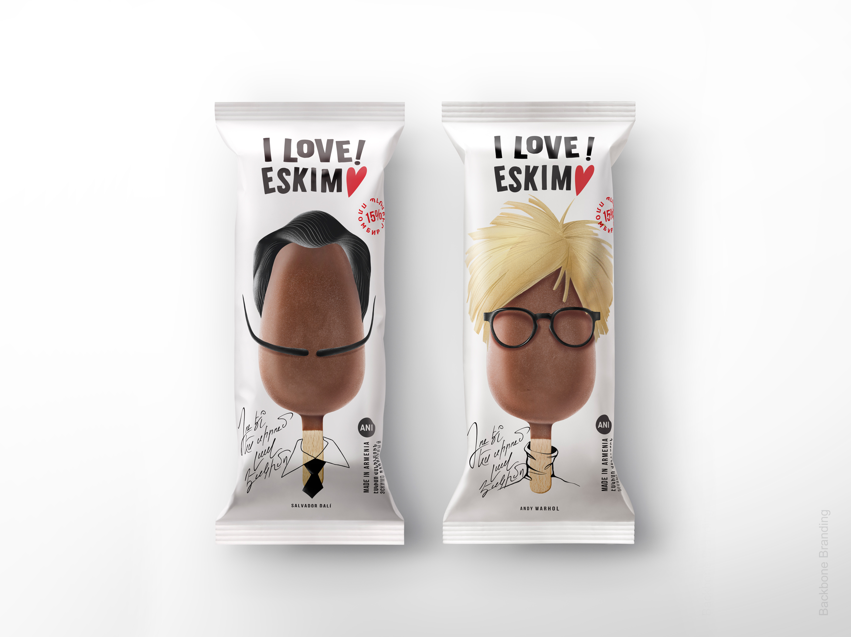
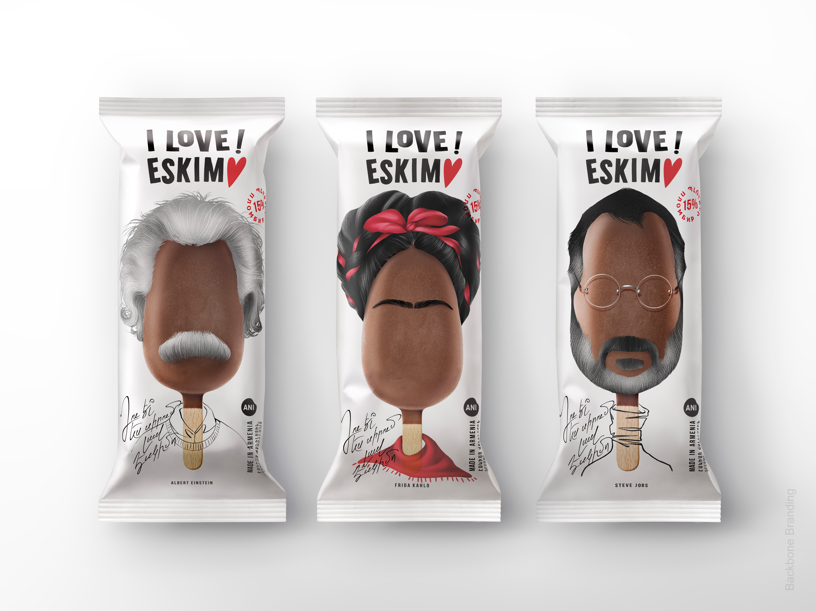
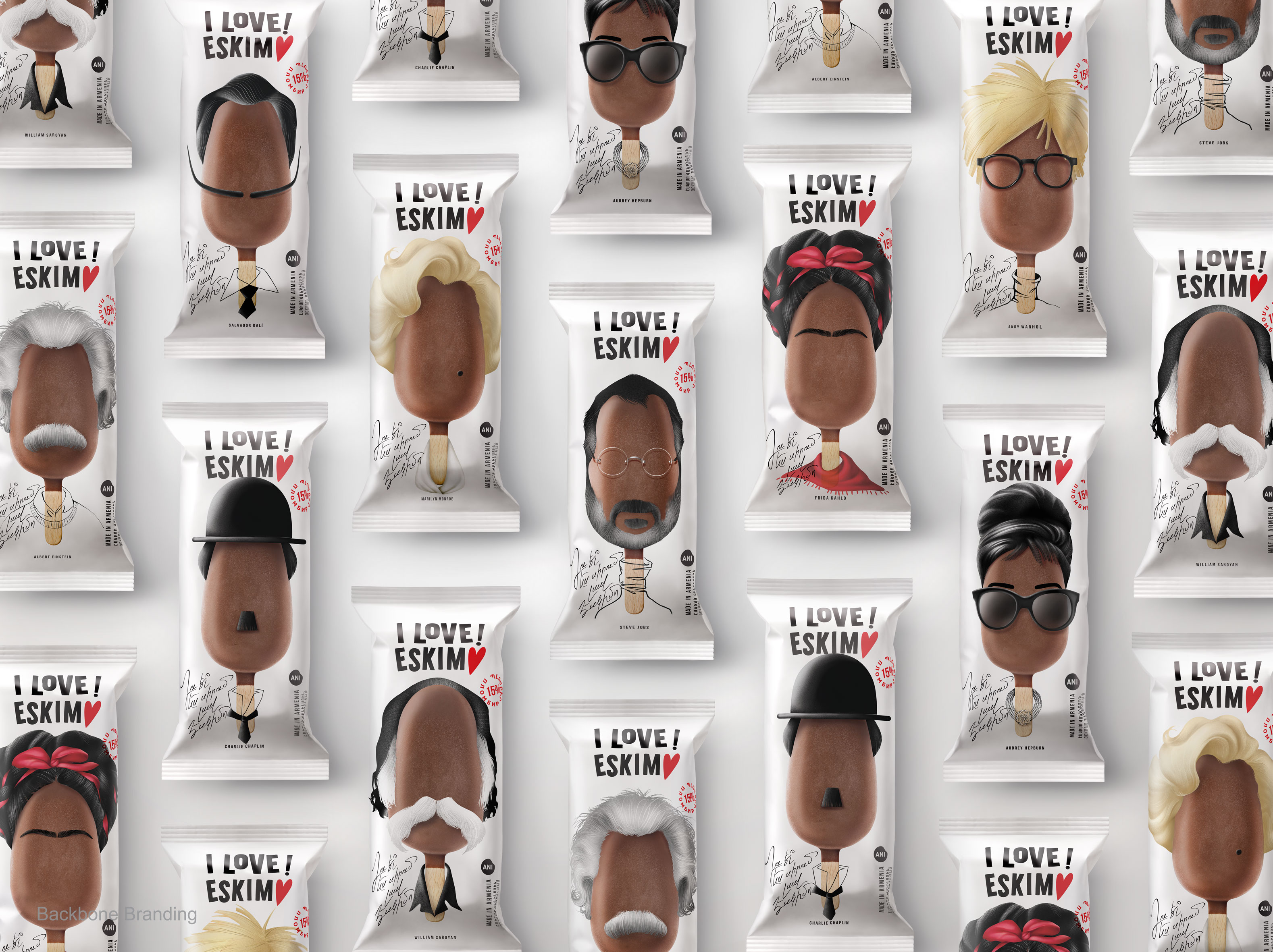
So we decided to personalise the ice cream and illustrated 9 important characters from different spheres, such as Albert Einstein, Charlie Chaplin, Audrey Hepburn, Steve Jobs, Salvador Dali, etc. Thus, we gave the possibility for the ice-cream lovers to choose the hero that is closest to them.
Avoiding making these characters too realistic, so that the customer doesn’t have the sense of eating them, we have illustrated the imitative images of these characters without face lineaments. Instead, we used hair, glasses, moustache and other characteristics to create resemblance with these personalities. The stick of the ice cream serves as the neck bearing an accessory or clothing, which helps easily associate with them. So the hints let you know exactly who the personality is: passing the emotions and mood connected to him/her. Nonetheless, we mentioned their names underneath the packaging, so that if someone didn’t recognize them, would go and study about these prominent figures.
A huge attention was paid to using a close-realistic graphic design style to illustrate the hair of characters: we succeeded to image them in such a way that wouldn’t create any distaste or incompatibility with the food for sensitive people.
The front of the packaging is a signature resembling handwritten text, which illustrates a celebrity communicating with the customer in the local language: “You love a good Eskim♥ too, right?”
The logo and the text were chosen to be black in order to clearly pop out to the eye and make it easily readable. The white matte background expressing freshness and coolness, allows characters to be strongly emphasising․
Result
As a result, by the packaging design of this new butter-based ice cream, we managed to create a design that would educate and inform the young generation about the invaluable input of these heroes in different spheres of different times along with enjoying their sweet ice cream. Although the product is one, it allows us to enjoy it differently, with the accompaniment of a new hero each time.
CREDIT
- Agency/Creative: Backbone Branding
- Article Title: Backbone Branding Creates New Packaging for a Range of Butter-Based Ice Creams
- Organisation/Entity: Agency
- Project Type: Packaging
- Project Status: Published
- Agency/Creative Country: Armenia
- Agency/Creative City: Yerevan
- Market Region: Europe
- Project Deliverables: Branding, Packaging Design
- Format: Flow-Pack
- Substrate: Plastic
- Industry: Food/Beverage
- Keywords: WBDS Agency Design Awards 2021/22
-
Credits:
Brand Strategist: Lusie Grigoryan
Creative Director: Stepan Azaryan
Illustrator & Designer: Elina Barseghyan
Graphic Designer: Ashot Hayrapetyan
Animator: Sahak Zarbabyan
Photos by: Backbone Branding & Suren Manvelyan


