Braun’s family story begins about 500 years ago, when English alchemists shouted “eureka!” by adding juniper to an alcoholic mixture. BrAuN emerged from this heritage, which unites chemistry and distillery. Through this mixture, father and son created a high quality gin, worthy of their ancestors.
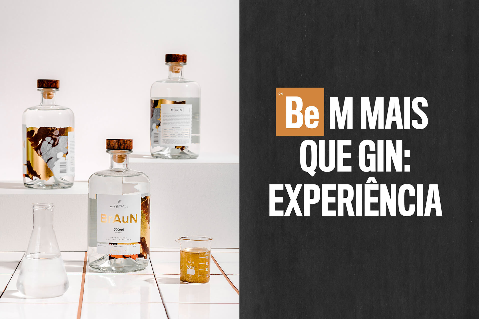
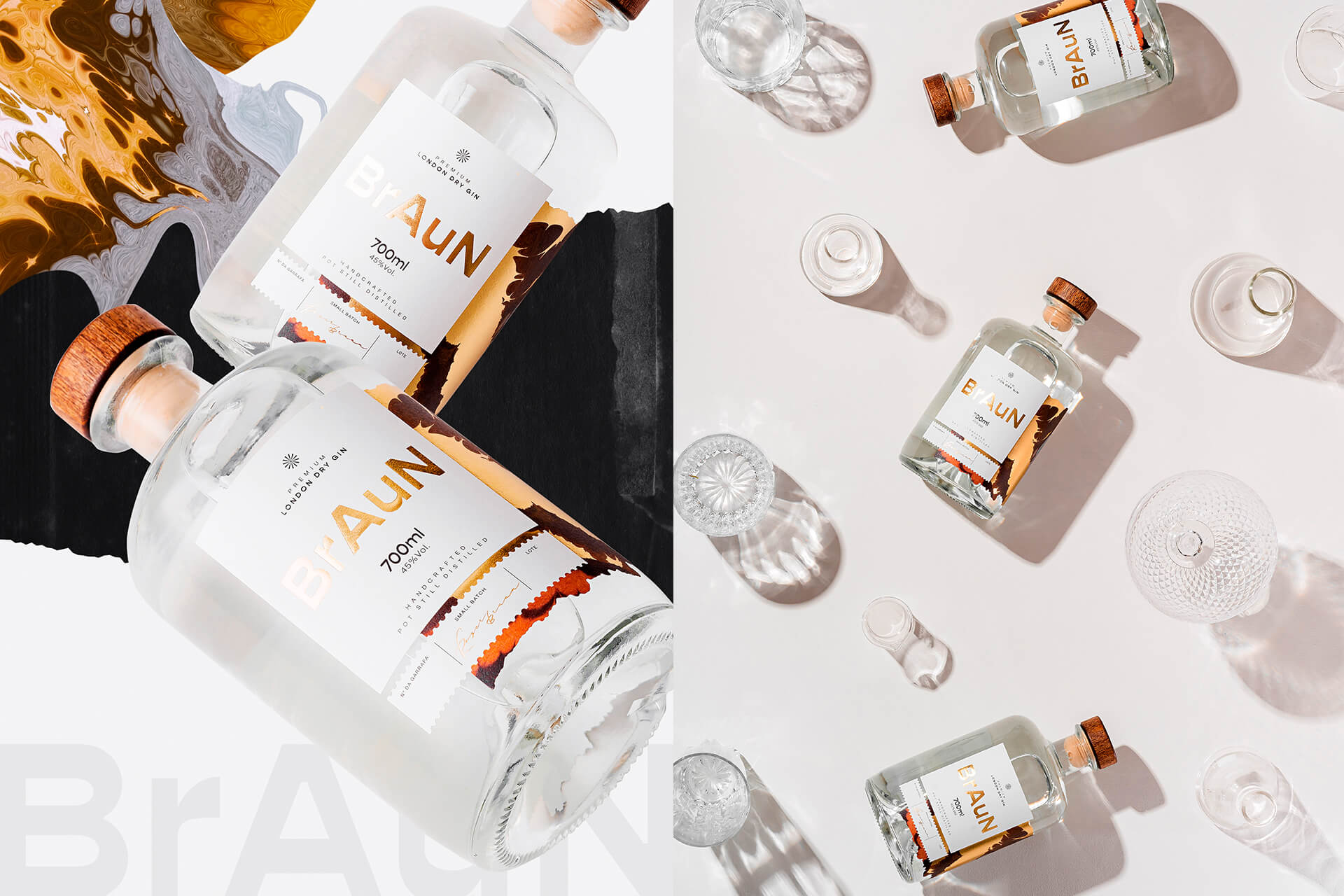
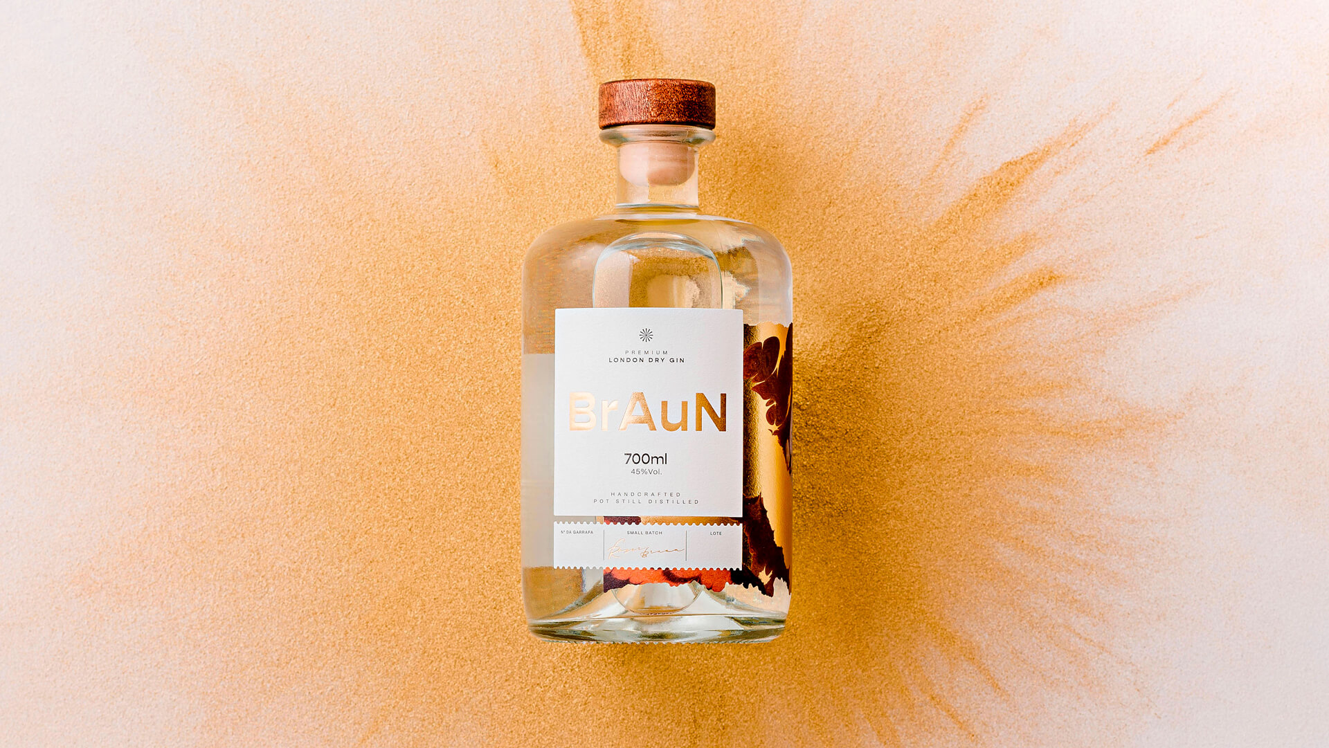
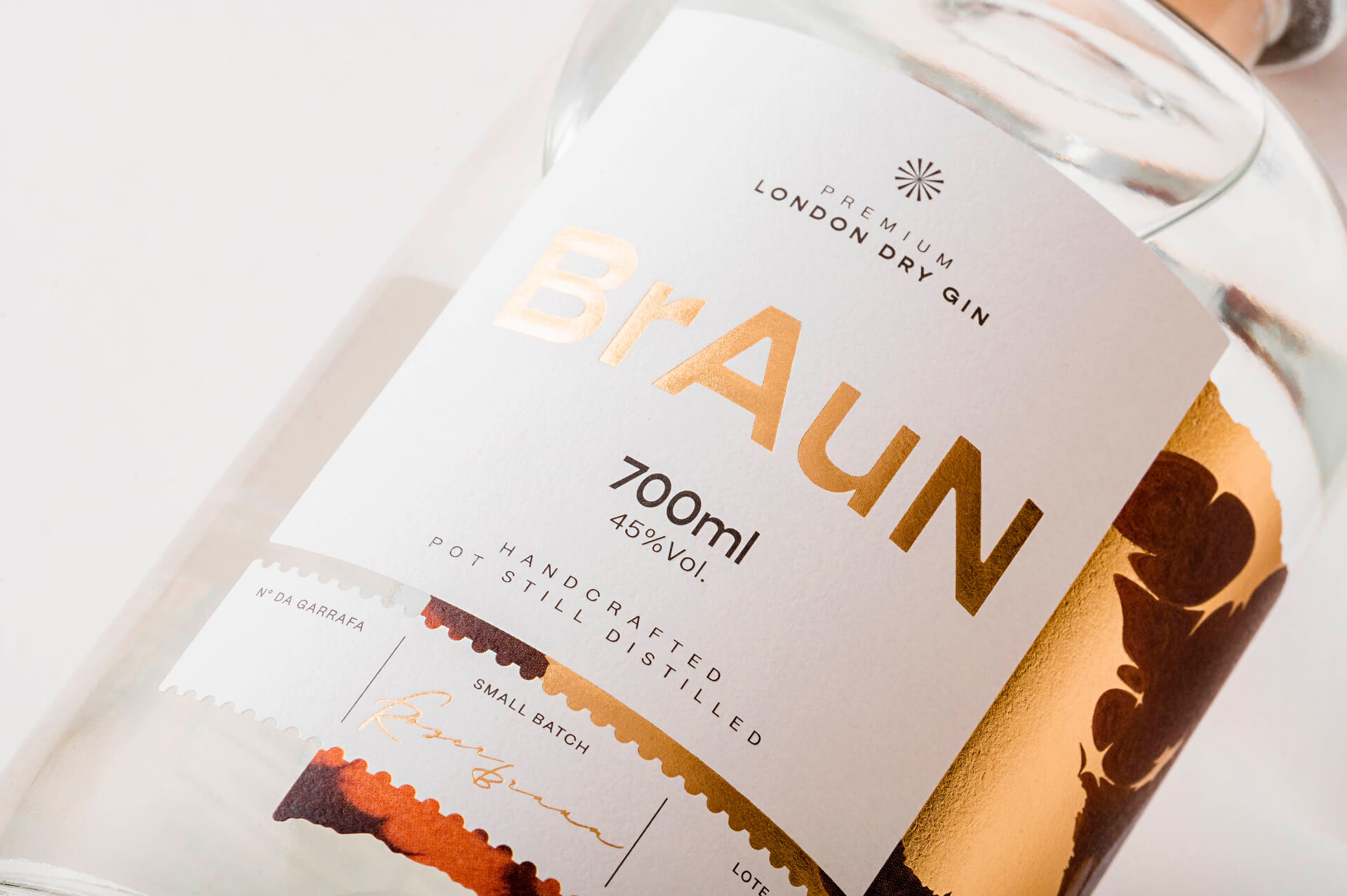
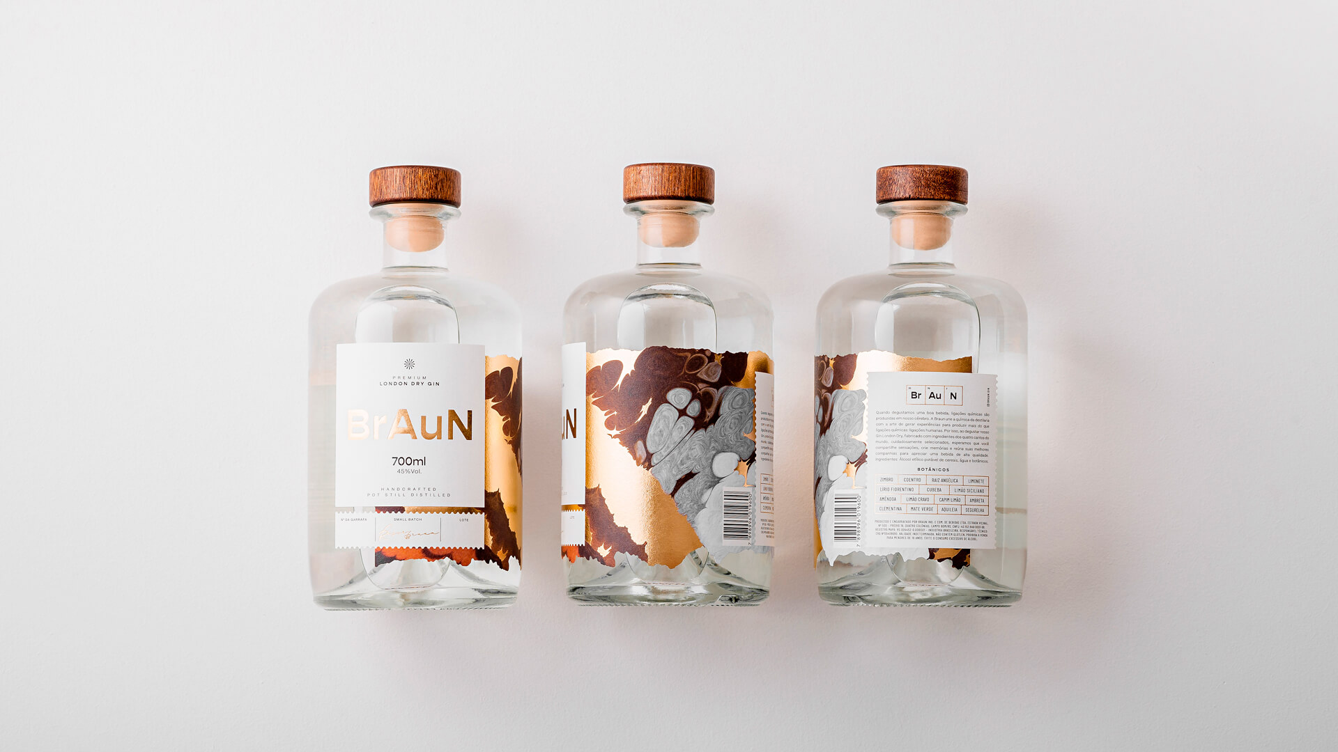
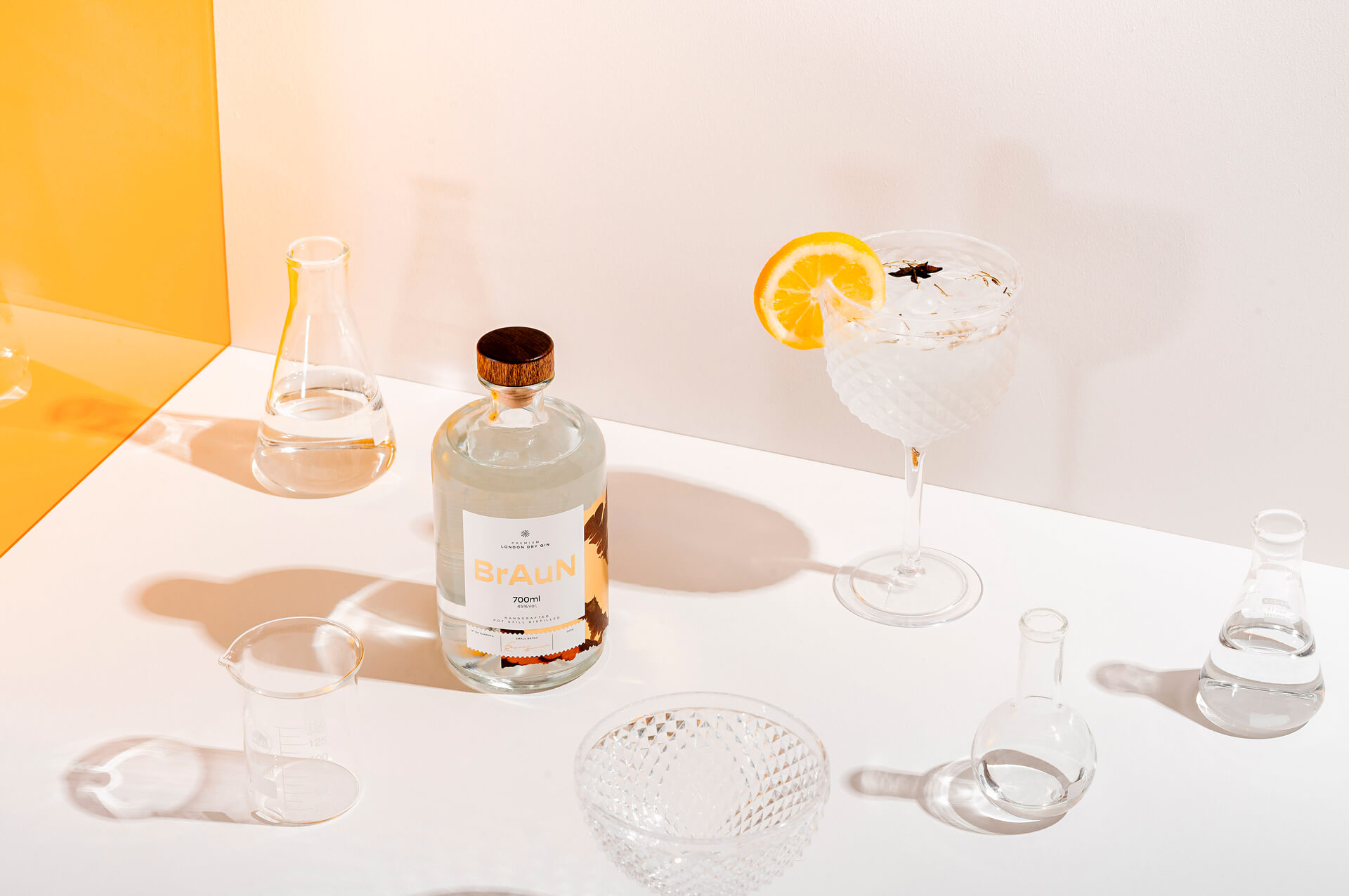
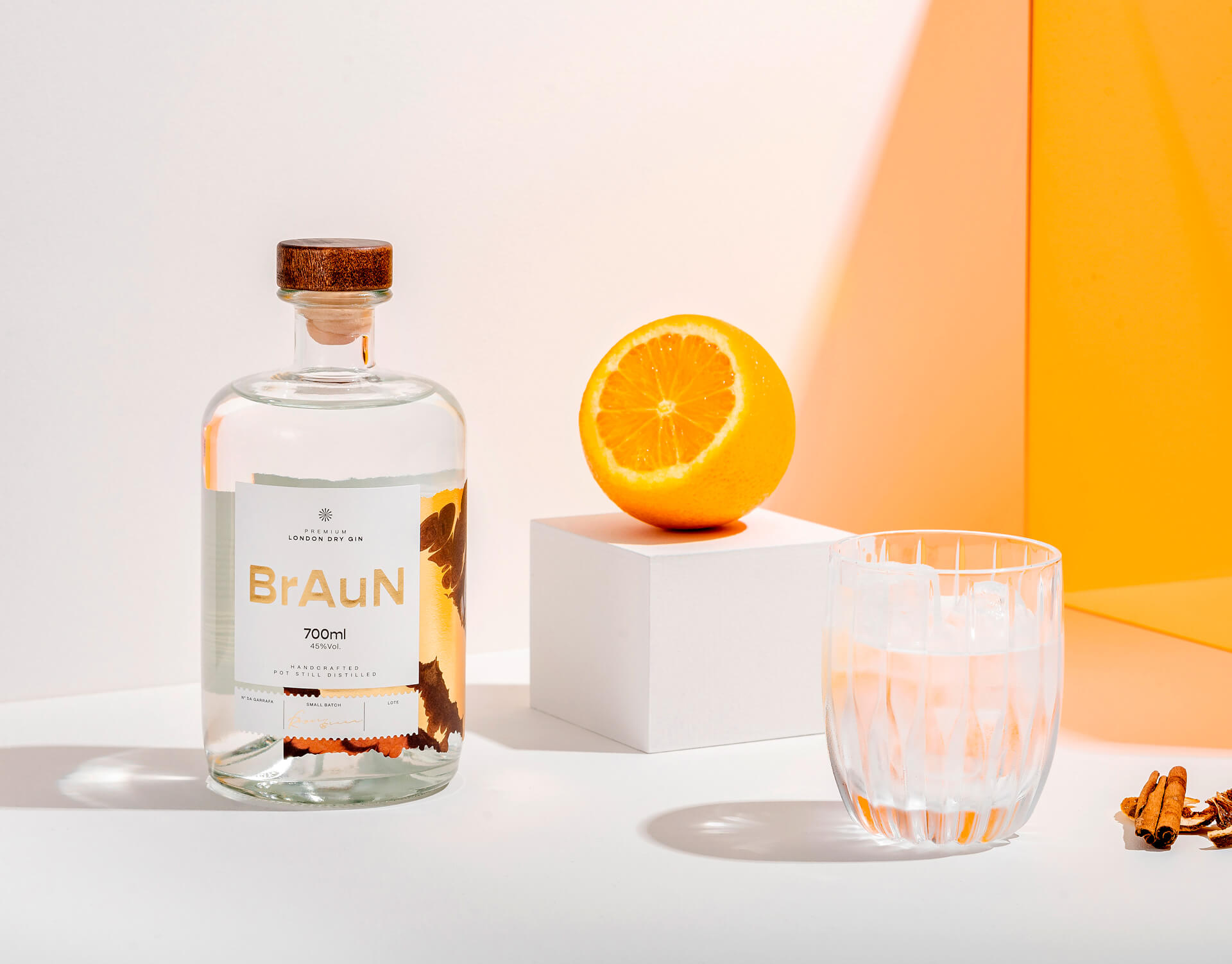
Chemistry, distillery, and family tradition are this brand’s territories, which synthesizes these passions in its purpose: “to distill stories and extract more than chemical bonds: human bonds”. Elements of the periodic table are present both in the logo – (Br) Bromine (Au) Gold (N) Nitrogen – and in the details of the packaging. In its printing, the lateral texture stands out as a sensorial element, created from chemical reactions seen through the microscope. In parts of it, gold hot stamping was applied, giving the feeling that the reaction is really happening. The label irregular cut, specially developed for the project, emphasizes the effect. In addition, the shape of the bottle resembles chemical glassware commonly used by apothecaries in the past, reinforcing the storytelling.
So, the packaging becomes an extension of the brand’s experience, which is intended precisely to provoke human connections between people who share sensations and memories around a high-quality drink. Thus, using storytelling as a project solution, it was possible to generate value and differentiation for the most demanding gin lovers.
Ismo Design was responsible for designing the brand strategy, brand identity and packaging for BrAuN Gin.
CREDIT
- Agency/Creative: Ismo Design
- Article Title: BrAuN Gin Packaging and Identity Created by Ismo Design
- Organisation/Entity: Creative
- Project Type: Packaging
- Project Status: Published
- Agency/Creative Country: Brazil
- Agency/Creative City: Porto Alegre
- Market Region: South America
- Project Deliverables: Art Direction, Brand Design, Packaging Design
- Format: Bottle
- Substrate: Glass Bottle
- Industry: Food/Beverage
- Keywords: WBDS Creative Design Awards 2022/23
- Keywords: Beverage, Gin, Label, Packaging, Chemistry
-
Credits:
Creative Direction and Design: Caroline Campos
Creative Direction and Design: Felipe Johann
Design: Rafael Kochhann
Tone of Voice: Jaqueline Luz


