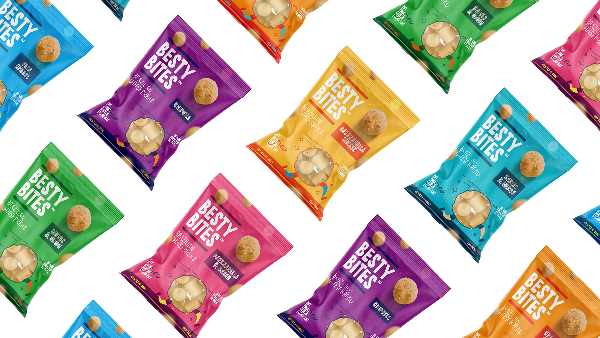
Besty Bites is a delicious cheese bread sold in the USA with the best of Brazilian flavor. Made with skills acquired over 3 Besty Bites is a delicious cheese bread sold in the USA with the best of Brazilian flavour. Made with skills acquired over 3 generation of Brazilian bakers, the recipe has improved for over decades and it’s now being put to the test and adapted for the American consumer.
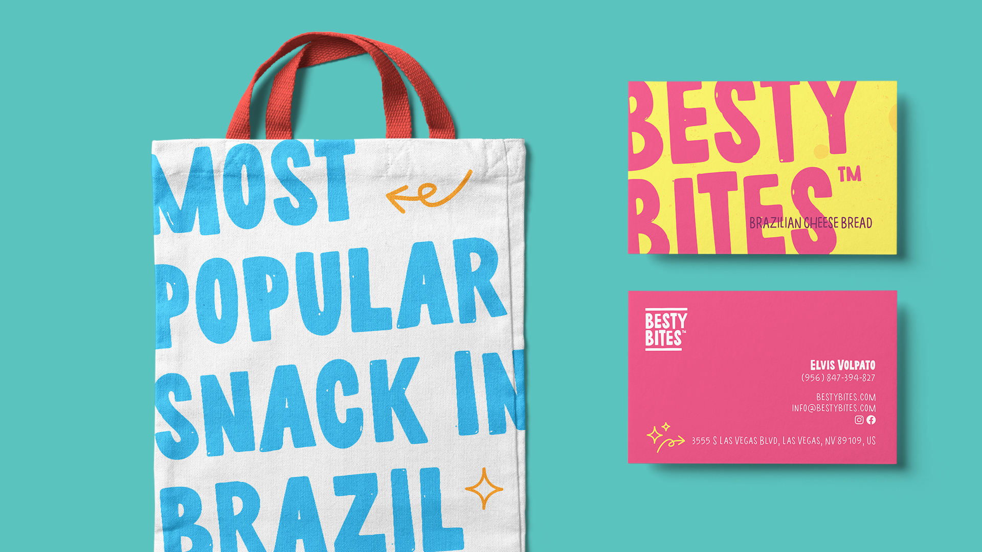
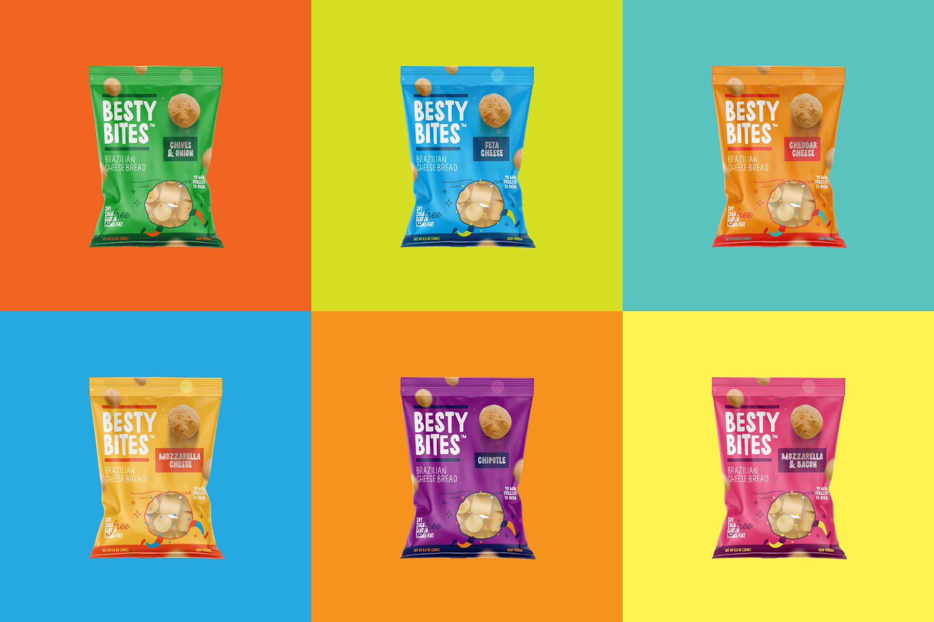
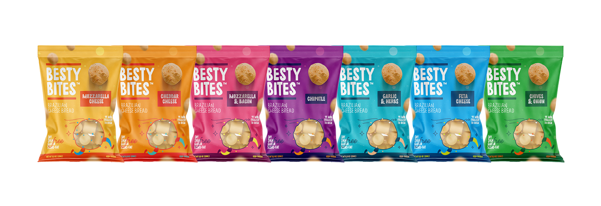
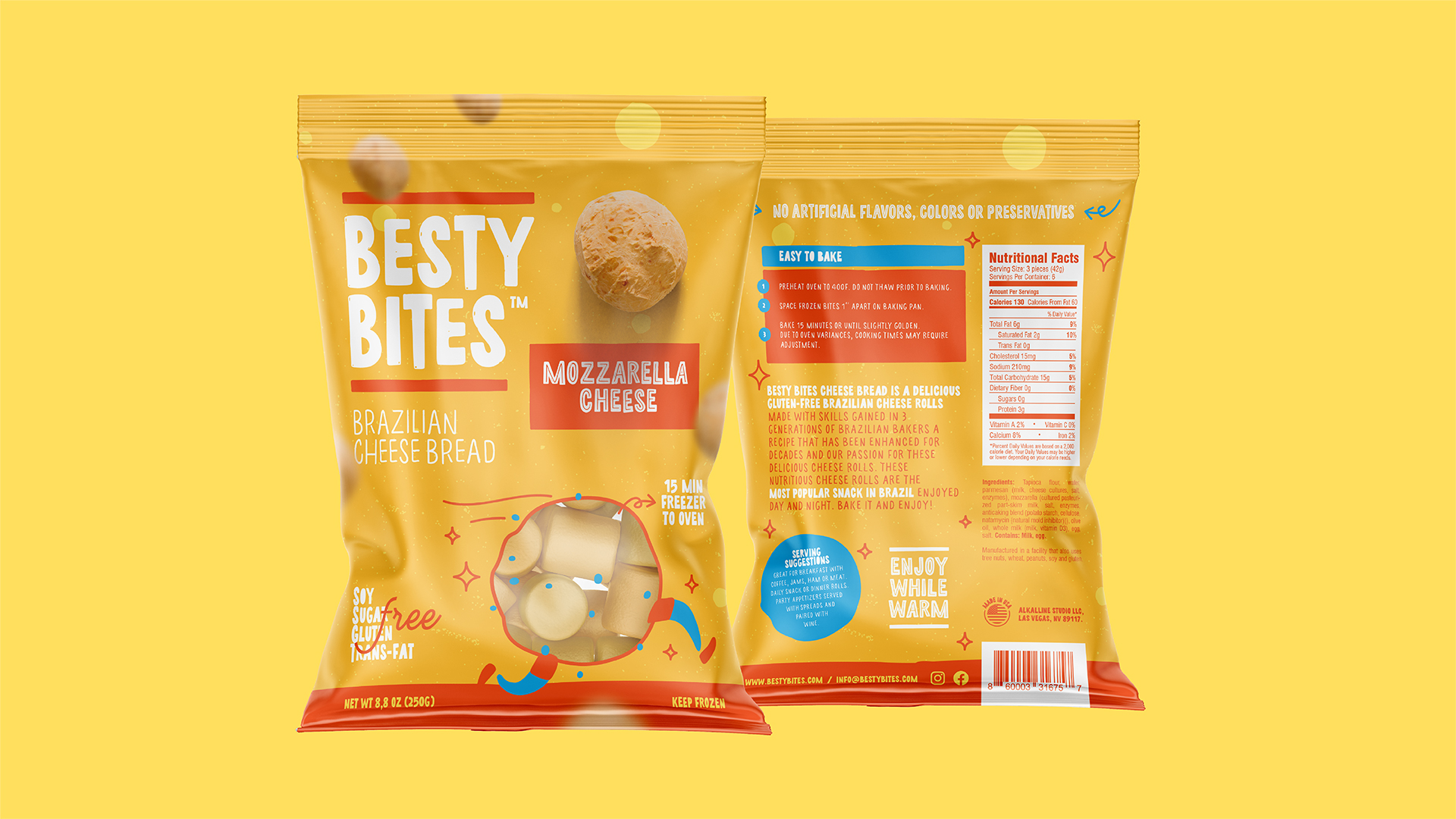
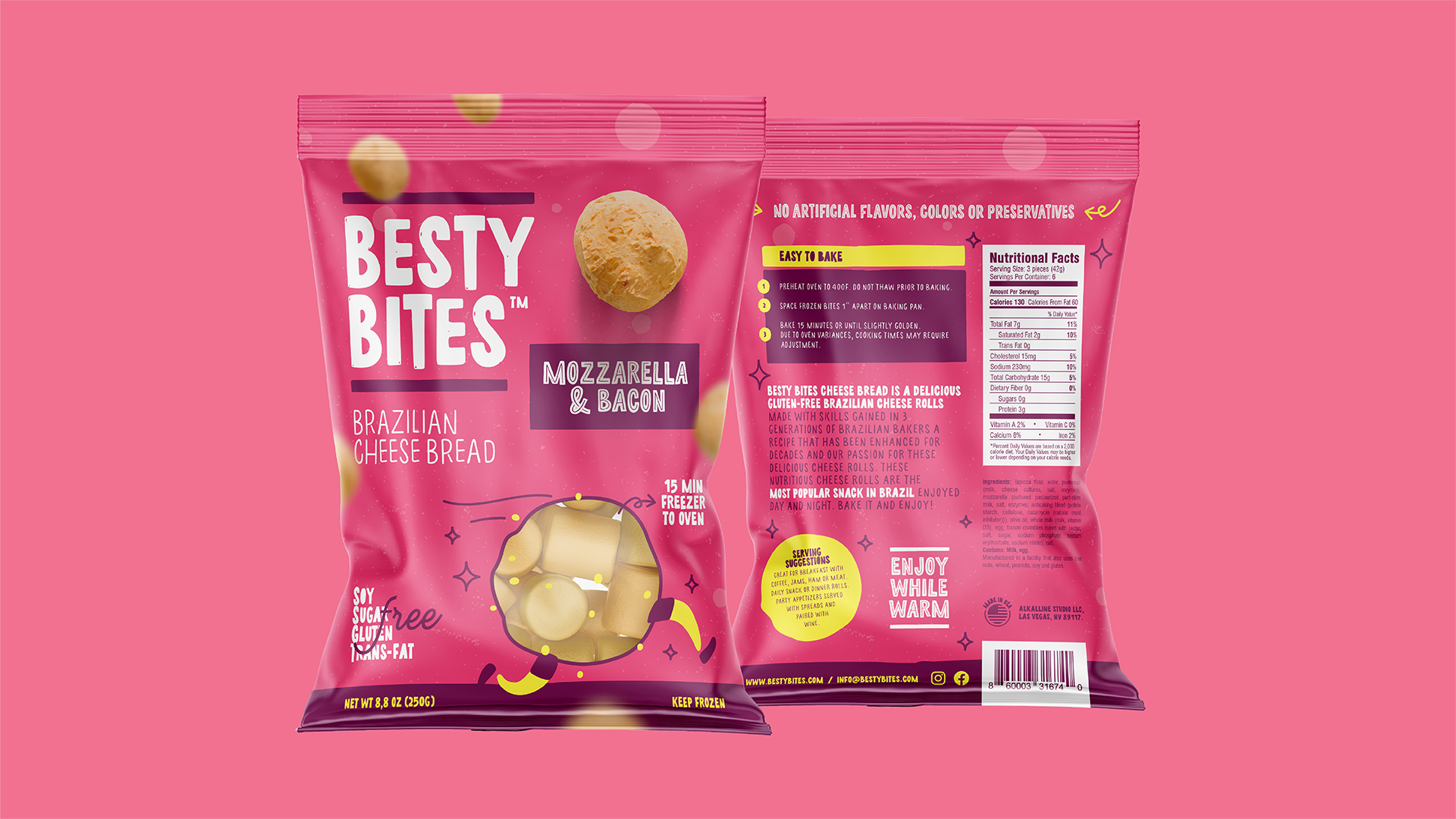
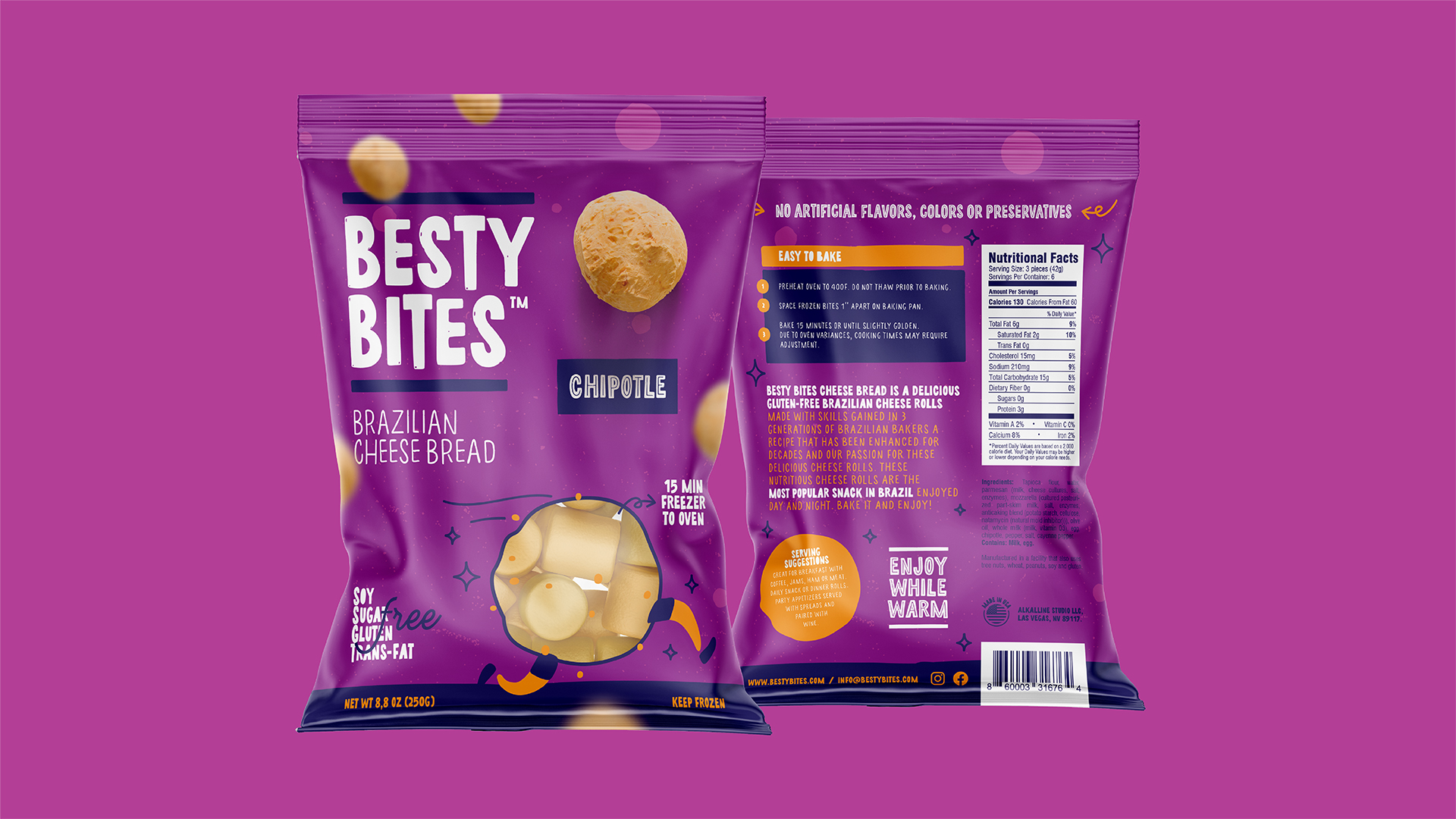
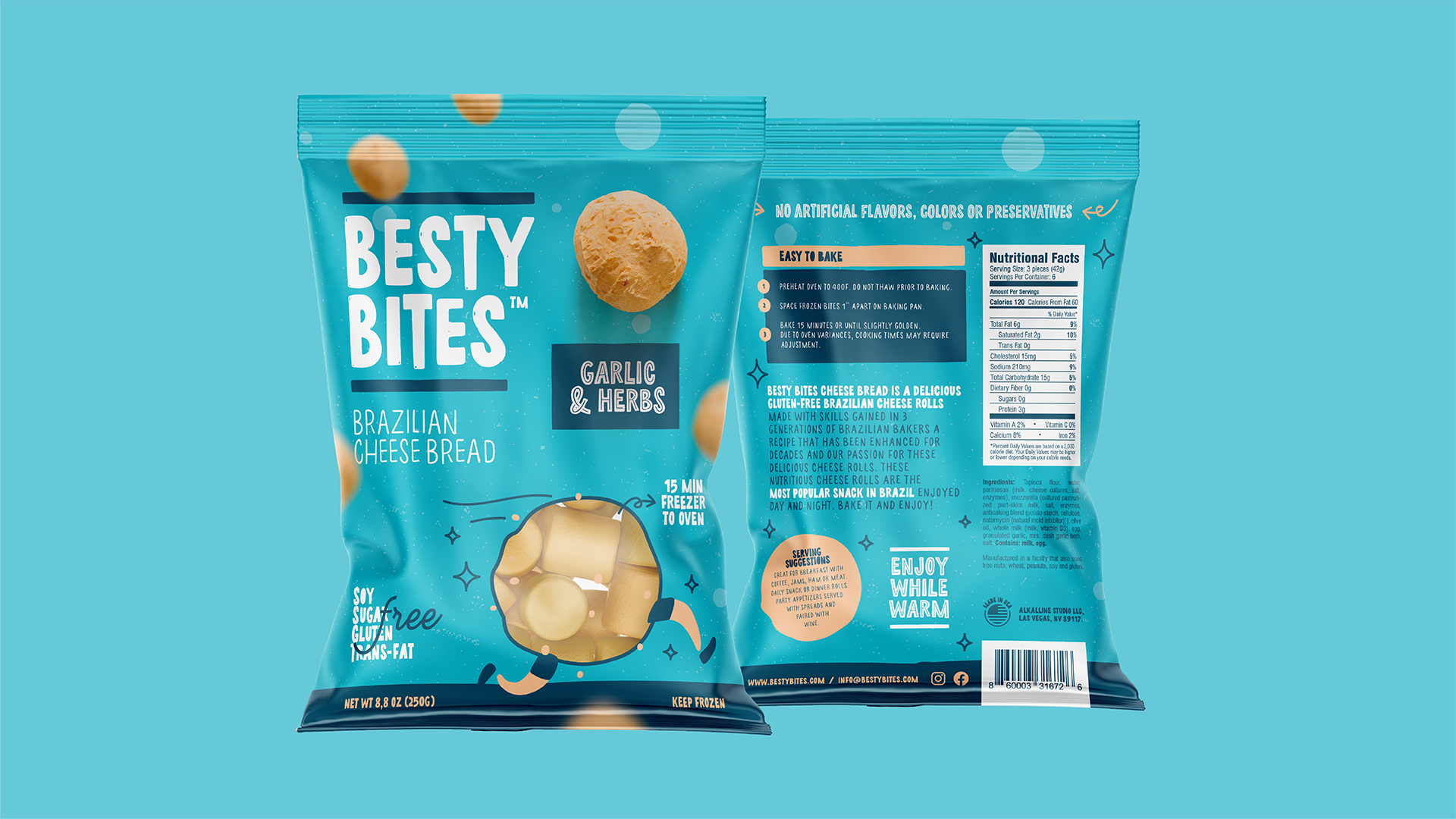
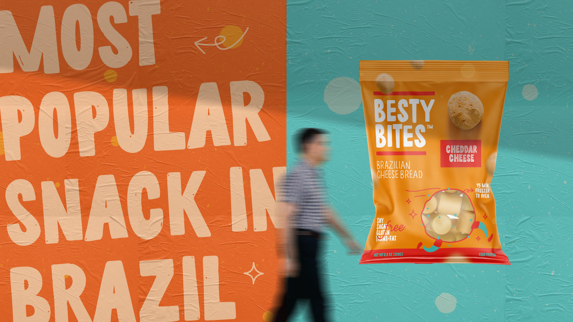
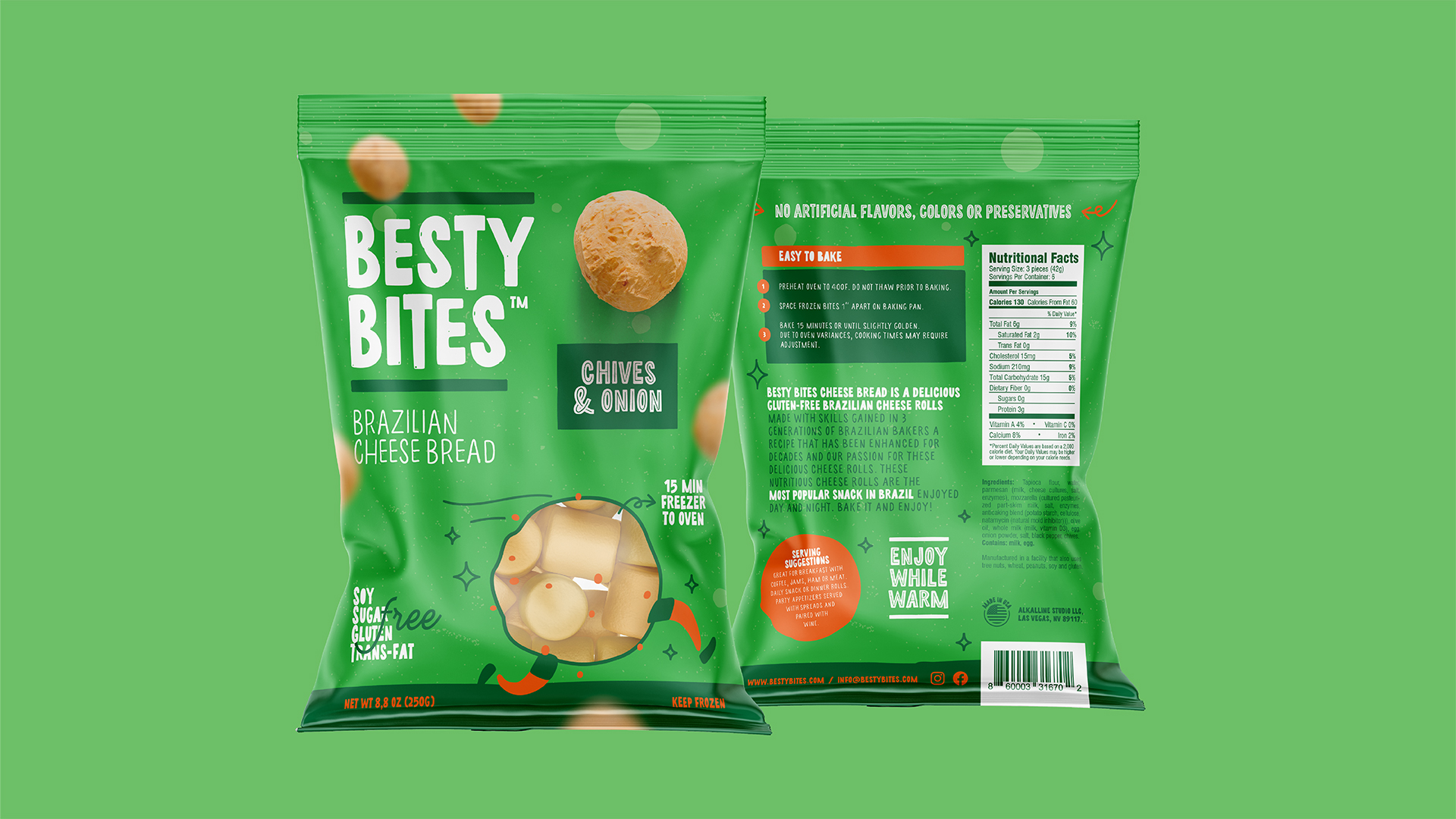
The most popular snack in Brazil needed to have a visual language that spoke to the American public. With that in mind, we developed an identity that values clarity in information, with large texts, organic shapes, vibrant colors and a pattern that may be reproduced as new flavors emerge on the portfolio.
Commercial appeal was taken into consideration, with the displaying of products on shelves in stores and supermarkets playing a big part on the package design. A clear view of the product, one of the packaging necessities was made possible in a fun way through the creation of a character the was designed to look like a cheese bread.
With uppercase uneven fonts, we tried to balance the aesthetic of American products with a little bit of the Brazilian flair, offering a truly Brazilian product that is completely adapted to the American culture and aesthetic. Generation of Brazilian bakers, the recipe has improved for over decades and it’s now being put to the test and adapted for the American consumer.
The most popular snack in Brazil needed to have a visual language that spoke to the American public. With that in mind, we developed an identity that values clarity in information, with large texts, organic shapes, vibrant colors and a pattern that may be reproduced as new flavors emerge on the portfolio.
Commercial appeal was taken into consideration, with the displaying of products on shelves in stores and supermarkets playing a big part on the package design. A clear view of the product, one of the packaging necessities was made possible in a fun way through the creation of a character the was designed to look like a cheese bread.
With uppercase uneven fonts, we tried to balance the aesthetic of american products with a little bit of the brazilian flair, offering a truly Brazilian product that is completely adapted to the american culture and aesthetic.
CREDIT
- Agency/Creative: Feitoria
- Article Title: Feitoria Creates Packages for Brazilian Snacks Sold in the United States
- Organisation/Entity: Agency
- Project Type: Packaging
- Project Status: Published
- Agency/Creative Country: Brazil
- Agency/Creative City: Balneário Camboriú
- Market Region: South America
- Project Deliverables: Packaging Design
- Format: Flow-Pack
- Substrate: Plastic
- Industry: Food/Beverage
- Keywords: colors, food, fast food, graphic design packaging design, identity,
-
Credits:
Graphic Designer: Alex Reuter
Graphic Designer: Guilherme Rosa
Graphic Designer: Juliano Jover


