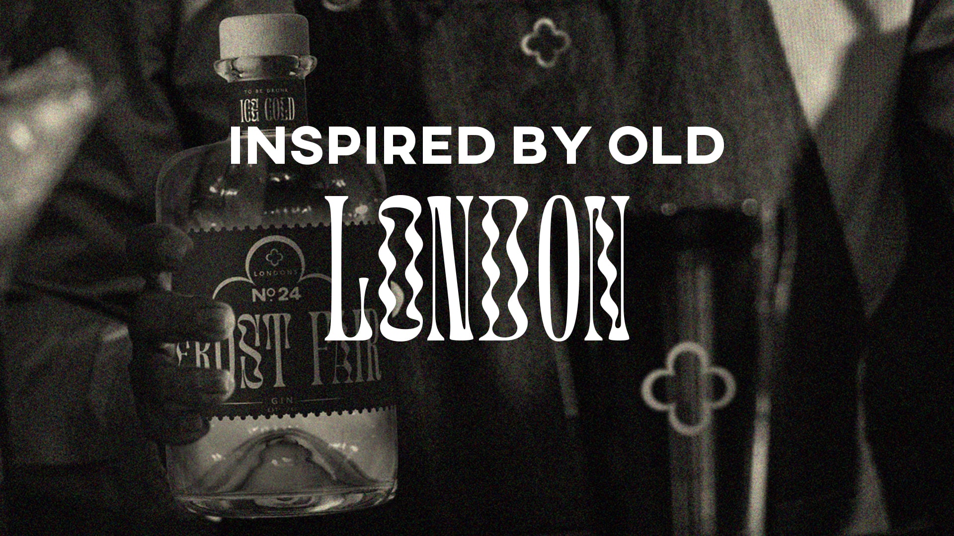
Brief: Create a self-initiated piece of graphic design that either informs, educates, or solves a problem. You write your own brief: design and brand the identity for a new gin.
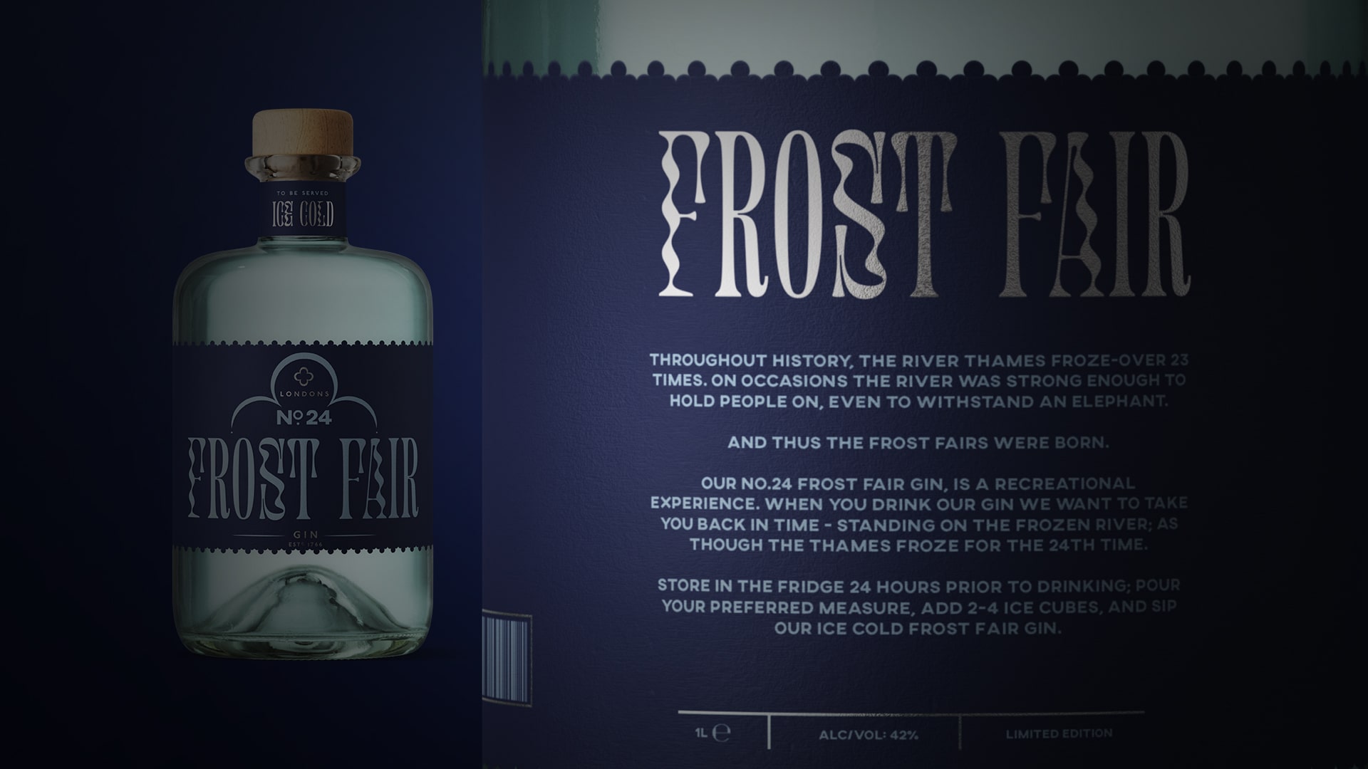
Insights: During the 18th century, London became so cold, the River Thames froze over 23 times. Due to the old London bridge being so shallow, this allowed the river to freeze over. On occasions, the river was strong enough to withhold people, even an elephant.
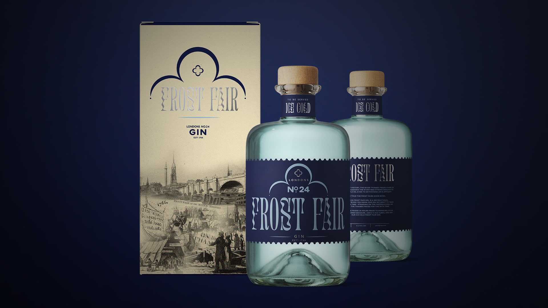
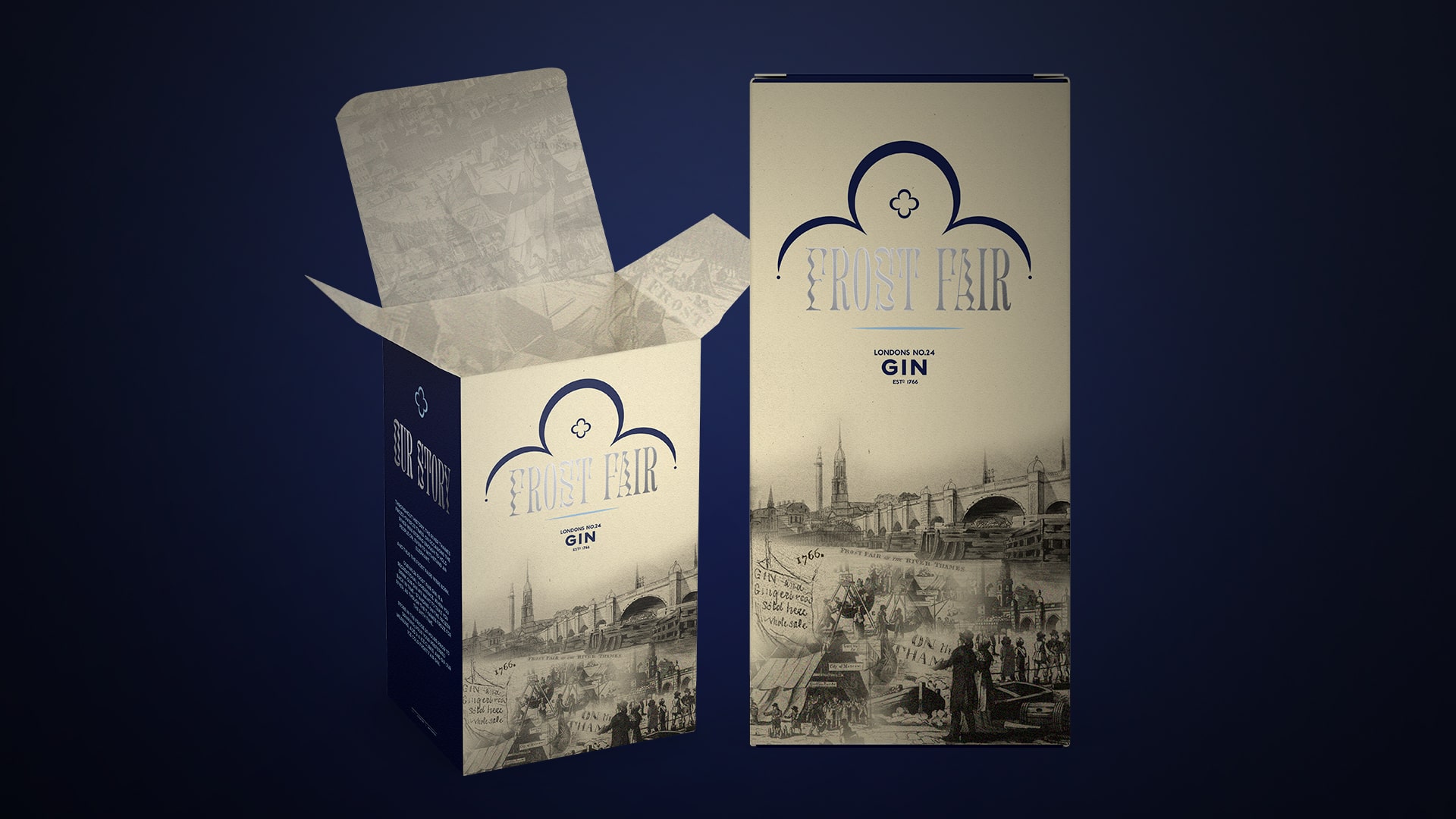
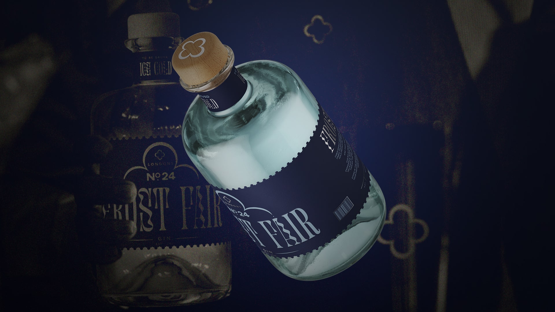
Solution: London’s No.24 Frost Fair gin is an experience that takes you back in time – as if you are standing on the frozen river, at the 24th Frost Fair. The brand’s execution is steeped in London’s heritage, and the designs are full of small nods towards its time. Old London bridge had a small decorative symbol that has influenced and become the core identity for this gin brand. London’s No.24 Frost Fair Gin. To be served ice cold.
CREDIT
- Agency/Creative: Clare Palmer
- Article Title: London’s No.24 Frost Fair Gin Student Concept by Clare Palmer
- Organisation/Entity: Student
- Project Type: Packaging
- Project Status: Non Published
- Agency/Creative Country: United Kingdom
- Agency/Creative City: Leigh-on-Sea
- Market Region: Global
- Project Deliverables: Brand Design, Brand World, Packaging Design
- Format: Bottle, Box
- Substrate: Glass Bottle
- Industry: Food/Beverage
- Keywords: WBDS Student Design Awards 2021/22
-
Credits:
Graphic Designer: Clare Palmer


