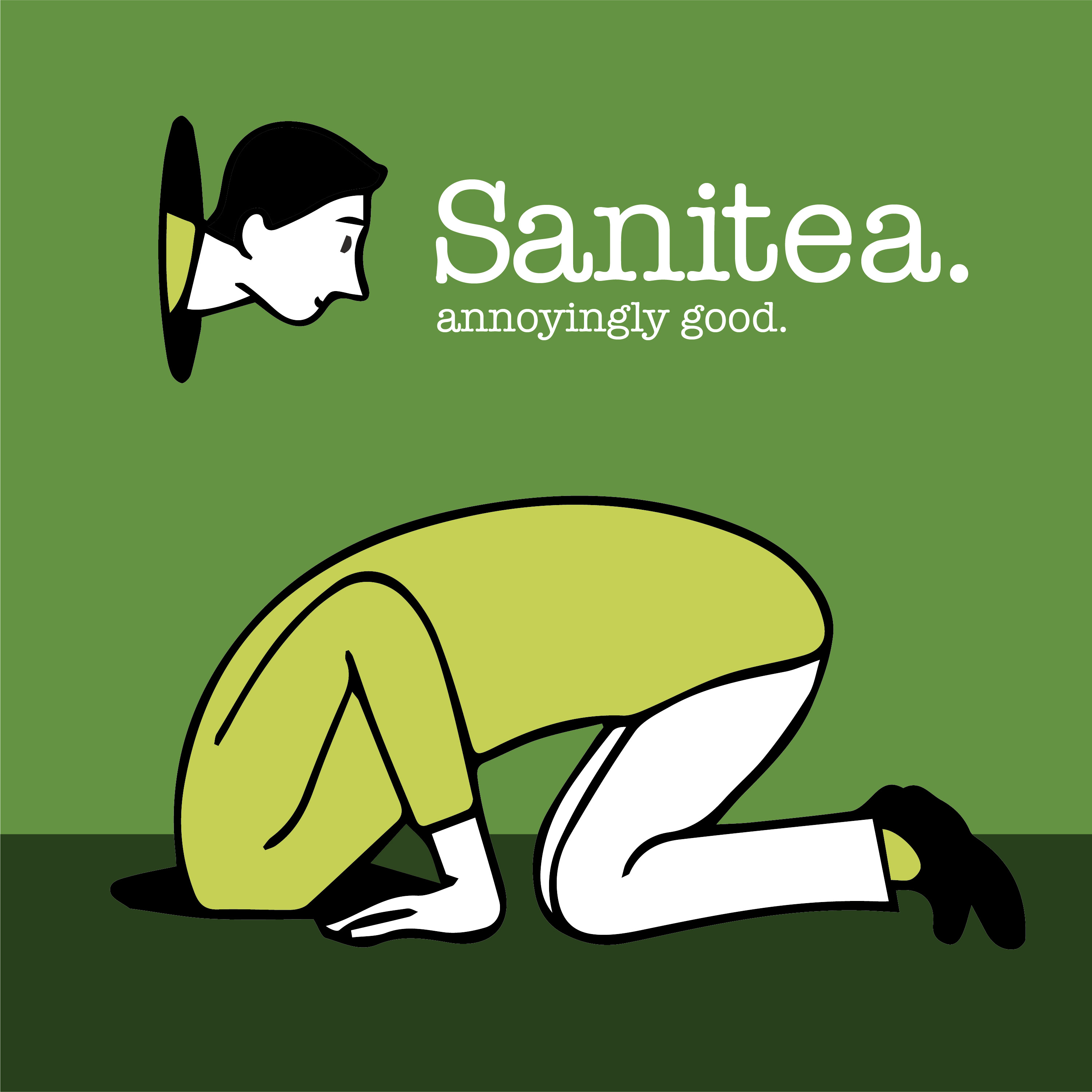
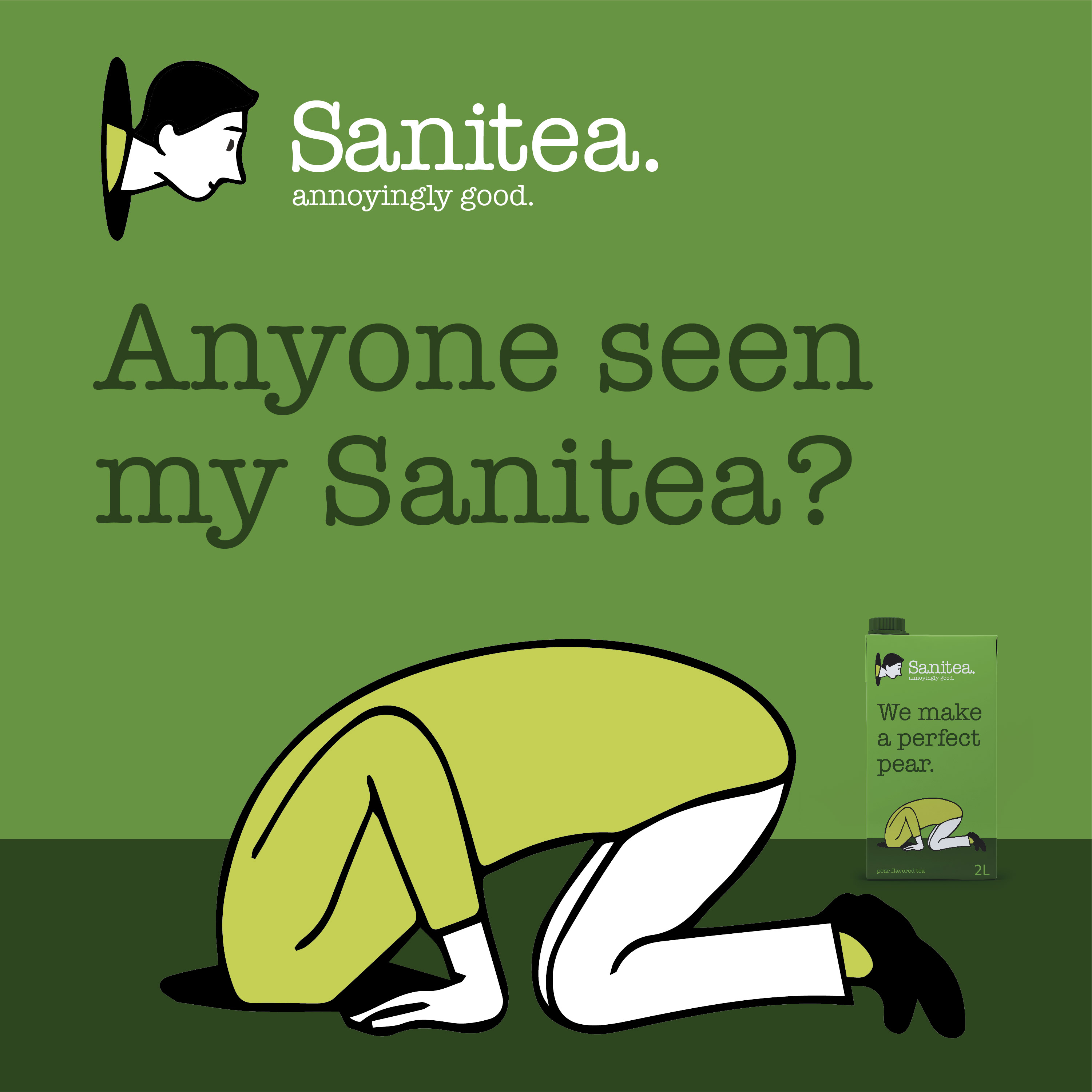
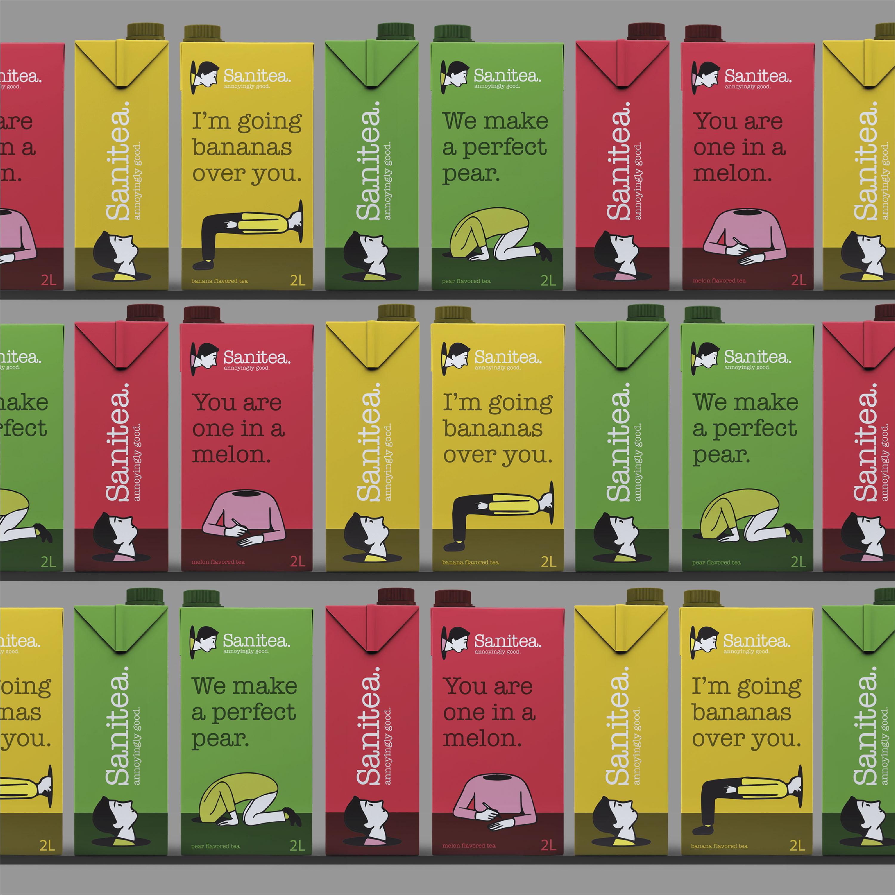
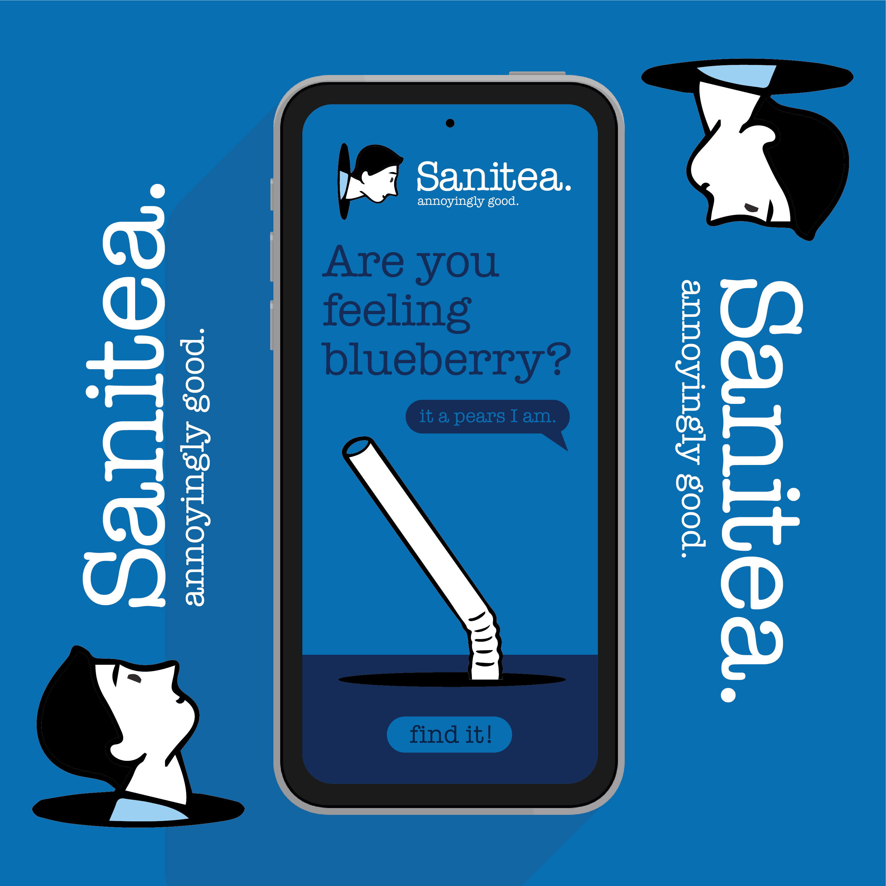
Sanitea – Concept for a cause-based line of teas that promotes calm and fosters balance. The idea of maintaining mental stability and equanimity by introducing a product line with benefits that include stress reduction was the purpose and natural progression of the creative. Visualizing the “search” for oneself is depicted as a character on the package always looking for “it”— the calm, the balance, the center. The character is always playful and satirical yet approachable and relatable. He is literal yet open to interpretation which has always been the point for me. It’s about what you, the audience or the consumer, take away from it.
Good design thinking is about finding that hidden truth of the brand and doing it in a way that feels authentic. I wanted to tell a story through empathy, to create something that let others know they’re not alone in how they feel. We’re all in this together, and like Marc Gobé once said, in his wonderful French accent, “the instinctive nature of the creative process leads to unusual solutions that make brands resonate with people in real ways.”
We live in trying times. Some days you’re on, some days you’re off, and every day there’s introspection. “How am I feeling today? Where is my head? Is it on straight? Is it on…at all?” Throughout my 20+ year career, I’ve worked as a Brand & Design Director with a heavy concentration in Packaging. I’ve gotten pretty good at visualizing my emotions, and the emotions a brand is trying to convey. I am passionate about telling those stories through the design on pack. So, rather than suppressing my stress and anxiety, I let my mind personify those feelings as reflected through the lens of brand.
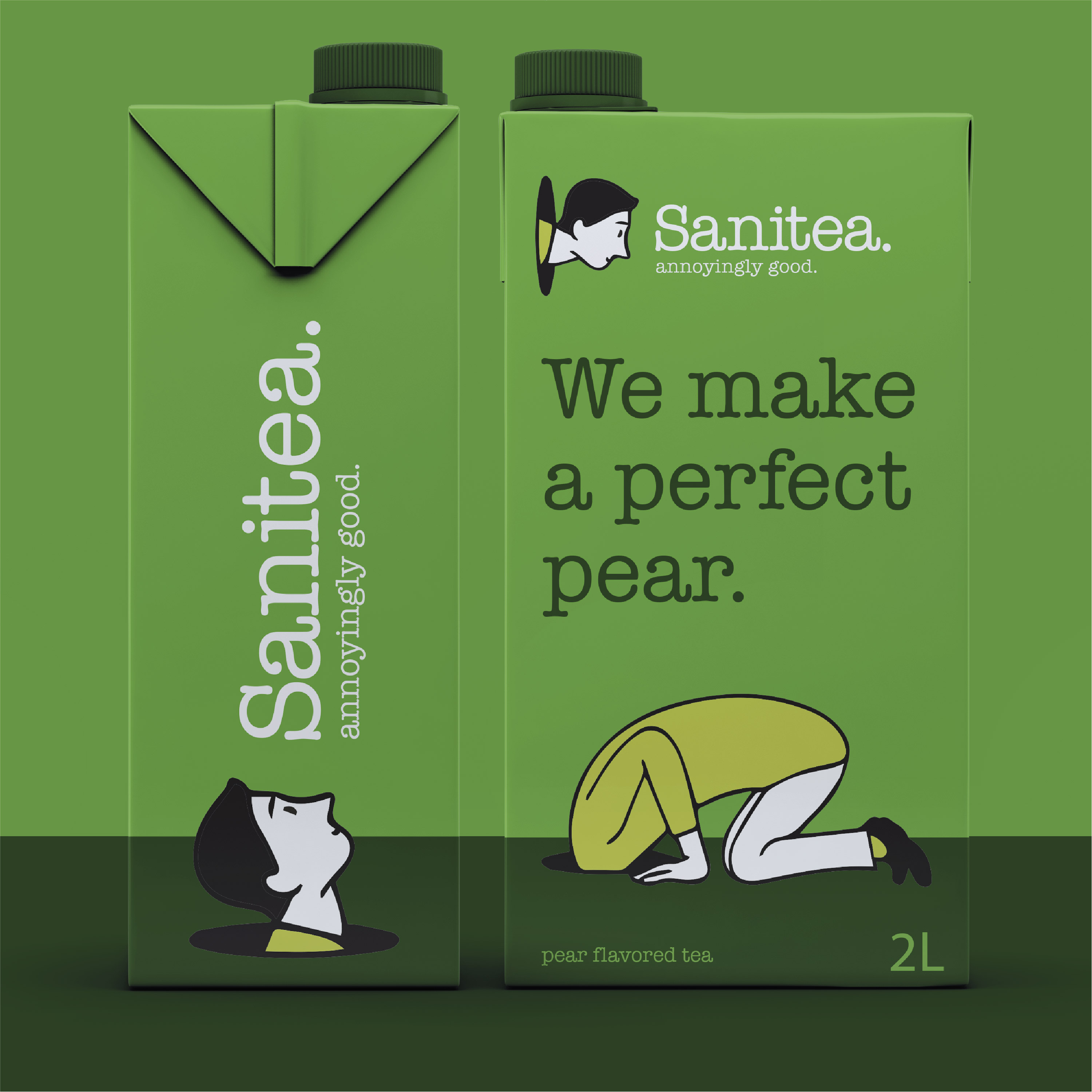
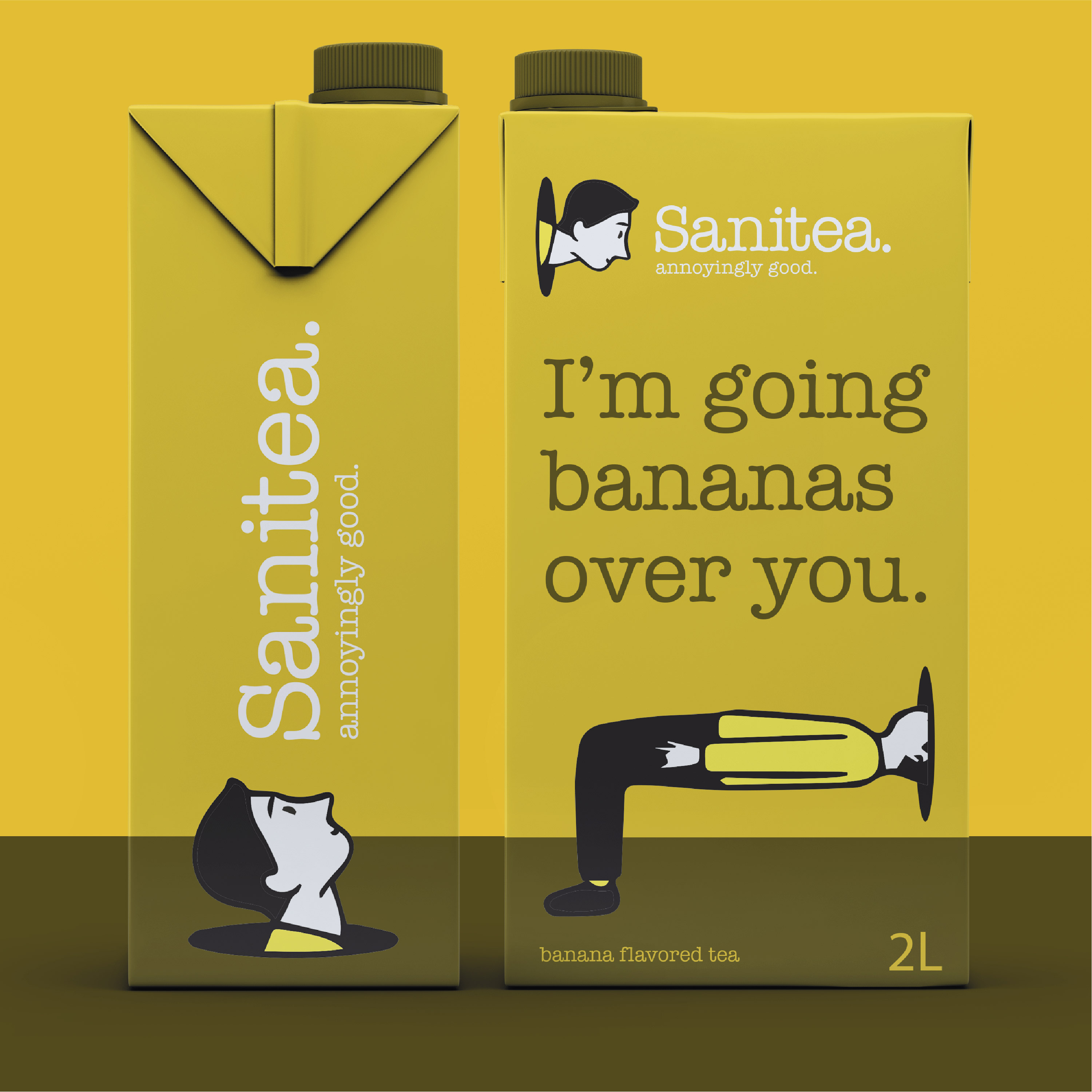
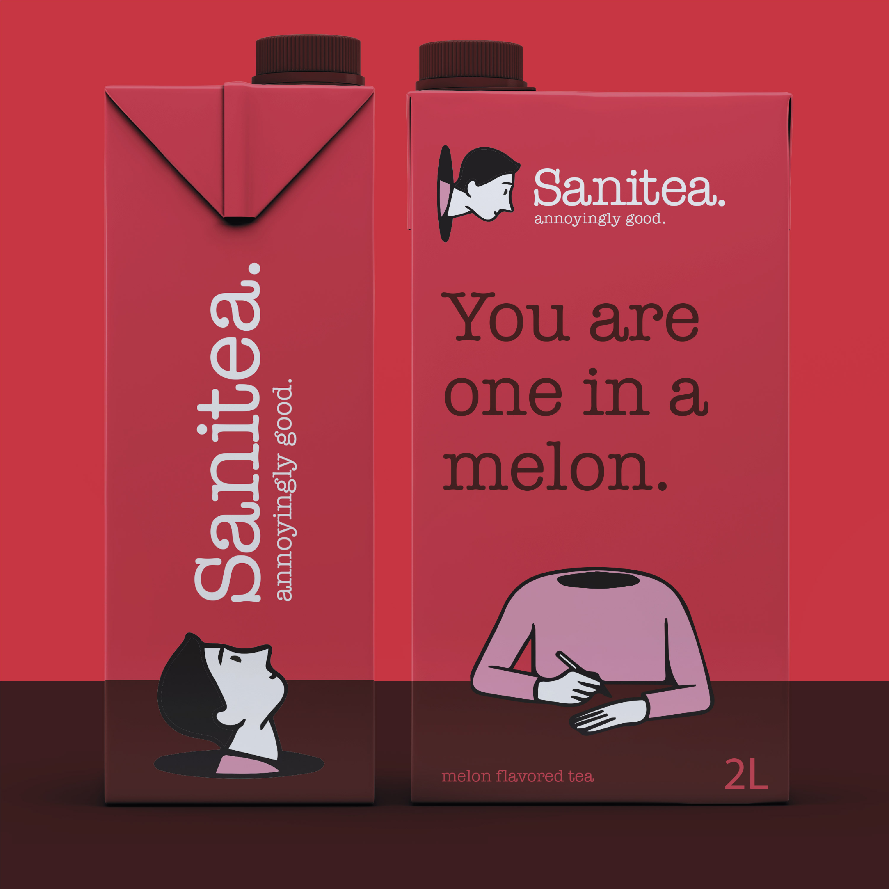
CREDIT
- Agency/Creative: Work and Company
- Article Title: Sanitea Concept that Promotes Calm and Fosters Balance, Designed by Work and Company
- Organisation/Entity: Agency
- Project Type: Packaging
- Project Status: Non Published
- Agency/Creative Country: United States
- Agency/Creative City: Brooklyn, New York
- Market Region: Global
- Project Deliverables: Packaging Design
- Format: Box
- Substrate: Pulp Paper
- Industry: Food/Beverage
- Keywords: Tea, Iced Ted, Sanity, Mental, Health
-
Credits:
Design Director: Gene Portnoy


