Midday – Real Handful
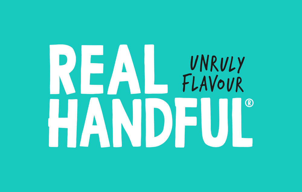
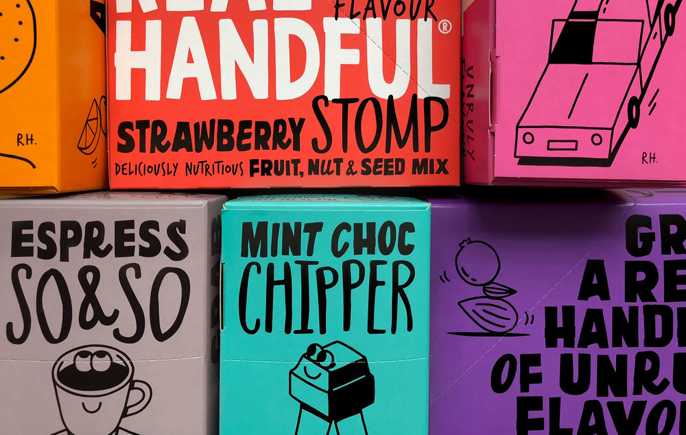
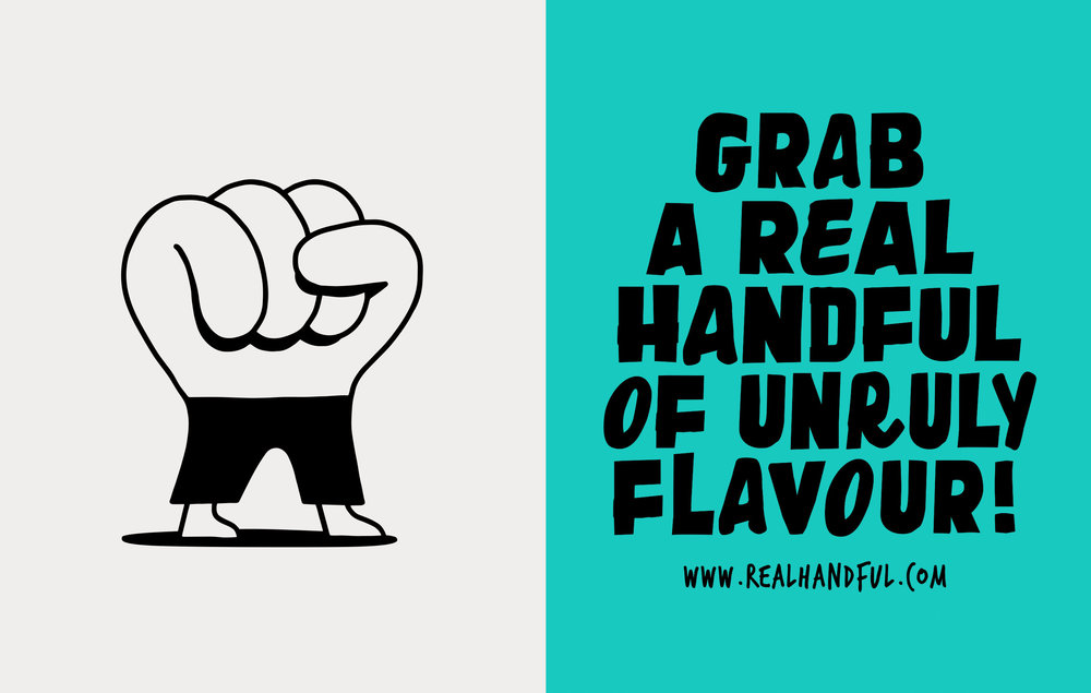
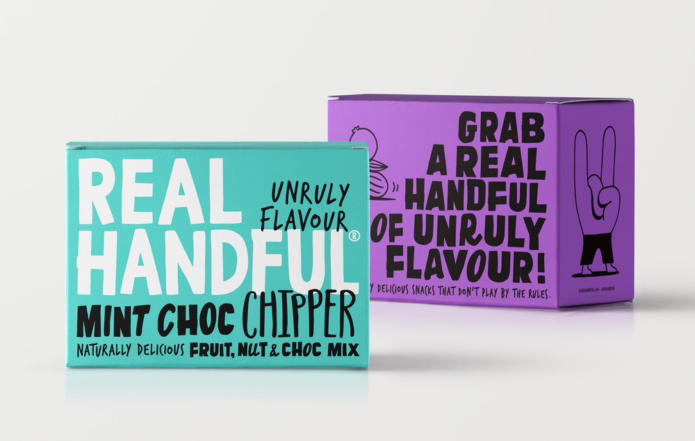
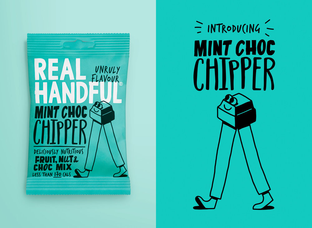
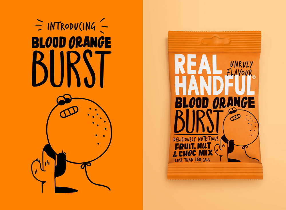
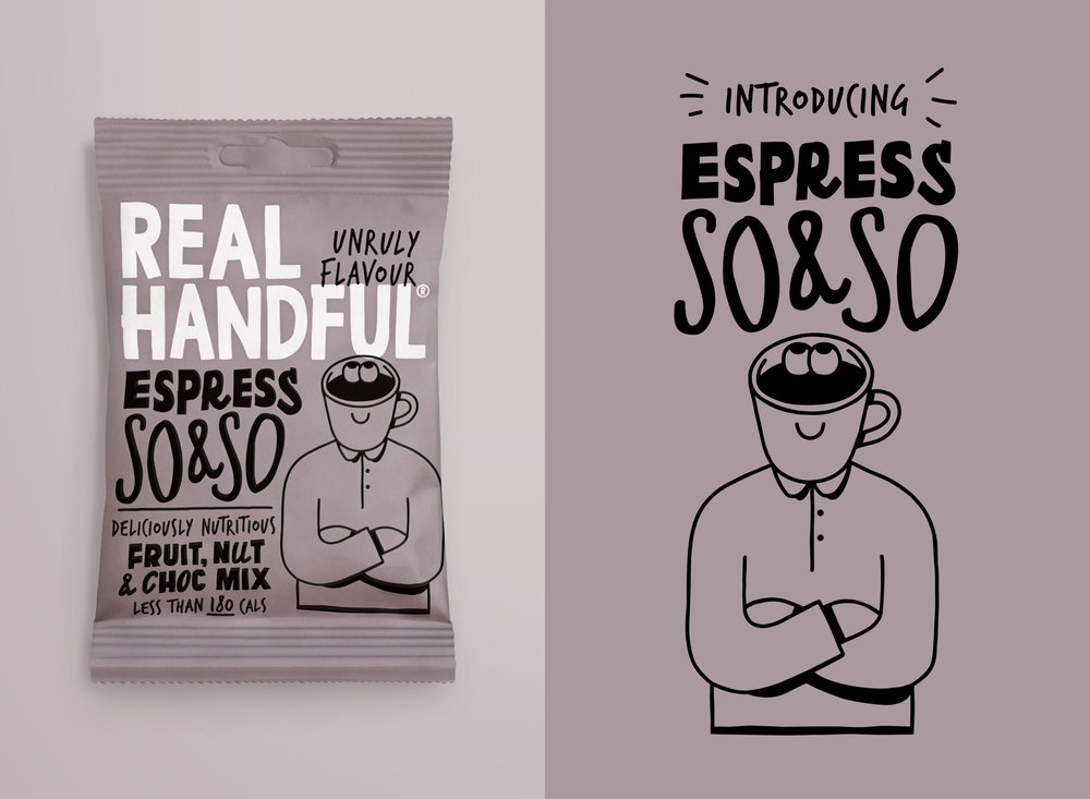
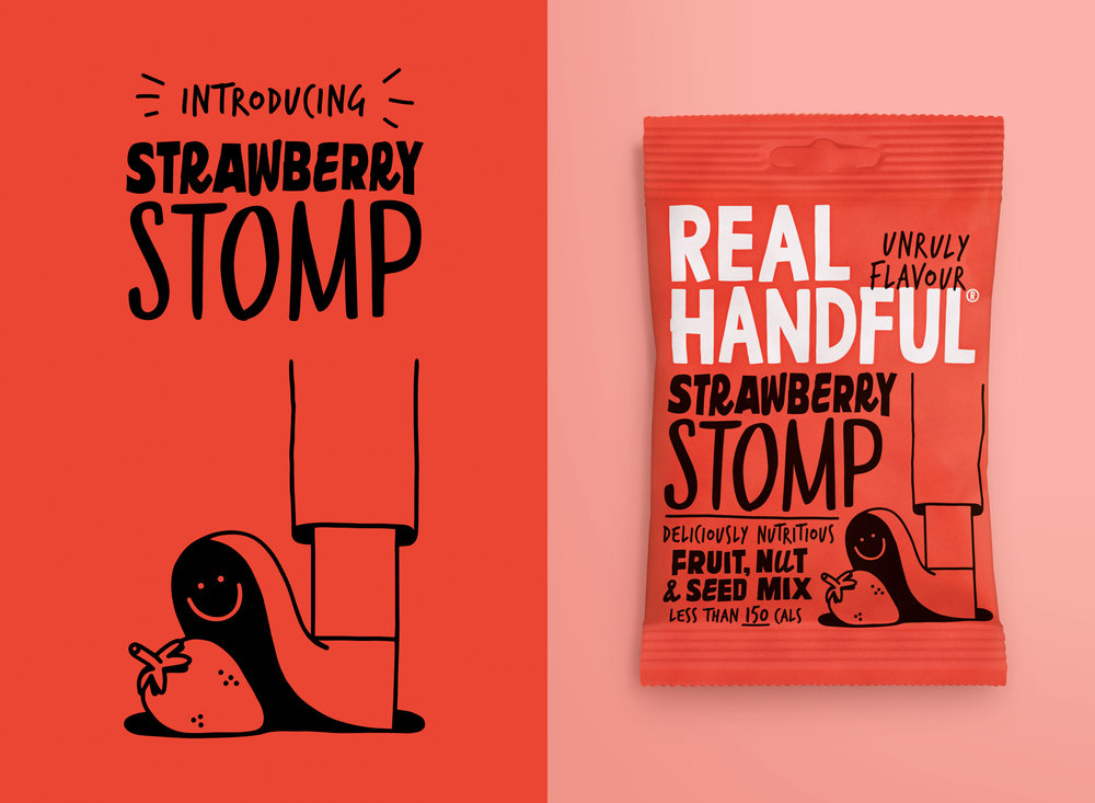
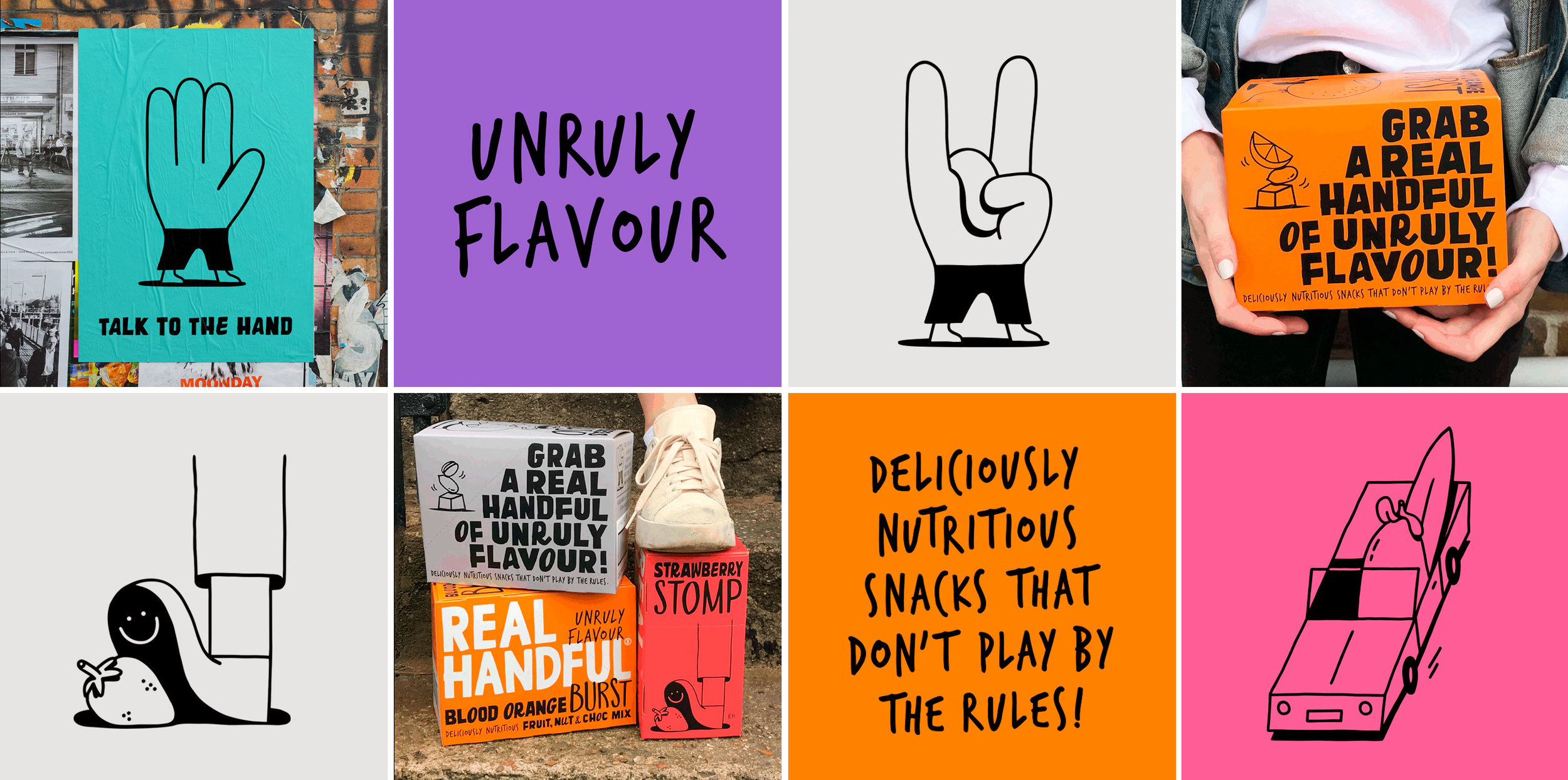
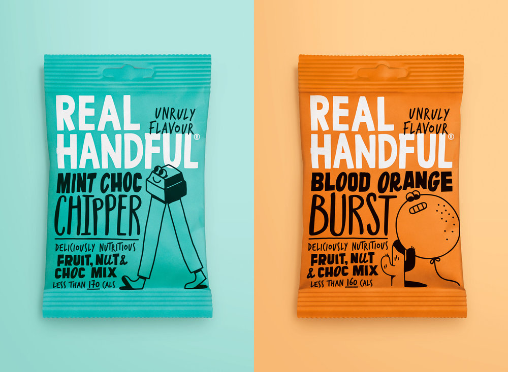
“Nutritious snacking brand Real Handful re-launch with new identity created by design studio Midday. Real handful was struggling to make an impact in a cluttered snacking category. Having identified a need to engage consumers on a new level Midday repositioned the brand, moving it away from its original energy focussed message to something more unique and relevant to the brand and its products. Based on the strong rebellious brand name and innovative products including all-natural Blueberry infused raisins, Midday created a new direction for the brand which is encapsulated in the ‘Unruly Flavour’ design essence. This essence now informs the brand’s visual language across all touch points.Joe Taylor, Founder, Real Handful, says: “From start to finish our rebrand project with Midday has been exciting. Midday pushed us to reflect on our mission at Real Handful, what we stand for now and and what we’re looking to create in the future. The end result of this – our Unruly Flavour positioning – is a direction that is disruptive to our category today but also true to everything we’re looking to build going forward. My only regret is that we didn’t start working with Midday sooner!”To achieve standout in a competitive yet often unsuprising category Midday focussed upon injecting real and untamed personality into the brand. Using creative product naming they inspired a cast of surreal characters to bring the brand to life in a bold and unrestricted manor. Midday collaborated with the hand of illustrator George(s) to create the illustrative content for the brand. With a growing range of 8 core products and NPDs in the pipeline Real Handful are looking to shake up the nutritious snacking category. Deliciously nutritious snacks that don’t play by the rules!Will Gladden, Creative Partner, Midday, says;“Real Handful understood they needed to strengthen their brand to compete and it’s been a pleasure working with them to do so. The potential of such an awesome brand name allowed us to let loose on this exciting and unruly design which gives the brand depth and infinite ways to entertain and engage with their consumers as they grow”