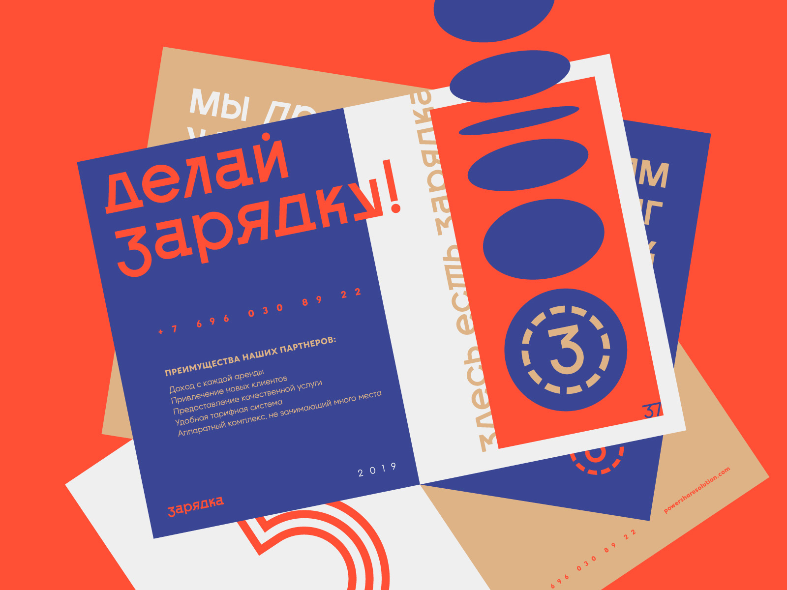
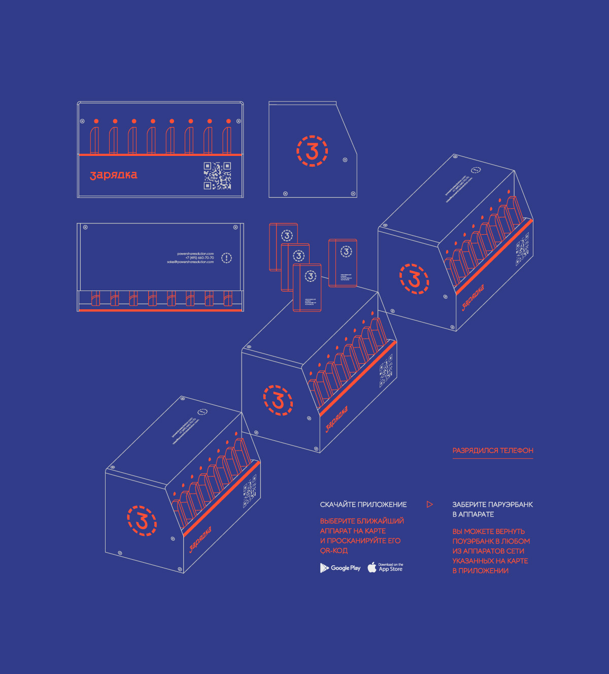
“Charging” is a service for short-term rental of portable batteries. The devices work automatically, all processes take place in the mobile application. Each device is part of the same network, which allows users to start renting in one place and finish in another.
Charging is a metaphor for a single and universal process for humans and electronics, giving a boost of energy for the whole day. In Russian, the word “zaryadka” has two meanings: electrical charging process / sports complex exercises. The duality of the metaphor provides a conceptual basis.The duality of the metaphor provided a conceptual and contextual basis for the implementation of the project.
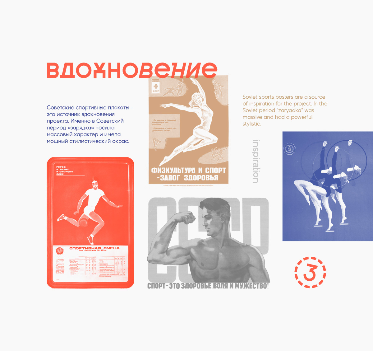
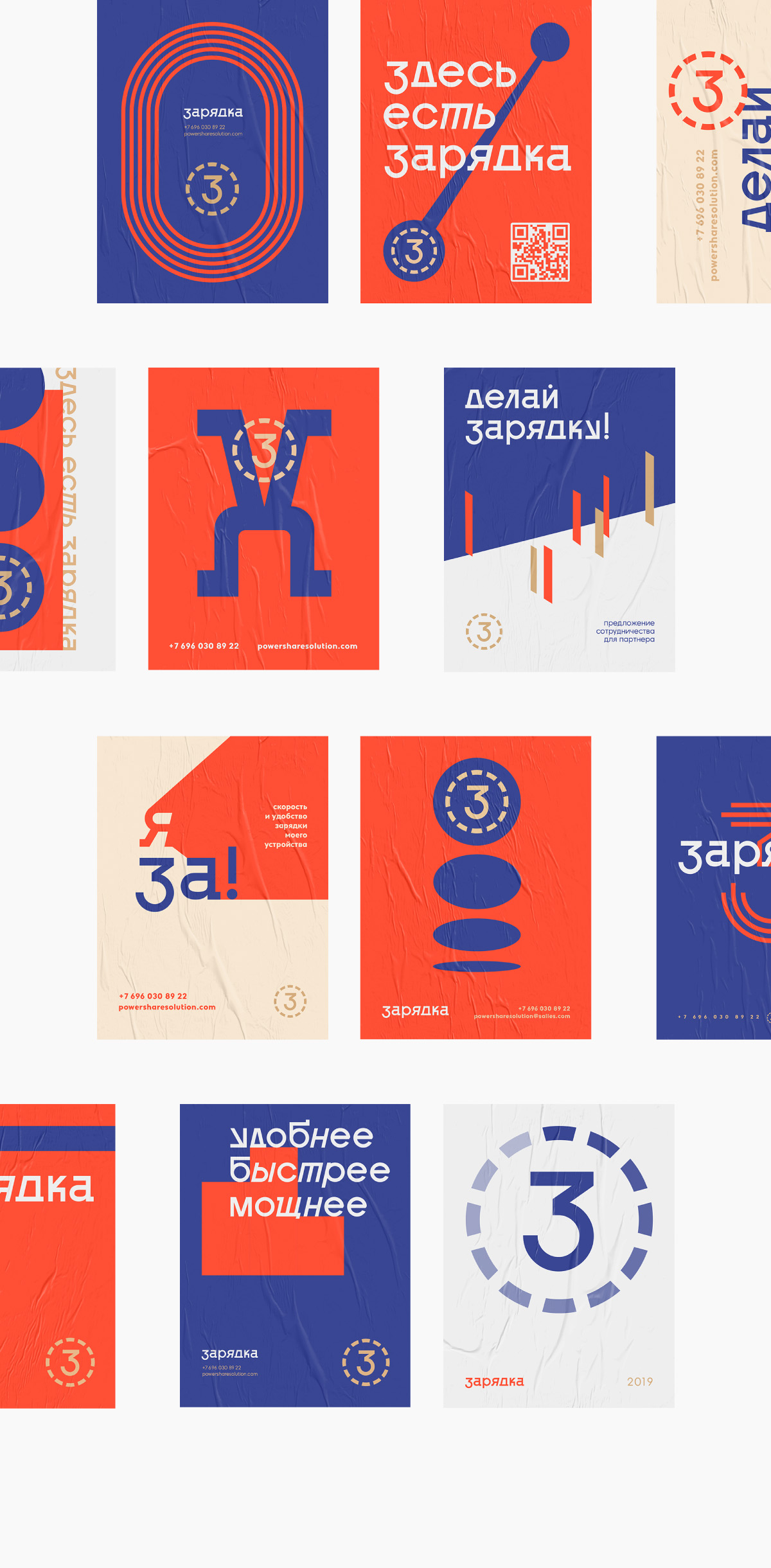
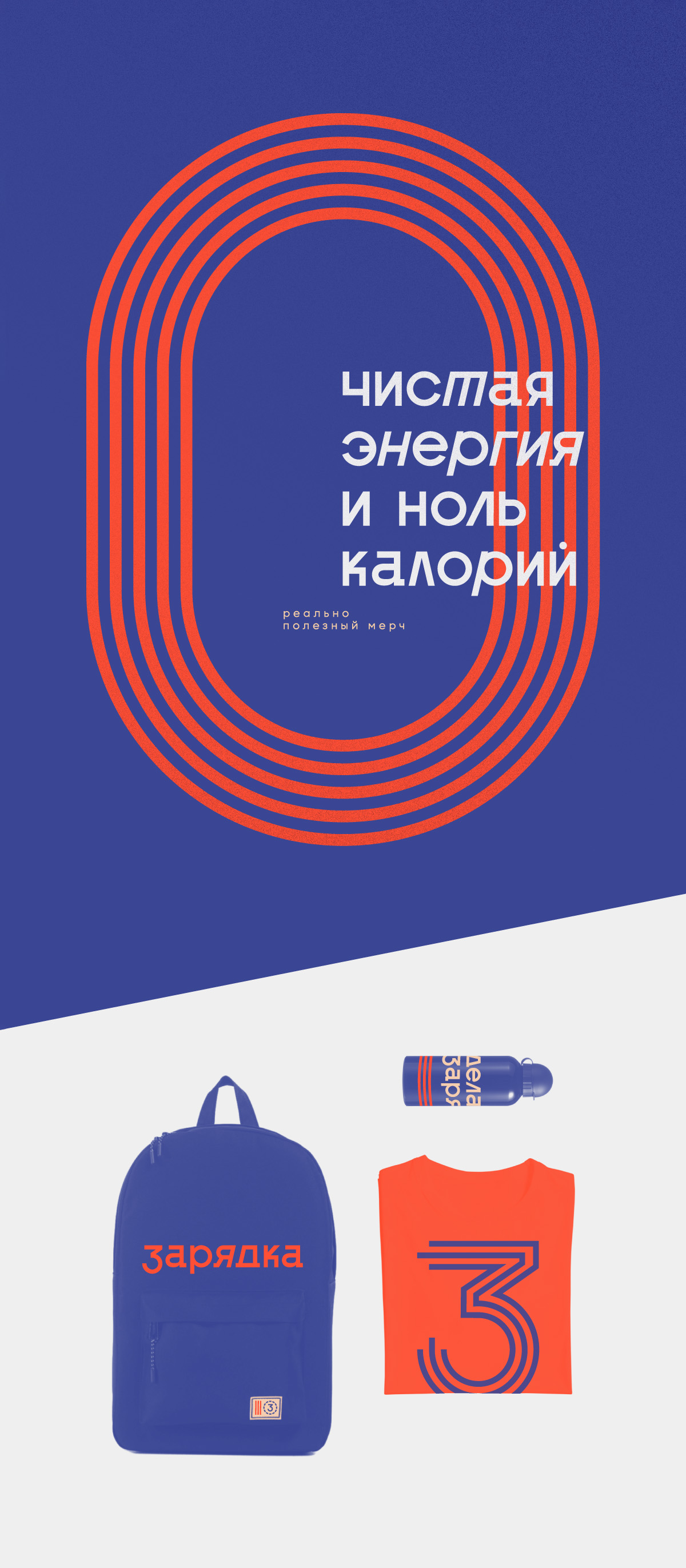
At the level of atmosphere and dynamics, the project is based on Soviet posters about sports and a healthy lifestyle. The general atmosphere, the dynamics of the composition and the traditions of typography and colors are taken from the Soviet design and modernized. The design of the device and components also refers to the constructive suprematist aesthetics.
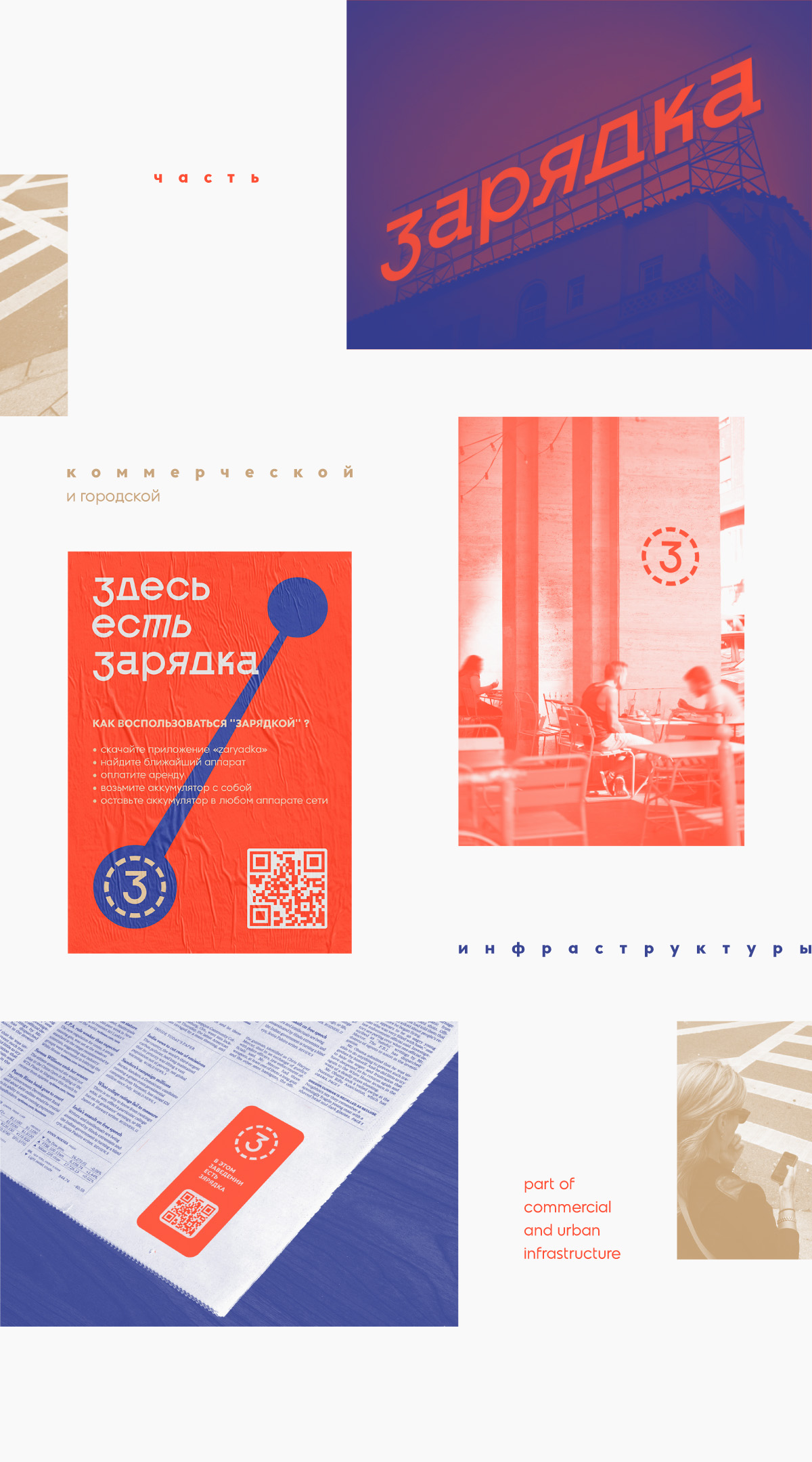
The style goes in two directions of communication at once. In the case of the device, signs, signs and other communication media, the design is minimalistic and works exclusively for effective brand identification. In the case of printed, advertising and image materials, there is much more stylistic space, which allows you to expand your identity to an art feed. The brand was created not just to exist in the environment of the city, but to be an effective part of its infrastructure. The final benefit for the consumer is at the forefront at all levels of the product.
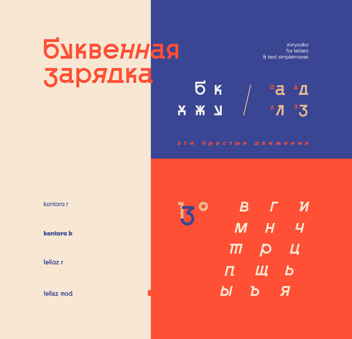
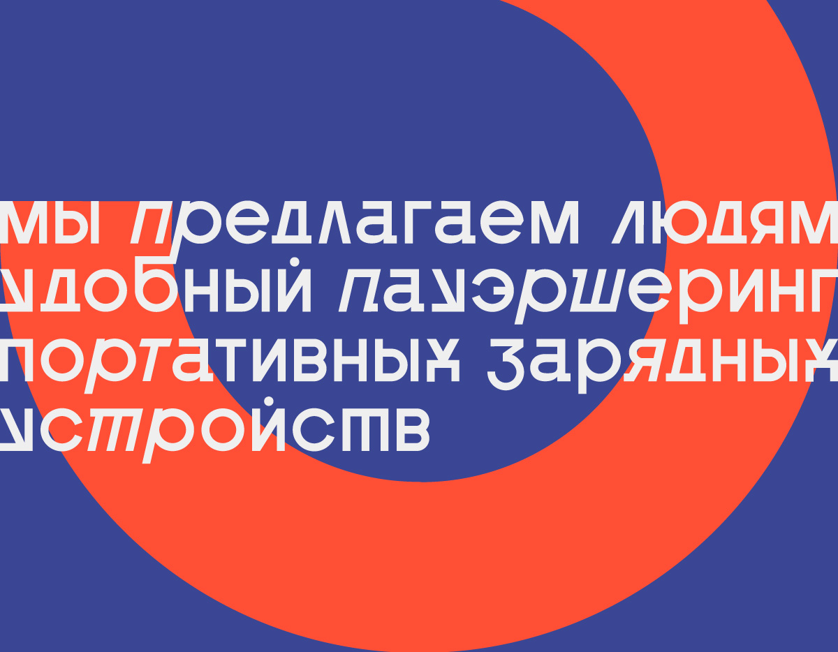
Competent work with the font in this project is an integral part of the atmosphere and communication. The typography is based on grotesque strict fonts with stylistic adaptation of individual letters and structures within the project metaphor. By adaptation, we mean giving some letters the appearance of “doing exercises”, as well as the introduction of italics (“stretching/tilting”) for individual parts in words/constructions. The stylistic basis of working with typography is laid down in everything, starting with the logo.


CREDIT
- Agency/Creative: Artgeneracia
- Article Title: Artgeneracia Created Branding for Zaryadka, Portable Batteries Rental Services
- Organisation/Entity: Freelance
- Project Type: Identity
- Project Status: Published
- Agency/Creative Country: Russia
- Agency/Creative City: Tver
- Market Region: Europe
- Project Deliverables: Art Direction, Brand Design, Brand Identity, Branding, Industrial Design, Logo Design, Typography
- Industry: Technology
- Keywords: brand identity, logo, logotype, graphic design, typography, art direction, corporate identity, sharing, charging, power, ussr, energy
-
Credits:
Art-direction & brand design: Ivan Voznyak


