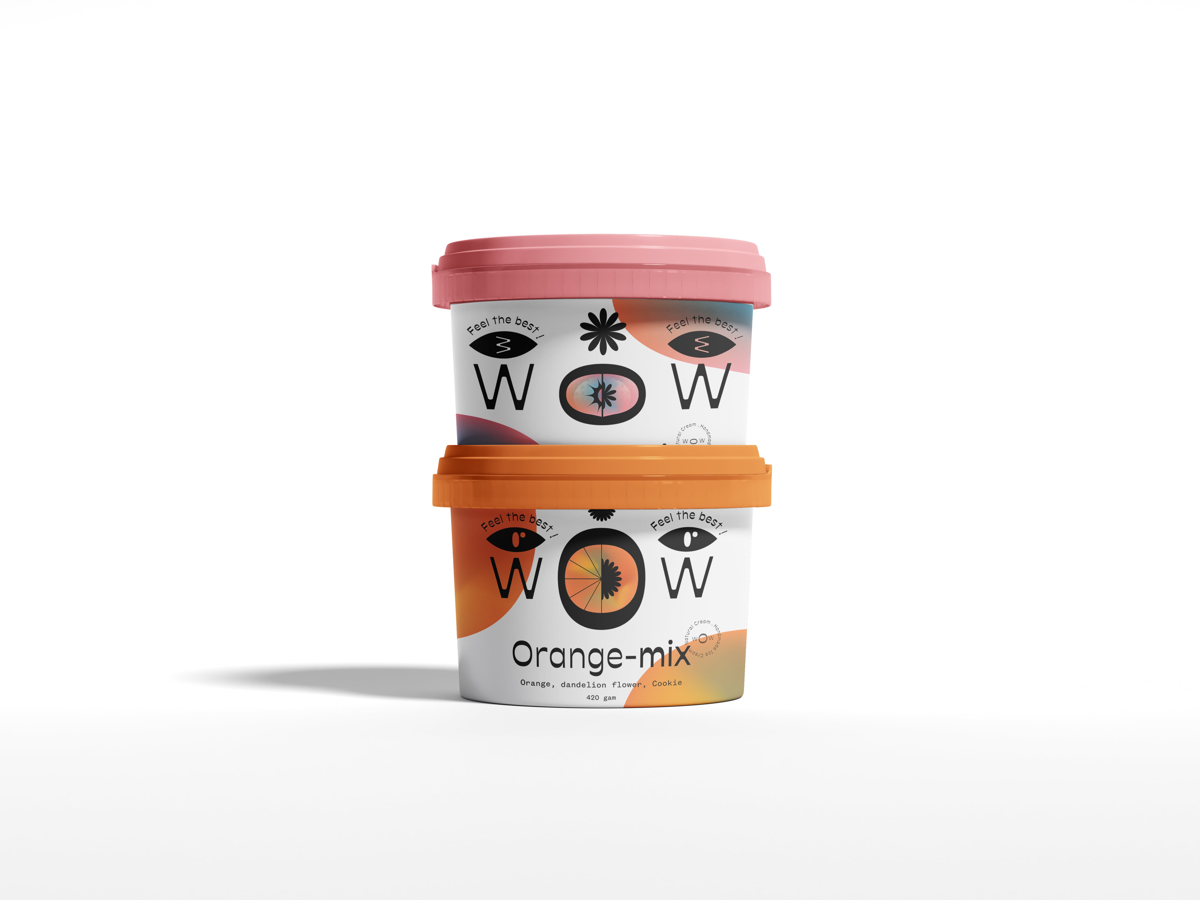
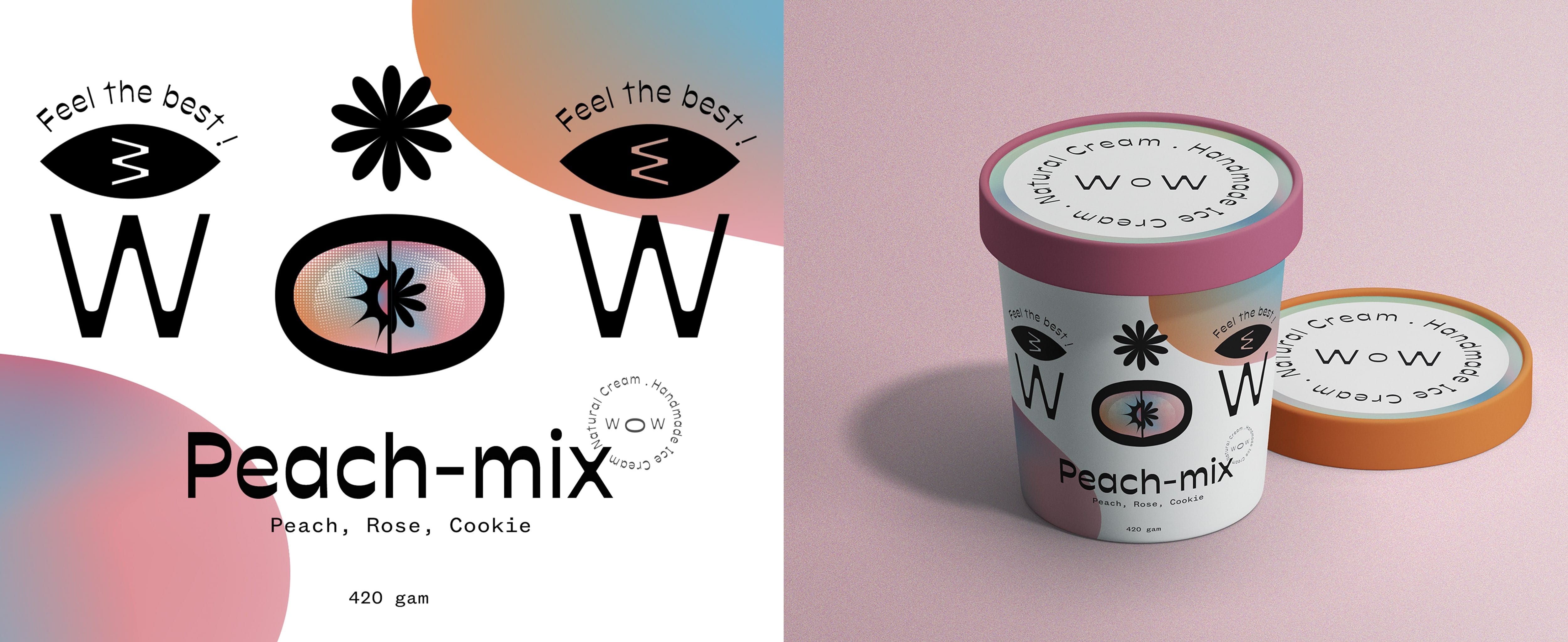
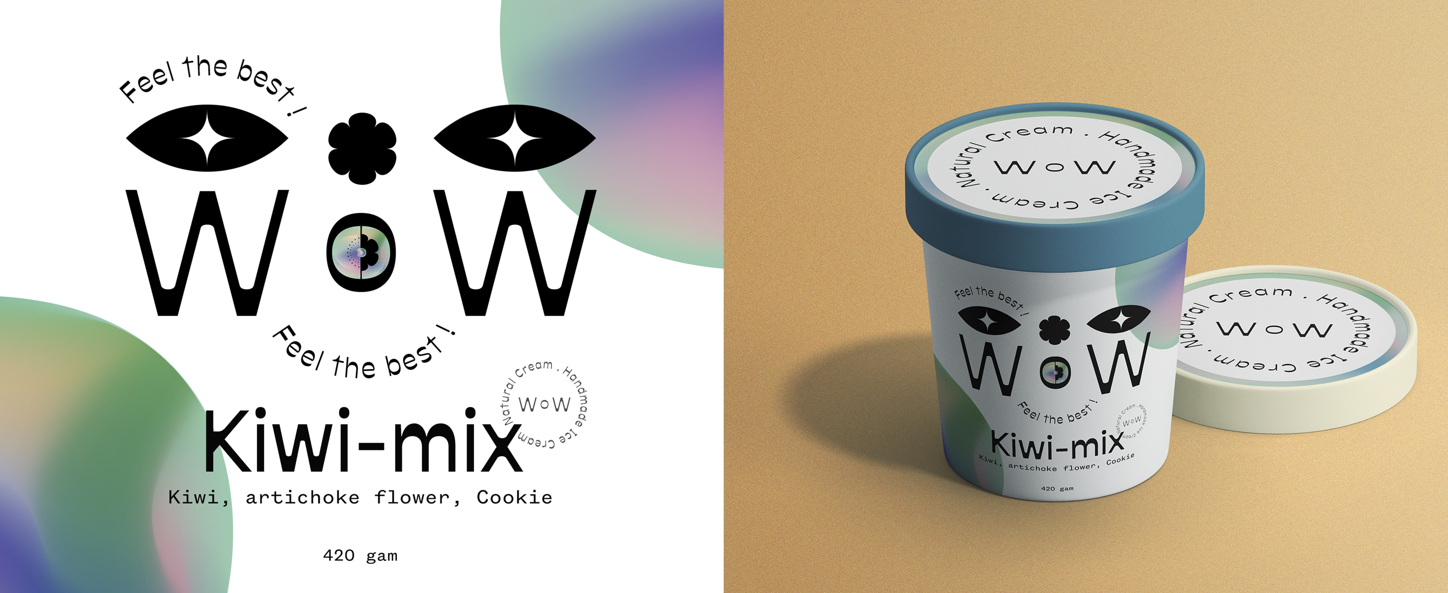
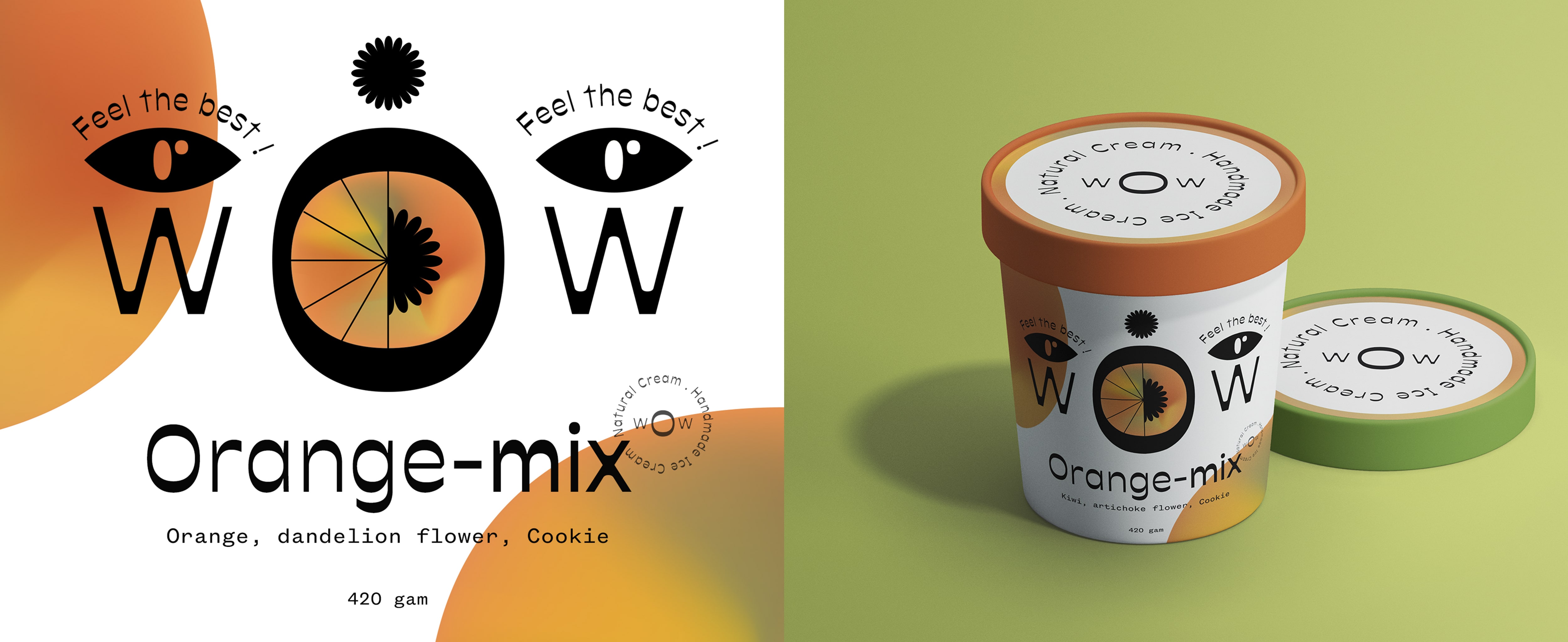
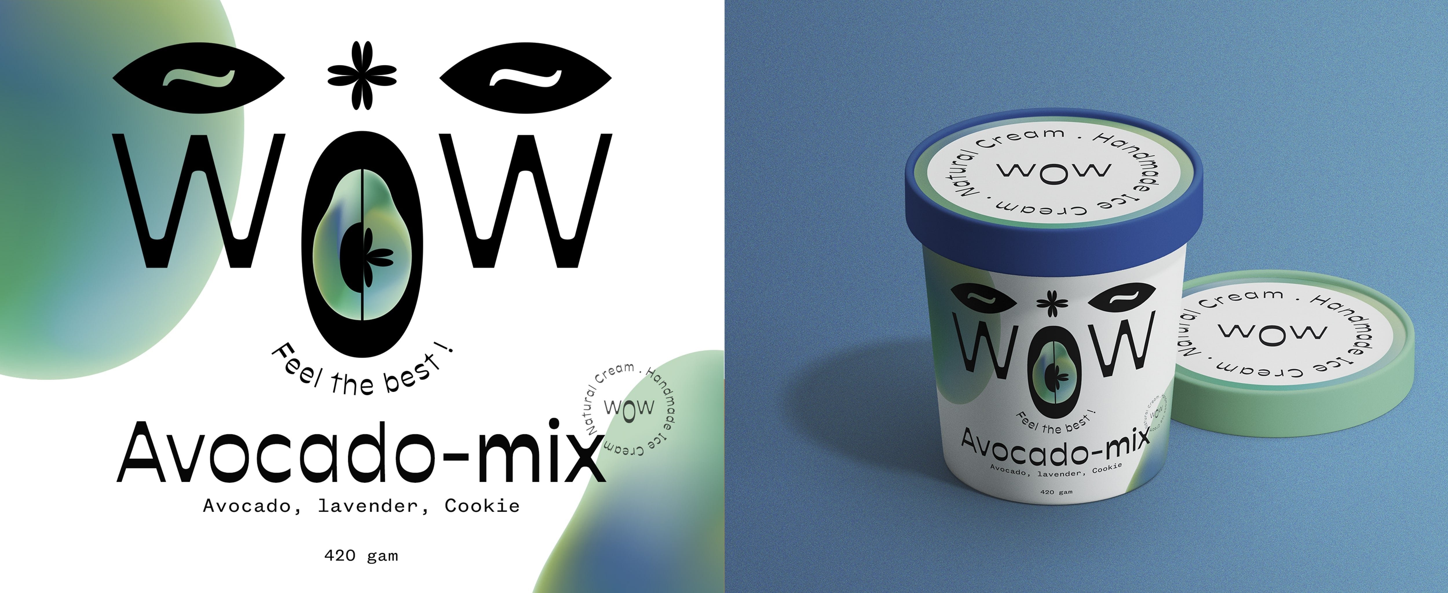
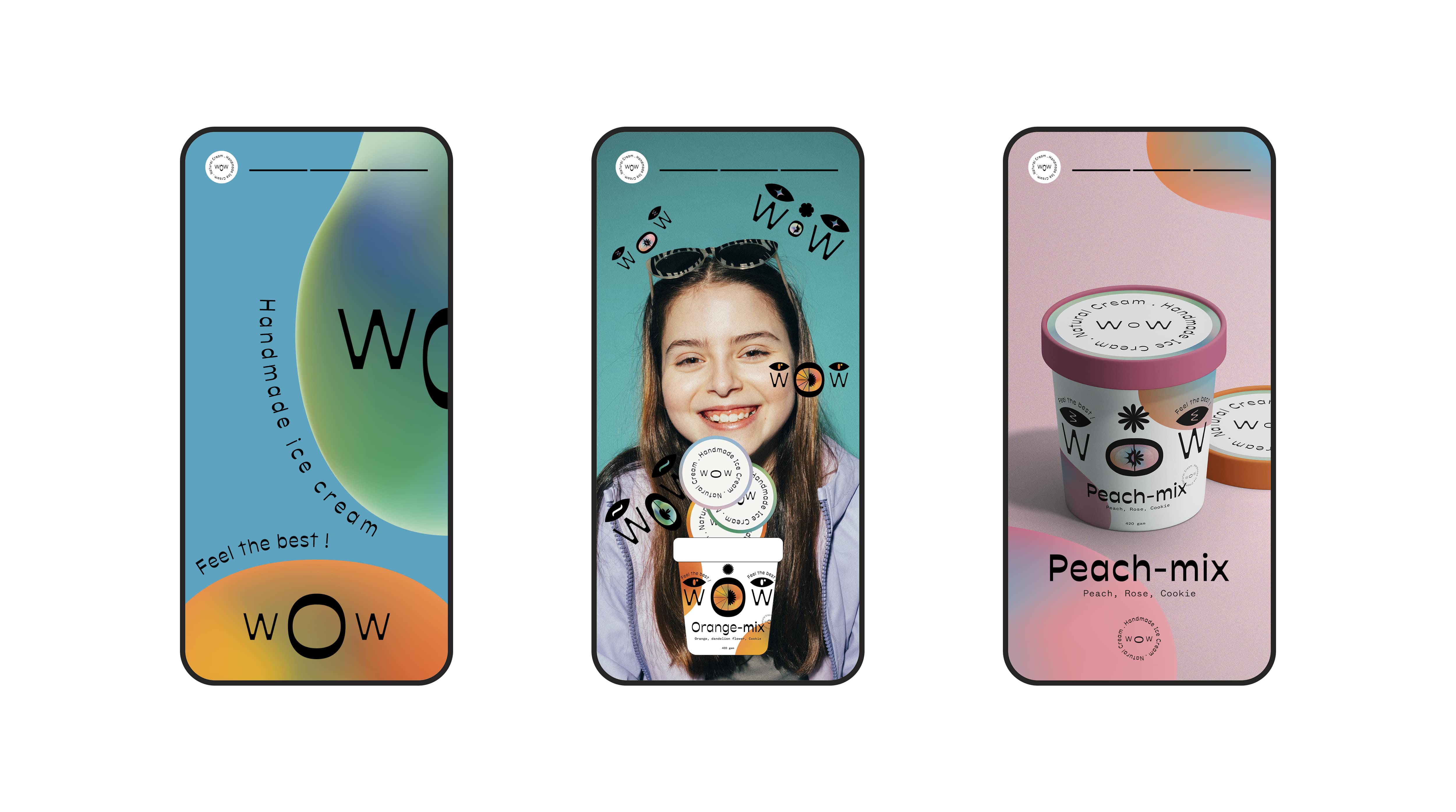
Our mission was to develop a packaging for WoW Ice Cream creams. Our goal is to convey in the design the main advantage of the product, which is homemade ice cream with natural fruit ingredients, a combination of edible fruits and flowers, and of course, it is very healthy and does not contain chemical dyes.
Product: Homemade ice cream is made with mixed fruits and edible flowers. The floral ingredient added to the ice cream is a type of topping, making the ice cream more interesting to enjoy. Homemade ice cream ensures food safety and hygiene, and does not use colorants. The color of the cream comes from the natural color of fruits such as avocado, peach, kiwi, orange, … ,very beneficial for health. The ice cream taste is not too sweet but sour and cool, creating a cool feeling for hot summer days.
Market and competitors: They mainly have traditional packaging, familiar fonts and images of ice cream, not having exploited other aspects and strengths of a particular ice cream.
Consumers: Our consumers usually fall in the age group of 10 – 40 years old mainly. These people love natural ingredients in the products they use, care a lot about their health, and lead a healthy life. Naming: With the name “WoW Ice Cream” , the owner told stories about the first time he ate ice cream, and that feeling made him “WoW”, and it came back him every time he ate ice cream. He also has love for ice cream, so he decided to create an ice cream that makes everyone “Wowwww” like him every time they eat ice cream. Interesting !
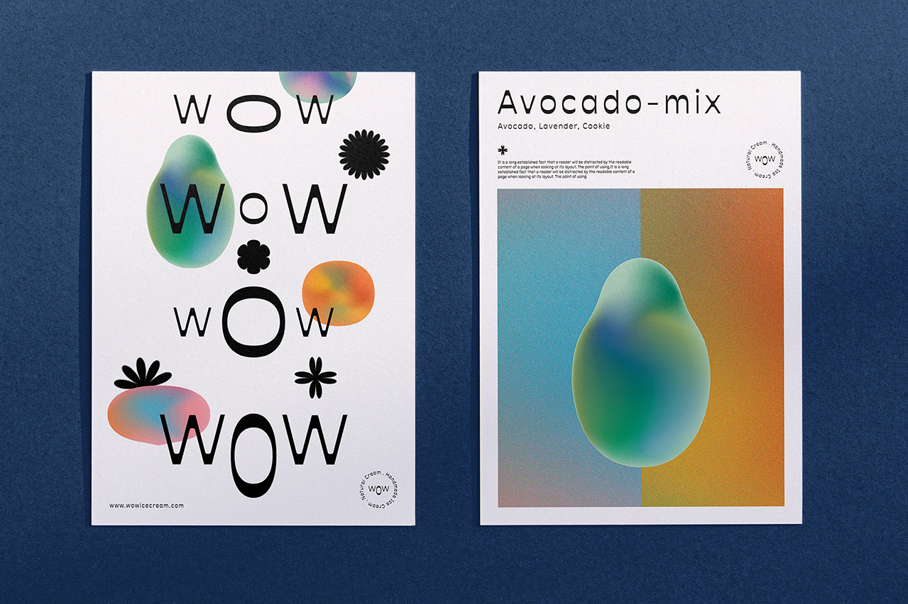
Design concept: The name ” WoW Ice Cream ” has given us many new and interesting design inspirations. We focus on how our customers feel when they eat ice cream. The feeling of “Wow” will take on many different shapes. Some people will “Wow” loudly, others will “Wow” in a softer way. We did not choose to use illustrations of ice cream, but just wanted to create a kind of feeling when the customer first saw the ice cream. Hey, they will “wow”.
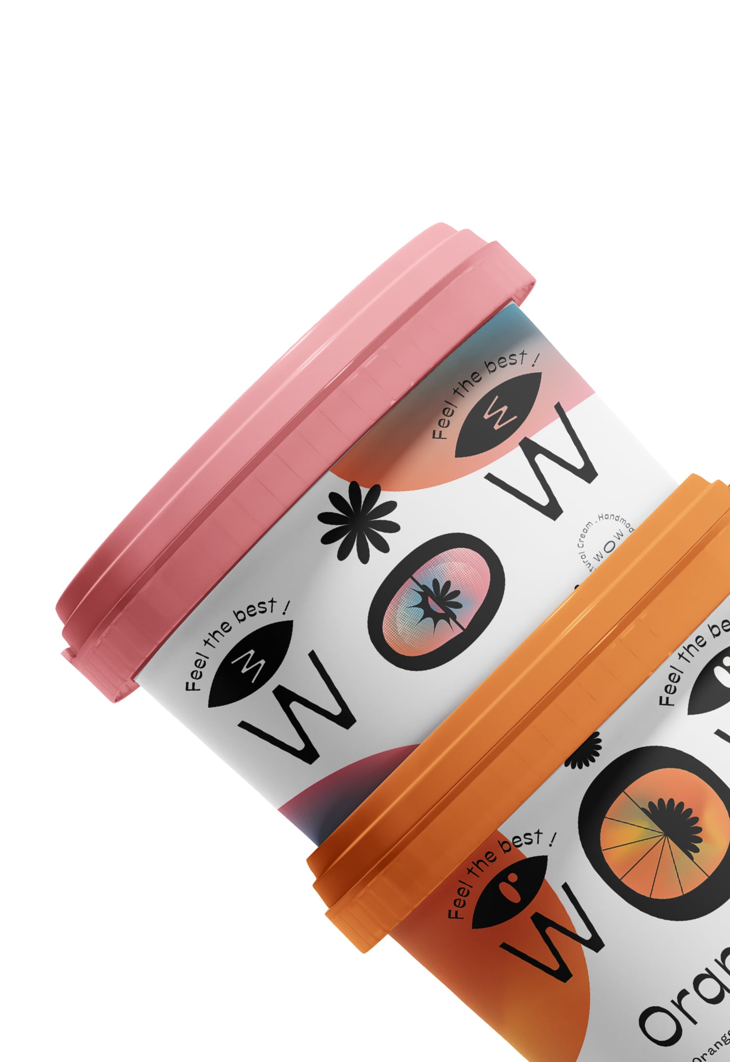
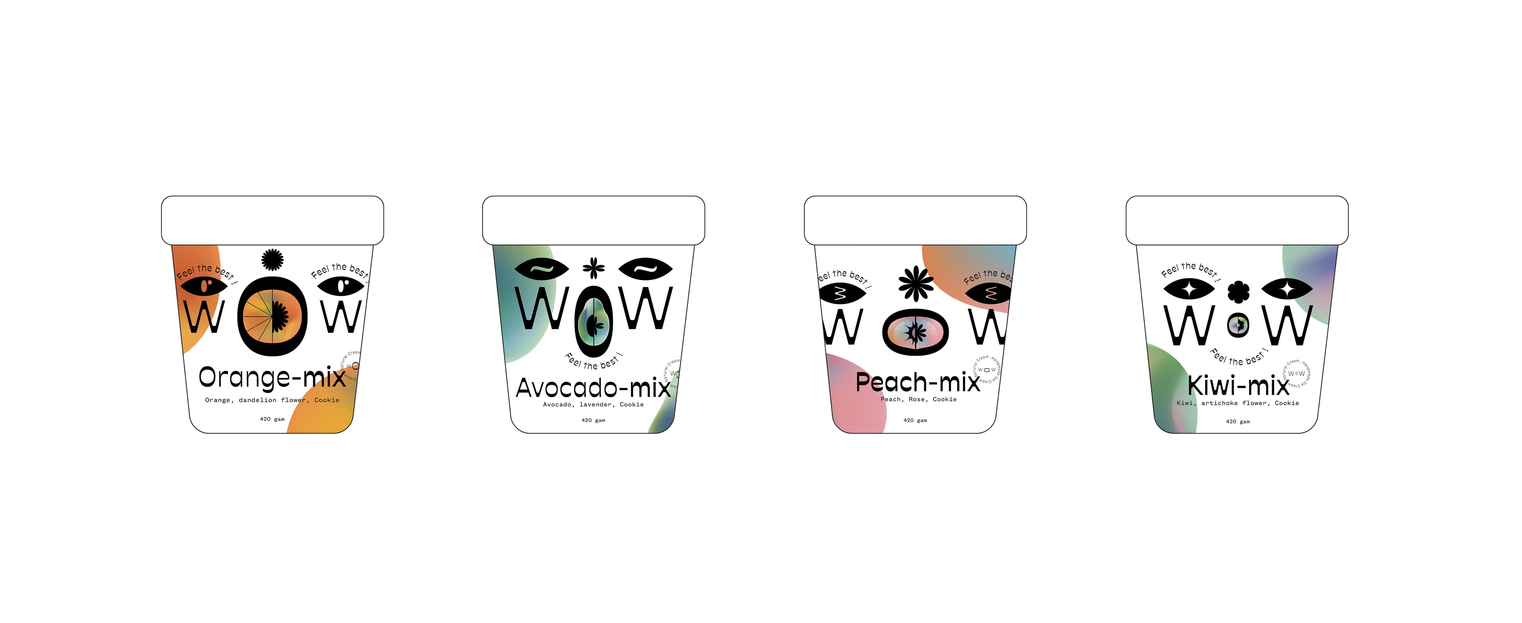
Design: We put an emotional illustration in the center of the packaging, which attracts customers to buy ice cream. The illustrations are different “wow” emotions, and it is designed with the word “wow” combined with drawings of the ingredients of the ice cream. Each type of ice cream will be a different kind of “wow” emotion. We resized the letters “o ,w” to form the most excited, hilarious “wow” faces. We want to convey the positive energy that this ice cream brings to the consumers. We use striking bright colors that match the sweet and sour taste of ice cream such as orange, pink, green, blue.
Hope everyone will like ” WoW Ice Cream “.
CREDIT
- Agency/Creative: huy oanh tuong
- Article Title: WoW Ice Cream Student Concept by Huy Oanh Tuong
- Organisation/Entity: Student
- Project Type: Packaging
- Project Status: Published
- Agency/Creative Country: Vietnam
- Agency/Creative City: Hồ Chí Minh
- Market Region: Asia
- Project Deliverables: 2D Design
- Format: Bottle, Cup
- Substrate: Pulp Paper
- Industry: Food/Beverage
- Keywords: ice cream, handmade, nature, juice
-
Credits:
huy oanh tuong: huy oanh tuong


