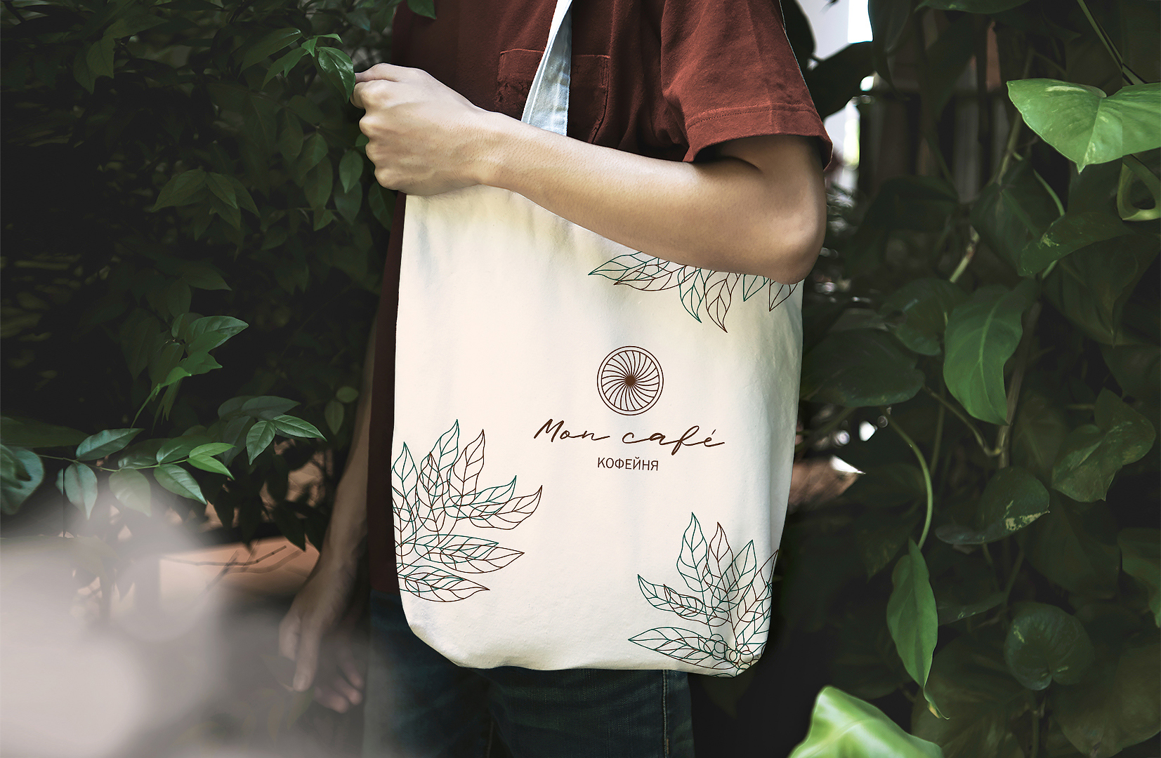
Rebranding for the coffee house “Mon cafe” by Sapunova food and people agency. The coffee shop has been working for about 10 years and brand’s components have lost their relevance. “Mon cafe” is located in the northern part of Russia and in winter the temperature drops to -58° С. That’s why we decided to base style on natural elements. In this case a brand should be cozier and more attractive for guests. Our goal was to create an atmosphere of comfort and warmth.
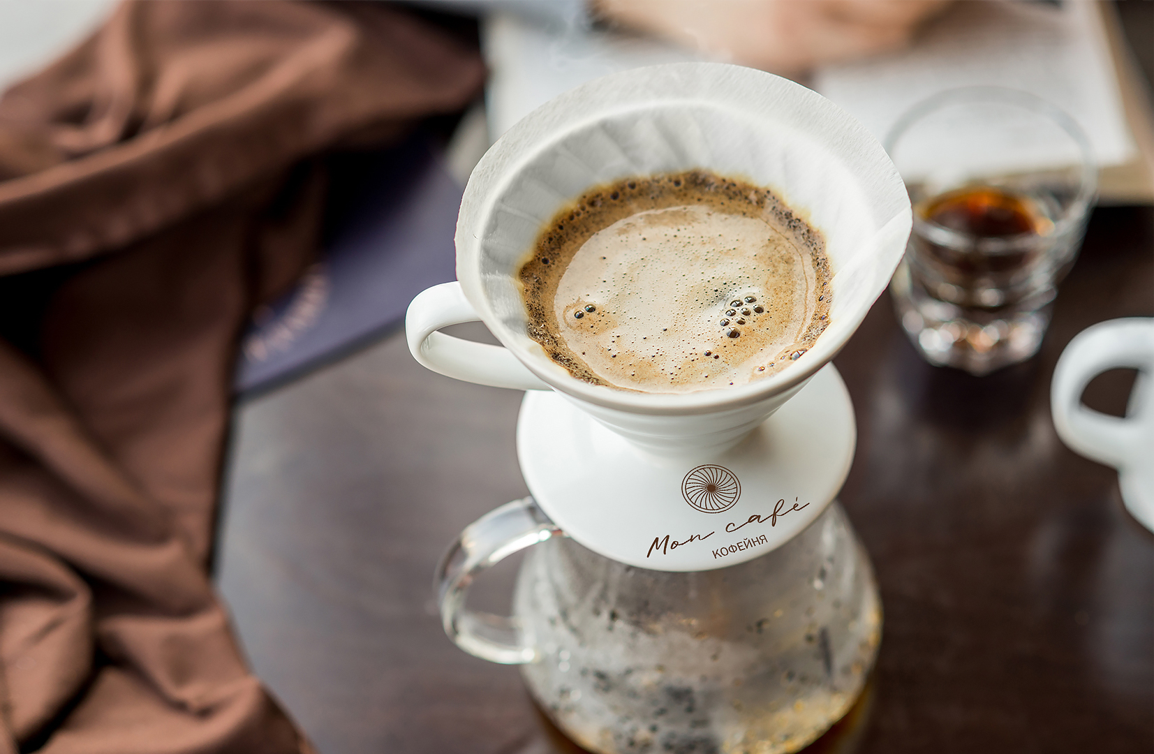
We showed several concepts of brand visualisation. In the process of working with a project, we mixed natural elements with a coffee style. The logo is a funnel of a pourover from above. Alternative coffee is part of the coffee culture that the coffee house shows. In the coffee house “Mon cafe” guests can order an alternative coffee or buy special dishes for making it.
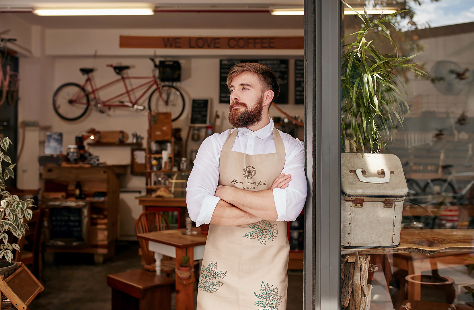
We have added coffee leaves to the pattern, which are duplicated in brown and emerald. We combined the classic coffee color and the color of nature.
The pattern is used for all brand elements and makes more recognizable the coffee house “Mon cafe” from competitors.
As a result, our team made:
1. Corporate identity: logo, font, colour, guidebook
2. Brand elements: business cards, uniforms, labels, handbags
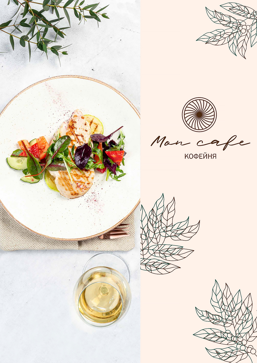
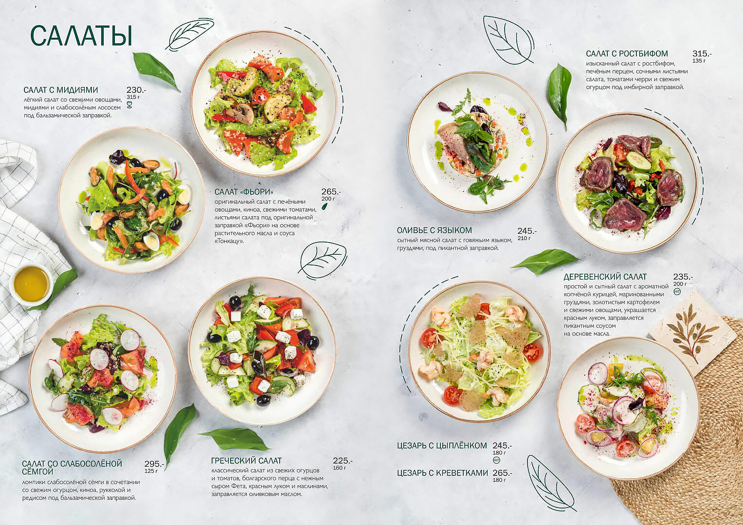
3. Menus: main menu, breakfasts, for children, seasonal offer
4. Packing: packing to go, branded cups.
Also, we had several shootings with a food photographer for menus. The branding was the basis for the interior with lots of living plants and warm color combinations.
CREDIT
- Agency/Creative: Sapunova Food & People Agency
- Article Title: Sapunova Food & People Agency Create Banding for Mon Cafe Coffeehouse
- Organisation/Entity: Agency
- Project Type: Digital
- Project Status: Published
- Agency/Creative Country: Russia
- Agency/Creative City: Novosibirsk
- Market Region: Asia, Europe
- Project Deliverables: Brand Creation, Brand Design
- Industry: Food/Beverage
- Keywords: coffeehouse cafe coffee branding menu food
-
Credits:
Art-director: Svetlana Sapunova


