Documentary films can perform various functions: informational, journalistic, scientific, popularization, educational, entertainment, and fiction. The main one, in my humble opinion, is the popularizing function, which helps the general public to more easily understand things that seem complicated at first glance.
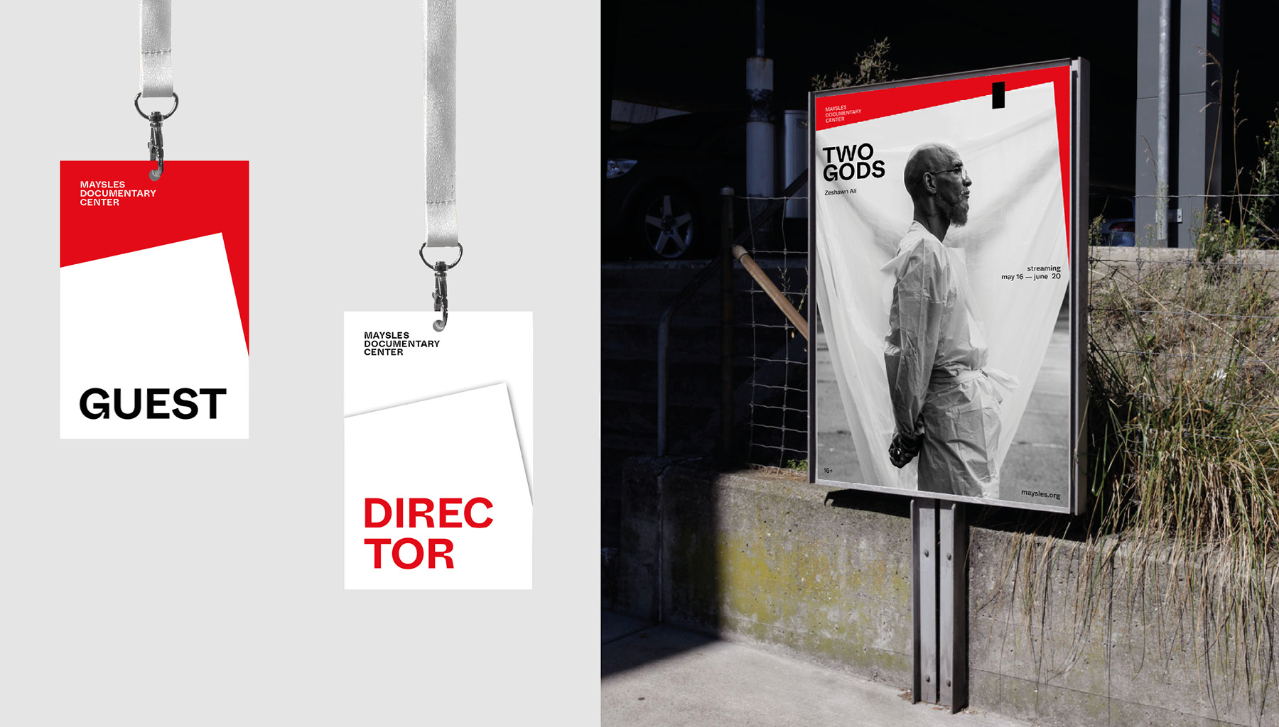
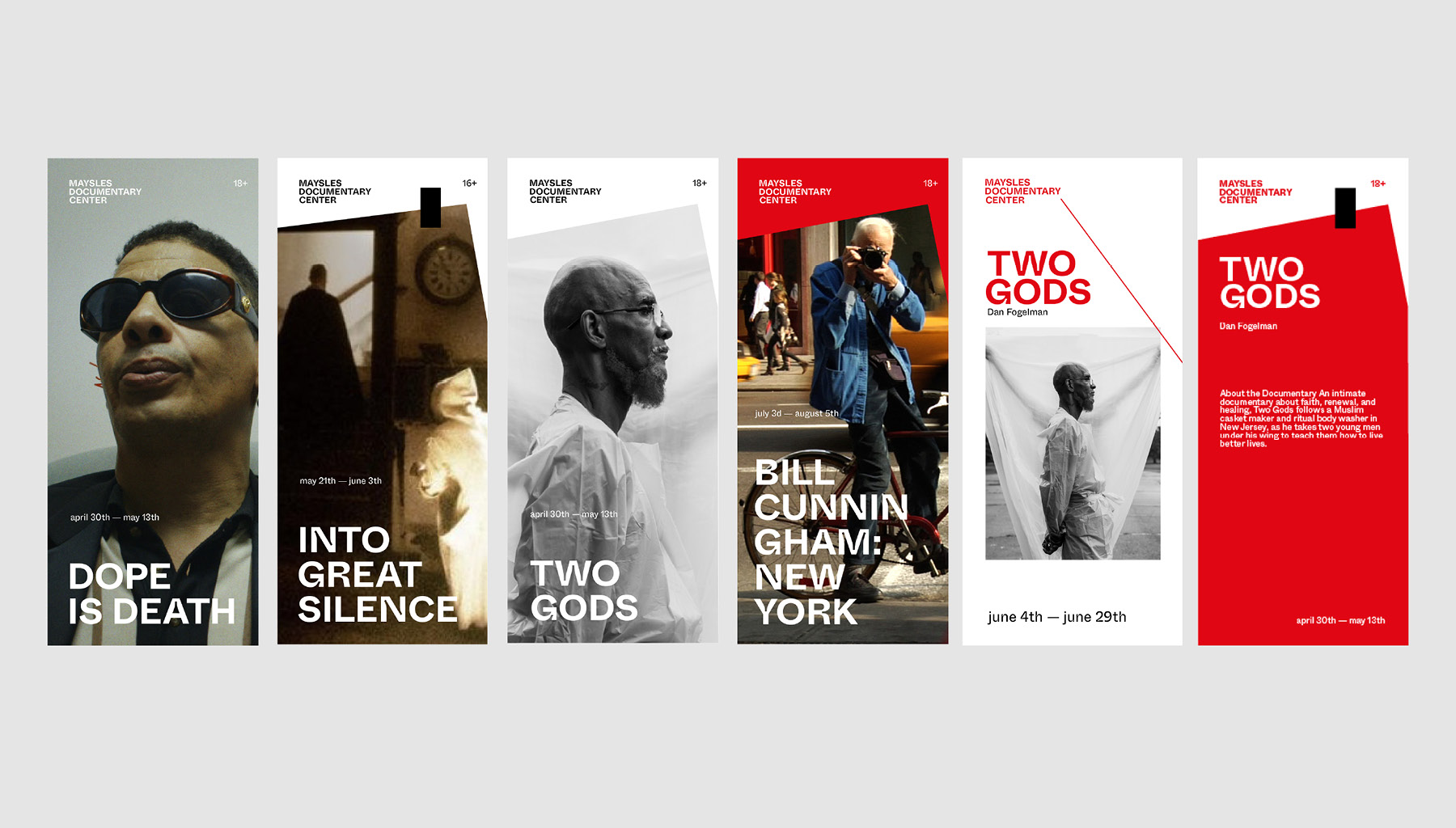
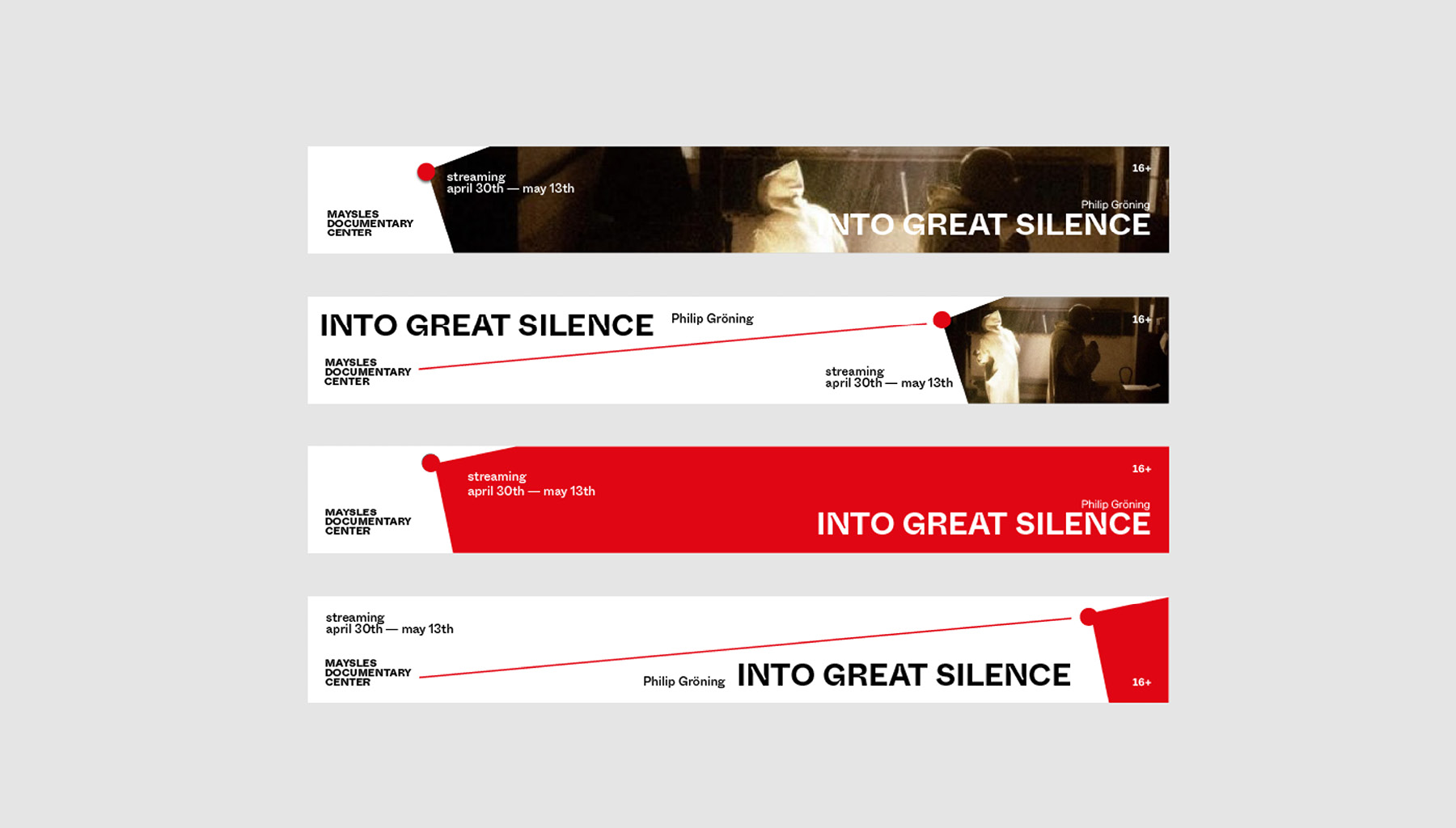
Rebranding of Maysles Documentary Center. It is a Harlem-based nonprofit organization committed to community, education, and documentary film. The center use filmmaking to amplify and expand under-represented artists and narratives, while empowering young filmmakers in creative self-expression, communicating ideas, and advocating needs.
I wanted to emphasize that the center not only shows movies, but also teaches how to make it. I decided to use metaphor about creating documentary films. Every documentary for a director is a real investigation. It is required to find a connection between the facts in order to combine them into history. Thus, the detective board has become a metaphor for brand identity. Red lines connect elements that are pinned with red pins. This reflects the popularizing function of documentary cinema, it connects facts and viewers. In that branding concept I used White Inktrap font by Dinamo design agency. The main goal of the rebranding was to make the identity of the center look structured and understandable so that visitors can enjoy stories from documentaries.
This project was done as a student project in HSE Art and Design School in 2021, curated by Evgeny Kashirin.


CREDIT
- Agency/Creative: Julia Seleznyova
- Article Title: Student Concept Rebranding of Maysles Documentary Center
- Organisation/Entity: Student
- Project Type: Identity
- Project Status: Non Published
- Agency/Creative Country: Russia
- Agency/Creative City: Москва
- Market Region: Europe
- Project Deliverables: Rebranding
- Industry: Entertainment
- Keywords: documentary films
-
Credits:
student: Julia Selezneva
curator: Evgeny Kashirin


