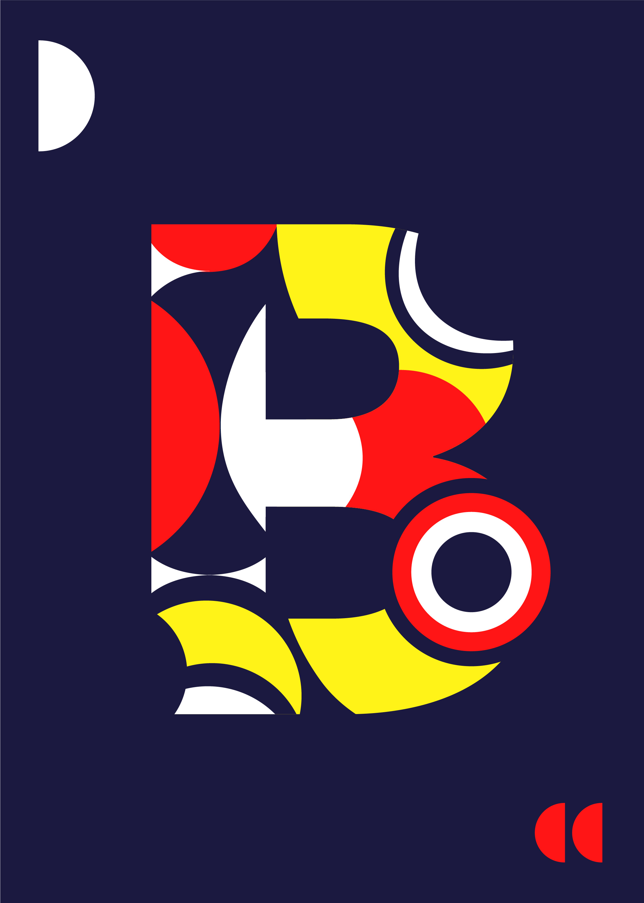
Bauhaus is originally an architecture and design school built in 1919 in Germany. From the school and its vision, the Bauhaus movement became a real artistic period that translated modernity in the architecture, objects but also photography, dance and performance. How Mies van der Rohe used to say “Less is more” which means that having the essential things is better than having too many superficial things. I tried to work with keeping this quote on mind, not too many colours, not unnecessary shapes, only what I need to shape the letter
I’ve created this project because I am passionate and always inspired by the Bauhaus movement and the school that continues to inspire designers and our way of designing for years. I would like to tell you more about this project, my vision and what inspired me.
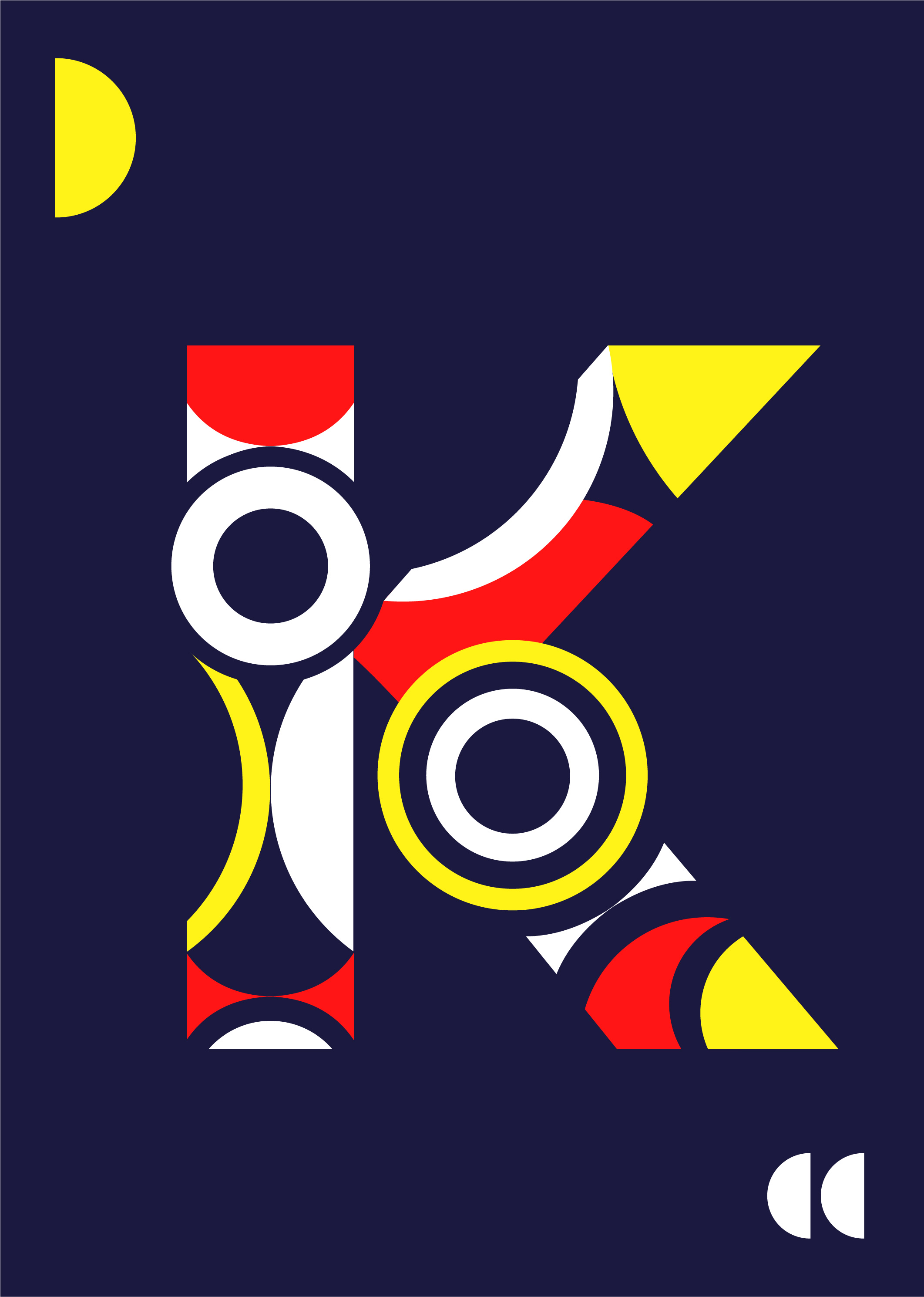
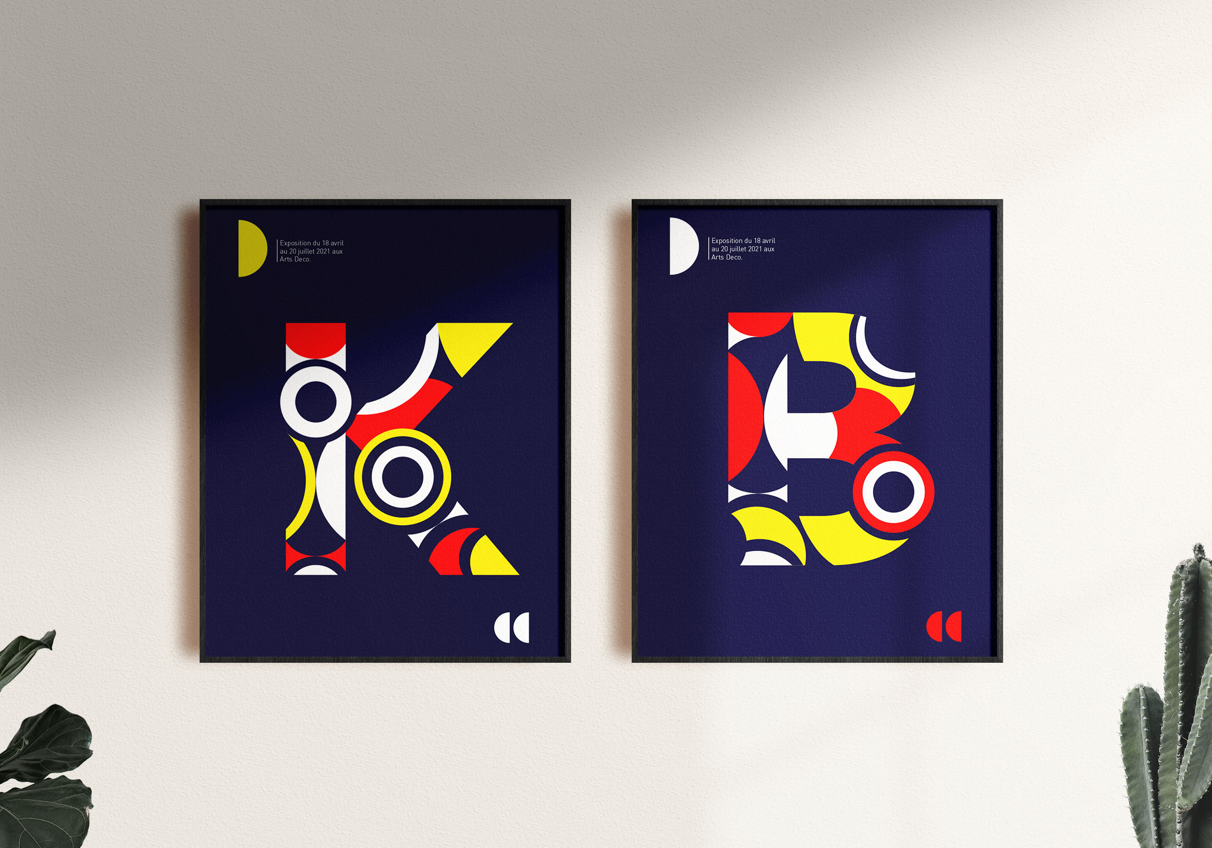
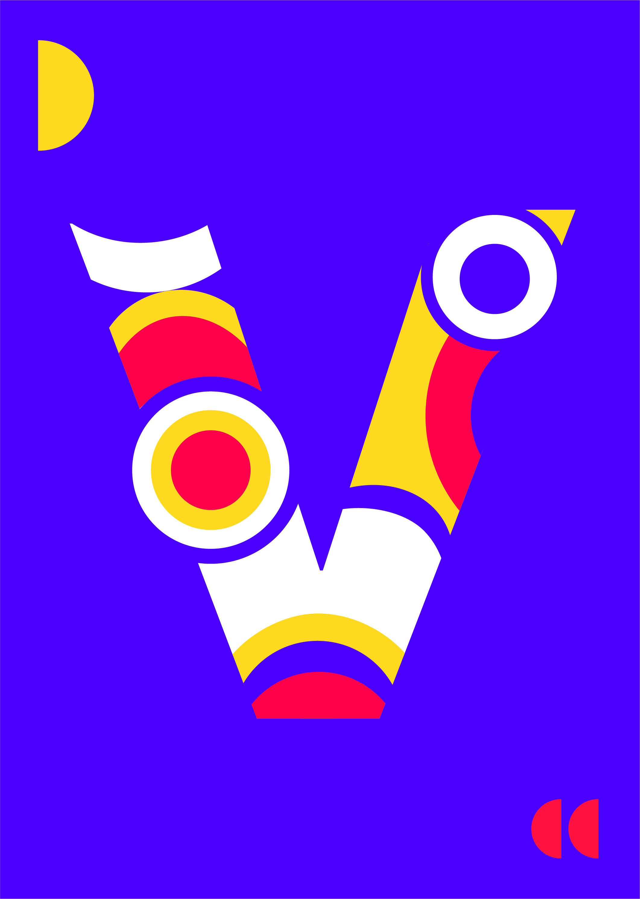
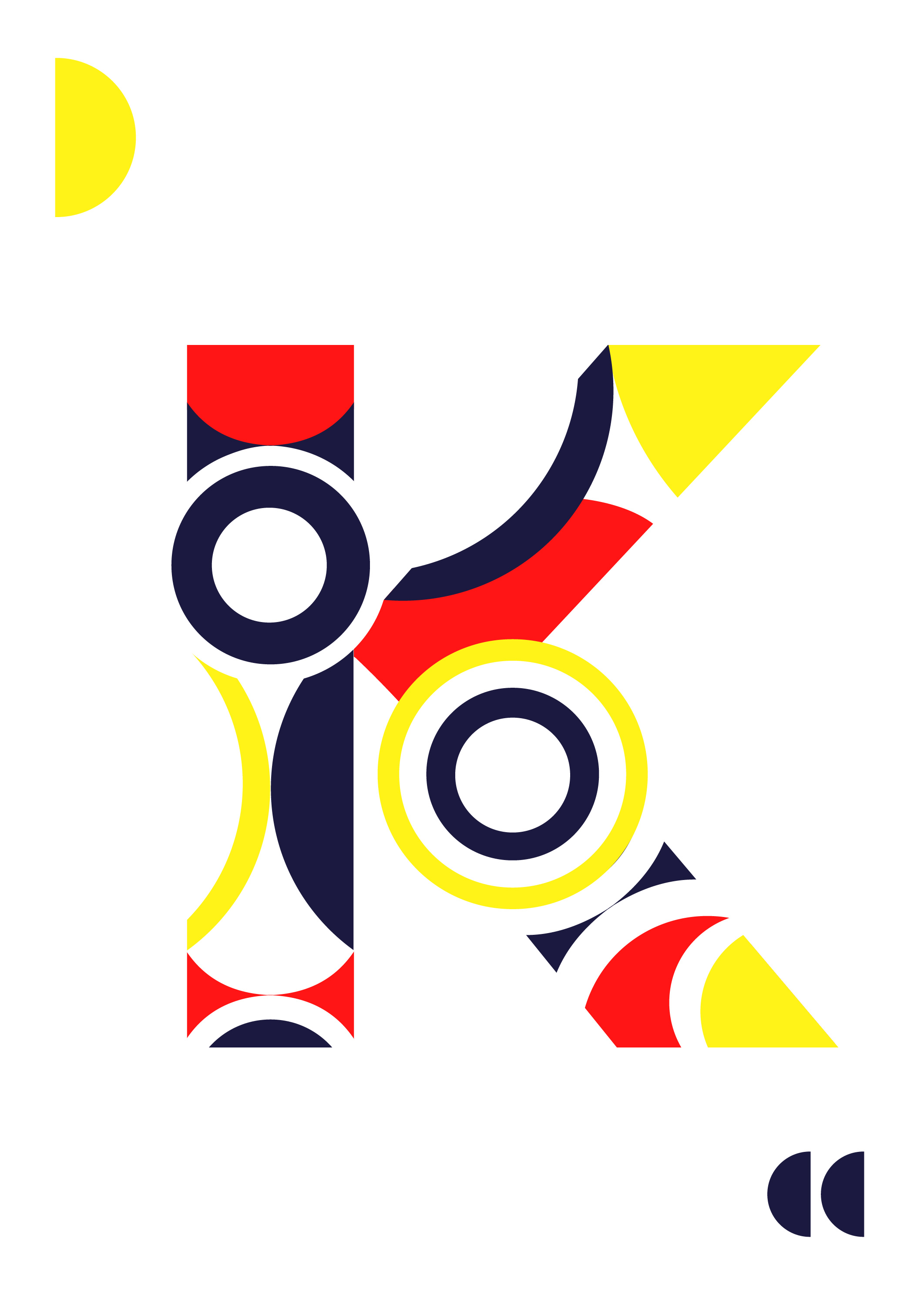
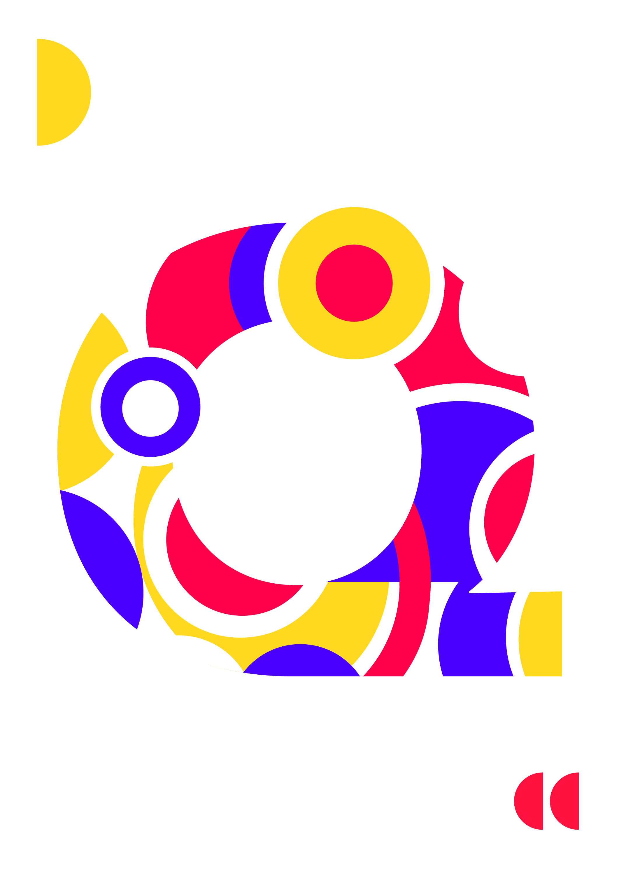
I’ve designed a poster series to celebrate the century of the school and artistic movement and challenged myself on how to set the typography as an image in the space. The geometrical shapes draw the letters with primary colours which is the base of the visual communication of this movement. The open and close space let the shape free and the impression of movement.
The posters share the value of the Bauhaus movement which are modernity, minimalism, geometry. The form follows the function and in this work I wanted to put typography at the first place like it used to be during this time.
The letter becomes a beautiful object that tells a story and where the shapes underline the geometry and curves of the letter to create movement.
CREDIT
- Agency/Creative: Studio vague d'amour
- Article Title: In-House Bauhaus Posters Creative Concept
- Organisation/Entity: In-House
- Project Type: Typography
- Project Status: Published
- Agency/Creative Country: Netherlands
- Agency/Creative City: Studio vague d'amour/Rotterdam
- Market Region: Europe
- Project Deliverables: Art, Poster Design, Typography
- Industry: Education
- Keywords: Bauhaus celebration of the design school
-
Credits:
Designer: Violaine Gonzales


