On any given day 800 million women in the world have their period. (UNICEF) For long, women have been embarrassed about their periods. To talk about it, or leaving a stain behind, has always been a shame. In many countries like Iran, a woman is ashamed to be seen with a sanitary pad package, and will be given a black plastic bag to carry it. We can see the same approach in packaging designs for sanitary pads around the globe. Period-shaming has found its way into the production industries too and it seems most packages have a conservative design – specially for mass products. There are very few creative designs for Sanitary pads packaging.
The Brief: My Lady, a market leader for sanitary pads in Iran, decided it’s time to refresh its well-known brand. This was a very challenging task as the brand was already selling well. However, due to changes in brand strategy, their touchpoints and specially packages should convey the new message. The new strategy was based on playing a role to make periods normal and empowering women to live life without limits.
The Challenge:
1- Brand was selling well and any change in package design was high risk. We were advised not to change the logo dramatically and we had to use the old color palette.
2- To convey the brand’s mission: ‘Period is normal’ on all touchpoints including the packaging.
3- The artwork would be printed using flexographic printing method, and it was really difficult and risky to use brighter colors and get a sharp and clean final result.
The Solution
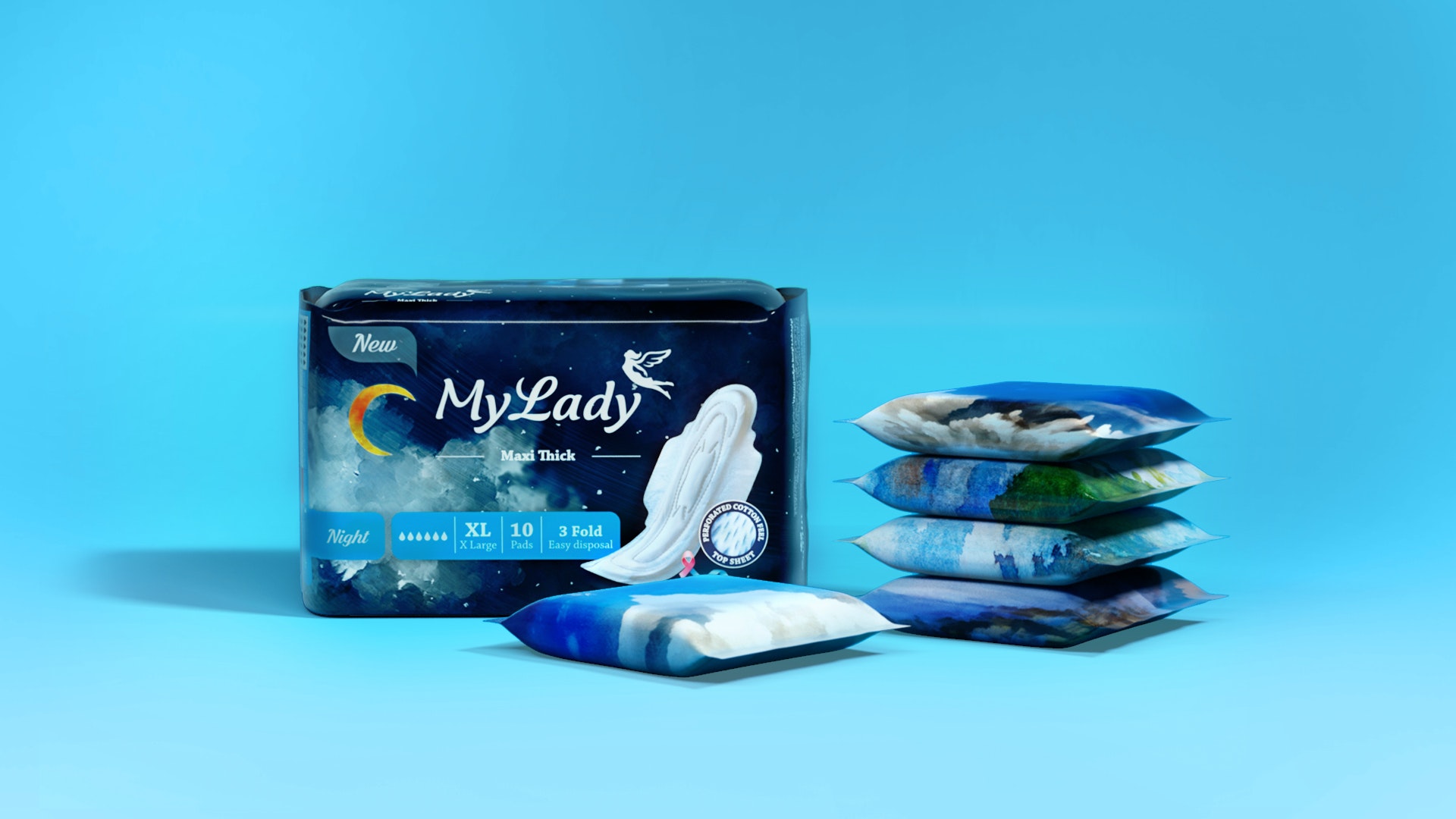
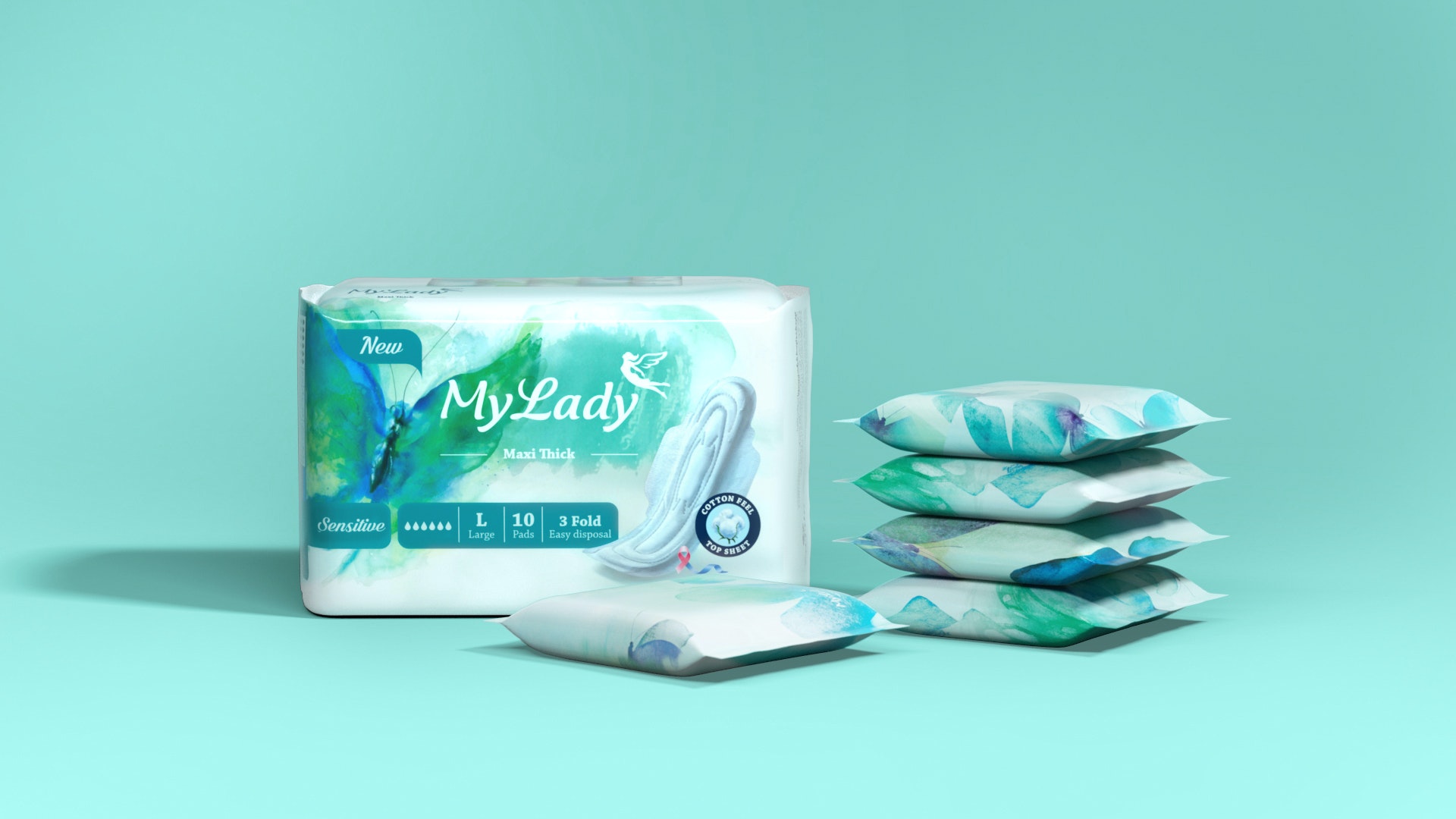
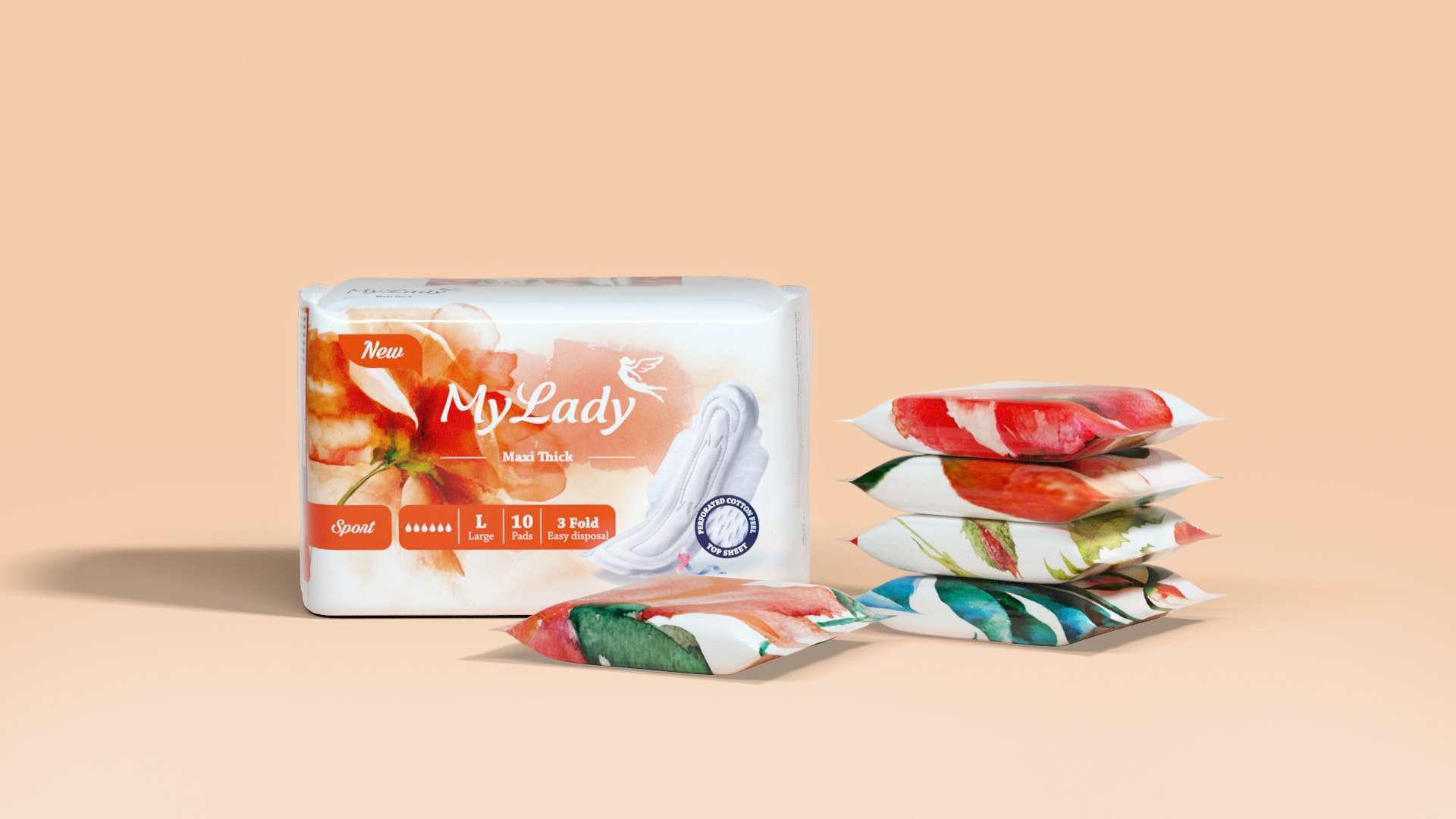
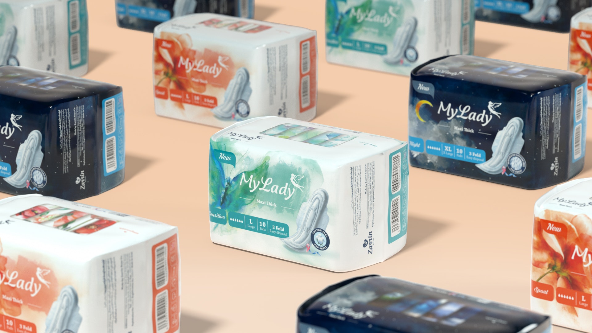
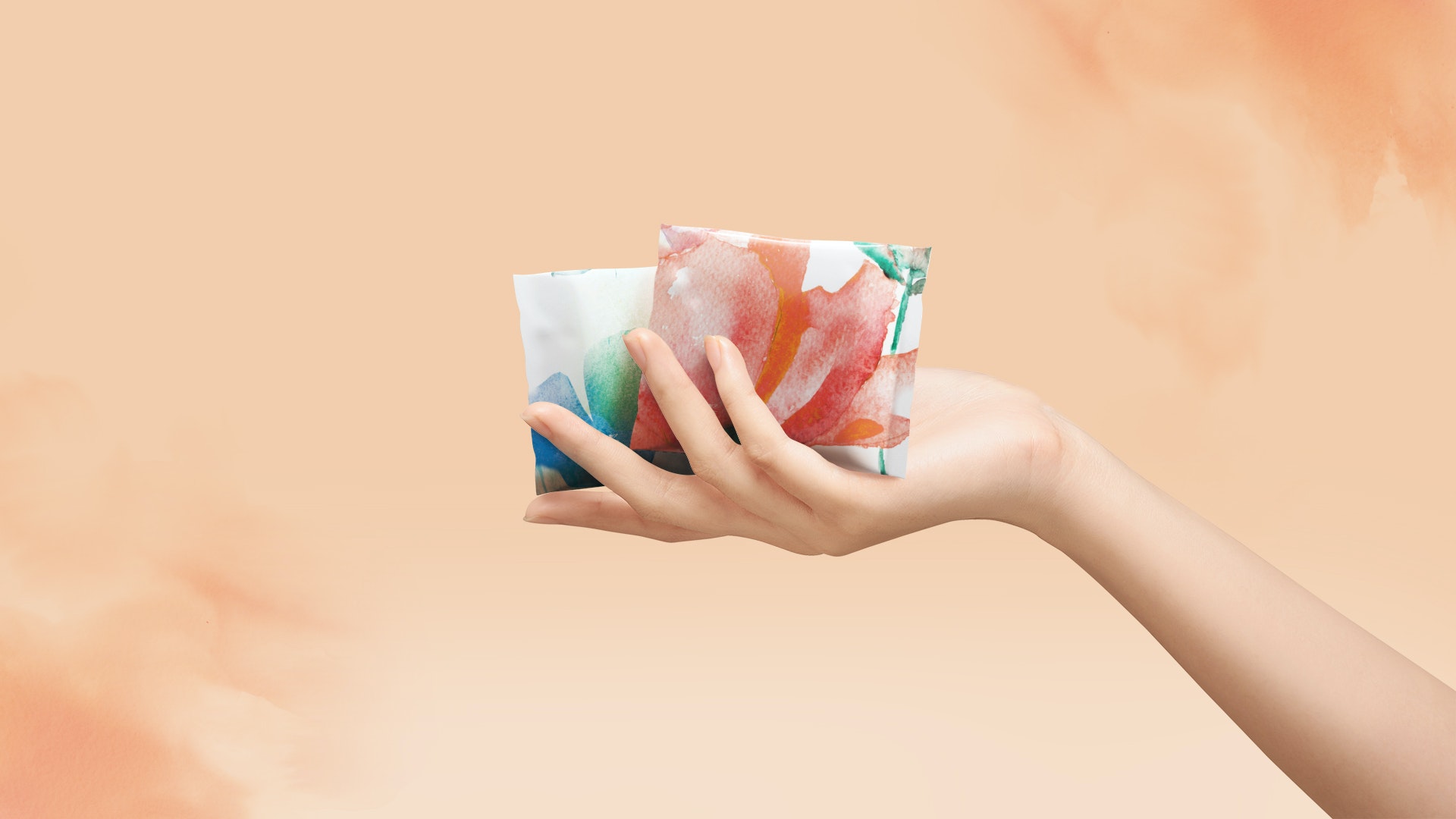
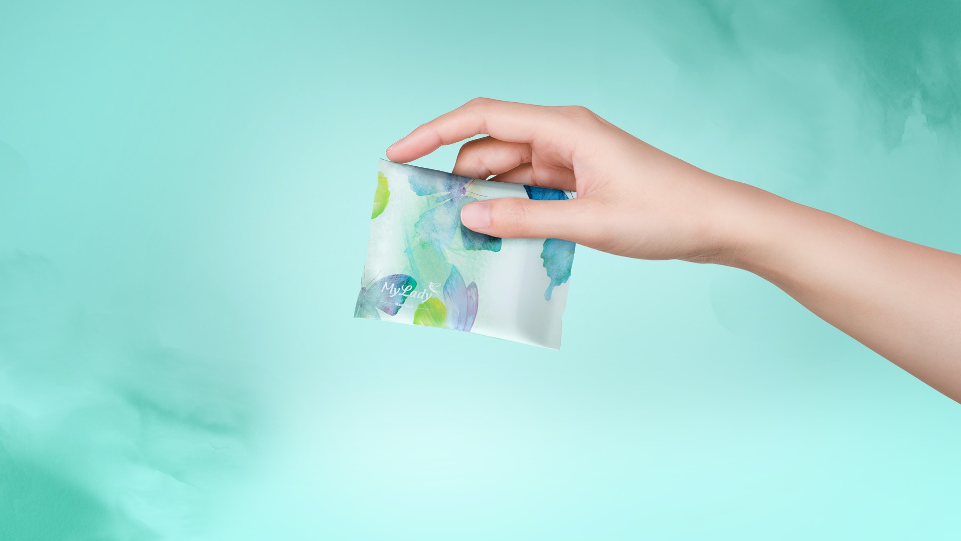
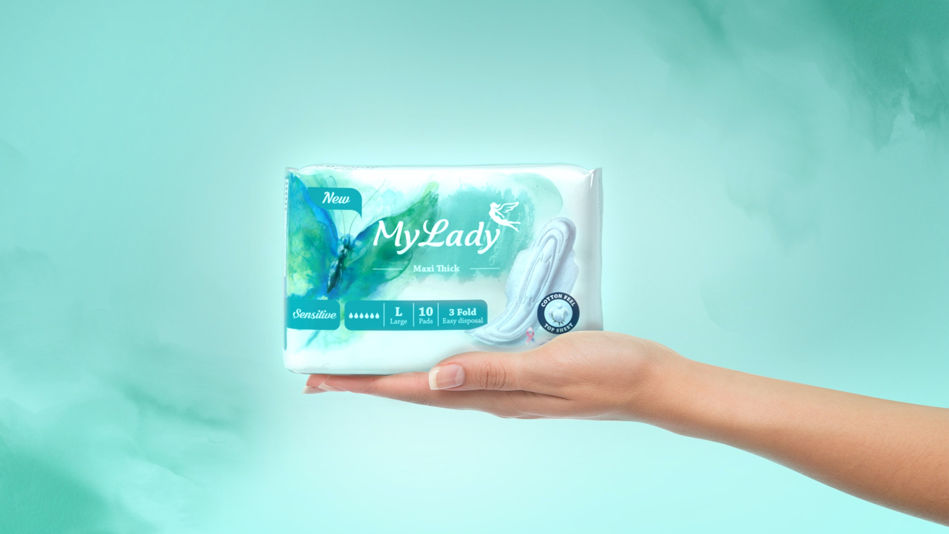
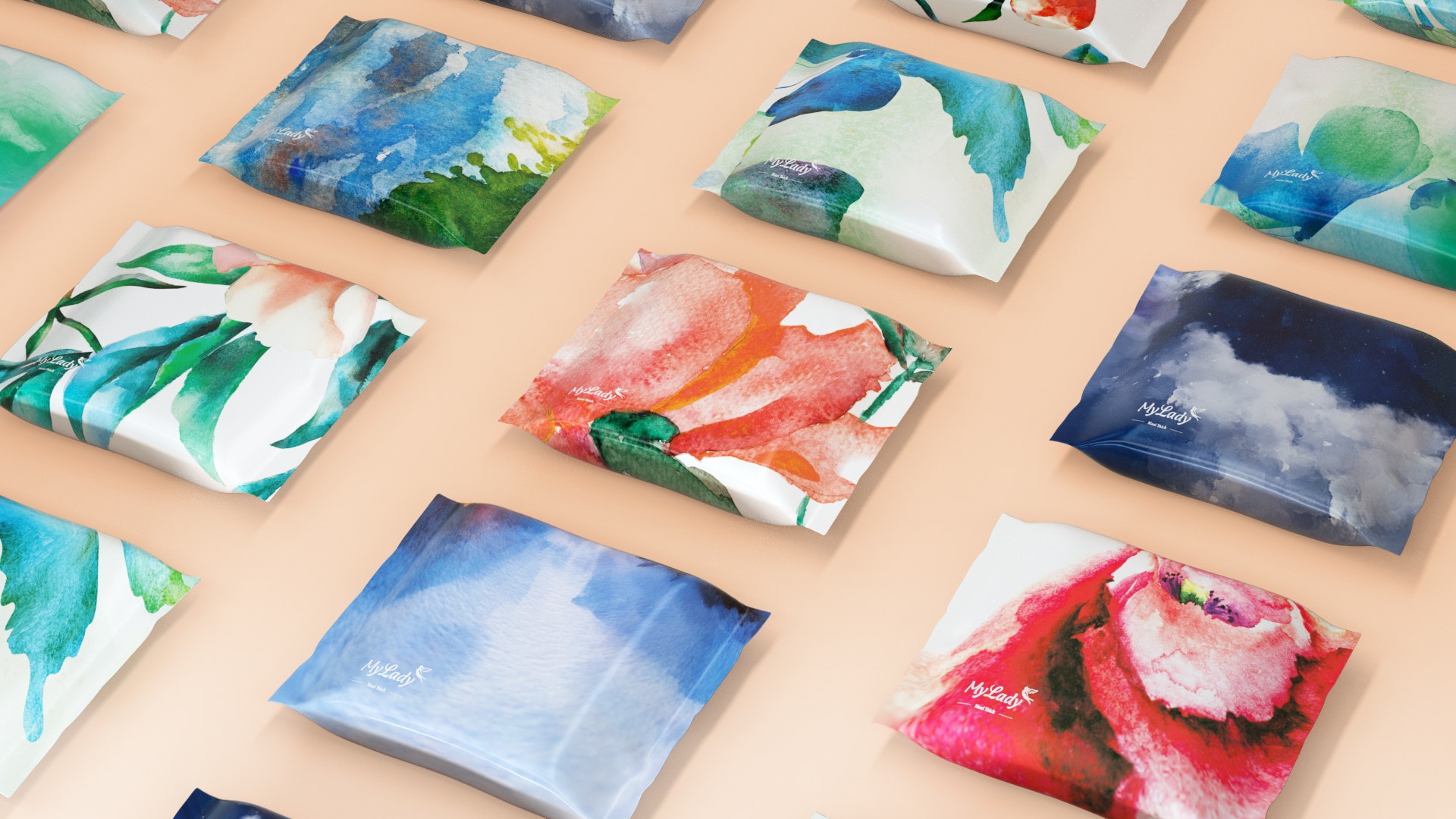
We used storytelling to put the brief together and help the brand communicate its messages in an easy-to-understand way. Everyone loves stories, we memorize stories and can relate to them. Our story is about a little girl who is curious to know how she becomes a woman. A fairy appears and takes her to 5 lands of womanhood and she explores them one by one. The first land is the ‘land of roses’ where a thorn pricks her finger and she bleeds. She learns growing up can be a painful process. But when she looks at the beautiful rose in her hand, she realizes, growing up could be rewarding too. In the second land, ‘land of butterflies’, she learns that she can start flying but she has to be careful, as her wings are still fragile. In the ‘land of singing birds’, she learns that her voice should be heard. In the ‘land of fruit trees’ she learns it’s good to share what she earns. And in the final stage, the ‘land of waters’ she learns to love herself the way she is. Each land, shows a different stage of a woman’s life. We used our story’s characters and painted them with watercolors. Many women around the globe are embarrassed about their period, and some even see bleeding as a disease and some find it dirty. We wanted to change the whole look and ask them to see it differently. We decided to use beautiful watercolor images, to make the women’s period experience a little nicer. We used My Lady’s old color palette in order to familiarize the audience with new designs. We gently retouched the logo. Designed a new fairy and modified the corporate pink color. All visuals and Icons were re-designed and new 3D models for pads were created which represented the exact shape and texture of each pad. Each pack contains two sets of five individually designed single wraps.
The Results
Our audience loved the new design. Brand perception of My Lady’s products, improved and we received hundreds of supporting messages, telling us the new design helps them feel better about their period. Above all, we made history. New design, allowed My Lady to make the impossible possible. Sanitary pad brands were never allowed to advertise their products in Iran. All ATL advertising for sanitary pads were banned. The new design and branding allowed us to take the brand on hundreds of billboards nationwide. We didn’t show the package nor did we name the product. There was brand’s name and a watercolor picture. Today, My Lady is the first sanitary pad brand that has ever advertised on billboards in Iran. My Lady has always encouraged women to talk about their period. After the rebranding campaign, other sanitary brands were encouraged to have a voice. Shortly after My Lady, other sanitary pad brands appeared on billboards, or started talking about period openly. My Lady branding campaign, paved the way for all other brands and helped women to believe in their power and embrace their femininity.

CREDIT
- Agency/Creative: Mitra Shahsavand Design Studio
- Article Title: MyLady-Period is Normal Challenging Period-Shaming Through Better Designed Sanitary Pads Packaging
- Organisation/Entity: Agency
- Project Type: Packaging
- Project Status: Published
- Agency/Creative Country: Iran
- Agency/Creative City: Tehran
- Market Region: Middle East
- Project Deliverables: Art Direction, Creative Direction, Packaging Design, Packaging Guidelines, Rebranding
- Format: Wrap
- Substrate: Plastic
- Industry: Health Care
- Keywords: WBDS Agency Design Awards 2021/22
- Keywords: My Lady, Period, Sanitary Pads, Package Design, Packaging, Re-Branding
-
Credits:
Design Director: Mitra Shahsavand
Head of Marketing: Negar Sharafeddin
Brand Manager: Masoumeh Moghaddasi
Art Director: Asal Farshchi
Logotype Designer: Reza Bakhtiarifard
Brand Icon: Hamid Daneshfar
Graphic Designer: Marzieh Pordel
Graphic Designer: Shaghayegh Bovand
Graphic Designer: Malika Naghashan
3D Designer: Hamid Daneshfar
3D Designer: Ali Sahlabadi
Digital Illustration: Hamid Daneshfar
Digital Illustration: Saba Nasiri
Motion Designer: Sadaf Asl Soleimani
Brand Manager Assistant: Masoumeh Hadi
Project Manager: Fatemeh Mosadegh
Project Manager: Farnaz Mousavi
Global Communications Director: Houman Yegani


