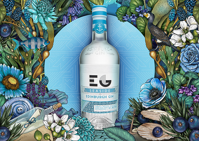
D8 were asked by Edinburgh Gin to refresh their overarching brand identity in line with their new brand positioning “Filled with Wonder”.
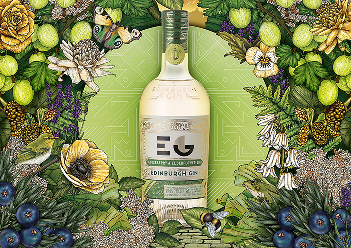
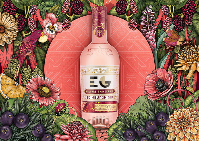
We began by creating a full series of illustrated master visuals showcasing natural flavours that distinguish the Edinburgh Gin range. Each individual element was illustrated by hand in-house at D8. In total, we created 11 master visuals.
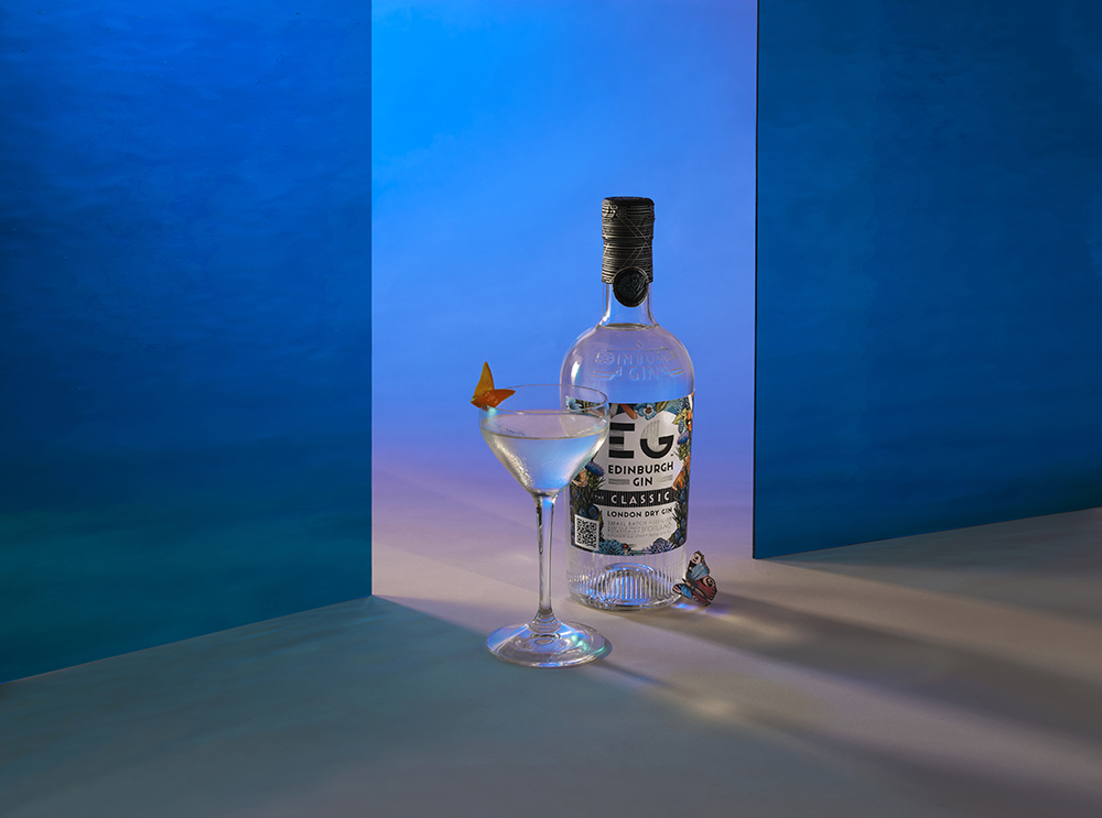
We redefined their photographic approach to bring a sense of Wonder to their trade and serve imagery
The illustrative and the photographic assets were then included within a comprehensive set of brand identity guidelines. Part of a larger brand positioning and identity refresh that we undertook to ensure the Filled with Wonder concept is communicated clearly and consistently across all media and touchpoints.
The flexibility of the illustrated master Case Study visuals brings vibrancy to the full range of Edinburgh Gin flavours across all media and communications, with the brand positioning to the fore.
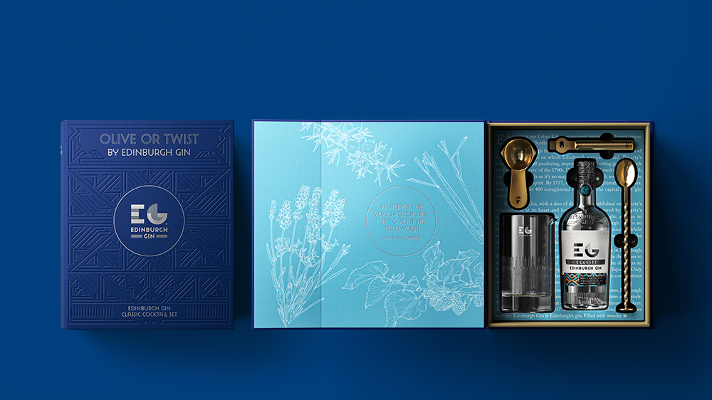
The identity is a combination of elements that create a harmonious contrast. We also introduced a graphic pattern – inspired by the labyrinthian streetscape of Edinburgh’s old town, created as a counterpoint to the organic illustrative assets. The pattern is often used as a high-quality print finish such as the embossing on the range of storybook gift packs we created.
CREDIT
- Agency/Creative: D8
- Article Title: D8 Working Wonders with Edinburgh Gin
- Organisation/Entity: Agency
- Project Type: Packaging
- Project Status: Published
- Agency/Creative Country: Netherlands
- Agency/Creative City: Amsterdam
- Market Region: Global
- Project Deliverables: Packaging Design
- Format: Bottle
- Substrate: Glass Bottle
- Industry: Food/Beverage
- Keywords: Edinburgh Gin, Packaging Design,Brand Identity
-
Credits:
QR code and design and delivery of microsite: HRG


