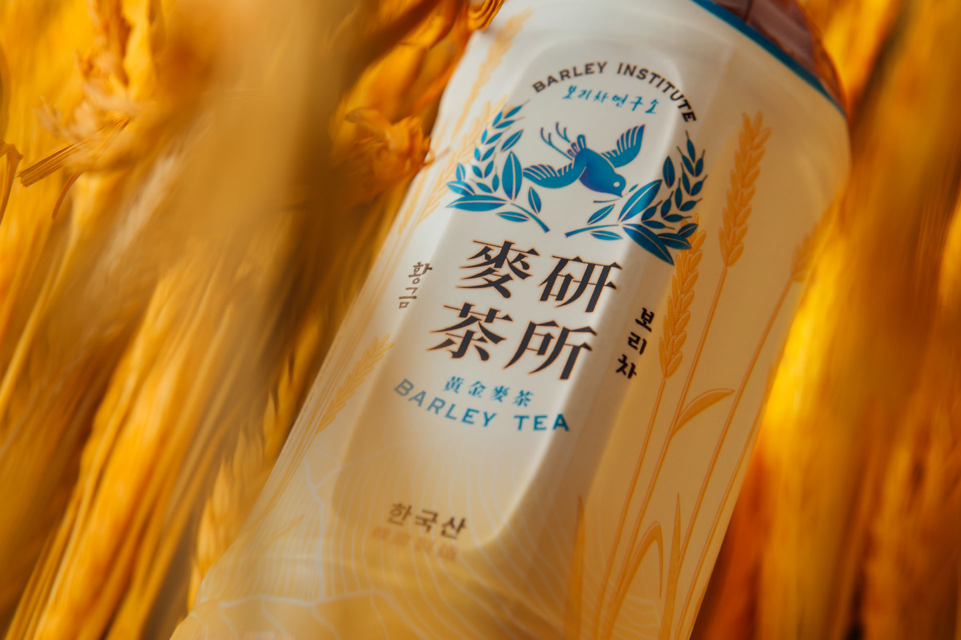
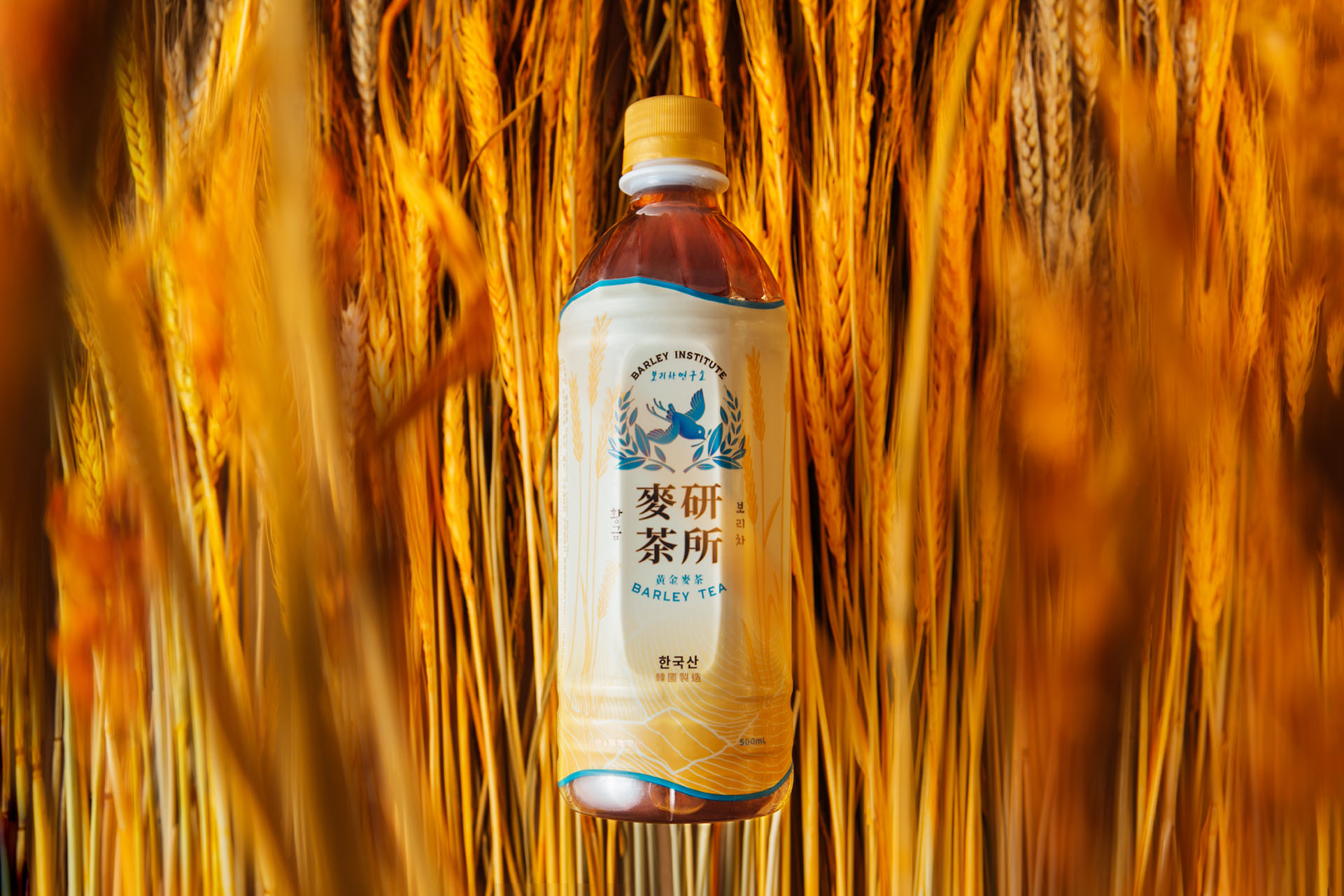
Brand Background: Barley Institute, focuses on studying barley tea and brings the best formula to the public. Roasted 100% Korean barley, is brought by the cuckoo who is the announcer of harvest, to the public. So people can try the natural and fresh taste of barley tea.
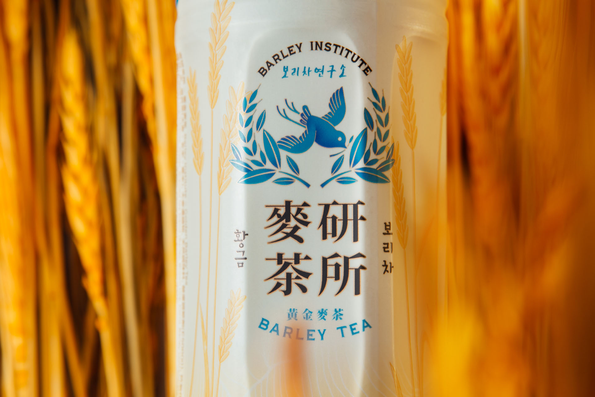
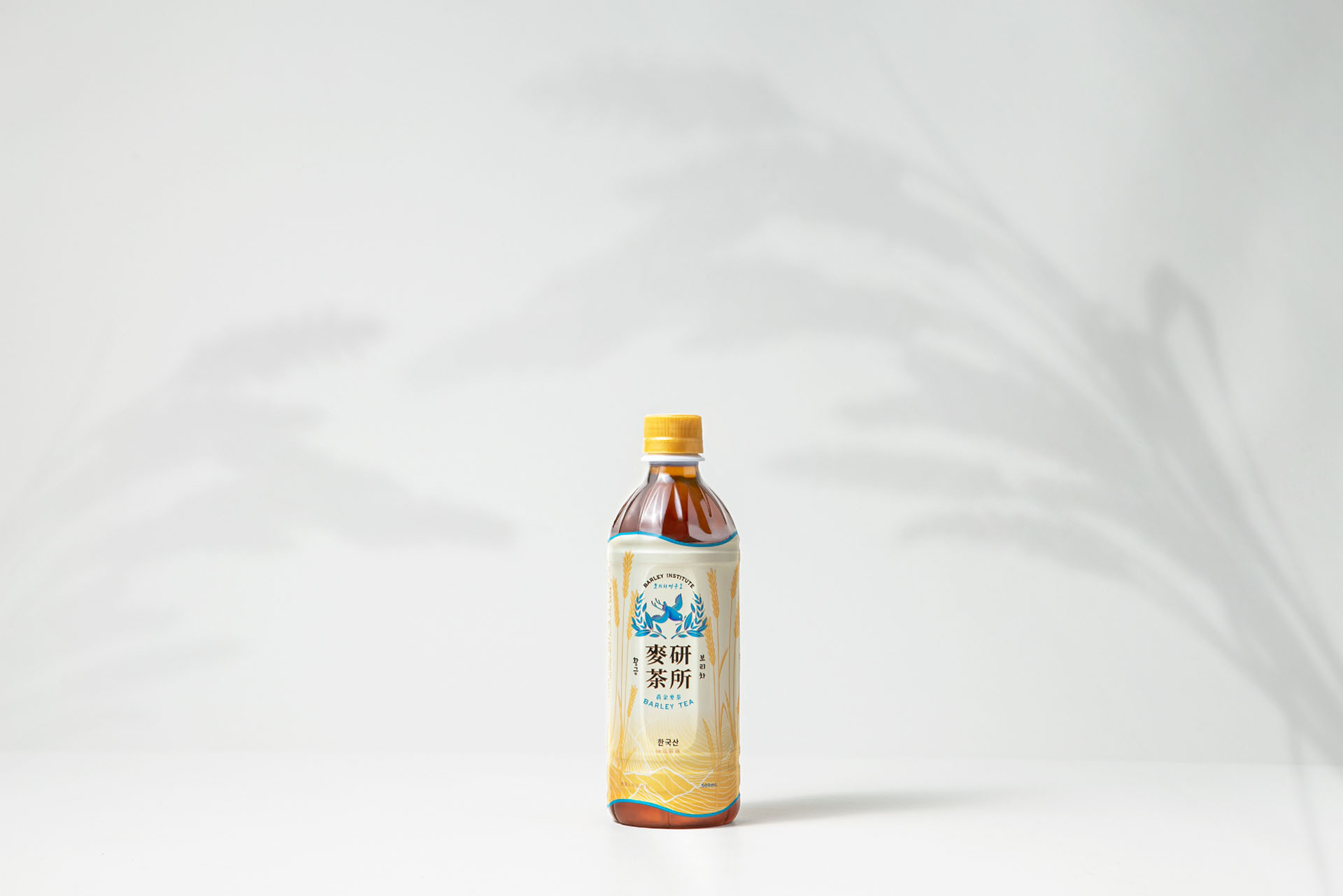
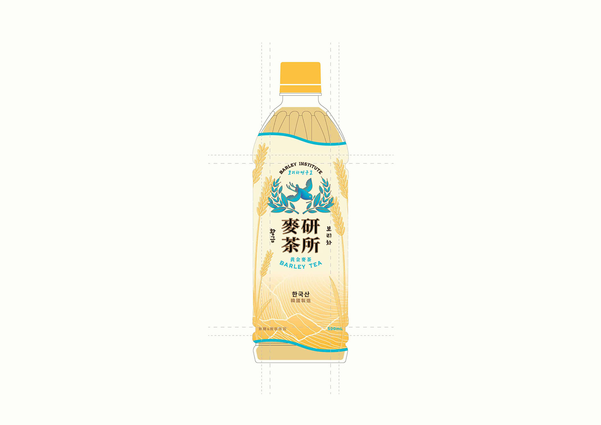
Solution: For the packaging design, VincDesign used beige as the main colour tone for Barley Institute Barley Tea. Furthermore, we added a texture for the barley illustration, so the roasting and barley taste of the product is more outstanding.
We used gold and sky blue on the design, which added a feeling of elegance and premium. The sky blue also added a natural sense to the product.
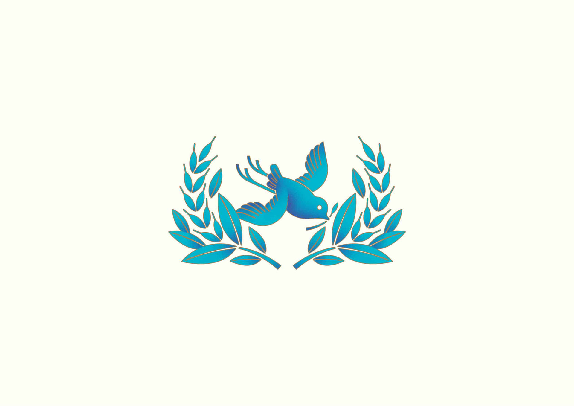
Blue cuckoo has the meaning of “happiness” and “luck”. A blue cuckoo holding a barley means the golden harvest time has arrived, and the cuckoo is bringing the perfect moment of barley to people.
Delivered: Branding Design, Logo Design Brand Strategy, Brand Positioning, Creative Concept, Brand Identity, Brand Communication, Package Design

CREDIT
- Agency/Creative: VincDesign
- Article Title: VincDesign Design Packaging Design for Barley Institute in Korea
- Organisation/Entity: Agency
- Project Type: Packaging
- Project Status: Published
- Agency/Creative Country: Hong Kong
- Agency/Creative City: 旺角
- Market Region: Asia
- Project Deliverables: Brand Identity, Brand Strategy, Packaging Design
- Format: Bottle
- Substrate: Plastic
- Industry: Food/Beverage
- Keywords: BARLEY INSTITUTE, BARLEY TEA, 麥研茶所
-
Credits:
Creative Director: Vince Cheung
Graphic Design: Kaman Kan


