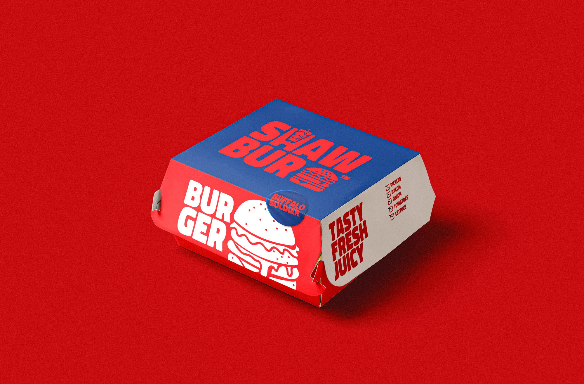
Shaw-bur is a restaurant with a focus on burgers and shawrma. The task of the studio was to create a modern, bright, daring and bold brand with a strong association with quality and cool spirit that are aim to attract young generation in the Kingdom of Saudi Arabia.
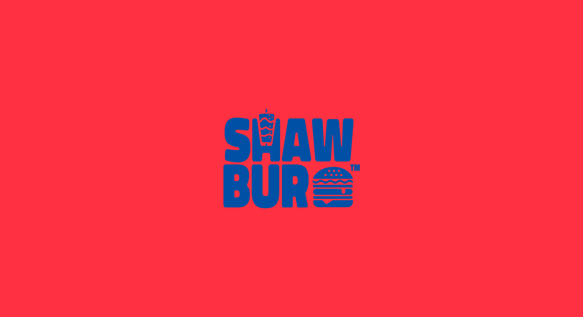
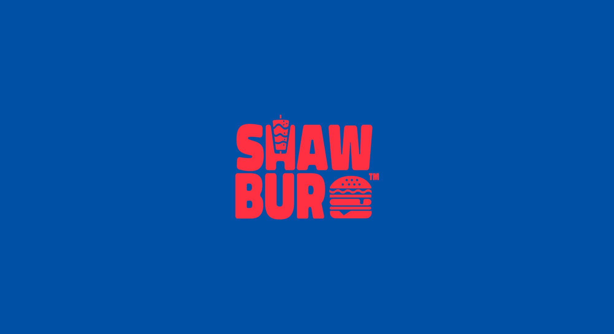
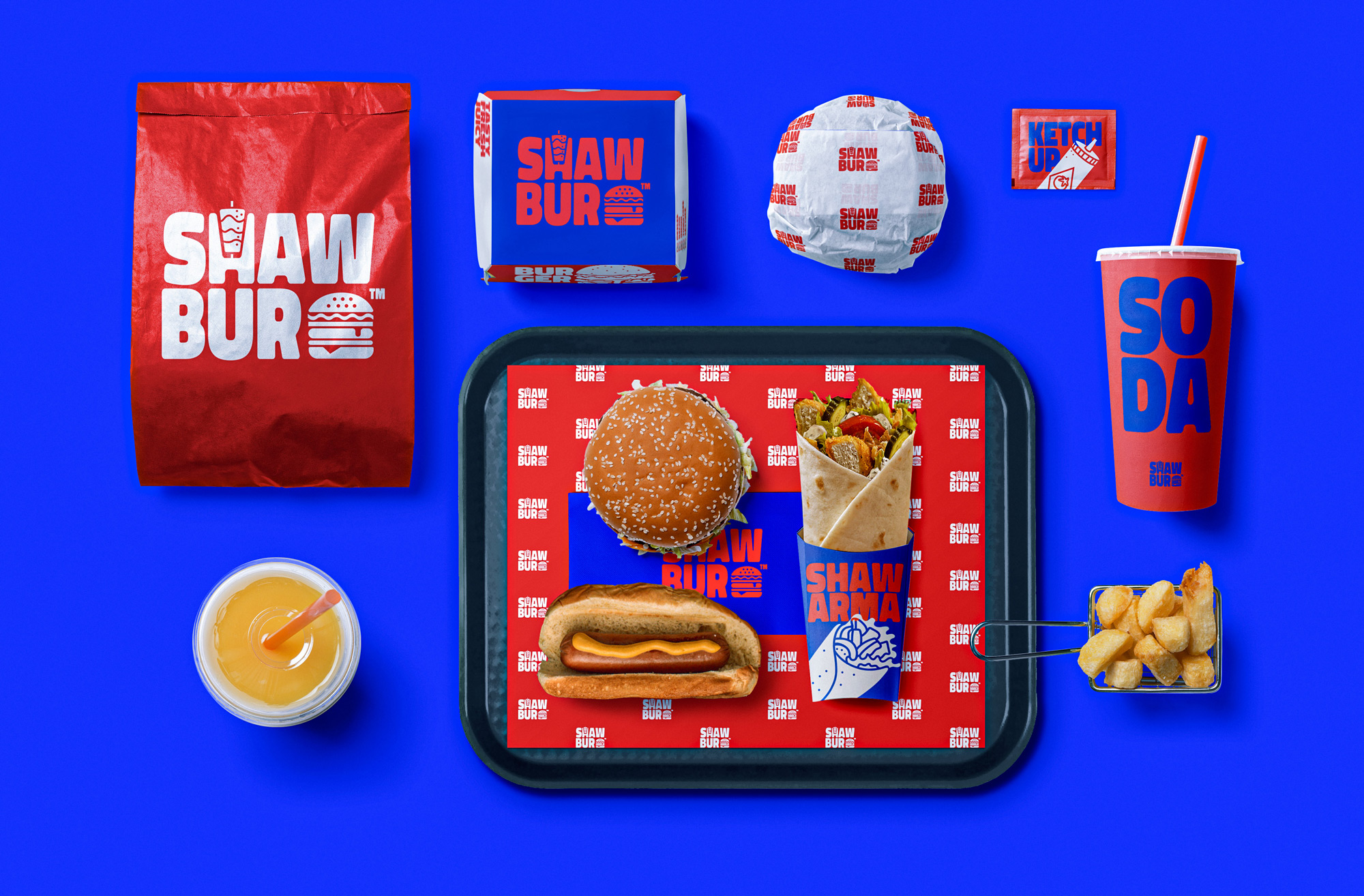
Shaw-bur offering a premium quality burger and shawarma and this where the name Shaw-bur came from, Shaw-bur is targeting the young generation and this should be translated in the Visual identity, the word Shaw-bur was divided into 2 line as if it is a layered sandwich, the typography was bold and bulky to translate the daring spirit of Shaw-bur adding the icon off the shawarma to the letter H in word SHAW and the burger icon beside word Bur created a unique logo that is very recognisable and can stand out among the burger joins in Kingdom of Saudi Arabia
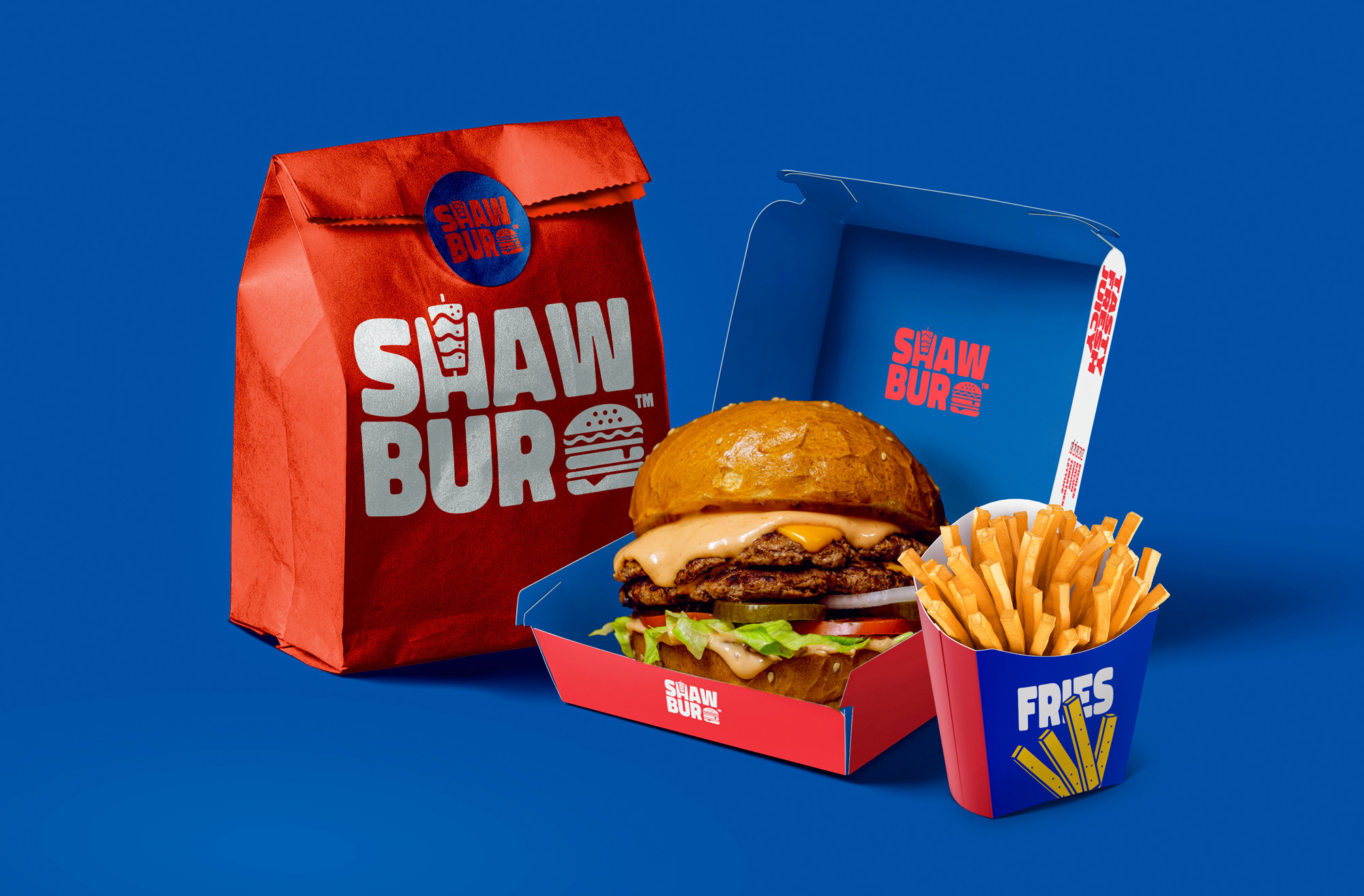
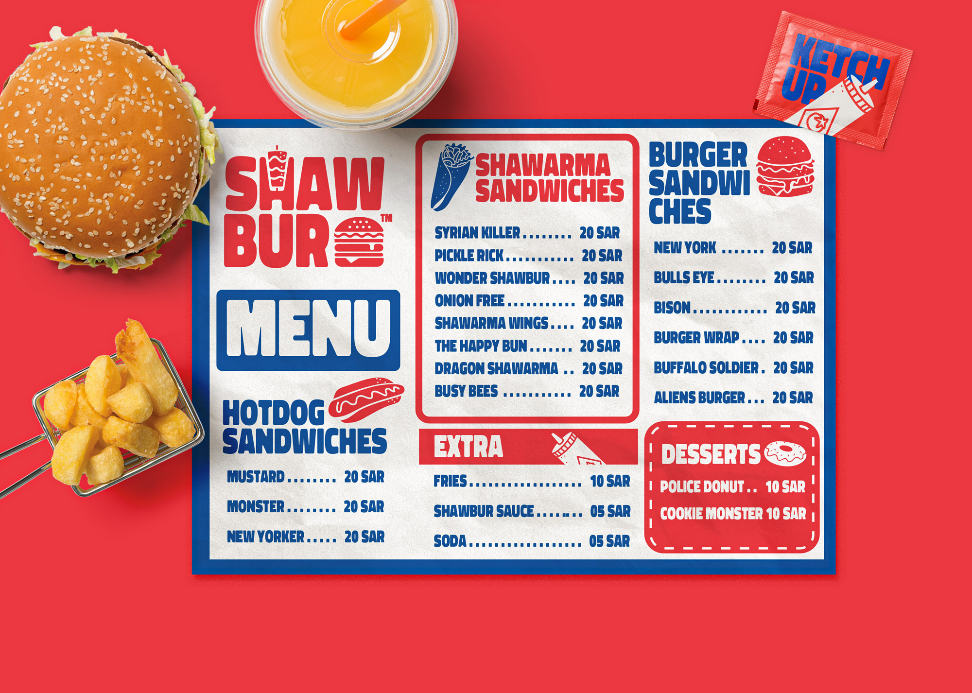
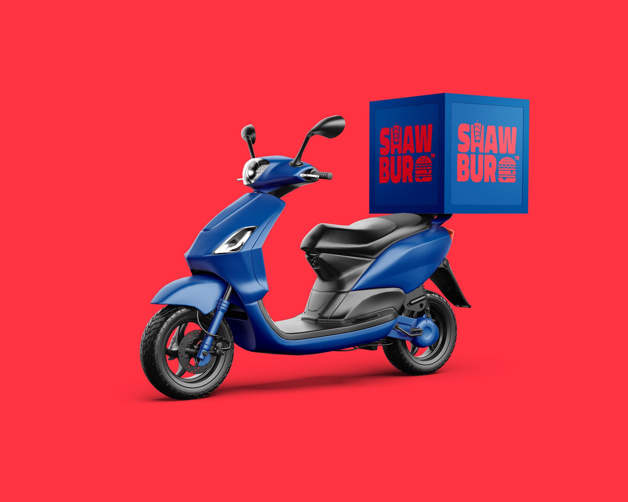
choosing a color scheme for shawbur was based on the daring and bold spirit of the brand, colors should reflect the coolness of the consumer and the hot food that we offer, so we choose the cool vibrant blue and combined it with the vibrant red, this combination created a unique look, combining red and blue isn’t very common since both are too vibrant but choosing a certain hue created the magic
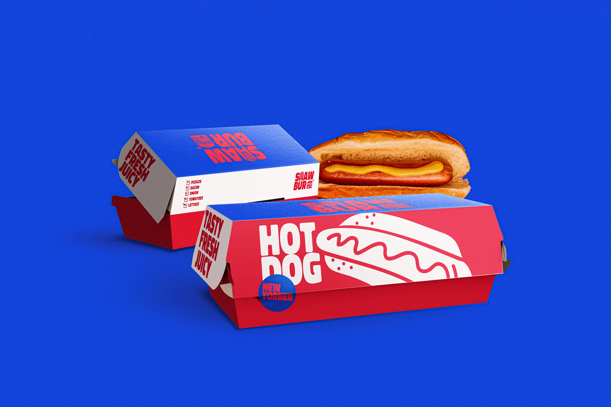
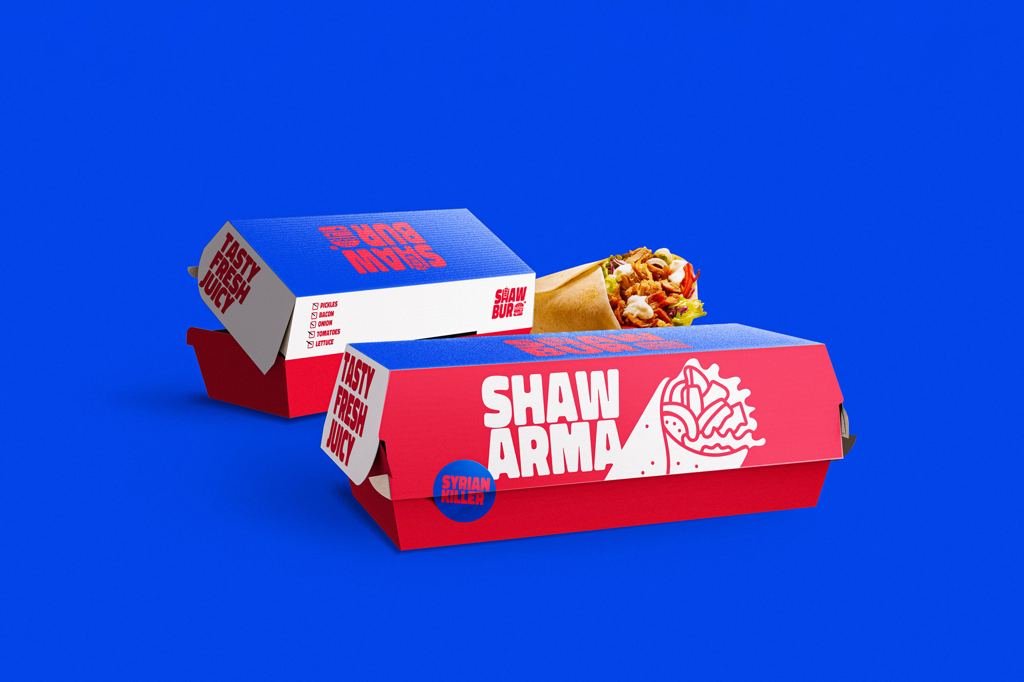
The packaging should reflect the persona of the brand so we created a unique style of illustrations, sandwiches were illustrated with a heavy outline and rough lines, the items in the menu itself were different and funny to emphasis the spirit of the brand and how different it is.
CREDIT
- Agency/Creative: Sheikh Branding
- Article Title: Sheikh Create Shawbur Restaurant Branding
- Organisation/Entity: Freelance
- Project Type: Packaging
- Project Status: Published
- Agency/Creative Country: Egypt
- Agency/Creative City: Cairo
- Market Region: Middle East
- Project Deliverables: Art Direction, Branding, Packaging Design
- Format: Box
- Substrate: Pulp Carton
- Industry: Food/Beverage
- Keywords: Shawbur Eatery
-
Credits:
Graphic Designer: Ahmed Elsheikh


