


We had to create a brand of products for the modern inhabitant of the metropolis. As a result of studying the needs of consumers and the trends of the modern market, we have formed the following requirements. The product should: Carry the maximum health benefits. Do not require complex cooking, it should be adapted as much as possible to an active and mobile life. Do not contain harmful additives, encourage proper nutrition. No freezing. This is a smart product, everything in it should be thought out. The product should be super-modern-without rural accents and archaic. It is a product of intellectual, intelligent. It is aimed at interacting with an educated, intelligent person of the new world.
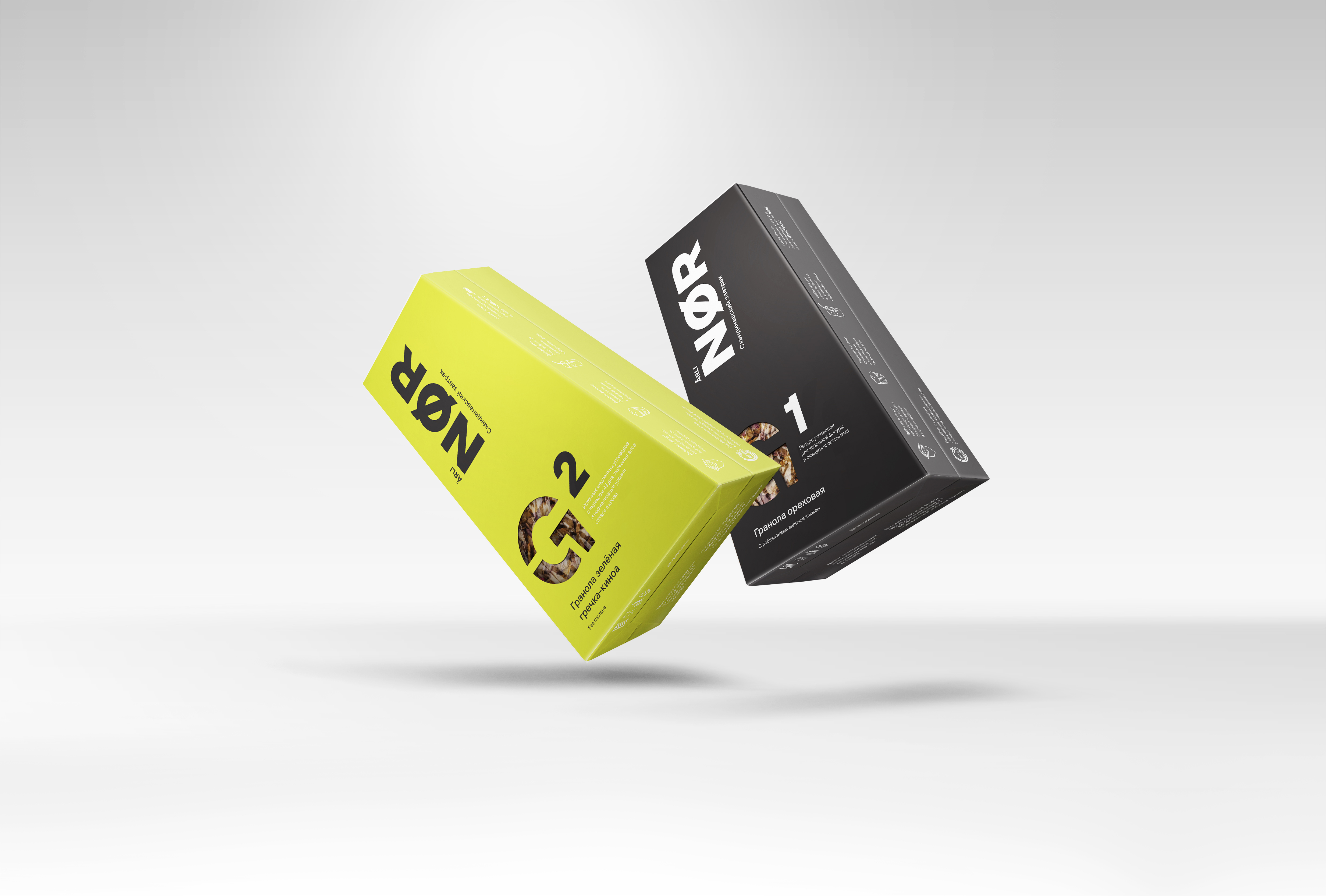
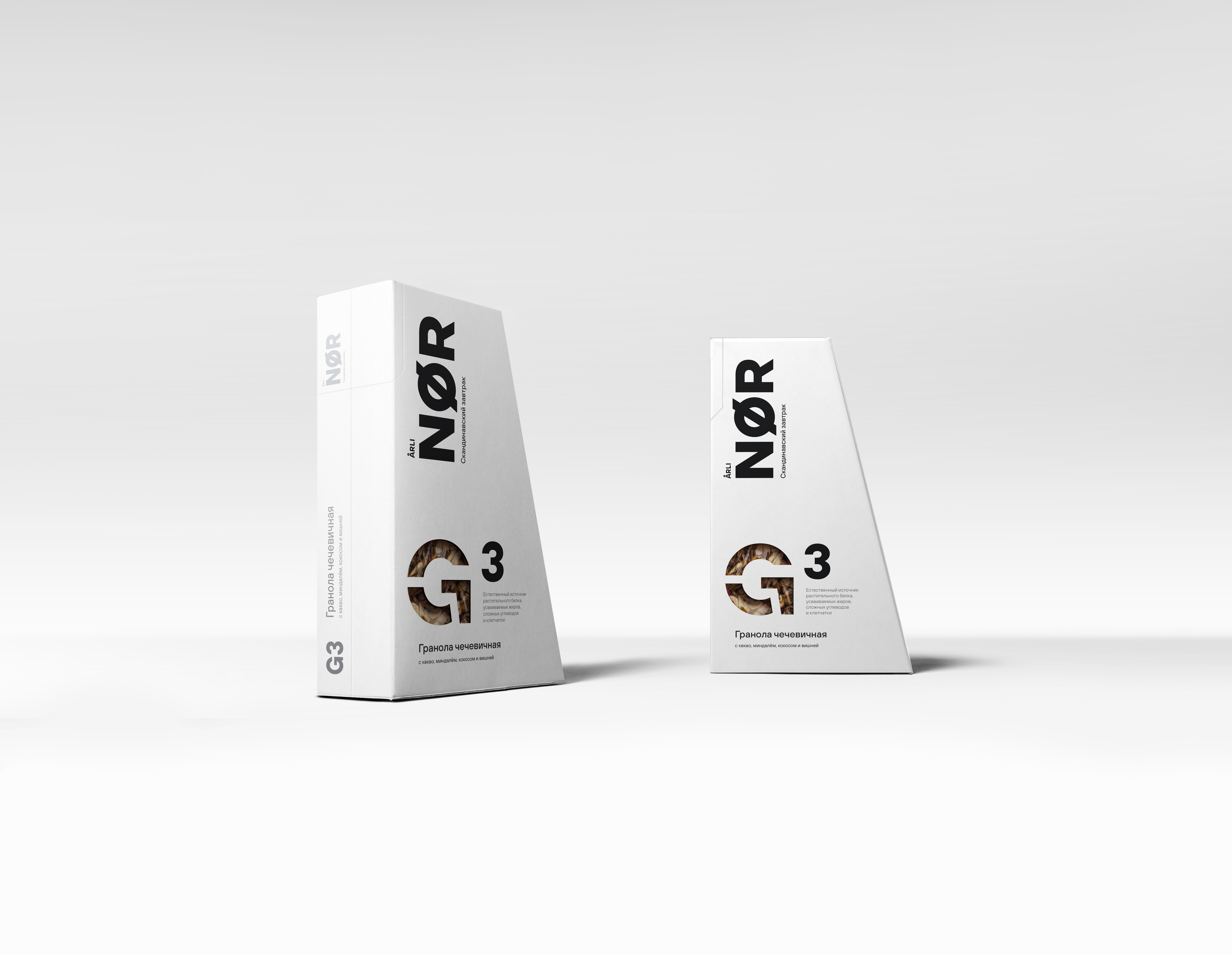
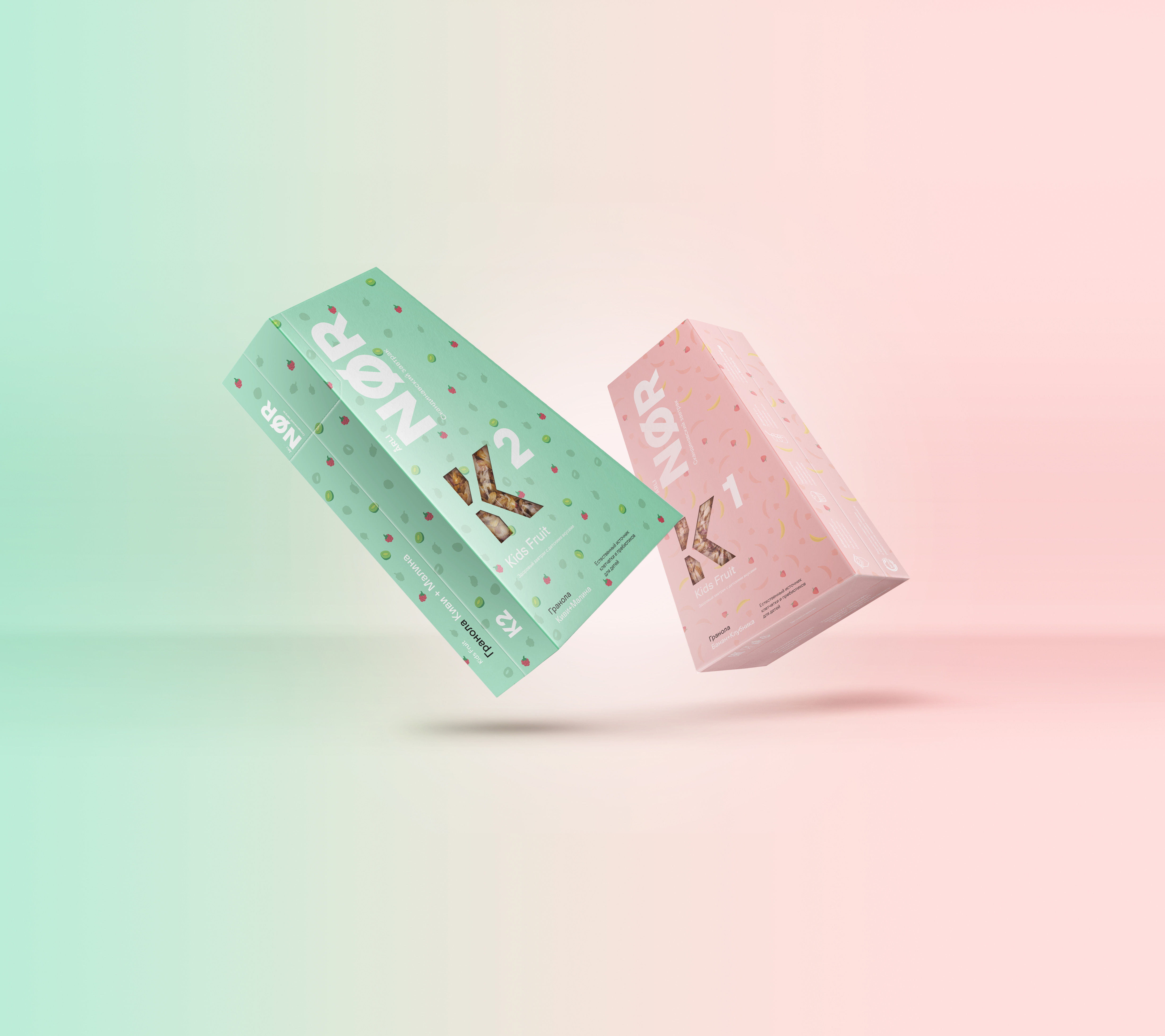
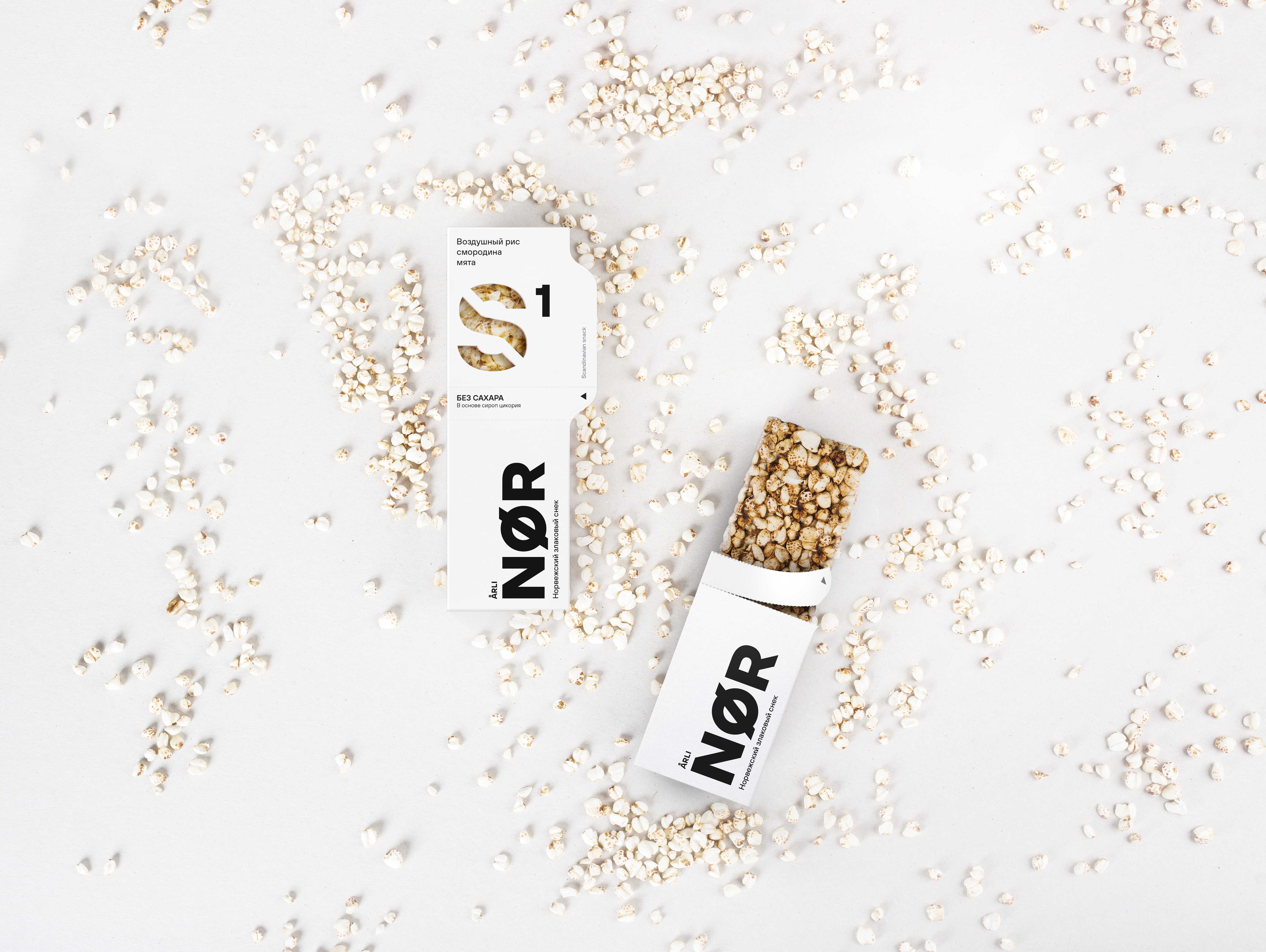
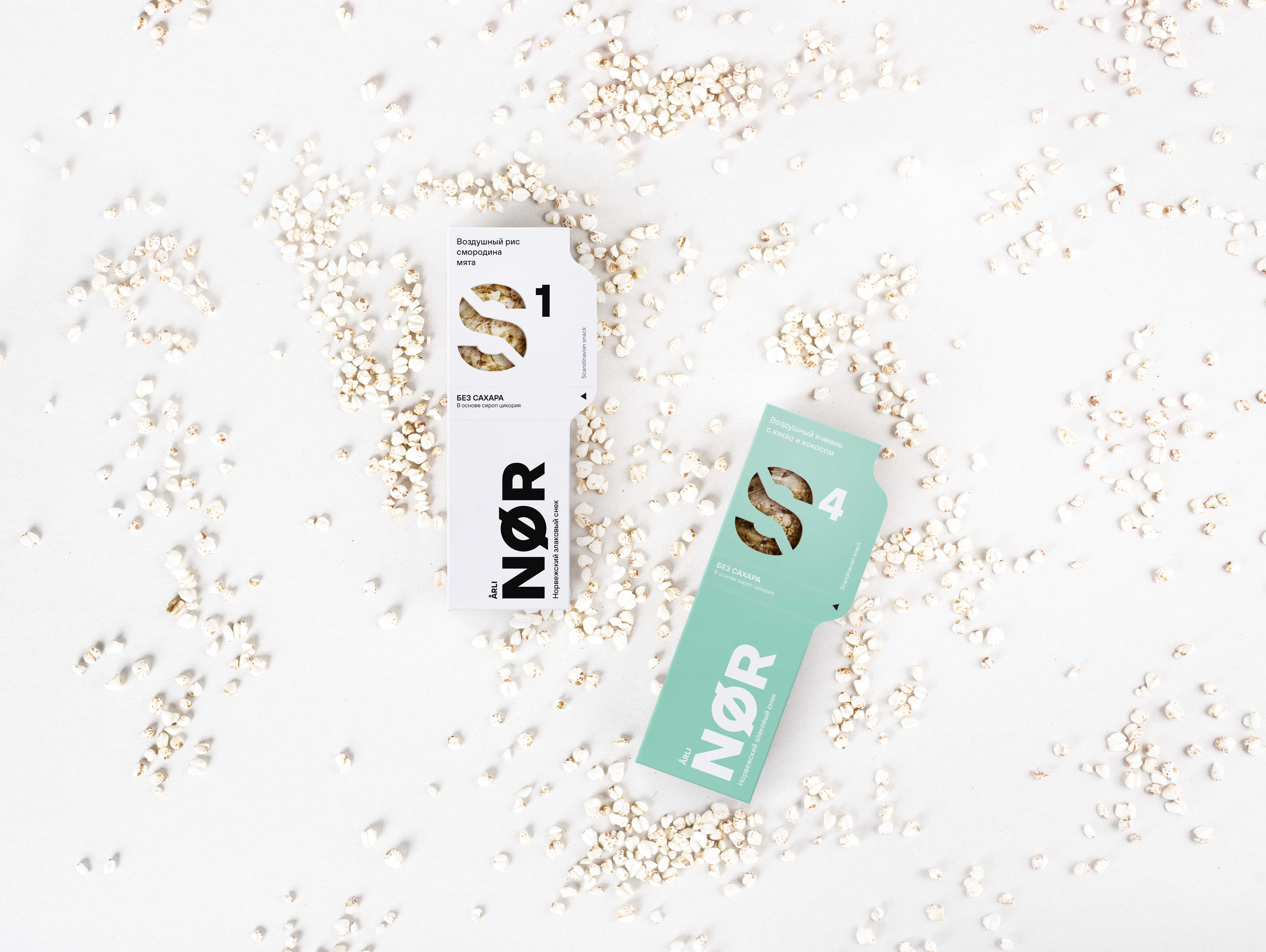
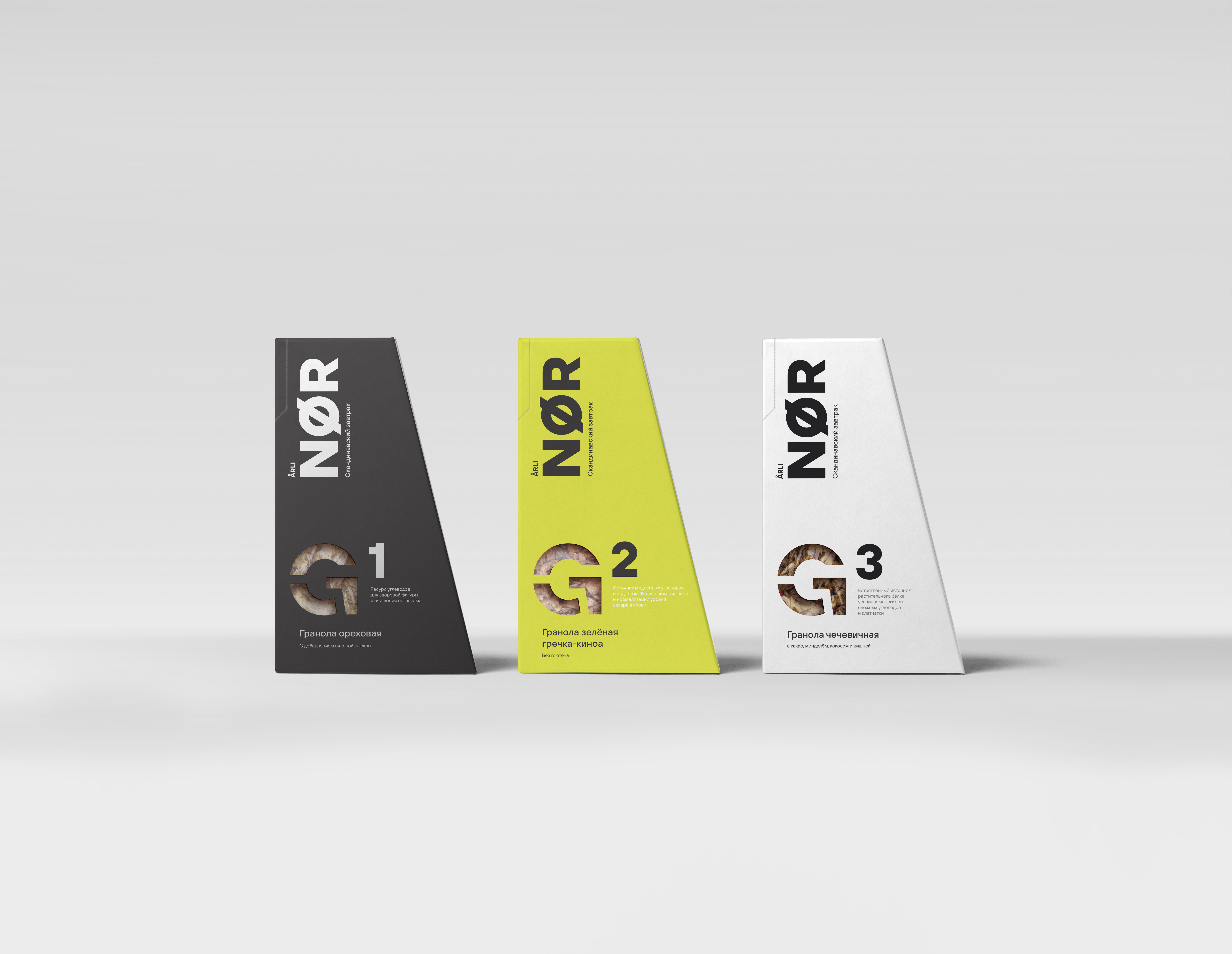
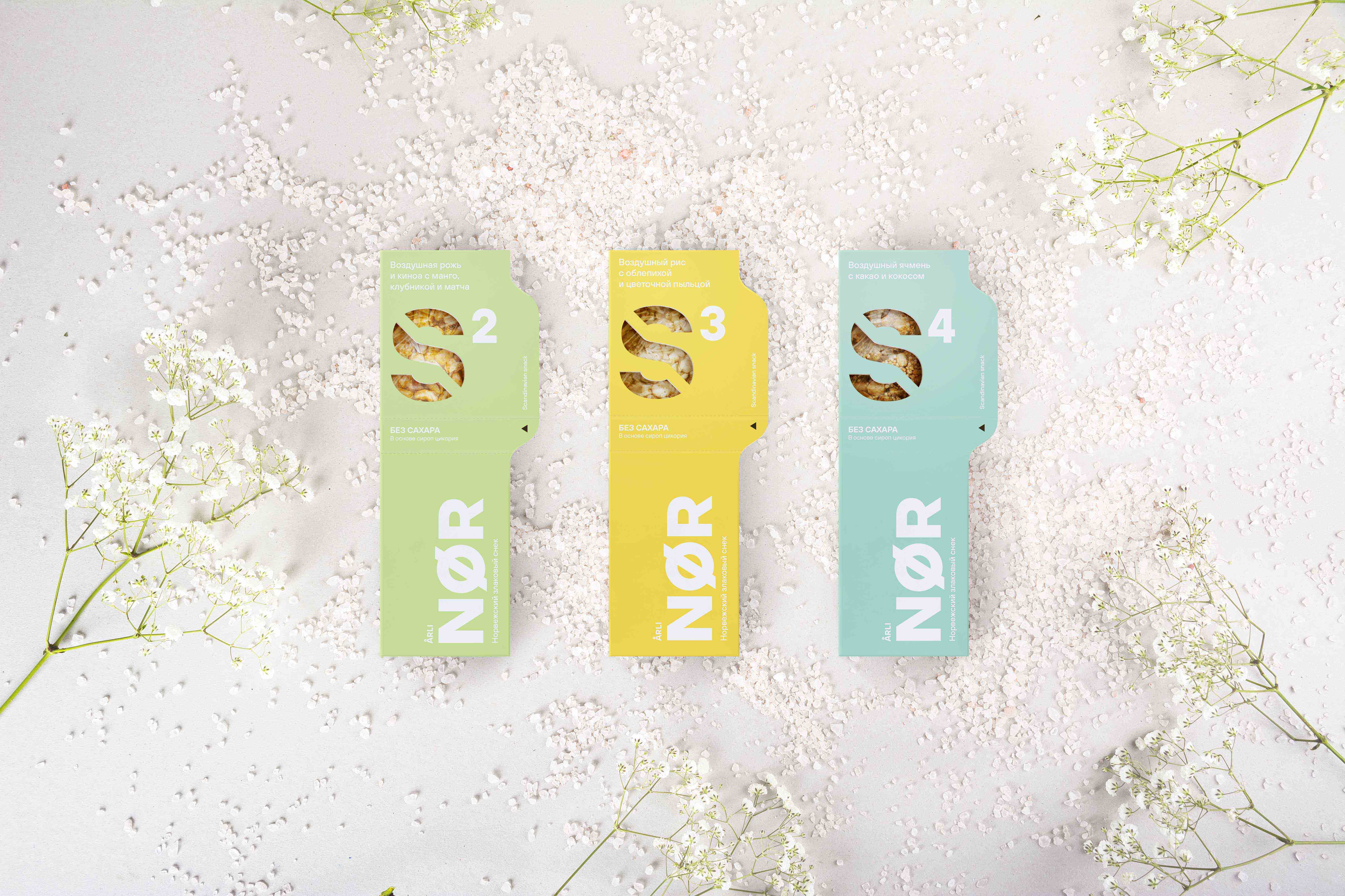
While searching for a niche for a new product, we focused on the Scandinavian philosophy of healthy food. We set about a detailed study of the typical Scandinavian diet, traditions, food basket, features of Scandinavian brands and, of course, packaging design. The work on creating the brand was not limited to packaging and design. We also adapted the product itself. It was then that the idea of the dominance of endemic cereals and the complete rejection of bright sweet flavors was born. After all, sweets stimulate overeating. And our philosophy declared proper nutrition. Thus, the brand’s taste platform was born: a cereal base, natural berries, vegetables, fruits and natural spices as a flavor carrier, a restrained taste, no sugar and maximum use of cereals endemic to central and northern Europe.
Name Philosophy
The name ArliNOR is purely fantasy. Its essence is to work on associations. The first part: Arli-associative with the English Early (early, early). This prefix declares a natural asceticism and connection with nature. And the second: NOR is a reference to the Scandinavian aesthetic.
In the process, an understanding of packaging was also formed. The packaging must be thought out for the situation of its consumption.
Its design should be very clean and ultra-modern. The packaging should look like a robot. But it should not be a slave to communication. We considered the product packaging not as a free space for placing colorful touts, but as an integral part of the product, its face. According to our belief, packaging should be an independent design object. We expected that most of the time the product would not be gathering dust on the store shelf, but would be in the everyday life of a modern person. And, accordingly, it should decorate his life, like any other element of his environment: his clothes, his kitchen, his phone, his car. The product should decorate the kitchen.
CREDIT
- Agency/Creative: Adequate people
- Article Title: Adequate People Creates Brand Identity and Packaging Design for Arli Nor
- Organisation/Entity: Agency
- Project Type: Packaging
- Project Status: Published
- Agency/Creative Country: Russia
- Agency/Creative City: St.-Petersburg
- Market Region: Europe
- Project Deliverables: Art Direction, Brand Creation, Brand Design, Logo Design, Packaging Design
- Format: Box
- Substrate: Pulp Board, Pulp Carton
- Industry: Food/Beverage
- Keywords: Arli Nor, Adequate people, Cereals, Granola
-
Credits:
Art direction: Vlad Rudovskiy


