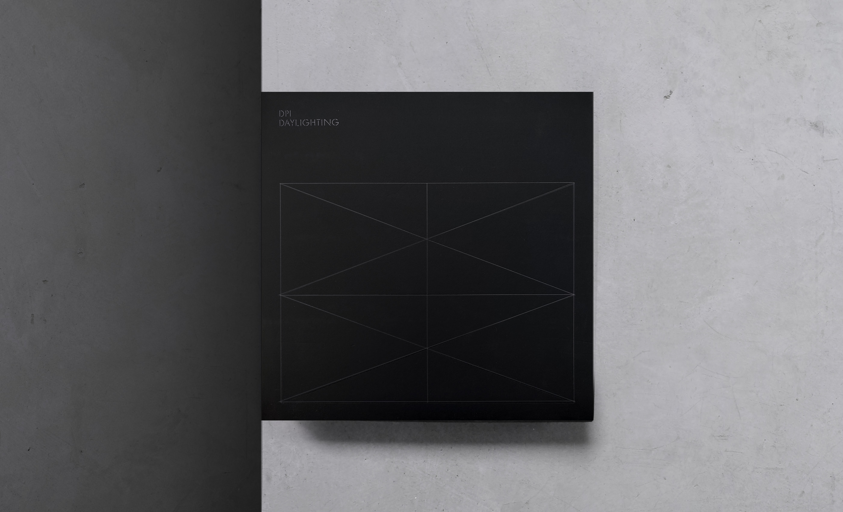
DPI Daylighting is a leader in commercial daylighting systems. By harnessing daylight through dynamic, environmentally friendly solutions, they provide visually and thermally comfortable architectural experiences. We were tasked to create a modern and sophisticated identity that showcased the product and attracted both architects, designers and project managers.
Adaptive Marque
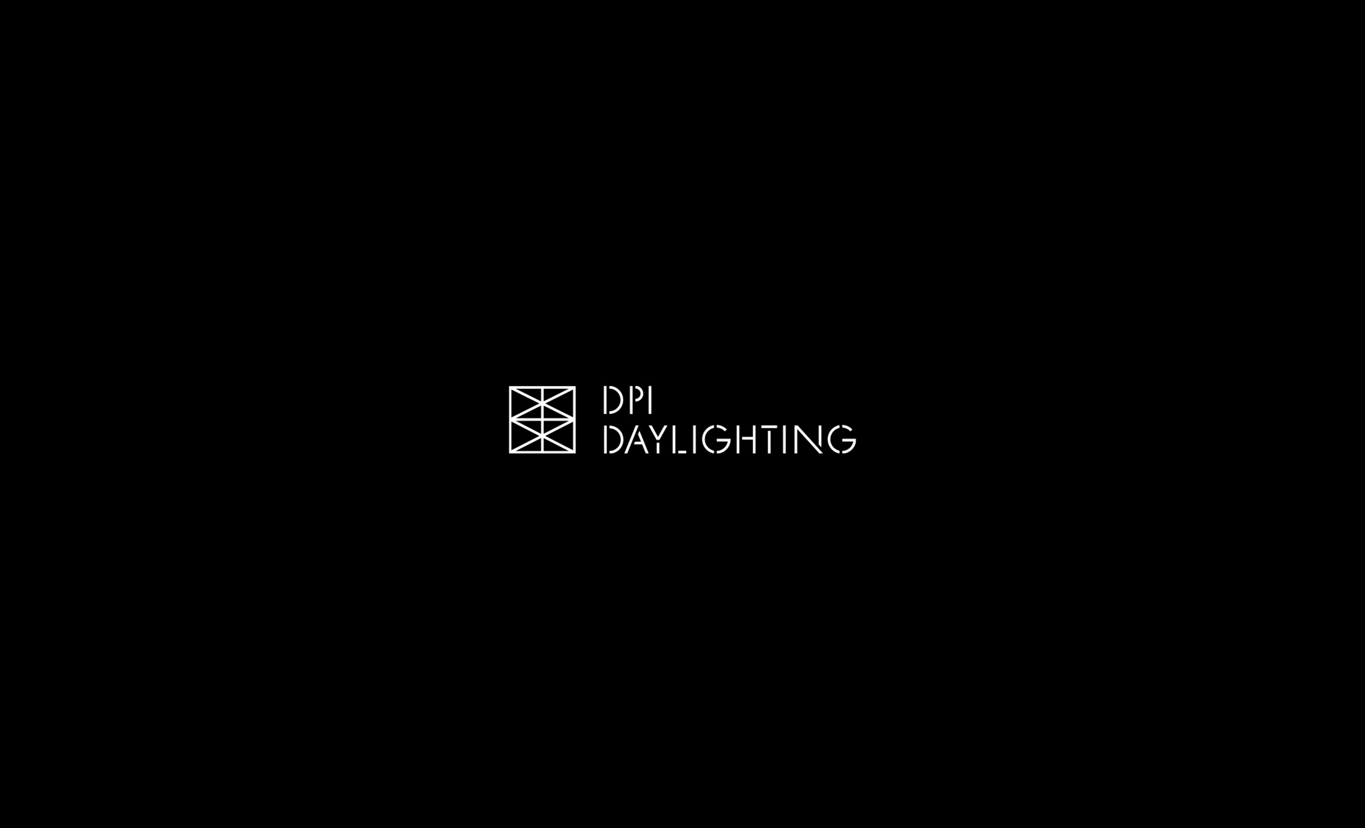
We created a brand marque that is directly inspired by the design and structure of the award-winning Flux™ skylight system that is unique to DPI. Diagonals and verticals combine to form triangles, providing strength and stability whilst optimising daylighting by controlling the levels of lux passing through the panel which is directly referenced in the logo.
Hero the Product
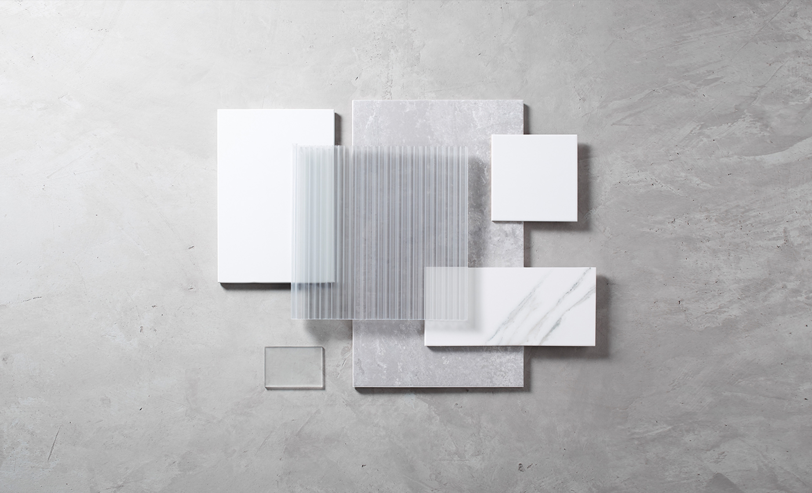
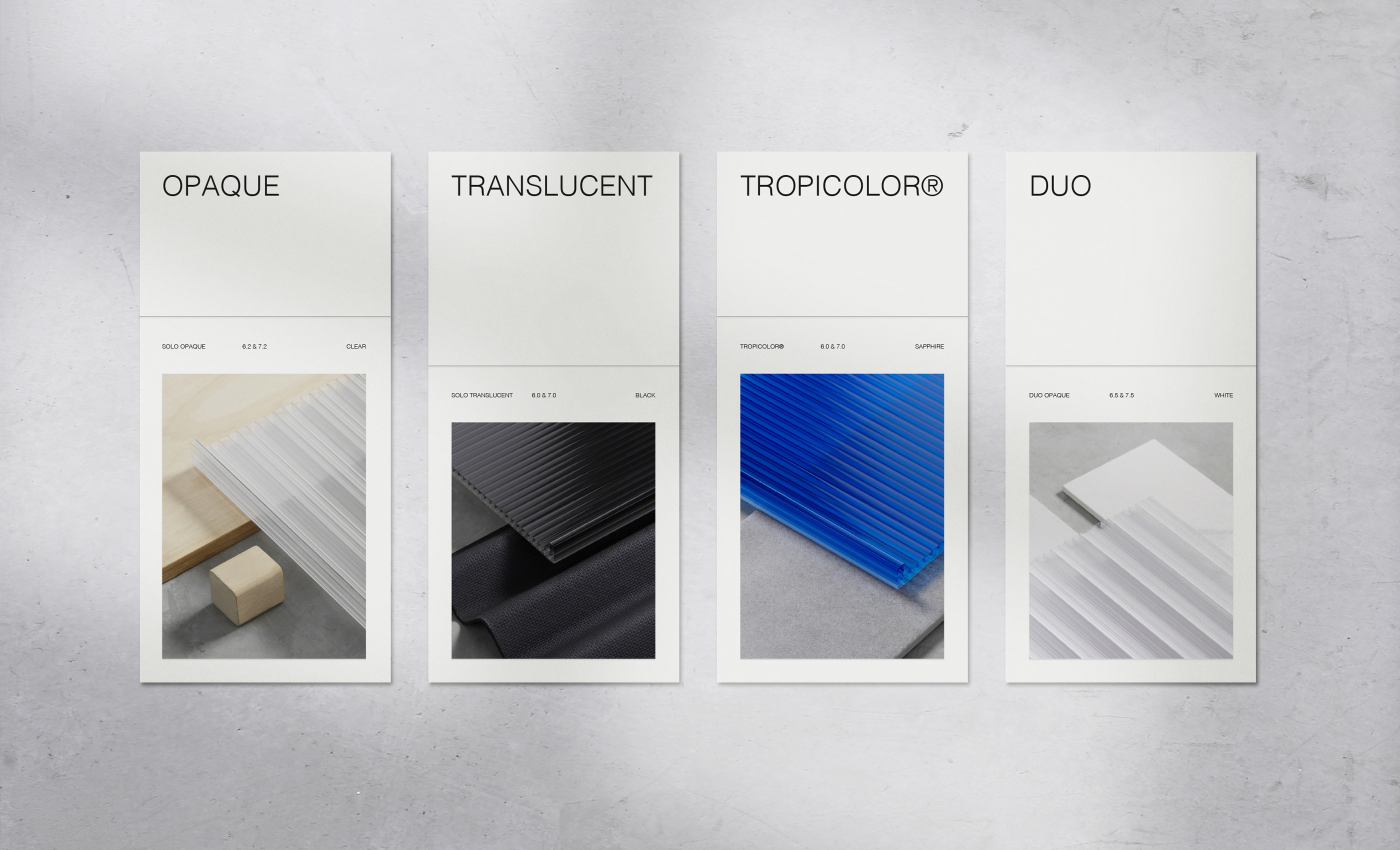
With the product being very functional and practical, we needed to create a way to showcase it which felt a little more desirable and aspirational. Using the product samples as a centre point, we art-directed compositions, layering a wide range of materials grouped by colour to show the versatility and effectiveness of the Flux™ product range.
“Alphabet have been very proactive in their approach and meeting deadlines without any compromises on creativity and output. Despite our products and industry being out of their usual line of work, their quick understanding and interpretation was commendable. We are extremely happy we chose Alphabet and would do so again.”
Rajeev Moudgil, CEO, DPI Daylighting
Bespoke Typeface
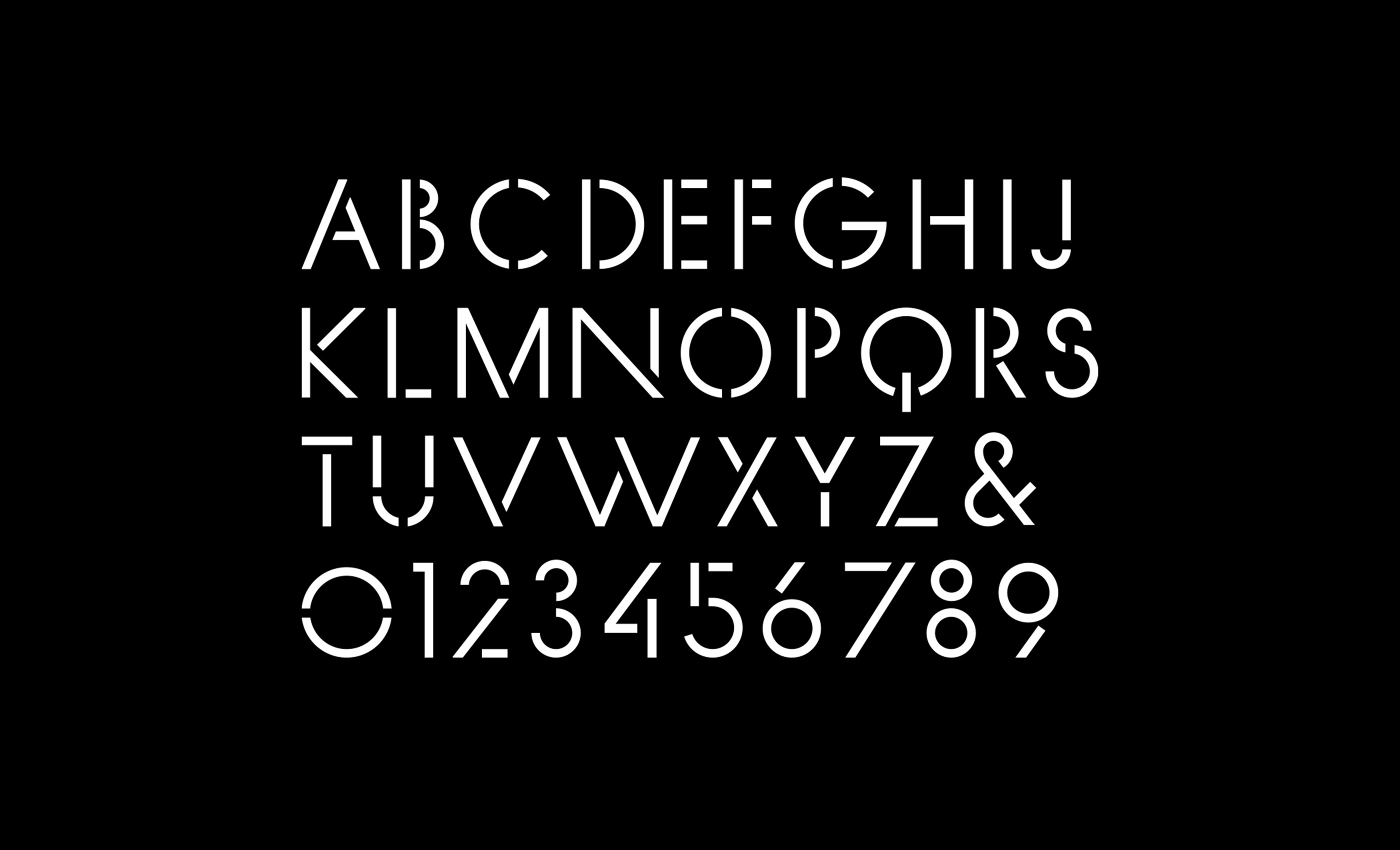
With the help of DR-Foundry, we created FLUX; a fully bespoke display typeface directly inspired by the product itself. Focussing on the vertical and diagonal angular louvres within the award-winning design, we created bold incisions through the letterforms to create a robust, stencil-style typeface with an overarching architectural look and feel.
Grid Systems
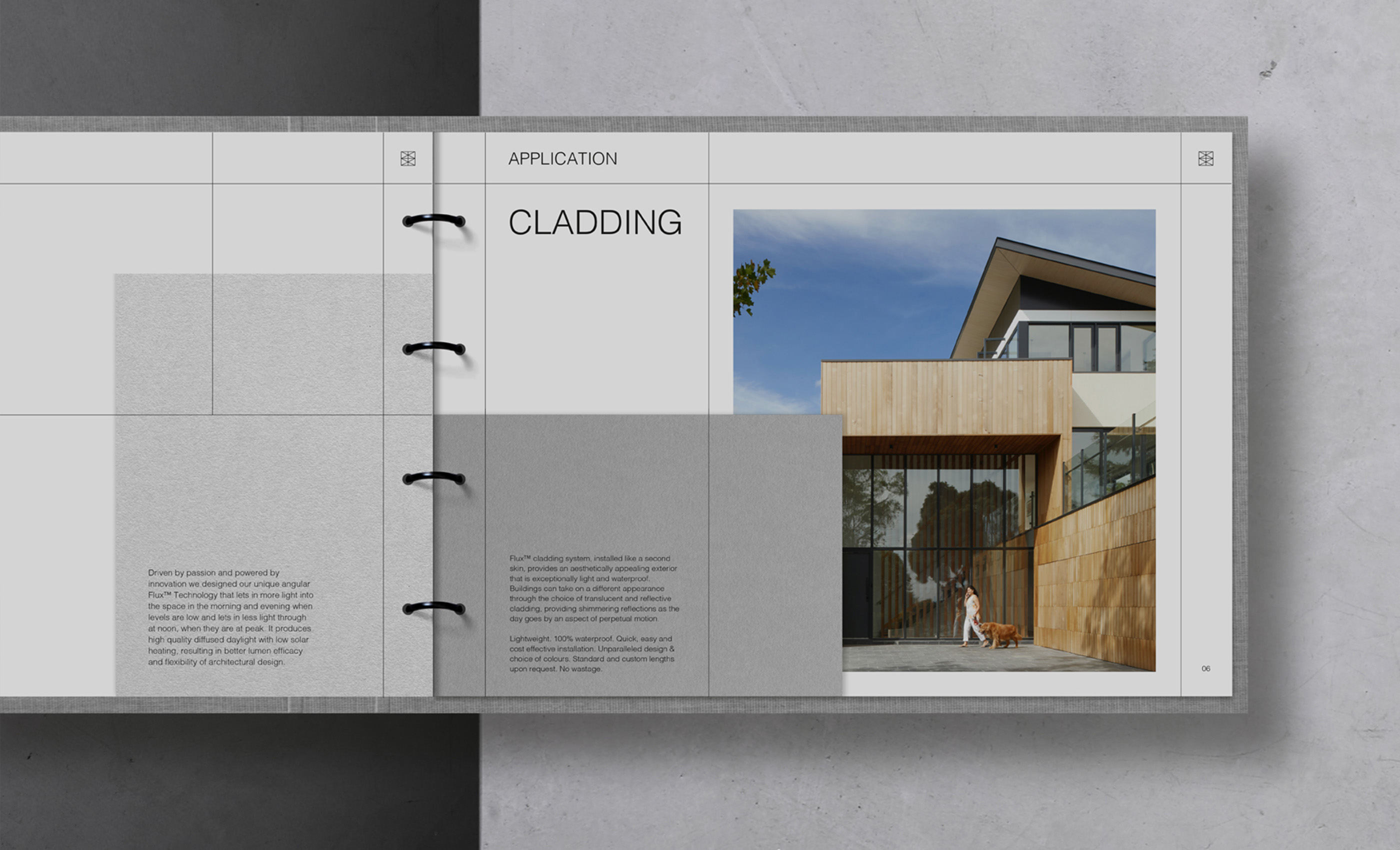
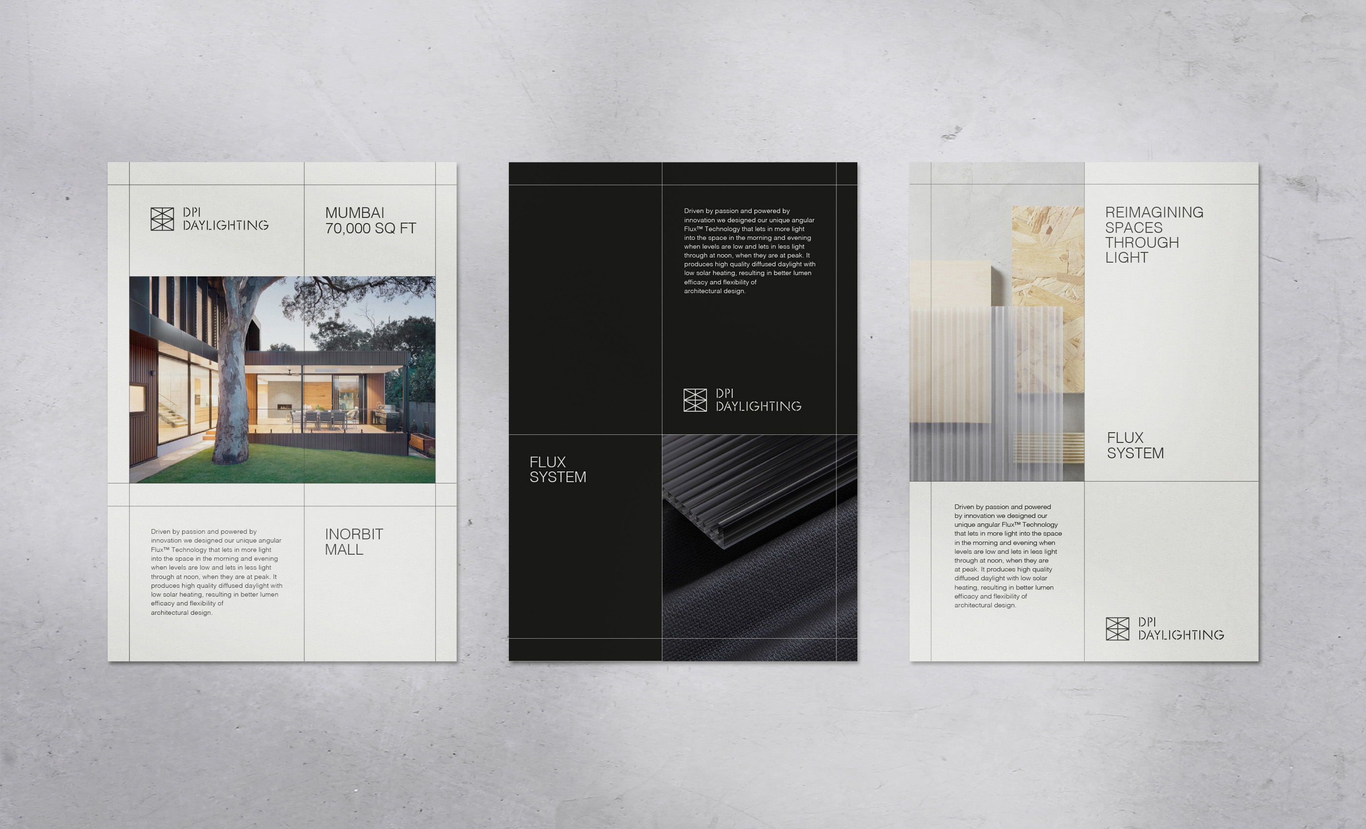
Continuing with the inspiration behind the logo and typeface, the natural progression was to carry this through into the unique grid systems for print and digital. Using a simple square grid format, we use a combination of vertical and horizontal lines to frame the content in a unique and engaging way, maintaining a premium-edge and overarching architectural feel to the content.
A combination of practical, in-use architectural photography with more aspirational studio-style product photography was important to show the full capabilities and uses for the unique Flux™ product range.
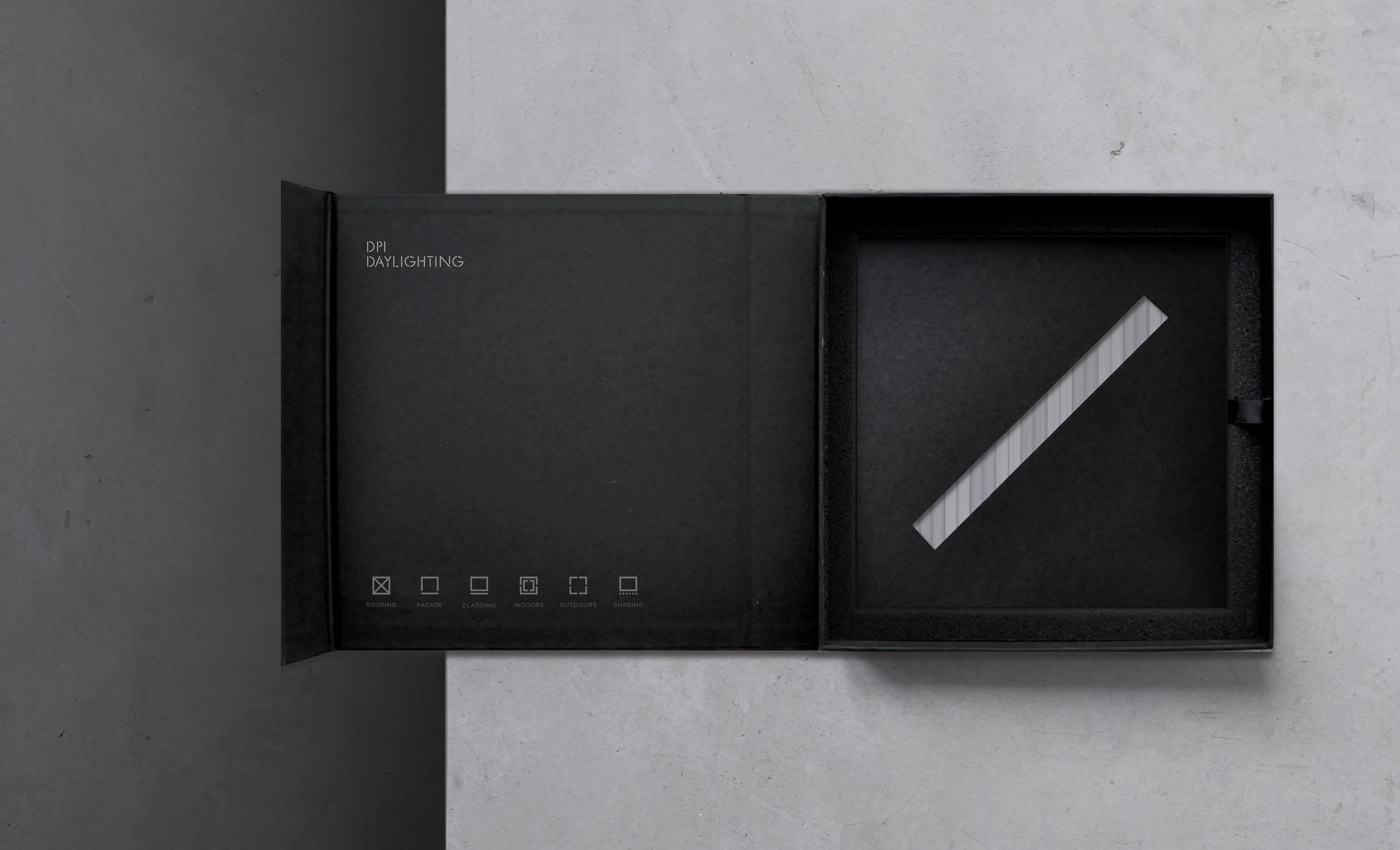
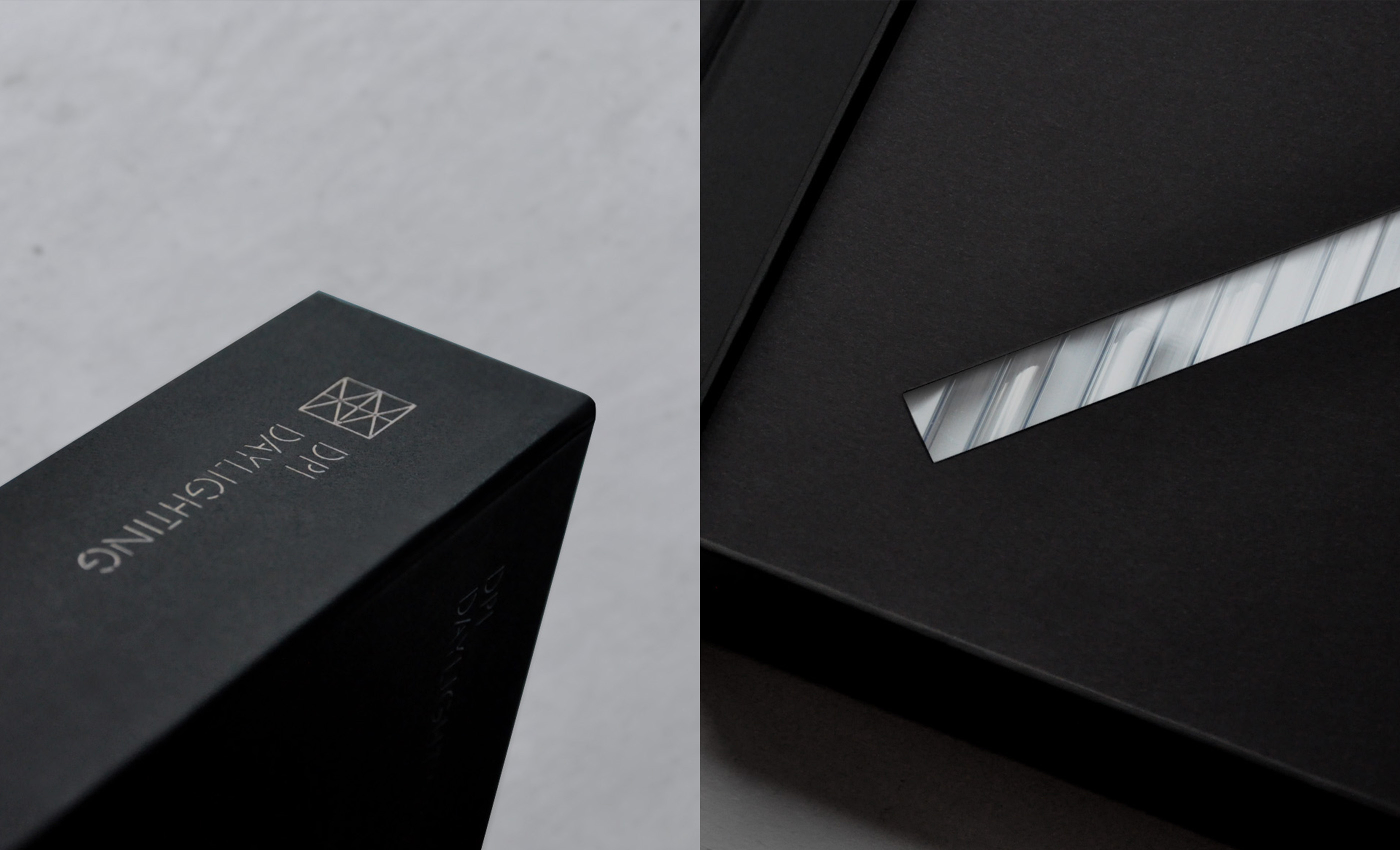
A key deliverable for the brand launch was a product sample pack to be sent out to architects and designers. Using the monotone black and white colour palette, with a mix of premium quality materials, we created bespoke packaging with a focus on a high-quality unboxing experience.
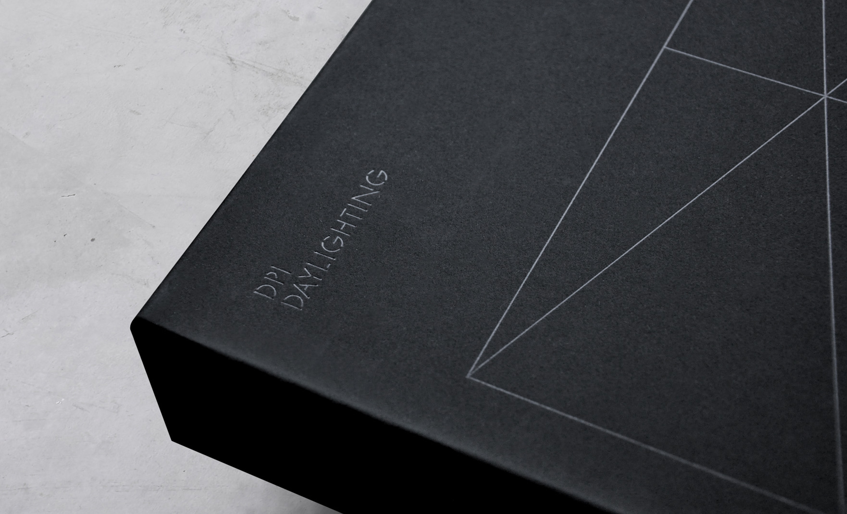
Materials are key in architectural design, and we put focus on this with the product sample, black foam cushioned interior, and premium black textured stock on the inside and outside of the box as well as screen printed, embossed, and foiled finishes.
In a similar style to the FLUX typeface, we also created a fully bespoke supporting suite of iconography which helped create a visual language for the key product features as well as wayfinding and supporting graphics throughout the offices and factory.
“Being an India-based manufacturer, we had a little reservation initially whether the virtual to and fro of visions and ideas would be enough, but this was put to rest by the professional Alphabet team right from the word go.” – Rajeev Moudgil, CEO, DPI Daylighting
“The bespoke grid system evokes architectural language with structure, ergonomics, materials, and modular components. The key for us was to reflect the product and the market within the logo marque and wider DPI brand.” – Sam Lane, Co-founder, Alphabet
We created a unique range of bespoke print including the folder catalogue, which layers the grid systems, imagery, typography, and iconography with different sized leaves to replicate the art-directed photography and nature of the Flux™ product range.
Larger hero typography is combined with closer product crops and unique formats to create a bespoke range of print that is both functional as well as desirable.
We worked with photographer TOMOD to capture close-cropped angles of the product, focussing on the detail within the angled louvres of the Flux™ product range.
More functional product packaging required more practical packaging formats, including plastic wrapping and cardboard. We maintained brand consistency using clear materials and a natural monotone colour palette to maintain a premium edge throughout every single brand touchpoint.
To make the brand accessible across digital platforms, we created a dynamic, beautifully crafted, portfolio-style website experience, which clearly and concisely communicates the offer, making for a superior online presence across all devices.
CREDIT
- Agency/Creative: Alphabet Design Agency
- Article Title: Alphabet Design Agency Create Branding and Packaging for DPI Daylighting a Leader in Commercial Daylighting Systems
- Organisation/Entity: Agency
- Project Type: Identity
- Project Status: Published
- Agency/Creative Country: United Kingdom
- Agency/Creative City: Manchester, UK
- Market Region: Global
- Project Deliverables: Art Direction, Brand Creation, Brand Design, Brand Identity, Branding, Creative Direction, Identity System, Packaging Design, Typography
- Industry: Construction
- Keywords: architect, architecture, branding, daylight, grid, light, lighting, polycarbonate, solutions
-
Credits:
Creative Director: Sam Lane


