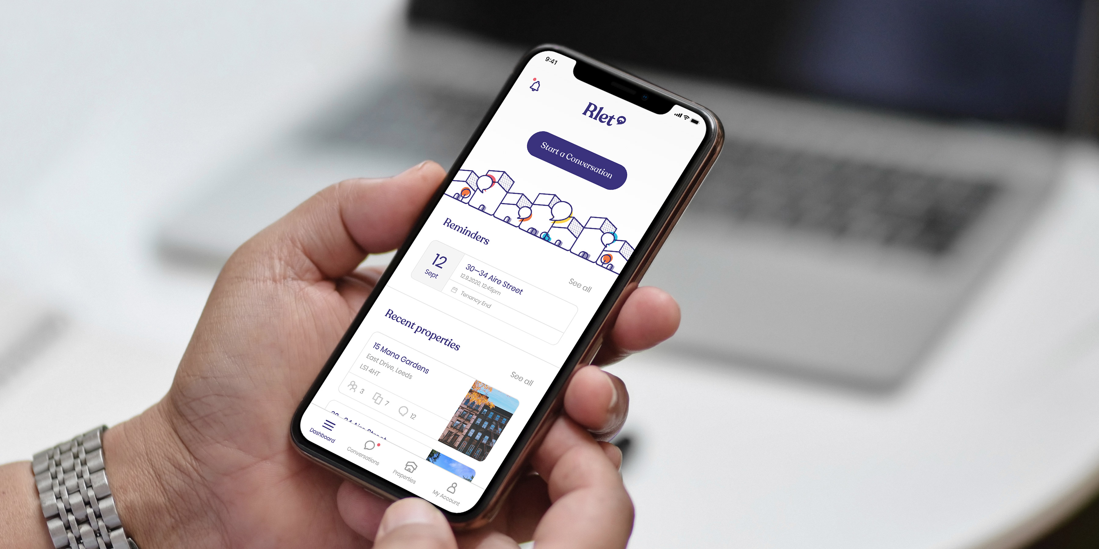
Rlet is a fully bespoke platform created by Few and Far that’s making property management simple. What is Rlet? For property managers, Rlet enables you to add each of your properties, set up profiles for additional property managers and tenants, and handle everything from signing contracts to exchanging photos of maintenance tasks through the platform.
You can host conversations with tenants, set reminders for important dates, exchange documents and keep a clear, organised audit trail, all under one roof.
The concept: When creating a platform that needs to connect property managers with tenants we wanted to make sure the entire experience felt welcoming, easy to use and for it to feel more like a part of your lifestyle than an overtly technical piece of software that was difficult to use. We brought this to life through the concept of Conversations.
In our definition workshops we presented the Conversations concept which would allow property managers and tenants to message one another based on a range of subjects from tenancies and documentation to maintenance issues and self-inspections in a format that would be familiar to any user on a device.
It’s about conversations: The brand for Rlet needed to feel friendly and inviting enough for anyone to be able to use. Whether you’re a property manager with multiple properties, or a single tenant the whole brand experience needed to feel accessible to you at all times.
We started by creating a custom logo based on the font family ‘Recoleta’ by type foundry Latintotype, which is accompanied by our custom marque: a silhouette of a property encased in a speech bubble.
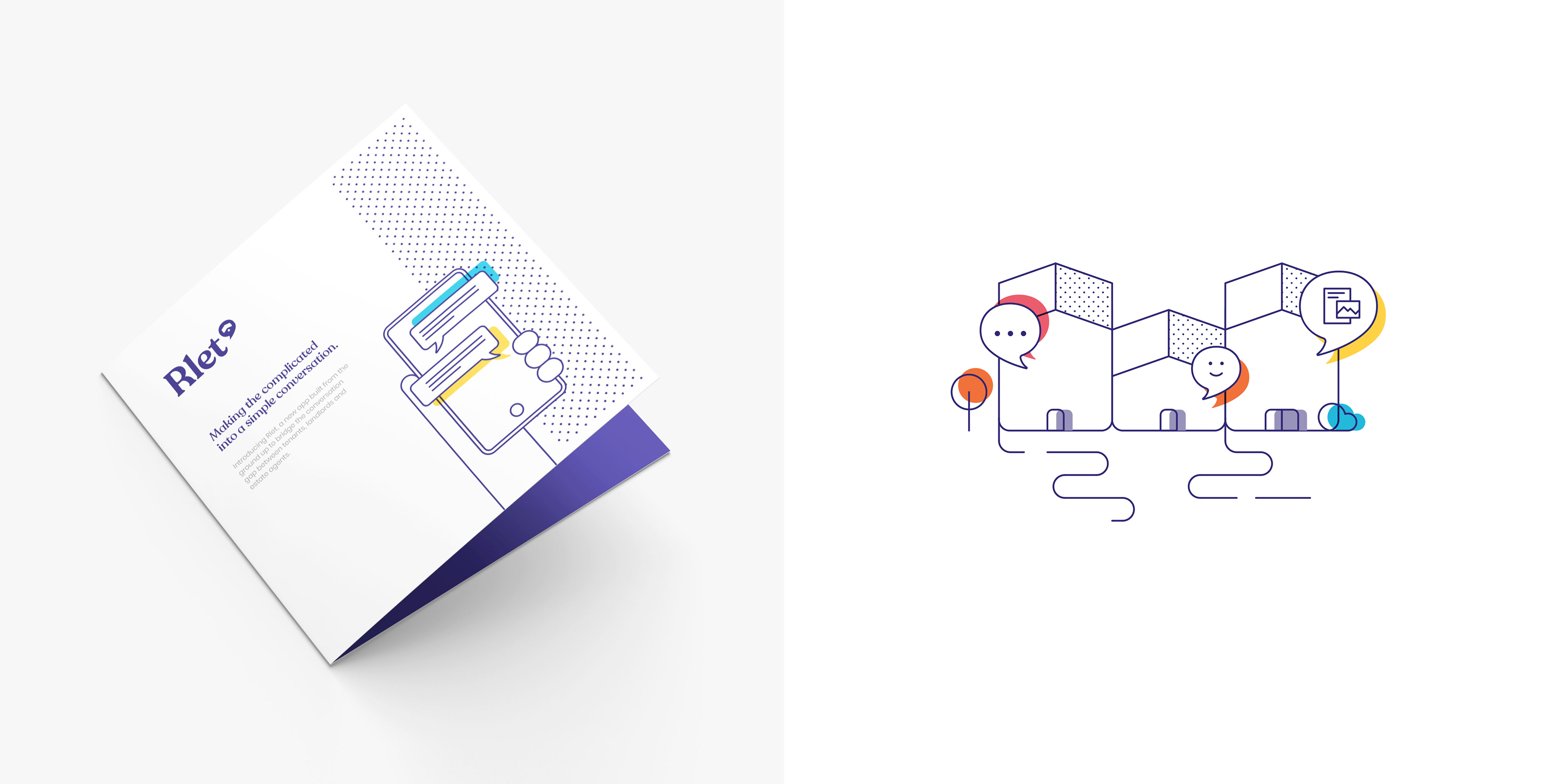
Bringing Rlet to life: We created a brand for Rlet that compliments the messaging and accessibility of the platform. The entire brand experience carries a constant feeling of being open, honest and welcoming to its users and the typography, colours, illustrations and iconography lends itself to being able to explain features and benefits of Rlet in a non-technical way to the varied users of the platform.


CREDIT
- Agency/Creative: Few and Far
- Article Title: Few and Far Agency Branding for Rlet
- Organisation/Entity: Agency
- Project Type: Digital
- Project Status: Published
- Agency/Creative Country: United Kingdom
- Agency/Creative City: Leeds
- Market Region: Europe
- Project Deliverables: App Design, Brand Creation, Brand Design, Brand Strategy, Copywriting, Creative Direction, Design, Icon Design, Identity System, Illustration, Interaction Design, Logo Design, Motion Graphics, User Experience, User Interaction, Web Design
- Industry: Real Estate
- Keywords: property, tenants, tenancy, property management
-
Credits:
Creative Director: Colin Grist
Creative Director: Thomas Nadin


