Great taste with minimalistic ingredients – The Wild Snack Co. presents its crisps and puffs with no added preservatives, sugar or colourings. The packaging design is just as clear and bang up-to-date.
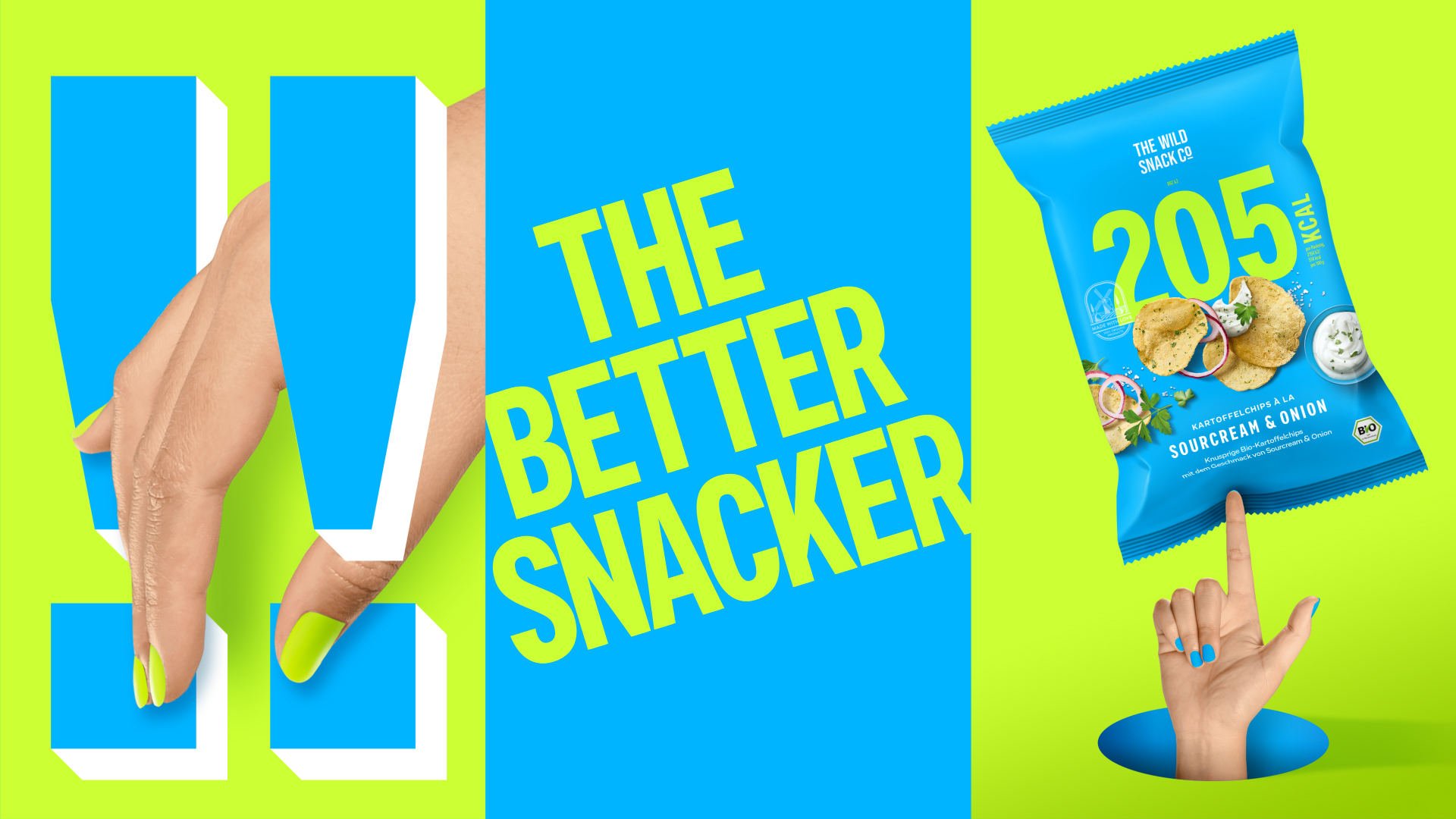
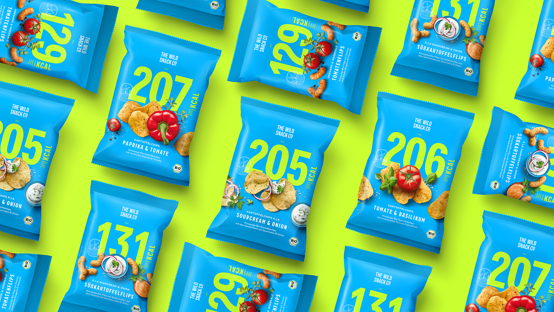
Wildcorn, a Berlin start-up is launching five new products and has big plans: change snack culture! The two puffs and three crisps variants are carefully produced with no added preservatives, sugar or colouring, using the best organic ingredients for high quality. Clear labelling and absolute transparency are particularly important for the products – only the ingredients that are in the pack should be shown on-pack. What’s more, the new products have significantly fewer calories than conventional salty snacks. The three founders are also committed to protecting honey bees and promoting sustainability, enabling you to snack with a clear conscience in more ways than one. Hajok Design has helped the brand communicate this new category in the snack segment on-pack and achieve a bold launch at POS.
Natural, bold, yummy and unique – this was the brief for the creative team. The packaging design should be just as extraordinary as the short list of ingredients and the low number of calories. The fact that the snacks are certified organic products should be communicated as a matter of course. A conventional ecological look and, above all, classic crisp packaging visual cues were to be avoided. Instead, the aim was to grab consumers’ attention, especially among the target group of nutrition-conscious millennials, by means of colour blocking and authentic food shots.
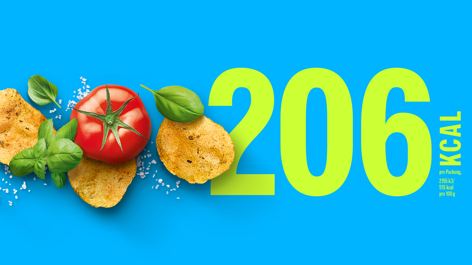
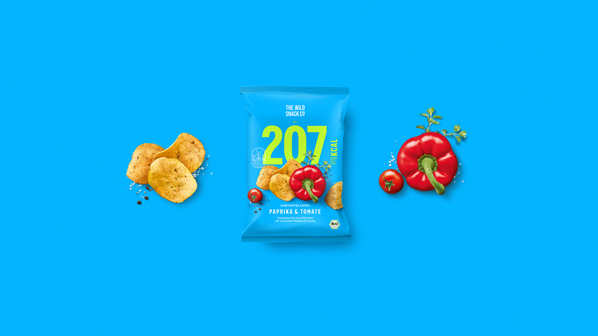
Very close cooperation with the client made this project particularly special. The idea of displaying the number of calories in a clear and striking way already existed. Hajok had to use all their powers of persuasion regarding the brand colour – but this was well worth it in the end! The packaging really stands out on-shelf, exuding a previously unseen look and brimming with confidence, and thus highlighting the ingredients in a striking way. These were elaborately photographed and, in addition to the large characters which depict the low number of calories, are the key focus on-pack, encouraging consumers to enjoy guilt-free, tasty snacking. In contrast to the high-impact look, the typography of the brand name and the quality seal with the windmill are executed with restraint, creating a perfect balance between courageous presentation and understatement.


CREDIT
- Agency/Creative: Hajok Design
- Article Title: Packaging Design for The Wild Snack Company’s Crisps and Puffs
- Organisation/Entity: Agency, Published Commercial Design
- Project Type: Packaging
- Project Status: Published
- Agency/Creative Country: Germany
- Market Region: Europe
- Project Deliverables: Brand Creation, Brand Identity, Branding, Graphic Design, Packaging Design, Photography, Research / Insight
- Format: Flow-Pack
- Substrate: Plastic


