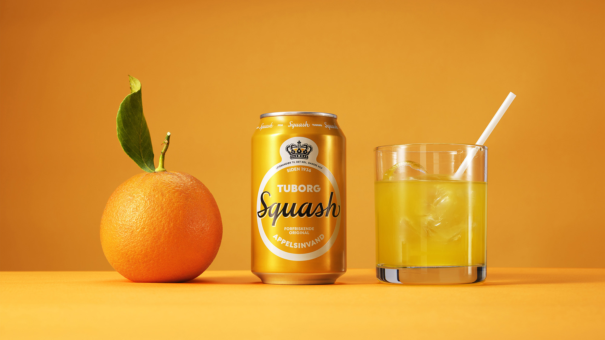
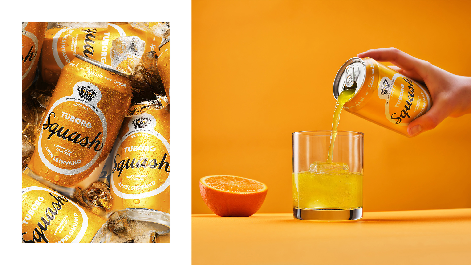
Tuborg Squash is a Danish icon, a true classic introduced in 1936. The design needed an update, so when our good friends at Another approached us, we were naturally excited.
The new design should connect with a younger audience, but at the same time, it should appeal to existing fans. Finally, it should emphasise the tasty orange flavour and just be more Tuborg’sk. Refreshing, without getting too fresh, and original without becoming old-school.
The two-orange rule.
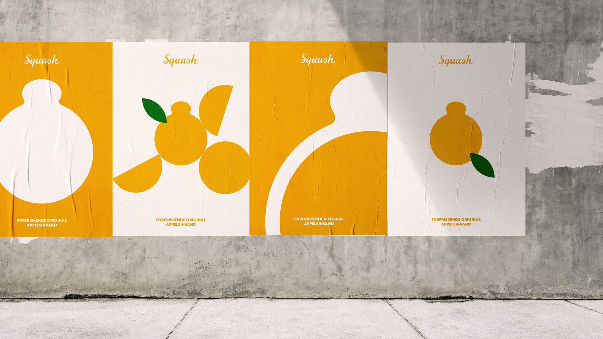
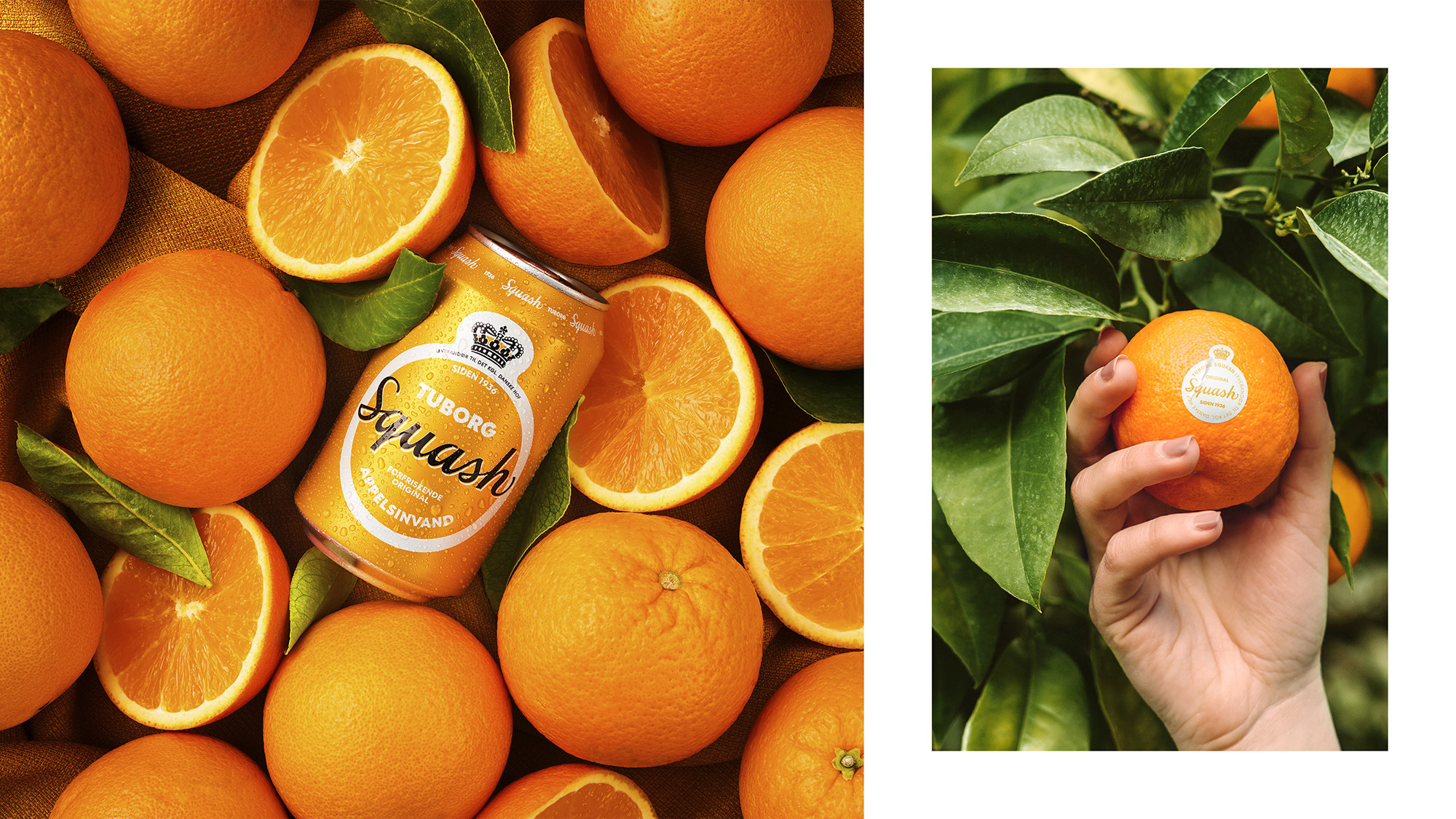
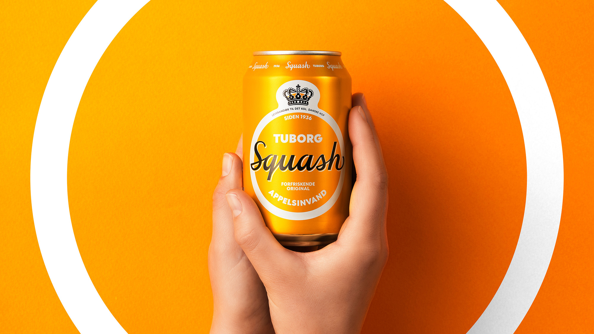
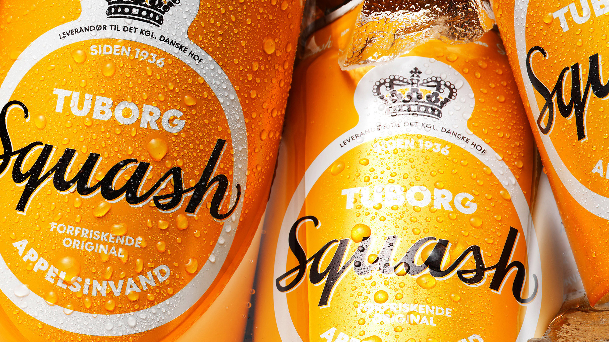
As a long-lasting icon, Squash is shrouded in storytelling and tradition. One of these traditions was the two-orange rule; in every Squash was the equivalent of two oranges. Naturally, we couldn’t help incorporate this into the new design. The first orange is the round label shaped like… well, an orange. The other orange is hidden inside the label’s top crown to focus on this legendary soda water’s legacy and pride.
Respecting the legacy.
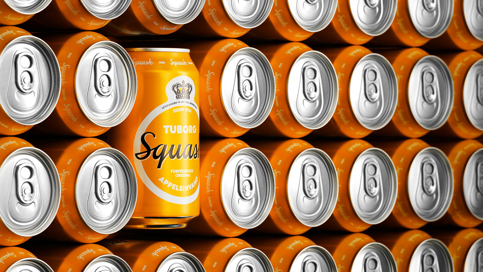
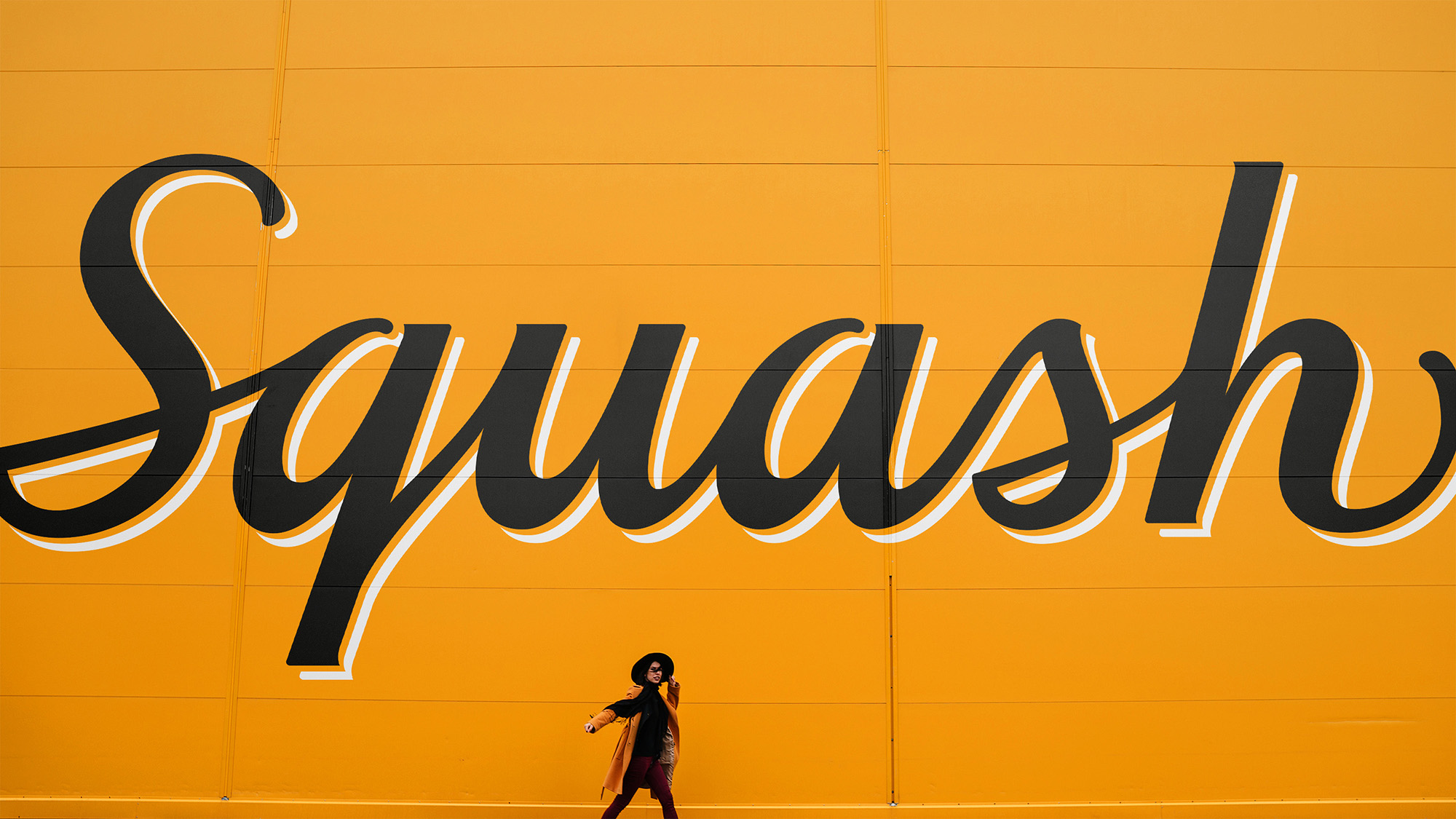
However, the real change in the design is the liquid typography used in the new logotype. We are interpreting traditional and personal details and convey them into a modern logo. By respecting what has worked in the past, we induce new life to the label. The lines become playful, with soft, silky movements, and if you look closer, you can see the S-letters greeting you with a friendly smile. It’s details like this that spark the imagination and make for good storytelling and iconic design. That, and an original, refreshing taste.
“Tuborg Squash is the original Danish orange soda water. With the new design, it’s well on its way to reclaim its place as a warmhearted national icon for generations to come. And as always, hard to pronounce, easy to drink”, adds Michelle Lægdsgaard Larsen, Brand Manager at Tuborg.
Tuborg Squash is part of the Carlsberg Group.
CREDIT
- Agency/Creative: Everland
- Article Title: Tuborg Squash Originally Refreshing Packaging Design by Everland
- Organisation/Entity: Agency, Published Commercial Design
- Project Type: Packaging
- Agency/Creative Country: Denmark
- Market Region: Europe
- Project Deliverables: Graphic Design, Packaging Design, Rebranding, Research
- Format: Can
- Substrate: Metal


