Private Brands, also known as private labels, retailer brands or store brands, are defined as all merchandise marketed under the retailer’s brand and can be identified by the name of the retailer itself or a name created specifically for that purpose.
The study by Cadent Consulting Group indicates that private brands are growing three times faster than manufacturer brands, and foresees that these will attain a 25% market share in the next decade. Retailers are taking advantage of this opportunity, offering a variety of private brand products, at good prices and with equal or superior quality than manufacturer brands. This growth has been driven above all by consumers in the Millennial generation. One-third of these consumers’ shopping carts are already comprised of private brand products and 54% of this target states that their store choice is influenced by the retailer’s private brand.
Millennials also purchase “Natural”, “Premium” or “Organic” Private Brands at much higher rates when compared with the previous generation, the Baby Boomers.
Pingo Doce launched its own brand in 1991 as a strategic vector for differentiation, currently representing 34% of sales. It is recognized by consumers as the label with the highest quality, according to the annual study Tracking Food Retail carried out by PRM.
Part of the Jerónimo Martins Group, Pingo Doce has more than 400 stores nationwide, leading the supermarket segment in Portugal and the Cash & Carry segment with the Recheio brand. In Poland, Biedronka is the largest Food Distribution Chain in the country, with 2.900 stores and, more recently, the group has started operating in Colombia, with the convenience stores Ara (Jerónimo Martins).
The challenge Pingo Doce launched for us was to develop a new image for the private label’s wine range. The goal was to reinforce the brand’s image and confidence in this category, giving it greater prominence on the shelf and attracting new consumers who value not only quality and price, but also a product’s image.
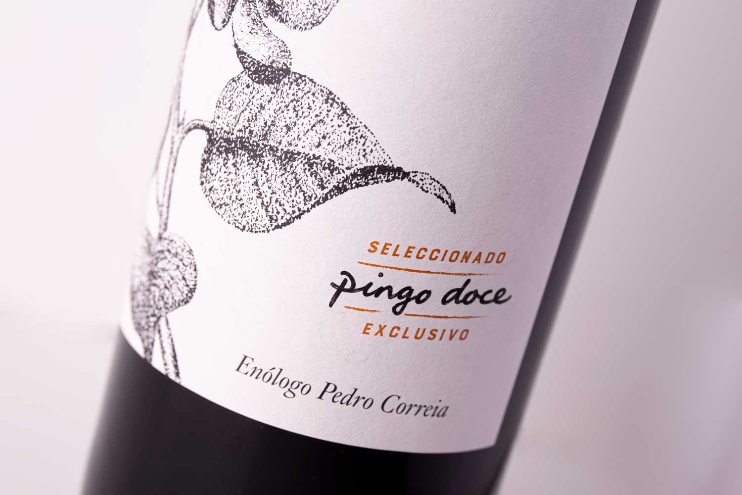
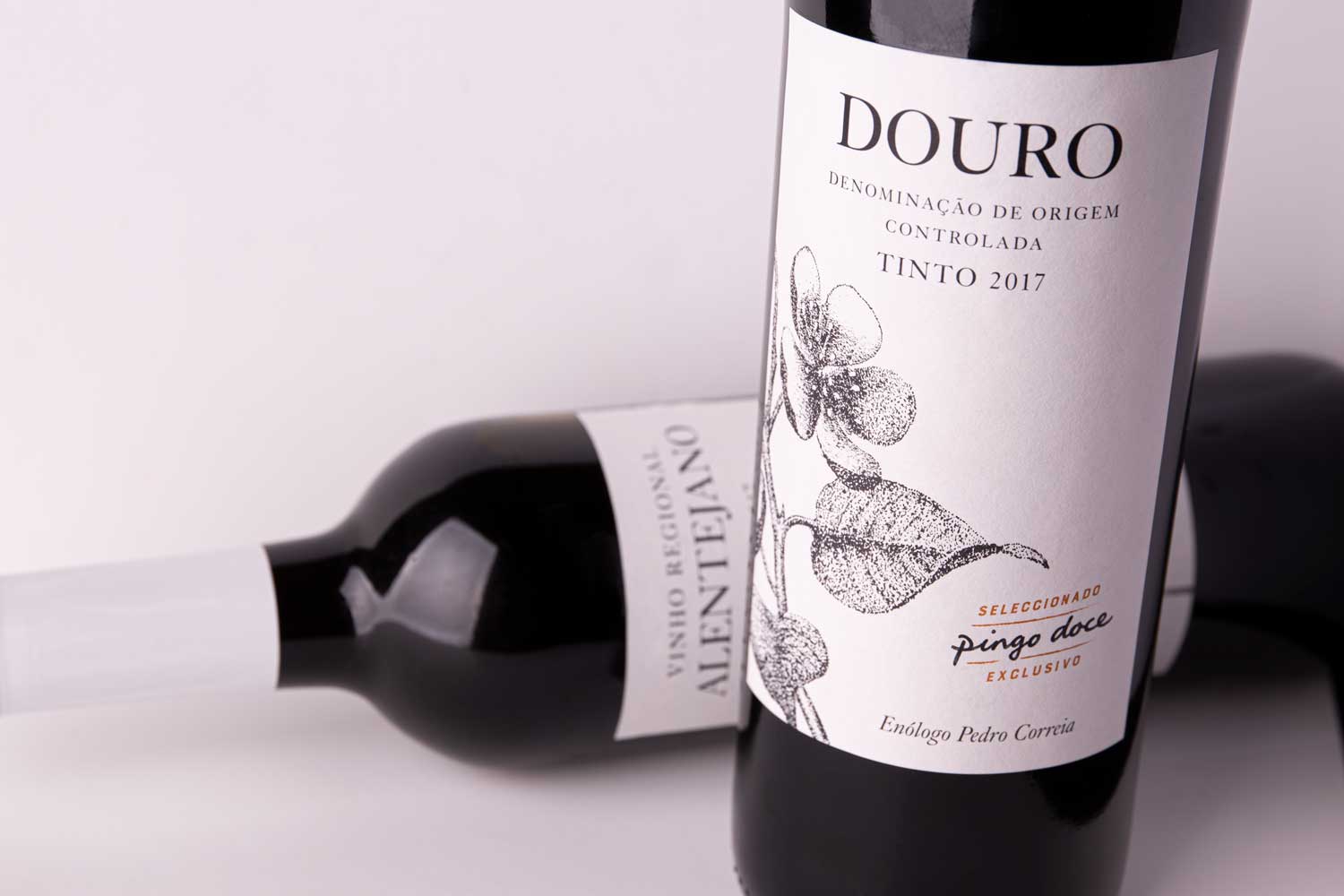
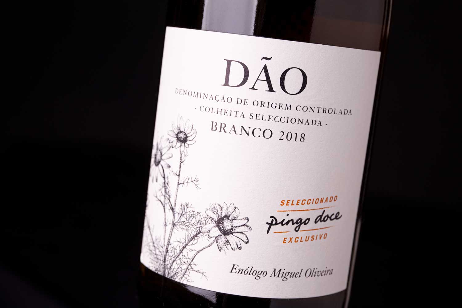
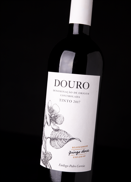
In the conception of the graphic identity, the presence of the Pingo Doce brand on the labels appears in the background as a seal of quality and confidence in this “Exclusive Selection” of wines produced across Portugal. The winemakers’ signatures reinforce Pingo Doce’s commitment to guarantee the authenticity of the wine style produced in each region, at the hands of those who know it best.
Inspired by Leonardo da Vinci’s quote, “Humanity will never devise an invention more beautiful, nor more simple than does nature”, the new image for Pingo Doce wines pays tribute to the small beings that live among the vines every day. Without coats of arms or ostentation, each label is a white canvas adorned with the beauty of simple things.
For this extensive range, we created a strong graphic narrative that connects with the consumer instantly, conveying closeness and confidence, in line with the Pingo Doce brand values: to democratize quality, in other words, to provide quality food products at competitive prices. With a clear and sleek visual message, this image showcases each wine’s characteristics and triggers the purchase of each bottle from this charming collection.
In the graphic communication of the Vintages (entry-level) the region where the wine originates is the predominant feature on the labels. The plant illustrations represent the typical vegetation where the wine is produced and, for the Reserves, we chose the richness and beauty of the local fauna to adorn the labels and dignify the region.
For the Limited Editions, which will be smaller productions, believing that the beauty of simple things lies in the attention given to details, we selected two items: the rooster’s feather and the oak tree’s acorn.
The new image for Pingo Doce wines has driven this category’s growth in sales and established the Pingo Doce brand as a whole.


CREDIT
- Agency/Creative: RitaRivotti® Premium Packaging Design
- Article Title: Rita Rivotti Designs The New Image For Pingo Doce’ Wines
- Organisation/Entity: Agency, Published Commercial Design
- Project Type: Packaging
- Agency/Creative Country: Portugal
- Market Region: Europe
- Project Deliverables: Brand Identity, Brand Redesign, Illustration, Product Architecture, Rebranding, Retail Brand Design
- Format: Bottle
- Substrate: Glass


