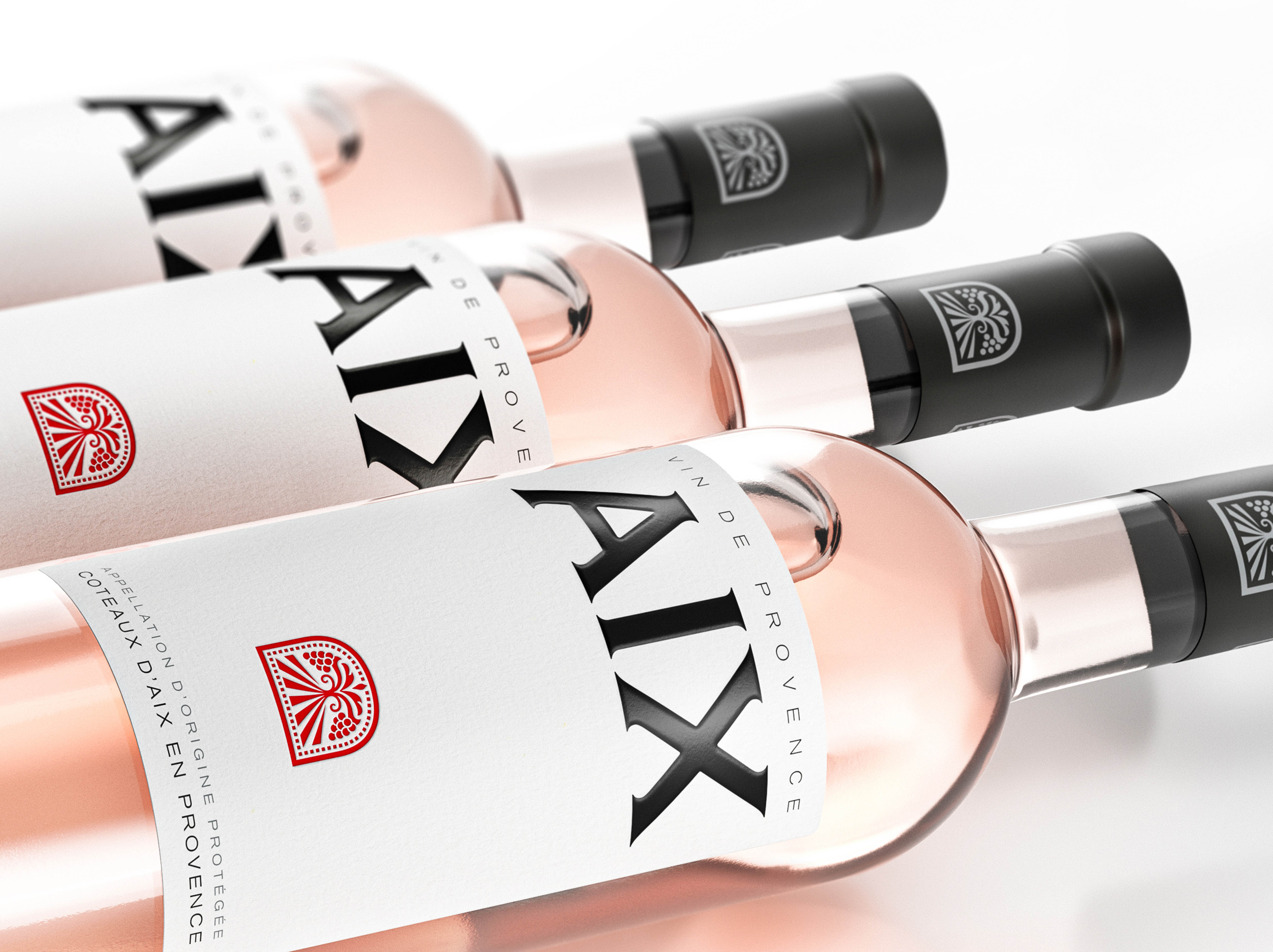
The boutique branding and packaging design agency Appartement 103 was commissioned to refresh AIX Rosé, a Provence icon.
With 135 years of history, the Maison Saint Aix winery is situated in Provence’s heart, one of the largest Domaines in the worldly renowned AOP Coteaux d’Aix-en-Provence. Following the acquisition of the Domaine in 2009 by Eric Kurver, his wishes were to share this beautiful piece of Provence’s soul with the world. Beyond its range of rosés, Maison Saint Aix is dedicated to the genuine art of giving, sparked by its Provençal roots: diversity meets generosity thanks to various wines, formats, occasions to celebrate, and promotes a spontaneous way of living, full of colourful and uplifting moments. As their flagship product, AIX nurtures its heritage, passion and dedication to be their best rosé, acting as an emblem of excellence and uncompromising quality.
With strong brand assets and a well-known design, AIX needed to remain up to date with its consumers while increasing its desirability even further for future generations. The main challenge was to redefine its brand mission and positioning so the brand message would become clearer, ultimately, more aspirational to consumers. For Appartement 103, the project started with an immersion visit to the winery, where the creative team could absorb the essence of AIX and its surroundings.
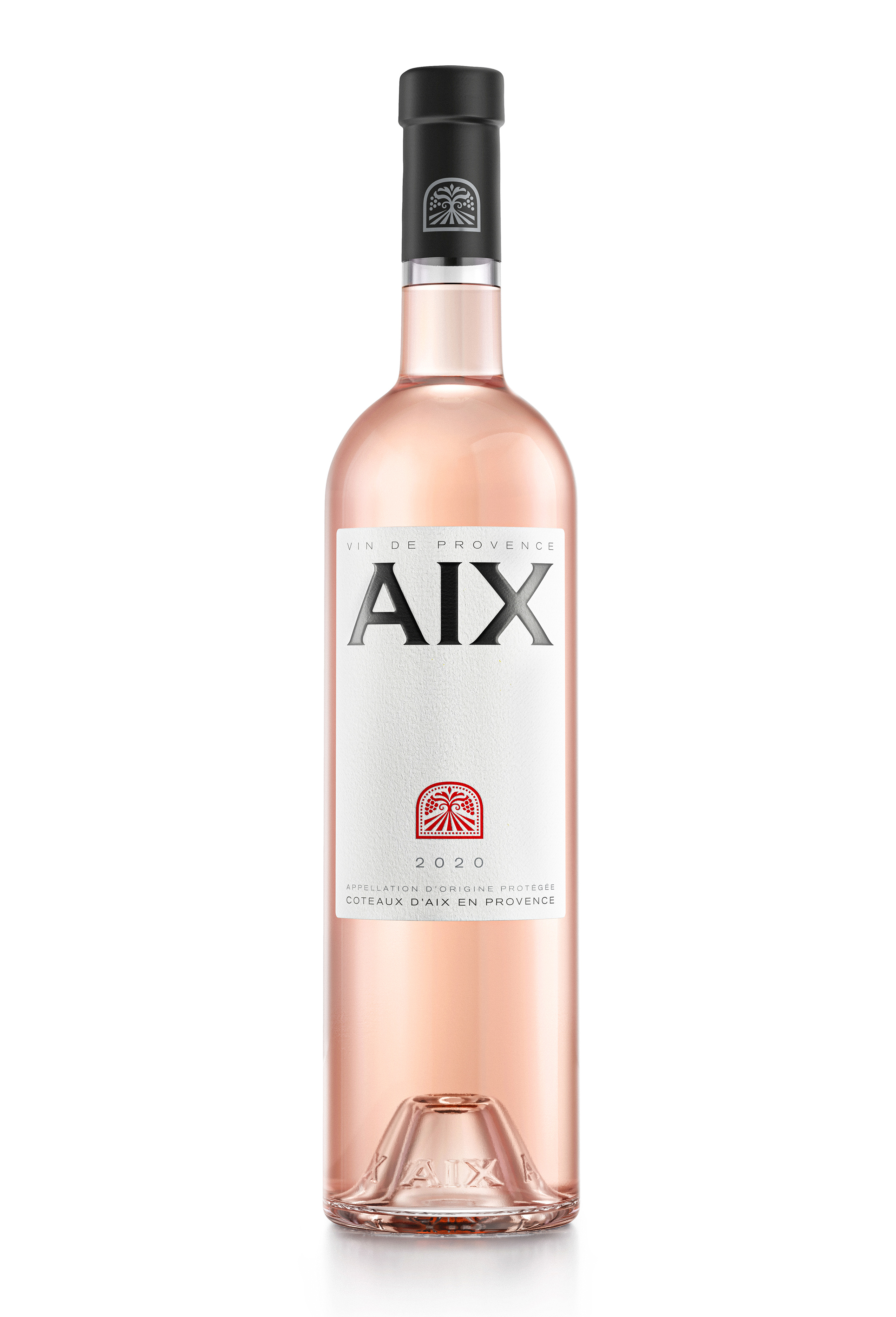
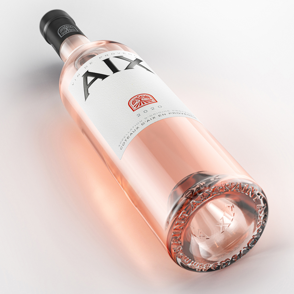
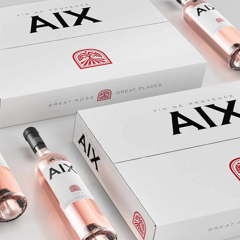
Following this field trip, the agency worked on a full strategic repositioning of the mother brand Maison Saint-Aix and the flagship product AIX, which determined a clear path for the design stages. The redesign consisted of a full visual identity rejuvenation, including all SKUs formats (75-150-300-600-1500cl), shippers, packshots, etc.
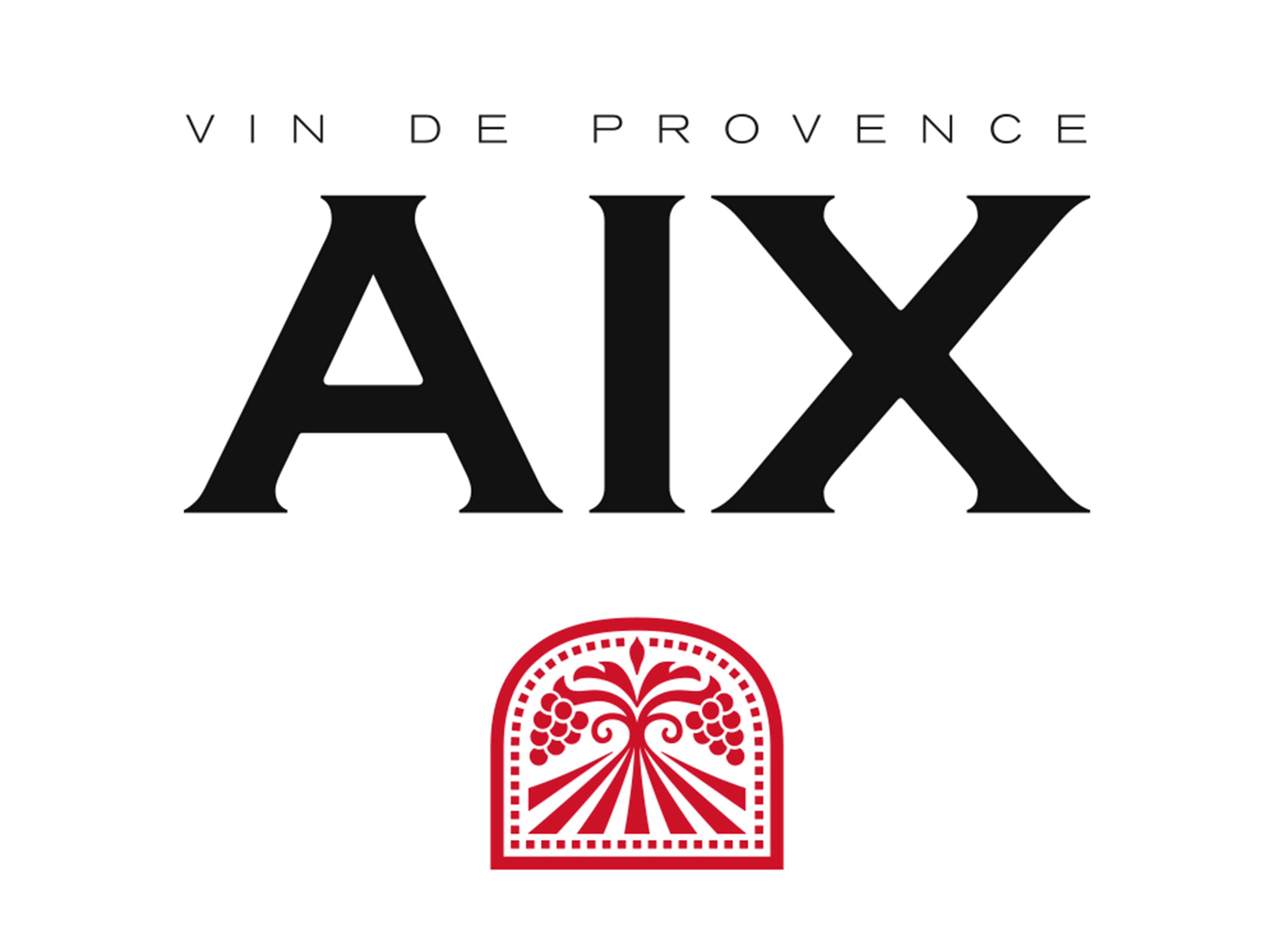
With a closer look at the logo and primary packaging, we refined every aspect of the label. The AIX wordmark has been redrawn and now printed with hot black foil instead of the previous bubbly varnishes, adding more precision, sharpness and elegance. The white spaces in the label have been readjusted to reach a better composition, while new paper texture and colours were selected to boost refinement.
As a more noticeable change, the previous “Chinese styled icon”, which represented happiness in love and togetherness in Mandarin, was removed and replaced by a more inspiring icon that genuinely connects with the house’s welcoming values. Inspired from the traditional stone gate found at the Domaine, the new blazon symbolises a notion of welcoming, generosity and French “Joie de Vivre”. The overall design ensures that AIX will remain relevant to its consumers while modernising the global brand image without losing its strong impact and brand awareness.

CREDIT
- Agency/Creative: Appartement 103
- Article Title: Appartement 103 Refreshes AIX Rosé Wine
- Organisation/Entity: Agency, Published Commercial Design
- Project Type: Packaging
- Agency/Creative Country: France
- Market Region: Multiple Regions
- Project Deliverables: Brand Redesign, Brand Strategy, Branding, Graphic Design, Packaging Design
- Format: Bottle
- Substrate: Glass Bottle


