During summer, and in the midst of lockdown, we were helping minted ice cream get ready to launch. A brave time to get stuck into things but one that has paid off and allowed the business to kick off with great success.
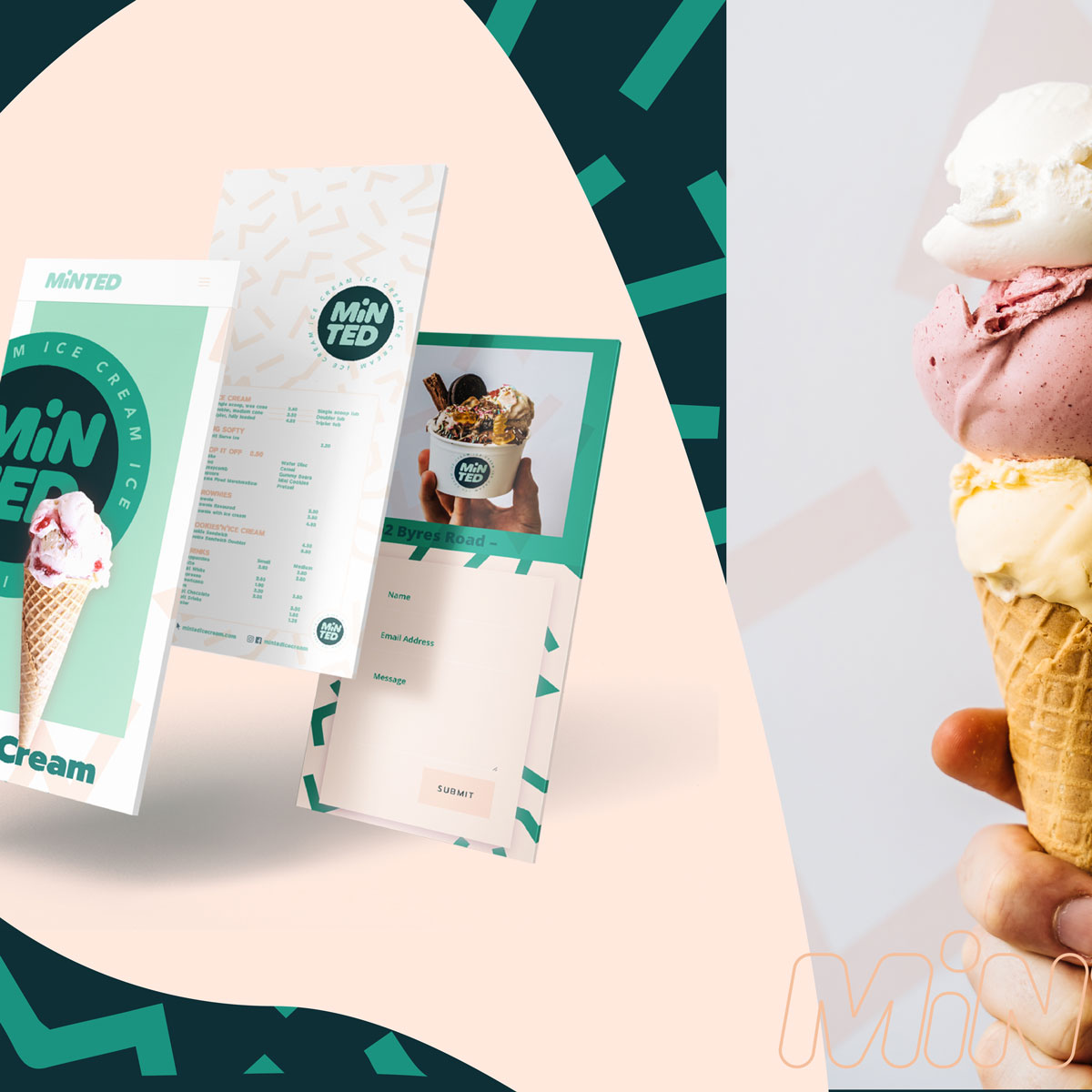
We developed the minted ice cream branding, tone of voice, built their website and dealt with all photography and social media to get them up on their feet.
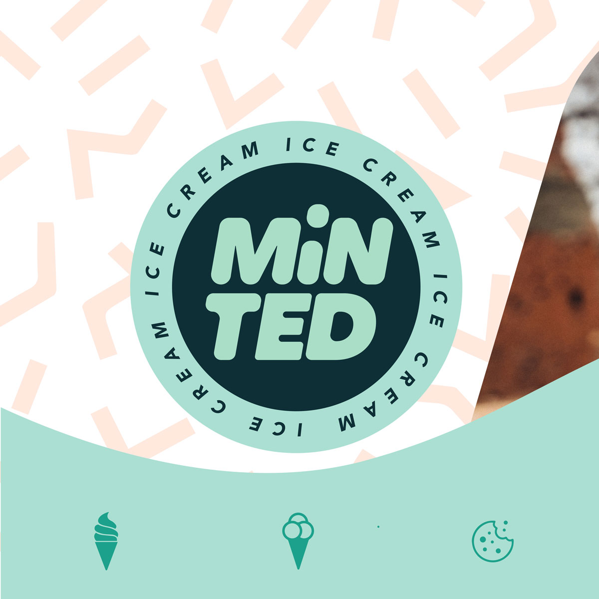
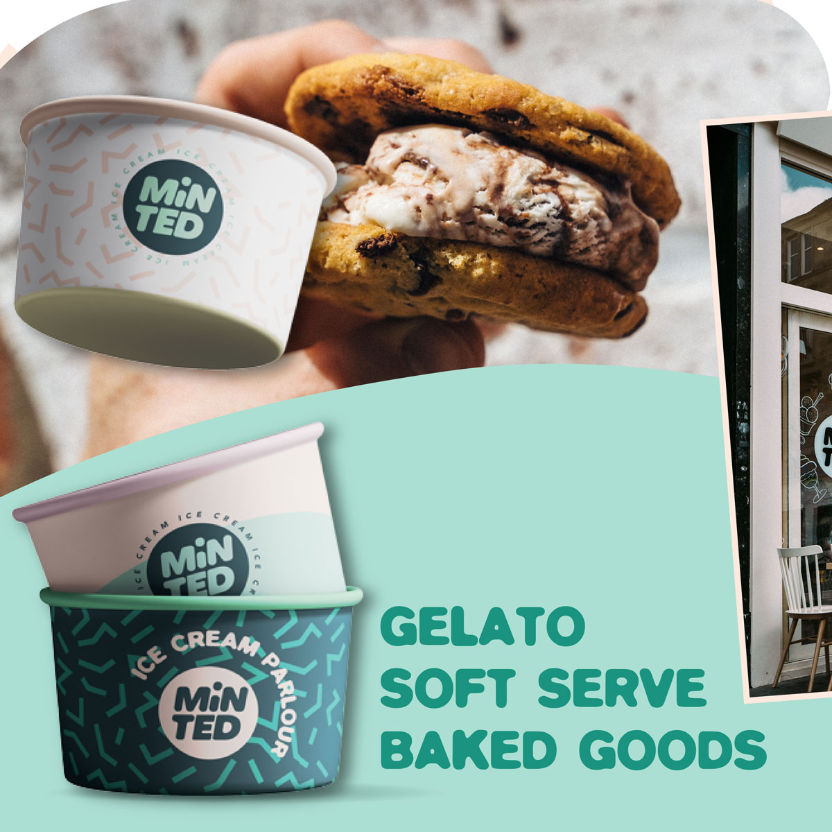
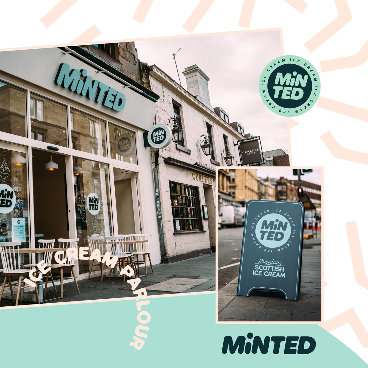
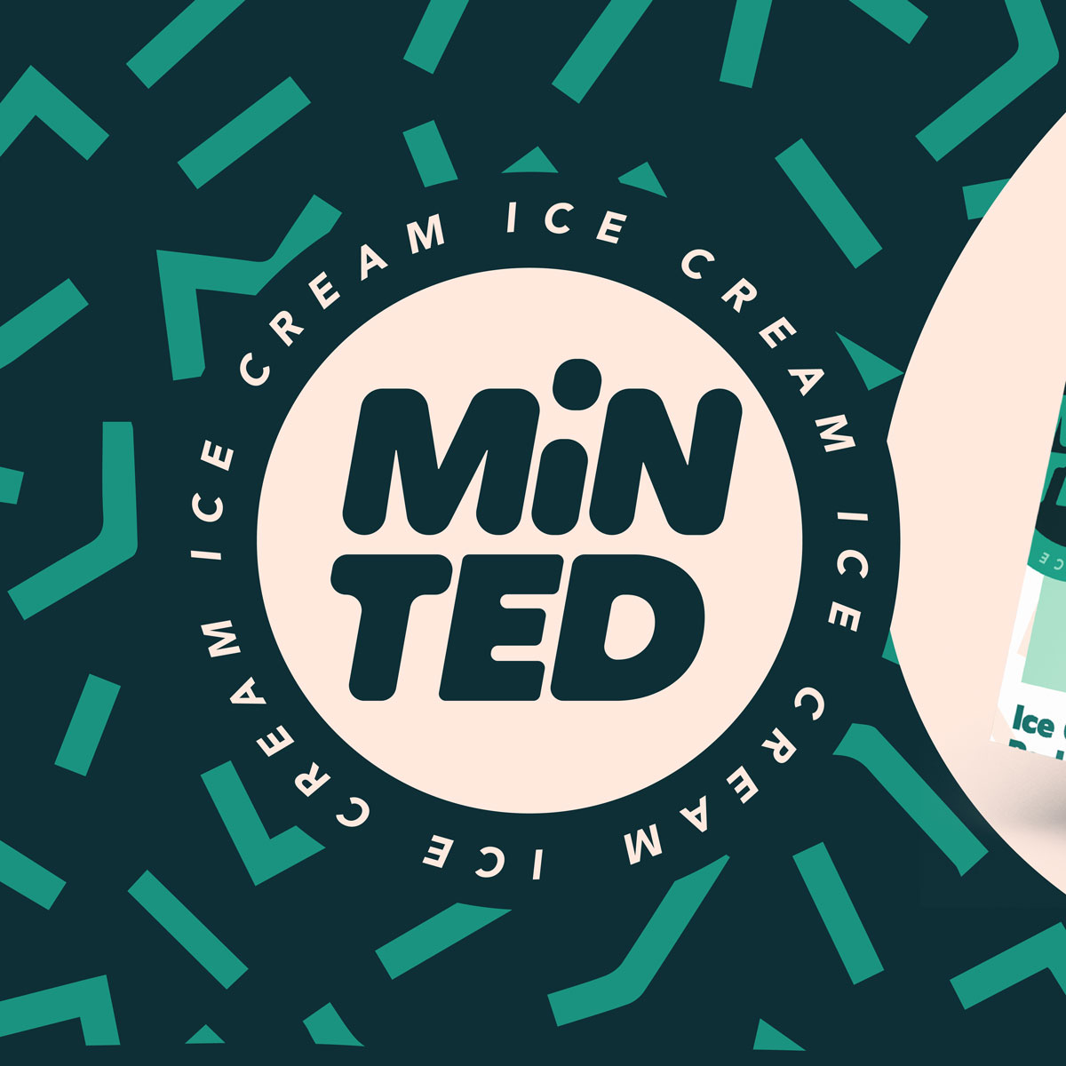
The concept needed to work across a host of demographics, appealing to adults and children alike, with strong potential when it came to social media with logo placement and visibility when being shared online. The circular logo design had all of this in mind, from profile pictures to round ice cream wafers and beyond. The playful uppercase and lowercase mix, split over the two lines with soft rounded edges was developed to create a sense of feel that was fun, bold and multifunctional. For the most part the logo exists in the roundel which can be applied to almost any situation with ease. The extended single line version of ‘minted’ is the secondary logo use reserved for specific situations where height restricted, landscape layouts dictate.
We developed a tone of voice for the brand that played on its Glasgow routes and in turn it’s Glasgow patter. The term #bigsofty was coined for the soft serve, deriving from common phrase. The name itself also takes pride from its Glasgow routes, where the term ‘minted’ is regularly used to describe something as being good or great. The flavoursome connection adds a layer to this that helps set the mind on the right track for the offering within.
We have also helped create some additional marketing routes to tie in with the brand and it’s approach, including the ‘any weather’ hashtag. We do believe ice cream to be an any weather product and given the ‘changeable’ weather on the West coast of Scotland this aimed to harness a potential negative and ride it out to become somewhat of a tagline.
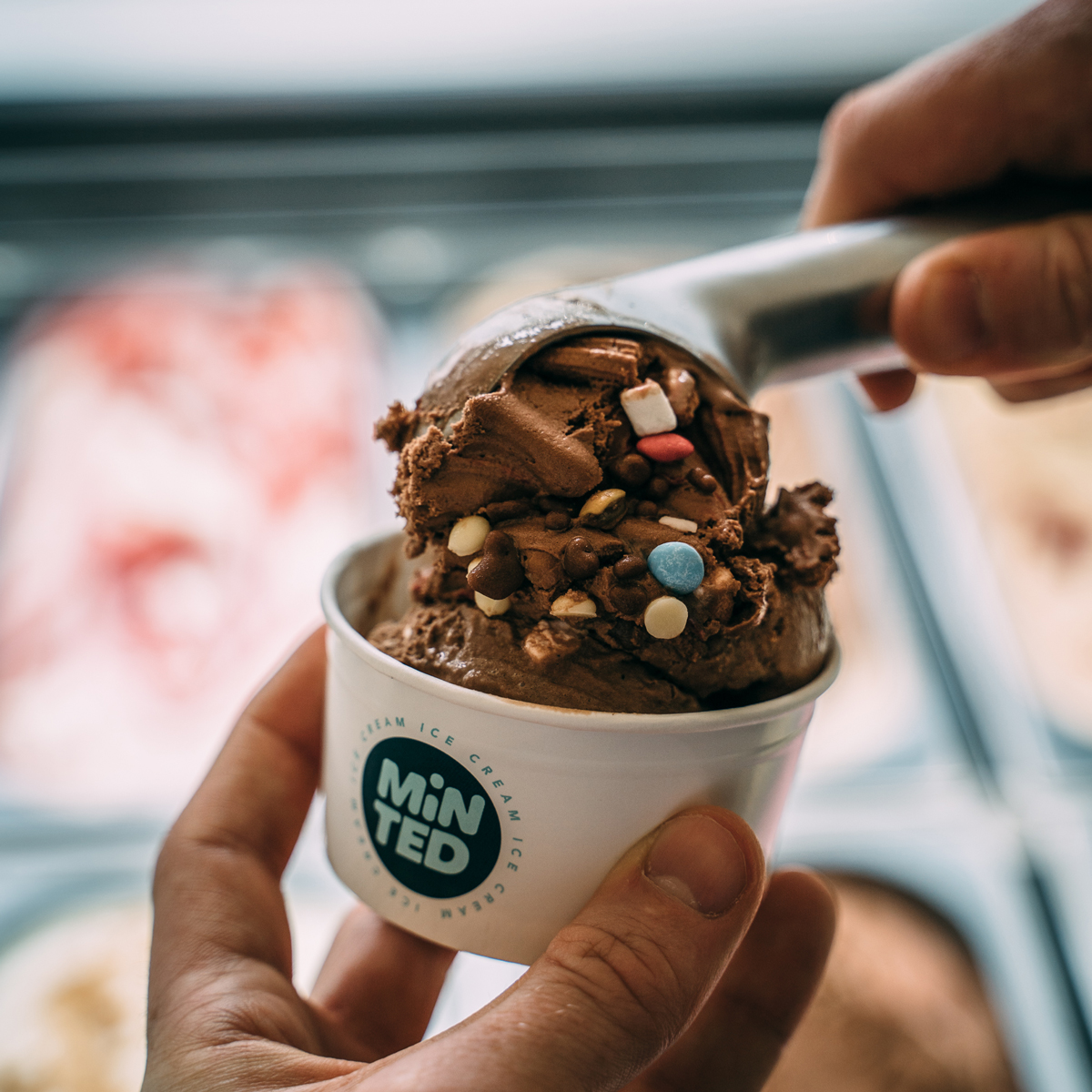
We can highly recommend popping down for a gelato/soft serve/coffee/baked good et al if you’re in the Glasgow area! The cookie sandwich is our personal favourite!
CREDIT
- Agency/Creative: 13 Thirteen Design
- Article Title: 13 Thirteen Design Created Minted Ice Cream Branding
- Organisation/Entity: Agency, Published Commercial Design
- Project Type: Identity
- Agency/Creative Country: United Kingdom
- Market Region: Europe
- Project Deliverables: Brand Creation, Brand Design, Brand Guidelines, Brand Identity, Brand Naming, Branding, Graphic Design, Identity System, Packaging Design, Photography, Product Naming, Retail Brand Design, Tone of Voice
- Industry: Food/Beverage
- Keywords: food & beverage, ice cream, branding, naming, tone of voice, photography, website, logo, identity system.


