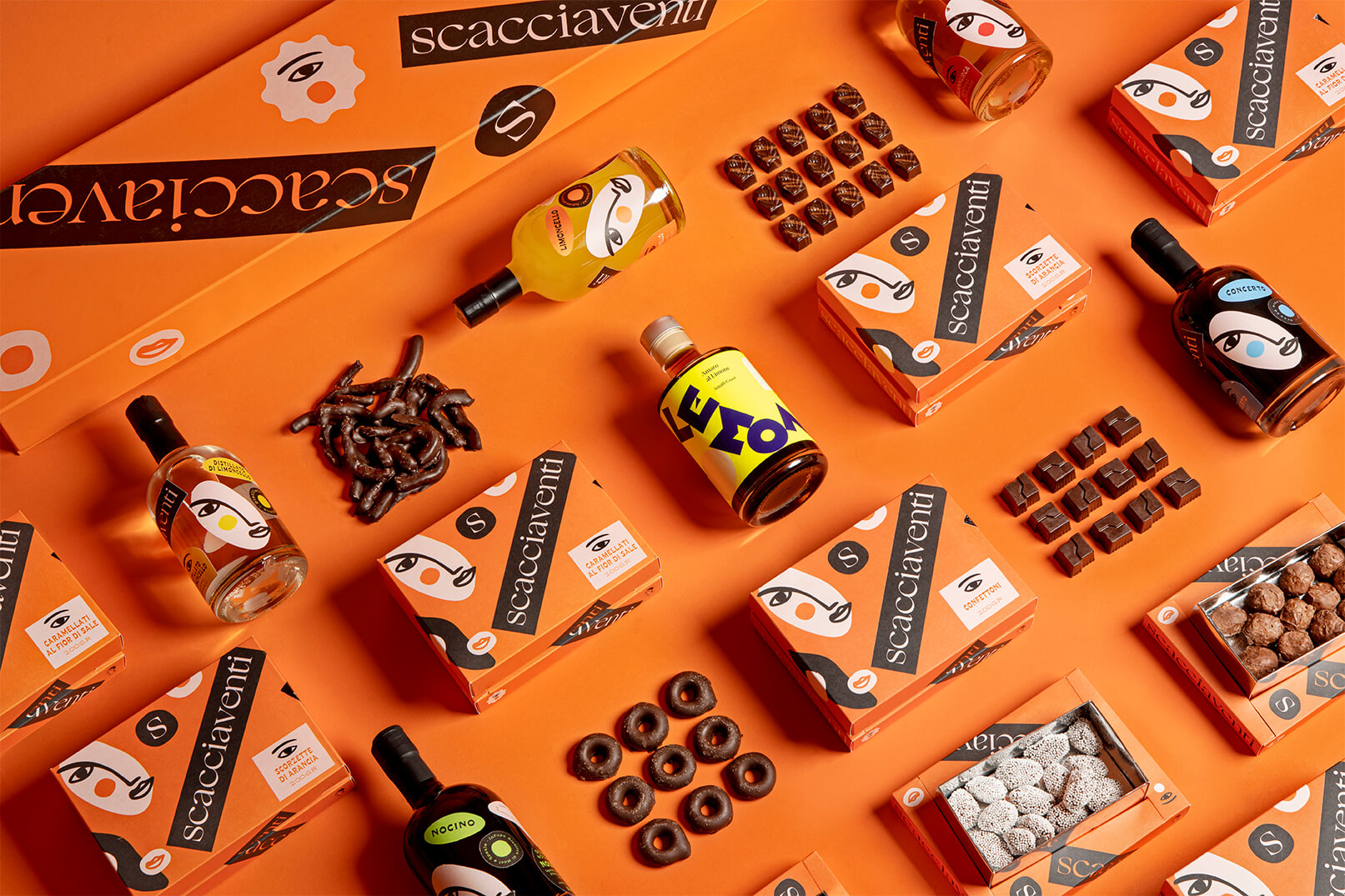
Brand: Scacciaventi is a project which translates the passion for Amalfi Coast into an eclectic production of confectionery, liquors and spirits.
Market and Audience: The brand tries to capture the attention and taste of a passionate audience who searches for refined food and want to immerse themselves in a wonderful journey through scents and flavours of this amazing land.
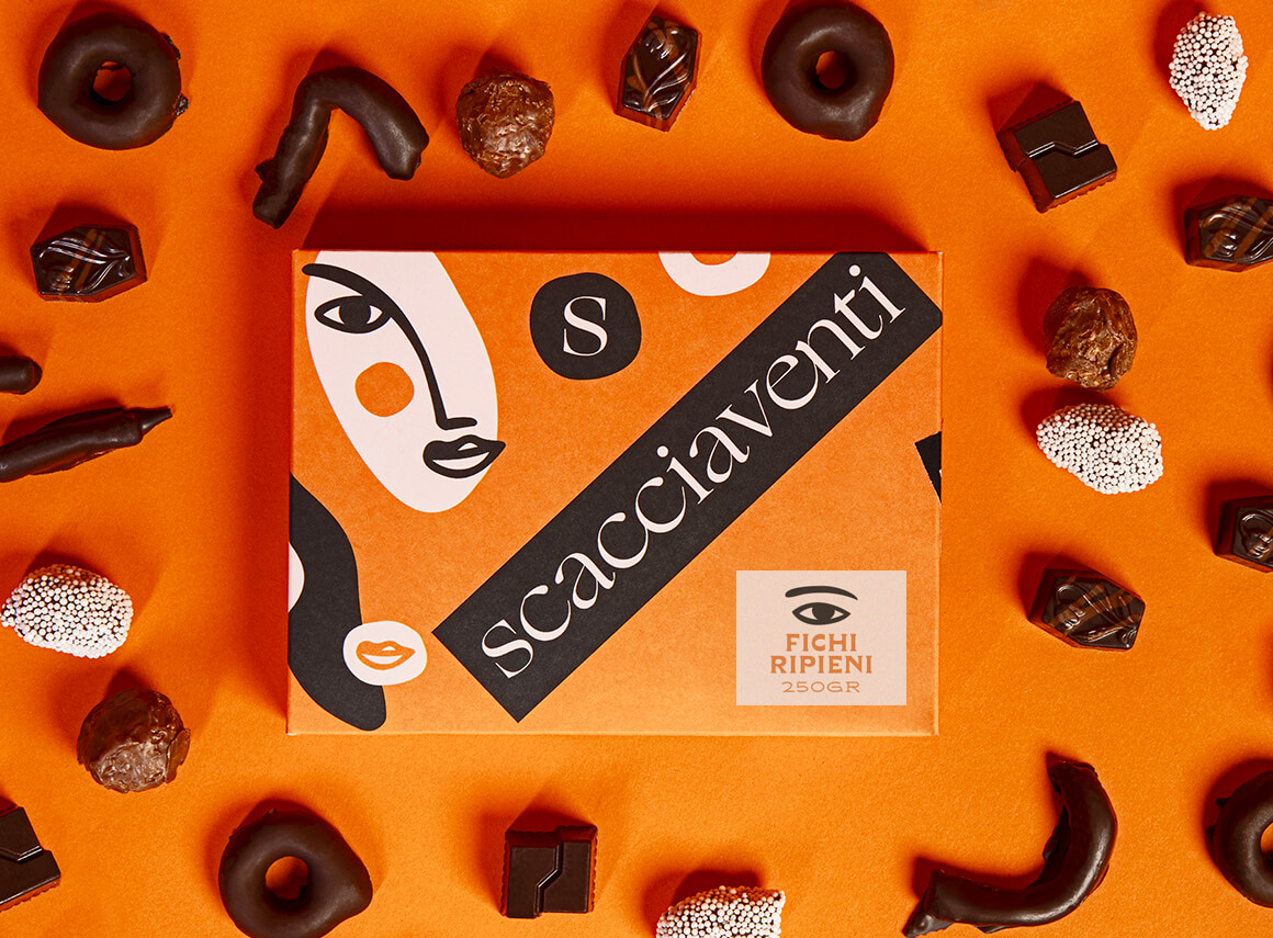
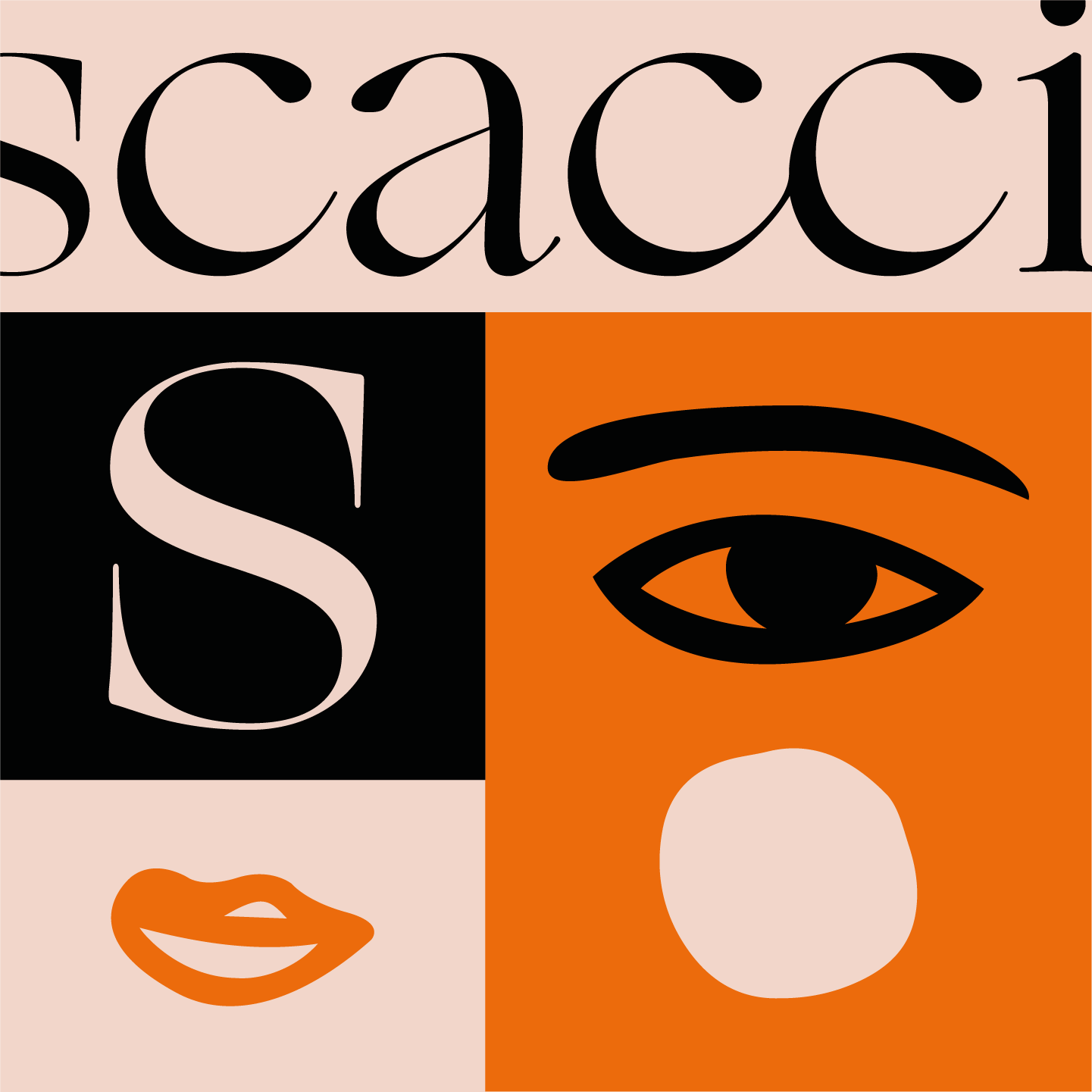
Brief: Camilla is the character who gives face and voice to the project and let herself be sinuously guided in the Cava De’ Tirreni territory in order to tell that culinary culture with renewed passion. Strategic Decisions: We imagined Camilla while wrapping the Scacciaventi products with her sensitive enthusiasm and, deconstructing the brand, we projected a packaging inhabited by a set of stickers which saturates the surface with rigor and dynamism making every pack deeply authentic.
Design Process: Camilla makes her way through narrow alleys, hundreds of stairs and many paths and lost in the Borgo Scacciaventi, the most ancient of Cava De’ Tirreni, she goes through the plurality of arcades letting herself go to the labyrinthine game which characterises the city plan and embodies the history and the habits of his community. The whole of perceptions that the Borgo offers to eyes and senses, together with the symbolic value of his architecture, is the starting point for the narration. Absorbing these tales we developed a careful process which aims to distill the sunny attitude of this character, at the same time highlighting a fascinating enigmatic side.
Deliverables: The project includes a special box for confectionery on which surface is applied a set of stickers that makes every piece unique.
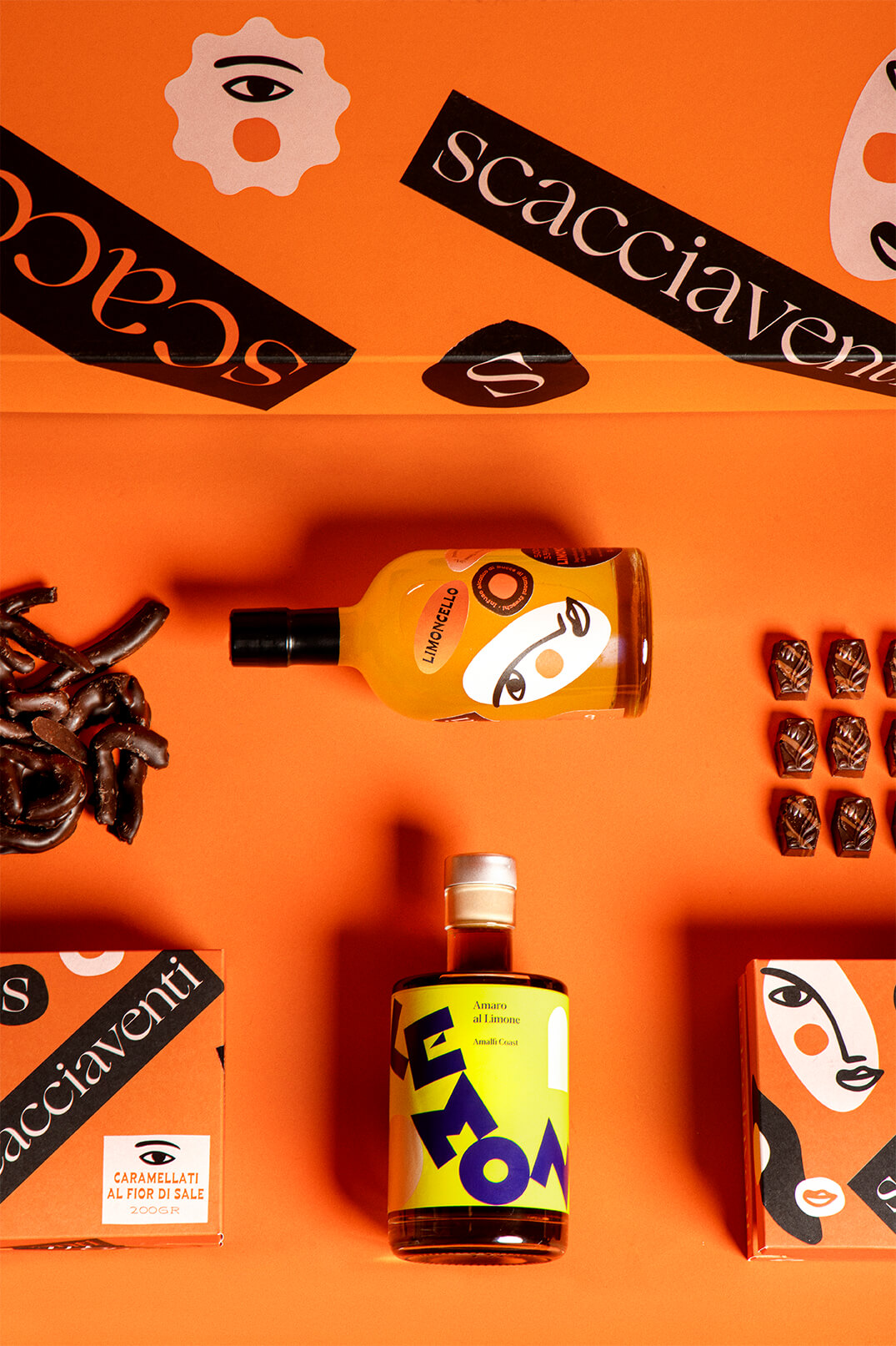
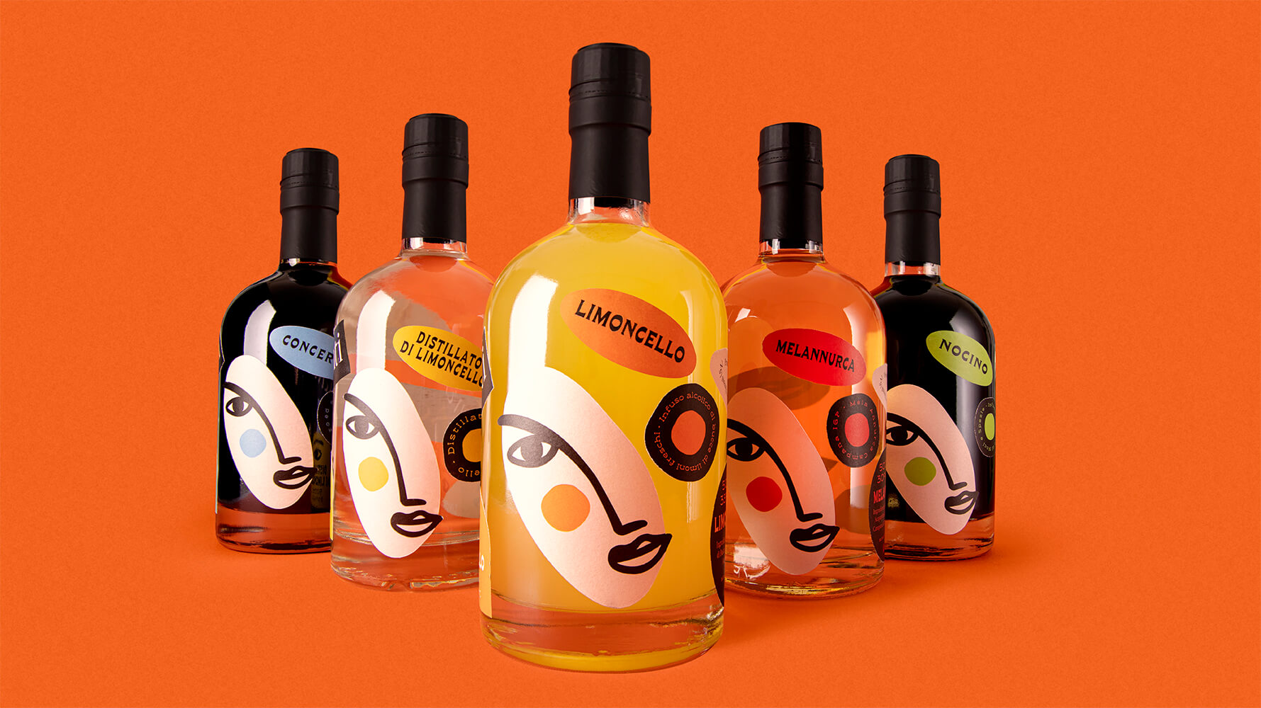
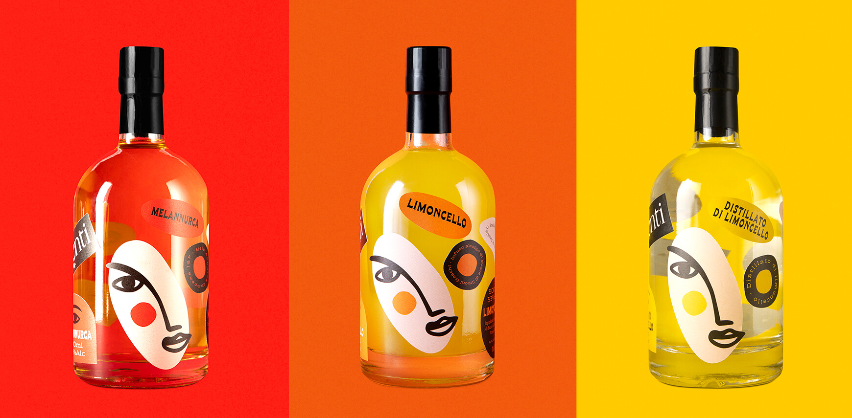
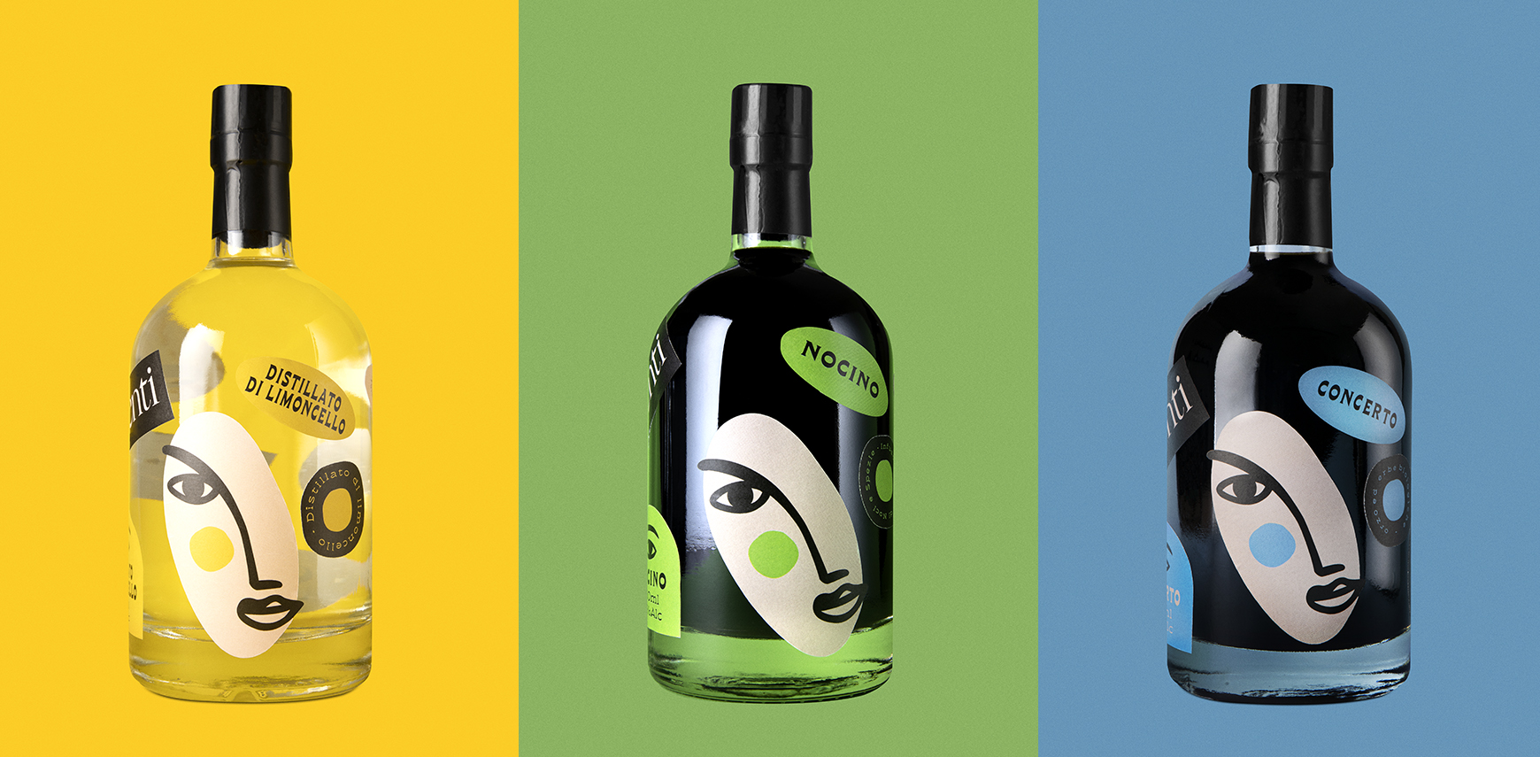
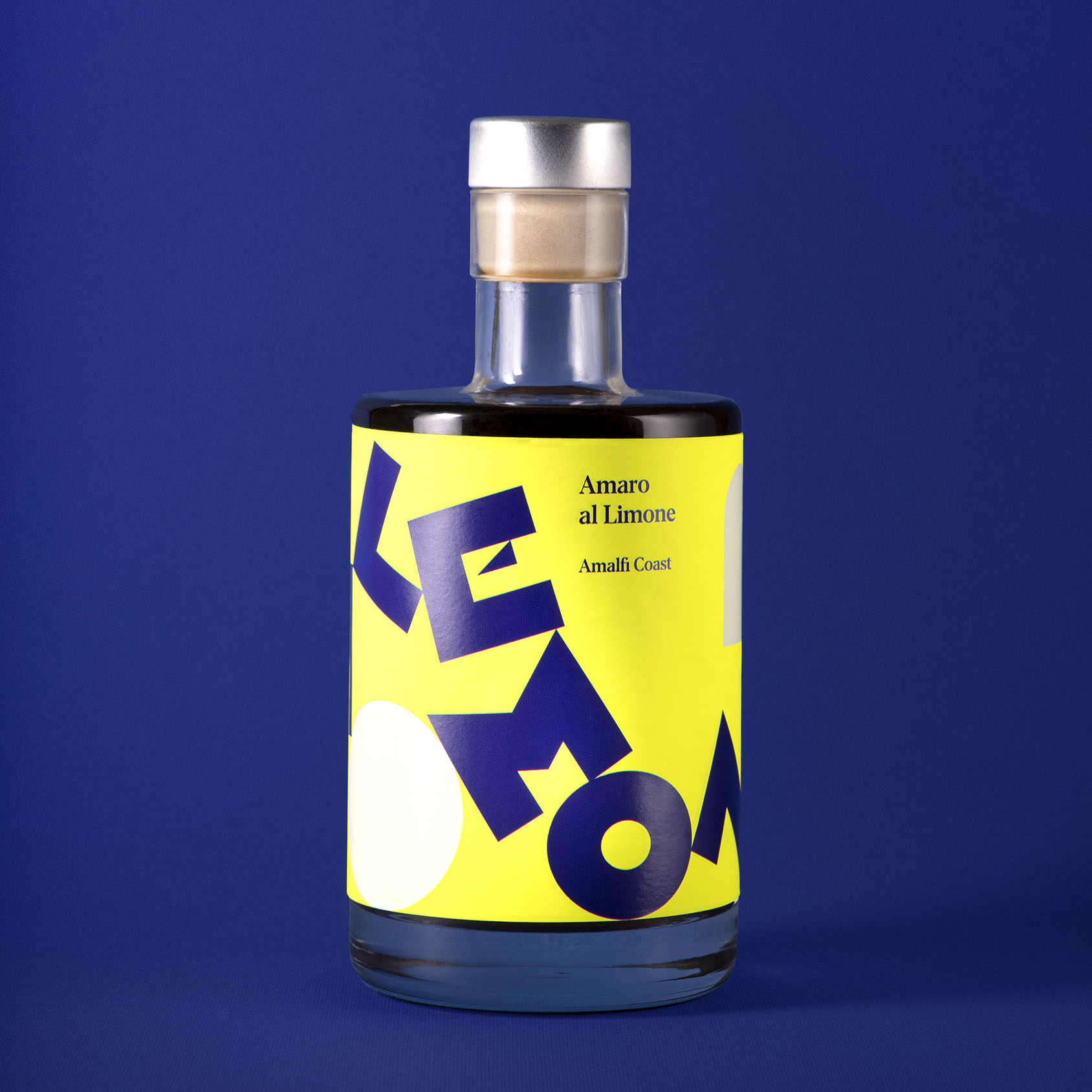
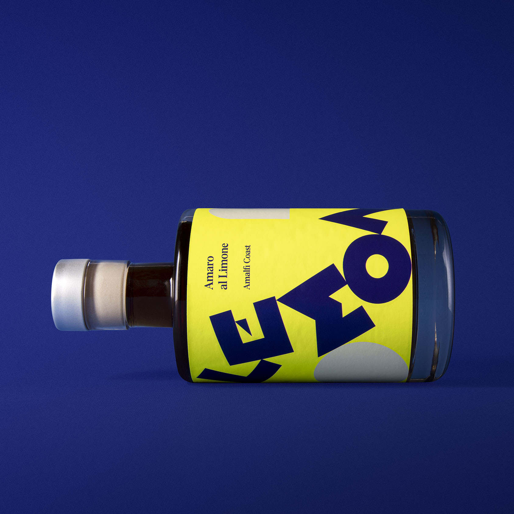
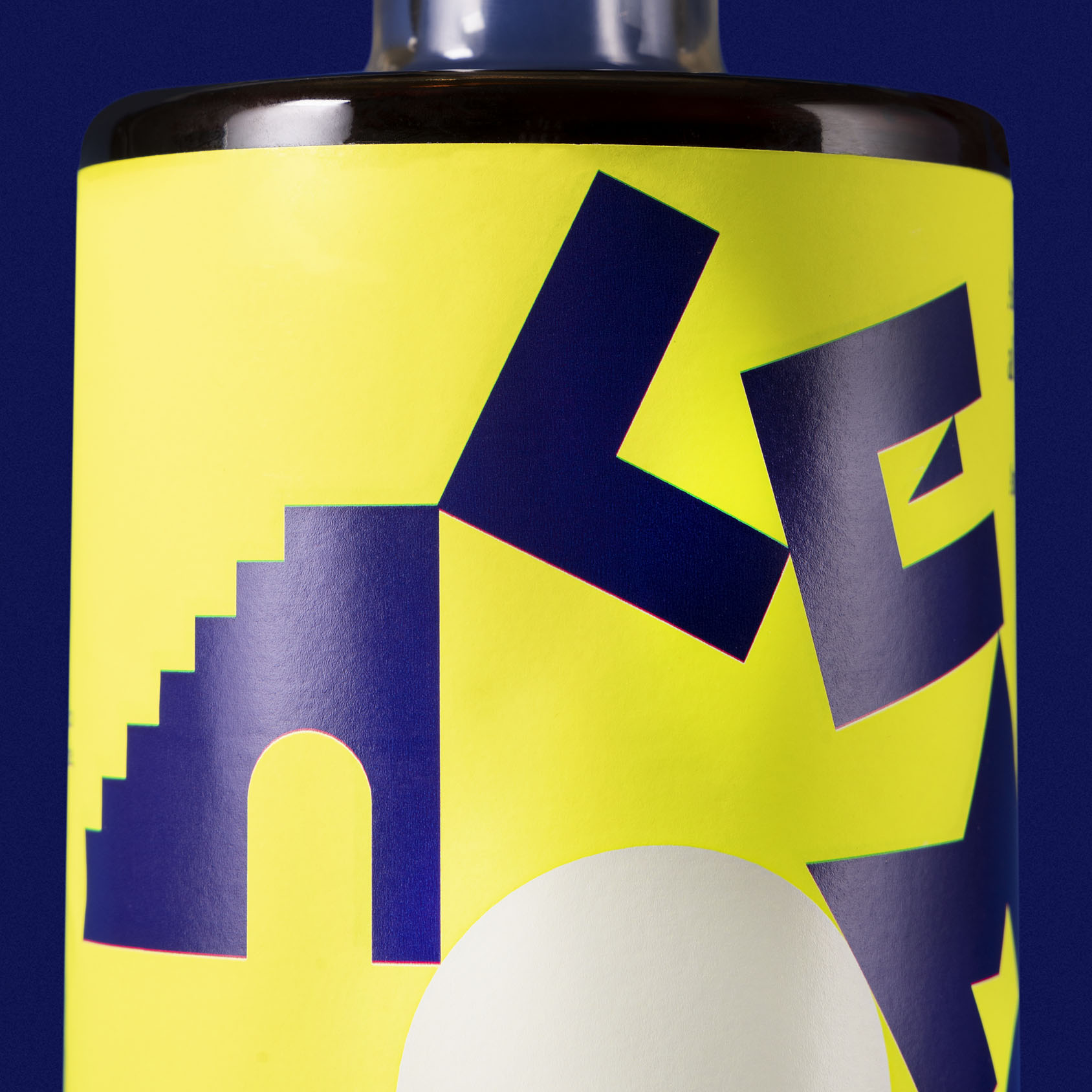
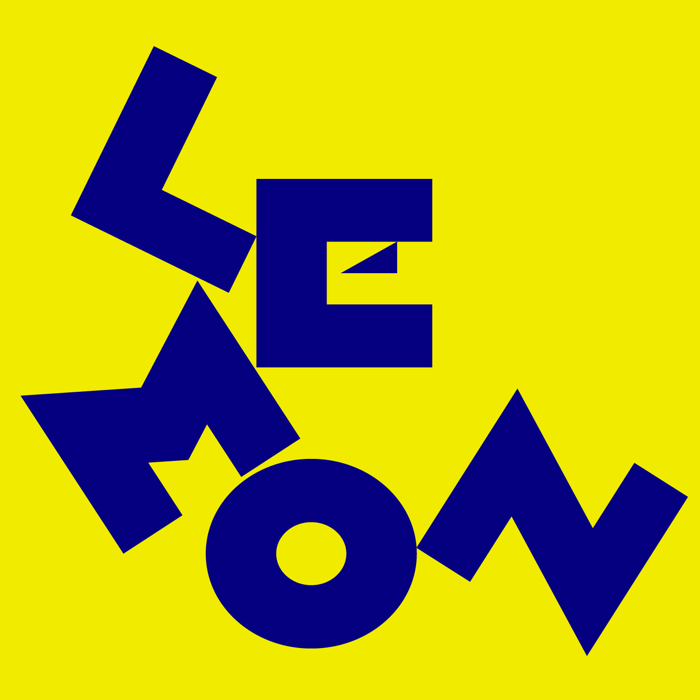
The liqueurs bottles wear all the elements derived from the deconstruction of the brand like Camilla’s cheek, mouth and eye, letters and the architectural elements of the Borgo Scacciaventi. The typefaces of the iconographic amaro Lemon appear as moved by a gentle gust through that arches and doors system that has the task of channeling the wind, the same elements that we find almost metaphysic on the label. Results: The vivid colours and the fluidity of the visual details accomplish a project that wanted to tell the tradition with a minimalist and contemporary language.


CREDIT
- Agency/Creative: Lettera7
- Article Title: Scacciaventi Packaging Design for Confectionery, Liquors and Spirits by Lettera7
- Organisation/Entity: Agency, Published Commercial Design
- Project Type: Packaging
- Agency/Creative Country: Italy
- Market Region: Europe
- Project Deliverables: Brand Identity, Brand World, Branding, Graphic Design, Illustration, Packaging Design, Photography, Research
- Format: Bottle, Box
- Substrate: Glass Bottle, Pulp Paper


