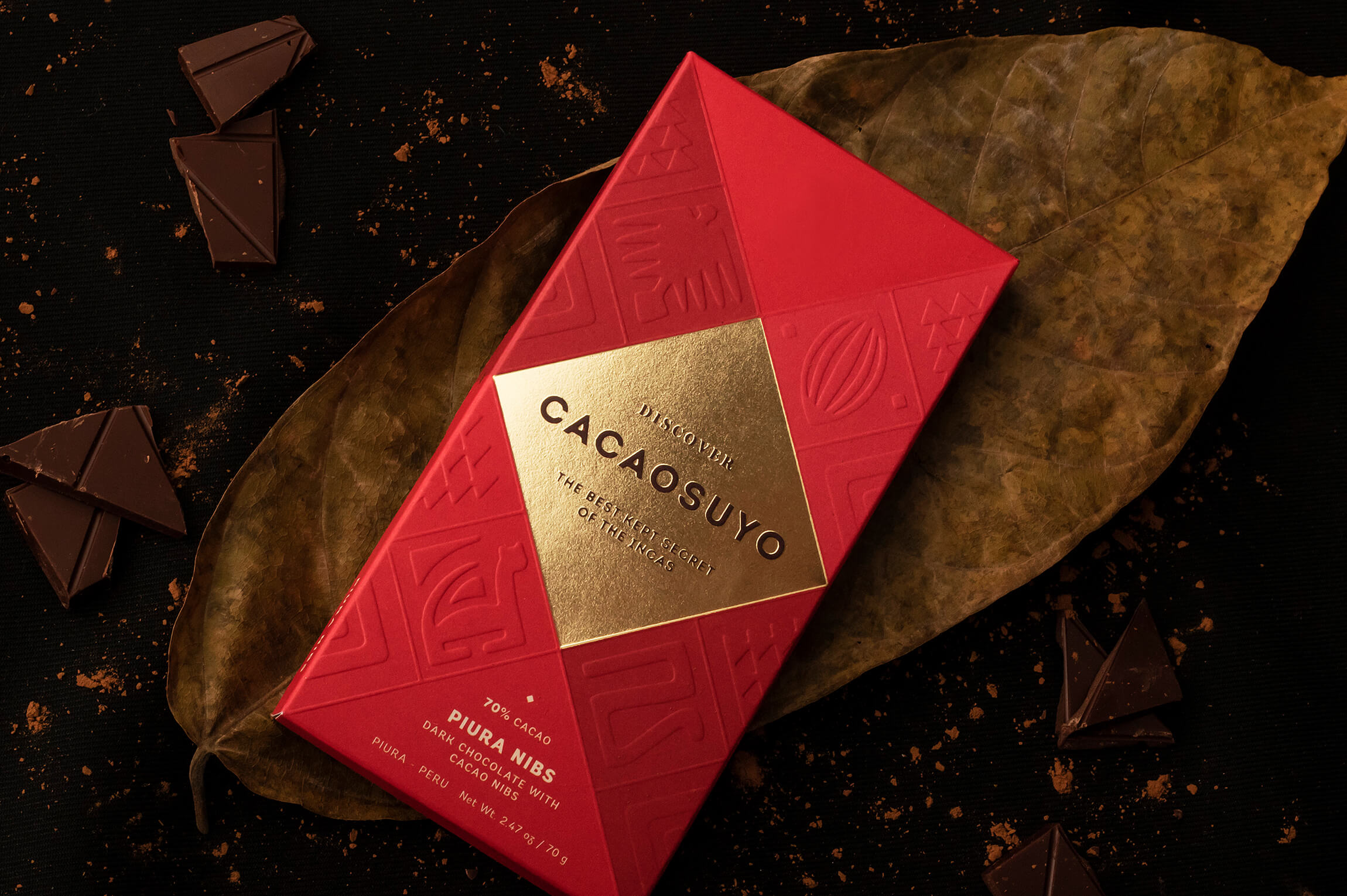
There are many studies that suggest that Peru is the origin of cacao, specifically, it’s Amazon rainforest. Cacaosuyo, which means “cacao territory,” is a brand that seeks to represent the legendary origin of fine chocolate from the country where the Incas once lived. We had to do the repackaging of a brand that has been awarded twice as the best chocolate in the world but whose packaging did not reflect this proven quality; and the objective was to enter new international markets. Likewise, the category of fine chocolates is very competitive in design in the world, so the challenge was difficult in itself, but even more so when Cacaosuyo was the current world champion.
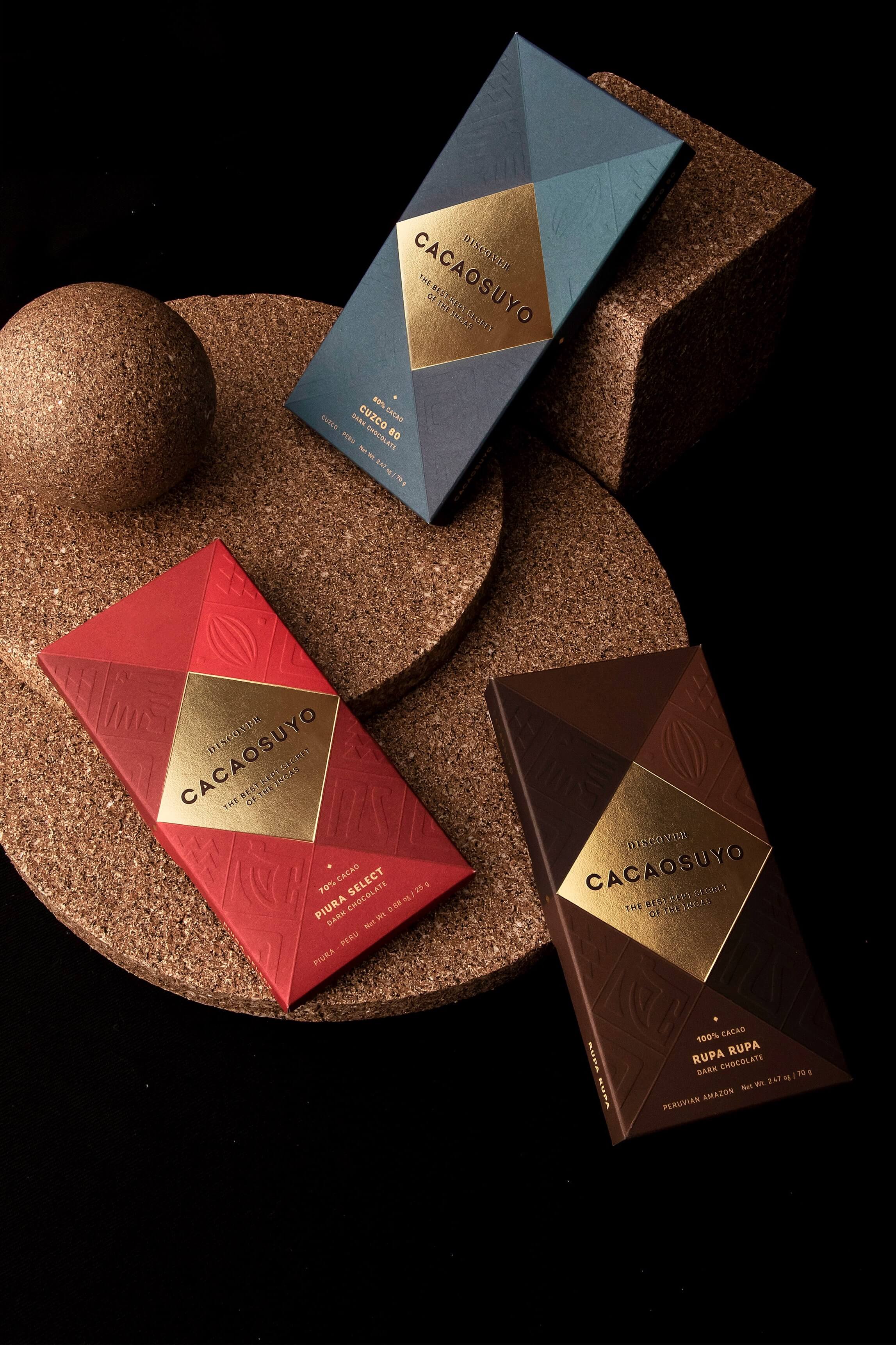
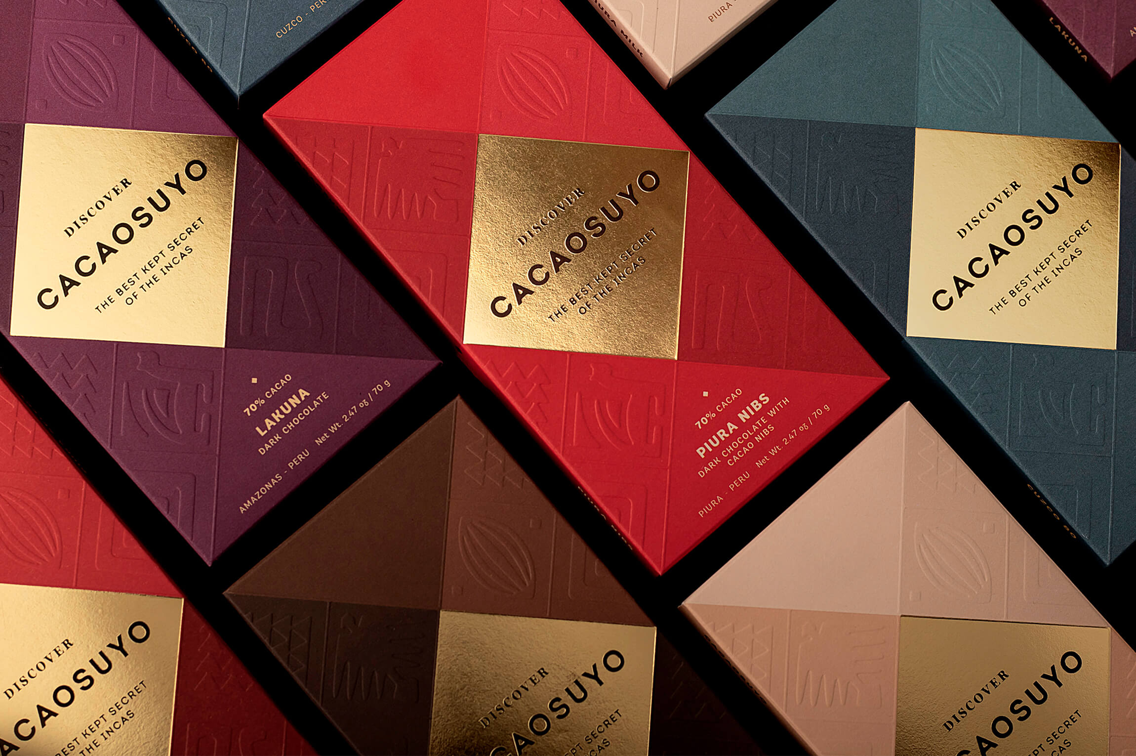
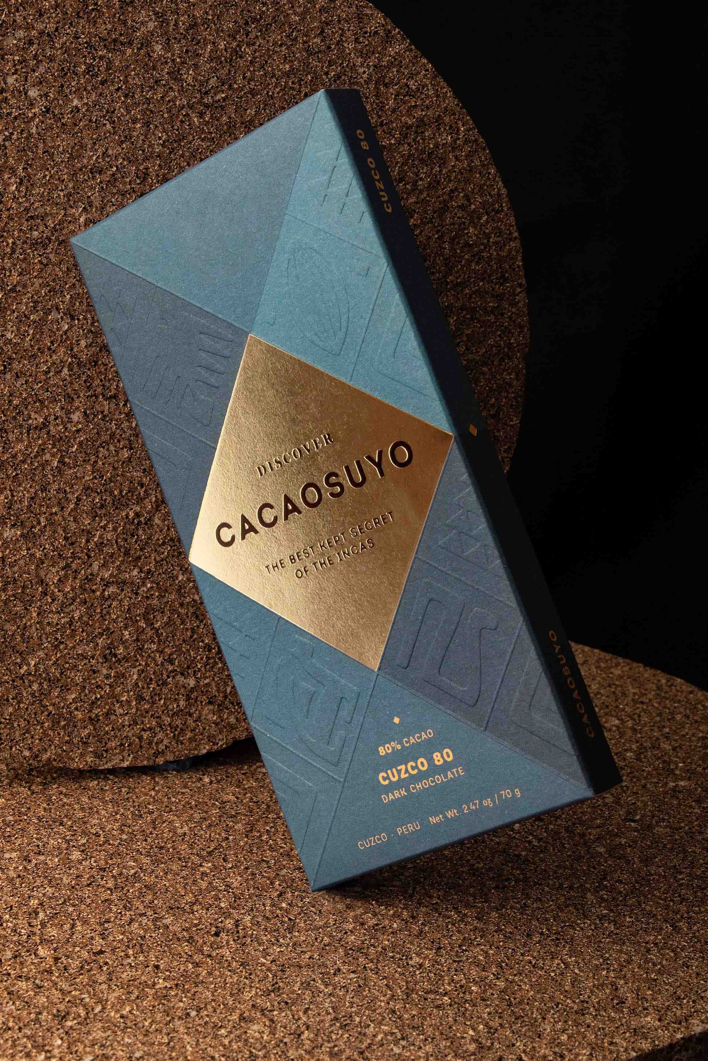
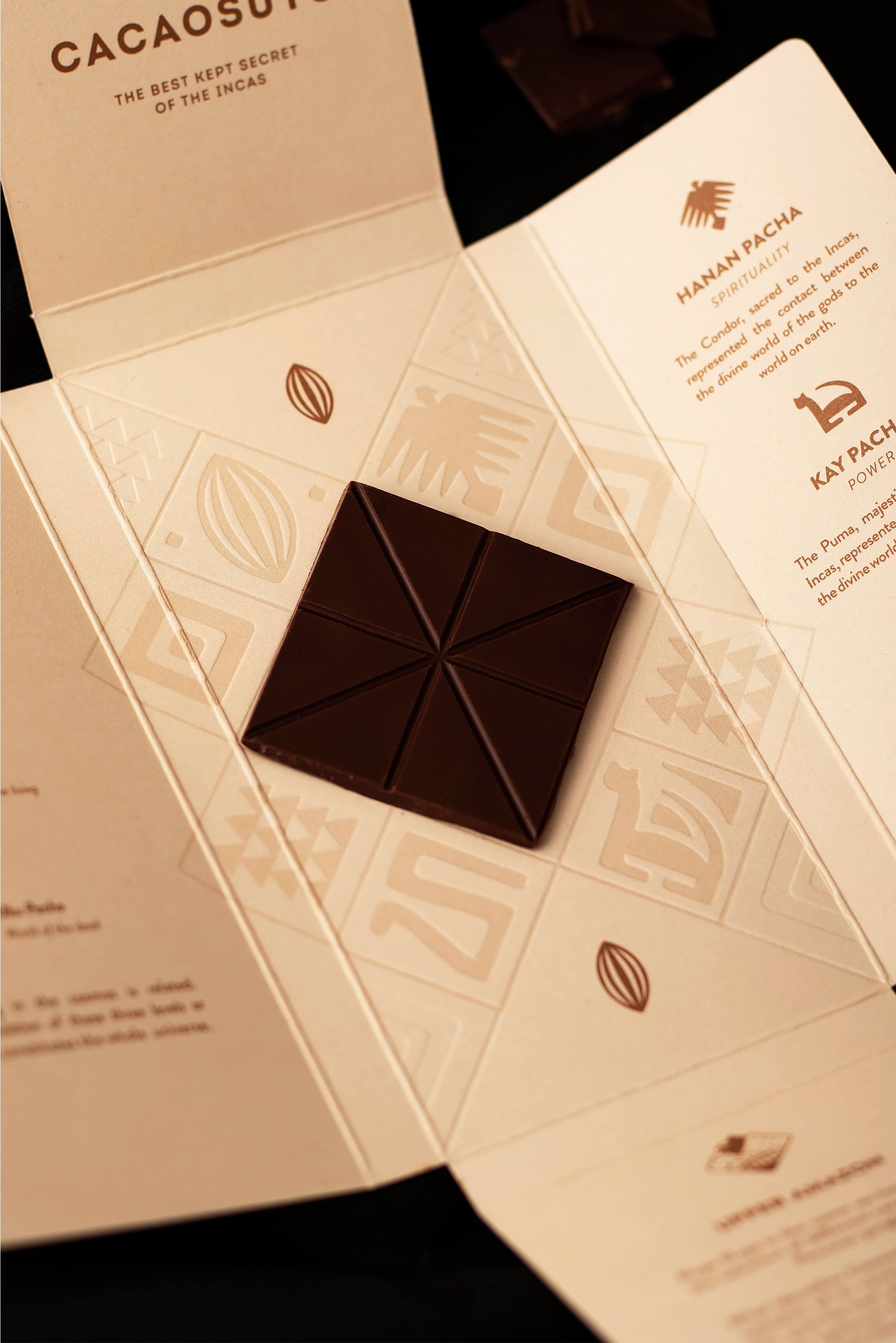
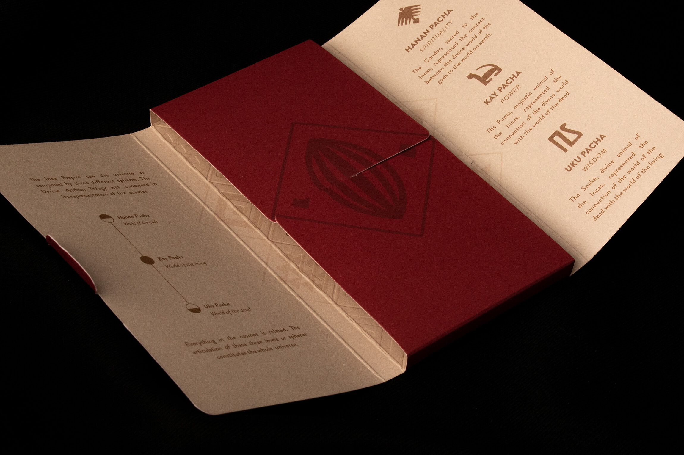
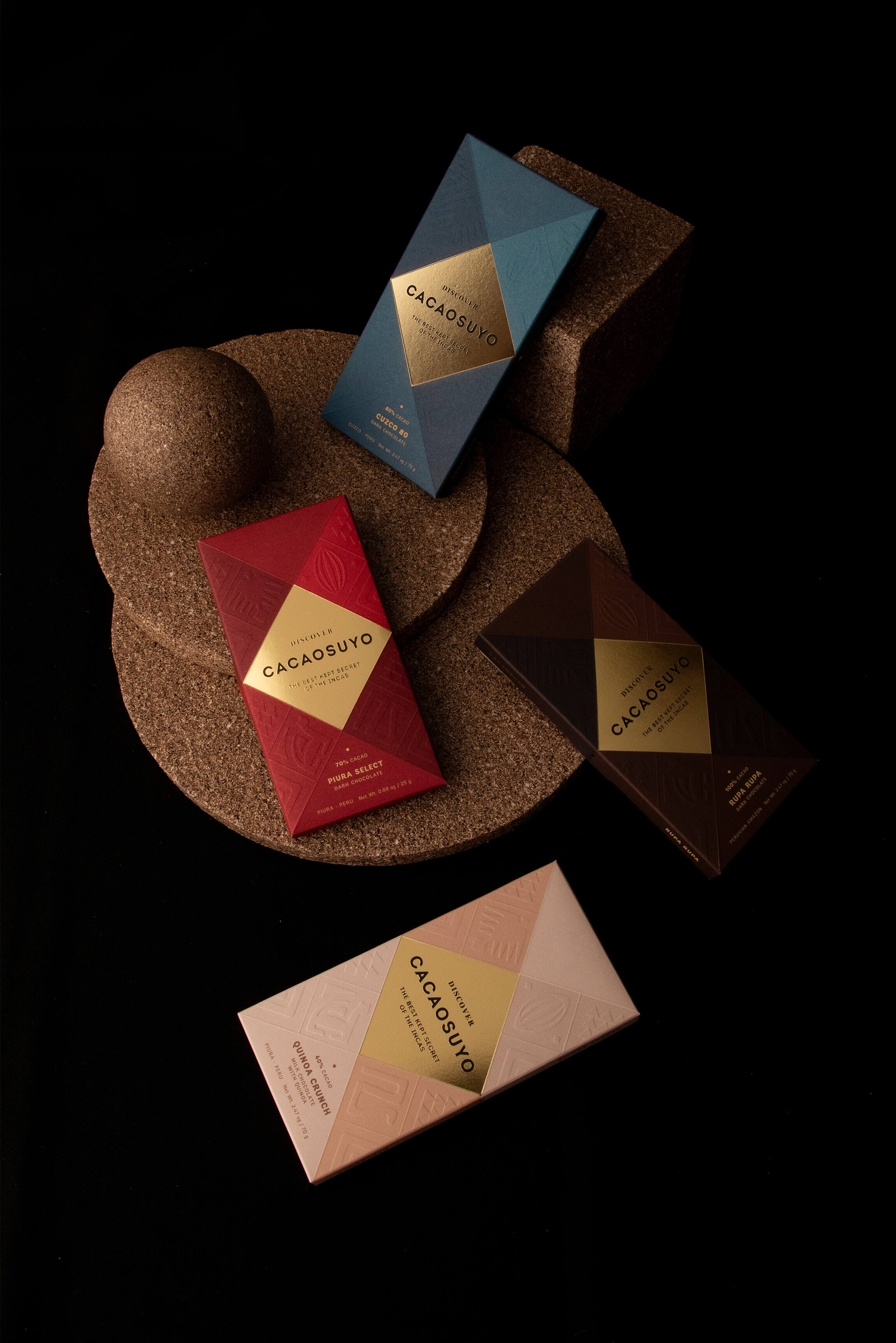
Solution: Cacaosuyo had to be consistent with the brand’s claim: “The best kept secret of the Incas”, since at a visual level the value of its content had not yet been transmitted. The brand already had a geometric system inspired by the tocapus, the graphic communication system of the Incas, which we decided to maintain but modifying its proportions. In addition, we added a system of icons that represent the Andean trilogy (condor, puma and snake). In this way, we were able to give a new look to the brand, but retaining its essence. The new packaging had to be seen as a true treasure, that’s why we gave the “gold” finish to the diamond that contains the brand and the rest of the packaging works like a loom, so we managed to make it feel like a museum piece.
To add a textured feeling to the packaging, we embossed the icons on the front side, adding a touch of mystery to the overall experience; as an invitation to decode the brand. Thus, the shape of the flat surface also calls you to discover the content. Finally, by putting together all these elements with a much more sober and elegant chromaticism, we made Cacaosuyo look like a true Inca treasure. In addition, we managed to raise the perception of quality; now it does look like the best chocolate in the world!
In Peru there is currently an important growth in the origin chocolate industry, bean to bar, which has generated the birth of many relevant brands within the category. This makes it difficult to find a space to build new authentic brands that differentiate themselves in the local market.
The Peruvian chocolate brands are supported, for the most part, by their export sales volume, which makes the analysis of the category very broad and very competitive. It is necessary to maintain high quality standards in packaging design so that the brand can conquer new markets.
CREDIT
- Agency/Creative: Fibra Branding
- Article Title: Packaging Design for the World’s Best Chocolate, Inspired by the Incas and Designed by Fibra Branding
- Organisation/Entity: Agency, Published Commercial Design
- Project Type: Packaging
- Agency/Creative Country: Peru
- Market Region: Global
- Project Deliverables: Brand Refinement, Branding, Graphic Design, Packaging Design, Product Architecture, Research, Retail Brand Design
- Format: Box
- Substrate: Pulp Paper


