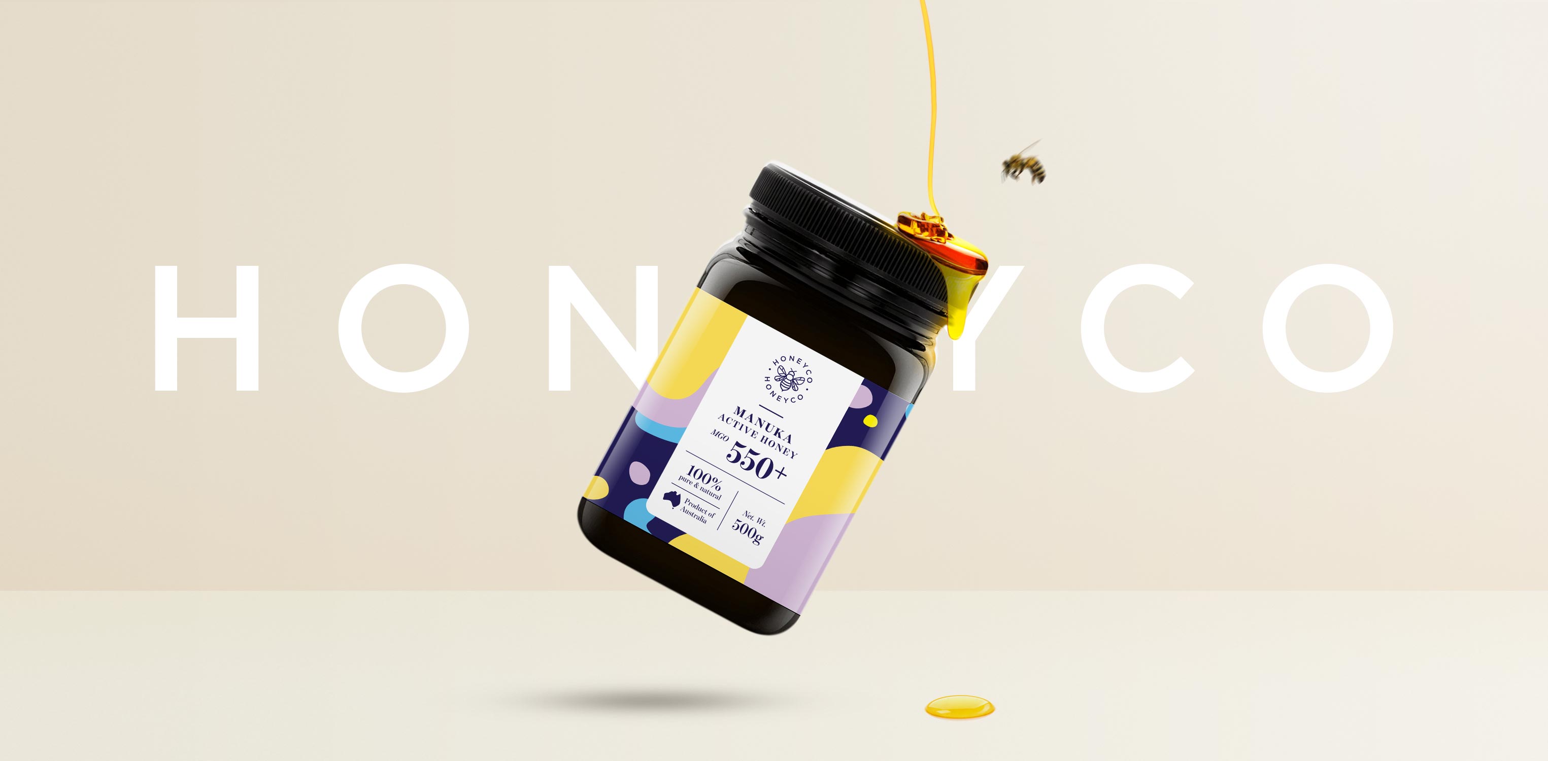
Based in Sydney, Australia, a brand new honey company Honeyco specialised in active Manuka honey sourced in Australia. Honeyco wanted an identity and packaging that represents the brand’s values and stand out from its competitive crowd.
We began researching the markets, competitors to understand the market, products and our people that we want to be accepted as a brand with authentic and different from rest of the honey brands. Manuka honey has a strong flavour often described as earthy, rich, florid and complex. We learnt it was in a way more mineral-like. As with any of the nature-derived earth’s gift, we were attracted to the idea of our mother nature’s gift. We took it right back to the core of the Honeyco brand, its product. We found an opportunity to focus on the gift of nature, honey in its pure form that is unsaturated and raw.
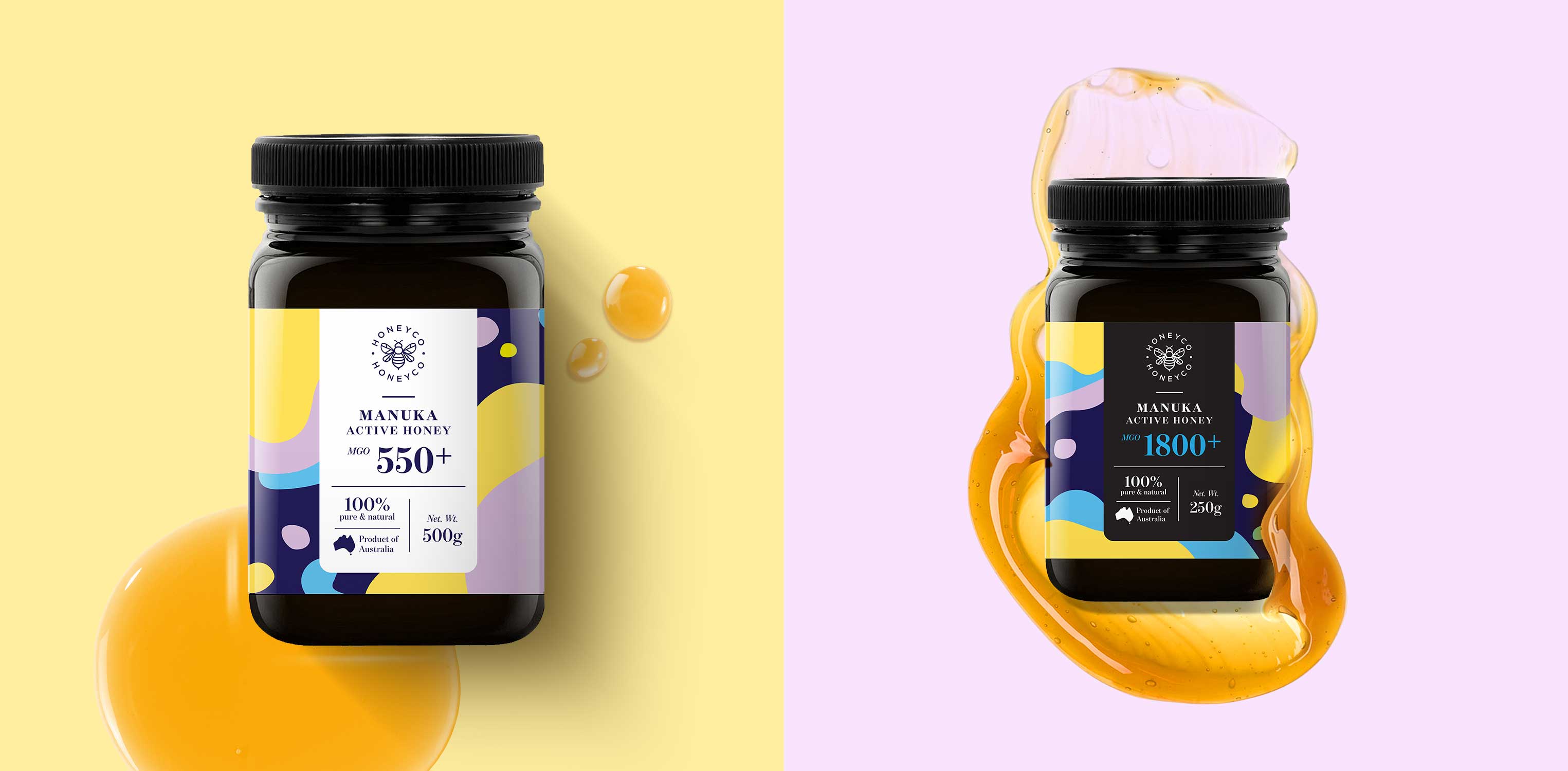
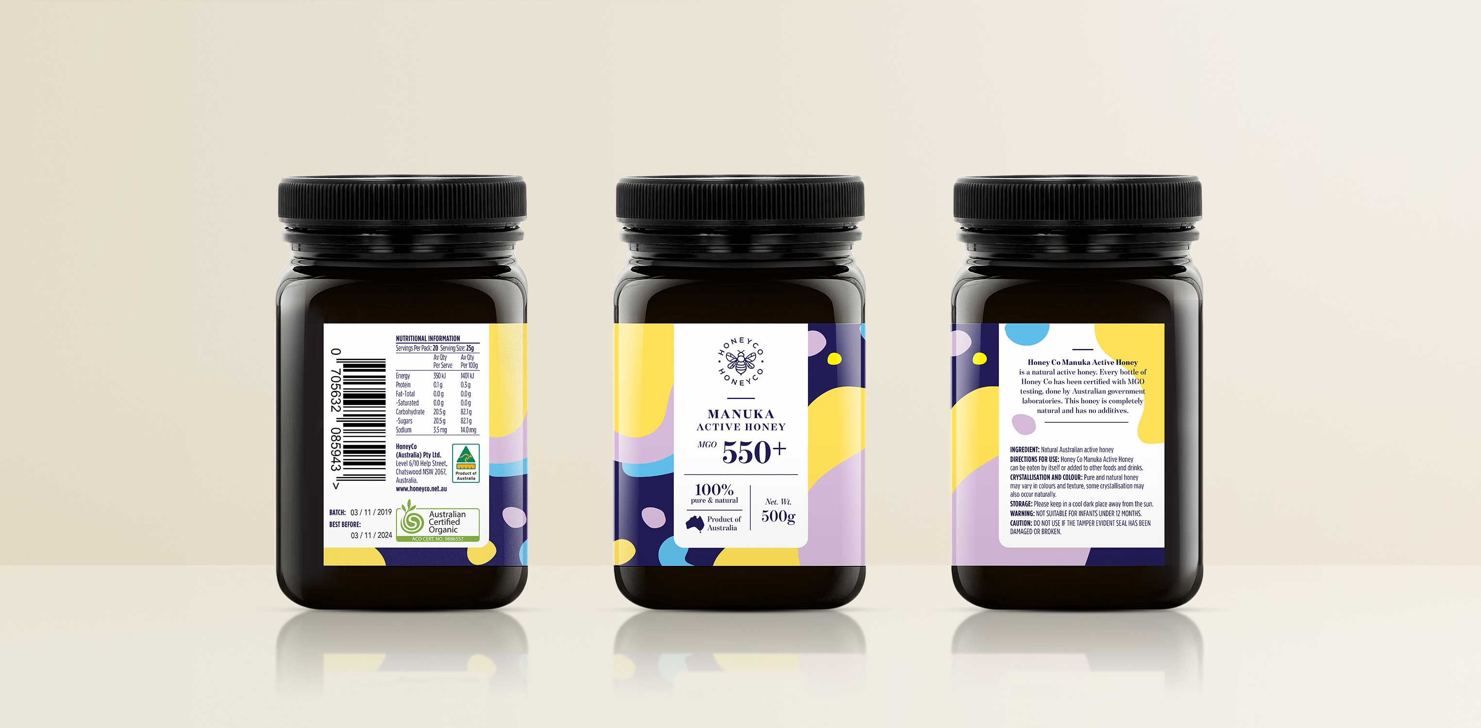
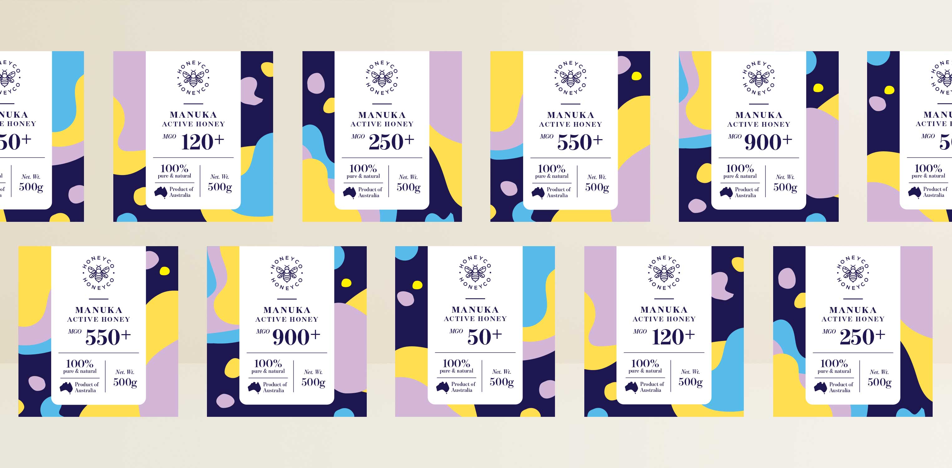
Our brand and packaging takes these learnings into account and created series of abstract illustration representing the fluidity of honey in natural form using welcoming and bright colours. Combined with these we created a simple navigation system for the label emphasising the primary difference between variant, the MGO strength in a bolder type. Secured with clean white background a partitioned navigation system details out the benefits of the product and also romantic but engaging brand story on the back of the pack.
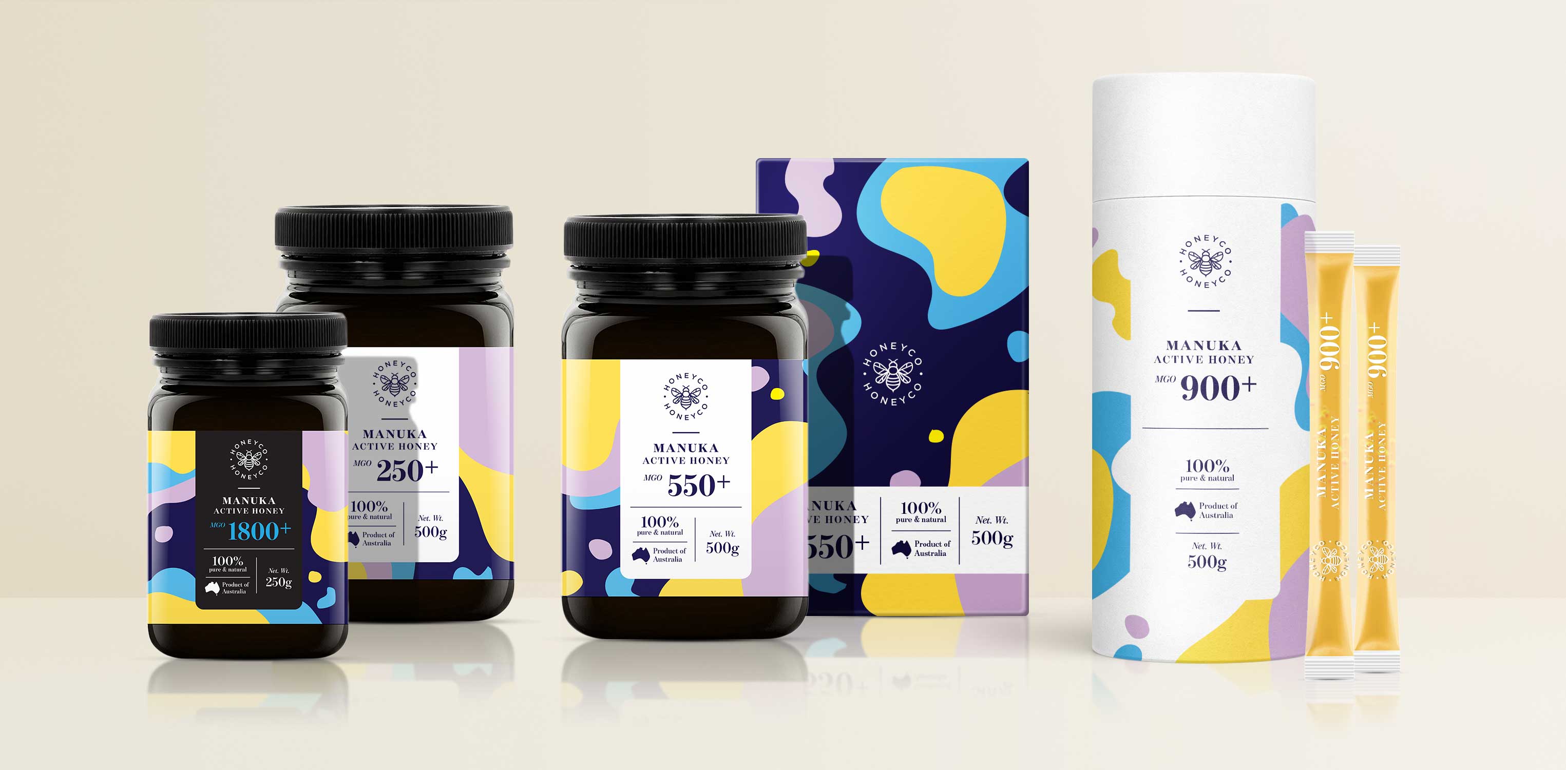
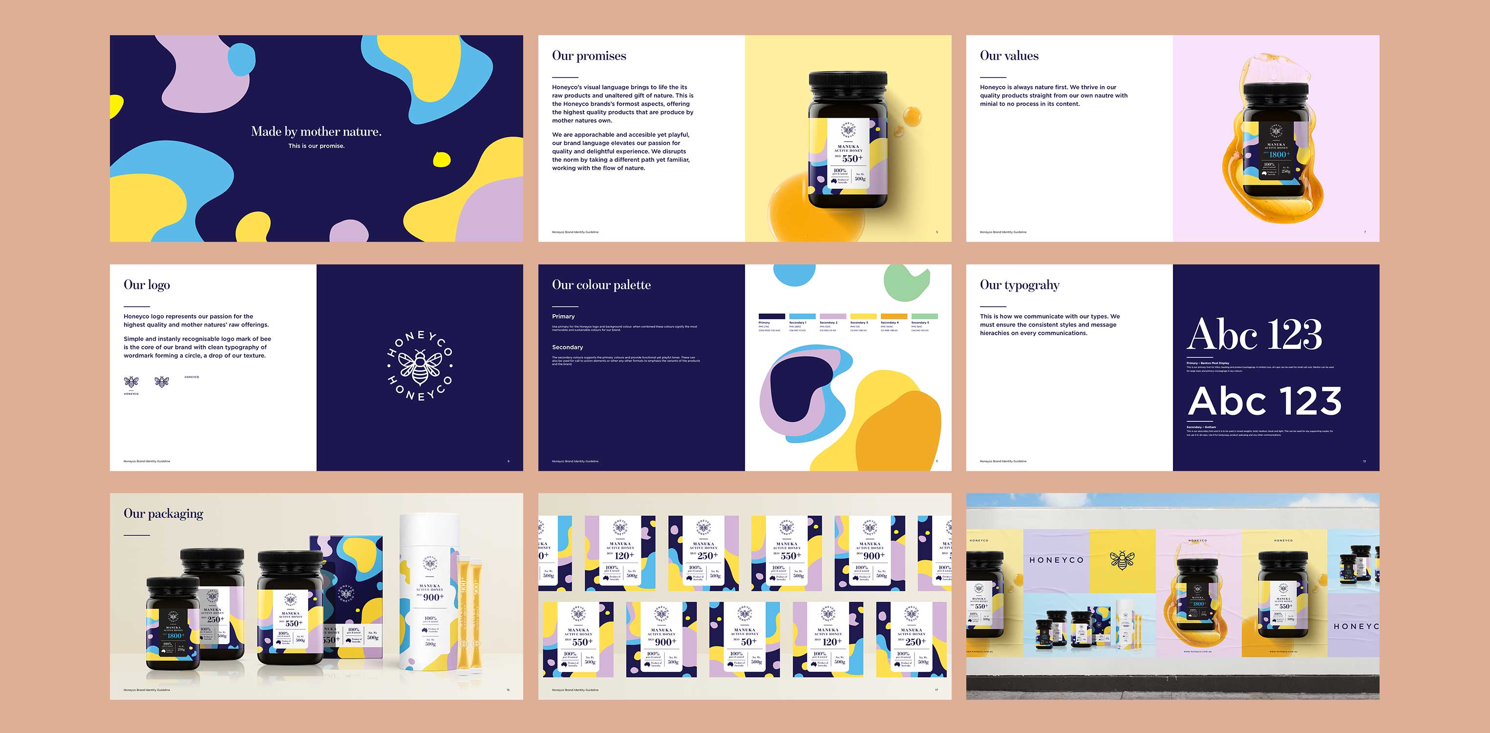
After championing the brand and primary pack design, the same visual language were implemented into its full range of products, merchandises and marketing collaterals. Along with these we have developed a clean yet impactful key visuals that help Honeyco brand’s to reach to its people. The complete project involved a brand new brand identity, brand visual style guide, 22 unique product labels (across five different product sizes and formats), key visuals, print and marketing collateral, and digital assets for website and social media posts.
We were delighted to partnership with Honeyco to introduce a brand that is truly unique and own-able. Honeyco is positive that it will disrupt the existing market and expand out into regions beyond Australia, into Asia in near future.

CREDIT
- Agency/Creative: Eo&So Graphic Design
- Article Title: Active Manuka Honey Brand and Packaging from Sydney
- Organisation/Entity: Agency, Published Commercial Design
- Project Type: Packaging
- Agency/Creative Country: Australia
- Market Region: Oceania
- Project Deliverables: Brand Guidelines, Brand Identity, Brand Strategy, Identity System, Packaging Design, Product Architecture, Research, Tone of Voice
- Format: Bottle, Box, Jar, Sachet
- Substrate: Plastic, Pulp Paper


