Parlor’s Ice Creams is a small Mom and Pop ice cream shop located in Dallas, Texas. The owners, raised as ice cream lovers and two recent graduates from SMU, had a dream to make America’s favorite treat by sourcing only the highest quality and minimal ingredients. They felt like something was missing: a good old ice cream shop with classic scooped ice cream flavors made from scratch. Thus, with a heart to support our fellow local farmers and small businesses, they took all of the Italian spirits of passion with us and built Parlor’s Handcrafted Ice Creams. With every flavor comes the highest-quality local and seasonal ingredients. Each scoop starts with a visit to our trusted Dallas farms and local businesses. They take those ingredients to the kitchen where they mix, pasteurize, and freeze the ice cream, all in-house. Almost all other ice cream shops use artificial fillers that are unhealthy and don’t taste nearly as soon as the ingredients going in Parlor’s Ice Creams. They were even named the “most nostalgic and beautifully sourced frozen confections in the city” by @d_magazine
Parlor’s Ice Cream’s new brand refresh embodies everything they believe in and stands for, which ultimately sets them apart from all their competitors in a saturated market.
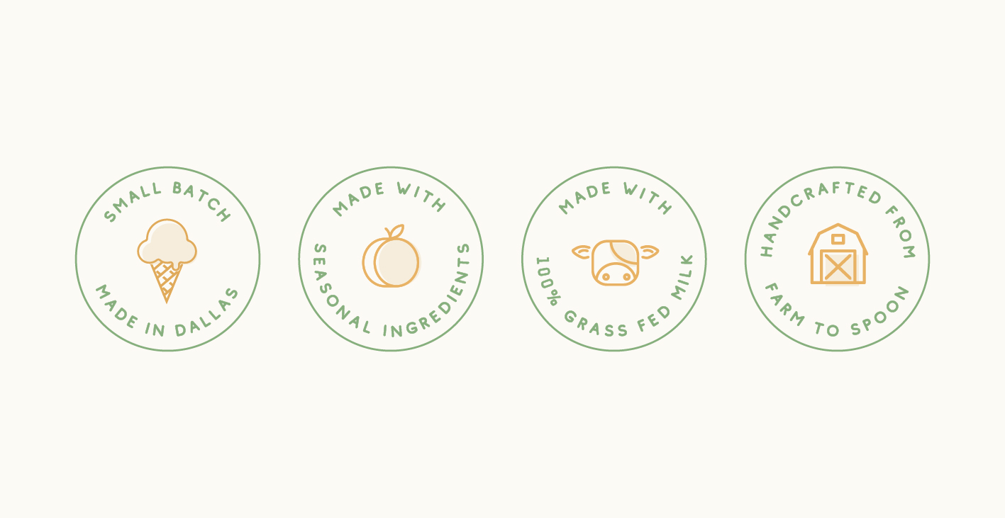
The new look is simple and clean: using only the highest quality minimal ingredients needed to make ice cream taste great! It is also classic (yet timeless): they craft their good old scooped ice cream with nostalgic and classic flavors. Lastly, their new brand look is local-focused. Their new brand is local-focused. The rustic feel portrays their promise to only use the highest quality ingredients, sourcing grass-fed milk and pasture-raised eggs from local Texas farms. They have a strong belief that it’s time to start thinking about what we are eating, is eating, and their ice cream proves that!
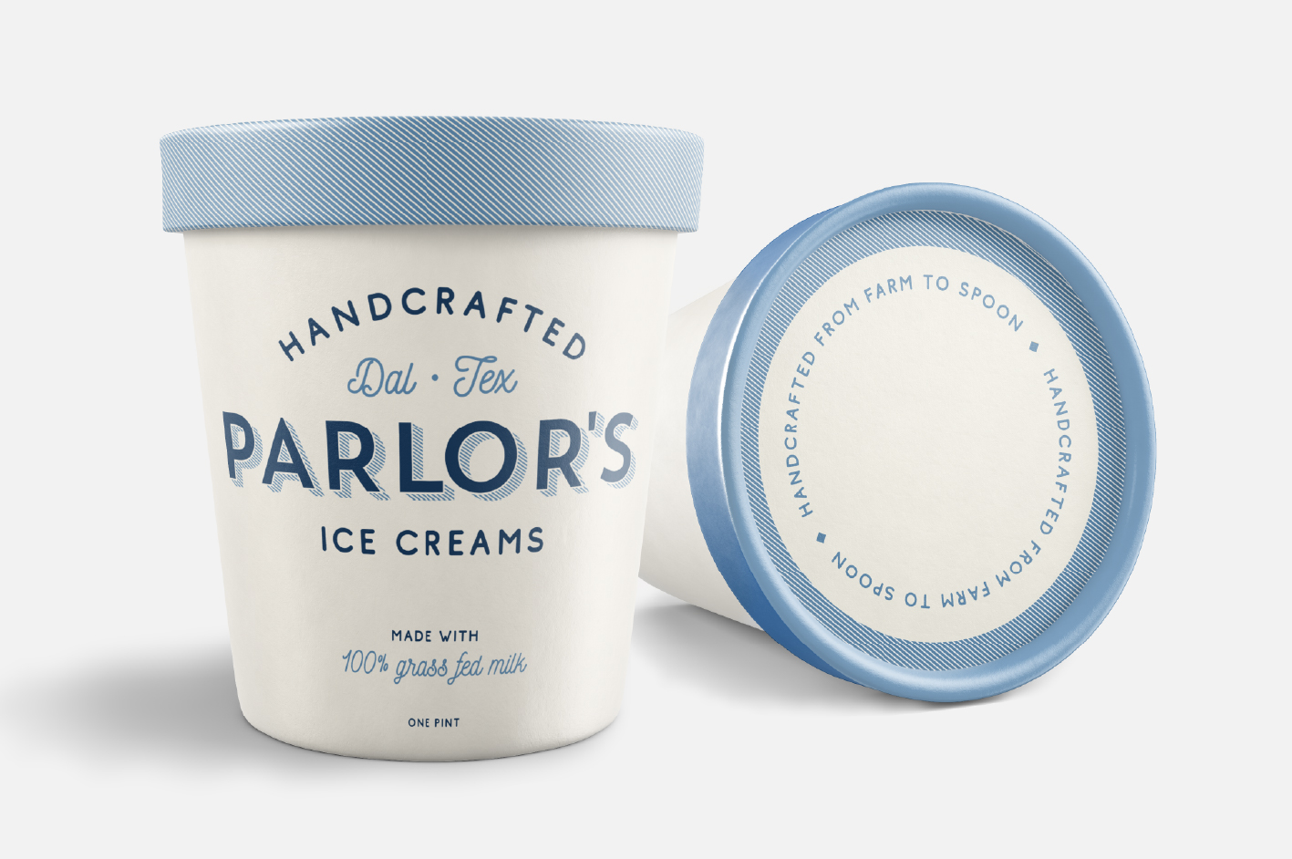
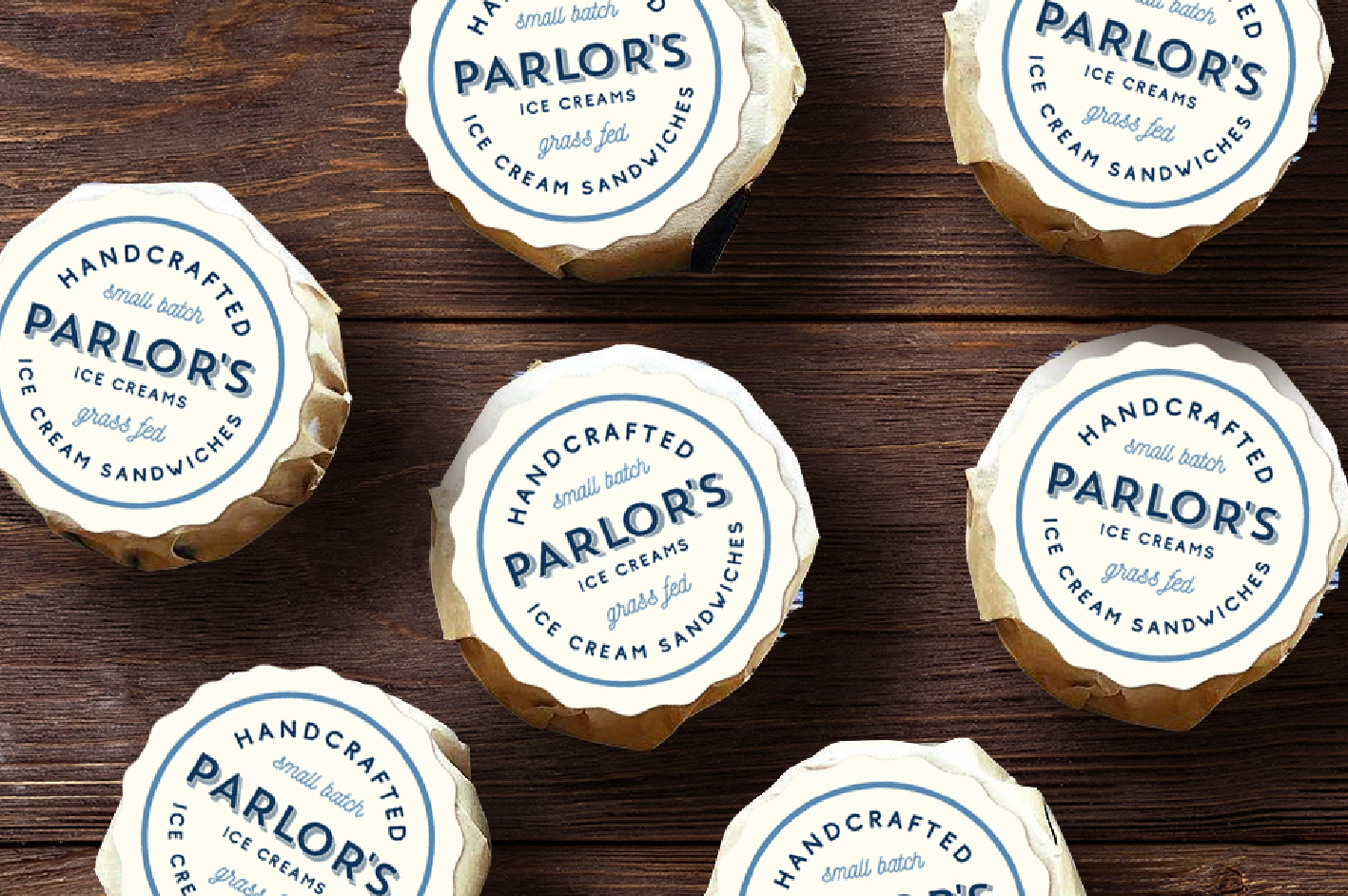
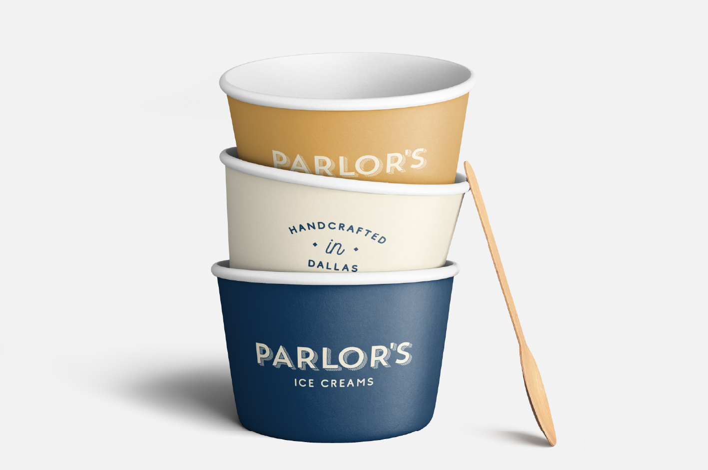
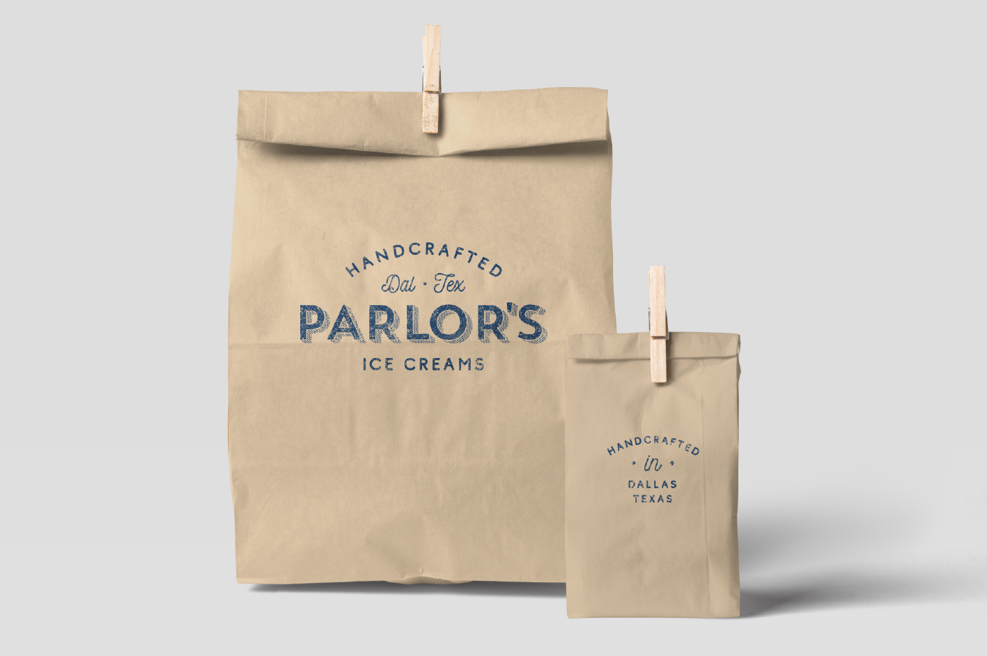
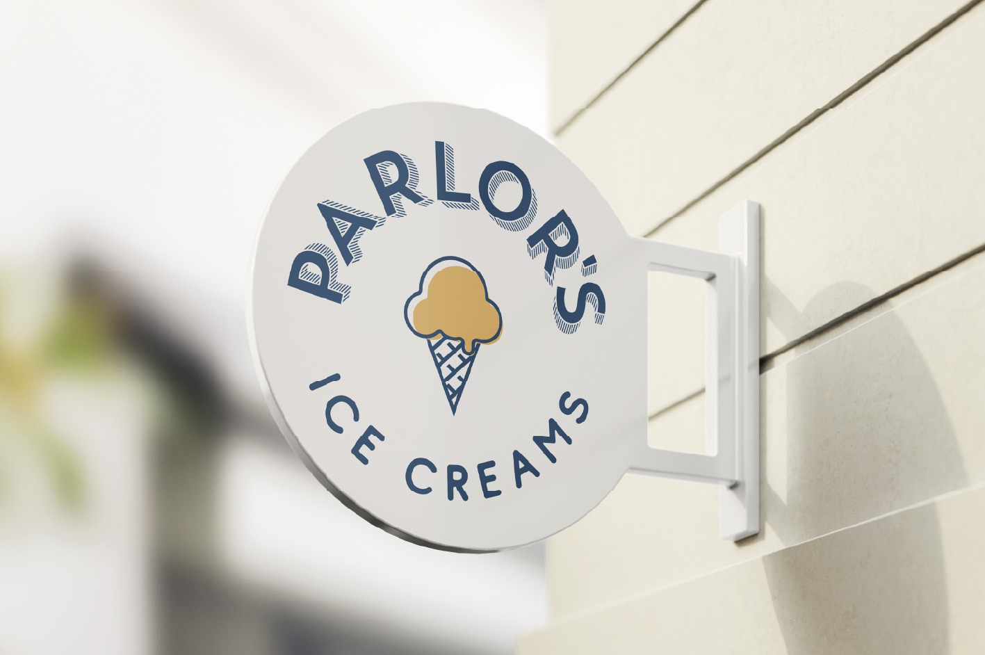
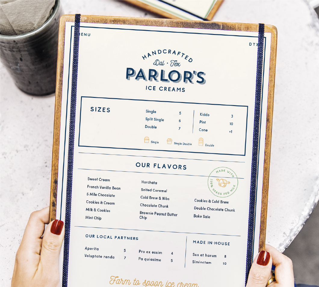
The logo, badges, typography, and the primary color palette; navy and cream, were inspired by the client’s desire to allude to the past to create a very classic feeling of a 50s ice cream parlor when the flavors were simple. The kraft paper used on various packaging items, as well as the secondary color palette; orange and green were inspired by rustic farm life.
The branding design spans from the packaging design, which includes their ice cream cups, ice cream sandwich stickers, and pints, to their signage, ice cream cart, menus, and color palette.
CREDIT
- Agency/Creative: Madison Wooters Design
- Article Title: Madison Wooters Design Creates Branding for Parlour’s Ice Cream Shop
- Organisation/Entity: Freelance, Published Commercial Design
- Project Type: Identity
- Agency/Creative Country: United States
- Market Region: North America
- Project Deliverables: Brand Experience, Brand Guidelines, Brand Identity, Brand Redesign, Brand Strategy, Brand World, Branding, Graphic Design, Packaging Design, Research
- Industry: Food/Beverage
- Keywords: Ice Cream, Parlor Shop, Ice Cream Shop, Ice Cream Sandwiches, Ice Cream Pint, Branding, Brand Identity, Farm, Grass-Fed, Rustic, Classic, Vintage, Farmers Market


