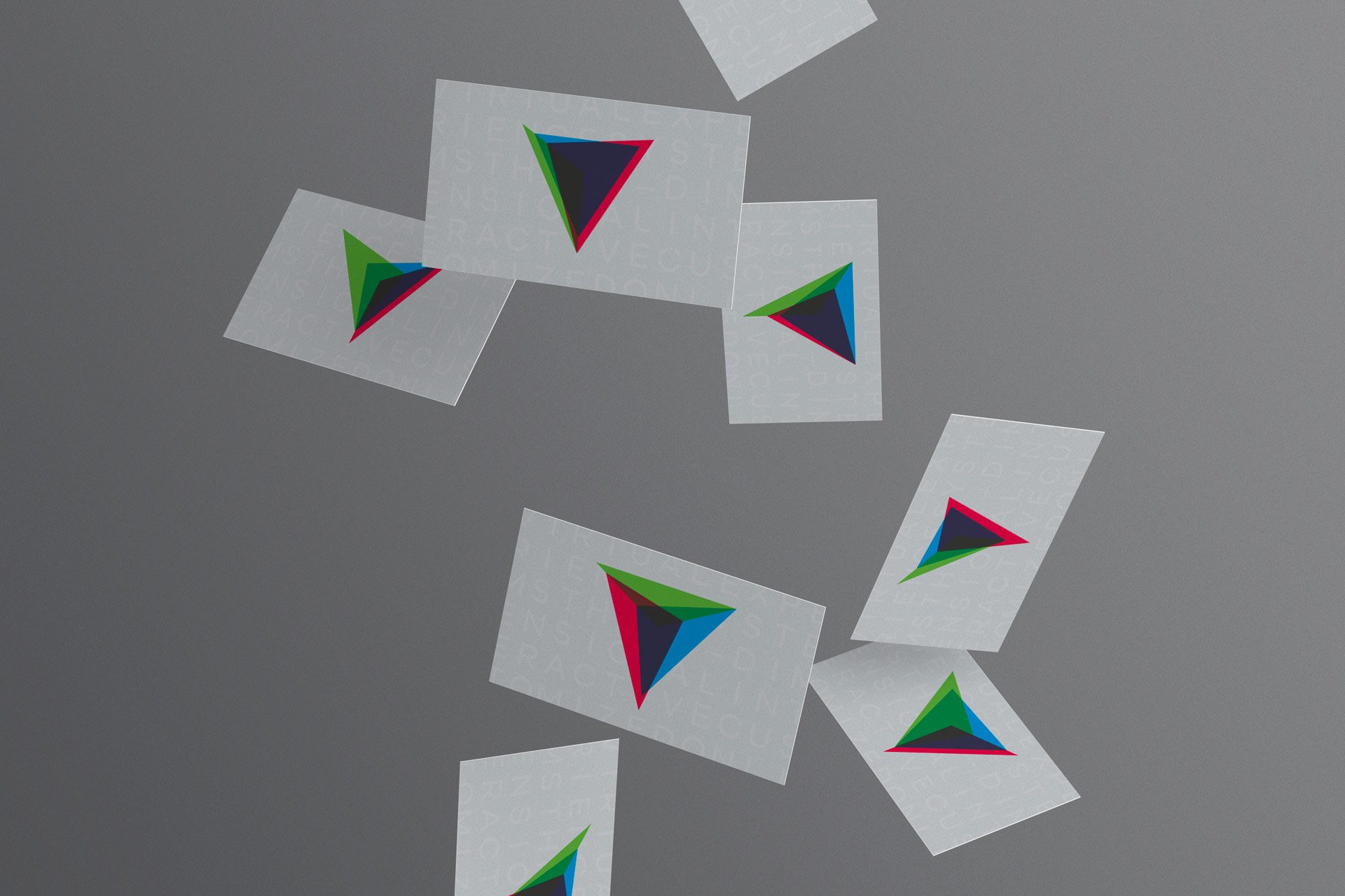
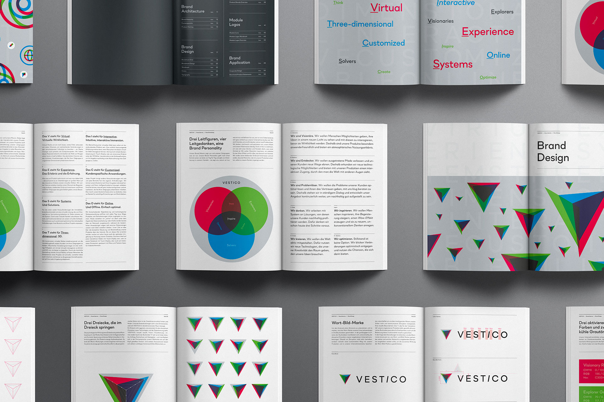
Vestico started with a name and an idea. As a designer, I helped the start-up in its initial phase to get a comprehensive picture of itself and to find the right words for its target groups. The result is a brand identity that paints the image of a visionary company both visually and communicatively.
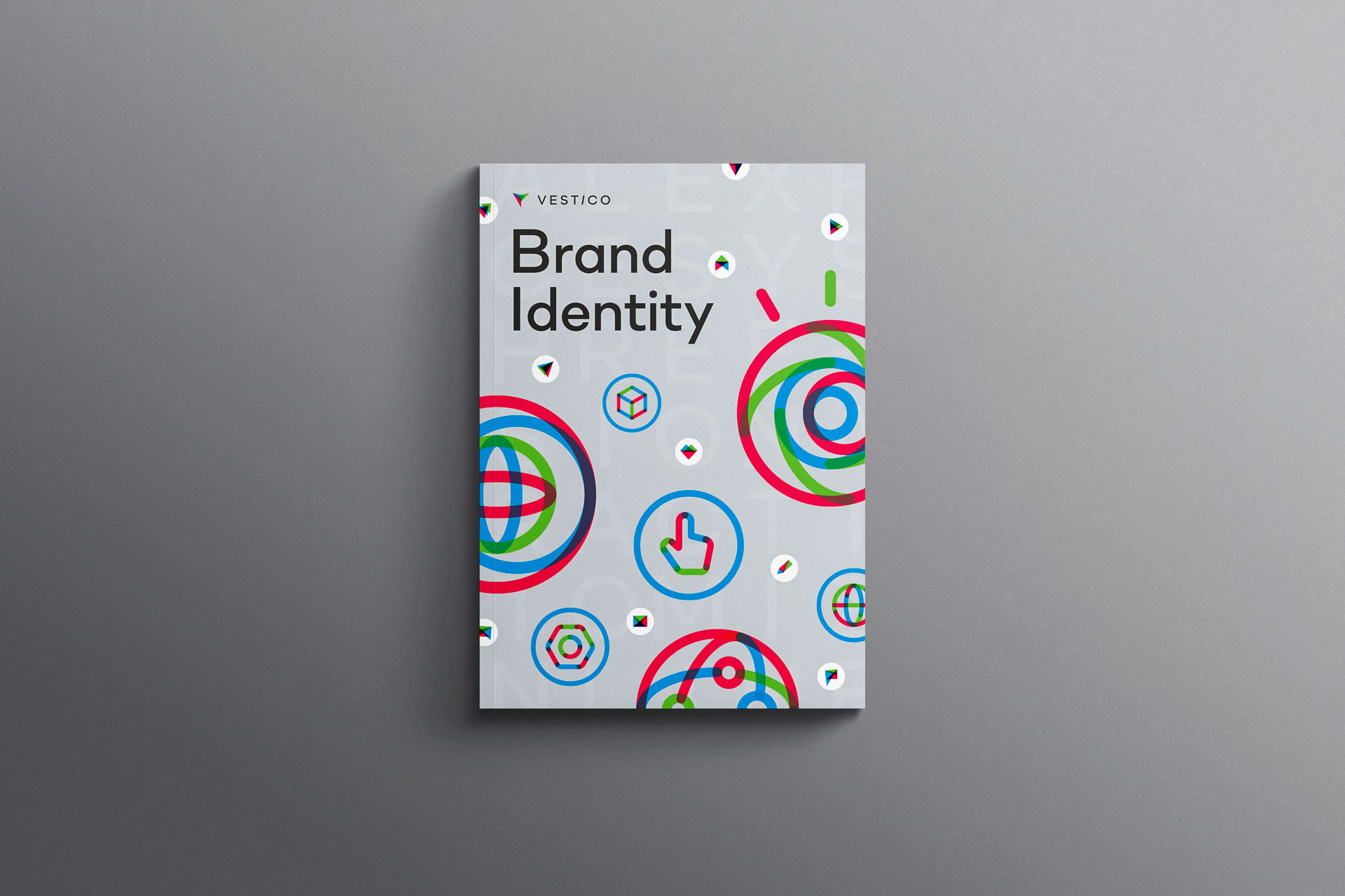
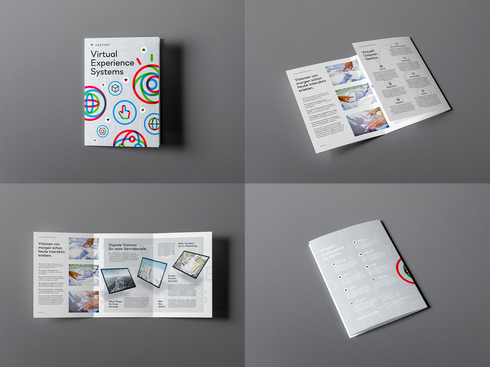
In a holistic approach, I developed an appearance that encompasses much more than logo, choice of font, choice of color and layout. This is how a figurative mark was created that is constantly reforming based on a generative principle and creating innumerable variants. Seven distinctive brand icons visually support communication and are central design elements. There are also product naming, product brands, module icons and the interaction design for the virtual application ‚vBuild‘.
The real trick of my work lies in the name itself: ‚Vestico‘ became the acronym for Virtual Experience Systems, Three-dimensional, Interactive, Customised, Online.
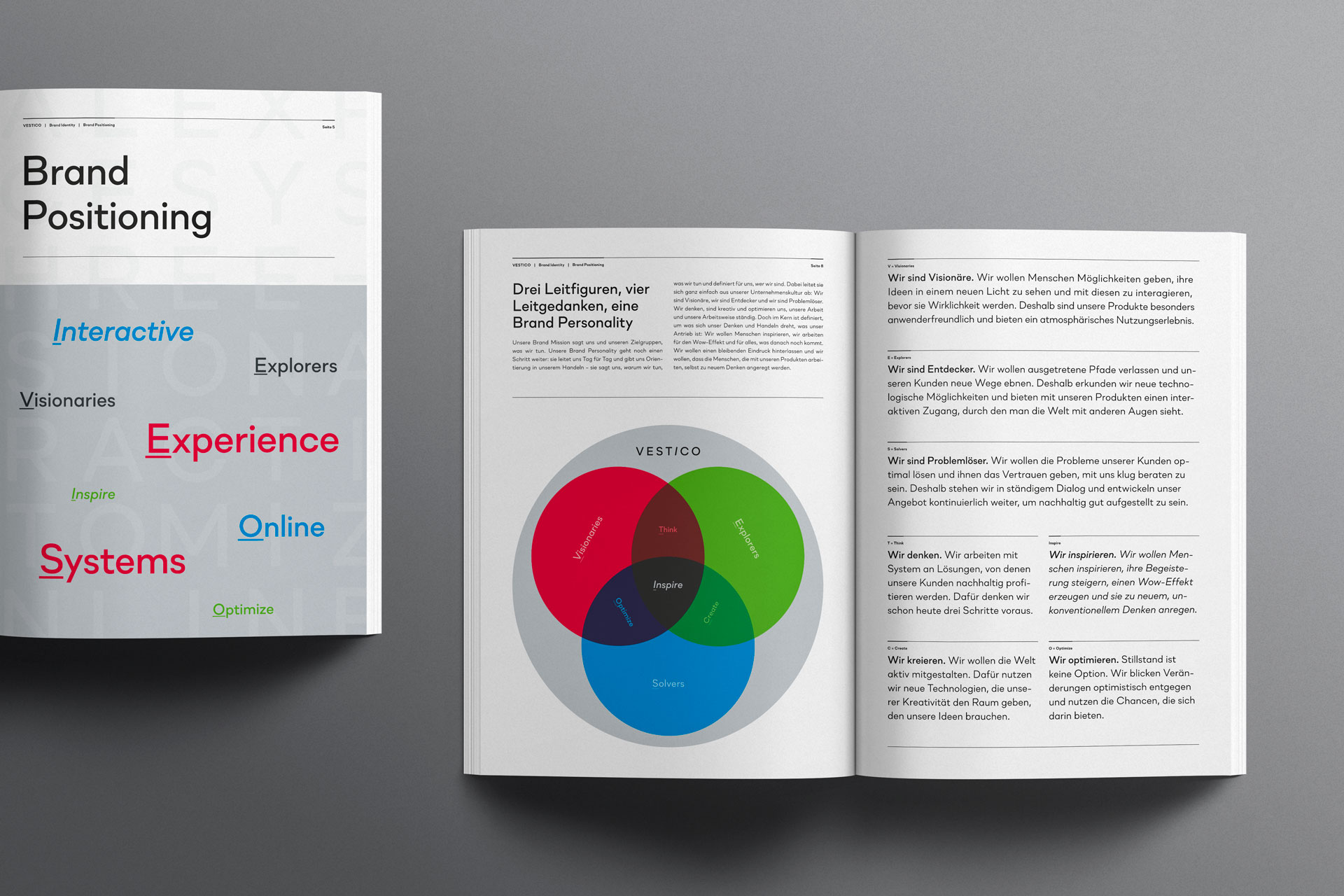
The brand positioning: Three leading figures, four guiding principles, one brand personality. Good positioning is derived from the corporate culture. At Vestico, visionaries are at work as well as technical geniuses in programming and what they have in common is the urge to think outside the box in order to find new ways – a spirit of discovery. The positioning follows an archetype-based model and defines three leading figures, their individual modes of action and a collective unifying thought in order to create a unique brand personality.
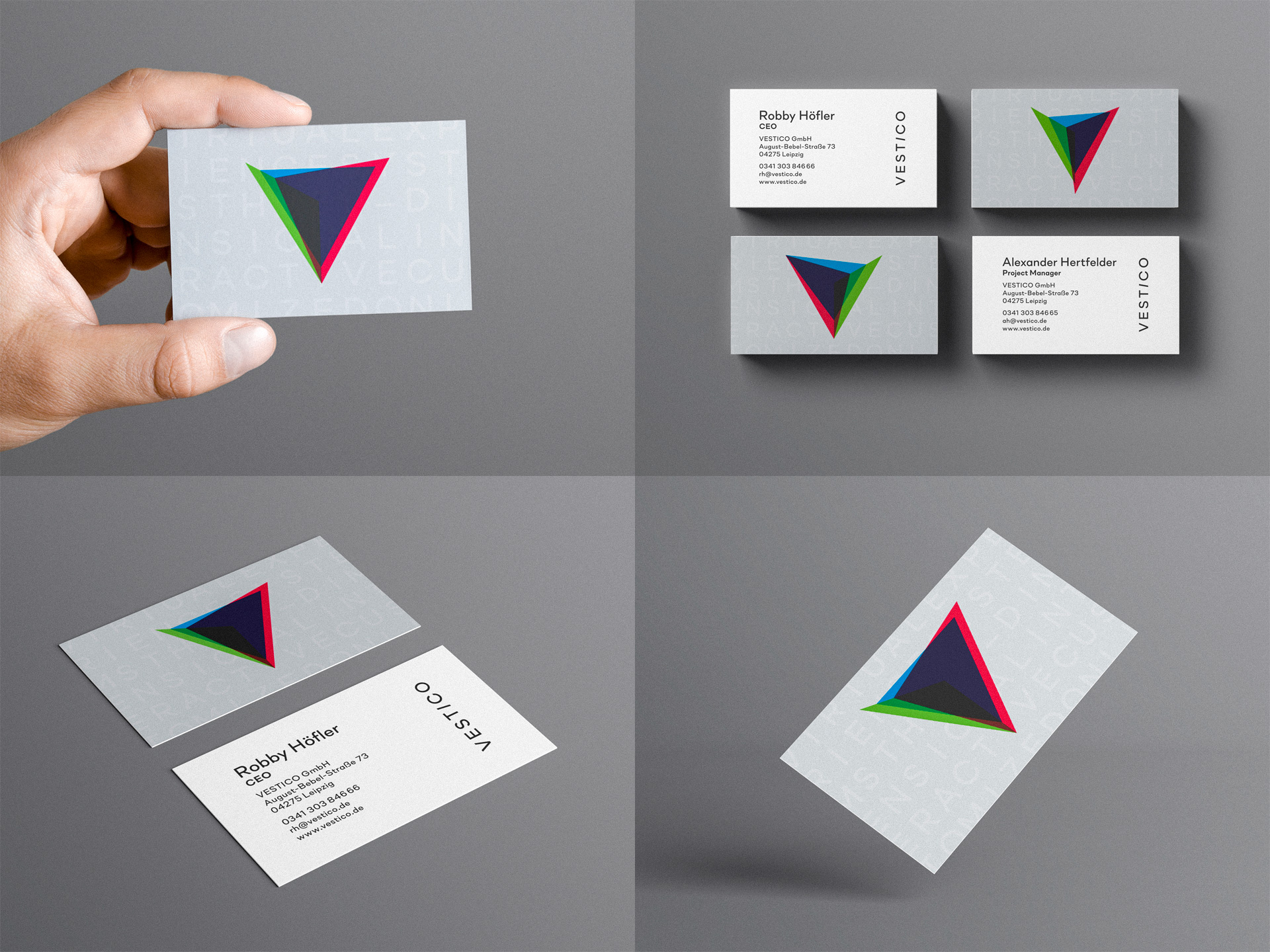
Change as a constant: Generative design in corporate design. The parent brand mark shows three equilateral triangles, which through their arrangement create a partially spatial effect and which are repeatedly rearranged in a special grid. The dynamism of this generative design is ideally suited to translate the essence of the company into the visual. The triangle is associated with properties like dynamism, tension and something mysterious. It seems aggressive, which is associative for the disruptive character of new technologies and the nature of digitization.
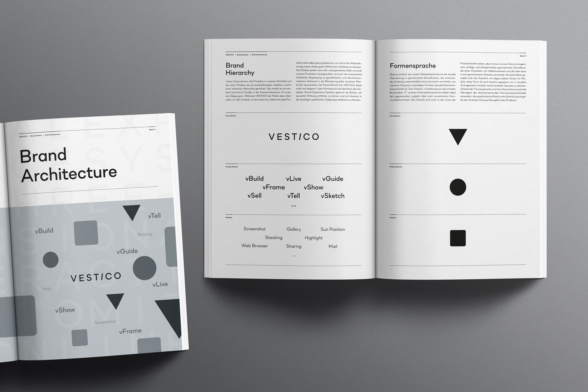
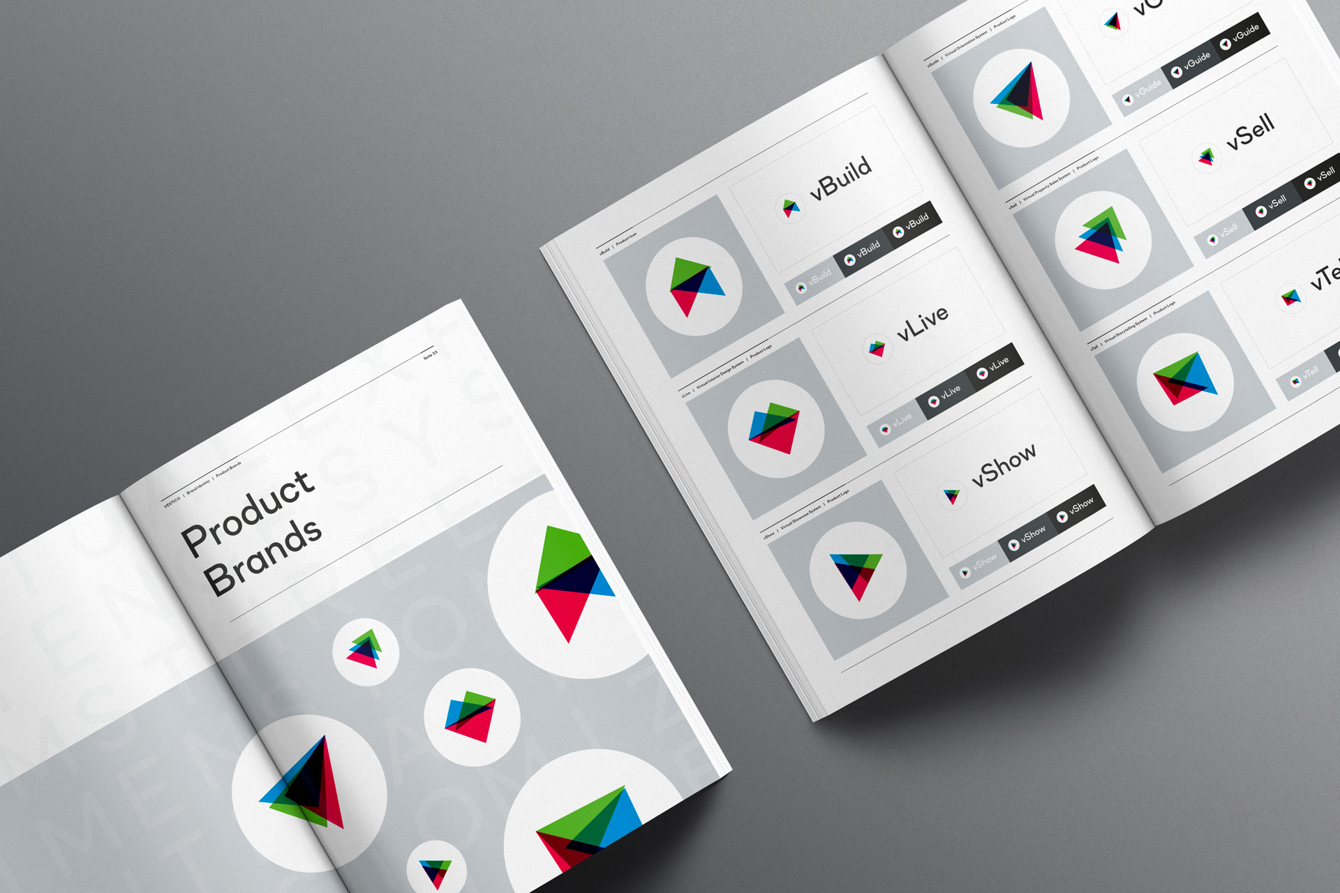
Storytelling through product naming: The product as a brand ambassador. Vestico develops virtual experience systems. In product naming, ‚Experience‘ is quickly replaced by a term that is common for the application or the industry. A single virtual experience system for the real estate industry is therefore a virtual architecture system. The product name is then derived from the system designation – a combination of a small ‚v‘ for ‚virtual‘ and an English verb that is associative for the industry. An example: the product name ‚vBuild‘ sounds like ‚We build‘ when spoken. A very short sentence structure in which Vestico sees itself as a subject and thus formulates a brand message with every product name.
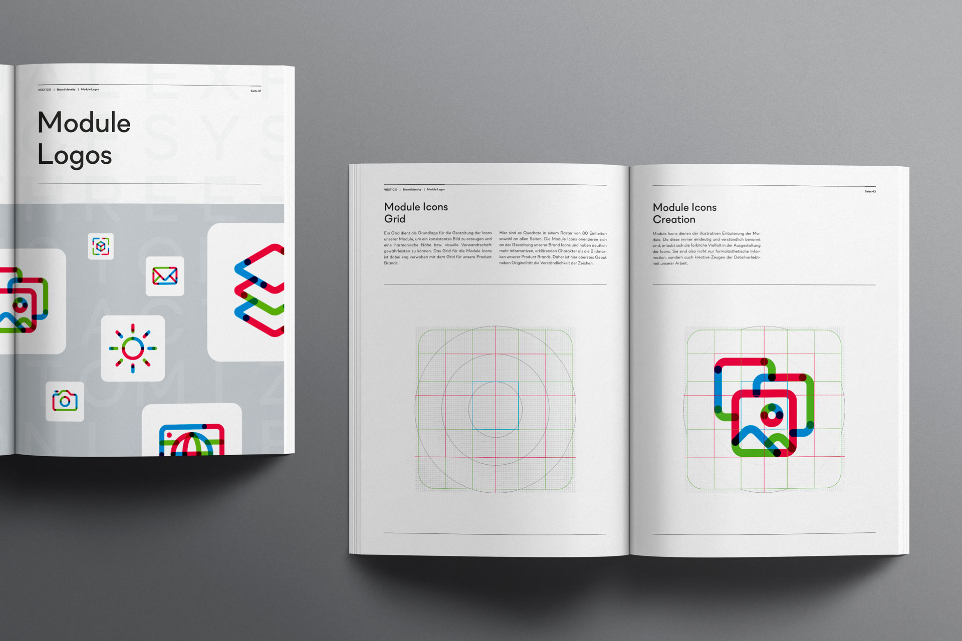
Module logos: consistent and variable down to the smallest detail. The figurative marks for modules of all virtual experience systems are based on the Vestico brand icons and visually build a bridge between user interface design and corporate design. They make it clear how flexibly the appearance can be dealt with without having to accept a style break and how well thought-out the brand identity is from the largest element to the smallest detail.
CREDIT
- Agency/Creative: Bureau FM
- Article Title: Vestico Virtual Experience Systems Designed by Bureau FM
- Organisation/Entity: Freelance, Published Commercial Design
- Project Type: Identity
- Agency/Creative Country: Germany
- Market Region: Europe
- Project Deliverables: Brand Architecture, Brand Creation, Brand Guidelines, Brand Identity, Brand Naming, Brand Strategy, Branding, Identity System, Product Naming, Research
- Industry: Technology
- Keywords: Virtual Reality, VR, Architecture Visualization, ArchViz, Startup, Property Technology, PropTech, Real Estate


