Wolfgang Joop is one of the best known and most acclaimed designers of our time. His new brand “Looks by Wolfgang Joop”, first presented at the Fashion Week in January 2020, attaches great importance to sustainability and a young mindset. The philosophy of the brand is to Reduce – Reuse – Recycle. The brand understands the challenge of meeting the desire for fashionable self-expression in an era of ever-expanding consumption. It values high-quality and mindfully manufactured materials that can be made accessible to everyone. “Looks by Wolfgang Joop” is the answer for an industry undergoing radical change. Instead of bowing to the fast-paced, seasonal rhythm of the fashion industry, “Looks by Wolfgang Joop” focuses on creating exclusive, high-quality designs and small collections that celebrate individuality and take a stand for the responsible use of resources. The brand encompasses fashion, fragrances and home interior.
As the designer wished his fragrances to have widespread availability, they are distributed in the lifestyle segments of all major drugstores and perfumery chains in Germany and Austria. The target groups are men and women, aged 20-39. They are fashion lovers with a young mindset and want to be inspired by new fragrances. They are interested in brands which are produced in a sustainable manner, and they appreciate attractive price-performance ratios.
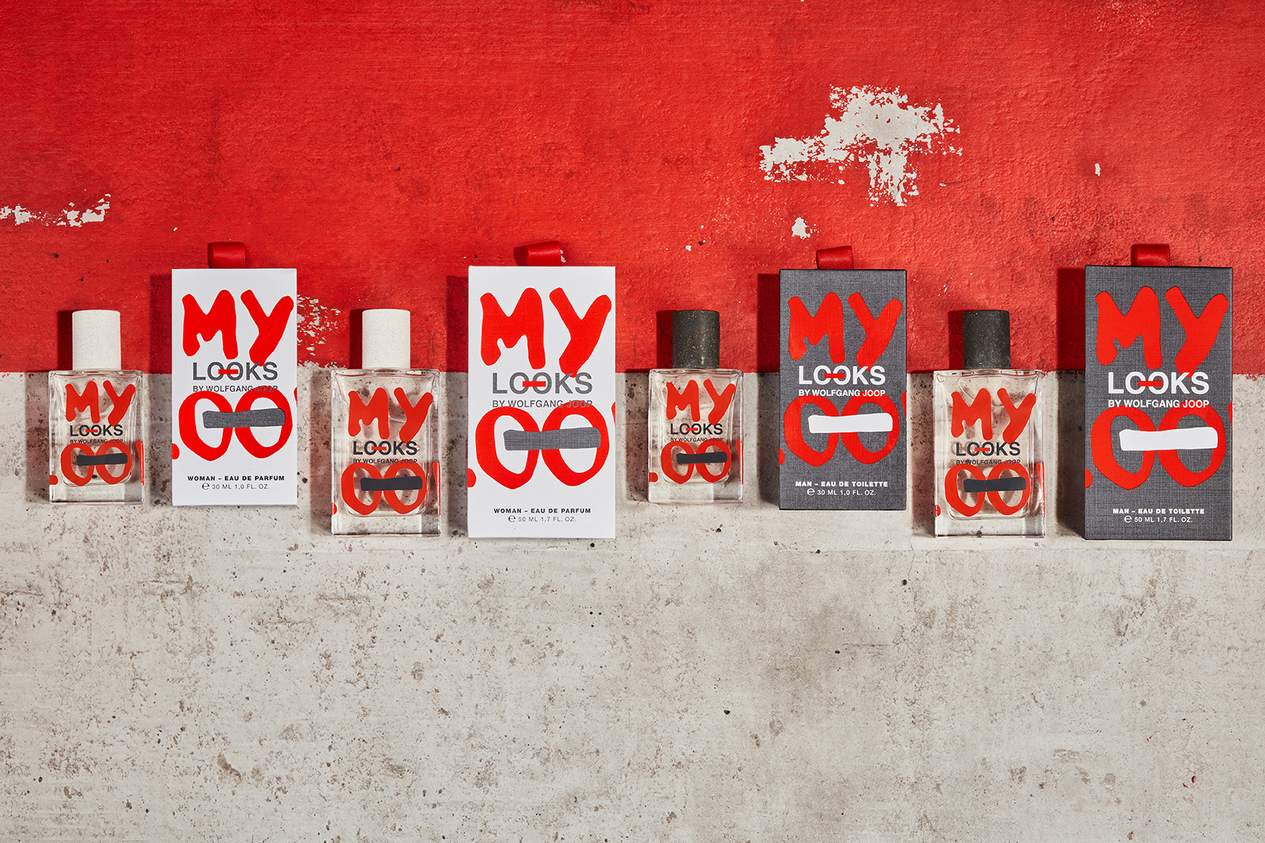
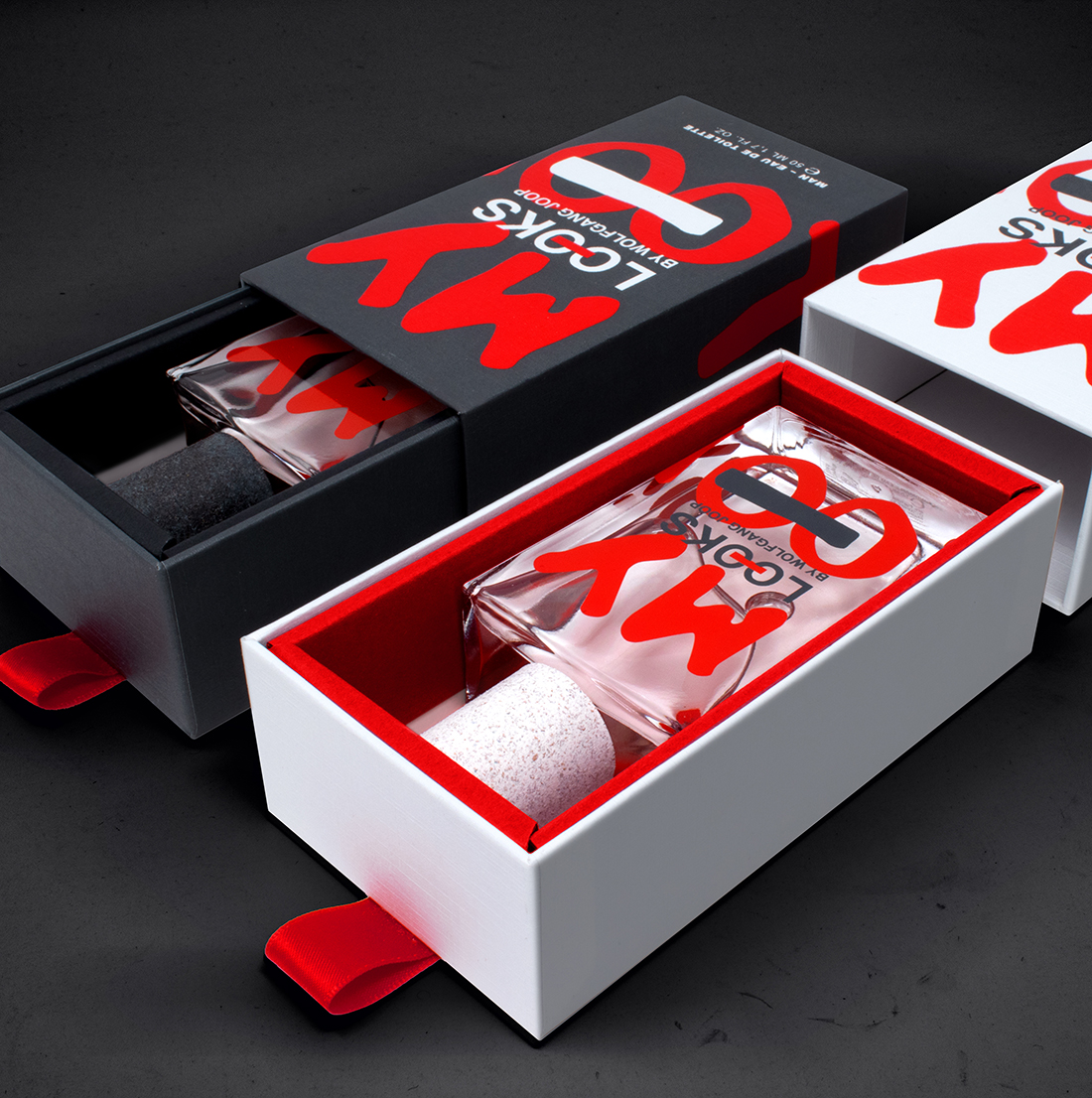
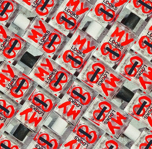
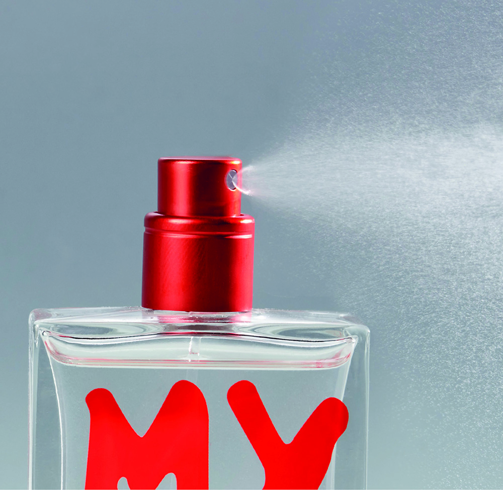
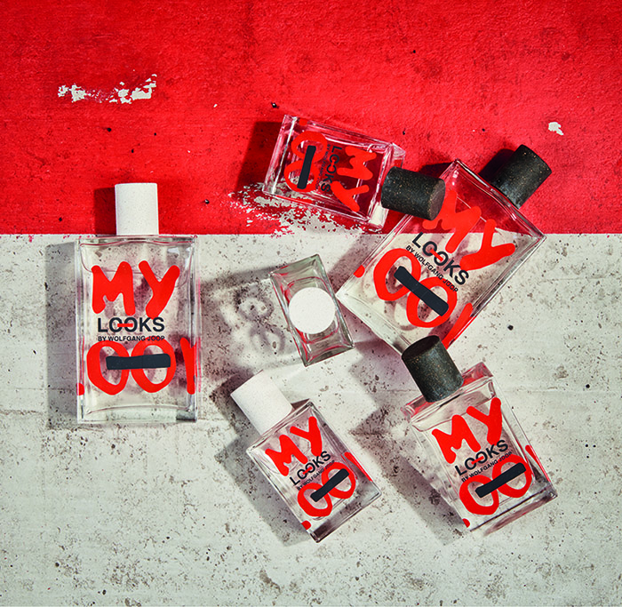
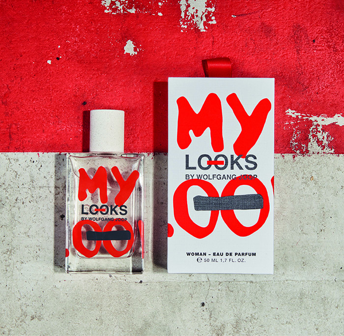
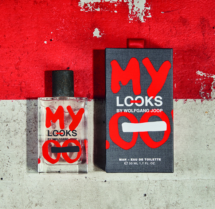
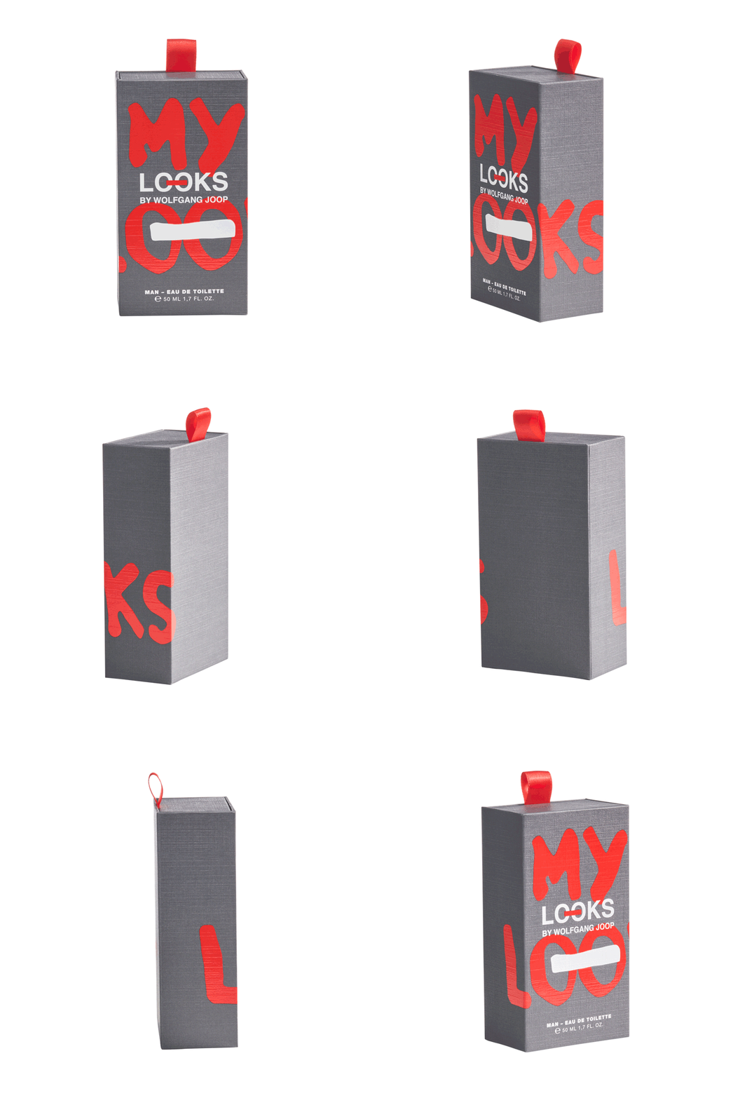
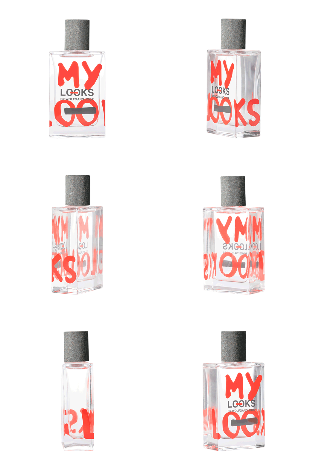
Our task was to create the packaging design of a flacon and the boxes of two signature fragrances for men and women, in two sizes. They should communicate the values and set the tone for the new fashion brand “LOOKS by Wolfgang Joop”. Due to the variety of fragrances commercially available, it was crucial to create a striking design with high shelf impact. The products should make both a powerful, and at the same time casually elegant impression, just like the brand itself. The result is a bold, highly visible brand with a rough lettering based on Wolfgang Joop’s fashion collection where free interpretations of the original logo symbolise Wolfgang Joop’s personal connection and identification with his brand. Using the CI colours, red and grey, of the original logo was mandatory. The result is a design for women’s and men’s fragrances that works individually, but also as a pair. A highlight of the design is the wrap-around printed bottle as well as the solid slipcase package with a fabric tag. Being true to the philosophy of the brand Reduce – Reuse – Recycle, the packaging of the fragrances is sustainable.
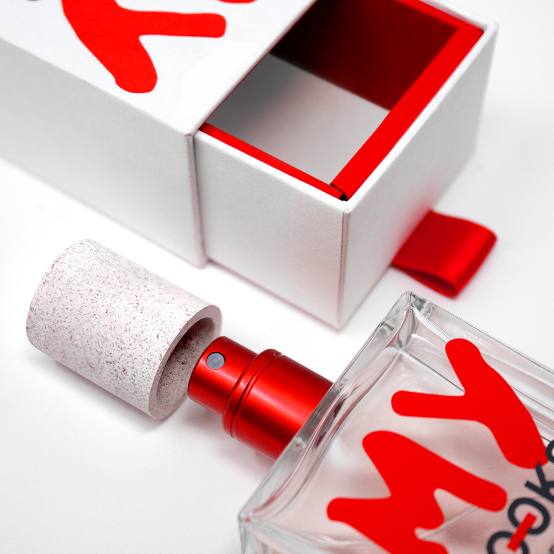
Neither foil finish, plastic inlays nor cellophane wrapping were used, instead the boxes are simply sealed with a small paper sticker. The flacon is a standard model and chosen as a straight base for the striking logo. The cylindrical cap material is made of recycled cork to give the fragrances a novel haptic feel. The chosen paper is premium-quality and FSC-certified. It has a fabric-like structure, linking it to the fashion collection and the additional lacquer on the design elements increases the visibility of the structure. The high-quality slipcase boxes are reusable as small design objects in which you can store your favourite things. We also designed all sales material, including a representative pr box with magnetic fastener.
CREDIT
- Agency/Creative: brandcouture
- Article Title: Design of Fragrances for Looks by Wolfgang Joop from Brandcouture
- Organisation/Entity: Agency, Published Commercial Design
- Project Type: Packaging
- Project Status: Published
- Agency/Creative Country: Germany
- Market Region: Europe
- Project Deliverables: Brand Naming, Branding, Packaging Design, Research
- Format: Bottle, Box
- Substrate: Fabric, Glass, Glass Bottle, Pulp Carton, Pulp Paper
- Keywords: WBDS Agency Design Awards 2021/22


