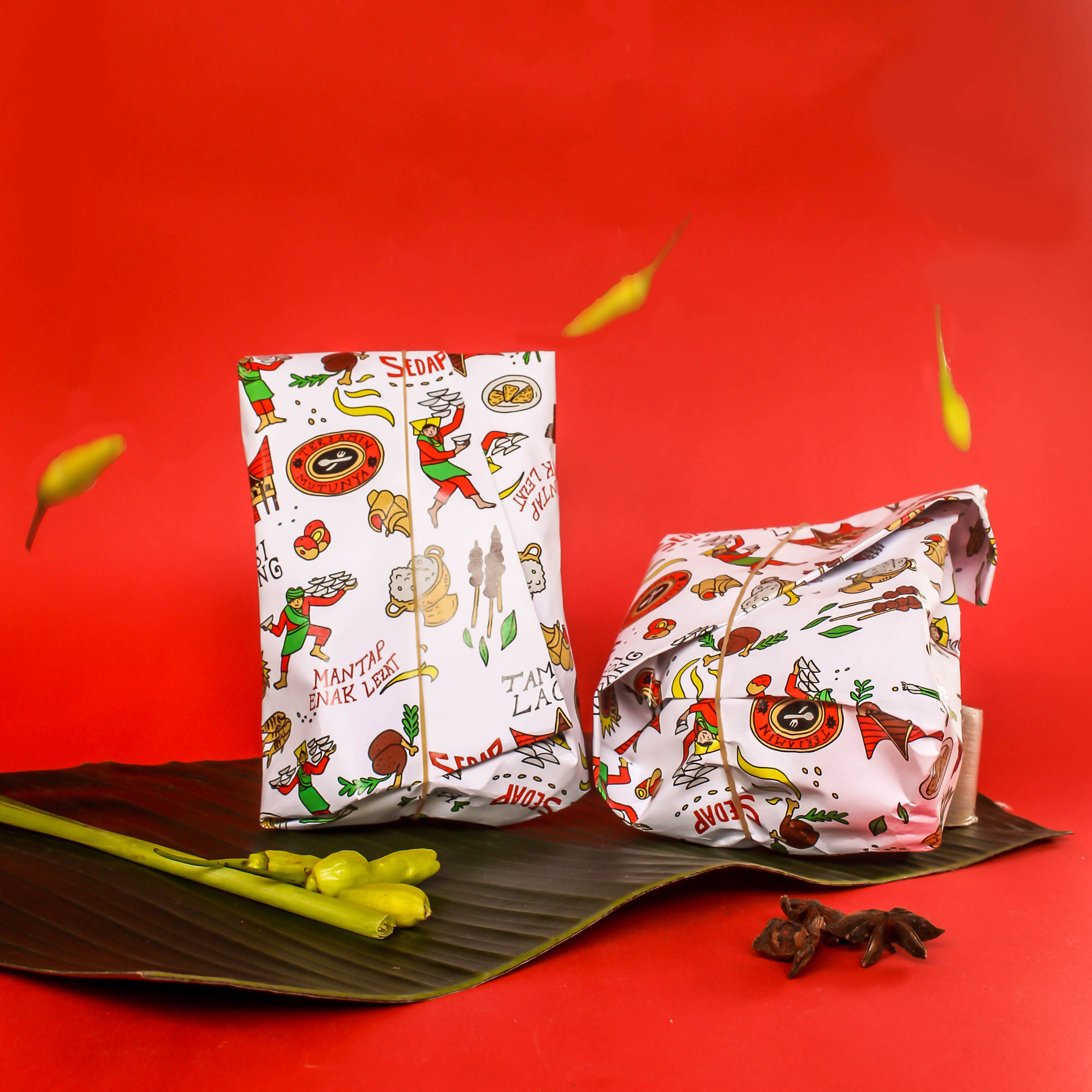
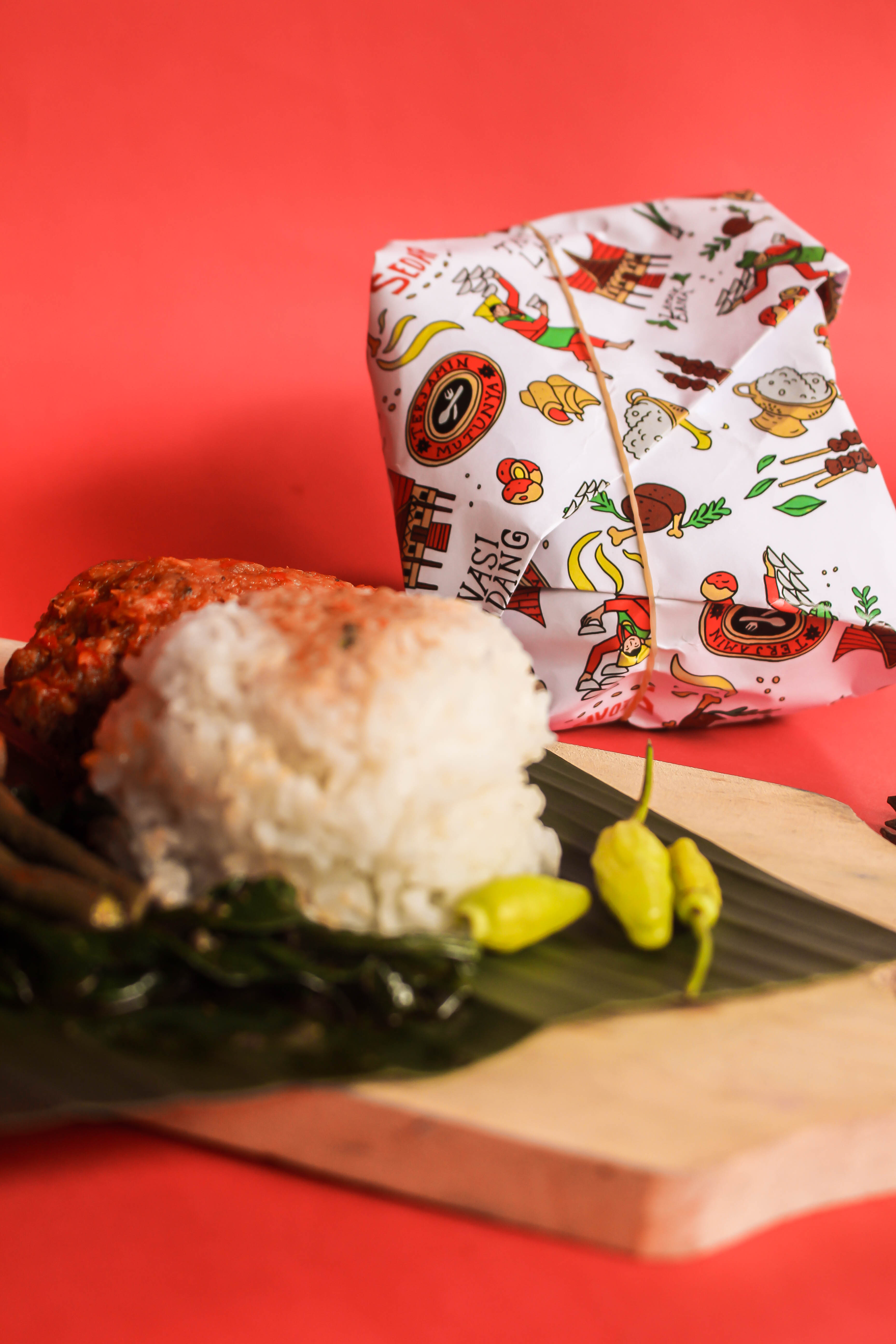
Indonesia is known as a country with a wealth of spices. This can be recognized by the richness of cuisine in Indonesia. One of the traditional dishes that have been legendary and can be found all over the country is Padang cuisine. In Indonesia everyone knows about Padang cuisine, with the richness of the spices in each dish and the unique way of presentation. and the larger portion of wrapped rice is a token of appreciation for restaurant owners because it makes it easier for employees to work. We try to reformulate the story of the uniqueness of Padang cuisine in its respective packaging patterns.
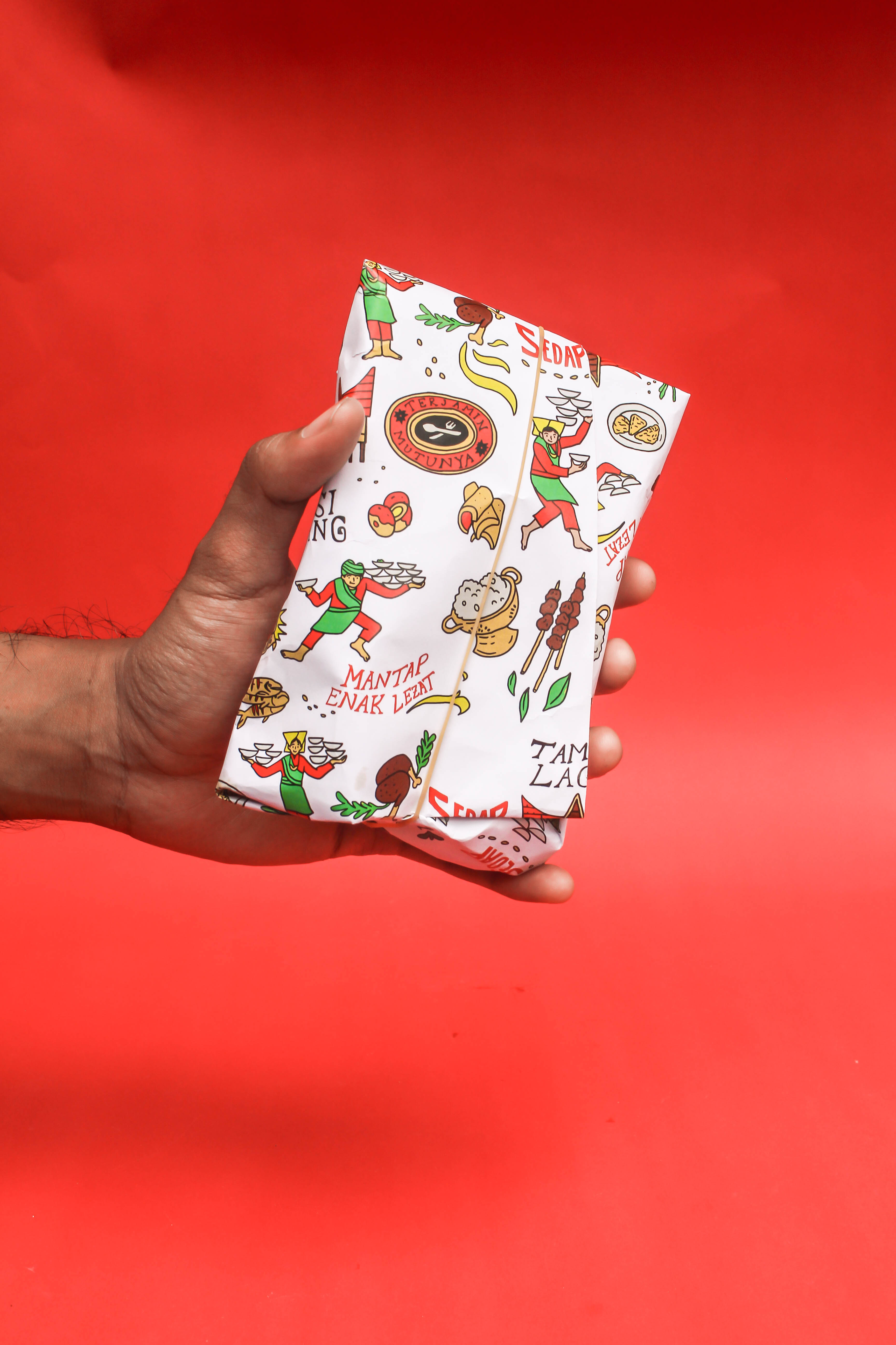
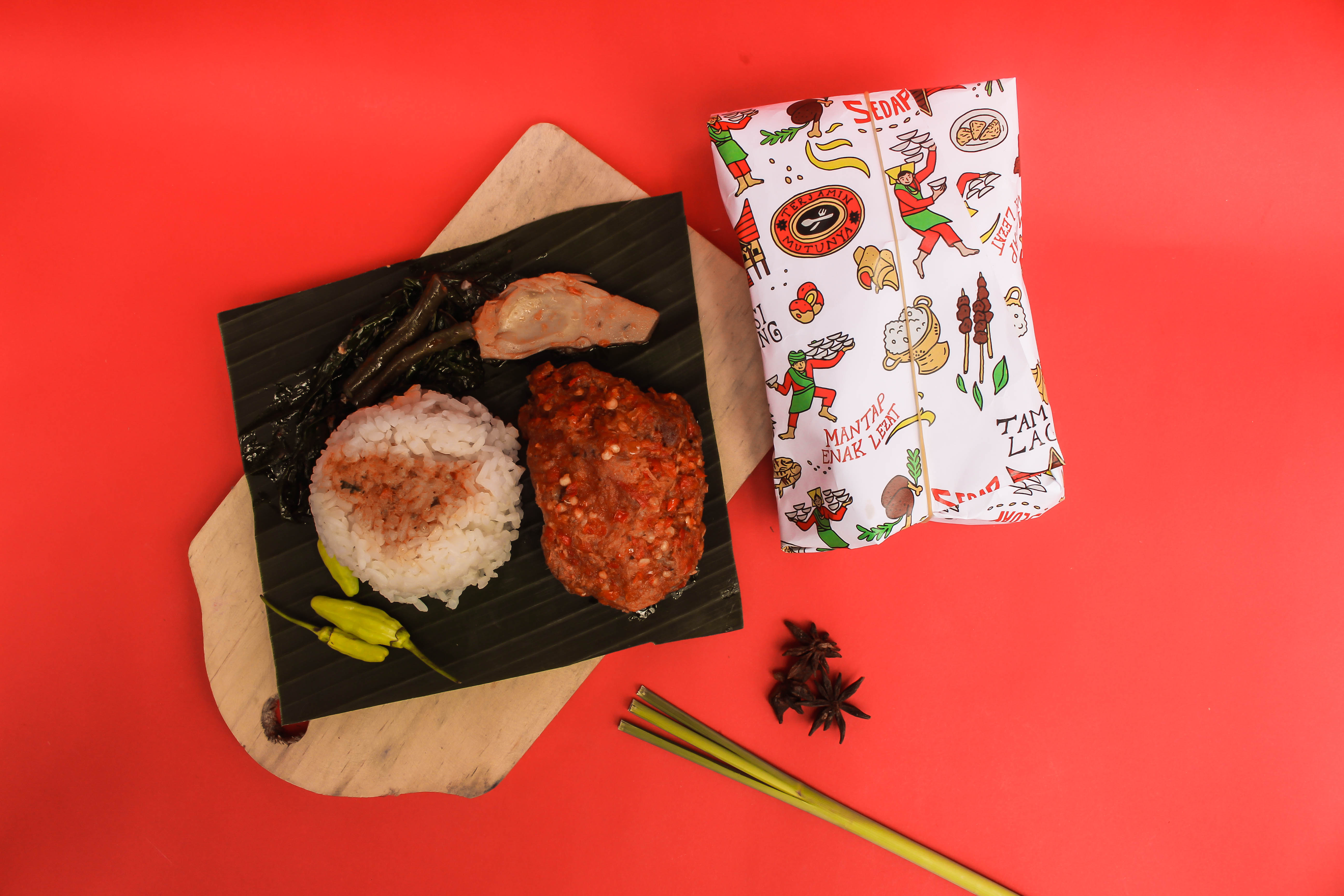
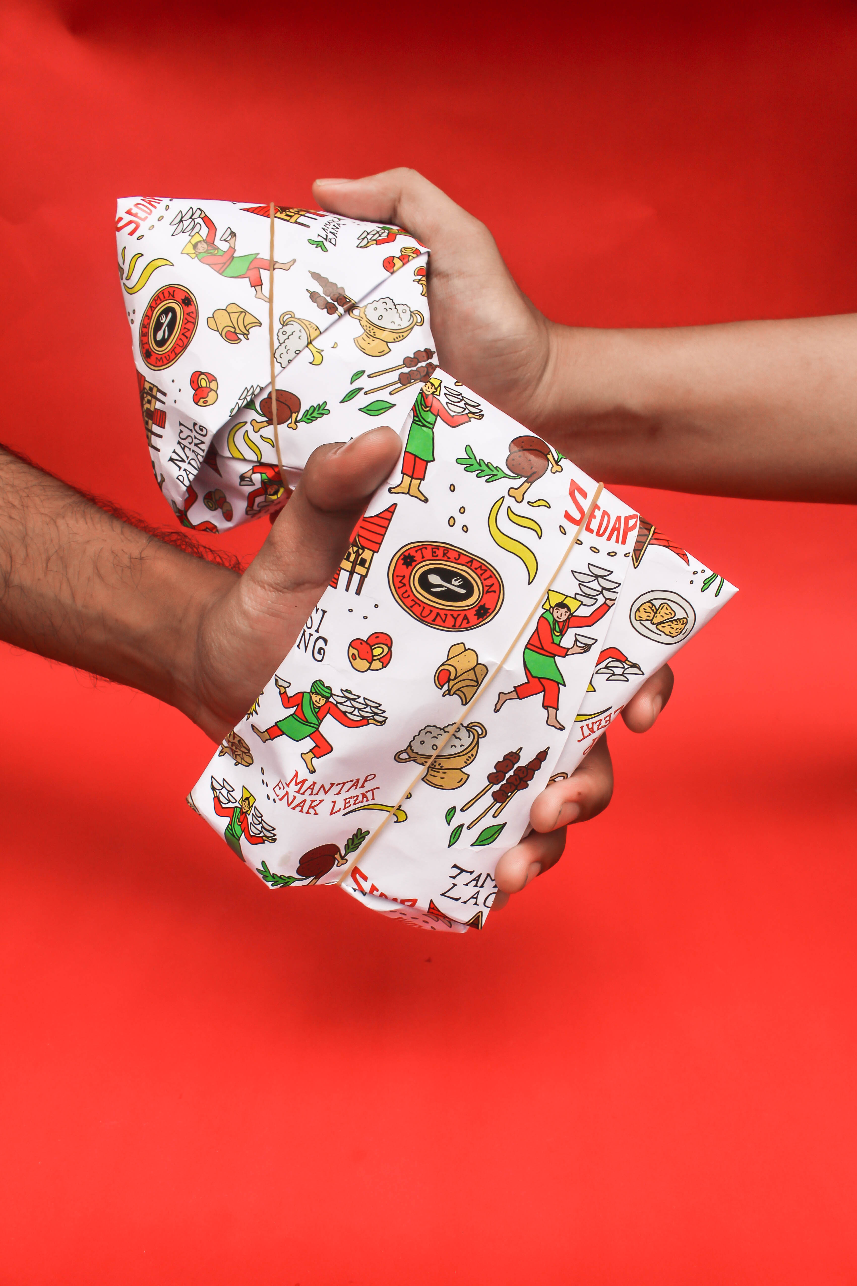
The idea for this package came when we were enjoying a packet of nasi padang. As a rule, Padang rice wrap is only a newspaper wrap which is cut and then threatened with banana leaves or plastic oil so that the rice and side dishes do not stick. However, there are some Padang rice stalls that use plain paper and are stamped with a distinctive logo, or the name of the stall. We thought there must be an interesting way as an attraction in enjoying a packet of nasi padang, we then came up with the idea of redesigning the appearance of this Padang rice wrap to be more illustrative.
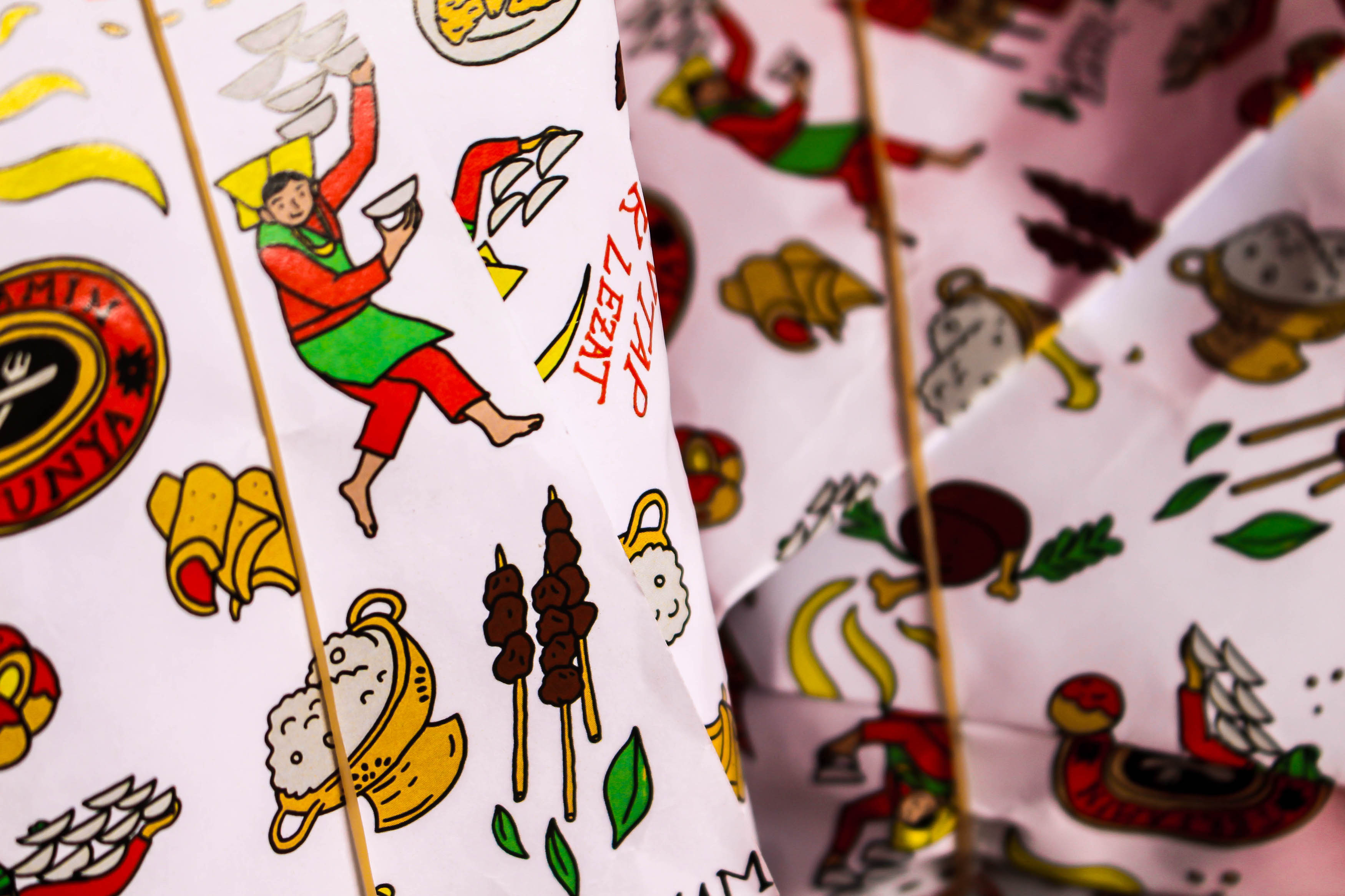
This idea is a very simple idea, although it still uses the same media, authentic wrapping technique, which is the hallmark of middle to lower class food in Indonesia. However, it is packaged in a more attractive and less boring way. This package depicts an illustration that is very thick with the visual style of Minangkabau, where the cuisine of this padang originates. Not only from the appearance of the illustration of the regional dances and traditional houses, but the typical typographic style that is often found and is very authentic with the nuances of the Padang restaurant. Most Indonesians are familiar with this style.
Although this design is initiative in nature and does not involve any party, of course this is a method or strategy that can be applied and offered to similar food entrepreneurs to use patterns or report their visual identity, with the same media, the same technique but present a unique and unique experience. new.
CREDIT
- Agency/Creative: Polamata
- Article Title: Polamata Illustrate Pattern of Nasi Padang on Its Paper Wraps
- Organisation/Entity: Agency, Published Self Promotional Design
- Project Type: Packaging
- Agency/Creative Country: Indonesia
- Market Region: Asia
- Project Deliverables: Graphic Design, Illustration, Packaging Design, Research, Tone of Voice
- Format: Wrap
- Substrate: Pulp Paper


