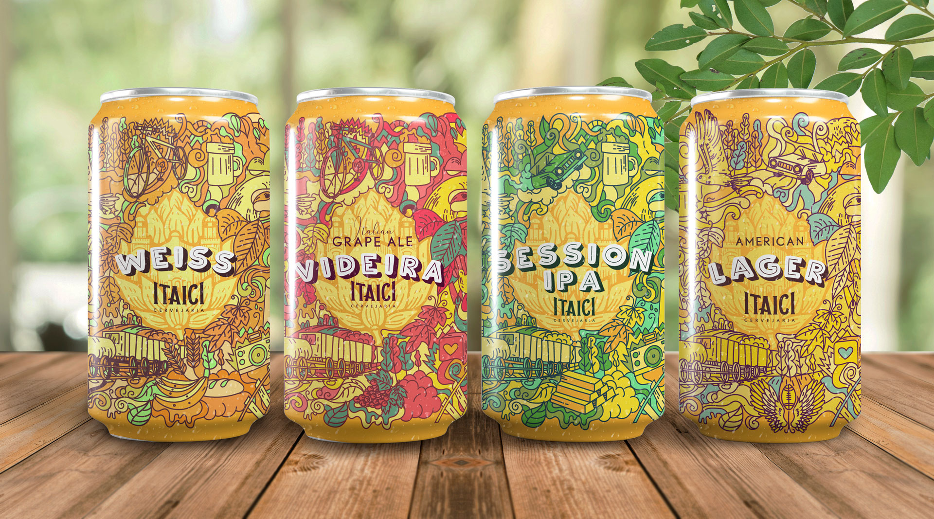
The brand: The Itaici brewery was born out of a family passion. A dream of a father and son who wanted to make the brewery their second home. It is located in the Itaici region in the city of Indaiatuba.
The market and audience: The city is a weekend destination for residents of São Paulo and Campinas, with a very active social life and strong integration with nature. The Itaici brewery seeks to be a landmark in this context, being a symbol of the city of Indaiatuba for its high-quality beers made with fresh and locally growned ingredients and for their friendly and welcoming service – a must visit for anyone in the city.
Brief: The brewery was about to open its first PUB. And, being pioneers in the management system and auto services technology for beer taps, the PUB also has the function of a showroom. Therefore, the brewery saw the need to invest in the creation of labels for its main beers.
Strategy: to express the history of the brewery and the region it represents, in addition to gaining greater brand recognition and connection with its customers. The challenge was to capture not only the essence of the brand but also the city and the characteristics of each beer.
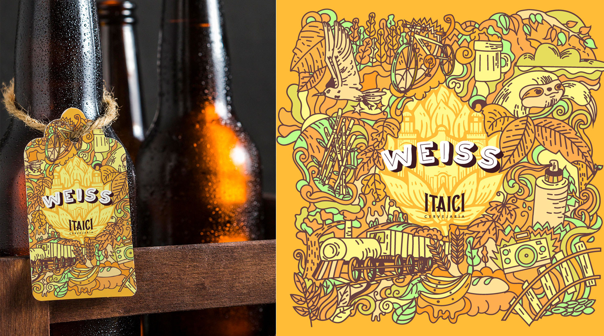
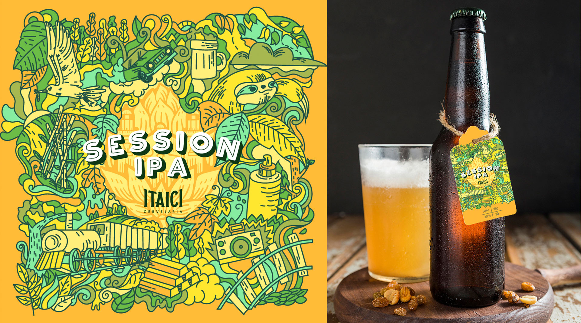
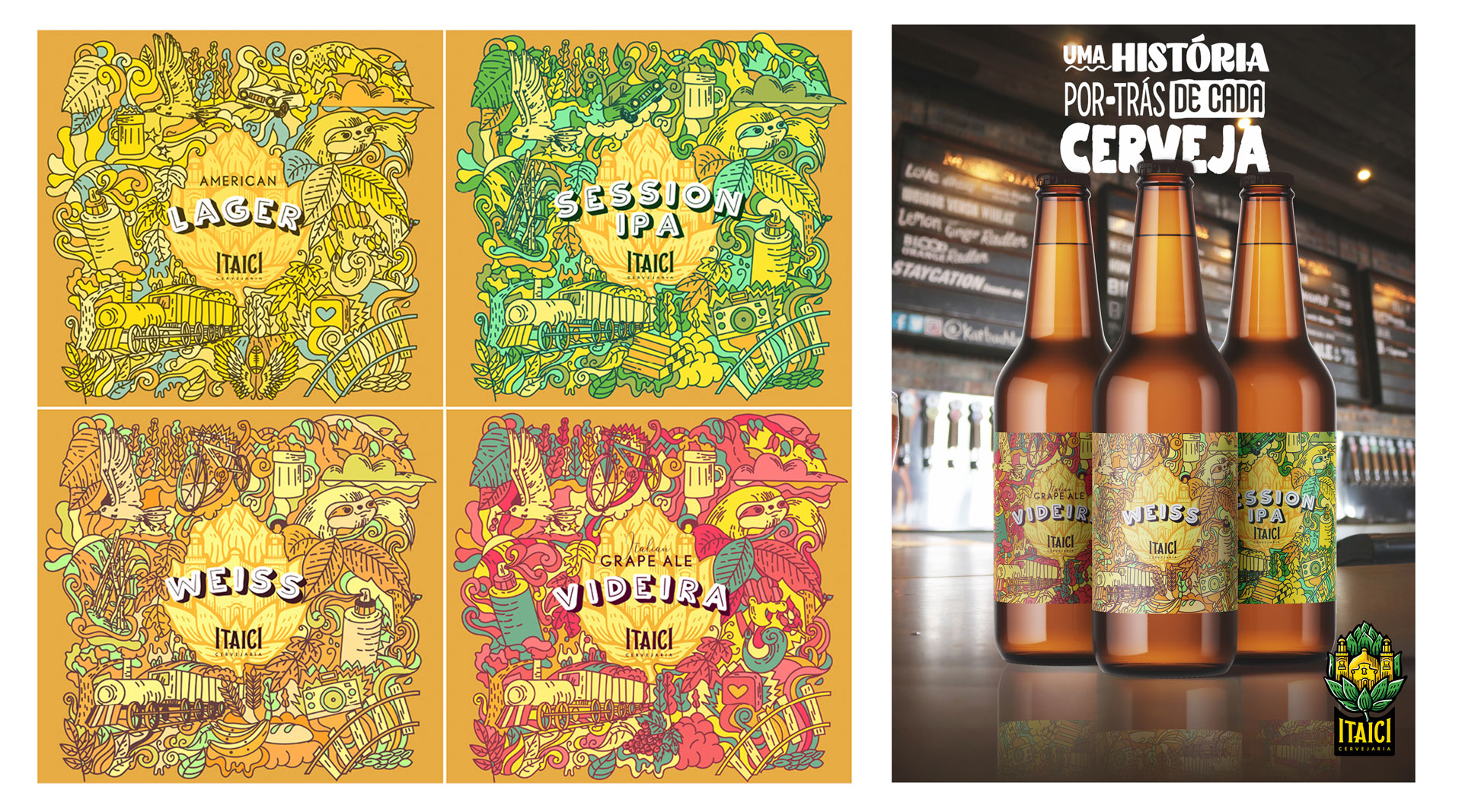
Process: For this, we created 4 doodle illustrations to show the whole story behind the beer and the brand. Something that generates curiosity. People stop to discover the small stories portrayed in art.
Itaici history is represented by the trail, the train, the sun, the sugar cane plantation, and other elements that complement the monastery of the logo.
Nature is striking in the figures of the sloth, bird, leaves, and landscapes.
In addition, the labels have the man in a tie, a bicycle, and an old car, with the intention of creating a greater connection with the brewery’s regulars. They are very active people and their activities are such as riding motorcycles, dirt bikes, mountain bikes, and any other nature sports.
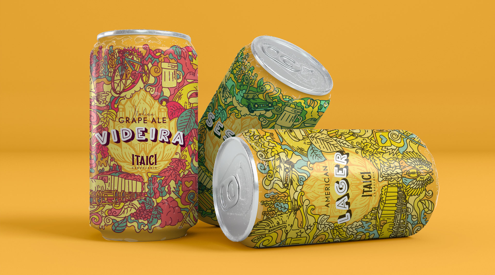
Each of the labels has colors and some elements that differentiate and characterize each beer produced.
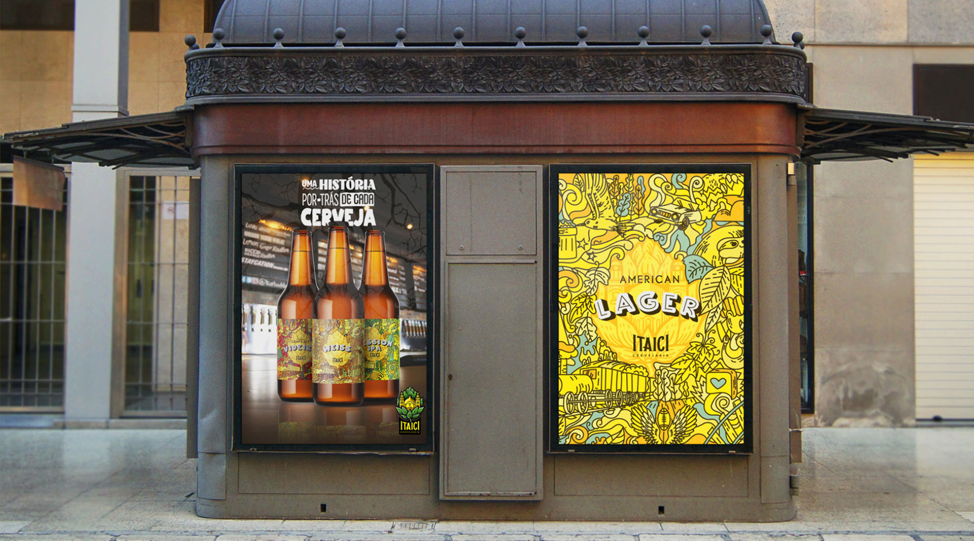
Deliverables: 4 vector Illustrations for each beer. Design for the beer can, poster and tag.
Results: Consistency in all of the illustrations creating great brand awareness and recognition. Is welcoming and inviting for the target audience. And it expresses the brand’s values as well as the city’s history.
CREDIT
- Agency/Creative: Giovanni Vilela
- Article Title: Brazilian Itaici Brewery Packaging Labels Designed and Illustrated by Giovanni Vilela
- Organisation/Entity: Freelance, Published Commercial Design
- Project Type: Packaging
- Agency/Creative Country: Brazil
- Market Region: South America
- Project Deliverables: Illustration, Packaging Design, Research, Tone of Voice
- Format: Can, Tag
- Substrate: Metal, Pulp Paper


