


The Challenge: Street Food Box is a product for food realists, time-poor urbanites, and a generation that values the environment as much as their takeaway lunch. We were challenged to educate consumers on the importance of reusing over recycling. The brand messaging needed to be as simple as the product.
“Having run my own brand design agency for 25 years, and having had first-hand experience of the work of many other agencies, I was blown away by the phenomenal job White Bear did for us at Street Food Box. I cannot emphasise enough how the team at White Bear have an exceptionally creative eye and an ability to not only generate amazing ideas but to create truly innovative, exciting and bang on brief concepts which exceeded our expectations.
Since our soft launch of Street Food Box, we’ve had a massive raft of positive feedback and it is clear that the brand is capturing people’s imagination. The early signs are there that the brand we have created with White Bear will take us far in our sector and help underpin our ambitious goal of helping to reduce waste and disrupt the plastic industry.” Eddie Stableford, Founder
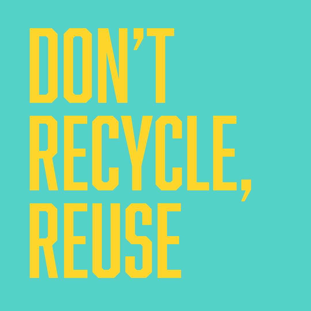
Reduce, Reuse, Don’t Recycle: The common misconception is that recycling is a simple way to reduce environmental impact, so exploring the themes of recycling alongside reuse was an obvious first step. Recycling is so universally known, it has its own logo. This inspired us to transform the Street Food Box itself into its own recognizable symbol for reuse.
The logo and brand icon conveys the entire purpose of Street Food Box before opening the packaging. The bright colour palette and street inspired typography appeals to the brand’s time-poor, Millennial and Gen Z demographic. To generate engagement across digital and to turn heads we played with deliberately provocative language like ‘Don’t recycle’.
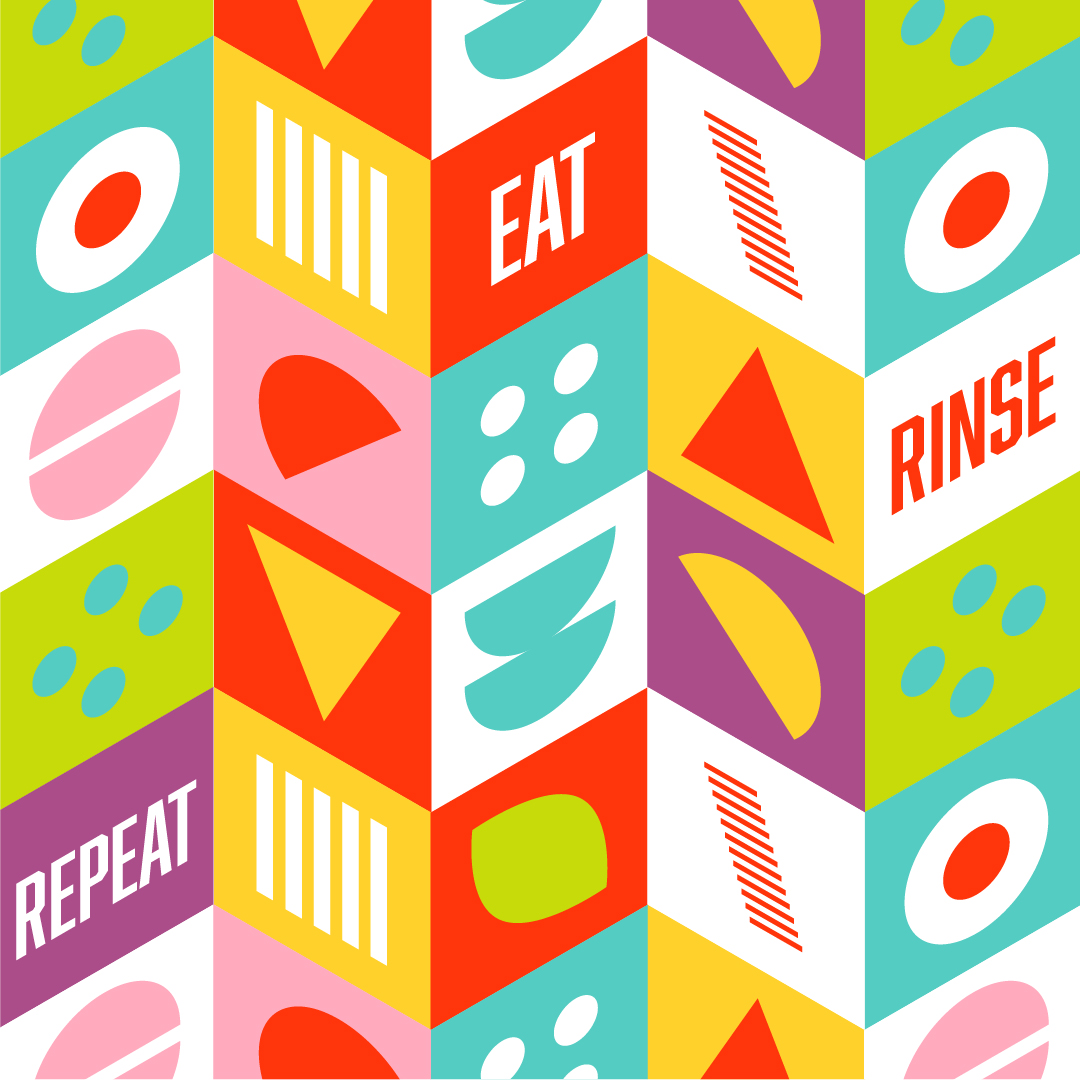
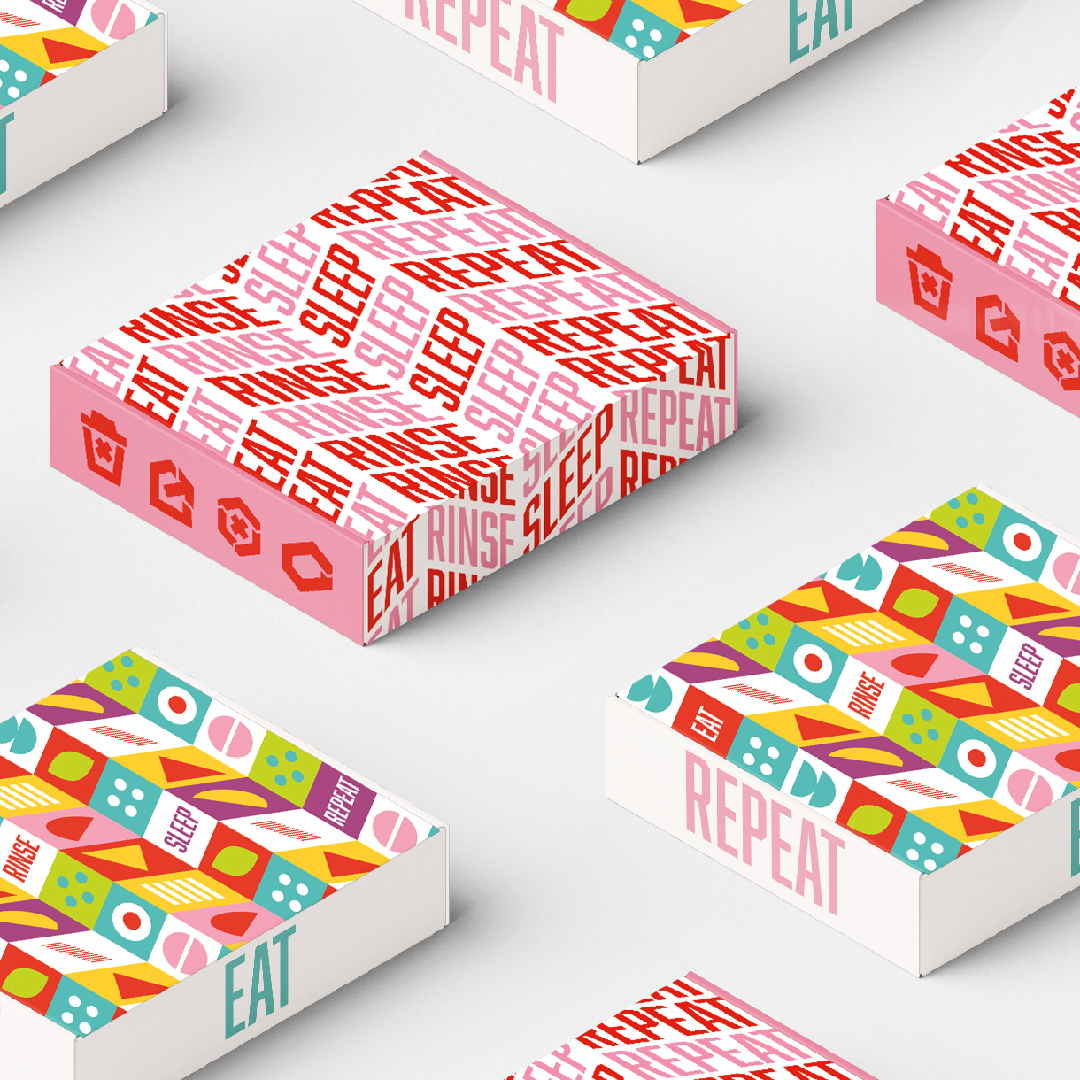
Eat, Rinse, Sleep Repeat: We played with the campaign strapline ‘Eat, rinse, sleep, repeat,’ which tells customers how to use the product while simultaneously ringing loud as a memorable brand mantra. In a similar repetitive style, we created a pattern to be used across packaging, customisable to the fast-food chain it will appear in. This repetitiveness ties in with the campaign line and the behaviour we want our consumers to take.
CREDIT
- Agency/Creative: White Bear
- Article Title: Street Food Box Branding Designed by White Bear
- Organisation/Entity: Agency, Published Commercial Design
- Project Type: Identity
- Agency/Creative Country: United Kingdom
- Market Region: Global
- Project Deliverables: Brand Advertising, Brand Architecture, Brand Creation, Brand Design, Brand Guidelines, Brand Identity, Brand Strategy, Brand World, Branding, Graphic Design, Illustration, Packaging Design, Tone of Voice
- Industry: Food/Beverage
- Keywords: sustainability, startup, branding, packaging, recycle, reuse, takeaway, food, food and drink


