


Not being able to wear what you want. Being afraid to repeat the process of standing and sitting down. Having a skin rash. Worrying about how others see you and how you smell. Such cycle is inconvenient, but our body needs to go through it. There must be a way to get on with this cycle with more comfort. With this belief, our underwear was born.
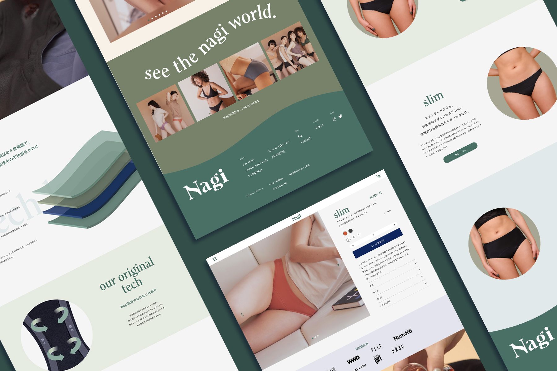
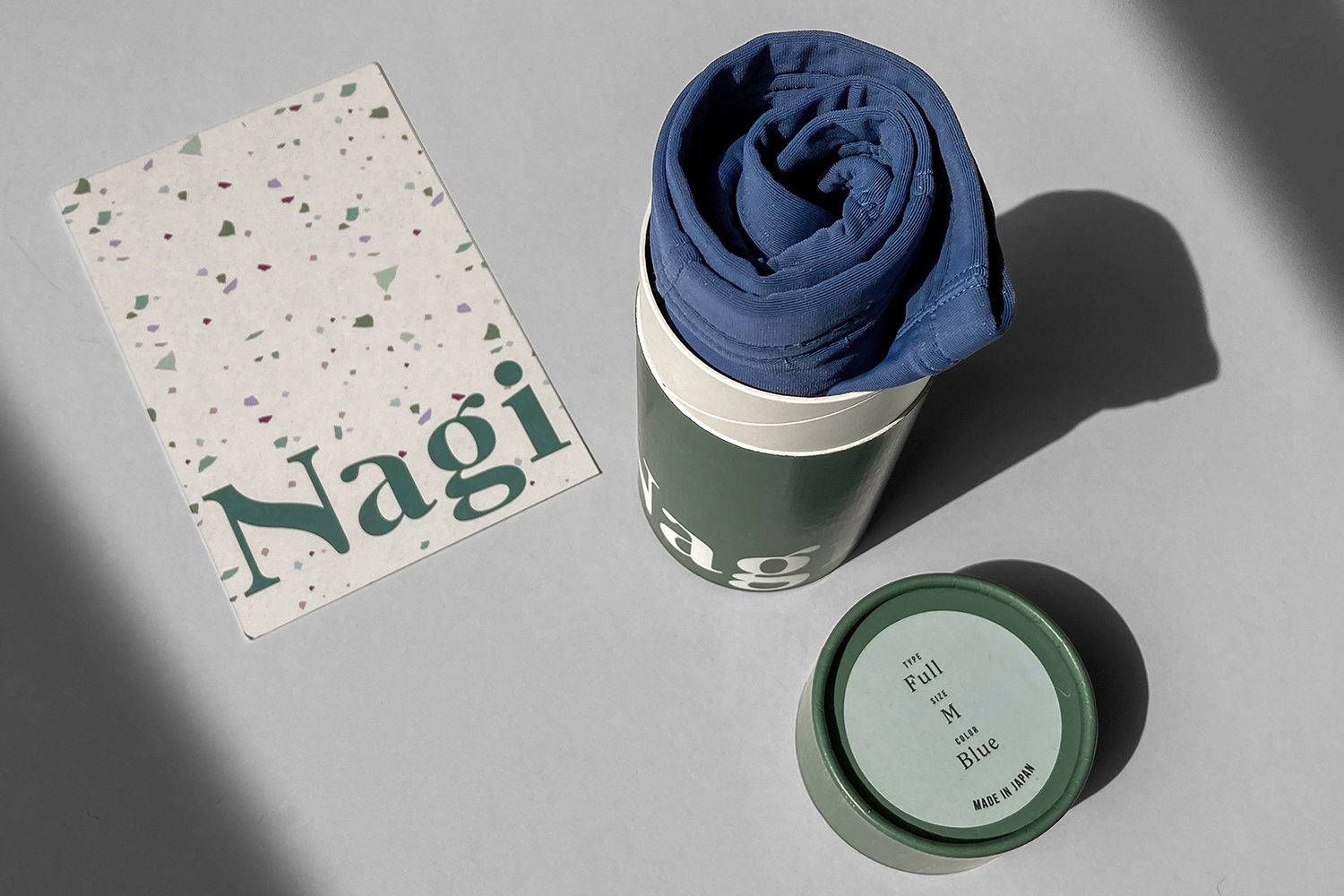
Nagi is a water-absorbing underwear that was created for all of us to live well with our own bodies. The development period lasted for approximately a year and a half, based upon the real voices of 150 women. Along with the attention on its function, the design of the product has been developed thoroughly so that it can be worn with any kind of style on any day.
The brand’s target audience is women in their mid-twenties to early-thirties, who are single and busy with work, and aware of the impact they are giving to the world when they buy products. When they buy products, they tend to choose from the brands who have mission and stories they can somehow relate to.
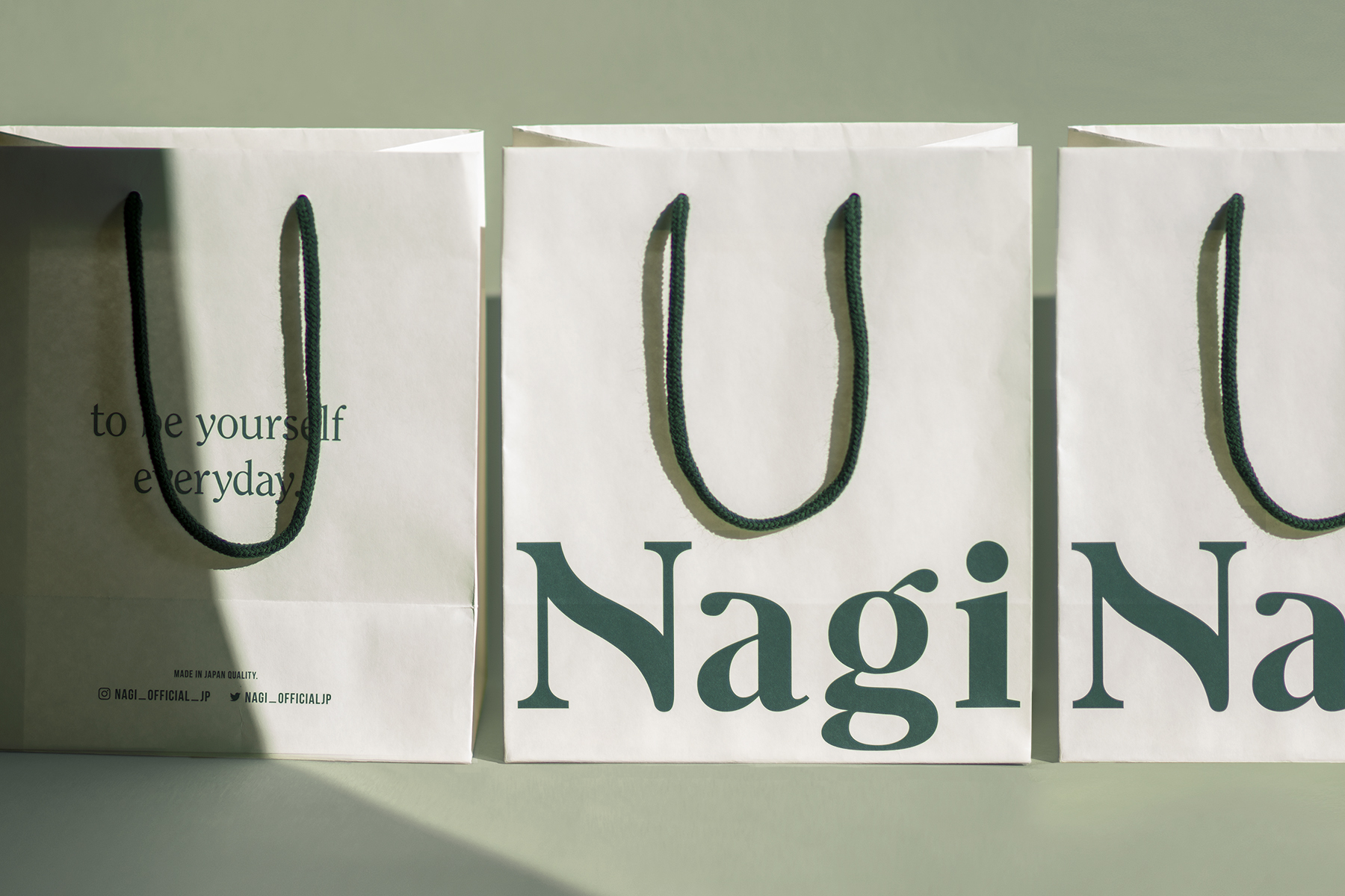
Art director/graphic designer Juri Okita worked closely with Rina Ishii, the founder, to develop the brand identity, and deliver an entire branding suite from tag to packaging to website. In order to convey the brand message that people should be able to live as they are with confidence on any day, the overall outlook of the design is a balance of gentleness and significant presence.
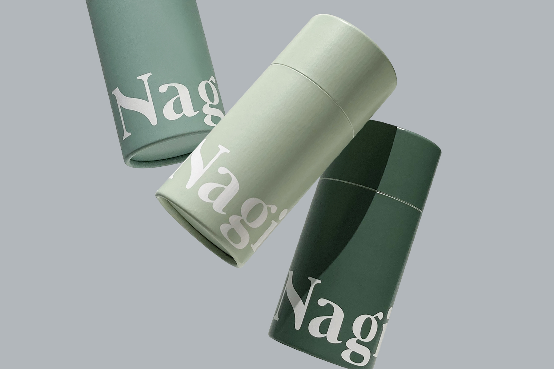
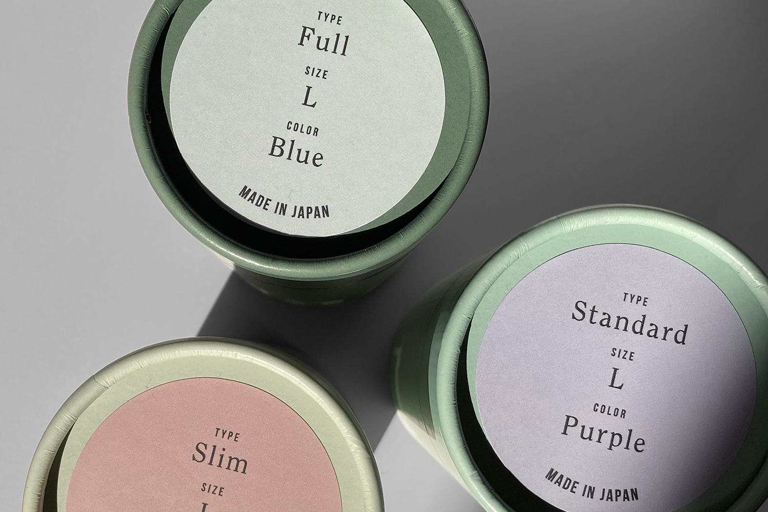
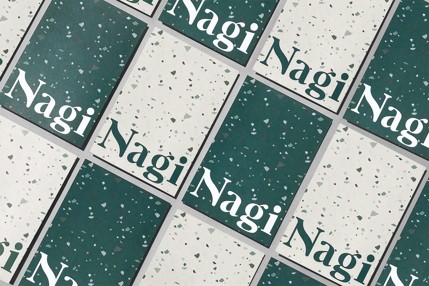
The logo was created using a bold, distinctive serif typeface accompanied by a curvy line in the N, inspired by the human body, giving the brand a trustworthy yet friendly and modern feeling. For the background of the packaging, several soft tones of green are used, with a significantly big sized logo to convey confidence and contribute to the dignified manner of the minimal taste. Furthermore, the packaging has great consideration for sustainability and uses paper instead of plastic to wrap the product. The tube-shaped packaging can be freely reused in daily life, as a pen holder or coin holder.

CREDIT
- Agency/Creative: Juri Okita
- Article Title: Juri Okita Creates Brand Identity for a Japanese Fem-tech Brand Nagi
- Organisation/Entity: Freelance, Published Commercial Design
- Project Type: Identity
- Agency/Creative Country: Japan
- Market Region: Asia
- Project Deliverables: Brand Design, Brand Identity, Branding, Graphic Design, Identity System, Illustration, Packaging Design, Photography, Research
- Industry: Fashion
- Keywords: Packaging design, web design, brand design, branding, brand identity, visual identity, graphic design


