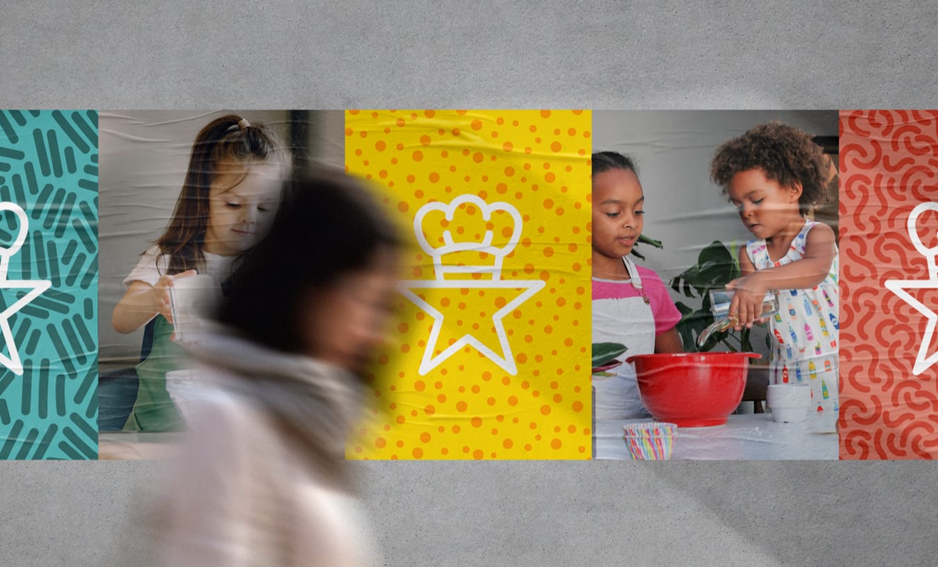
Starbaker.club is a newly developing business who’s idea is to bring fun and education to children through baking. Think Gousto or Hello Fresh but for baking and you’ll be on the right track to understanding what this business strives to achieve. You, as a parent, can subscribe weekly and then choose from a selection of home baking kits which you’ll then be able to bake together, without the journey to the supermarket. All the necessary ingredients are supplied in the box for the item you’ve chosen to bake.
The audience for this product is the parents. People who aspire to educate their children, have fun and ultimately spend some quality time with their children. With that said, the products and packaging must be engaging for the children to want to participate. This also allows for a strong brand recognition throughout the entire order process and even once the packaging sits in the recycling bin – you’ll see it.
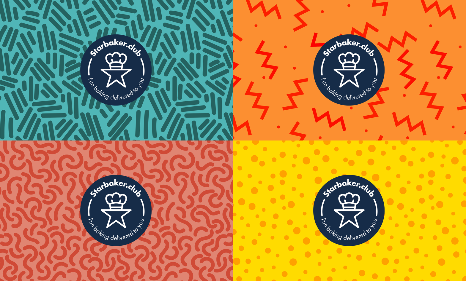
The initial objective was to create a logo that would be recognised with ease, and one that people would understand. The icon for the logo is a very ‘blunt’ concept, by which we mean it very much says what it is. It also confidently ‘stands alone’. By this we mean that after a customer or target audience member has had some exposure to the brand and products – we believe they’ll recognise it instantly moving forward allowing the brand to stay present in the minds of those who might be interested in subscribing to such a service.
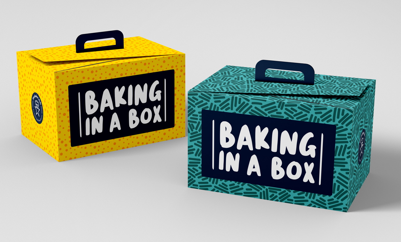
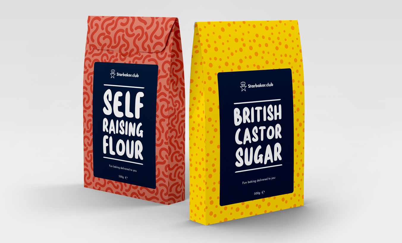
Following the design of the logo we then moved on to developing a visual identity which could be used across an entire spectrum of design. Everything from a website where customers would subscribe and choose their boxes, to product packaging and material collateral such as social media advertisements.
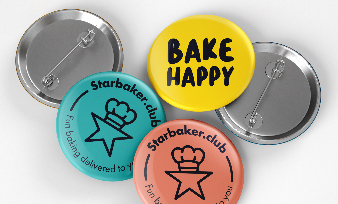
The key here was to develop an attractive brand identity which would resonate with both children and adults. Our concept for this was to marry the ‘serious’ side of the brand (logo, font stack etc) with a visual aesthetic and illustrative pattern that no matter where it was applied it would be noticed.
Admittedly it is skewed purposely more towards children as they will be a key driver in adults adopting the product/products.
With the logo having been signed off everything else is very much in development. The packaging you see is currently a concept which we’re hoping the client will adopt alongside the wider branding and marketing collateral.


CREDIT
- Agency/Creative: Sed+Co
- Article Title: Logo and Branding for Educational Baked Delivery Service by Sed+Co
- Organisation/Entity: Freelance, Non Published Concept Design
- Project Type: Identity
- Agency/Creative Country: United Kingdom
- Market Region: Europe
- Project Deliverables: Brand Identity, Brand Strategy, Branding, Graphic Design, Packaging Design, Research
- Industry: Retail
- Keywords: Baking, Subscription Box, Logo Design, Branding, Packaging Design


