A blended Sake for wine lover:Blending The Best With The Best.
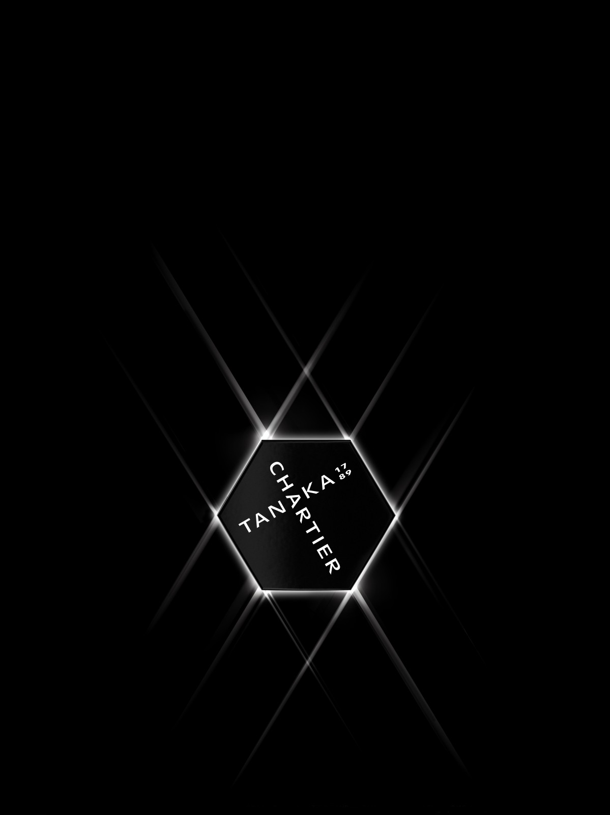
forceMAJEURE worked closely with Chartier to develop a brand and visual strategy, as well as a design system, to represent the collaboration between the Tanaka 1789 Brewery and Francois Chartier, associating two very different cultures to create one disruptive product and design. We brought to life the synergy of two Masters in their respective crafts, juxtaposition of tradition and modernity into this groundbreaking product. We brought together a perfect blend of the two identities. We were inspired by the distinctive architecture of the Tanaka Brewery—the beautiful tile pattern on the brewery walls are an embodiment of the Edo period’s Kura architecture and a symbol of the rich history of Tanaka 1789. The pattern, when multiplied, creates beautiful hexagonal grids, similar to the modern symbol of Francois Chartier’s aromatic science and expertise.
We worked closely with the Tanaka team, and Francois Chartier to understand trends and market in order to create this new-to-world, new-to-market brand. We defined our strategic path and brand territories, learning from the traditional world of Sake, and the unique creative process used by Francois. Our Production team sourced all the components of the packaging and coordinated all the supplies with the Japanese team.
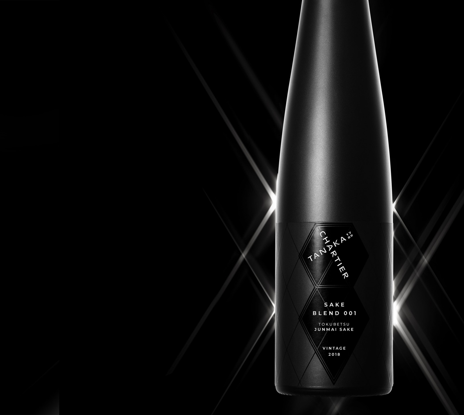
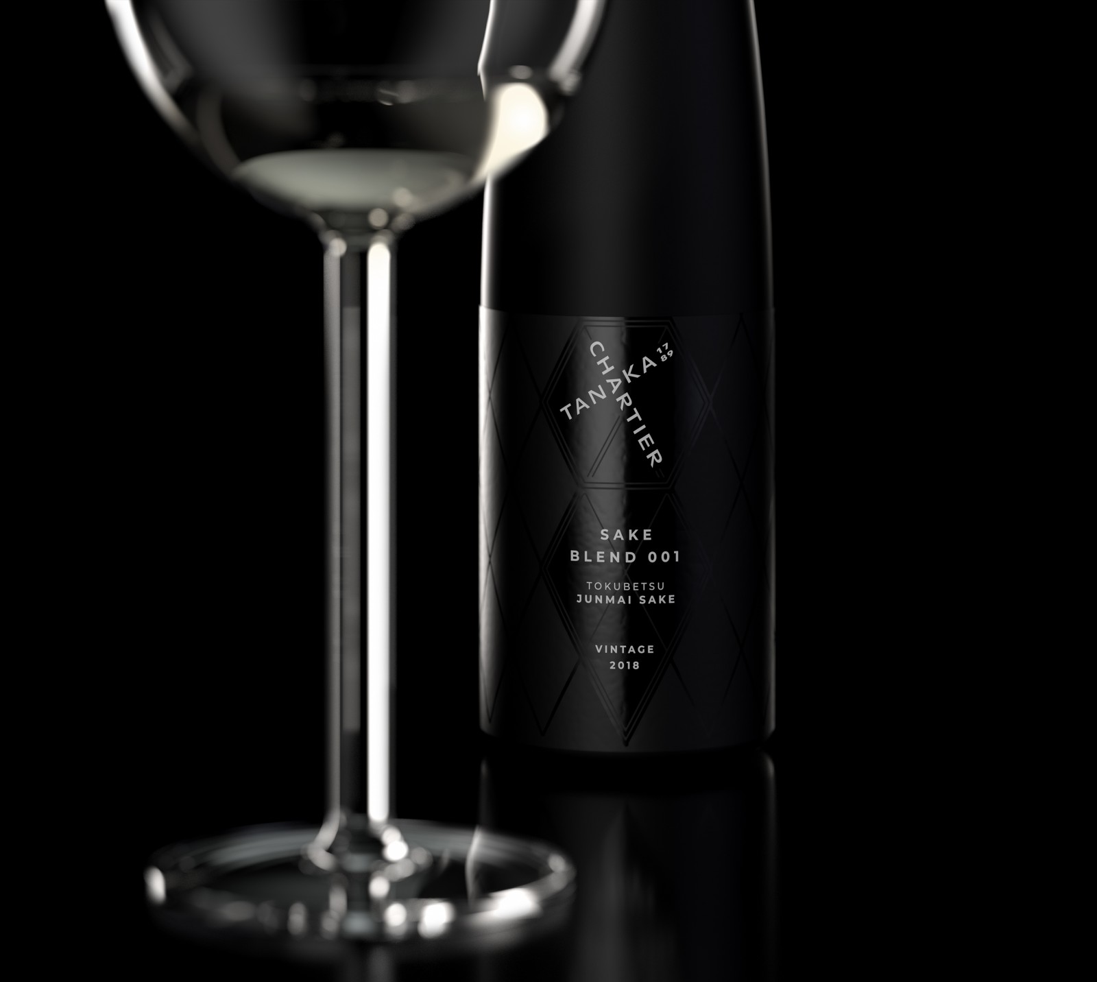
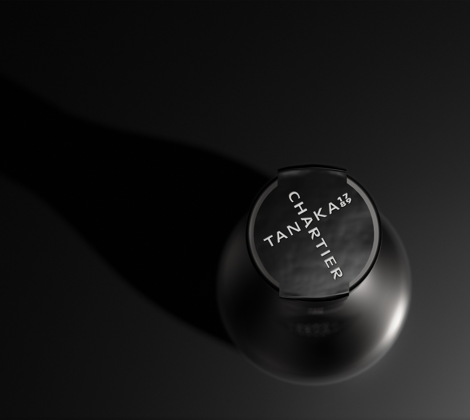
The brand’s goals were to highlight on every level a partnership that reflects “Blending The Best With The Best”. From the tile grid pattern and hexagon, we saw that both Tanaka 1789 and Chartier featured black and white prominently in their own branding. The minimalism, elegance, and luxury of the black and white match the quality of the product: in traditional sake packaging, black bottles are reserved for the most premium Sakes. To illustrate the “best of” in the brand’s identity, we combined Tanaka and Chartier together in a cross pattern to create a strong logo lockup—using a common A to bring the two words together.
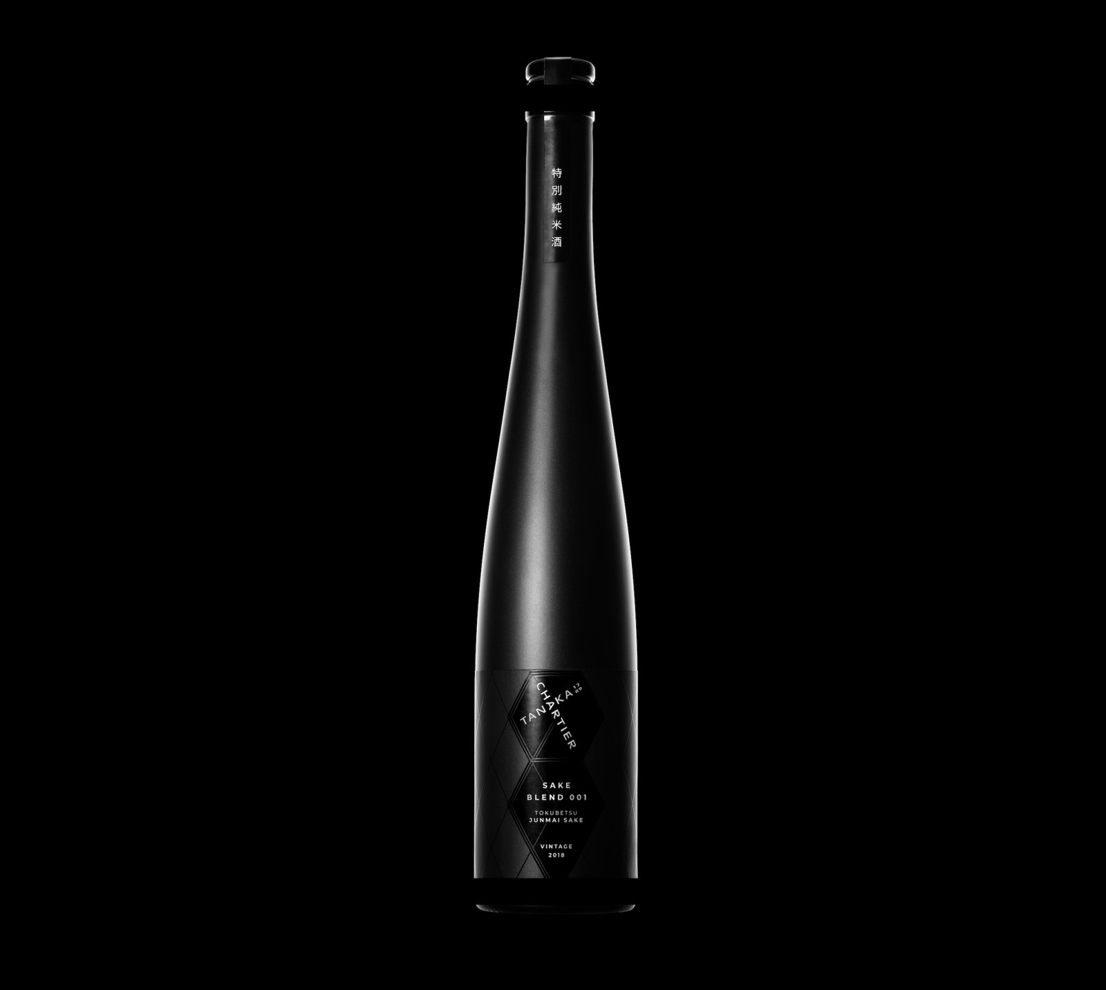
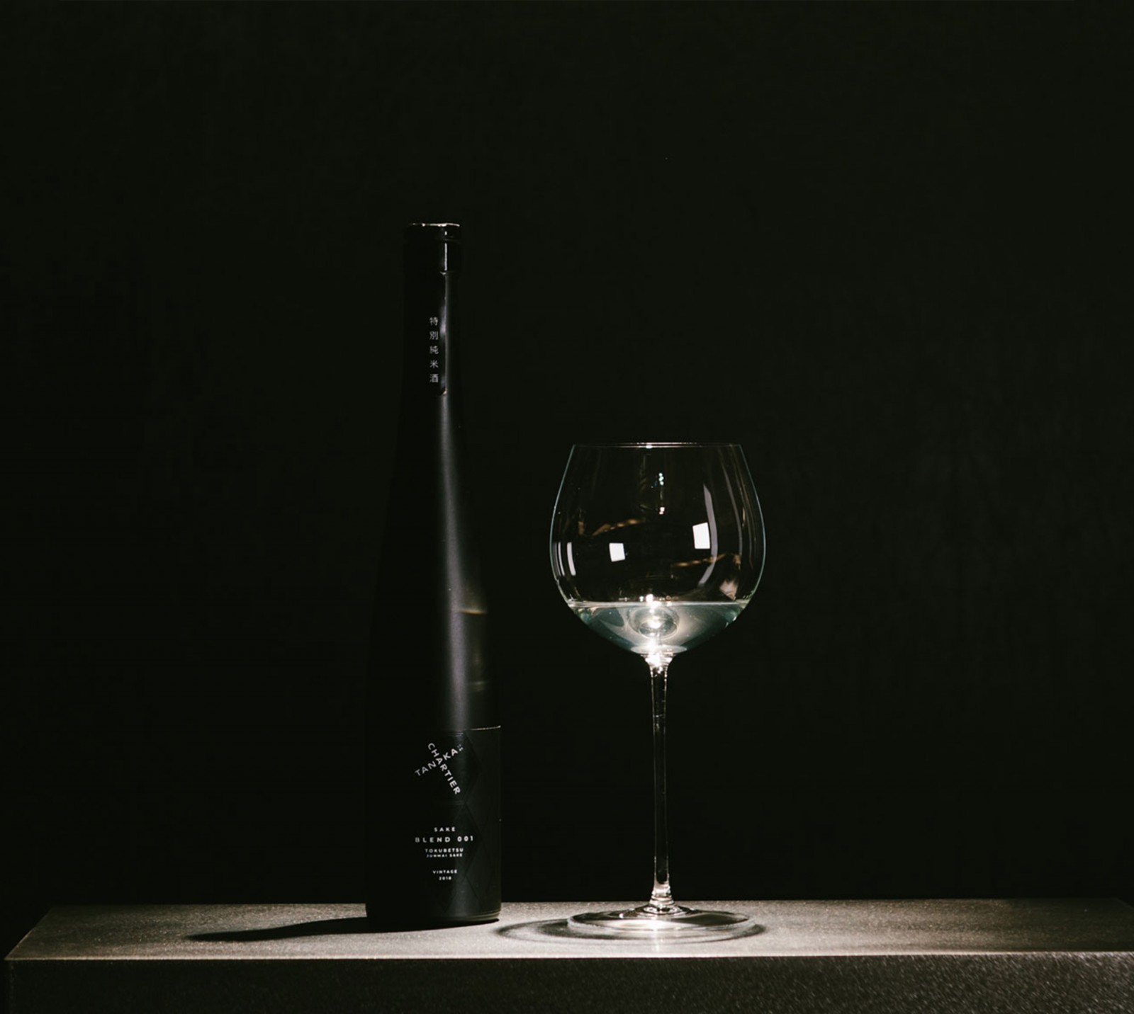
Built around the re-interpretation of tradition, the design successfully balances the rich history of Tanaka, with Chartier’s unique take on innovation. The smooth, matte black bottle works together with the minimalist white graphics, for a sleek and sophisticated look & feel, contrasting with the traditional sake semiotics, and creating a differentiating and impactful look on shelves.
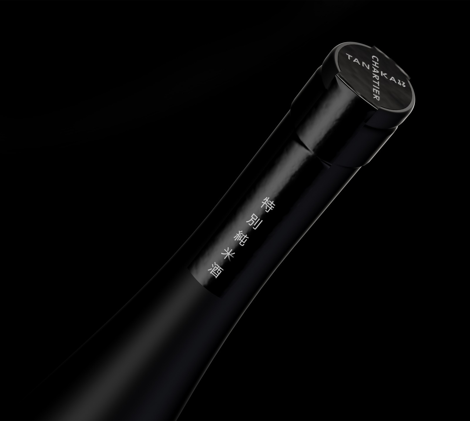
The bottle is a stock bottle from Estal, sleek in shape, which is used most often in wines like Riesling and Gewurztraminer and is a nod to Chartier’s sommelier roots. The cork stopper from Vinolok is an elegant, minimalistic black glass t-top that fits perfectly with the slim profile of the bottle. The closure type curated for this new design is reminiscent of the traditional sake closures, using beautiful black glass. The bottle shape is unusual for a Sake brand and lends to the changing perception for a more global market and wider audience—a shift that will go beyond this project.
CREDIT
- Agency/Creative: forceMAJEURE Design
- Article Title: Blending The Best With The Best – Tanaka 1789 X Francois Chartier Sake Brand Design
- Organisation/Entity: Published Work
- Project Type: Packaging
- Project Status: Published
- Agency/Creative Country: United States of America
- Format: Bottle
- Keywords: WBDS Agency Design Awards 2020/21


