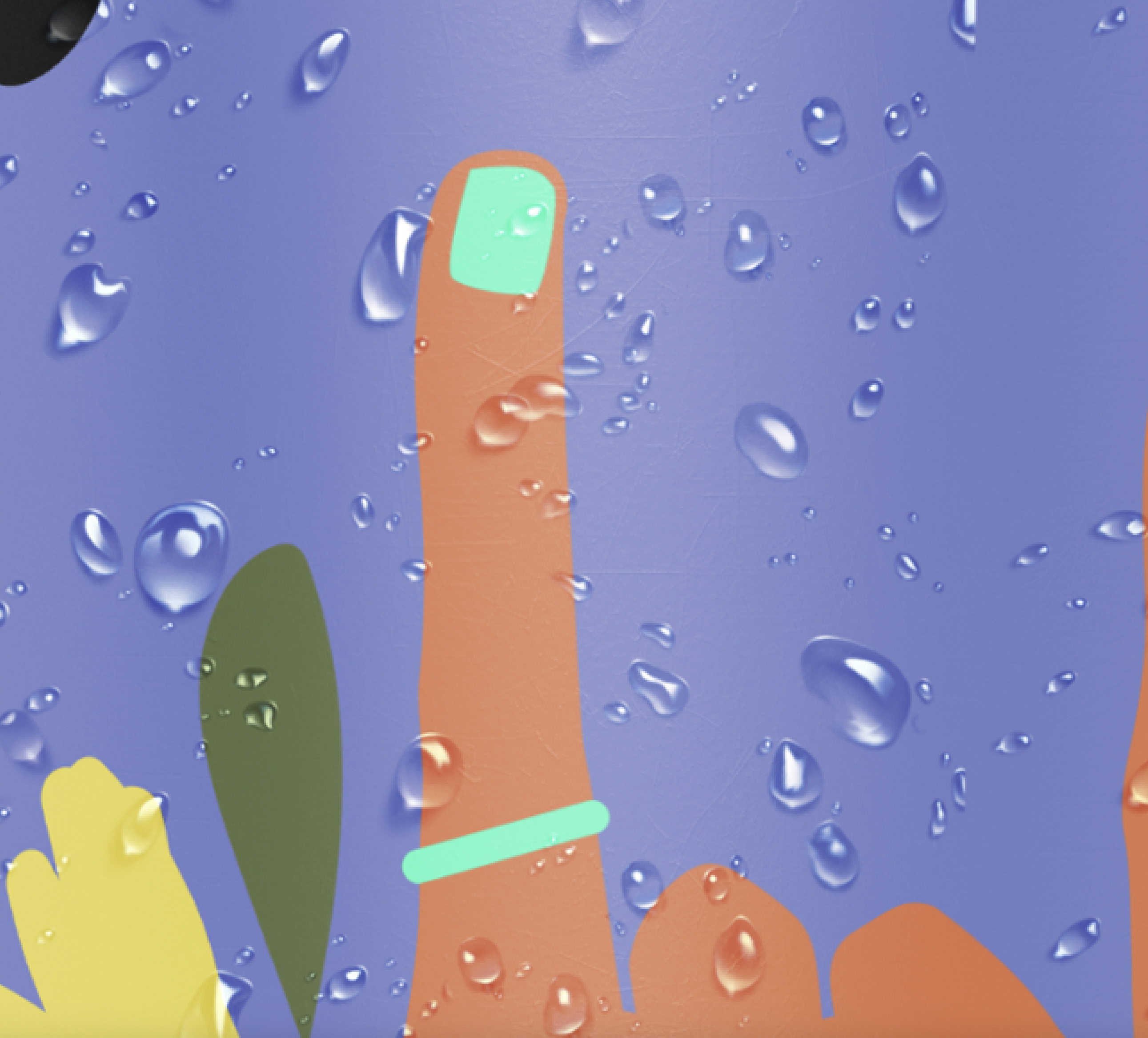
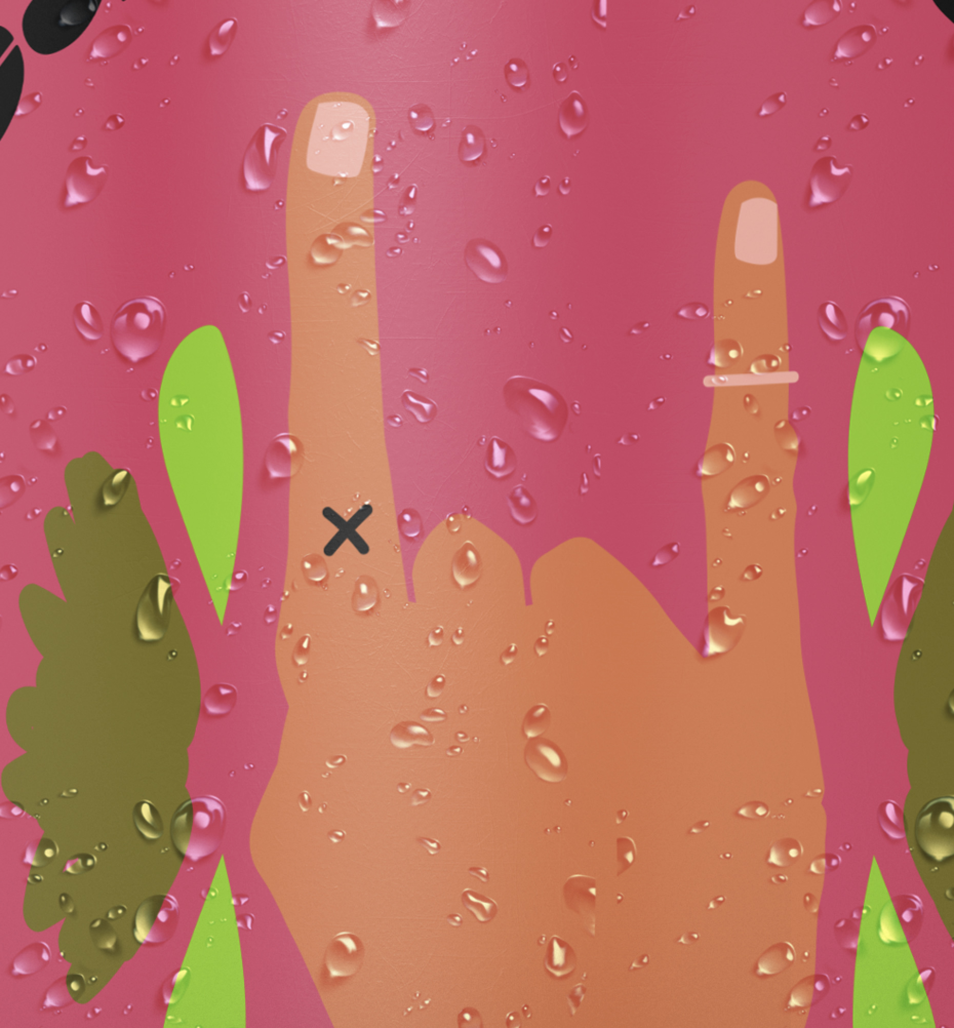
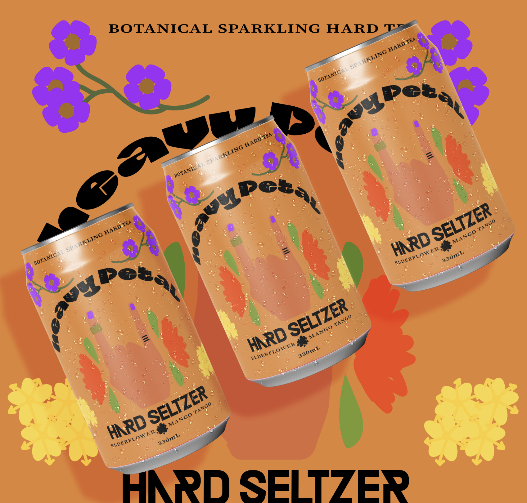
What could be a more perfect unlikely pair to create a unique young new beverage?…flowers and rock! kind of like tea and alcohol…this unlikely pair make the perfect contemporary beverage aimed at the genzenial market that want a fresh aesthetic and “edgy” (cringe) illustrations and all natural botanical ingredients. This fun line of hard seltzers is set to stand out in the boring has been fridges of the local bottleO and cause quite a stir! We love them and hope you do to, the only thing cooler than the vibe is the taste! fusion of tea and alcohol and the juxtaposed theme of flowers and rock – winna!
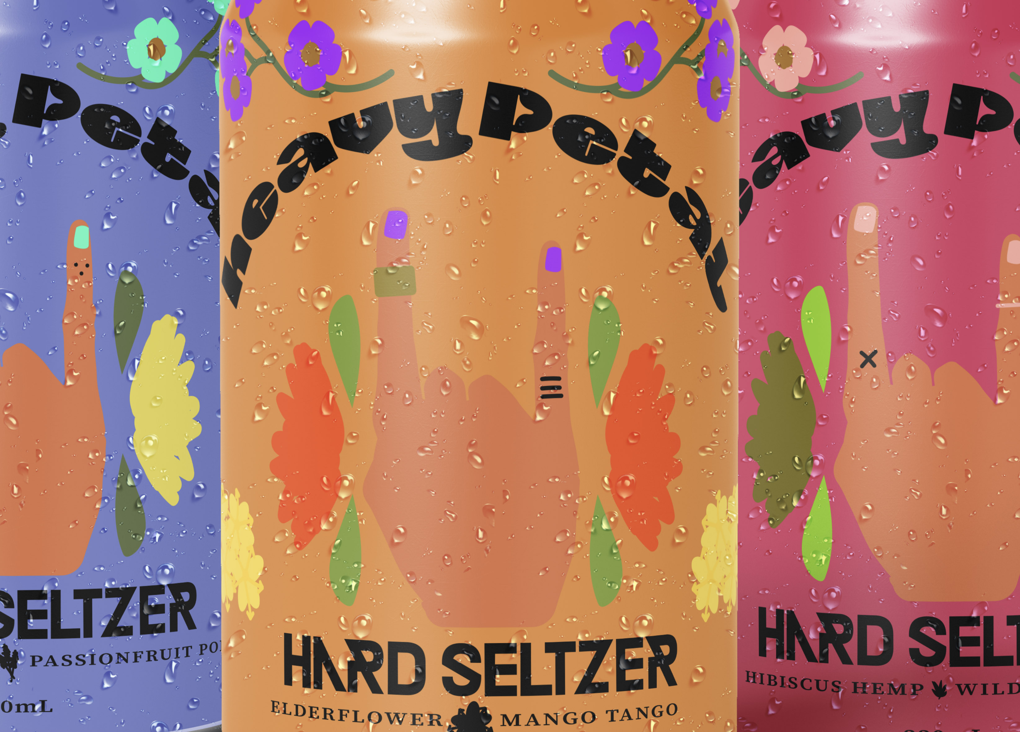
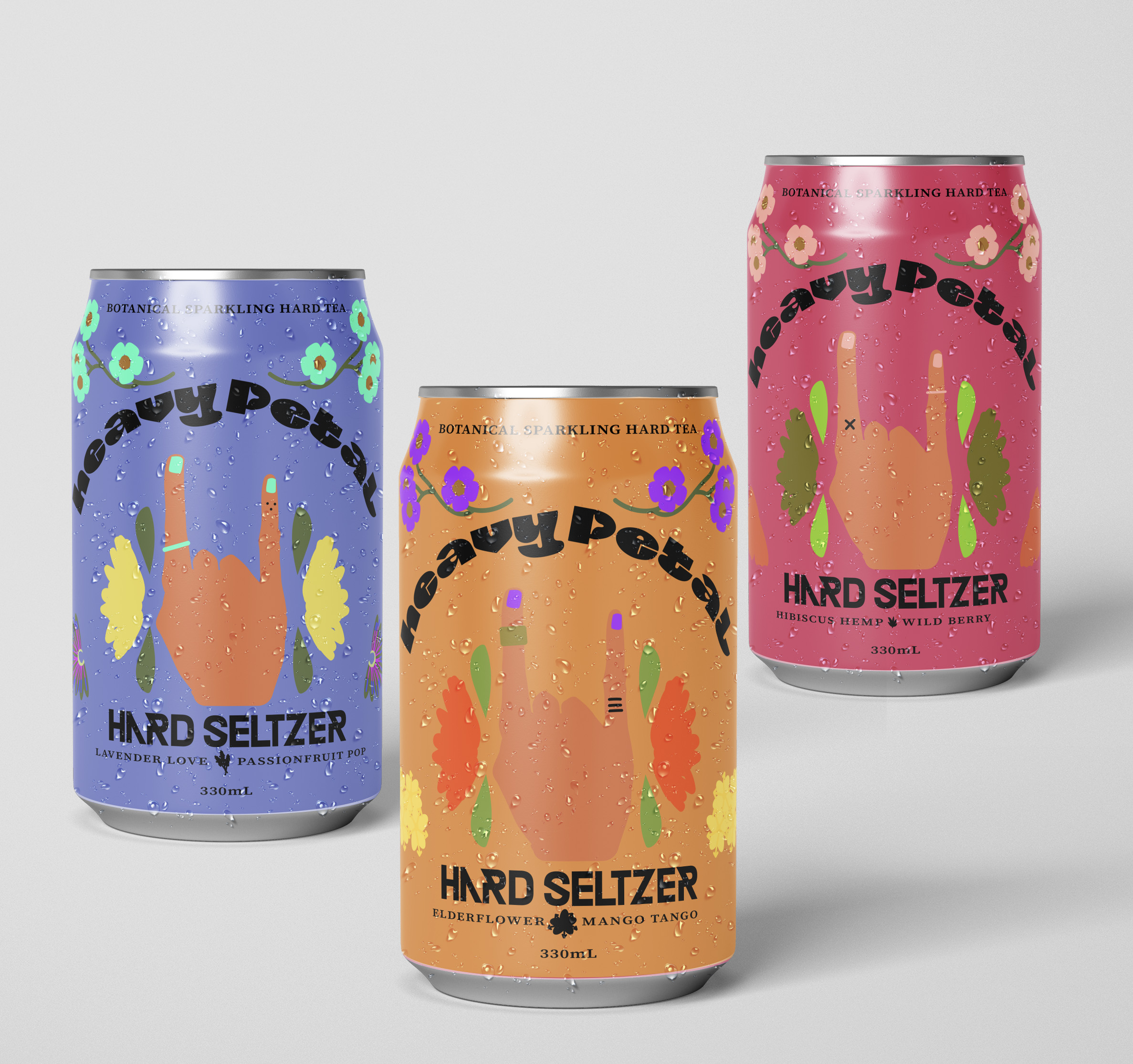
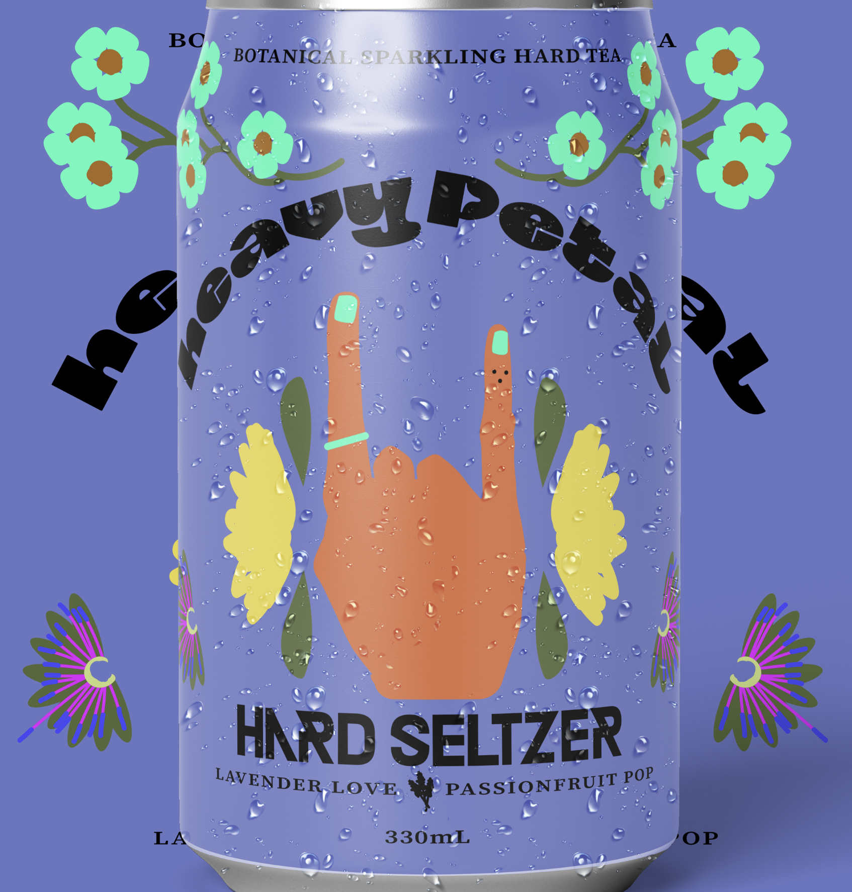
The 3 skus all contrast one another with a collections of muted dusty shades and electric colour pops of neon, the wordmark is hard drawn and heavy to represent the heavy part of the brand and the soft colours and un-outlined illustrations represent the softness of flowers and tea, show in some fruit ad this creation will please them all.
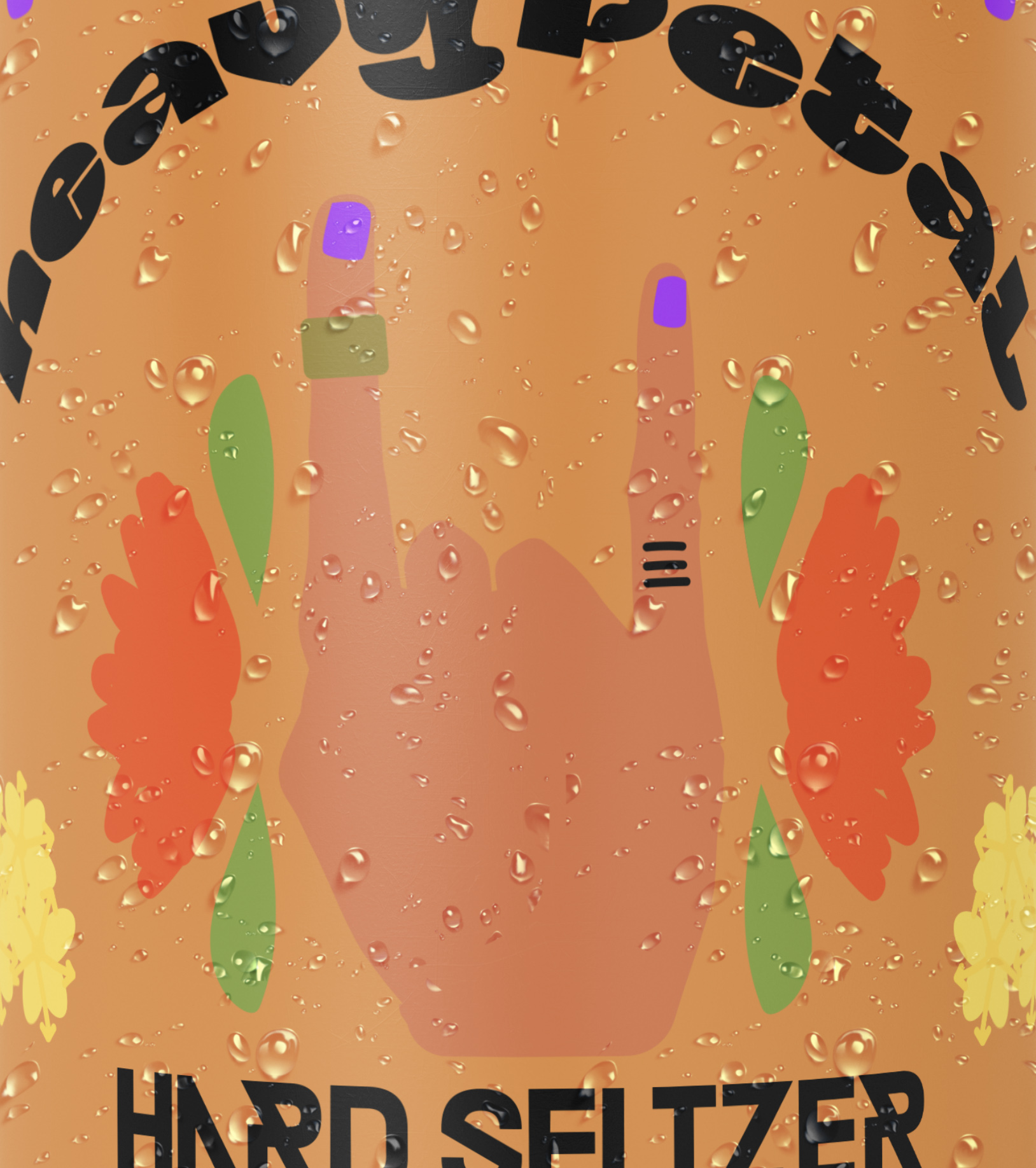
The client brief was for a modern fun seltzer brand and the rest was uptown candybrophycreative to make some magic, after a few variations on flavour sticking to some botanicals and fruit without it turning into a tissue box vibe this fun brief was taken from concept to completion in lightening time and we are very proud and confident that it will be a stellar seller! the hands have 3 different tattoos and 3 different rings in various positions these repetitious but varied elements add a element of fun and variant and curiosity to the consumer when choosing and the variety pack is an explosion of colour and graphics to enjoy.

CREDIT
- Agency/Creative: candybrophycreative
- Article Title: Candybrophy Creates Concept for Heavy Petal Botanical Hard Seltzer Beverage
- Organisation/Entity: Freelancer, Published Commercial Design
- Project Type: Packaging
- Agency/Creative Country: Australia
- Market Region: Global
- Project Deliverables: Brand Architecture, Brand Creation, Brand Identity, Brand Naming, Brand Strategy, Branding, Product Architecture, Tone of Voice
- Format: Can
- Substrate: Metal


