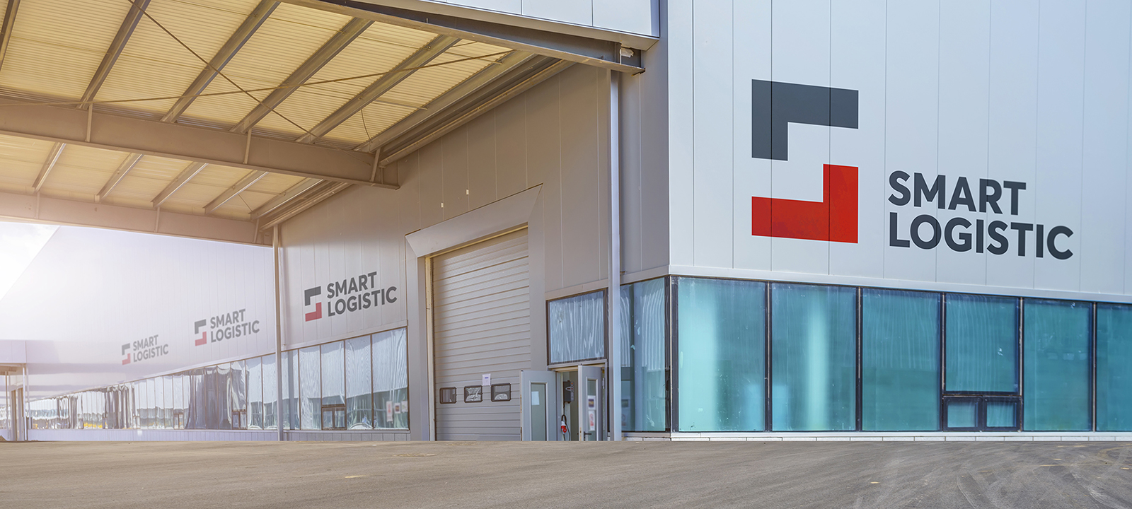
The logotype and visual design elements for a new logistics company. The brand represents “smart logistics” covering a large audience and territories of several countries. These are the countries of Central Asia (former USSR), as well as Russia and neighboring countries. Therefore, the design of the logo and identity must become global and impressive for several countries. Classic graphic minimalism with a strict character should be well received in different countries with different audiences. The brand intends to become a strong “player” in this segment and gain popularity over time.
Warehouses and their operation have become the main services of the brand. New large premises equipped with appliances and electronics (in contrast to the old premises of competitors and the lack of new technologies in them). In addition to the traditional understanding of the industry, this is a presentation of new technologies and new services in Central Asia. Such as online applications, electronic systems, internal serviceability. And even services for ordinary people – storage of any cargo through rental in a warehouse with delivery. Competitor logos are very complex and usually represent old cars or outdated warehouses.
The design shows that everything has become easier. Orders, services, work and brand maintenance.
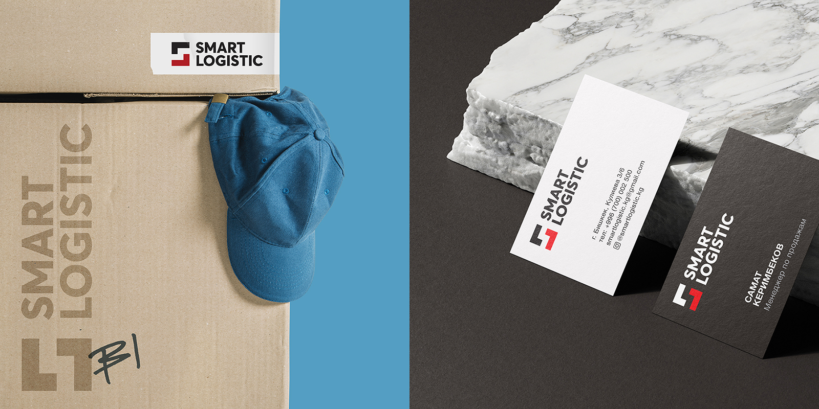
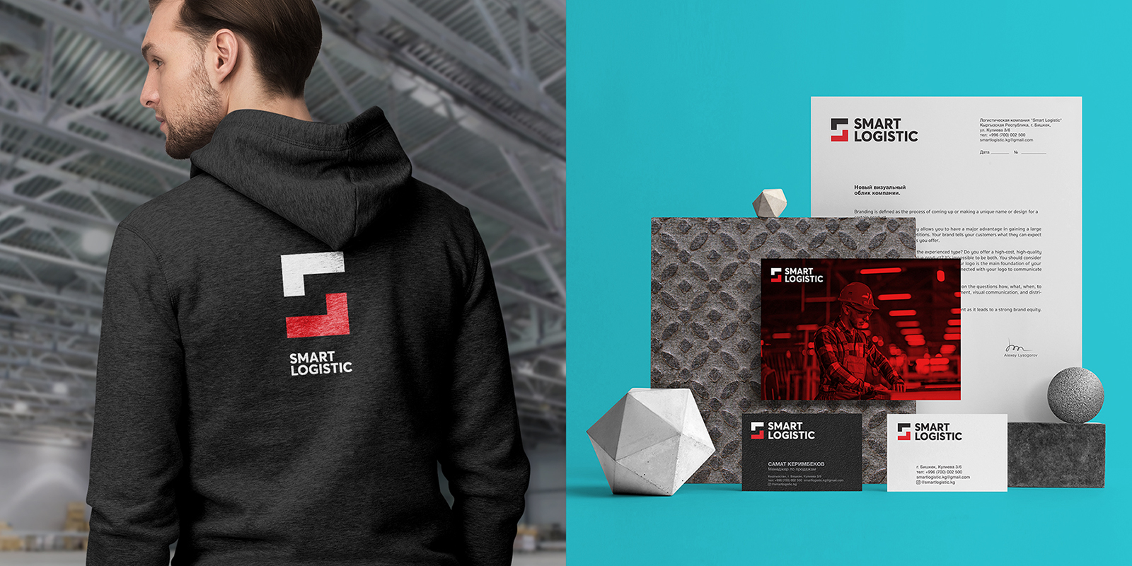
We are simple, but we are strong – this is the main message of this minimalistic design. Colors, sharp graphics, fonts and spatial compositions underline this brand message.
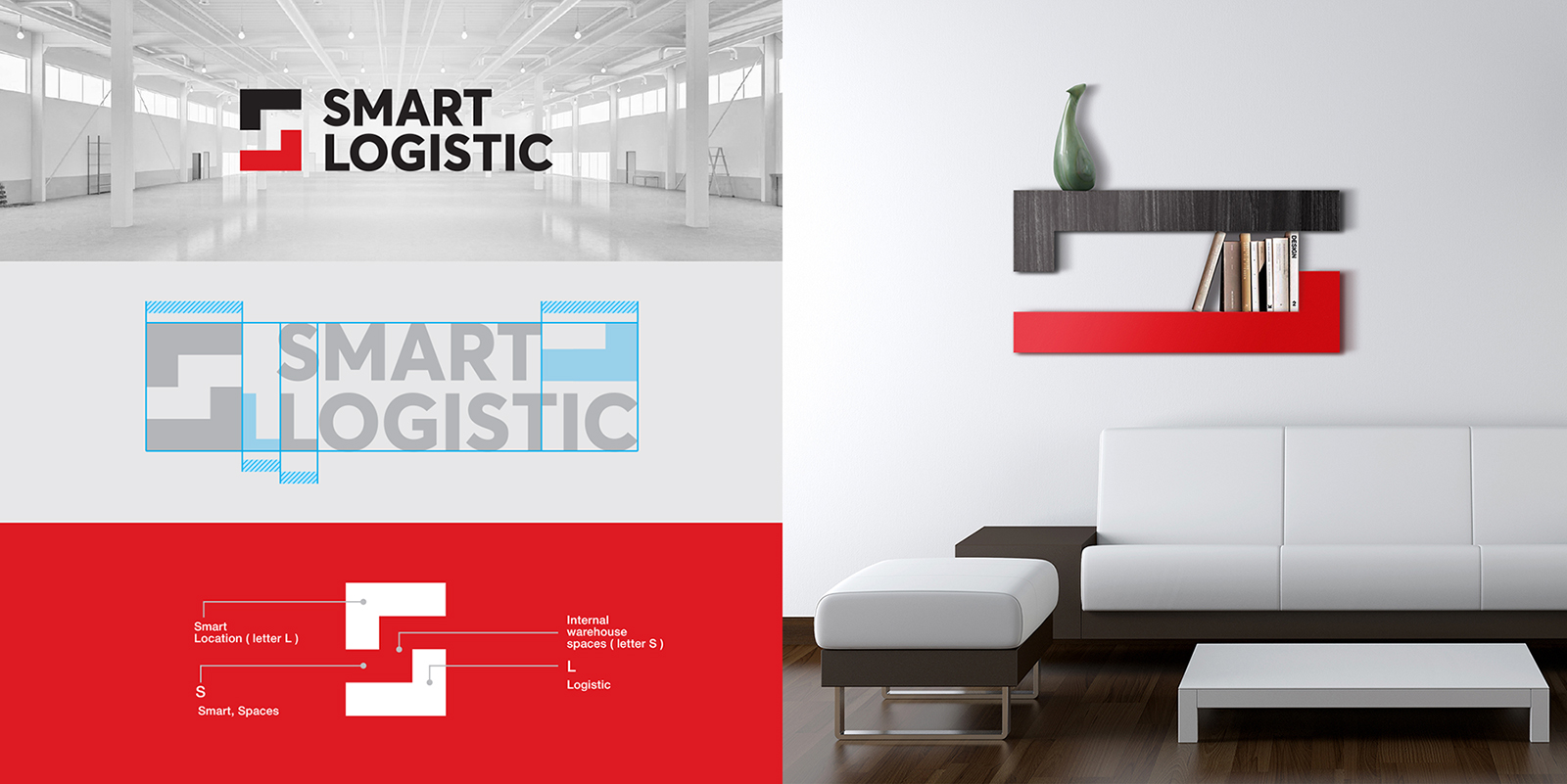
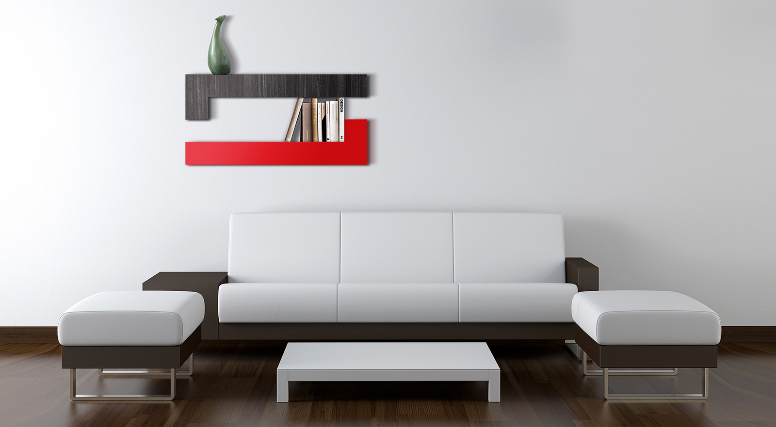
The logo managed to reveal the essence of the brand, to express the understandable idea of Tetris. Smart layout inside the warehouses has become the main theme of logo and graphic design. Simple and thoughtful minimalism, in which the arrangement of one graphic element, created a play of combinations of letters SL. S (smart) is hidden in the inner space of the sign, and the letters L literally lie in the spaces. The logo has the ability to transform, which is clearly shown in the design of, for example, shelves for interiors. The sign can be longer or shorter, depending on the visualization needs.
CREDIT
- Agency/Creative: Alexey Lysogorov Design
- Article Title: Visual Identity for Smart Logistic by Alexey Lysogorov
- Organisation/Entity: Freelance, Published Commercial Design
- Project Type: Identity
- Agency/Creative Country: Kyrgyzstan
- Market Region: Asia
- Project Deliverables: Brand Identity, Branding, Identity System, Research
- Industry: Transport
- Keywords: Logistic, Central Asia, Logo design, visual identity, Lysogorov


