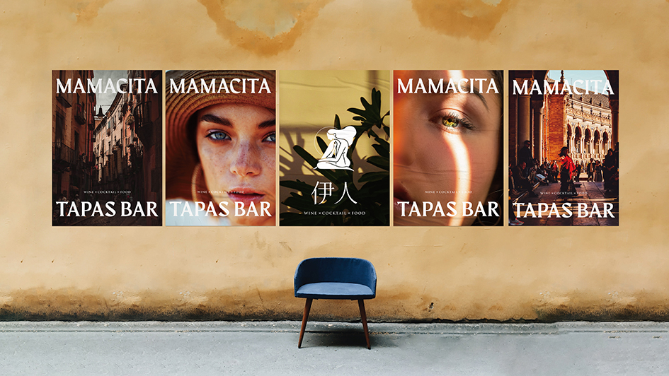
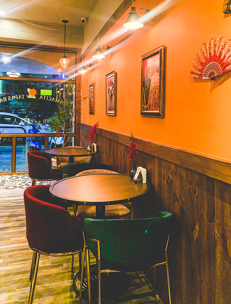
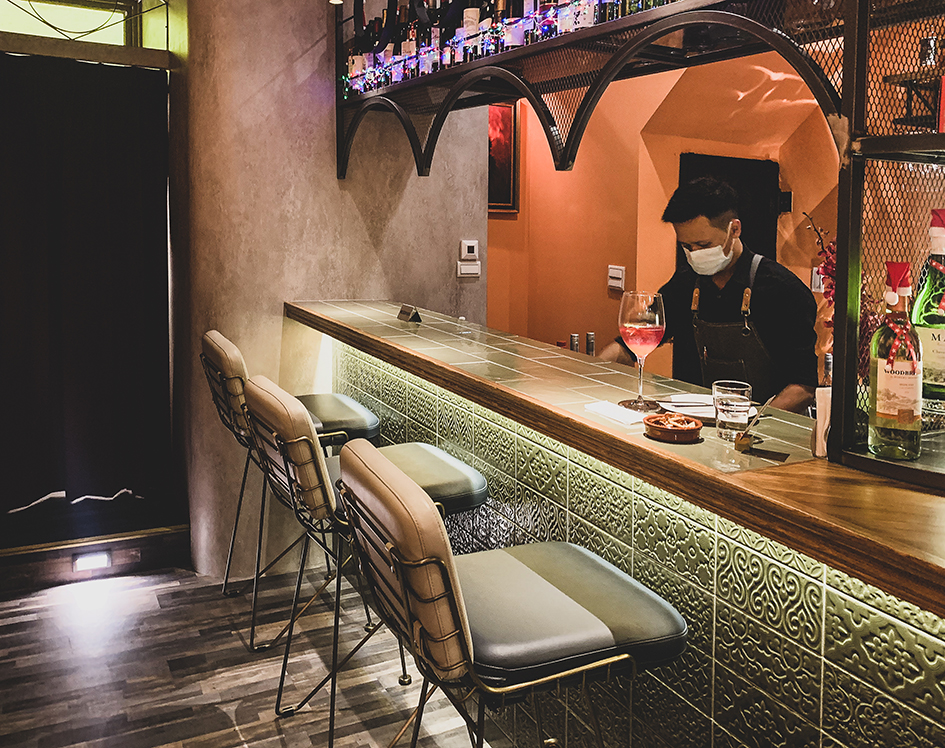
Tapas is not just a dish, but an aesthetic of life culture. As you stroll the streets of Spanish cities, you’ll see bars selling Tapas in small and varied sizes. You can have fun at the bar with the people around you, share your meals and enjoy the comfort of your surroundings, just like going to a friend’s house for a party. For Spaniards, Tapas is more than just food and wine. It’s a way of connecting with people.
Tapas, according to Mamacita’s founders, has spread around the world because of its varied nature. In order to create our own Tapas culture, we fused eastern and Western ingredients together and provided them to consumers at a reasonable price, so that this new food culture could be more acceptable to local consumers.
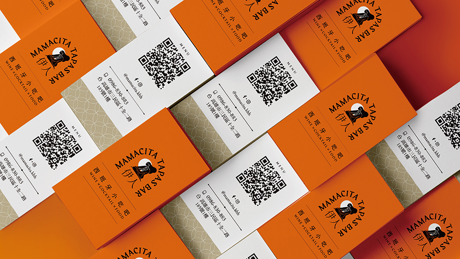
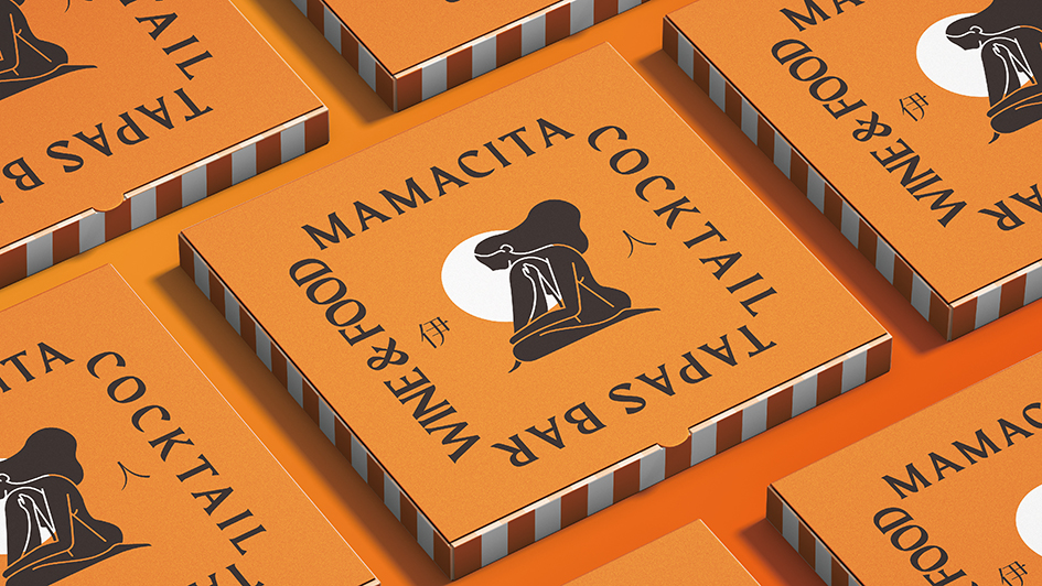
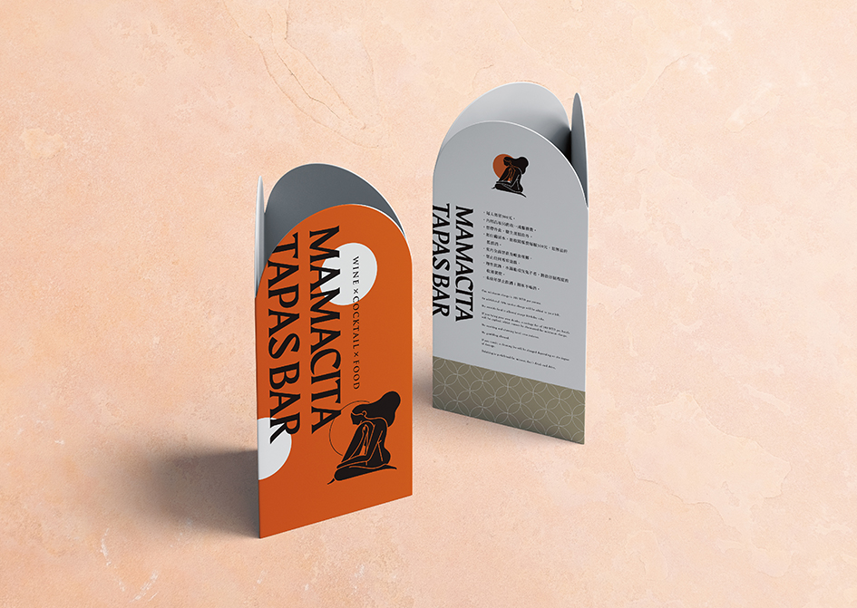
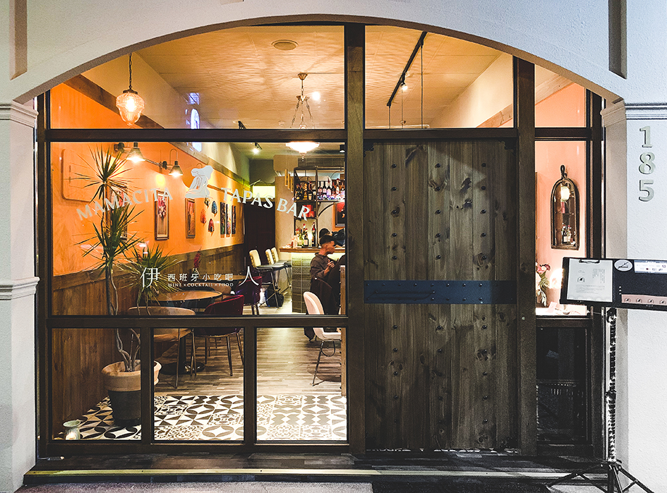
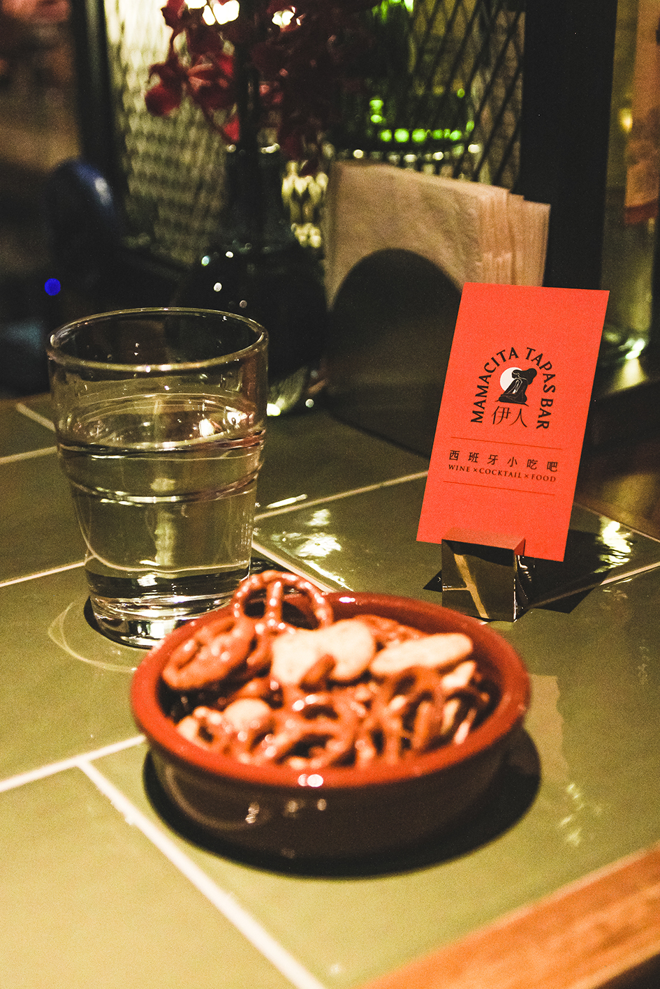
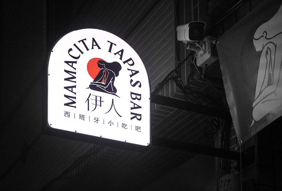
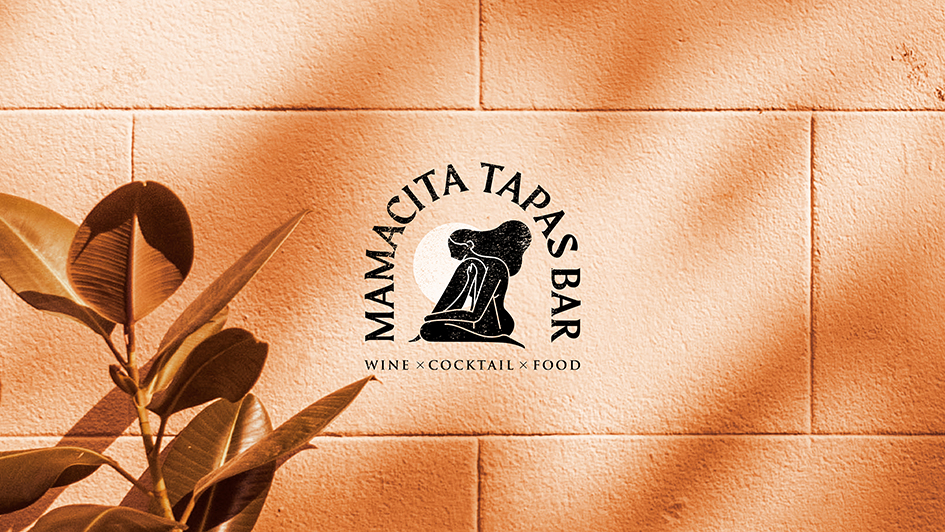
In this brand recognition, the founder takes Mamacita as the brand name, which stands for woman of prostitution in Spanish. In the logo design, we use the visual characteristics represented by female dancers, such as rhythm, self-presentation, body lines and other elements as the entry point, and draw portraits with relatively simple expression techniques, just like the black pottery painting commonly seen in Mediterranean ruins.
CREDIT
- Agency/Creative: AAOO Studio
- Article Title: Mamacita Tapas Bar Branding Design Created by AAOO Studio
- Organisation/Entity: Agency, Published Commercial Design
- Project Type: Identity
- Agency/Creative Country: Taiwan
- Market Region: Asia
- Project Deliverables: Brand Advertising, Brand World, Branding, Graphic Design, Product Naming
- Industry: Food/Beverage
- Keywords: Bar , Tapas , Branding


